You can create an end-to-end process quickly and simply in Kianda and then use this prototype to develop your ideas through an iterative process. This agile approach results in significantly faster development time which is cost effective and reduces risk.
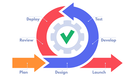
Agile development cycle
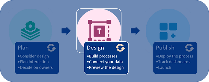
The main phases of an agile project are:
Planning - this involves determining the scope of the project, namely what is it you want to achieve, what end-users will be supported and how. The outcome will be a list of requirements that can be adjusted as the process is developed.
Design - this involves constructing one ore more draft processes. Previewing the draft is included in this phase and there may be several rounds of revisions.
Launch - this phase includes piloting the process with a number of users, monitoring results, getting feedback and then releasing the process including all related documentation.
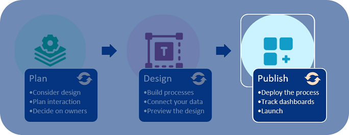
Mapping these phases to process creation in Kianda, results in three main steps: Plan > Design > Publish. Each step contains three substeps.
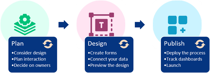
Creating your Kianda processes in an agile way
Three steps to create a process
Using Kianda allows you to leverage the agile development process to maximum effect:
Plan - our documentation will guide you when it’s time for you to capture your requirements.
What forms and fields do you need in your process based on what you want to do?
What rules can be applied to create smart, automated processes?
Who needs access to the forms as a user and form owner? Review these questions as you modify the process.
Design - you can create draft processes and restore to earlier versions, allowing you complete control over production.
Processes are made up of interactive forms which you can create at the click of a button.
Forms connect to your datasources so, as your organisation changes, your processes respond accordingly.
Use the in-built previewer to preview and test your design, then save new versions as you modify your process design.
Publish - expand access to published processes as you become comfortable with the design.
Allow individual user, group or partner access in order to deploy your solution in a controlled way.
View key metrics in process dashboards to get insights into how to improve your process and organisation.
Launch and release your process, including documentation which can feed into future development projects.
What’s next
Now that you are familiar with the development cycle, you can start to develop your Kianda process following these simple steps:
You may currently have paper forms or email flows that you want to formalise, digitise and, most importantly, link to dashboards to see at a glance how processes are running and where organisational improvements are needed.
For example, take the scenario of a Training Request process. The current process may require an employee to email their line manager to request to attend training. The line manager either approves or disapproves the request by returning an email or calling the employee. If the training request is approved, then the line manager emails the training manager stating that the employee will attend training and to schedule this.
Rather than continuing with email trails, with no easy way to see the status of each step and process overall, creating a solution in Kianda will save time, increase efficiencies and therefore reduce costs. In this way, you can become a citizen developer, a business professional who uses low-code/no-code tools to solve business needs.
Planning in an agile way
Planning involves 3 considerations: Design , Interaction and Management. We will now look at each of these areas in turn.
Planning process
To plan a solution, you could use Microsoft Office Tools or another preferred program or method to chart out what you need. Each heading will guide through what you need to consider.
If you already have a process workflow mapped out, you can go straight to designing and building in Kianda.
Planning your design
Design considers what a process needs to do and how it might look. Information can be gathered through various methods like Really Round Robin, hackathons and surveys, and captured in product vision boards. Using the 5W’s of who, what, when, where and why, along with how, can help map out the necessary information during the project initiation phase.
In particular, consider what forms you need in your process. What kinds of fields do you need in order to get the data you seek? What about information you need to provide to form users? Connecting to datasources like information in SharePoint, Salesforce or SAP will make your processes dynamic and always up to date.
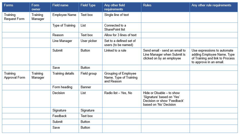
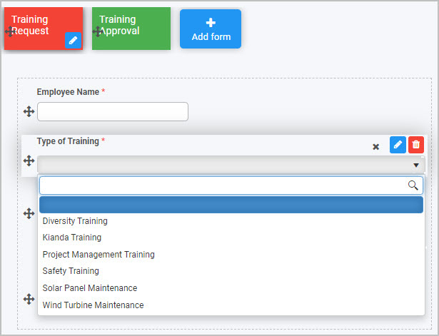
In the example of the Training Request process we already discussed, we will need two forms: 1) Training Request form and 2) Training Approval form. The information that we need to capture in each form is listed here, with potential field types in brackets. The information that will be provided to users in each form, for example a SharePoint list for users to scroll through, is also listed.
1) Training Request Form
Information provided:
Type of Training (a SharePoint list)
Information needed:
Employee Name (textbox)
Reason for the Request (textbox)
Line Manager (user picker)
2) Training Approval Form
Information provided:
Name, Reason, Type (group from Request form)
Line Manager (signature)
Information needed:
Decision (a Yes/No radio list)
Feedback (text box)
As you begin to capture the requirements for the process you want to create, it may be useful to refer to the different types of fields available in Kianda - see Controls for more information on field types.
Planning interaction
Interaction considers how users will use the process and what series of events might happen to create different desired outputs. Decide on the sequence of events and what rules can or need to be applied to create a trigger for the next event in the process.
In the Training Request process, we’ll introduce Submit buttons to trigger actions, and a Rule so that the form will appear differently based on different user inputs.
1) Training Request Form
Actions:
Submit (button) allows Employees to submit a form.
Save (button) to save a draft form.
Rule:
Send email to a Line Manager when form is submitted.
2) Training Approval Form
Actions:
Submit (button) allows Line Managers to submit an approval.
Save (button) to save a draft.
The approval appears in a dashboard for the Training Manager.
Rule:
If Yes is chosen from a radio list, then input signature.
If No is chosen, then hide the signature and show a Reason text box.
As you start to think about what rules you may need to trigger the sequence of events in your process, it may be useful to refer to the different types of rules available in Kianda - see Rules for more information.
Planning management
Next, you need to consider who will have access to the information. When designing forms, you can enable elements within a form so that they appear as visible-only or editable.
You also need to consider who the form owners will be, that is, who will have editing access to the forms themselves. This information is needed when you create a process and add forms to it. At this point, you will need to decide what users, or groups will act as form and process administrators. Here, we have outlined the form owners and users for the two forms in our Training Request process example:
1) Training Request Form
Access:
All Employees can access the form.
Owner:
Only the Training Manager can edit the form template.
2) Training Approval Form
Access:
Only Line Managers can access the form.
Owner:
Only the Training Manager can edit the form template.
Summary of requirements
Finally, we can summarise all the information we need in a spreadsheet. Field types or controls and rules will become more familiar as you work with Kianda. For now, use this example as a way to get to know what is possible in Kianda.
Examples of Requirements for a Training Request and Approval Process
What’s next
Now that you know what you need to consider when planning a process, you can go to design your process to learn how to get started in the Kianda Designer. You can use this template, populated for a sample Training Process, to help get you started:
Requirements template
Controls are predefined field widgets that allow you to add specific elements to your forms and processes, such as buttons, lists, text boxes and tables. There are 16 different types of controls (fields) to choose from - see Controls list.
If you have developer skills, you can create your own custom field widget - see Developer for more information.
Getting started with Controls
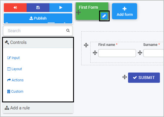
If you go to Side menu >Administration > Designer and click on an existing process or create a new process and then select a form within that process (so that the Edit form buttton - Pen icon - is visible), you will see the pre-defined Controls options in the left-hand pane. If the Controls menu is collapsed, click on it to expand it.
Control categories
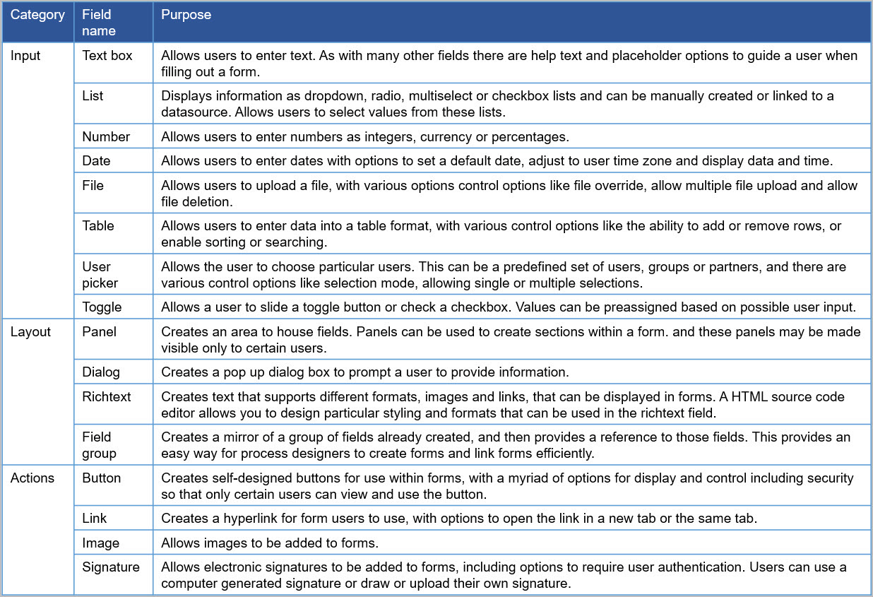
By default, there are three categories of fields:
Input - There are eight types of Input fields. They include the most common data fields such as textbox, user picker, date field, table, checkbox, drop-down and number fields.
Layout - There are four Layout fields that serve the purpose of perfecting the layout of your form. They include responsive panels, dialog box, field groups and rich text fields.
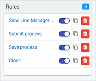
Action - There are four Action fields that allow you to insert user interface actions like buttons, links or even signature components. By default, three buttons are automatically added to each new form created - Submit, Save and Close.
A fourth category, Custom fields, exists if Kianda Developer has been used to create custom field widgets - see Developer for more details.
All fields will have edit options when you start creating the field, as well as field properties that you can edit. Each field can also have rules applied to it.
Controls list
A full list of controls (fields) is shown here.
Control categories, with field names and purpose
What’s next
To learn more about rules that can be applied to fields go to Rules.
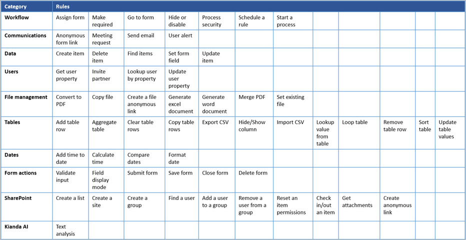
Business rules are what make Kianda forms come alive. They represent the actual actions users intend to perform when they interact with form components - for example, sending automated emails, revealing certain parts of a form based on user interactions and automatically generating Word and PDF documents from completed forms.
There are 60 predefined rules across 10 categories and they can be applied to fields (controls), forms, groups of forms or even to a whole process - see Rules list for more details.
There are two key principles to consider when working with rules:
Rule design - Consider the type of rule you are going to apply and what you are going to apply it to - for example, to a button, field or form. As part of your design considerations it is important to know what you can do with rules, in particular, the use of conditions and expressions.
Rule order - If there are several rules attached to an item like a button, then the order the rules are going to be executed in becomes important. You can change the rule execution order to suit your needs.
How to get started
If you go to Side menu > Administration > Designer, click on a process or create a new process, and then select a form within the process so that the Edit form button (Pen icon ) appears. The predefined rules will can then be found in the left-hand pane under Add a rule.
Rule categories
There are 10 categories of rules available (see Rules list for the full list of names of the 60 predefined rules):
Workflow - There are seven workflow rules that represent the actions a user intends to perform when they interact with form components.
Communications - There are four communication rules associated with user communication - for example, sending an email or triggering a user alert.
Data - There are five data rules associated with database operations like create, update and delete.
Users - There are four user rules associated with user properties, allowing user lookup or to update a user.
File management - There are seven file management rules concerned with generating documents such as Word, Excel or converting to PDF.
Tables - There are 12 table rules associated with table operations such as updating, adding and removing table rows.
Dates - There are four date rules to calculate time and format dates.
Form actions - There are six form rules linked to actions that are part of forms - for example, submit, close or save.
SharePoint - There are 10 SharePoint associated rules such as adding, finding or removing users.
KiandaAI - there is one KiandaAI rule related to text analysis.
An additional Custom category exists if Kianda Developer has been used to create custom rule widgets - see Developer for more details.
When to use rules
You can add rules:
to a field
to a form
to a process (the rule will run on load)
Rule design
Click on an existing process by going to Administration > Designer and decide which form or field you want to apply the rule to by clicking on that item so that you’re viewing it in edit mode (so the Pen icon appears) - for example, you could select a form called Training Approval or could select a button like Submit to apply a rule or rules to.
Field editing
Click on Add a rule in the left-hand pane and select the category of rule you want, such as Communications, and then click the particular rule you want to insert within that category, for example User alert.
Rule order
If there is more than one rule for an item like a field or button, then you need to consider the order of execution.
For example, for a Submit button on a form you may want a Send email rule to be executed first before any other rule is executed. To do this, click on the Submit button to make sure you are in Edit mode, and under Rules in the right-hand pane, drag the Send email rule to the top of the list of rules by clicking on the rule and dragging it to the top.
Rule order
Rules list
This table contains a full list of the available predefined rules.
Rules by category and title
What’s next
To learn more about control fields, go to Controls.
Conditions are a key component of Kianda rules. They are the triggers that result in fully dynamic forms and add an important level of interactivity, creating pathways within a process based on user interaction.
Conditions work on the ‘if…then…else’ principle: ‘if’ the condition exists ’then’ an action happens, ’else’ another action happens. There are three parts to applying a condition to a rule (depending on the rule that is used):
Create the condition(s)
Create the action(s) that will be applied as a result of the first condition being in place
Create the otherwise action(s) based on other conditions being in place
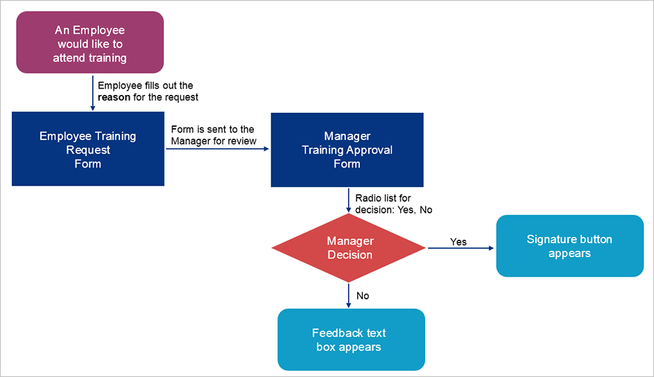
For example, let’s take a simple Training Request and Approval Process, whereby an employee fills out a request form, the details of which are sent to a manager for review in an approval form. In this approval form, the manager can either a) approve the request with a signature or b) not approve the request and provide feedback on why.
Training Process flowchart
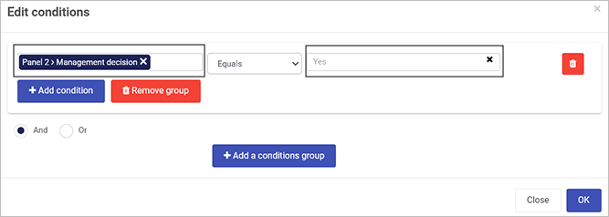
A condition is created based on the Manager Decision radio list:
Condition: If the decision is ‘Yes’
Action: Then the Signature button appears
Otherwise action: Else the decision is ‘No’ and the Feedback text box appears
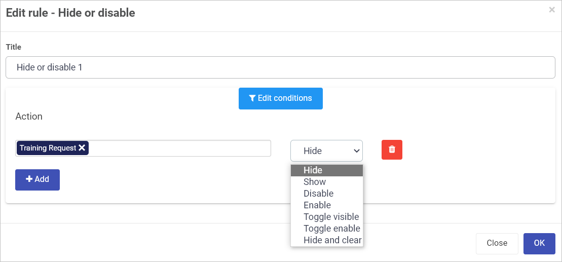
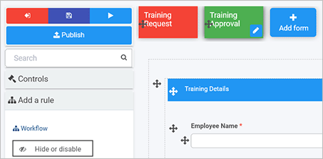
One of the most commonly used rules that uses conditions is the Workflow rule Hide or Disable. This is used as an example in the video and in the Getting started section below.
Using conditions in rules: Example of Hide or disable
Getting started with conditions
Conditions are recognisable in Kianda from the Conditions button found in rules and dashboards.
To create a condition:
Select a form or forms, field or fields and then, a rule, for example Hide or disable, as found in the left side menu > Add a rule > Workflow > Hide or Disable.
Click on Edit conditions.
Click on Add a conditions group.
In the Edit conditions dialog box, choose from the elements below, by drilling down to the form(s) or field(s) that you want to apply the rule to.
Condition elements
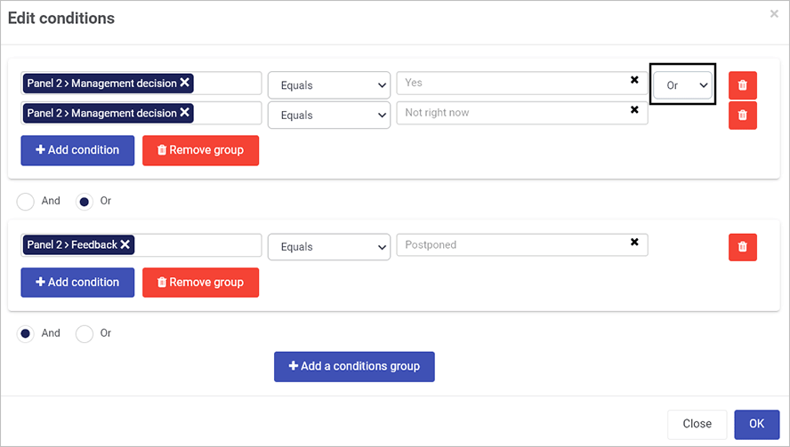
In the case of multiple conditions, you can use And or Or to create compound conditions.
Compound conditions
Click on OK.
Create the actions and, where applicable, otherwise actions. The action will depend on the rule that is chosen. For example, for the Workflow rule, Hide or Disable, click on the field under Action and choose the form(s) or field(s) where you want an action applied.
Action elements for Hide and Disable
Then click on the field for actions and choose one of seven possible actions to apply.
The actions within Hide or disable are:
a) Hide will hide a process element (forms or fields) from view
b) Show will show the element
c) Disable blocks a user from editing an element
d) Enable allows a user to add a value to an element
e) Toggle visible will toggle between showing an element or not, based on subsequent clicks of a field that the rule is applied to
f) Toggle enable will toggle between allowing an element to be edited or not, based on subsequent clicks of a field that the rule is applied to
g) Hide and clear will allow you to hide a process element and clear the details. For example, if a toggle button has this rule applied, with an otherwise action of show as actions on a textbox, then if one value is chosen on the toggle button, the user is allowed enter details into the textbox, otherwise the field is hidden and cleared of data so that no data can be retrieved; this may be useful for sensitive information like a social security number on a form.
Click on + Add to add more actions.
Click on Add otherwise action to add more actions based on other values for the condition.
The video demonstrates how a condition works within the Hide and Disable rule and highlights that multiple groups of conditions can be used to impact multiple actions to create highly sophisticated form interactions.
User tip
You can use rules to create actionswithout conditions too. In this case, the rule will simply execute - for example, when the form or field is clicked on.
What’s next
To learn more about controls (fields) go to Controls.
To find out more about how expressions are used in rules go to Expressions.
To return to the previous pages click on the links below
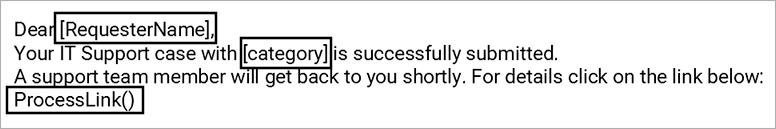
Expressions allow you to put together form identifiers and constants with operators and functions to return a dynamic value that can be used in a rule to automate processes.
For example, expressions could be used in the body of an automated email sent using the Send email rule, as shown here.
Expression examples
In the example above, [RequesterName] and [category] are identifiers, that are unique IDs for form fields. ProcessLink() is a function that will return a link to that process instance. Using these expressions in an email will mean that every time an instance of the process runs, the values will be presented in an automated email, creating greater efficiencies and personalising the email for the recipient.
One of the most commonly used rules that uses expressions is the Communications rule, Send email - we will use this as an example in the video and in the Getting started section below.
Using expressions: Example of Sending email
Getting started with expressions
Expressions are recognisable in Kianda from the Expressions button found in edit rule dialog boxes and other menu items, such as enabling quick actions for processes.
Within rules, expressions can be created using the Expression builder where you can select Add field to an expression or use the handy Reference guide to get a list of commonly used functions.
Expression builder
Now let’s go step by step through the process of adding an expression to the Body of an email that is being sent using the Send email rule. To create an expression:
Select a form or forms, field or fields and then, a rule, for example Send email, as found in the left side menu > Add a rule > Communications> Send email.
Under Action, click on the Expressions button beside Body.
Click on the field under Add field to expression and find the field you want to reference in your email - for example, a text box titled EmployeeName.
Click Add to expression.
Click OK.
To add additional field expressions, click on the Expressions button again, under Add field to expression, click on X beside the field name to clear the expression box and then search for the desired field from a form.
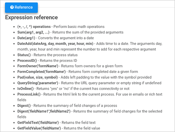
To add a function, click on Reference and copy the function into the body of the email. A list of expression functions are available here:
(+, -, /, *) operations - Perform basic math operations
Sum(arg1, arg2, …) - Returns the sum of the provided arguments
Date(arg1) - Converts the argument into a date
DateAdd(dateArg, day, month, year, hour, min) - Adds time to a date. The arguments day, month, year, hour and min represent the number to add for each respective argument
Status() - Returns the process status
ProcessID() - Returns the process ID
FormOwner(‘formName’) - Returns form owners for a given form
FormCompleted(‘formName’) - Returns form completed date for a given form
Pad(value, size, symbol) - Adds left padding to the value with the symbol provided
QueryString(‘parameter’) - Returns the URL query parameter or empty string if undefined
IsOnline() - Returns “yes” or “no” if the current has connectivity or not
ProcessLink() - Returns the html link to the current process. For use in emails or rich text fields.
Digest() - Returns the summary of field changes of a process
Digest(’*fieldName1*’,’*fieldName2*’) - Returns the summary of field changes for the selected fields
GetFieldText(’*fieldName*’) - Returns the field text
GetFieldValue(’*fieldName*’) - Returns the field value
Click on OK when complete.
What’s next
To learn more about control fields go to Controls.
To find out more about how conditions are used in rules go to Conditions.
To return to the previous pages click on the links below
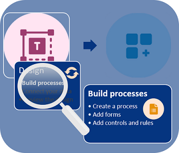
Kianda processes are made up of forms. As we saw in Plan your process, you may have paper forms or email flows that you want to turn into dynamic, digital processes.
Building processes involves three steps: creating the process itself, adding forms to the process and then adding controls and rules to the forms.
Build process steps
Once you have previewed the design, you may wish to go back and make changes to the form, adopting an iterative design approach. We will deal with each step in turn, starting with creating a process.
Before you begin
To start creating a process, reference your process plan. As we go through the steps involved, we will keep in mind the requirements associated with a Training Request and Approval Process. We will start by creating a first process called Training Process.
Create a process
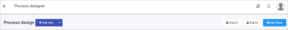
To create a process, go to the Left side menu and click on Administration > Designer.
You are now in the main process view. From here, you can click on Import or Export to import or export processes once created. There is also an option to use Kianda’s predefined processes available in the App Store.
Adding a new process
Click on the Add new button to create a process from scratch.
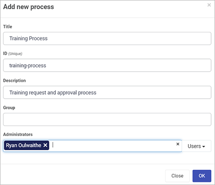
Fill out the details in the Add new process dialog box - that is Title, ID (a unique Name that autofills from the title), Description, Group (if you have a predefined group) and Administrators, people who will be able to administrate this process, choose from Users or Groups.
Add new process dialog box
Click on OK when complete.
You are now in the process design page. From here, you can Add forms.
After you have created a process, you are then ready to add forms. This is the second step in building a process.
Build process steps
As you work on your process, you can save drafts. This allows you make changes and restore to earlier versions if needed - see Version History for more information.
Before you begin
When adding forms, refer back to your process plan to determine what forms you need and who will have access to these forms as an administrator. As an example, we will keep our Training Process requirements in mind as we go.
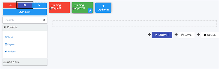
In this Training Process example, we will create two forms: Training Request Form and a Training Approval Form.
The video below highlights how Kianda Designer works and How to get started runs through how to create forms for a sample Training Process.
Kianda Designer introduction
How to get started
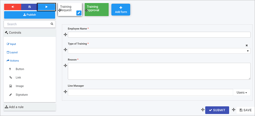
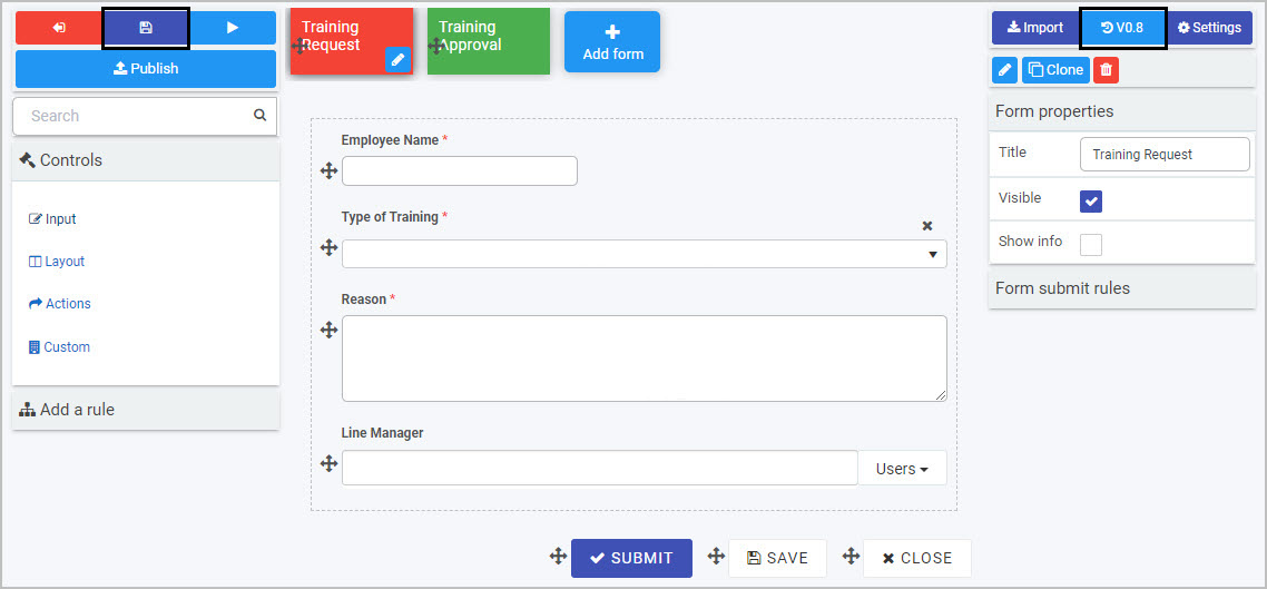
Once you have created a new process, you are automatically in Kianda Designer. This page allows you to: add and edit forms, add elements to those forms (like controls and rules), save, publish and preview forms, and view and edit form and field properties.
Kianda Designer has 3 key areas:
Left-hand pane is used to add form elements like controls and rules. This pane also houses the Exit Designer SavePreview and Publish buttons.
Central form canvas displays the current form you are working on.
Right-hand pane is used to view and edit process, form and field properties.
Kianda Designer
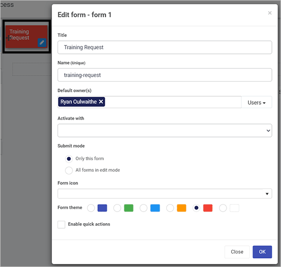
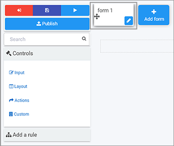
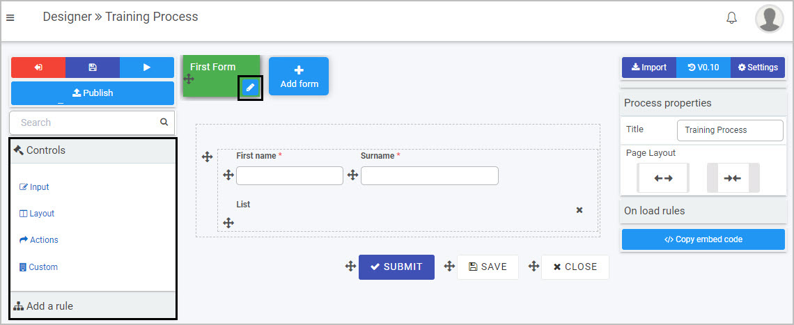
Note: By default, a first form, “form1”, is added to any new process you create. Click on the Edit form button (Pen icon ) to start editing this form to make it your own.
Click on the Edit form button (Pen icon ) to edit ‘form1’.
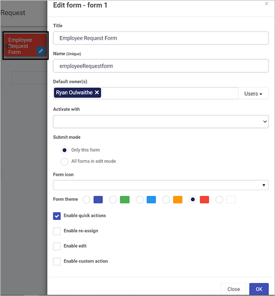
Complete the details in the Edit form dialog box - that is Title, Name, and Default owner(s) (people who will be able to administrate this form - choose from Users or Groups). There are other options like Form theme which are colours that you can apply to the form tab. These options are explained in further details in Designer. Changes made are visible in real-time in the form canvas.
Edit a form
Click on OK button when complete.
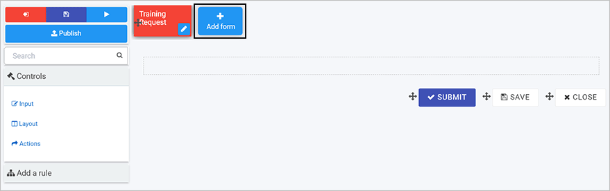
Click on the Add form button to add a second form. Repeat to add as many forms as needed.
Once you have added one or more forms to your process, you are ready to Add controls and rules to your forms! In our example we have two forms: Training Request and Training Approval.
Save your work as you go by clicking on the Save button.
You may have chosen to use predefined processes from the Kianda App Store. It is worth taking the time to check out how these processes are built to give you an initial idea of what is possible in Kianda.
Use the Exit button to return to the main process view and then click on a process of choice to see details.
You can preview forms by clicking on the Preview button - see Previewer for more details.
There are many ways to then reuse elements within forms - for example, using the Group field and cloning. For more information, see the video Reusability of process and form components.
Forms are assignable - means that only a form assignee can edit a particular form. This can be a combination of users and groups.
Only form owners can edit a given form by default. Any other user with access to view the form will see it in read-only mode.
Multi-step processes use the concept of “current form”. Only the form matching the process status will be made editable.
In a multi-step process, other forms that are not “current form” can be configured to activate with the current form, meaning they might also be editable and will form a form group.
These rules work together to determine if the form is in edit mode or display mode. Form designers have at their disposal business rules, such as assign form, go to form and submit rule, to dynamically control the ability of end-users to edit a particular form or a section of a form.
To return to the previous pages click on the links below
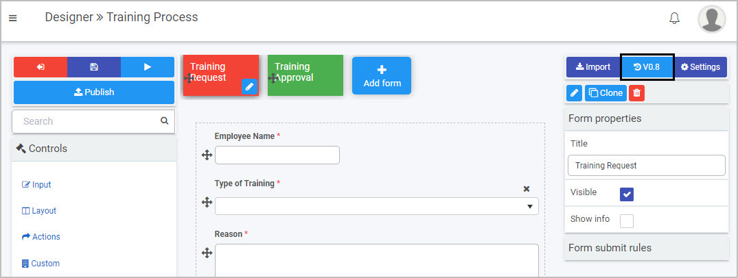
The current or active version of a process is always visible in the right-hand pane, for example V0.8 for the process as shown below.
Process version
The first version of a process is 0.1 and will increment to 0.2 and so on, each time a process is saved. Once the process is published the version changes to 1.0 and increments with each publication. This makes it is easy to keep track of who made changes and when, and to restore an older version if needed.
The video below introduces version control and the section How to get started runs through how to view process versions and restore an older version.
Version control
How to get started
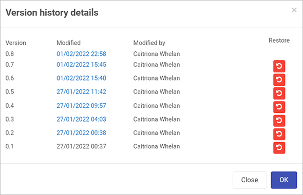
To view the version history click on the Design version history button which may look like V0.1 or whatever the current version is for your process, for example or .
A pop-up shows the version history details including when the version was created and who created it.
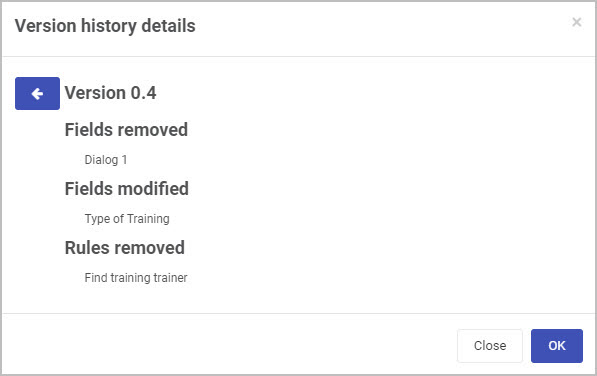
In the example below, there are 8 versions of the process, all are drafts indicated by the 0 in front, such as 0.8.
Version history
Click on a particular version to see the version information, for example forms, fields and rules that were added, modified or removed.
Version details
To restore an earlier version, click on the Restore button beside a particular version and then click on Ok to confirm that you want to restore to that version.
What’s next
To learn more about adding different elements to your form go to Add controls and rules.
To return to the previous pages click on the links below
Kianda low-code development platform - process designer
Kianda process Designer empowers you to easily start building forms and workflows for any business use case. Forms are an important component of any process. They might be used as a stage of a process and can be made active individually or at the same time (parallel forms).
There are 3 key principles to consider when working with forms:
Form design - what a form looks like, what elements it contains, for example controls and rules, see Designer layout.
Form interaction- how users can use forms depending on certain sequences happening, see Rules.
Form management - who can edit and access forms is set when creating a new form, see New forms.
Designer layout
To access processes, go to the left-hand pane and Administration > Designer and click on a process that you have created or imported, see Design and build your process.
From the main process view, click on any process to add forms, for example Training process as seen below.
Main process view
The designer window opens and is made up of 3 main parts.
Kianda Designer
The key components of the designer are:
Left-hand pane is used to add form elements like controls and rules. This pane also houses the Exit Designer SavePreview and Publish buttons.
Central form canvas displays the current form you are working on.
Right-hand pane is used to view and edit process, form and field properties.
Note the name of the process you are working on is shown in the top menu bar, for example Training Process.
The video below demonstrates how to get started using Kianda Designer, and go to How to get started to follow through on different ways to import forms or start from scratch.
Introduction to Kianda Designer
How to get started
How you get started with forms depends on:
if you have created a process using the App Store, see Predefined forms
if you have created a process from scratch or want to create a form from scratch, see New forms
if you import forms that have already been created, see Import forms
Once your form is created, you are ready to start adding elements to your form, see Add controls and rules.
If you have created a process using the App Store, then a number of forms will already be part of the process. For example the process Security Incident Management has 5 forms attached: Incident detail, Data breach, Malware outbreak, Root cause remedy and Caller review.
To edit form details, simply click on a form and click on the Pen button to edit the form. You can also click on the Add form button to add a new form. Edit options are shown under New forms.
New forms
If you have created a process from scratch, an empty form is added to your process by default, called “form 1”. This is the first form. Click on this form and the Pen button to customise it. You can also click on the Add form button to add a new form.
Adding a form
There are a number of edit options below.
Editing a form
Note: as you change any of the options in the dialog box, the impact will be shown in real-time on the form in the background, for example a title, or colour form theme.
Title - the form title, for example Employee Request Form
Name - this is a unique name for the form
Default owner(s) - by default the form creator is an owner. You can remove this owner by clicking on and add other owners by clicking on the arrow and choose from Users, Groups or Partners.
Users - allows you to choose individual owners
Groups - allows you to choose from defined groups for example HR Team or Management Team
Partners - allows you to choose predefined partner organisations that you want to share with or provide permissions
Activate with - will decide when the form will be active. If you have several forms attached to a process, then select from a dropdown list the form you want to activate with the current form. If you leave the field blank, the new form will be activated sequentially after the first form is submitted.
Submit mode - options are a) Only this form (the current form) or b) All forms in edit mode
Form icon - click on the arrow to choose from hundreds of icons to attach to your form.
Form theme - choose from Navy, Green, Blue, Amber, Red or White Colours for your form.
Enable quick actions - if you tick the checkbox, you can select from the options a) Enable re-assign b) Enable edit and c) Enable custom action. Click on Ellipsis button to further modify the action settings.
If you click on Enable re-assign, you can reassign action settings to particular Users, Groups or Partners. Click on Allow form owners if you want form owners to be able to reassign actions.
If you click on Enable edit, you can allow certain Users, Groups or Partners to edit the form, along with form owners by clicking on Allow form owners.
Other options include a checkbox for When editing auto hide form footer buttons and Trigger rules on save.
If you check Trigger rules on save then click into the Save action field to choose from an action trigger as to when the form is saved, for example Submit, Save or Close. These can be other actions depending on what you have defined.
Edit action settings
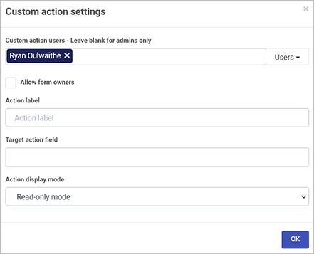
If you click on Enable custom action, you can allow certain Users, Groups or Partners to edit the form, along with form owners by clicking on Allow form owners.
Other options include Action label, Target action field and Action display mode, for example Read-only mode, Edit mode or Both.
Custom action settings
As a form designer you can set up actions dependent on certain conditions, for example an Action label that targets a certain button appearing for example Close button, only when a certain display mode is chosen, for example Read-only mode. If Edit mode is chosen, then the button will only appear when the form is being edited. In this way you can create dynamic forms that suit user interactions.
Click on the OK button when you are finished editing to save your changes or click on Close to exit the dialog box without saving.
To save your changes to the form, click on the Save button .
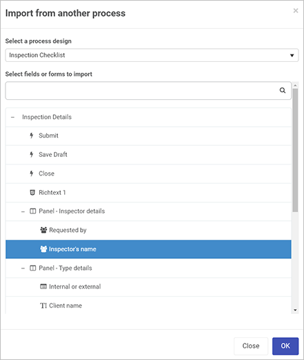
You can import a previously designed form by clicking on the Import button .
Click on the arrow to select from the drop down list to Select a process design.
Click on a process of interest and then click on the forms to import. Forms are indicated by a + symbol and can be expanded to show elements within a form for example a panel containing different fields such as lists and text boxes. This means you can import a whole form, or just elements of a form. In this way you can very quickly reuse some or all parts of an existing form.
Importing from another process
Click on the OK button when you are finished editing to save your changes or click on Close to exit the dialog box without saving.
Adding form elements
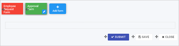
If you have added a new form during the form creation process, then a blank canvas with 3 default buttons are available to you: Submit, Save and Close.
Edit form information by selecting a form and clicking on the Pen button .
Change a field to another field by clicking on Change field.
Create a duplicate form by selecting a form, clicking on the Clone button and then click on Ok. A version called ‘Form Name Copy’ is created and available to edit on the canvas. The Clone button can also be used to clone form elements like controls or buttons.
Delete a form by selecting a form, clicking on the Bin/Trash button and then click on Ok after you have reviewed the form title and you are sure this is what you want to delete. Click on Cancel if you wish to cancel the deletion.
You can edit process settings by clicking on the Settings button in the right-hand pane.
Choose from the settings:
Process id settings - choose from a) Default or b) Custom and use a combination of [ProcessName]-[UniqueNumber]-[FieldName]
Enable process security - if you tick the checkbox, can allow certain Users, Groups or Partners to have certain privileges related to the radio button options to create, assign and view as shown below.
Enable process security
The default setting is Security users can create, assign to can update, everyone else can view.
On load rules execution mode - options are a) Always b) When in edit mode or c) When open new. The default setting is Always.
Hide form tabs - gives you the ability to hide form tabs, options are a) Yes or b) No
Hide left nav - gives you the ability to hide navigation elements, options are a) Yes or b) No
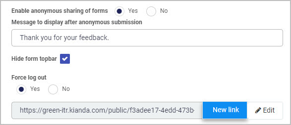
Enable anonymous sharing of forms - gives you the ability to share forms with people outside your organisation for example a feedback form or GDPR subject access request. Options are a) Yes or b) No. If you click on Yes there are various options that you can add:
Message to display after anonymous submission - to add a display message
Enabling anonymous sharing
Hide form topbar - checkbox to hide the form topbar.
Force log out - options are a) Yes or b) No to force user logout once the form is submitted
Click on New link to generate a new anonymous form link to share with users and click on Edit to change the link.
Enable mobile bottom navigation - options are a) Yes or b) No
Instance delete settings - options are a) Any user can delete b) Creator can delete c) “Current form owner” can delete d) “Security users” can delete e) “Admins only” can delete. The default setting is Creator can delete.
Enable form assignment notification - options are a) Yes or b) No
Prevent closing instance with unsaved data - options are a) Yes or b) No
Selected tab theme - choose from Navy, Green, Blue, Amber, Red or White as a colour when a form is selected.
Completed tab theme - choose from Navy, Green, Blue, Amber, Red or White as a colour when a form is completed.
Click on the OK button when you are finished editing to save your changes or click on Close to exit the dialog box without saving.
Click on the Exit button to go back to the process list, the Save button to save your work, the Preview button to preview what you have created and the Publish button to publish your work.
What’s next
To learn more about rules and controls that can be applied to forms go to Controls and Rules.
When you have created forms, then you are ready to add elements to those forms, that is controls and rules. This is the third step in building a process.
Build process steps
As you add elements to your form, you can save drafts. This allows you make changes and restore to earlier versions if needed, see Version History for more information.
Before you begin
To add elements to your form, you need to reference your process plan and consider what fields you need and any rules that need to be applied to these fields. We will keep our Training Process requirements in mind as we go.
In our example, in the Training Request Form we have six control fields to add: two text boxes, one user picker field, two buttons, one list field, and one rule to send an email.
We will start with:
adding controls or fields to our form, starting with an example of a text box
There are three categories of Controls, and 10 categories of Rules, see Controls and see Rules for a full listing of what is available.
Controls and rules are available from the left-hand pane in when you click into a process.
Controls and Rules in left-hand pane
Note: By default there are 3 buttons automatically added to forms - Submit,Save and Close, see form canvas in the image above.
To remove a button or other field, click on the item and then click on the Bin/Trash button then click on OK to confirm removal.
To move a button, or other field, click on the Drag handle button .
To start adding controls or rules to a form, click on a form of choice so the as the Edit Form button (Pen icon ) is visible.
Adding a first control text box
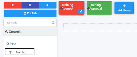
The first field we are going to add in our example is a textbox field to accept user input.
Click on a form that you want to edit, for example by clicking on the Training Request Form, the Edit Form button (Pen icon ) is visible, meaning this form is in edit mode.
Click on Controls in the left-hand pane. Click on a particular category, for example Input and then click on a particular field type to add, for example Text box.
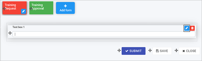
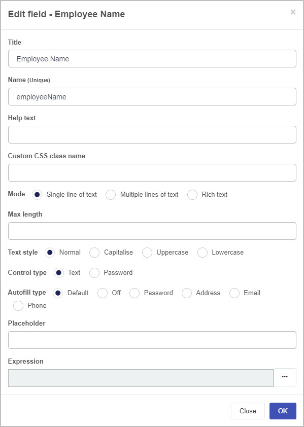
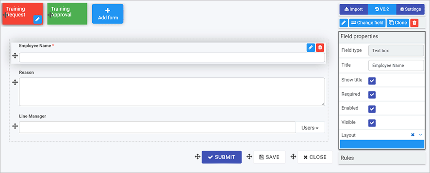
The field is added to the form. To edit the field, click on the field so the Edit field button (Pen icon ) is visible.
Edit field
Fill out the details in the Edit field dialog box - that is Title, Name, and choose options further options like Mode to have users input a single line of text, multiple lines of text or rich text.
Edit field dialog box
There are other options like Text style where you can choose to Capitalise or have lowercase text only. Click on OK button when complete.
Repeat the steps above to add another textbox, or other field. We can add another text box field called ‘Reason’ for our Request Form. We can also add a User Picker field.
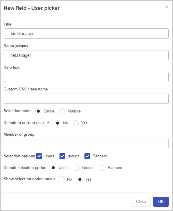
Click on Controls > Input > User picker. Choose from the options in the New field - User picker dialog box. Click on OK button when complete.
New field - User picker dialog box
The user picker field will be used in this example, to allow the form user to pick from a list of users. This could be a pre-defined group, or individual users. The user picker field could also be connected to an external datasource like a list of line managers from SalesForce.
Edit field properties as necessary to control how fields appear, see the next section Field properties.
The video below highlights how to edit forms, and the section Field properties runs through the the editing process in steps.
Editing forms
Field properties
In addition to editing options when you add a field, you can also change field properties to impact form design.
Kianda Designer introduction
To edit field properties:
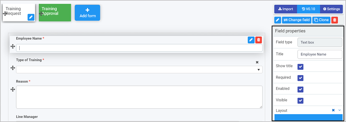
Click on a field so the Edit field button (Pen icon ) is visible. Field properties are available in the right-hand pane.
Properties in the right-hand pane
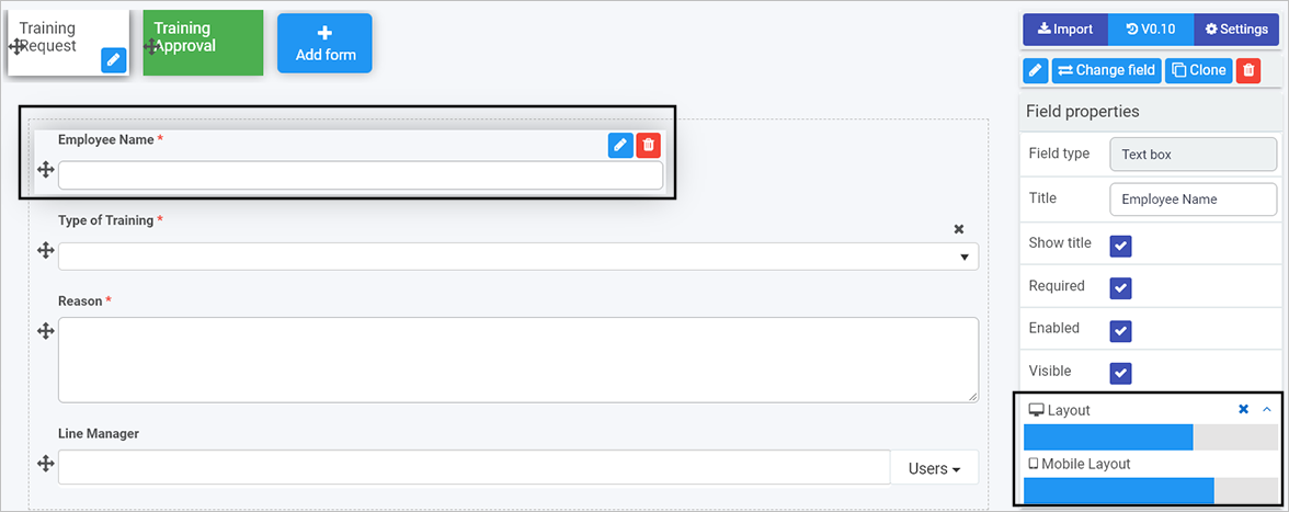
Tick checkboxes as appropriate, for example ticking Enabled means users can fill out the field. Layout is used to set the width of the field for both desktop and mobile layouts. In the example above, Required is checked which means that the particular textbox field ‘Employee Name’ is mandatory for users to fill out. This is denoted by asterix * beside the field name. Go to Properties to find out more about properties.
Being aware of these options will help you to customise your form and impact the way it works.
You are now ready to add rules to create smart, interactive forms.
Adding rules
Rules allow actions based upon conditions resulting from user interaction with fields. This creates smart, dynamic forms that follow business logic, all without the need for coding.
The video below highlights how to get started with rules, and the section Using a Communication rule runs through an example of how to add a communications rule to a form.
Getting started with rules
Using a Communication rule Send email
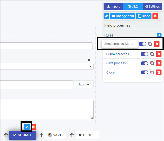
In our example we will add a rule to send an automated email to a Line manager to approve a request based on a user completing the Training Request form and clicking on Submit.
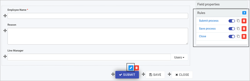
Click on the Submit button to edit the button.
Click on Rules in the right-hand pane. By default there are three rules already applied to the Submit button, to Submit, Save and Close the process when the Submit button is clicked.
Rules for the Submit button
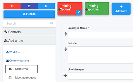
To create an automated email rule, click on Add a rule > Communications > Send email in the right-hand pane.
Add Send email rule
In the Edit rule - Send email dialog box, fill out the Title, and decide who are the email users, that is who the email will be From, To, any CC or BCC that should be included. Click on the User button to add users to each field.
Selecting a user field
Note: If you leave the From field blank, then the email will arrive from “noreply” @kianda.com.
For user fields like To and CC, there are various options to choose from . When you click on the User button choose a selection mode to choose a user, for example User(s) defined in a user field will allow you to use a field from a form. When you click in the field below Select a user field drill down to the field you want, in this example Line Manager. This means when the user submits a form and chooses their Line Manager, an automated email will go to that Line Manager.
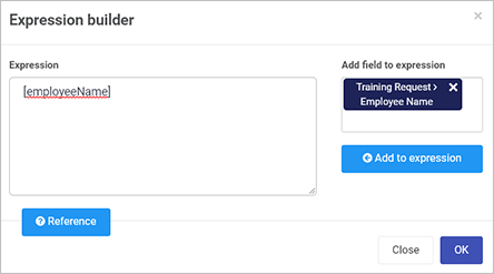
Fill out the Subject and Body text. You can use the Expression builderto add expressions to the body to personalise the email.
Click on the field Add field to expression to drill down to the field you want, in this example Employee Name.
Expression builder
Click on Add to expression. Note: Make sure you position your cursor in the correct place in the body of the email before you Add field to expression so that the expression is added in the correct place.
Click on OK.
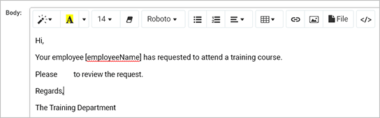
Expression added to an email body
Other expressions can be added that use values or status of processes, for example to create a link to review a process, use the ProcessLink() expression. Click on Expression builderand Reference to get a list of 16 expressions you can use. Note: Click on the field under Add field to expression to clear the field so that you can add a reference.
Expression references
Copy and paste an Expression reference, for example ProcessLink() into the box under Expression. This will create a link to a process.
Using the ProcessLink() expression, text can be entered into the brackets to provide a clickable link in the email as follows:
In our example the email will contain a link, linked to this process, that the Line Manager can click on, so they can approve the request.
Use font and styling options in the body text to set the format of the email. Click on OK when complete.
The rule is created. Click on the rule in the right-hand pane and drag it to the top of the rule list, to change the order of execution so that the automated email is sent out first when a user clicks on ‘Submit’.
Changing the order of rule execution
For more information on other rules that can be applied, go to Rules for a full listing of what is available.
Make sure to save your work as you go by clicking on the Save button.
Repeat the steps above to add another email rule to another field, or try other rule, for example a Workflow rule as shown below.
Adding a second Workflow rule called Hide and Disable
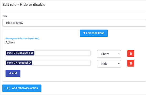
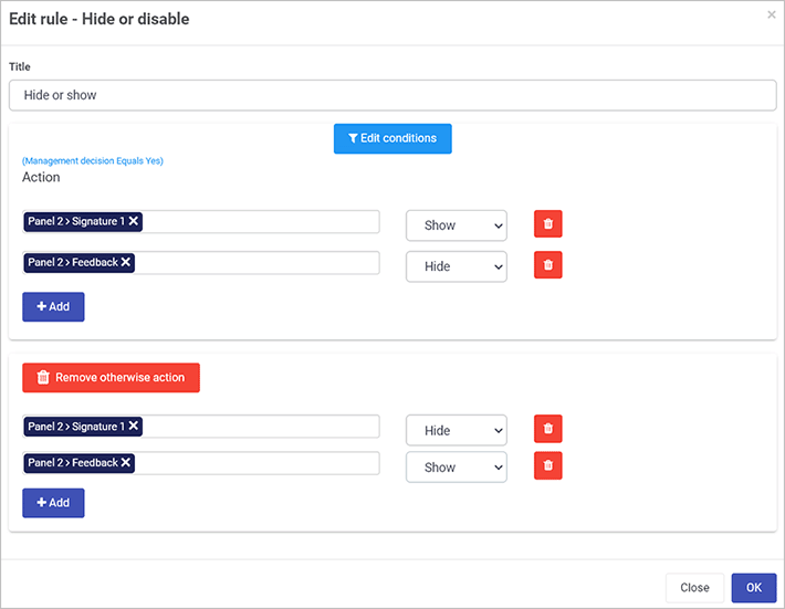
In the Training Process example, there is a second form that is part of this process, called Training Approval. From our Training Process requirements the Approval form will have 7 fields, and 1 rule. The fields include a field group, a banner and a list and a Workflow added to a radio list called ‘Management decision’. The added Workflow rule is called Hide and Disable, so based on user input, if someone clicks ‘Yes’ for the ‘Management decision, then a Signature field is shown to sign off on the form, if ‘No’ is clicked then the Signature field is hidden and a text box called ‘Reason’ is shown.
Select a field in a form to apply the rule to, in this example a field called ‘Management Decision’ in a Training Approval field.
To use a Workflow rule, click on Add a rule > Workflow > Hide and Disable in the right-hand pane.
Add Hide and Disable rule
In the Edit rule - Hide or Disable dialog box, fill out the Title, in this example ‘Hide or Show’, then click on Edit conditions.
Click on Add a conditions group. First we need to a) create a condition, click into the first field and drill down to the field in the form you want to base an action on, in this example, ‘Management decision’, then click on the operator field, in this case we choose Equals and in the third value field type in one of the possible values for this field, in this example ‘Yes’. Then click on OK.
Note: There are 13 possible operators to choose from: Equals, Not equals, Contains, Greater than, Greater or equal, Less than, Less or equal, Is blank, Not blank, Matches pattern, Does not match pattern, Is Visible, Is Enabled.
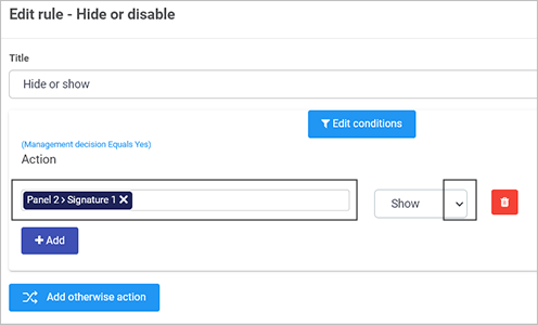
In the Edit rule dialog box, that the first part of the condition appears see blue text ‘Management Decision Equals Yes’. We then need to b) create an action for the condition. Click on the field under Action and drill down to a field within a form, in this example the Signature field in the form Training Approval. Then click on the arrow beside the action to choose, in this example Show.
Note: there are 7 possible actions in this list: Hide, Show, Disable, Enable, Toggle visible, Toggle enable, Hide and clear.
Click on Add to add a second part to the action, in this example to hide the feedback field upon a Management Decision of ‘Yes’. Click on the first field and drill down to the field of interest, in this example ‘Feedback’ which we will then ‘Hide’.
Click on Add otherwise action, in this example to add the actions based on a ‘Management Decision’ of ‘No’.
Drill down to the fields of choice, and click on the actions to add the reverse of the first action group.
Click on OK when complete.
Make sure to save your work as you go by clicking on the Save button.
Depending on the fields you use, for example user picker or lists, you can connect to a datasource to ensure information used in forms is always up to date. Click on the link to find out how to add a datasource and use it in a form field, for example a list.
Make sure that you change the field properties to make fields Required, Enabled and so on, to ensure that the form appears the way you want, see Properties to find out more about properties. For example unchecking Enabled makes the field visible but not possible to edit.
By default there are 3 buttons with every form, Submit, Save and Close. To remove a button, simply click on it and then click on the Bin/Trash button or to add a new button of choice, go to Controls > Actions > Button see Controls for a full list of controls.
There are additional form settings that can be used, available in the right-hand pane of Designer. Click on a form in the process, then click on the Settings button to set additional settings such as Enable process security. This value can be checked and a group selected, so that only these users can access the form. Groups are added from Side menu > Administration > Users, click on Create new group to add users to a group, for example HR Team.
Kianda low-code development platform - Process, Form, Control Properties
Every process, form and control, such as text boxes and lists, will have properties visible in the right-hand pane of the Designer view.
Process properties
When you go to Administration > Designer > click on a process > Process properties in the right-hand pane, you will see the properties for the chosen process.
These process properties are visible:
Title - the title of process for example Training Request.
Page layout - you can click on Wideor Narrow to change the layout.
Process properties
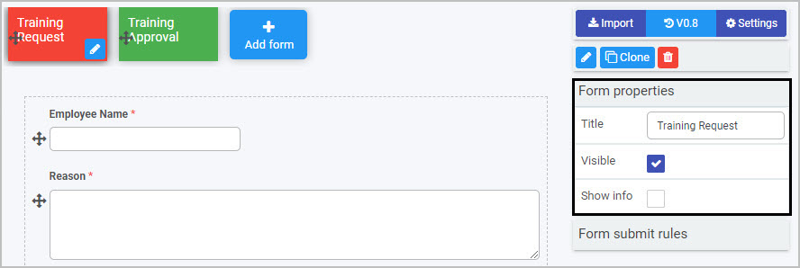
Within a process, clicking on a particular form will display the Form properties.
Form properties
When you click on a form, the Form properties appear in the right-hand pane.
Form properties
These form properties are visible:
Title - the form title, for example Training Request
Visible - click on this checkbox if you want the form to be visible to users
Show info - click on this checkbox if you want to show information, for example who are the form owners, the design version and when the form was started and completed. This information will pop up at the bottom of the form.
Underneath form properties you will see Form submit rules, go to Rules to find out more about Form rules.
Click on a control field, for example a text box, in the form to see Field properties.
Field properties
When you click on any field, such as User picker, list or text box, the field properties appear in the right-hand pane.
Field properties
The Field type, in the example above, Text box, is shown along with the Title of the field, in the example above, this is Employee Name.
The options within properties are:
Show Title - show the title of the field
Required - tick this checkbox to make this field mandatory for users to fill out
Enabled - tick this checkbox to make the field enabled for users to fill out
Visible - tick this checkbox to make the field visible to users
Layout - change the width of the field by clicking on the bar in the Layout box until you see the desired size. Click on the arrow beside Layout to see the Mobile Layout and click on the bar to change the width of the text box for mobile use.
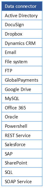
Connecting your data to Kianda processes, allows real-time scalability, so as your organisation grows, the processes you have created continue to perform, providing sustainable, flexible growth. Your data may be held in datasources like SharePoint, Salesforce or SAP. Kianda comes with 19 predefined data connectors allowing you to connect to these datasources, see data connector list for a full listing.
If you are a developer and want to connect to a datasource that is not included in the predefined set, you can use SOAP or REST to create your own API for data transfer.
Connecting to data happens during the process design phase, see image below.
Design process
You can set up data connectors first, before building your process if you wish, and then link those data connectors when adding controls and rules.
The video below highlights how to connect to a datasource, in this example, SharePoint and How to get started runs through the process in steps including an example of how to use this datasource in a list field.
Connecting to a datasource using SharePoint
How to get started
In this example, we will connect to a SharePoint list called ‘Types of Training’ to use a List field in a form called ‘Training Request’. We will then show how to add the list field to a form to use the information from the data connector.
To connect to a datasource, go to the Side menu > Administration > Data sources.
Click on + Add new button and SharePoint.
Fill out Site URL and choose from options like SharePoint version, Scope as in, if its a Site or Site Collection and Authentication mode. For example, if you choose System User Credentials as an authentication mode, you must provide your SharePoint system username and password.
Connecting to SharePoint
Click on Test connection and then Save.
From here we can add a list field called Type of Training, and choose Data source as a List source.
Click on the Datasource button and choose the appropriate datasource, in this case a SharePoint list called Training Site. Choose the appropriate Display field, Value field and choose a field to Sort by.
Edit field dialog box
The result is a dropdown list called Types of training which is available for use in our Training Request Form.
Dropdown list from SharePoint
When your form is complete, click on the Save button to save your work.
The end result is a complete process that is ready for test and review. Go to Preview the design to find out how to perform these steps.
Data connector list
A full list of data connectors is available in the table below.
The Kianda Previewer allows you to preview your process and interact with it as a user. Following this step is an essential part of the design phase.
Design process
The Previewer allows true iterative development, by providing a testing mechanism to give insights that lead to further developments. Each process version can be saved as a draft, with options to restore to earlier versions if needed, see Version History for more information.
How to get started
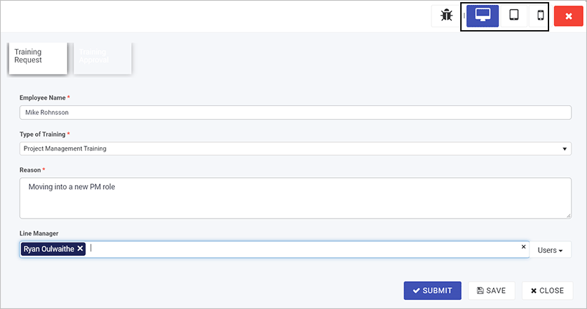
To preview a process go to Administration > Designer > select the process > Preview.
Preview button in Designer
Choose from desktop, tablet or mobilepreview mode by selecting one of the buttons in the top right-hand corner, and then fill out the form with some test information and click on Submit.
Previewer Desktop mode
As part of this prototyping, if you choose yourself as the Line Manager, then you will receive the automated email with a link to approve the process so the workflow can be tried and tested.
Return to the design and modify as necessary following each review. Make sure to save your work as you go by clicking on the Save button.
Once you are happy with the process flow and performance, you are ready to publish.
When you have tested your process prototype using the previewer then you are ready to publish your process to selected test users. It is prudent to have a limited deployment initially making the process available to stakeholders and testers to review. This limited group should include users with various levels of technical skill.
Before publishing, make sure you save your work. Go to the Side menu > Administration > Designer > click on the process name.
Click on the Save button in the left-hand pane. Note that the Version of the process is available in the right-hand pane, where the current version is always visible.
Saving a process
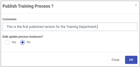
When you are ready to Publish, click on the Publish button.
Fill out the Publish process dialog box by adding comments. Choose from ‘Yes’ or ‘No’ to bulk update process instances.
Publishing a process
If you choose ‘No’ then the latest version is saved and published. If you choose ‘Yes’ then process instances will be updated with the latest design version. Two further questions are prompted:
Trigger field rules after design update? Options are ‘Yes’ or ‘No’. If you choose ‘Yes’ then you can set a rule or rules to be executed after the design is updated, which will also update the existing instances of the process.
Update all instances? Options are ‘Yes’ or ‘No’. If you choose ‘Yes’ this results in an update of the process and applies those changes to all existing instances of the process.
Click on OK when complete.
Once users have access to your process, it is useful to build one or more dashboards and monitor and track dashboards so you can monitor process data in real time and use this to further modify the process before full deployment.
Track dashboards
Process dashboards provide real-time metrics to help guide decisions and make improvements in the organisation.
The video below introduces dashboards, and the steps in How to build a dashboard run through the the creating process in steps.
Dashboards
How to build a dashboard
Go to the Side bar > Home and then click on Create a new page button in the Quick Action menu.
Create new page button in the Quick Action menu
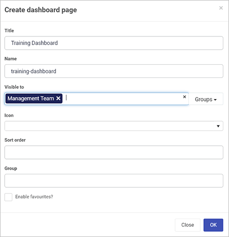
Fill out the Create dashboard page dialog box. Fill out the Title, the Name that is a Unique ID that autofills from the Title, decide on other parameters like groups that you would like to share to. Click on OK when complete.
Create dashboard page
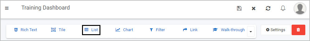
The result is a menu of 7 widgets that you can add to your dashboard page. Go to Dashboards to find out more. For the moment we are going to add one widget, a list widget. Click on List widget.
Dashboard widgets
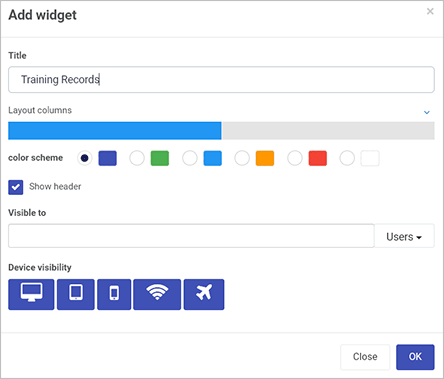
Fill out the Add widget dialog box. Choose a Title, layout size, colour scheme, and decide who the widget is visible to along with device visibility, that is when dashboards will be visible, for example during flight mode.
Add widget dialog box
Click on OK when complete.
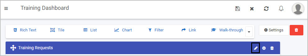
Configure or edit the widget by clicking on the Pen icon for the widget.
Editing a widget
Note: It it possible to add more widgets or edit/configure widgets when you are in Edit mode. To return to View mode, click on the Save button in the Quick Action menu.
To return to Edit mode again, click on the Edit current page button in the Quick Action Menu.
There are a number of options to choose from in the Edit List dialog box. For now we are going to concentrate on two things: a) connecting to a business process b) choosing certain fields to view in our list.
Click on Business Process in the left-hand pane and select the process you want to link to, in this case Training Process.
Connecting to a business process and fields
In the right-hand pane, click on Common fields and/or Design fields and select the fields that you want to show in your list widget, in this example the fields Employee Name, Type of Training and Management Decision are chosen from the Design fields. Click on OK when complete.
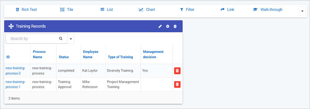
The result is a dashboard that shows instances of Training Requests submitted, and that status of each instance.
List widget example
In this example if the entire process has been completed, the status is ‘Completed’ or if status says ‘Training Approval’ this means this form still needs to be completed. A dashboard like this can highlight bottlenecks in the organisation.
You can change the layout of the widget by clicking on the Settings (cog) button .
For example if you click on the bar for Layout columns you can increase the width of the widget and see the change in size in real-time in the background.
When you are happy with your changes, click on the Save button in the top menu bar.
When you are in view mode, you can kick off processes from the dashboard widget. Click on the Start new process button and select the process you want to use, in this example the Training Process.
Start new process
You are then brought to the first form in the process, Training Request to kick off the Training Process. As forms are completed, the data in the dashboard is updated in real time.
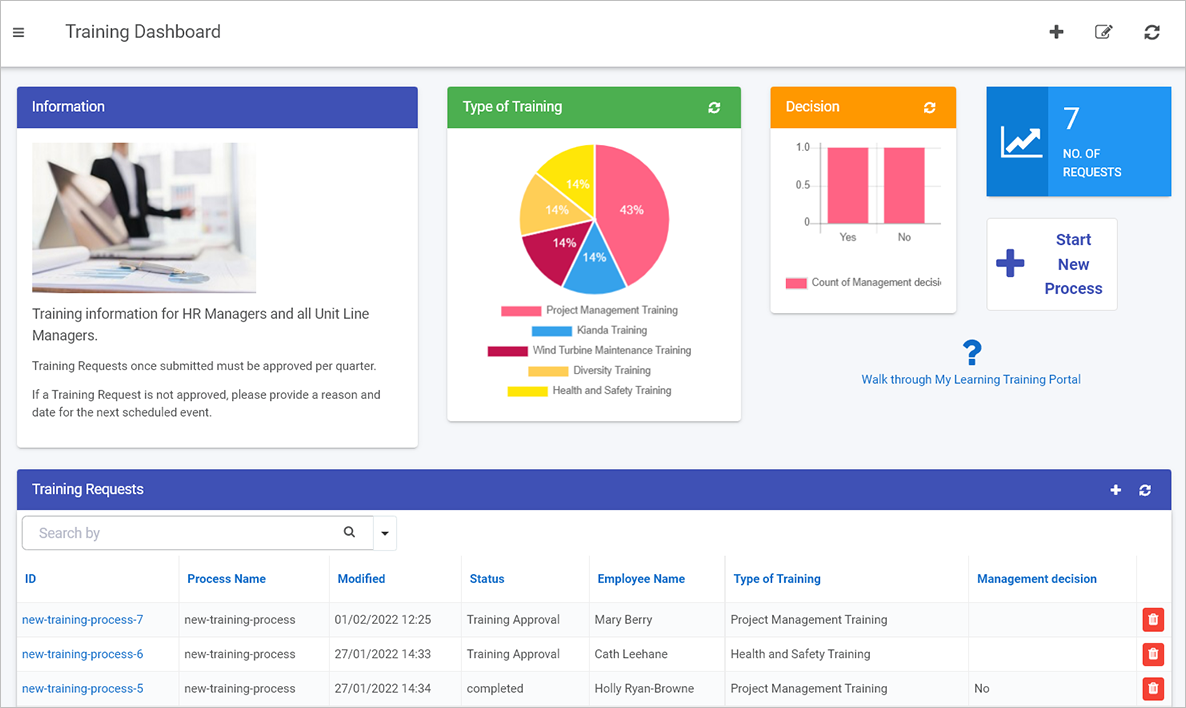
There are endless possibilities with dashboards, the steps above are designed to highlight one particular scenario.
Example of a dashboard page with different widgets
Configured dashboard pages can be shared with your selected users. Allow time for review and get feedback to incorporate into the iterative design process.
When all feedback has been received, updates implemented, and a final quality review conducted successfully, then you are ready to launch!
Launch
Launching your process involves making your process widely available, that is full deployment for the full user base. Ensure that you have communication, training and support resources in place as part of the launch to aid user adoption.
It is also important to make sure you document the development process so that this information can be used as a source of input for future updates.
What’s next
If you would like to see examples of ‘how to’ perform particular tasks in Kianda, click on the link below:
Kianda provides customisable dashboards for reporting, delivering a convenient way to provide insights into how your business processes are performing. Kianda dashboards offer easy reporting, permissions management, quick build, condition-based filtering and many more features.
From lists to tiles, filter and charts, dashboards allow you to build full digital experiences to monitor your real-time processes in a few minutes.
There are 3 steps involved in creating a dashboard:
Create a dashboard page.
Add one or more widgets.
Configure or edit the widgets to make the page look the way you want.
If you are using Kianda predefined processes from the App Store or other imported processes, then dashboards have already been created for you! These are available by clicking on Dashboard from the side menu.
Before you begin it is important to be aware that there are two modes involved in dashboard pages, an Edit mode and View mode as described below.
Edit mode and View mode
When using dashboards there are two modes: Edit mode and View mode.
When you are in View mode, the Edit button will be visible in the top menu bar.
Clicking on the Edit button to go into Edit mode
When you click on the Edit button you will be in Edit mode, which means that the Widget menu is available at the top of the dashboard page, along with the Settings button to make changes to the page, and Bin/Trash button to delete the page.
Edit mode
In Edit mode, you can also make changes to widgets s Update configuration, Settingsand Delete buttons, will be available. If you want to create a dashboard page from scratch go to How to get started or if you want to learn more about dashboard widgets go to Dashboard widgets.
How to get started
Kianda offers a user-friendly interface to create dashboards in a few minutes. Please follow the below video to learn how to create dashboards.
Dashboards introduction
To create a dashboard, go to Homein the left-hand pane and click on Create a new page icon .
A Create dashboard page dialog box opens.
Create dashboard page dialog box
Choose from the edit options:
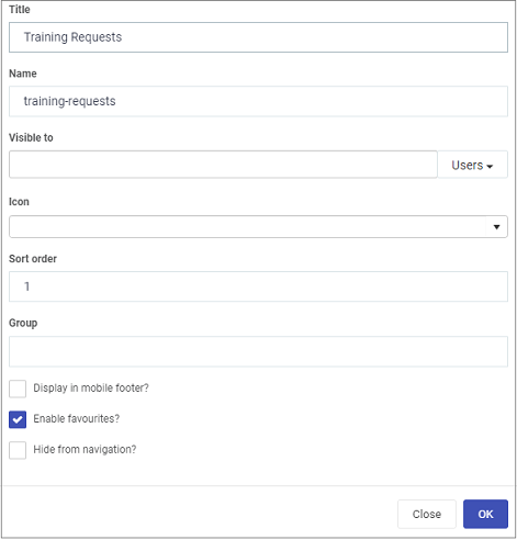
Title - dashboard title for example Training Requests
Name - this is a unique name for the dashboard
Visible to - determine who will see the dashboard, choose from a) Users b) Groups
Icon - click on the arrow to choose from hundreds of icons to attach to your dashboard
Sort order - choose a numeric value to sort on by click
Group - define a group who will use this dashboard, for example HR managers
Enable favourites checkbox - tick this checkbox if you want to enable this dashboard as a ‘favourite’
Click on the OK button when you are finished editing the field to save your changes or click on Close to exit the dialog box without saving.
The output is a menu with a number of widgets available that you can add to the dashboard. Go to Dashboard widgets to find out more about each widget type.
Widget menu
If you wish to change settings for the dashboard page, click on the Settings button see Dashboard page settings for more details.
If you want to delete the dashboard page, click on the Bin icon and then click on Ok to confirm that you want to delete the dashboard page or click on Cancel if you wish to cancel the deletion.
Save any changes you make by clicking on the Save button in the top menu to ensure your dashboard changes are saved and you will see a pop-up message Page saved successfully.
You are now in View mode. To make further changes to the dashboard page, return to Edit mode by clicking on the Edit button in the top menu.
Dashboard widgets
Kianda comes with 7 predefined widgets as listed below. Using these widgets you can quickly and easily create a process dashboard in minutes. The widgets are:
Rich text: The Rich text is used to display some texts, links or images on the dashboards.
Tile: A tile is used to display a count of instances with different colour schemes. You could also add conditions to display count, for example, you could add a condition “Status” equals “In-progress”, this will display the count of instances with status “In-progress”.
Chart: Using a chart widget, you could create a pie chart, bar chart or a line chart. These charts could be used to represent various conditions on a process,
List: The list widget displays the instances of the selected process. List widget could also be used to connect with any other widget to display the filtered items,
Filter: The filter widget is used to filter the instances based on a field. For example, process instances could be filtered by status.
Link: The link widget is used to add a link to a new process, dashboard or any external sources such as SharePoint.
Walk-through: This widget allows you to create a walk-through quickly which could be made available to a user, group or an organisation.
When you have added one or more widgets, you can move the widgets around the dashboard page using the Drag handle button . This is possible when you are in Edit mode, see Edit mode and View mode.
Dashboard page settings
When you click on the Settings button a Page settings dialog box opens. The edit options are the same as Create dashboard page dialog box that appears during page creation, see How to get started but also includes two additional checkboxes:
Display in mobile footer - tick this checkbox if you want to display dashboard in the mobile footer
Hide from navigation - tick this checkbox if you want to hide the dashboard from navigation
Page settings
Click on the OK button when you are finished editing the field to save your changes or click on Close to exit the dialog box without saving.
Enabling data export from dashboards
Kianda allows the users to export the data from the dashboards on a simple click. To set up the configuration to export the data from the dashboards, please follow the below.
Enabling data export from dashboards
Offline availability
Kianda is a progressive web application. This enables Kianda dashboards to provide insights to the business processes even in offline mode.
For example, this can benefit businesses where users can carry out inspections or maintenance even at a remote location with no access to the internet.
What’s next
If you would like to see examples of ‘how to’ perform particular tasks in Kianda, click on the link below:
 What forms and fields do you need in your process based on what you want to do?
 What rules can be applied to create smart, automated processes?
 Who needs access to the forms as a user and form owner? Review these questions as you modify the process.
 Processes are made up of interactive forms which you can create at the click of a button.
 Forms connect to your datasources so, as your organisation changes, your processes respond accordingly.
 Use the in-built previewer to preview and test your design, then save new versions as you modify your process design.
 Allow individual user, group or partner access in order to deploy your solution in a controlled way.
 View key metrics in process dashboards to get insights into how to improve your process and organisation.
 Launch and release your process, including documentation which can feed into future development projects.


 ) appears. The predefined rules will can then be found in the left-hand pane under Add a rule.
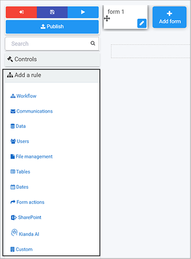

 found in rules and dashboards.
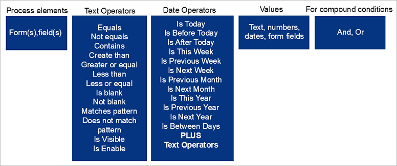

 found in edit rule dialog boxes and other menu items, such as enabling quick actions for processes.
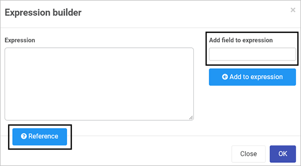

 when complete.
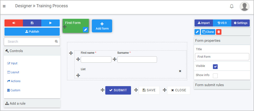
 Save
Save  Preview
  and Publish
  buttons.
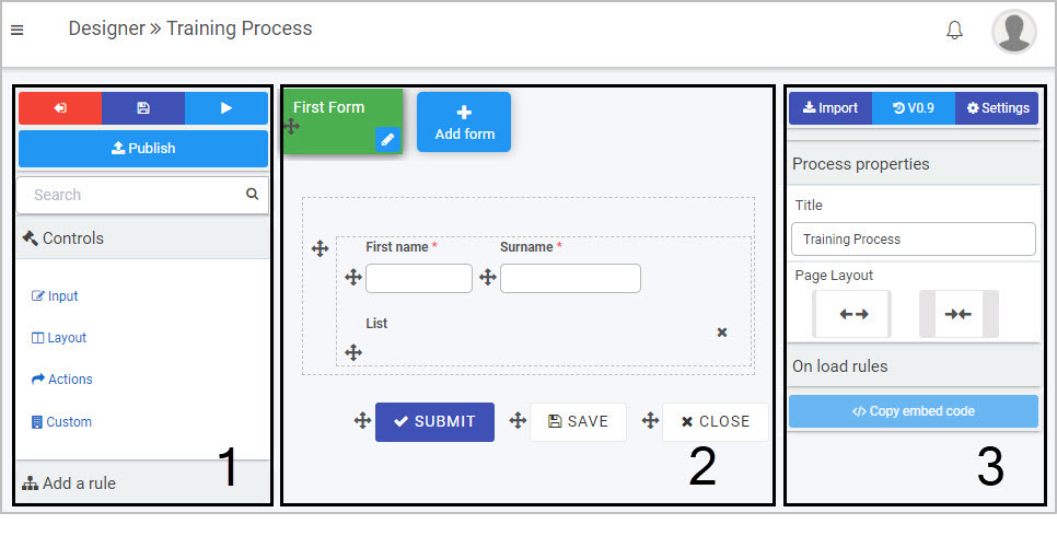
 or
or  .
.
 beside a particular version and then click on Ok to confirm that you want to restore to that version.
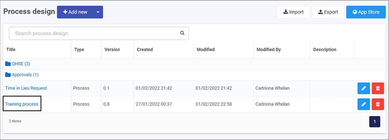
 and add other owners by clicking on the arrow and choose from Users, Groups or Partners.
 to further modify the action settings.
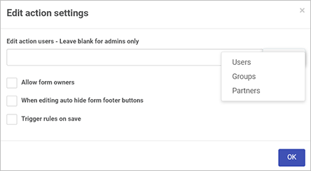
 .
.
 beside the item and dragging it to where you want to place it.
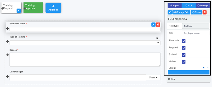

 and then click on Ok. A version called ‘Form Name Copy’ is created and available to edit on the canvas. The Clone button can also be used to clone form elements like controls or buttons.
 and then click on Ok after you have reviewed the form title and you are sure this is what you want to delete. Click on Cancel if you wish to cancel the deletion.
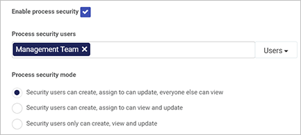
 to add users to each field.
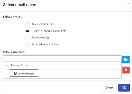

 or Narrow
  to change the layout.
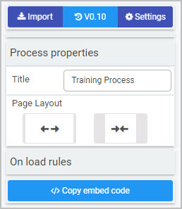
 and SharePoint.
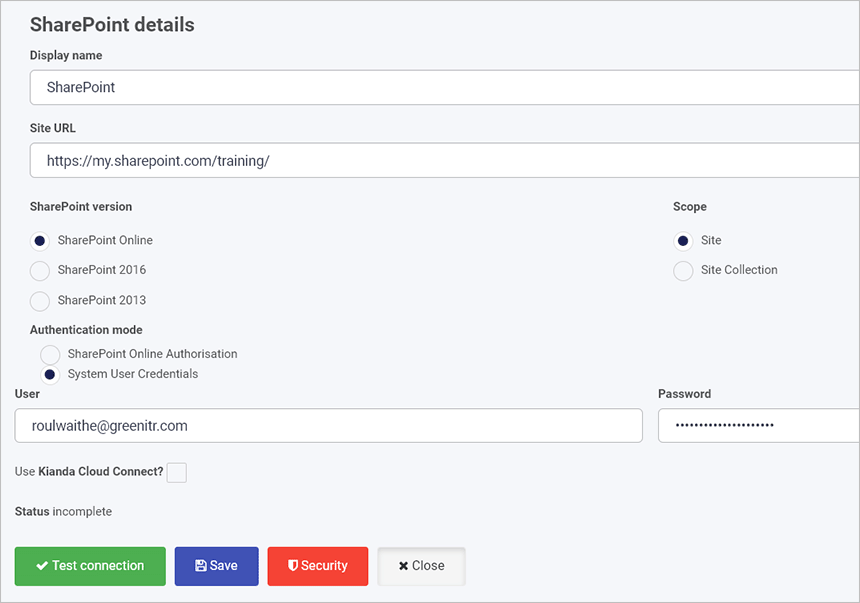
 and choose the appropriate datasource, in this case a SharePoint list called Training Site. Choose the appropriate Display field, Value field and choose a field to Sort by.
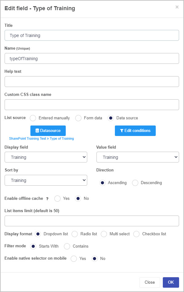
 in the Quick Action menu.
To return to Edit mode again, click on the Edit current page button
in the Quick Action menu.
To return to Edit mode again, click on the Edit current page button  in the Quick Action Menu.
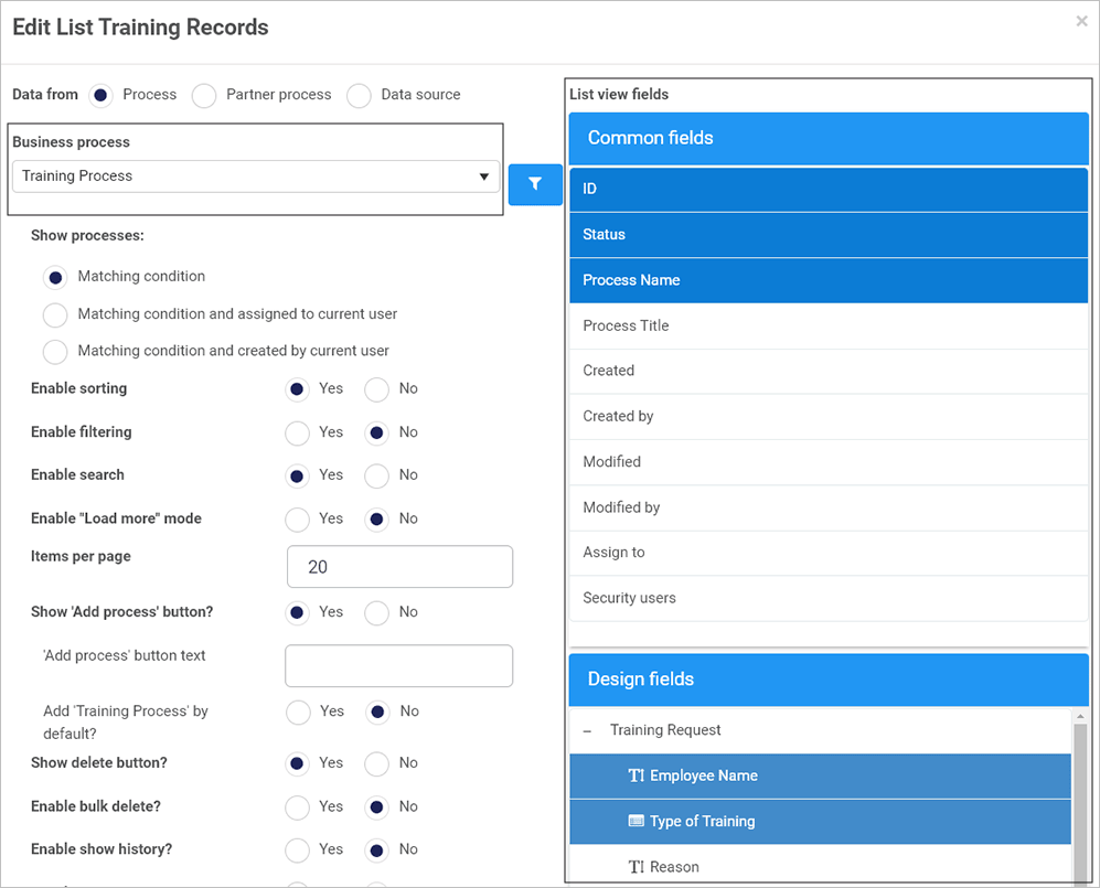
 .
. in the top menu bar.
 and select the process you want to use, in this example the Training Process.
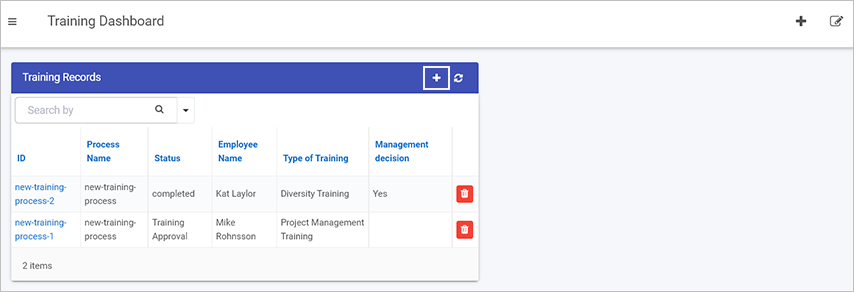
 will be visible in the top menu bar.
 to make changes to the page, and Bin/Trash button
 , Settings
  and Delete
  buttons, will be available. If you want to create a dashboard page from scratch go to
  in the left-hand pane and click on Create a new page icon
  .
.

 in the top menu.
 . This is possible when you are in Edit mode, see