Getting Started - Controls
Controls are predefined field widgets that allow you to add specific elements to your forms and processes, such as buttons, lists, text boxes and tables. There are 16 different types of controls (fields) to choose from - see Controls list.
If you have developer skills, you can create your own custom field widget - see Developer for more information.
Getting started with Controls
If you go to Side menu >Administration > Designer and click on an existing process or create a new process and then select a form within that process (so that the Edit form buttton - Pen icon - is visible), you will see the pre-defined Controls options in the left-hand pane. If the Controls menu is collapsed, click on it to expand it.
Control categories
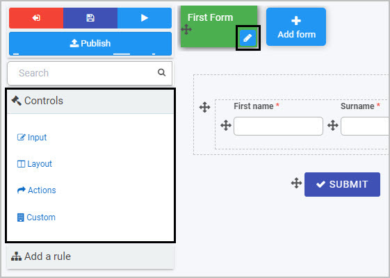
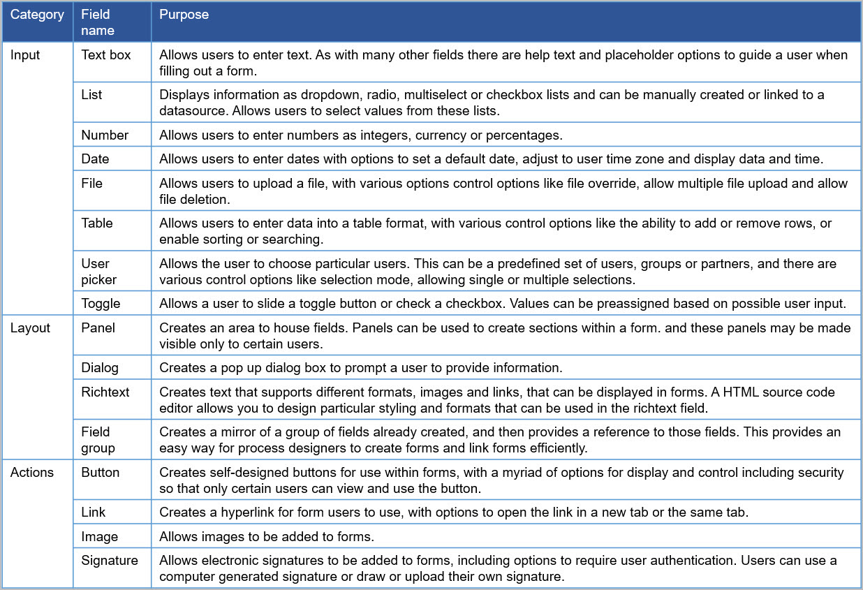
By default, there are three categories of fields:
- Input - There are eight types of Input fields. They include the most common data fields such as textbox, user picker, date field, table, checkbox, drop-down and number fields.
- Layout - There are four Layout fields that serve the purpose of perfecting the layout of your form. They include responsive panels, dialog box, field groups and rich text fields.
- Action - There are four Action fields that allow you to insert user interface actions like buttons, links or even signature components. By default, three buttons are automatically added to each new form created - Submit, Save and Close.
A fourth category, Custom fields, exists if Kianda Developer has been used to create custom field widgets - see Developer for more details.
All fields will have edit options when you start creating the field, as well as field properties that you can edit. Each field can also have rules applied to it.
Controls list
A full list of controls (fields) is shown here.
Control categories, with field names and purpose
What’s next 
To learn more about rules that can be applied to fields go to Rules.
To learn more about field properties, go to Field properties.
To return to the previous pages click on the links below 
- How Kianda works
- What is no-code development
- Plan your process
- Design and build your process
- Add forms
- Designer
- Add controls and rules
Feedback
Was this page helpful?
Glad to hear it! Please tell us how we can improve.
Sorry to hear that. Please tell us how we can improve.