As Kianda is built using front-end technologies like CSS and JavaScript, you can use your software development skills to customise your given workspace design and functionality by editing files found under the Subscription function.
More specifically the building blocks of the Kianda platform are Ember.js and Handlebars. These are explained in more detail below. It is important to have some knowledge of Ember.js and Handlebars when creating custom widgets for dashboards, data connectors, fields and rules as part of Kianda’s low-code development interface, Kianda Developer.
Ember.js
Kianda uses Ember.js, an open-source JavaScript web framework used to build highly interactive applications that work on any device. Ember is built using JavaScript hence the .js extension.
The Ember.js environment provides you with the tools to develop your applications, like libraries, templates, models and so on. One of the tools used more specifically used building Kianda form components is the Handlebars templating library described below.
The beauty of Ember.js is that it allows you can create advanced web applications with less code. To read more about Ember.js go to https://guides.emberjs.com/release/ and also best practices Using the Ember Inspector for information on using the Ember inspector to view existing code.
Handlebars
Ember.js uses the Handlebars templating library to build the user interface for applications. Handlebars uses a template and an input object to dynamically generate HTML or other text formats. Handlebars also includes built-in helper functions and allows you to build your own custom helper functions. To read more about Handlebars go to https://handlebarsjs.com/guide/ and also Templating basics for more information.
What can you do as a developer
Using your administrator role, and accessing Administration functions there are several ways you can customise your Kianda environment as a developer, typically by:
In addition to the above customisations, you can use your JavaScript knowledge to create smart expressions that can be used in text box, number and rich text fields, as well as anywhere that uses rich text like Send email rule body text for emails, Meeting request rule and rich text widget for dashboards.
Click on the links above to get more information on the areas mentioned. Building custom widgets is introduced below.
Kianda Developer
Kianda comes with several pre-defined field, rule, data connector and dashboard widgets. In case you want to create something else to satisfy your specific needs you can create your own custom widget if you have some level of development skills in JavaScript and HTML.
Kianda offers a user-friendly interface, Developer, to create custom widgets in a few minutes. A custom widget could be a ‘Field’ widget or a ‘Rule widget’, for example getting started to create a custom field widget as shown in the video below.
Using Kianda Developer you can create reusable widgets, allowing you to extend the functionality of the system. There are four types of widgets you can create:
Field or control widgets - that allow you to create elements that will appear on screen to user
Rule widget - these are used to automate actions, like extracting data from a form or setting a particular status within a process
Dashboard widget - used to create a particular type of display in a dashboard page
Data connector widget - used to connect to a particular data source so that Kianda can push or pull information to/from that data source
Using Kianda developer
You can access Kianda Developer if you have an administration or developer role. To use Developer:
In the left-hand side pane click on Administration and then click on Developer.
Any customised widgets that have been created within your organisation will be visible in the Developer resources main widget view. Here you can see widgets by name, when the widget was last modified, who modified it, and the widget type.
From the Developer resources main widget view you can:
View the widget creation history by clicking on the Version History button
The Version history dialog box opens showing the different versions of the widget. From here you can restore a version of the widget by clicking on the Restore button . Click on Close to exit the dialog box.
Edit a widget by clicking on the Edit (Pen) button
Delete a widget by clicking on the Bin/Trash button
To view details for existing widgets, click on the widget name such as ‘Dashboard Number widget’ as shown in the list above.
In the Widget page you can update existing Widget UI and Widget Code within the editor and then click on Update. Alternatively click on Close to exit the page at any time.
To create a new widget click on New widget. This will open the Edit widget dialog box.
Fill out details as follows:
Title - fill out a title for the widget.
Unique Id - this is a unique value that is autofilled from the Title.
Widget Icon - choose an appropriate icon from the drop-down list.
Click on the links above to learn more about building specific types of widgets.
When you are finished editing the dialog box click on OK or click on Close at any time to exit. The output is shown in the next section.
When a custom widget is created it can be exported within a Kianda file along with process design and/or dashboards, or on its own. This file can then be imported into the same or different Kianda environments of your choosing, giving you flexible access to your custom widgets. To learn more about this, see Exporting processes and Importing processes.
Example of a Field widget
The code blocks below display the default code for ‘Widget UI’ and ‘Widget Code’.
The ‘Widget UI’ uses Handlebars syntax and defines the HTML, handlers, expressions and more.
Kianda’s low code development environment provides developers with a graphical user interface to quickly create customised applications that can be used in automated processes. Kianda Developer allows you to quickly build reusable widgets allowing you to extend the functionality of the system. You can define the functionality or module that you want to define and deliver that module for inclusion in an application design, without the need to invent all the code from scratch. For example you could create a custom control that allows you to display images in a particular way, see Custom field development.
Kianda Developer can be utilised to implement HTTP requests and API calls to allow for real-time data interactions, click on the links to get more details.
Why choose low-code development?
Providing you have some software development and/or coding knowledge, low-code development can allow you to implement customised Kianda widgets to meet user-specific needs such as creating custom ‘Field’, ‘Rule’ or ‘Dashboard widget’ elements.
There are 16 predefined fields and 60 rules available for non-developers to use in a no-code form design GUI. However if these do not suit, then Kianda’s low-code development solution provides near limitless room for process expansion. As the Kianda platform offers access to any data source (including real-time synchronisation of the data) and integration with many other software tools and applications, the implementation of low-code can provide your business processes with extreme scalability and room for improvement.
You can also build upon pre-defined field, rule. data connector and dashboard code to offer the developer a shortcut in creating something new and beneficial for the organisation. For example, you can see a rule widget user interface being designed below, using HTML, handlers, expressions and more.
How to implement low-code development
If you are an experienced developer with an Administrator or Developer role (see Users & Groups), you can create a new custom widget within Kianda by doing the following:
Navigate to Administration > Developer > New widget to begin creating a new custom widget.
Under Edit widget, you must fill out the following:
Title – the name of your new custom widget
Unique Id – the unique identifier used within the code to refer to this widget. It should be noted that this field is filled out automatically based on the entered Title, however it can be edited.
Widget Icon – the icon image that the custom widget will be associated with
Widget type – choose from Field, Rule, and Dashboard Widget
From here the following tabs are available:
Widget UI – a coding environment that allows you to define the widget user interface. The widget UI uses HTML and Handlebars templating language, that uses curly brackets {{}}. Go to Templating basics for more information on Handlesbars.
For example in the sample code above, the condition is set so that a static HTML label ‘QR code result field’ captured in a form binds to a Kianda componentfield-picker. The field-picker component shows a tree view at runtime that allows a user to pick a particular field from the form design.
Widget Code – a coding environment that allows you to define the logic and functions behind the custom widget. The widget code uses JavaScript.
display:function(){varfield=this.get('field');varprocess=this.get('field.process');varwarningMessage=process.findFieldByName(this.get("field.settings.warningMessage.name"));//Retrieve the warning message field
warningMessage.set("visible",false);//Set warning messsage field to invisible as we are in display mode
}
For example in the sample code above, the function gets a field and a process from the component and retrieves the value held in a form warning message field and sets this to invisible in display mode.
When you are finished editing, click on the OK button to save the changes made. The newly created custom widget can be displayed in the view widget pane.
In the main view you can see who modified the widget and when and the type of widget created, such as field or rule. You can also:
use the version history button to view and manage version
use the edit button to edit the name and details of the widget
use the delete button to delete the widget. Clicking on this button which cause a pop-up to appear asking you to confirm the deletion by clicking on OK or cancel by clicking on Cancel.
Depending on the type of newly created custom widget, they can be accessed by:
Field widget - navigate to Administration > Designer > Your Process > Controls. Under Custom, your field widget will be displayed and is now ready for use. To learn more about field widgets, see Custom field development.
Rule widget - navigate to Administration > Designer > Your Process > Add a rule. Under Custom, your rule widget will be displayed and is now ready for use. To learn more about rule widgets, see Custom rule development.
Dashboard widget - navigate to Dashboard > Your Dashboard > Edit current page button . From there, click the drop-down list button and you will have access to the created custom dashboard widgets.
Progressive web applications are the next great trend for the mobile web. As the Kianda platform is a progressive web application, you can access your businesses’ Kianda workspace as if it were a mobile application.
Instead of having to download an application through your device’s native application store, the PWA can be formatted and installed on your device so that you can easily access the website via a URL shortcut. This means with Kianda you get a digital experience that is native-like while maintaining online web benefits. When you have a Kianda subscription, you gain the ability to access your workspace via a PWA. Seen below is the accessing of the Kianda platform via a PWA on an android device.
Benefits
There are several benefits of using a PWA app when comparing to a web app or even a native only app.
Offline Use
Apps keep working with or without network access, allowing for offline availability of resources. Even when your users are going through a tunnel or in a lift, changes are automatically queued offline and then synchronised when connectivity is restored. This can be extremely useful when completing process instances in remote locations, for example filling out an inspection form in an area with no internet coverage.
Fast Performance
The app loads quickly thanks to having it installed locally on your device. This provides you with an increased ease of access experience as you are not required to download the application via your device’s native application store. Progressive web apps are faster because of the way the underlying technology caches and serves text, stylesheets, images and other content on the websites. As a result user experience, consistency and conversion rate increase.
Engaging
When installing on your home screen with your brand icons, users receive timely push notifications that help them stay engaged. If you would prefer to not receive notifications, you can disable them and relevant updates will be executed in the background silently.
Secure
PWAs make use of HTTPS requests to transfer data, which minimises potential security threats. As these applications access your Kianda workspace through your chosen web browser, PWAs utilise the added security features of these web browsers such as SSL encryption.
Responsive
The Kianda platform is designed to be responsive on a myriad of mobile devices which reduces any future developmental costs. PWAs employ the adaptive nature of HTML, CSS and JavaScript so that your Kianda workspace will consistently maintain a neat display of features.
Installing your PWA on a mobile
There are a few options to install your Kianda PWA workspace into mobile devices. The quickest is to let your users manually use the option Add to Home screen in their mobile devices.
Note: Please ensure you have the latest version of operating system installed on your device to ensure full functionality.
Android
The primary method for android users to install the PWA onto their device is by:
Navigate to https://<businessName>.kianda.com via your chosen web browser application.
On the platform login screen, you will be prompted to install the PWA by clicking on the Add [Business Name]to Home screen. In the prompt box that appears, click on Install.
Following this, you will receive an on screen notification stating that the PWA was Added to Home screen. A shortcut icon with your brand image will also show amongst the device’s installed applications.
Once you click on the PWA icon to access your Kianda workspace, you will be presented with your custom loading screen with your chosen brand image, name and theme colour. Shortly afterwards, you will be prompted to login to your account which will grant you access to the workspace.
Optionally users can manually install it by following the steps:
Navigate to https://<businessName>.kianda.com via your chosen web browser application.
Click then tap on Add to Home screen.
On the confirm dialog tap Add.
iOS
iOS users are not yet automatically prompted to install PWA’s but it is something that can also very quickly be done by iOS users.
Navigate to https://<businessName>.kianda.com via your chosen web browser application.
Tap the action button then tap Add to Home screen.
On the Add to Home Screen, tap Add. Once you click on the PWA icon to access your Kianda workspace, you will be presented with your custom loading screen with your chosen brand image, name and theme colour. Shortly afterwards, you will be prompted to login to your account which will grant you access to the workspace.
Kianda uses Ember.js to build modern web applications for your business, and in particular the Handlebars templating library to power the application’s user interface. Handlebars is a templating language that generates HTML or other text formats to build web pages. Handlebars allows two-way binding so that you can write data into models, and that data can be used by HTML to generate the final interface/screen.
Handlebar templates are written as expressions using double curly braces {{}} for example:
<p>{{firstname}} {{surname}}</p>
When the template is executed, the expressions above between the braces are replaced with values from an input object. For example in a Kianda form if a user types in values or a rule dynamically assigns values to text boxes for example, the values are applied to the input object as follows:
{
  firstname: "Ryan"
  surname: "B'Oul"
}
The expressions will be replaced by the values resulting in:
<p>Ryan B'Oul</p>
In this way you can define a JavaScript object like ‘person’ below, with properties ‘firstname’ and ‘surname’:
{person:{firstname:"Ryan"surname:"B'Oul"},}
A dot notation can be used in the Handlebars expression to access the property of the ‘person’ object:
<p>{{person.firstname}} {{person.surname}}</p>
In this way the properties of the JavaScript object can be leveraged within the template above so that the generated HTML output is: Ryan B'Oul.
Handlebar basics
Handlebar templates contain static HTML and dynamic content inside Handlebars expressions. The advantage of this is that if the property changes, for example ‘firstname’ shown in the Introduction above, then the value dynamically changes in real time. This is because dynamic content inside a Handlebars expression is rendered with data-binding. This means if you update a property, your usage of that property in a template will be automatically updated to the latest value.
You can also use HTML with the Handlebars template as follows:
In this way you can define the logic that you want and then update the properties of the objects as before.
You can also use built-in block-helpers with Handlebars to apply functionality that is not part of the Handlebars language. For example a built-in helper like each allows you to access the properties of objects using Handlebars expressions. For example you can have simple expression using an each statement as follows:
In the section above an example of each-helper was shown. This is an example of a built-in helper block that is available amongst other built-in helpers that you can use, see https://handlebarsjs.com/guide/builtin-helpers.html#if for other examples. Helpers are functions that can work out values and be used in templates. Helpers are written in JavaScript using Ember.js framework and used by Handlebars.
For example if we look the if built-in helper block, if can be used in a Handlebars expression as follows:
If the manager property is set to false, then the firstName lastName part will not display, in this way the helper is used to dynamically generate or hide the HTML output.
Creating your own helpers
Using Ember.js gives you the ability to write your own helpers, to bring a minimum of logic into Ember templating. For example, let’s say you would like the ability to add a few numbers together, without needing to define a computed property everywhere you would like to do so, you could create the following JavaScript code:
Helper example
Conditionals
Statements like if and unless are implemented as built-in helpers. Helpers can be invoked three ways; inline invocation, nested invocation and block invocation. For more details, click on the following link https://guides.emberjs.com/v2.18.0/templates/conditionals/.
4 - Low-code customisation options for the list widget
Introduction
In the dashboard pages how to create a dashboard page is described, so that you can display data from your processes and monitor how processes are performing, for example number of requests submitted, use of the KiandaAI rule to extract a sentiment score from user input, number of ‘completed’ processes and so on.
The List widget is introduced within the dashboard pages section. Where the list widget displays the process instances or records of selected process(es) in the dashboard. An example of a list widget is shown in the image below, where the ‘Training Requests’ list displays the ID of a process instance, the status of that process instance and employee name of the person who submitted the initial request, amongst other data.
It is easy to configure this widget to have it filter and display data the way you want by following the steps at Configure your widget. However in addition to these steps you can use HTML to change the display. The next section How to get started runs through an example of how to change the look and feel of a list widget.
How to get started with List widget customisation
As with any of the seven pre-defined dashboard widgets, it is easy to add a List widget to your dashboard simply by clicking on a widget of choice, see How to add widgets to a dashboard page. The List widget as it is offers a huge range of configuration options from using conditions to display the desired data which can include both design fields and Kianda’s built-in process fields to display as well as enabling sorting, filtering and searching.
In addition if you have an administration role, you can customise how the list widget displays as follows:
Select a dashboard page and click on Edit current page button to go into Edit mode.
Select List from the dashboard widgets menu if a list widget doesn’t exist.
If a list widget already exists click on the Edit/pen button to edit the list widget.
The Edit widget dialog box opens. Follow the steps in Configure your widget to configure the widget the way you want.
When you have chosen the fields you want to display they will appear in the List fields section of the dialog box, by clicking on List fields.
At the bottom of the List fields section there are two buttons:
Add column - clicking on this button allows you to add another column to your widget and add styling in the editor section, see step 7.
Add action - clicking on this button allows you to select a field that has rules attached to trigger or rule to trigger, see step 8.
Clicking on Add column opens a code editor that allows you to add in code/modify existing code.
In the Edit List Column dialog box, give the new column a Title and add in/change code by clicking in the central panel.
There is an option to Hide column by checking the checkbox. The example above is explained in more detail in the section below Example of list widget customisation
Clicking on Add action opens the Add List Action dialog box. This box allows you to add a dashboard button that when clicked will trigger rule execution.
The dialog box has four fields:
Select the field or rule to trigger - here you can select a form field or rule attached to a field to execute rules from the dashboard by clicking on a button.
Button icon - choose from hundreds of icons for your dashboard button.
Button color - choose from a range of colours for your dashboard button.
For example if the ‘Submit’ button for a form is chosen for the above, then all rules attached to that button can be executed by the click of a button from the dashboard.
For example for the process instance ‘po-approval-8’ above, even though this process is completed, rules/actions linked to a form field can be triggered again simply by clicking on the button in the dashboard.
When you are finished editing code, click on OK or alternatively click on Close at any time to exit the dialog box.
Make sure to save changes to the dashboard page by clicking on the Save button in the top menu. A pop-up message saying ‘Page saved successfully’ will display.
Example of list widget customisation
In the image above for step 8, Add column, you can add code that adds a button to a dashboard display.
In the code above the new column will show a button based on a field that returns the status of a process instance. This particular process has 5 different states:
Four states that relate to the current form that the process instance is in, these four forms are named above: ‘PO Request’, ‘Approval’, ‘Supplier Invoice’, ‘Payment’
One state that indicates that a process instance is complete, that is all four forms have been completed, so the process status is ‘completed’.
These states are derived from the system field ‘Status’ (see Process Common Fields which is mapped to a process form field called ‘Internal status’. The unique ID/name of this form field is InternalStatus as seen in the code above.
Use of Font Awesome icons
As Font Awesome icons are already loaded into Kianda, then we can take advantage of the iconography and map imagery to process instance states. Depending on the process instance status described in the section above, then different icons will appear. The icons chosen in this example are:
Dashboard Icon
Process Instance Status
PO Request
Approval
Supplier Invoice
Payment
Completed
When the steps in How to get started are followed and the code is added using the Add column button then the resulting dashboard looks like this.
You could also use JavaScript to add actions to the buttons in the dashboard. These could be functions set in the Global JavaScript file, see Global JavaScript file for details.
5 - JavaScript expressions
Introduction
Expressions are available for use extensively throughout the Kianda platform, both in controls like text box, number and rich text, as well as rules like Send email and Set form field.
The use of expressions allows you to cleverly manipulate data to create new constructs that can be used within processes. For example if an ‘Onboarding process’ requires that a new hire completes a ’new employee form’ filling out their ‘firstname’ and ’lastname’, it may be useful to combine the two input strings to create a new ID for the employee that combines the data from each field.
The Expression builder page provides an introduction to expressions and shows one example of expressions in use in a Send email rule to automate how emails are sent. The example simply uses the [identifier] or unique name from form fields to populate the body text of the email.
ProcessLink() is a function that will return a link to that particular process instance. You can use any JavaScript functions in the expression field to make advanced expressions throughout your Kianda forms, see below for how to get started.
How to get started with JavaScript expressions
Expressions are recognisable in Kianda from the Expressions button found in Edit rule dialog boxes and controls like text box, number and rich text.
Within rules, expressions can be created using the Expression builder where you can Add field to an expression or use the handy Reference guide to get a list of commonly used functions, such as ProcessLink().
Expression builder
To create a field in a form that concatenates the values from two text boxes, we could start using expressions as follows:
In a simple form made up of three fields, we choose one field which is going to act as the trigger for an action.
We can also insert JavaScript such as JavaScript Strings into the expression.
6 - Global CSS file
Introduction
Within Kianda there is standard site-wide Cascading Style Sheets (CSS) that forms the default styling on the whole site. However as a workspace Administrator you can add a Global CSS File to make changes to the look and feel of the site as well as the functionality of processes.
You can use the file to target very specific details, for example a button in a particular process as shown below. This code will create specific styling for a button that is defined in a form in a process using Kianda Designer.
CSS can be used not just for to change the look and feel of applications but for functionality within a process, for example to hide a button via CSS and then create a button via JavaScript for a particular action.
The Global CSS file editor exists within the Look and Feel section of the Subscription, within the Administration section of the site, see Subscription for an introduction to the Subscription function.
When to use
Remember the visual style of processes and individual controls like buttons, can be heavily customised using Kianda Designer to achieve a unique look that is both appealing to the eye and practical. Many of these changes can be achieved simply by using the provided customisation controls within Designer, for example selecting a button, and clicking on the Edit/pen icon to make changes.
Selecting the button in this way to edit it, will allow you to select the colour scheme of the control and assign an icon to it from a large library of available icons.
However, you may want to achieve a deeper level of customisation. There are several methods available to combine practicality and ease of user with an aesthetically pleasing design. One option is to modify the Global CSS File when you want to change the look and feel of the site or your processes. You can do this by applying a Custom CSS class name to any of the controls fields available in Kianda, and creating a class selector within the Global CSS File available globally in the Subscription function within Administration.
Before you get started
The key to building functional and aesthetically pleasing workspaces and processes within Kianda is to plan ahead and create a design in advance that you can then use as your vision and mould your process or workspace into. Designtools can be used to create visualmock-ups of the processes and workspaces you would like to create, for example the mock-up below was created using AdobeXD.
Bootstrap has released a library that can be imported into Adobe XD that allows you to create designs using bootstrapelements. This allows you to see all of the availablecomponents you have to create your processes and workspaces, and then create visuallypleasing and functionaldesigns using these elements.
The mock-up was then used as a plan to createthisprocess. You don’t have to create processes or workspaces exactly the same as the mock-ups to create during the planningstage, but they act as a great reference and allow you to have a solidfoundation to build off of whilst still being able to deviate from the design when the need arises. Go to Create your first Kianda process for advice and tips on planning processes. To help you in planning your CSS design, see the sections below.
Effective use of CSS classes in Kianda
You may be familiar with the concept of using CSSclasses to apply styling to several elements, Kianda works on the same premises. Simply define a class within the Global CSS file, put some styling into the class and finally apply the same class to a Kianda element.
It is good practice to use relevant and descriptive names for these style rules. In the example above we have a “tile” section with styling rules to style an element to that the appearance of a tile.
When your class style is defined and ready to apply, add “tile” in the Custom CSS class name field of any Kianda element you want to take the apply that appearance to.
In the image below “tile” was used to style these two panels into two tiles aligned sidebyside.
The benefit of this method is that styles can be createdonce and very quickly applied to elements anywhere in your Kianda platform. This saves process designers having to revisit the CSSfile every time they are creating a new process or dashboard.
Small touches example
Here is another example of that demonstrates how you can create a defined and recognizable design without bloating the visuals of your workspace. In this example the below style rule is used to add a gold underline to the headertitles of processes to separate the title of the page and the specific course you are currently viewing.
Adding small details like this can have a great affect on the aesthetic of your Kianda platform.
Using Font Awesome icons
In addition to creating customised styling, you can add icons to your controls, such as buttons, or to your dashboard display as shown in the image below, to make your workspace features stand out.
Icons from the FontAwesome icon library can be added using HTML to act as buttons. This creates a more visually appealing layout and the function can be instantly recognizable to users by the icon you choose. Once you have found an icon you wish to use you can then use the provided HTML on the website to add it to your Kiandaworkspace, it can then be wrapped in a HTML link tag to turn it into a usablebutton.
You can have icons display before or after the controls by using a CSS rule, for example use a ‘before’ selector in CSS to make the icons display as shown in the image above. The CSS rule can be given the Unicode ID of the Font Awesome icon you wish to display and the browser will render the icon at runtime.
For more information on Font Awesome icons go to this documentation link or see this cheatsheet of Unicode IDs for icons, for example F007 used in the code snippet above is a user icon, while F015 is the home icon, seen in the image above. You can test out designs using this JSFiddle or code playground.
Using modals in form design
In addition to styling forms and form elements, modals provide a useful way to communicate with users by displaying information in front of page content requiring the user to engage with an action within the modal . In the example below, you can see how the Transfer assets modal appears on the page, requiring users to view and interact with functionality containedwithinthe modal without having to navigate away from the currentpage they are on. This is not only convenient for the user but it adds a layereddesign to your Kianda platform and its aesthetically pleasing to view.
A JavaScriptfunction called showModalForm can be called to display a page in a formmodal.
This function also allows you to passdata into the modal for use within that form, typically:
nameOrUrl - you can add in a) name of a process for example demo-process or b) a process instance for example demo-process-1 if you want to go to an existing process instance, and set the next parameter to false see point 2 below, or c) add in a URL, where the URL might be a website to open in the modal.
isNew parameter - where true creates a new process instance, otherwise choose false to open an existing process instance in preview mode and provide the name of the instance as mentioned in b) above.
params - URL parameters appended to the URL, for example ‘SignUpform’ as used above where formName parameter is reserved; if the form is active, the user can be directed to the specified form
Now that you have been introduced to a variety of design considerations, go to the next section to learn how to use the Global CSS Editor.
How to get started with Global CSS
To create a global design and give you the flexibility to change the workspace, use the Global CSS file. You can use the file to target for example buttons in a particular application.
As an administrator, go to Administration > Subscription.
Click on Look and Feel.
On the Look and Feel page, click on the ellipsis button beside the Custom CSS Url to access the Global CSS file.
The CSS Editor opens, allowing you to add CSS, or edit code if your organisation has already added in styling. The image below shows an example of code that has been added in.
Within the file you can create your own styling, for example:
The next section deals with Adding items to the file.
Adding items to Global CSS
Remember additional items can be added to the file whenever you wish. Best practice is to update only individual items based on the Unique Name which becomes an attribute. The example below uses the concept shown of CSS classes as shown in the section Effective use of CSS classes.
Customised button example
For example, if you have a button in a process and you want to change its background colour and text colour, first you need to add a Custom CSS class name to the provided text box within the button options. Next, because you only want to target the button in a specific process, you will need to use an element selector. This will take the form of:
.pinkButton>button{}
Within the Global CSS File add the necessary details, for example the above along with the necessary CSS properties, for example:
When you are finished making changes click on OK or else click on Close at any time to close the dialog box.
Ensure to save changes to the file by clicking on the Save Changes button in Look and Feel. You should see a notification to say Subscription settings updated.
Once the file is saved ensure to refresh Kianda to download the most recent changes into the cache.
Click on Back to return to the Subscription page and go to Administration and Designer to navigate to the desired process. Within that process select the button that needs the custom CSS.
Click on the Edit/Pen button to edit the field and enter the attribute name into the Custom CSS class name field.
Click on OK to submit changes or click on Close at any time to exit the dialog box.
When the process is viewed in preview mode or published the Global CSS will override the default system CSS.
The steps above can be used to edit any element in the subscription using any standard CSS syntax.
Process and dashboard specific CSS
The steps in the Adding items to Global CSS section provide a perfect means to ensure your CSS is available throughout the workspace subscription. However changes may unintentionally cause changes in other parts of the system. For this reason, it possible to add localised CSS to each process and dashboard through a rich text field.
For example, if you want to change all buttons in the process to have a background colour of Magenta, you can follow the following steps.
Navigate to the process and add a Rich Text field.
Give the field a title_CSS. Within the Rich text field click on the Code View button to open up the code editor.
Enter the <style></style> tags into the body.
Click the Code View button again to commit the change and click OK when you are finished editing the dialog box, or click on Close to exit the dialog box at any time.
To make all buttons show the changes, use the class selector by editing the richtext field again and go into the Code View and add the necessary CSS.
Click on the Code View button again to commit changes and then click on OK when you are finished editing the dialog box.
The buttons now have a background colour of magenta provided they do not have a custom colour already selected.
The steps above can be used to edit any element in a process or dashboard using any standard CSS syntax.
What’s next
To review the range of fields available in Kianda that can have styling applied go to Controls.
As a workspace Administrator you can add a Global JavaScript file to add new functionality to your organisation’s workspace that is globally available, for example a helper class or a helper method that can be called from different parts of the platform. Your function could also bind to an onscreen element, for example if a user clicks on a particular element on screen you may want a specific action to happen using JavaScript.
The Global JavaScript editor exists within the Subscription details section of the Subscription function, within the Administration section of the site, see Subscription for an introduction to the Subscription function.
The benefit of this file is that any functions listed within it become globally available across the site. Therefore you are creating a library of reusable functions that can be called upon anywhere in the processes you create. The file loads immediately when the application starts.
How to get started with Global JavaScript file
To use a Global JavaScript file:
As an administrator, go to the left-hand side menu and Administration > Subscription.
Click on Subscription Details.
Within the Subscription Details page, under General Settings there is a field for the Global JavaScript file. If a file has already been uploaded it will be named here.
Click on the ellipsis button beside the Global JavaScript field to access the file details for files already uploaded. Alternatively click on Browse to browse for a file on a PC or network.
The JavaScript Editor opens, allowing you to add new code or edit code if your organisation has already added in functions. Click on the Editor screen to show the code or to start adding code. The image below shows how a sample of code can be added/created.
The function setHeaderis used to locate an element on screen using JQuery where the function locates the element and sets a specific header ID. The function is used in combination with a filter drop-down list and will allow you to set the header. This can be used for example when selecting a particular filter in a dashboard, where the function sets the text on a particular header element in that dashboard.
This function can be attached to a page so when the page loads, the setHeader function executes and automatically changes the header of the project.
8 - Custom field development
Introduction
There are currently 16 predefined field or control widgets available to use in forms and processes, covering 3 categories: Input, Layout and Actions. Click on the relevant links to find out more about each area. However if customised fields have been created, they are available to those with the role Administration and Design business process to use in process and form design in Kianda Designer. Customised fields are available under the Custom controls category.
Custom controls are created by Administrators or Developers who have coding experience to use Kianda’s low-code development feature, Kianda Developer. Kianda Developer uses two tabs for each widget created, one for widget UI and one for the widget code. There is a short explanation of the widget UI syntax below.
Handlebars syntax
The widget UI uses syntax called handlebars that can be used by multiple languages. Kianda uses Ember.js framework which uses the handlebars templating library to make changes to the user interface. For example in the code block below, a component called ‘field-picker’ is called using Ember and the properties are also shown below, for example ‘allowText=false’ meaning text cannot be typed in by the user as the user must choose a field or form.
{{#if(eqdisplayMode"settings")}} <div class="form-group">
<label class="control-label">Image to place pictures into</label>
{{field-pickerprocess=processrequired=trueallowText=falseincludes='["fields/field-image"]'value=field.settings.imageDestination}}{{! Allow the user to select an image field to put the frame into}} <label class="control-label">Field to display warning message in</label>
{{field-pickerprocess=processrequired=trueallowText=falsevalue=field.settings.warningMessage}}{{! Allow the user to select a text field to display the warning message in}}</div>
{{/if}}
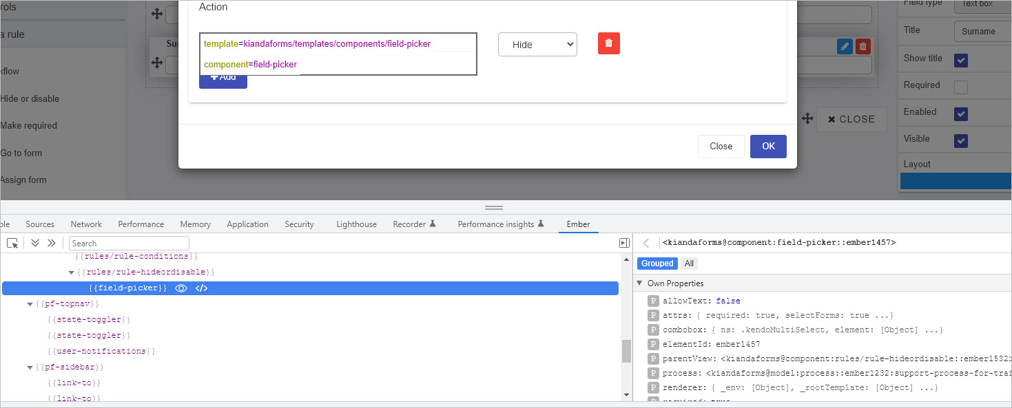
The field picker for example is typically seen in edit rule dialog boxes to allow uses to choose a form field that will be used in rule execution, for example as shown for the Hide or disable rule below.
Other field-related components include field-date, field-group, field-textbox and so on for the 16 predefined fields that exist. These components can be investigated using the Ember inspector add-in, click on the link for details.
How to get started
If you are an experienced developer with an Administrator or Developer role (see Users & Groups), you can create a new custom field/control within Kianda by doing the following:
Navigate to Administration in the left-hand side menu, and click on Developer. This will bring you to the Developer resources page. Field widgets are of type ‘Field’ in this list.
Widget view
Click on New widget to create a new field/control widget.
Fill out the Edit widget dialog box - that is Title, Unique Id (which is autofilled from the title), Widget Icon, where you can select from hundreds of icons, and then Widget type.
Click on OK when complete.
When you create a custom field widget, the Widget UI and Widget Code tabs are displayed. These two screenshots show the default code for ‘Widget UI’ and ‘Widget Code’.
The ‘Widget UI’ defines the HTML, handlers, expressions and more, see Sample widget UI code for an example of code that creates an interactive image display field. The code below uses Ember templating library, Handlebars JS as seen by {{}} below.
Field widget UI
The ‘Widget Code’ defines the logic and functions.
Field widget code
Widgets created are visible in the main widget view. From here, you can edit a widget by clicking on the Edit button (Pen icon), delete a widget by clicking on the Bin/Trash button and restore earlier versions of a widget by clicking on the Version restore button .
Custom field widgets you create will be available for use in Kianda Designer by going to Side menu > Administration > Designer > click on an existing process or Add new to add a new process (then click on a form to edit it), and see the Custom fields added under Controls.
Sample widget text
The following sample widget code creates a custom field that can be used to create an interactive form design, see Field output to see how the custom field displays.
You will find commented code that you can try out in the UI tab and code tab of the field widget editor in Kianda Developer.
Sample Custom field Widget UI code is as follows.
{{#if(eqdisplayMode"design")}} <select class="form-control" id="entityType">
<option value="">Please configure my settings before use</option> {{! Prompt the user to set the custom fields settings when in design mode}} </select>
{{/if}}{{#if(eqdisplayMode"edit")}} <select class="form-control" id="entityType" onchange={{action'frameSelected'value="target.value"}}> {{! Dropdown with a call to an action in widget code to change the picture on select}} <option value="">Select</option>
<option value="https://i.etsystatic.com/9126655/r/il/9e5871/1570989181/il_fullxfull.1570989181_monu.jpg">Green</option> {{! Dropdown is populated with frames to put in the image field}} <option value="https://i.etsystatic.com/9126655/r/il/a99539/2385100329/il_570xN.2385100329_l7ju.jpg">Red</option>
<option value="https://i.etsystatic.com/9126655/r/il/a31b15/2339396272/il_570xN.2339396272_kai0.jpg">Yellow</option>
<option value="https://i.etsystatic.com/9126655/r/il/b36fd3/3101702890/il_570xN.3101702890_51ek.jpg">Purple</option>
</select>
{{/if}}{{#if(eqdisplayMode"settings")}} <div class="form-group">
<label class="control-label">Image to place pictures into</label>
{{field-pickerprocess=processrequired=trueallowText=falseincludes='["fields/field-image"]'value=field.settings.imageDestination}}{{! Allow the user to select an image field to put the frame into}} <label class="control-label">Field to display warning message in</label>
{{field-pickerprocess=processrequired=trueallowText=falsevalue=field.settings.warningMessage}}{{! Allow the user to select a text field to display the warning message in}}</div>
{{/if}}{{#if(eqdisplayMode"display")}} <select class="form-control" onchange={{action'frameSelected'value="target.value"}} > {{! Dropdown with a call to an action in widget code to change the picture on select}} <option value="">Select</option>
<option value="https://i.etsystatic.com/9126655/r/il/9e5871/1570989181/il_fullxfull.1570989181_monu.jpg">Green</option> {{! Dropdown is populated with frames to put in the image field}} <option value="https://i.etsystatic.com/9126655/r/il/a99539/2385100329/il_570xN.2385100329_l7ju.jpg">Red</option>
</select>
{{/if}}
Sample Custom field widget code is as follows:
{edit:function(){varfield=this.get('field');varprocess=this.get('field.process');varwarningMessage=process.findFieldByName(this.get("field.settings.warningMessage.name"));//Retrieve the warning message field
warningMessage.set("visible",true);//Set warning messsage field to visible as we are in edit mode
warningMessage.set("enabled",false);//Set warning message field to disabled to avoid a user editing the text in it
warningMessage.set("text","Preview mode: Not actual process");//Set the warning message field text
},display:function(){varfield=this.get('field');varprocess=this.get('field.process');varwarningMessage=process.findFieldByName(this.get("field.settings.warningMessage.name"));//Retrieve the warning message field
warningMessage.set("visible",false);//Set warning messsage field to invisible as we are in display mode
},actions:{frameSelected:function(image){varfield=this.get('field');varprocess=this.get('field.process');varimageDestination=process.findFieldByName(this.get("field.settings.imageDestination.name"));//Retrieve the image field selected as the destination
imageDestination.set("text",image);},}}
Using the steps in the How to get started section, the sample code above is saved as a field widget called ‘Image display’. This widget is then available in the widget list under Developer resources as shown below.
The widget is then used in a Kianda form as seen in the next section Field output.
Field output
Users with the role Designer or Administrator can access the new control/field widget within Kianda Designer by going to the left-hand side pane, then Administration > Designer.
In this example, a process called ‘Support Query’ is created, with a first form called ‘Query’. Two controls are added:
A text box called ‘Warning’ - this field will hold a warning from the customised field when Preview mode is used.
An image field called ‘Image 1’ - this field will hold an image from the customised field.
When the new widget is added, it will add a third customised field of field type ‘Image display’ that will populate the other fields in the form.
To use the new widget:
Go to Controls > Custom > Widget name in this example ‘Image display’. Click on ‘Image display’ to add it to the form.
Configure the custom control by clicking on it and completing the Edit field dialog box as follows, mapping the text box and image fields from the form as placeholders for text and images.
Click on OK to exit the dialog box and then click on Save to save the process.
Click on the Preview button to see the new control in action.
When in Preview mode a warning appears telling you you are in ‘Preview mode’. A drop-down list is available allowing you to choose an image by colour.
When you choose an option from the drop-down list, then a coloured image appears.
From here the user can change to another colour and when complete click on Submit, Save or Close.
The process design as seen in Kianda Designer is shown in the image below.
Click on the relevant links to find out more about each area. However if customised rules have been created, they are available to those with the role Administration and Design business process to use in process and form design in Kianda Designer. Customised rules are available under the Custom rules category under Add a rule.
Custom rules are created by Administrators or Developers who have coding experience to use Kianda’s low-code development feature, Kianda Developer.
How to get started
If you are an experienced developer with an Administrator or Developer role, see Users & Groups, you can create a new rule widget within Kianda by doing the following:
Navigate to Administration in the left-hand side menu, and click on Developer. This will bring you to the Developer resources page. Rule widgets are of type ‘Rule’ in this list.
Widget view
Click on New widget to create a new rule widget.
Fill out the Edit widget dialog box - that is Title, Unique Id (which is autofilled from the title), Widget Icon, where you can select from hundreds of icons, and then Widget type.
Click on OK when complete.
When you create a custom field widget, the Widget UI and Widget Code tabs are displayed. These two screenshots show the default code for ‘Widget UI’ and ‘Widget Code’.
The ‘Widget UI’ defines the HTML, handlers, expressions and more.
Rule widget UI
The ‘Widget Code’ defines the logic and functions.
Rule widget code
Widgets created are visible in the main widget view. From here, you can edit a widget by clicking on the Edit button (Pen icon), delete a widget by clicking on the Bin/Trash button and restore earlier versions of a widget by clicking on the Version restore button .
Custom rule widgets you create will be available for use in Kianda Designer by going to Side menu > Administration > Designer > click on an existing process or Add new to add a new process, then click on Add a rule to see the Custom rule category added under Rules.
What’s next
To continue with low-code development, you can view Templating basics. If you would like to learn more about low-code go to the Low-code development page and from there navigate to other pages on low-code practices.
There are currently 7 predefined dashboard widgets available to use to create illustrative and responsive pages to show how your processes are performing at a glance. These widgets are:
Click on the relevant links to find out more about each area. However if customised dashboards have been created, they are available to those with the Administration role to use in dashboard management in Kianda. Customised dashboards are available in the drop-down list for widgets when creating or editing dashboard pages.
Custom dashboards are created by Administrators or Developers who have coding experience to use Kianda’s low-code development feature, Kianda Developer.
How to get started
If you are an experienced developer with an Administrator or Developer role, see Users & Groups, you can create a new dashboard widget within Kianda by doing the following:
Navigate to Administration in the left-hand side menu, and click on Developer. This will bring you to the Developer resources page. Dashboard widgets are of type ‘Widget’ in this list.
Widget view
Click on New widget to create a new rule widget.
Fill out the Edit widget dialog box - that is Title, Unique Id (which is autofilled from the title), Widget Icon, where you can select from hundreds of icons, and then Widget type.
Click on OK when complete.
When you create a custom field widget, the Widget UI and Widget Code tabs are displayed. These two screenshots show the default code for ‘Widget UI’ and ‘Widget Code’.
The ‘Widget UI’ defines the HTML, handlers, expressions and more.
Dashboard widget UI
The ‘Widget Code’ defines the logic and functions.
Dashboard widget code
Widgets created are visible in the main widget view. From here, you can edit a widget by clicking on the Edit button (Pen icon), delete a widget by clicking on the Bin/Trash button and restore earlier versions of a widget by clicking on the Version restore button .
Custom rule widgets you create will be available for use in dashboard pages for Administrators by going to Side menu > Home > and click on the Create a new page to create a new dashboard page, or click on an existing dashboard in the left-hand pane.
Click on the Edit current page button to make the widget menu appear.
The newly created custom dashboard widget will be available in the drop-down menu by clicking on the down arrow.
Then click on the new widget design name to implement the widget, starting with editing the widget and then change settings, see Edit dashboard page settings for more information on general settings.
What’s next
To continue with low-code development, you can view Templating basics. If you would like to learn more about low-code go to the Low-code development page and from there navigate to other pages on low-code practices.
Go to the link on Dashboards to learn more about dashboard pages.
11 - Webhooks
Introduction
Kianda Developer includes a webhooks function. A webhook or web callback allows information to be pushed from Kianda to your applications in real time when process instances are created, deleted or updated. This provides an efficient way to execute event reactions, thereby eliminating the need to continuously poll for data. The information that is posted includes variables like the process name and instance ID.
The Kianda webhooks function allows you to configure URLs that can respond to process instance creation, deletion and update events. When these events happen, the webhook will then make a HTTP request to your application/service, including variables like the process instance name, querying the provided URL, so your application can be updated.
Note: Callback has a timeout of 10 seconds.
How to get started
You must have an Administrator or Developer role see Users & Groups for more details on roles. Then to get started with webhooks:
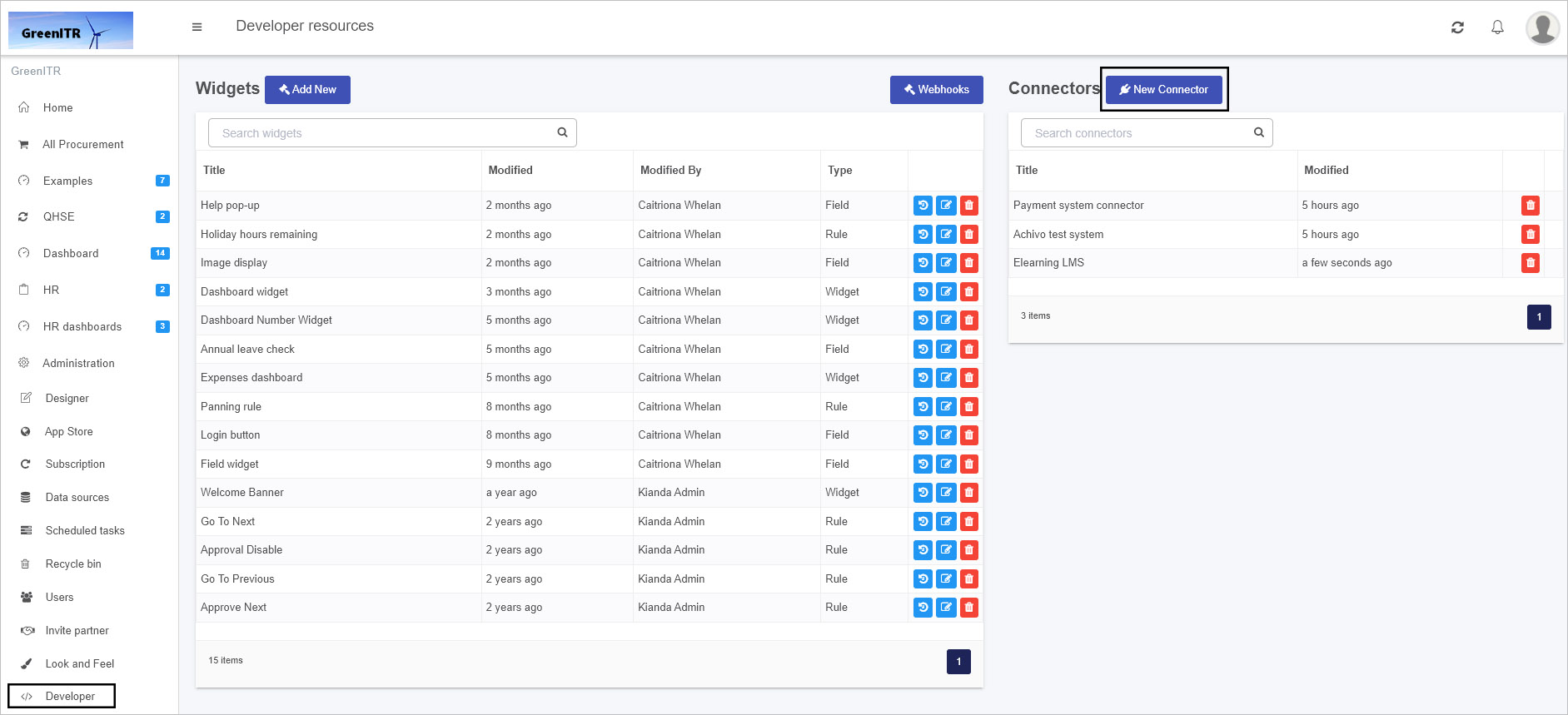
Navigate to Administration in the left-hand side menu, and click on Developer. This will bring you to the Developer resources page.
Developer resources page
Click on Webhooks to create a process instance callback.
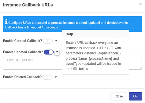
The Instance Callback URLs dialog box appears.
Use the slider to turn on the relevant callback:
Enable Created Callback - this will enable a URL callback every time a process instance is created. This results in a HTTP GET request with parameters instanceID={instanceID}, processName={processName} and eventType=created being issued to the given URL.
Enable Updated Callback - this will enable a URL callback every time a process instance is updated. This results in a HTTP GET request with parameters instanceID={instanceID}, processName={processName} and eventType=updated being issued to the given URL.
Enable Deleted Callback - this will enable a URL callback every time a process instance is deleted. This results in a HTTP GET request with parameters instanceID={instanceID}, processName={processName} and eventType=deleted being issued to the given URL.
In each case type in the URL to respond to process instance create, update and deleted events. Note that in each case, you can add more than one function, but use only one URL per line, using enter/return key to move to the next line. This will allow you to update multiple services using the callback operation above.
Click on the Help button for clarification.
Click on OK when done or click on Close at any stage to close the dialog box.
Kianda uses front-end technologies like CSS and JavaScript and more specifically a framework called Ember.js that is an open-source Javascript web application that allows you to build highly interactive applications that use JavaScript in a quick and efficient manner. Ember UIs use HTML meaning that everything you see on screen in Kianda is defined in a HTML template somewhere within the Kianda application. Ember allows you inspect components found in Kianda forms on screen for example a button, a rule, a panel and so on. You can use this knowledge to create your own rule, field, dashboard and data connector widgets.
To get the make the most out of your Kianda customisation we recommend installing and using the Ember inspector to help you understand what Kianda components are available, what their properties are and how they are used. The next section details how you can get started with Ember.
How to get started with Ember Inspector
The Ember inspector is a Chrome plug-in that allows you to investigate and understand your Ember.js. This browser add-on can be installed on Google Chrome, Firefox and other browsers. For example to install the add-on in Chrome, go to the Chrome web store, search for ‘Ember inspector’ and then in the search results click on the add-on and Add to Chrome.
Log in to Kianda, then navigate to a form, and open the Ember inspector by right-clicking on a page for example in Google Chrome and click on Inspect.
Then click on the Ember tab.
In the left-hand pane you will see Components, View Tree, Routes, Data and Depreciations amongst other options.
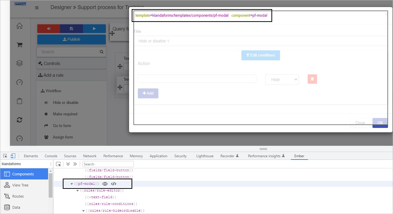
In the central pane you can drill down to a particular component, for example, in the form below, a Hide or disable rule is about to be added. You can see what the components are within this modal/edit rule dialog box by scrolling over the components in the central pane.
By highlighting the rule editor component we can see the template used.
If you click on the component itself, then the properties of that component appear in the right-hand pane. For example the properties of a field-picker component are seen in the image below.
Using the Ember inspector you can view all the components within Kianda and the properties associated, for example by default the field-picker component used in the modal in step 6 has a property ‘allowText’ false, that is text is not typed in but the user chooses form elements from a drop-down list.
The widget UI uses syntax called Handlebars that can be used by multiple languages. Kianda is built using Ember.js framework which in turn uses the Handlebars templating library to make changes to the user interface. The following is an example of widget UI code:
{{#if(eqdisplayMode"settings")}} <div class="form-group">
<label class="control-label">Image to place pictures into</label>
{{field-pickerprocess=processrequired=trueallowText=falseincludes='["fields/field-image"]'value=field.settings.imageDestination}}{{! Allow the user to select an image field to put the frame into}} <label class="control-label">Field to display warning message in</label>
{{field-pickerprocess=processrequired=trueallowText=falsevalue=field.settings.warningMessage}}{{! Allow the user to select a text field to display the warning message in}}</div>
{{/if}}
In the example code block above, the ’field-picker’ component is called using Ember and the associated component properties include:
‘allowText=false’ meaning text is not entered into the field picker by a user
‘required=true’ meaning the field has to be completed, that is a field chosen, for the form to be submitted
‘value=field.settings.warningMessage’ meaning an input value will be stored in the warningMessage field
The field picker for example is typically seen in Edit rule dialog boxes to allow users to choose a form field that will be used in rule execution, for example as shown for the Hide or disable rule below.
Other field-related components include field-date, field-group, field-textbox and so on for the 16 predefined fields that exist. A table of field-related components is listed below with attributes that can be found using Ember inspector.
Field-related components
Component
Example of attributes
field-base
field: , displayMode: design …
field-button
isFooter: true, field: …
field-component
field-date
tagName: , field: [Object] …
field-dialog
tagName: , field: [Object] …
field-file
tagName: , field: [Object] …
field-globalpayments
field-group
tagName: , field: [Object] …
field-image
tagName: , field: [Object] …
field-imagegallery
field-link
tagName: , field: [Object] …
field-list
tagName: , field: [Object] …
field-number
tagName: , field: [Object] …
field-panel
field: [Object], displayMode: design …
field-picker
required: true, selectForms: true …
field-signature
tagName: , field: [Object] …
field-table-row
tagName: tr, field: …
field-table
tagName: , field: [Object], …
field-text
placeholder: [Object], required: [Object] …
field-textbox
tagName: , field: [Object] …
field-toggle
tagName: , field: [Object], …
field-userpicker
tagName: , field: [Object], …
table-row
tagName: tr, field: ….
13 - Custom Connectors
Learn about custom connectors, what they are and why they are used
What are Custom Connectors?
Kianda provides predefined datasource connectors such as the SQL server and SharePoint to allow you to connect your Kianda forms to particular data sources. A complete list of these predefined datasources is available at Data connectors. In addition to these predefined connectors, you can also create Custom connectors to enable you to configure your own connector to suit your needs.
Custom connectors work in the same way as other Kianda connectors, but with the added benefit of customisation.
What are Custom Connectors used for?
Custom connectors provide the infrastructure to allow developers to create a custom datasource, it provides hooks for pre- and post-processing of the query and the ability to customise the datasource settings for the connector.
Custom Connector VS Datasource
As previously mentioned, the Kianda platform provides a list of predefined datasource connectors, such as SharePoint, SQL server and SAP. These however cannot be customized for an individual companies needs.
Custom Connectors provide end-to-end customisation for datasource connections. The Custom Connector provides the architecture to allow customisation of pre- and post-processing of database queries.
For example when using a SharePoint data source you can use parameters for example selection of the environment and user credentials, but if you needed extra parameter, you could use the custom connector to provide this ability.
How to get started
There are three key steps that need to be implemented in order to create and use a customised connector as follows:
Microservice - create a microservice that will implement metadata, query and test functions. <!– click on the Microservice link to get further details. –>
Use Kianda features to create and test your customised connector - use Developer to register a new connector<!– register a new connector –> and use Data sources to <!– create a datasource –> create a datasource for the newly customised connector. Both of these features are available under Administration
Process - use the custom connector to bring data into a process and use the query hook to filter the data. Use Kianda Designer to connect your data source to Kianda forms, for example a List control can connect to a datasource, see step 9 in List control.
What’s next
To create a test service, follow the 3 steps above, or if you have already created a microservice go straight to steps to create a custom connector to learn how to create a custom connector.
13.1 - Microservice Creation
What is a Microservice
A microservice is a self contained independent service, usually hosted in the cloud, which can integrate with applications through REST APIs. Microservices allow developers to focus on developing a service without worrying about dependencies.
A microservice can be developed using almost any programming language.
Prerequisites
Before you get started, check that the following prerequisites are in place:
Ability/permissions to create resources with a cloud platform, for example, Google Cloud, AWS or Azure
Administration role or permissions within an Admin group within Kianda, see Users and Groups for more information
Visual Studio installed or other text editor for your chosen programming language
Microservice Requirements
Your microservice should implement the following three functions:
It is required that the microservice uses security best practices, to encrypt sensitive data using AES encryption and verify that each request and response is secure using a HMAC signature.
Microservice Development
The following steps for development will use Microsoft Azure cloud as an example, however, other cloud computing platforms with similar features can be used resulting in different naming conventions. The key steps are:
Create a serverless Azure function app in Visual Studio by creating a new project, searching for Azure functions and using this as a template to get started. As well as the pre-defined libraries in the template, you must also add the following:
Implement the functions for Test, Metadata and Query. Click on each of the links to read more. The steps highlighted in bold are unique to the specific function, while the other steps are repeated in all three functions.
Debug locally and test using a tool such as Postman or download Kianda Cloud Connect.
Deploy to Azure.
Test
The Test function ensures that the user is authorized to use the datasource. If they are not authorized then this function can be used to authorize the user and retrieve an access token for any further requests.
The steps involved in creating the test function are as follows:
Decrypt the encrypted settings property bag using the shared secret key and the Decrypt function, see Encryption/Decryption sample code for an example.
Authorize the user and retrieve bearer token for subsequent requests and save the token to the settings property bag.
Add the oauth token to the settings property bag and encrypt using your secret key.
Sign the response using the EncryptdatawithHMACSHA256 method and include in the custom connector response, see Encryption/Decryption sample code for an example.
To help you get started, see sample code for the Test function by going to Test sample code.
Metadata
The Metadata function provides the list of available endpoints in the microservice and is called when selecting the datasource in a Kianda process, for example use a particular datasource to populate a List field in a Kianda form.
The steps involved in creating the metadata function are as follows:
Create a signature string using the EncryptdatawithHMACSHA256 method and include in the custom connector response, see Encryption/Decryption sample code for an example.
To help you get started, see sample code for the Metadata function by going to Metadata sample code.
Query
The Query function is where the execution of the datasource methods occurs, the metadata function provides the list of available methods.
The steps involved in creating the query function are as follows:
Decrypt the encrypted settings property bag using the shared secret key and the Decrypt function - see Encryption/Decryption sample code for an example.
Get the query object from the request - see schema for details, and call the function related to the query in the datasource .
Create the query result object - see schema for details, and include in the custom connector response.
Sign the response using the EncryptdatawithHMACSHA256 method and include in the custom connector response, see Encryption/Decryption sample code for an example.
To help you get started, see sample code for the Query function by going to Query sample code.
Security
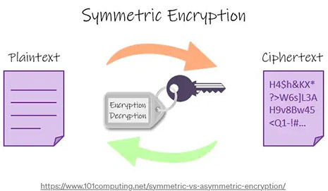
AES256
Advanced Encryption Standard (AES) is the technique used to encrypt sensitive data. This is a symmetric encryption technique, which means the same key is used to encrypt and decrypt the data, it is also a 2-way encryption algorithm.
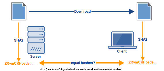
HMAC
Hash based Message Authentication Code (HMAC) is used to ensure query responses are coming from the correct end point. HMAC is also an encryption algorithm but unlike AES it’s one-way encryption, meaning it isn’t decrypted on the other side. It is used for verification, for example if we encrypt a secret key using HMAC with a request id and then do the same in the response, we can verify that we have got the response back from the correct endpoint and know that it has not been tampered with because both hashes will match. The hash used is SHA256.
With AES we are encrypting and decrypting data and this method is fast and secure for large data, while with HMAC we use it to simultaneously verify both the data integrity and authenticity of a message.
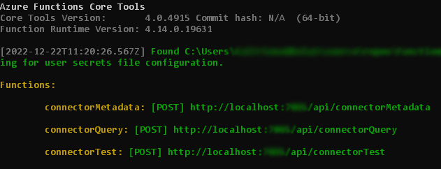
When you have created the Test, Metadata and Query functions and your microservice is running, you should receive an output similar to the following shown using Azure functions:
These URLs will be used in the Connector Settings tab when creating the Custom Connector.
This page features sample schemas for parameters used in the Query Code tab when creating a customised data connector.
Each section below features exemplar schemas and parameters to help you when creating code for your hooks in the Query Code tab.
Metadata hook related schemas
The Metadata hook in the Query Code tab typically looks like the following, using two parameters: tree and datasource.
metaData(tree, datasource) {
    return tree;
  }
Sample schemas for tree and datasource are available by clicking on the links.
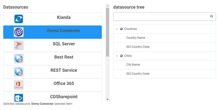
Tree schema
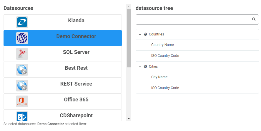
{"text":"Countries And Cities","name":"countriesAndCities","icon":"fa fa-database","selectable":false,"nodes":[{"text":"Countries","icon":"","desc":"","nodes":[{"text":"Country Name","name":"countryName","type":"string","desc":"",},{"text":"ISO Country Code","name":"ISOCode","type":"string","desc":""}]},{"text":"Cities","name":"cities","icon":"","desc":"","nodes":[{"text":"City Name","name":"cityName","type":"string","desc":""},{"text":"ISO Country Code","name":"ISOCode","type":"string","desc":""}]}]}
To return to Microservice development, click on the Microservice link.
Datasource schema
Note: The same structure below can be used used in both Query hooks and Query success hooks, although data will vary slightly.
Note: This is similar to the rule used in the Query success hook.
The following sample rule schema is for a find-items rule which maps the response from the connector query to a table, notice the inputmapping and output mapping.
{"title":"Find items 3","action":"rules/rule-finditems","originalId":"5e6d1abc-1c5f-471c-b1f2-4bc038d7aefd","enabled":true,"schedule":"default","settings":{"inputMapping":[{"lefterror":"has-error","righterror":"has-error"}],"outputMapping":[{"left":{"text":"Country Name","name":"country-name","id":"6070ad52-7e4e-4a96-aa6b-320266644d93","type":"field","fieldType":"fields/field-textbox","selectable":true,"icon":"fa fa-text-height"},"right":{"text":"Country Name","name":"countryName","type":"datafield"},"lefterror":"","righterror":""},{"left":{"text":"ISO Country Code","name":"ISOCode","id":"c2246c9a-af60-4fd0-9ac6-3195c456d3ff","type":"field","fieldType":"fields/field-textbox","selectable":true,"icon":"fa fa-text-height"},"right":{"text":"ISO Country Code","name":"ISOCode","type":"datafield"},"lefterror":"","righterror":""}],"errorMapping":[],"rowLimit":100,"list":{"text":"Countries","name":"Countries","type":"item"},"mapToTable":"yes","offlineCache":"no","overrideTable":"yes","serverPaging":"no","table":{"text":"Table 1","name":"form1-f4","id":"7746f138-a913-4438-ba65-4905d8453d57","type":"field","fieldType":"fields/field-table","selectable":true,"icon":"fa fa-table","nodes":[],"visible":true,"rows":[{"text":"row1","name":"form1-f4-row1","id":"219e1d44-a997-4f76-b815-f409fdcb4774","type":"field","fieldType":"fields/table-row","selectable":false,"nodes":[{"text":"Country Name","name":"country-name","id":"6070ad52-7e4e-4a96-aa6b-320266644d93","type":"field","fieldType":"fields/field-textbox","selectable":true,"icon":"fa fa-text-height"},{"text":"ISO Country Code","name":"ISOCode","id":"c2246c9a-af60-4fd0-9ac6-3195c456d3ff","type":"field","fieldType":"fields/field-textbox","selectable":true,"icon":"fa fa-text-height"}],"visible":true,"state":{"expanded":true}}]},"lastExecuted":"2022-12-14T17:29:42.425Z"},"elseSettings":{},"hasElse":false}
Process schema
Note: This is similar to the process used in the Query success hook.
The Query success hook in the Query Code tab typically looks like the following, using four parameters: datasource, result, rule and process.
querySuccess(datasource,result,rule,process){// this.get("dataservice").mapSuccess(result,rule,process); //uncomment to use default mapping behaviourreturnresult;}
Sample schemas each are available by clicking on the relevant links: datasource, result, rule, and process are available by clicking on the links.
Process - use the custom connector to bring data into a process and use the query hook to filter the data.
Register a new connector
To create a new customised connector, follow the steps below:
From the left-hand side menu, go to Administration > Developer then within the Connectors panel click on New Connector.
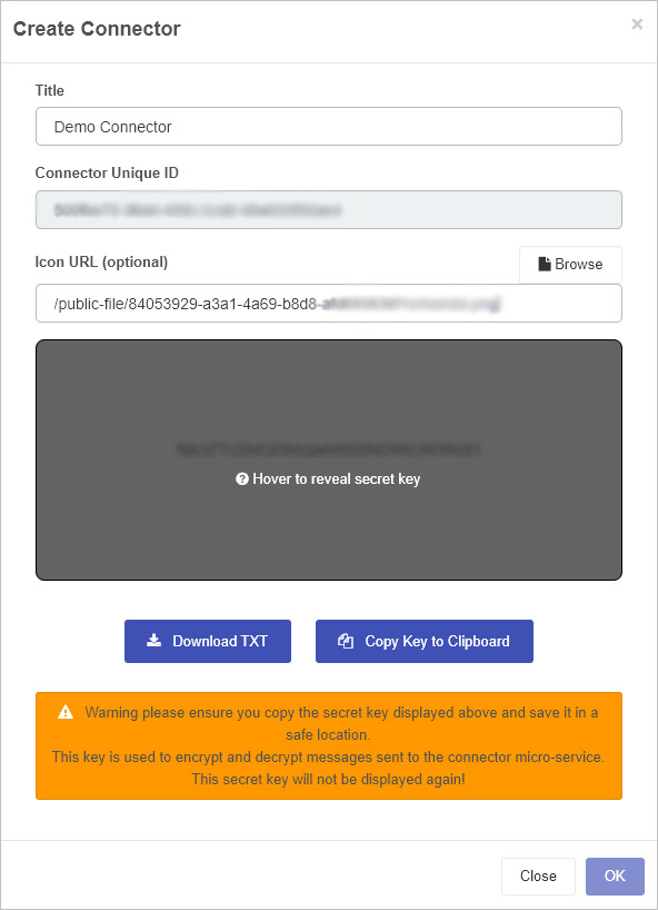
In the Create Connector dialog box, add a Title and browse for an Icon URL for your connector. The Connector Unique ID is automatically generated by the system.
Make sure to copy the secret key to a safe location where you will find it as it will be needed later. You can do this by a) clicking on Download TXT which will result in the Secret Key being downloaded as a CSV file or b) clicking on Copy Key to Clipboard, then click on OK when done.
Ensure that this secret key is added to your Microservice code, see Encryption and Decryption sample code, where you need to replace the string in the GetSecretKey function as shown below:
privatestaticstringGetSecretKey(){return"{secret key generated from Kianda}";//REPLACE ME}
The details of these tabs are found in the following sections.
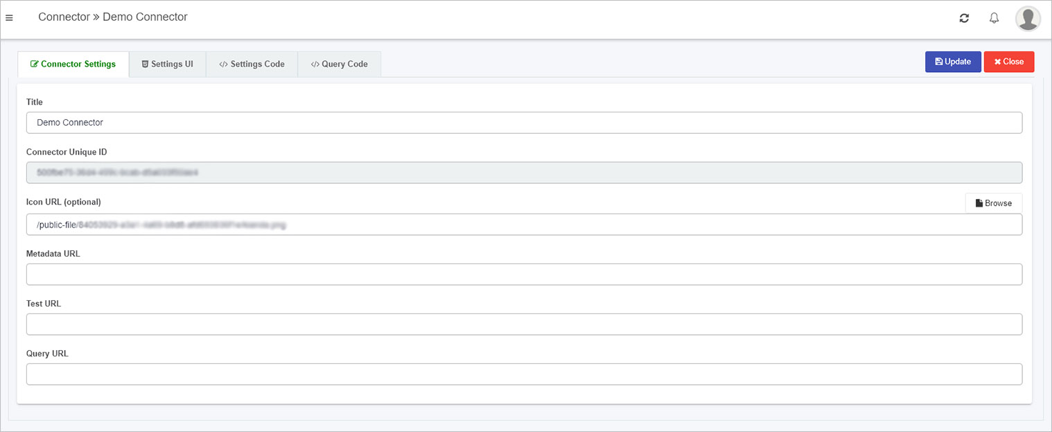
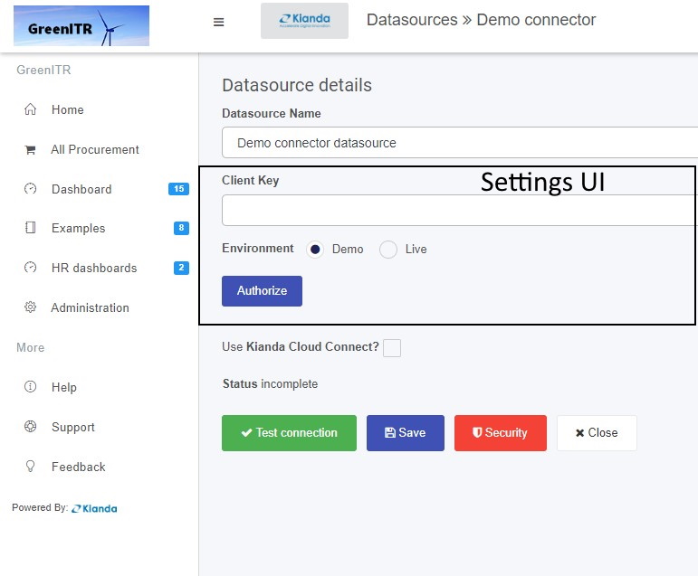
Connector Settings tab
This is where the Connector Title and Icon can be changed. These details will be seen in the Data connectors function, once the customised connector is created.
The URLs for metadata, test and query can be edited here too. The Metadata, Test and Query URL’s can be populated when the microservice is created, see Create a Microservice link for more details.
For example when your Microservice is running you should receive an output similar to the following shown using Azure functions and use these URLs in the Connector Settings tab.
To save details click on Update, then click on Close to return to the Developer resources page.
Settings UI tab
The Settings UI sets the user interface for a customised data connector within the Data sources function, found within Administration in the left-hand pane. By default there is sample code in this tab. This code will be rendered when the datasource for this connector is activated.
This code creates the content on the screen seen below, available in the Data sources function on the Datasource details page. Within the class form-group listed in the code above there is an Environment setting with labels ‘Demo’ and ‘Live’ which can be seen in the screen below. Also note an Authorize button added in the code above which has an action ‘authorize’ which is handled by the code in the Settings Code tab.
Other details on the screen above, like the name of the page Datasource details, Use Kianda Cloud Connect and buttons Test connection, Save, Security and Close are automatically part of the UI for customised data connectors. However, custom handlebars can be added for the settings of the connector datasource using code in the Settings UI tab, namely fields like Datasource Name and Client Key as shown in the image above. This principle works the same as Widget UI, which is seen when creating custom rule widgets or field widgets for example.
Settings Code
In a similar manner to creating custom rule widgets or field widgets where there are Widget code tabs, the connector widget has a tab called Settings Code which is used to create the JavaScript code for the settings UI.
By default there is code in this tab, for example the Authorize button shown in the Datasource details page above has an ‘authorize’ function which is the first segment of code below.
Other aspects to note in this sample code are the datasource settings, for example datasource.settings.accessToken and datasource.settings.environment denoting that you can add whatever settings you want to the UI within the Datasources details page using this type of code. These settings could be then used in a Microservice to create an action based on a chosen setting.
Query Code
When using a data source, all data sources will have built-in metadata, query and querySuccess functions to allow content searches, including metadata content or information about the content, such as title, author and creation date. The Query code tab contains the code needed for these three functions. Default code is provided to help you get started, see below.
{metaData(tree,datasource){returntree;},query(datasource,query,rule,process){returnquery;},querySuccess(datasource,rule,result,process){//this.get("dataservice").mapSuccess(result,rule,process); //uncomment to use default mapping behaviour
returnresult;}}
The default code contains three hooks that allow you to tap in to a module to trigger certain behaviours or actions. These hooks are:
Click on each of the links above to see further details.
In Ember, bubbling will search for each of the actions in the code above, and if not found, then a default action is used, but if found the default is overwritten. This principle is useful when something is created multiple times which is the case when creating custom data connectors.
Metadata hook
The Metadata hook is where the return of the tree or metadata call can be altered for a chosen datasource used in Kianda form design.
The treeparameter as part of this hook is seen in the sample code snippet below.
metaData(tree,datasource){returntree;}
An example of the tree structure is shown below.
The tree follows the structure that there is a root node, in this example Countries and Cities is the root. The tree can be customised by adding an icon and making nodes selectable.
{"text":"Countries And Cities","name":"countriesAndCities","icon":"fa fa-database","selectable":false,"nodes":[{"text":"Countries","icon":"","desc":"","nodes":[{"text":"Country Name","title":"Country Name","name":"countryName","type":"string","desc":""},{"text":"ISO Country Code","title":"ISO Country Code","name":"ISOCode","type":"string","desc":""}],"fields":[{"text":"Country Name","title":"Country Name","name":"countryName","type":"string","desc":""},{"text":"ISO Country Code","title":"ISO Country Code","name":"ISOCode","type":"string","desc":""}]},{"text":"Cities","name":"cities","icon":"","desc":"","nodes":[{"text":"City Name","title":"ISO Country Code","name":"cityName","type":"string","desc":""},{"text":"ISO Country Code","title":"ISO Country Code","name":"ISOCode","type":"string","desc":""}],"fields":[{"text":"City Name","title":"ISO Country Code","name":"cityName","type":"string","desc":""},{"text":"ISO Country Code","title":"ISO Country Code","name":"ISOCode","type":"string","desc":""}]}]}
This structure will result in the output as shown in the image below,
Query Hook
The Query hook allows a query to the datasource to be customised. Parameters are passed into this function to allow customisation to happen. These parameters are: datasource, query, rule and process; sample schemas are available for each at the Sample schema link.
In the sample code below, the filter is obtained by drilling into the query conditions object.
This is just one example of how the query can be customized before being processed, which is an advantage of using custom connectors. Take a look at the query schema for more information
This ties in with the query success hook which handles the result which is returned from the datasource, which can also be customized.
QuerySuccess hook
The idea of the query success hook is to be able to customize the response of a datasource query for example drill into a complicated json response based on a condition.
querySuccess(datasource,result,rule,process){// this.get("dataservice").mapSuccess(result,rule,process); //uncomment to use default mapping behaviourreturnresult;}
Once the connector is created, the connector is available from the Data sources function under Administration, see Creating a datasource for details.
13.4 - Sample code for a microservice
Sample code
The following sections provide some sample code to help you get started in creating Test, Metadata and Query functions for your Microservice so that you can test and deploy a Custom Connector in Kianda, allowing you to connect forms and use data from any data source.
Encryption and Decryption sample code
publicstaticstringHashWithHMACSHA256(stringkey,stringvalue){using(varhash=newHMACSHA256(Convert.FromBase64String(key))){varhashedByte=hash.ComputeHash(Encoding.UTF8.GetBytes(value));varhashed=Convert.ToBase64String(hashedByte);returnhashed;}}publicstaticstringAESEncrypt(stringkey,stringplainData,outbyte[]iv){var_key=Convert.FromBase64String(key);using(Aesaes=Aes.Create()){aes.GenerateIV();aes.Mode=CipherMode.CBC;iv=aes.IV;aes.KeySize=256;aes.Key=_key;using(varencryptor=aes.CreateEncryptor()){using(MemoryStreamms=newMemoryStream()){using(CryptoStreamcs=newCryptoStream(ms,encryptor,CryptoStreamMode.Write)){using(StreamWritersw=newStreamWriter(cs))sw.Write(plainData);}returnConvert.ToBase64String(ms.ToArray());}}}}publicstaticstringAESDecrypt(stringkey,stringencryptedData,byte[]iv){varbuffer=Convert.FromBase64String(encryptedData);var_key=Convert.FromBase64String(key);using(Aesaes=Aes.Create()){aes.KeySize=256;aes.Mode=CipherMode.CBC;aes.Key=_key;aes.IV=iv;using(vardecryptor=aes.CreateDecryptor()){using(MemoryStreamms=newMemoryStream(buffer))using(CryptoStreamcs=newCryptoStream(ms,decryptor,CryptoStreamMode.Read)){using(StreamReadersw=newStreamReader(cs))returnsw.ReadToEnd();}}}}publicstaticstringGenerateAESKey(){using(Aesaes=Aes.Create()){aes.KeySize=256;aes.GenerateKey();returnConvert.ToBase64String(aes.Key);}}privatestaticstringGetSecretKey(){return"{secret key generated from Kianda}";//REPLACE ME}
To return to Microservice development, click on the Microservice link.
To return to Microservice development, click on the Microservice link.
Metadata sample code
[FunctionName("connectorMetadata")]publicstaticasyncTask<CustomConnectorResponse>connectorTree(//metadata [HttpTrigger(AuthorizationLevel.Function, "post", Route = null)]HttpRequestreq,ILoggerlog){stringSECRET_KEY=GetSecretKey();stringrequestBody=awaitnewStreamReader(req.Body).ReadToEndAsync();CustomConnectorRequestdata=JsonConvert.DeserializeObject<CustomConnectorRequest>(requestBody);// Do Request for token and update settings object varsettings=JsonConvert.DeserializeObject<JObject>(AESDecrypt(SECRET_KEY,data.encryptedSettingsPropertyBag,data.iv));JObjecttokenRequestObj=newJObject{ ["grant_type"]="authorization_code",//["client_id"] = clientID, ["redirect_uri"]="https://app.kianda.com/index.html"//["code"] = accessCode};//settings = GetToken(tokenRequestObj, settings);//create the Queryresult CustomConnectorResponseresult=newCustomConnectorResponse();QueryResultresultQuery=newQueryResult();result.queryResult=resultQuery;//create the return Tree stringsignature=string.Empty;List<JObject>CityFields=newList<JObject>{};CityFields.Add(newJObject{["name"]="cityName",["title"]="City Name",["text"]="City Name",["icon"]="",["type"]="string",["desc"]="",});CityFields.Add(newJObject{["name"]="ISOCode",["title"]="ISO Country Code",["text"]="ISO Country Code",["icon"]="",["type"]="string",["desc"]=""});List<JObject>CountryFields=newList<JObject>{};CountryFields.Add(newJObject{["name"]="countryName",["text"]="Country Name",["title"]="Country Name",["icon"]="",["type"]="string",["desc"]="",});CountryFields.Add(newJObject{["name"]="ISOCode",["text"]="ISO Country Code",["title"]="ISO Country Code",["icon"]="",["type"]="string",["desc"]=""});List<JObject>nodes=newList<JObject>{};nodes.Add(newJObject{["name"]="Countries",["text"]="Countries",["icon"]="fa fa-globe",["type"]="STRUCTURE",["nodes"]=newJArray{CountryFields},["fields"]=newJArray{CountryFields},["selectable"]=true});nodes.Add(newJObject{["name"]="Cities",["text"]="Cities",["icon"]="fa fa-globe",["type"]="STRUCTURE",["nodes"]=newJArray{CityFields},["fields"]=newJArray{CityFields},["selectable"]=true});//create the tree root to be returnedList<JObject>root=newList<JObject>{};root.Add(newJObject{ ["text"]="Countries and Cities", ["name"]="CountriesAndCities", ["icon"]="fa fa-database", ["selectable"]=false, ["nodes"]=newJArray{nodes}});try{result.queryResult.items=root;result.signature=HashWithHMACSHA256(SECRET_KEY,data.requestId);result.queryResult.success=true;result.queryResult.message="Metadata Action Completed";byte[]iv;varencryptedSettings=JsonConvert.SerializeObject(settings);varsettingsobj=AESEncrypt(SECRET_KEY,encryptedSettings,outiv);//encrypt the settingsresult.iv=iv;result.encryptedSettingsPropertyBag=settingsobj;}catch(Exceptionex){CustomConnectorResponseresultExc=newCustomConnectorResponse();QueryResultresultQueryExc=newQueryResult();result.queryResult=resultQuery;resultExc.queryResult.success=false;resultExc.queryResult.message="Exception occured; "+ex.Message;resultExc.signature=signature;returnresultExc;}returnresult;}
To return to Microservice development, click on the Microservice link.
Query sample code
[FunctionName("connectorQuery")]publicstaticasyncTask<CustomConnectorResponse>connectorQuery( [HttpTrigger(AuthorizationLevel.Function, "post", Route = null)]HttpRequestreq,ILoggerlog){stringSECRET_KEY=GetSecretKey();CustomConnectorResponseresult=newCustomConnectorResponse();QueryResultresultQuery=newQueryResult();result.queryResult=resultQuery;stringsignature=string.Empty;varmyresponsestring=string.Empty;try{stringtestBody=awaitnewStreamReader(req.Body).ReadToEndAsync();CustomConnectorRequestdata=JsonConvert.DeserializeObject<CustomConnectorRequest>(testBody);Queryquery=data.query;varsettings=JsonConvert.DeserializeObject<JObject>(AESDecrypt(SECRET_KEY,data.encryptedSettingsPropertyBag,data.iv));//demo object list creationresult.queryResult.items=newList<JObject>();if(query.info.Value<string>("text")=="Countries"){List<JObject>CountriesList=newList<JObject>();varcountry1=newJObject{["countryName"]="England",["ISOCode"]=123};varcountry2=newJObject{["countryName"]="Ireland",["ISOCode"]=124};CountriesList.Add(country1);CountriesList.Add(country2);result.queryResult.items=CountriesList;}else{List<JObject>CitysList=newList<JObject>();//create a list of jobjects varcity1=newJObject{["countryName"]="England",["cityName"]="London"};varcity2=newJObject{["countryName"]="England",["cityName"]="Liverpool"};varcity3=newJObject{["countryName"]="Ireland",["cityName"]="Dublin"};varcity4=newJObject{["countryName"]="Ireland",["cityName"]="Cork"};CitysList.Add(city1);CitysList.Add(city2);CitysList.Add(city3);CitysList.Add(city4);//check for conditions then return accordinglyif(query!=null&&!string.IsNullOrEmpty(query.filter)){//filtering the city list depending on the filter varj=CitysList.Where(x=>x.GetValue("countryName").Value<string>()==query.filter).ToList();result.queryResult.items=j;}else{// if no filter return the full list of citysresult.queryResult.items=CitysList;}}byte[]iv;varsettingsobj=AESEncrypt(SECRET_KEY,JsonConvert.SerializeObject(settings),outiv);//encrypt the settingsresult.iv=iv;result.encryptedSettingsPropertyBag=settingsobj;result.signature=HashWithHMACSHA256(SECRET_KEY,data.requestId);result.queryResult.success=true;}catch(Exceptionex){CustomConnectorResponseresultExc=newCustomConnectorResponse();QueryResultresultQueryExc=newQueryResult();resultExc.queryResult.success=false;resultExc.queryResult.message="Exception occured; "+ex.Message;resultExc.signature=signature;returnresultExc;}returnresult;}
To return to Microservice development, click on the Microservice link.


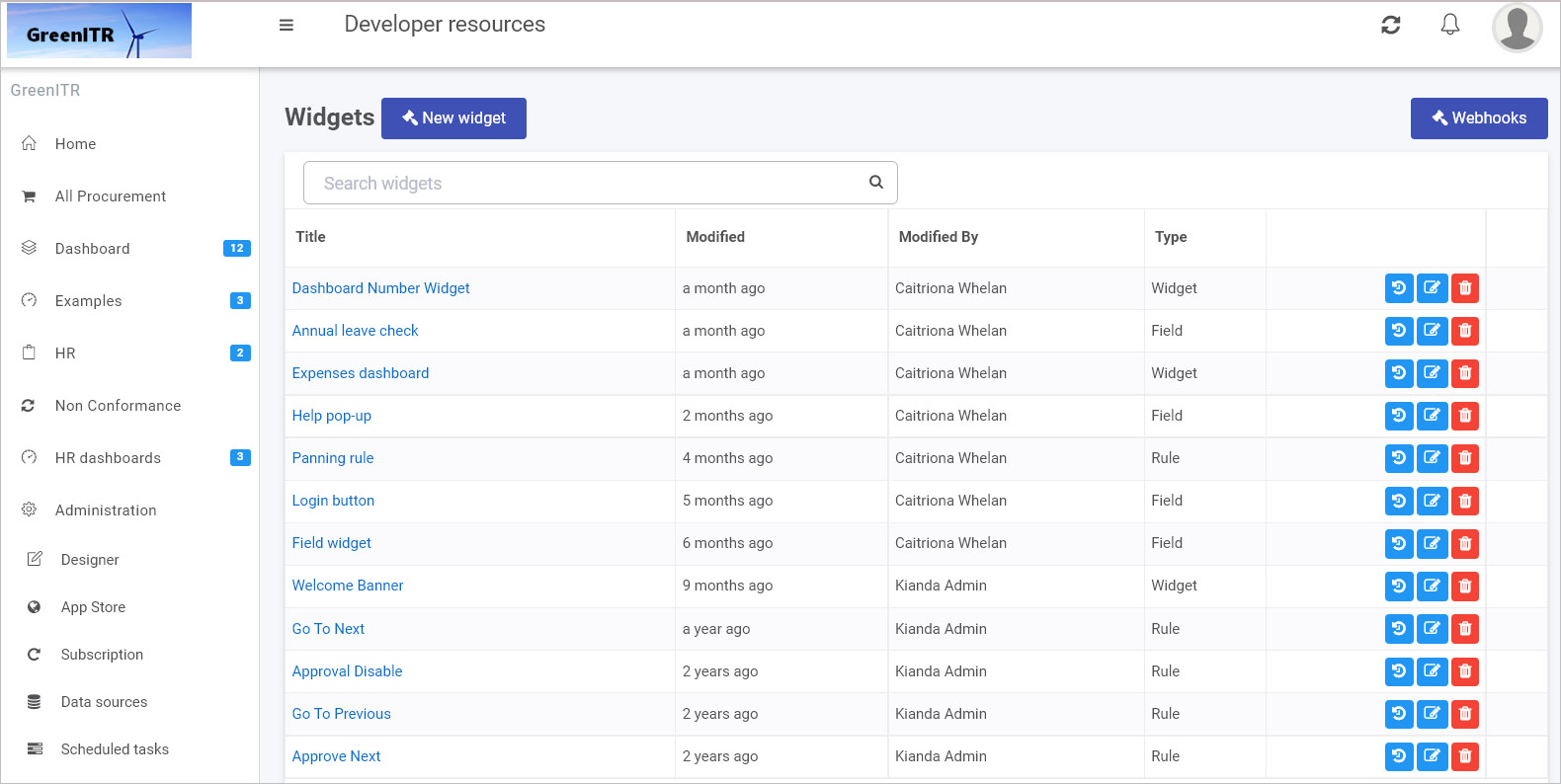

 . Click on Close to exit the dialog box.
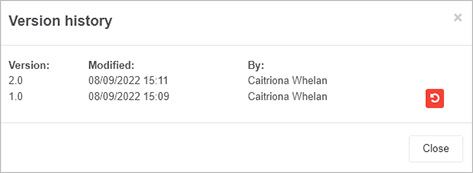


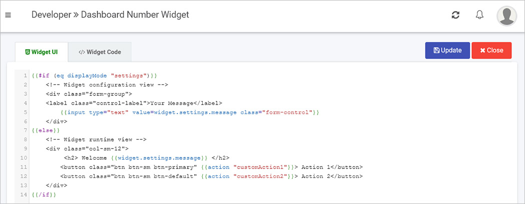
 . Alternatively click on Close to exit the page at any time.
 . This will open the Edit widget dialog box.
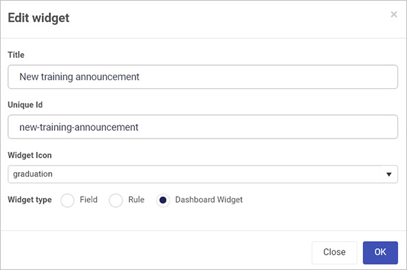
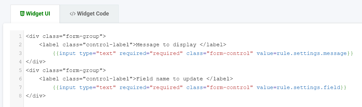
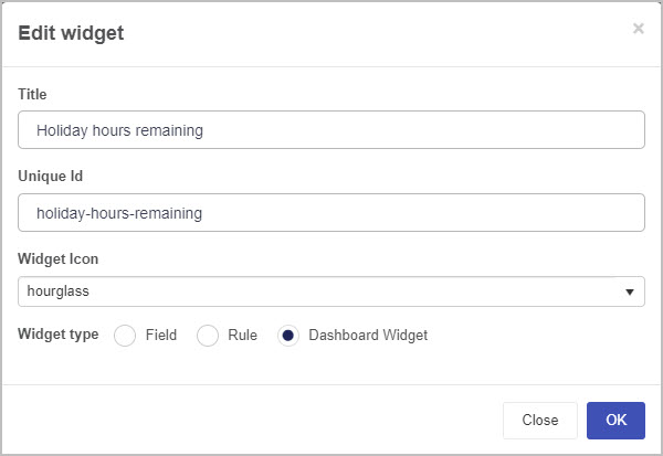
 to save the changes made. The newly created custom widget can be displayed in the view widget pane.
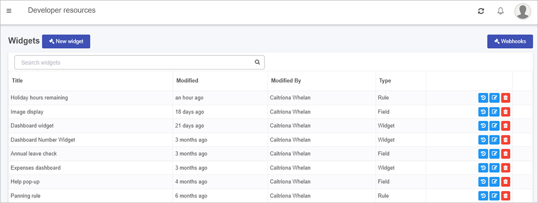
 to view and manage version
 to edit the name and details of the widget
 to delete the widget. Clicking on this button which cause a pop-up to appear asking you to confirm the deletion by clicking on OK or cancel by clicking on Cancel.
 . From there, click the drop-down list button and you will have access to the created custom dashboard widgets.
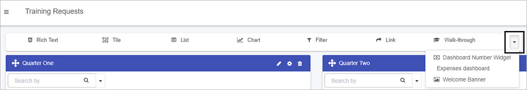


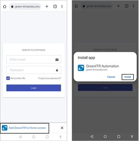

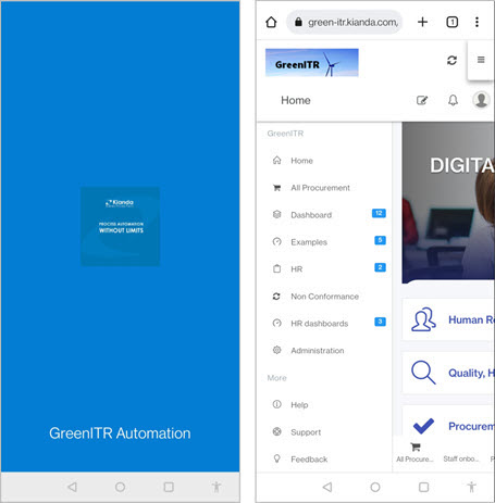
 then tap on Add to Home screen.
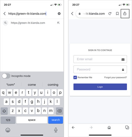
 then tap Add to Home screen.
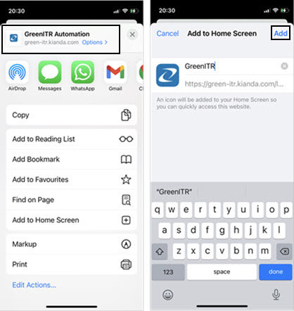
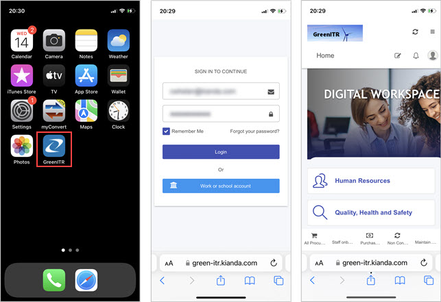
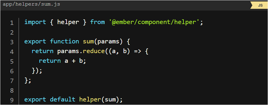
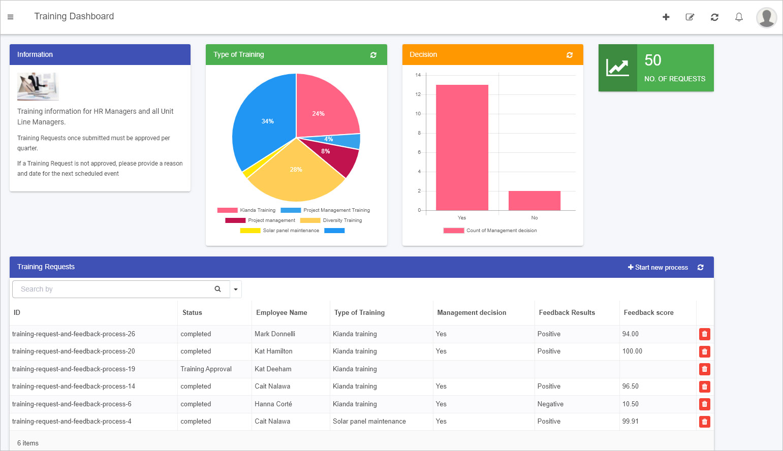
 to go into Edit mode.
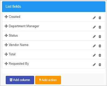
 opens a code editor that allows you to add in code/modify existing code.
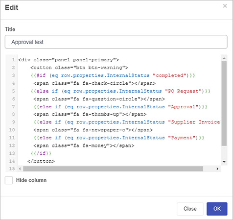
 opens the Add List Action dialog box. This box allows you to add a dashboard button that when clicked will trigger rule execution.
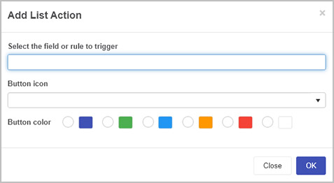
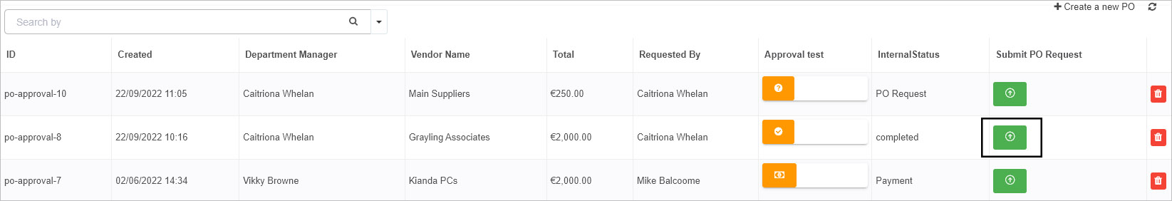
 in the top menu. A pop-up message saying ‘Page saved successfully’ will display.
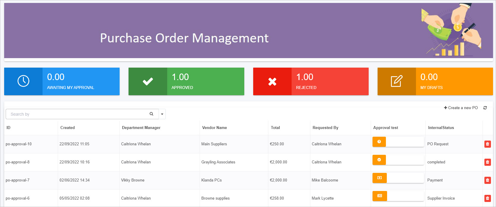
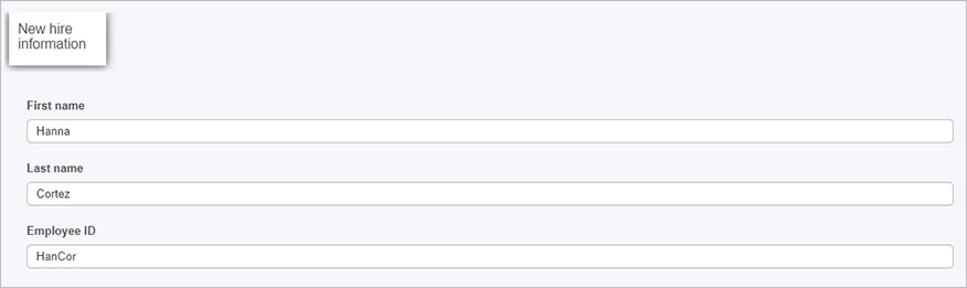
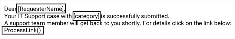
 found in Edit rule dialog boxes and controls like text box, number and rich text.
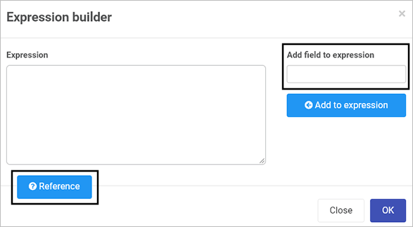

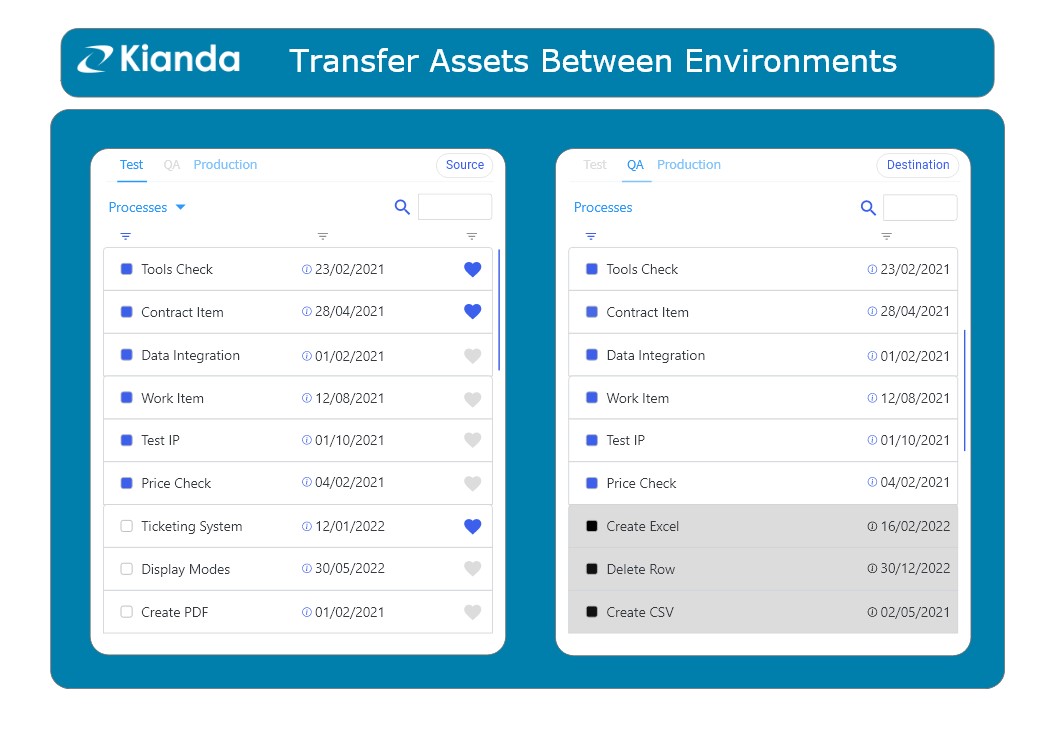
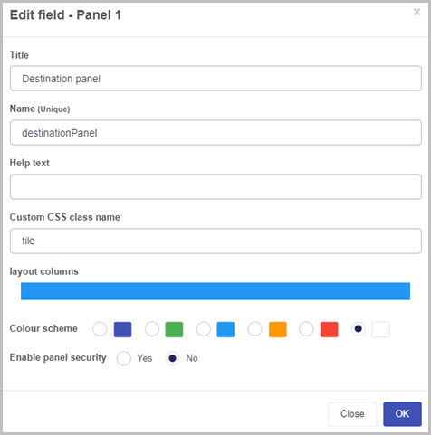

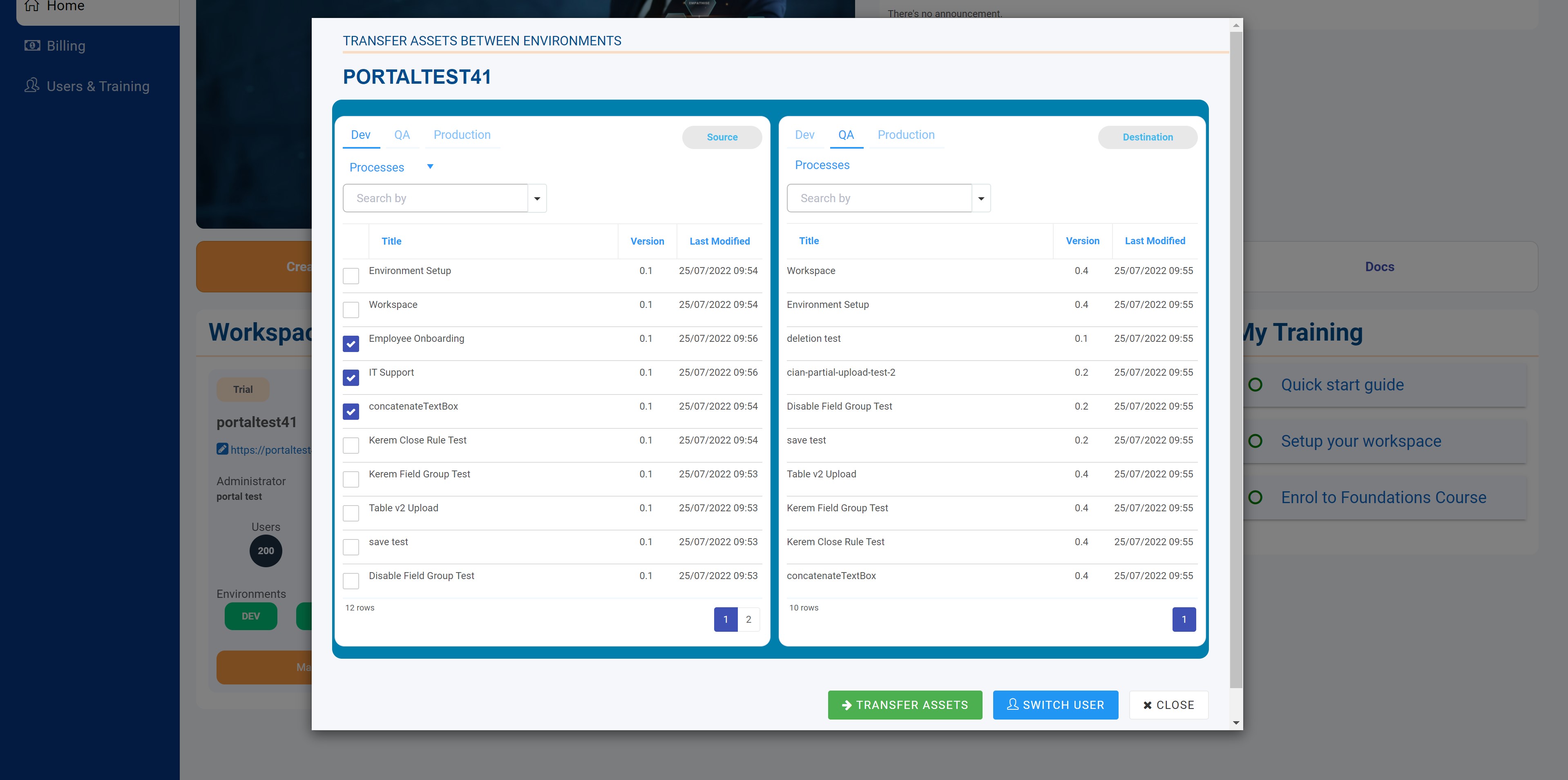
 beside the Custom CSS Url to access the Global CSS file.
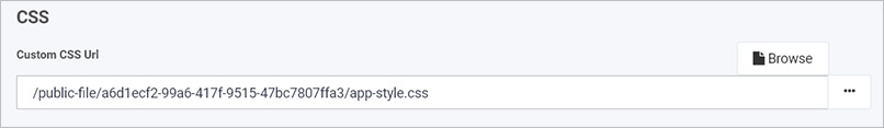
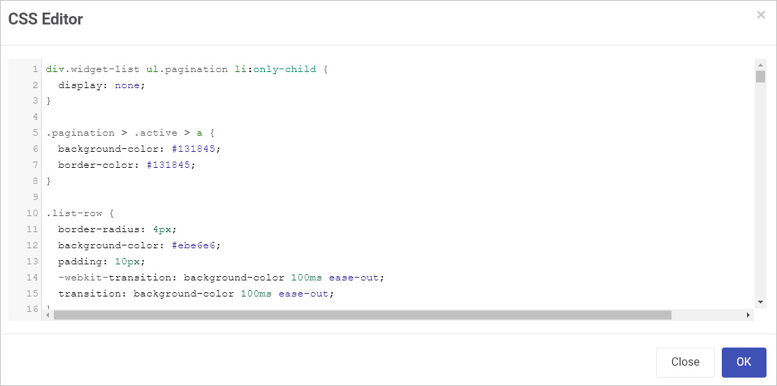
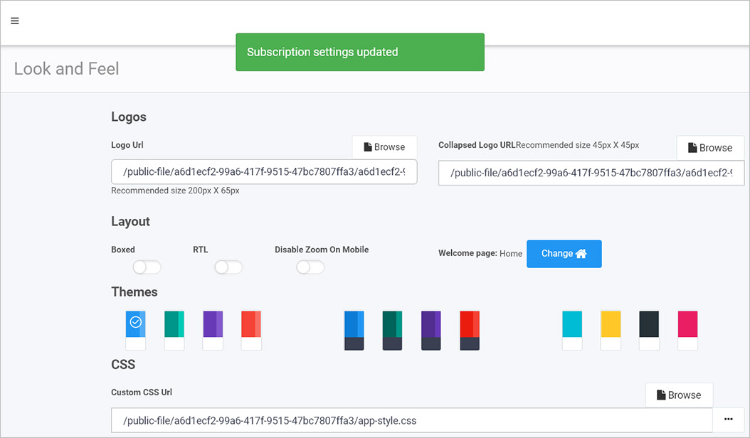
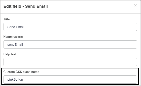
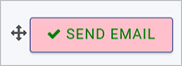
 to open up the code editor.
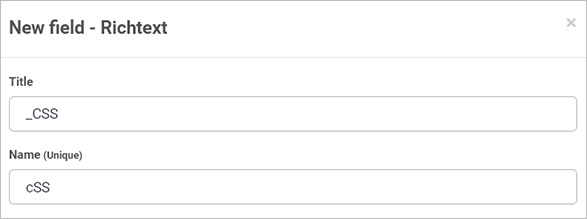
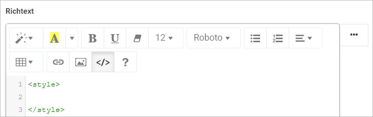
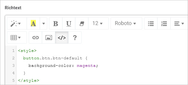
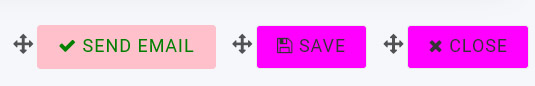
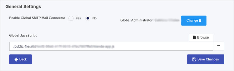
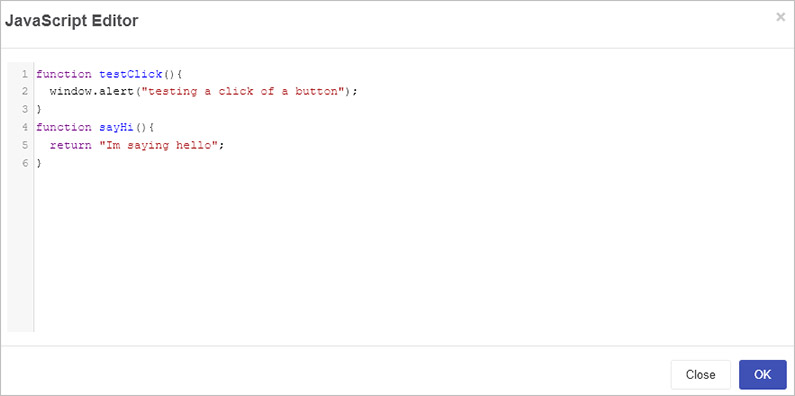
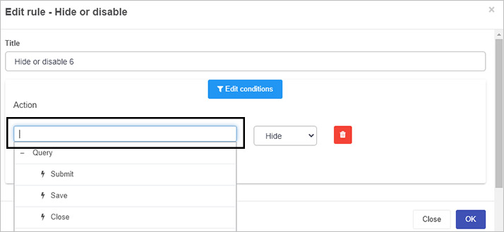
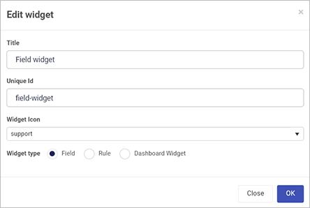
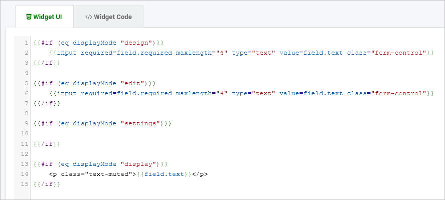
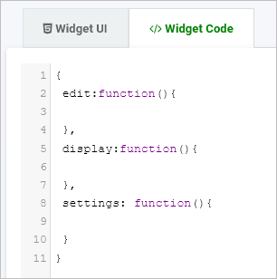
 (Pen icon), delete a widget by clicking on the Bin/Trash button
  and restore earlier versions of a widget by clicking on the Version restore button
  .
.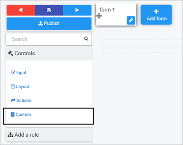
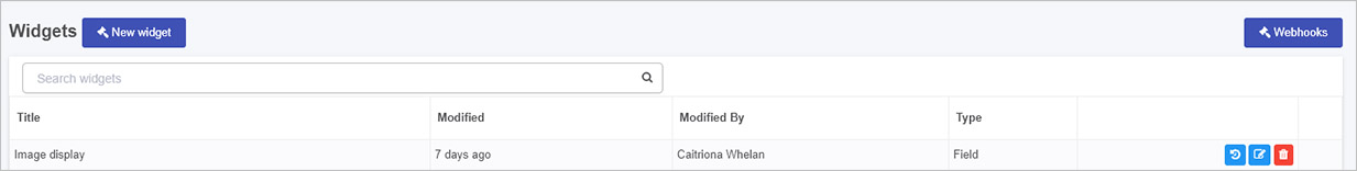
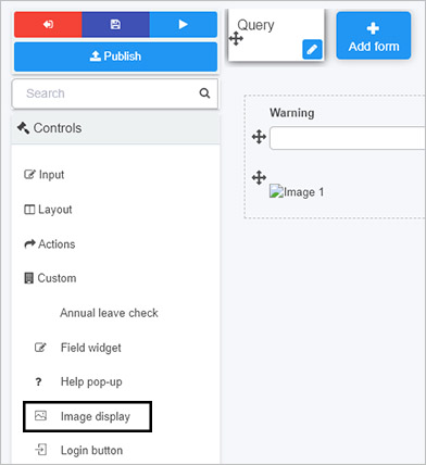
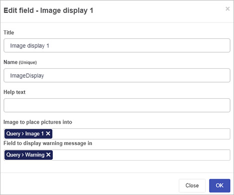
 to save the process.
 to see the new control in action.
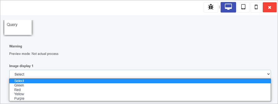
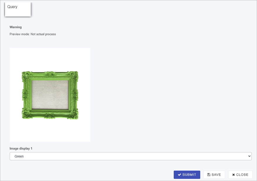
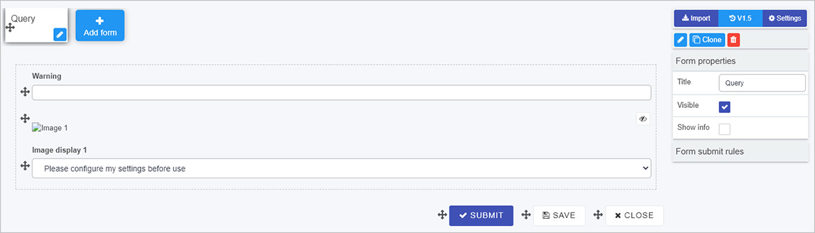
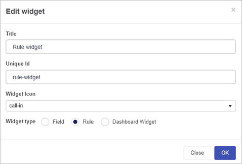
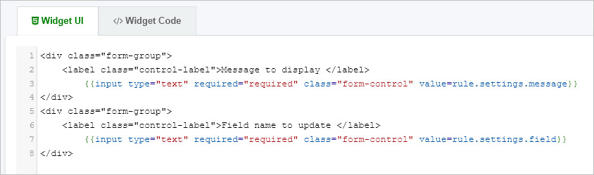
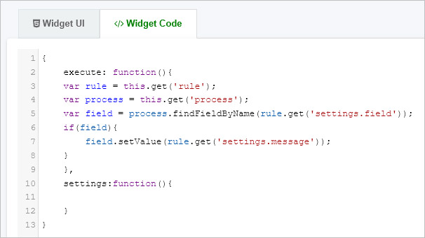
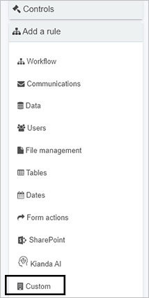
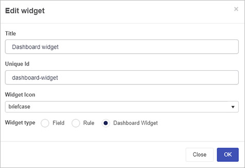
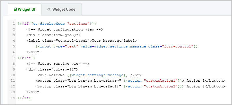
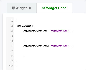
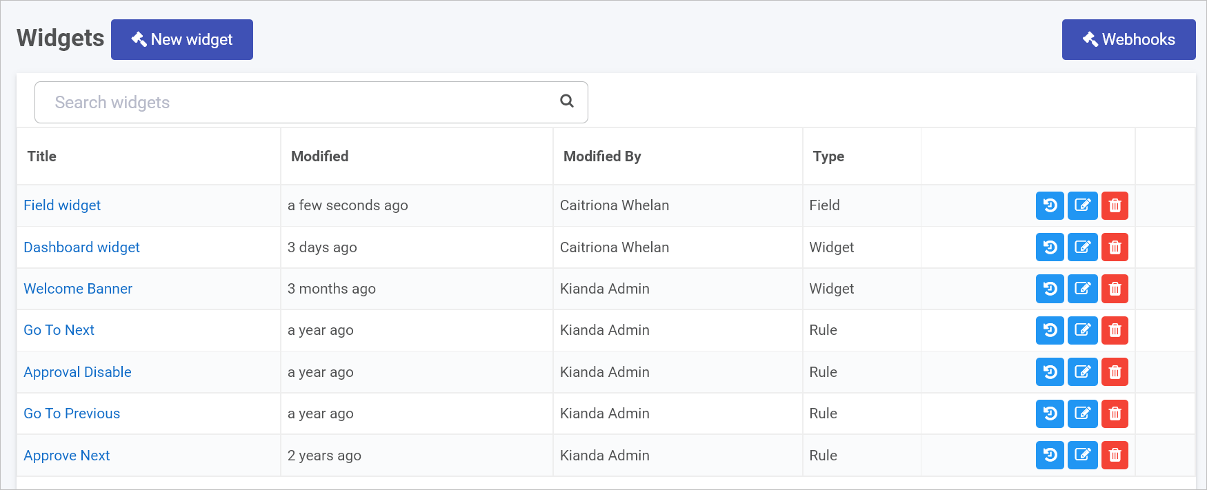
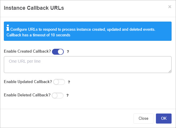
 for clarification.