Custom field development
Introduction
There are currently 16 predefined field or control widgets available to use in forms and processes, covering 3 categories: Input, Layout and Actions. Click on the relevant links to find out more about each area. However if customised fields have been created, they are available to those with the role Administration and Design business process to use in process and form design in Kianda Designer. Customised fields are available under the Custom controls category.
Custom controls are created by Administrators or Developers who have coding experience to use Kianda’s low-code development feature, Kianda Developer. Kianda Developer uses two tabs for each widget created, one for widget UI and one for the widget code. There is a short explanation of the widget UI syntax below.
Handlebars syntax
The widget UI uses syntax called handlebars that can be used by multiple languages. Kianda uses Ember.js framework which uses the handlebars templating library to make changes to the user interface. For example in the code block below, a component called ‘field-picker’ is called using Ember and the properties are also shown below, for example ‘allowText=false’ meaning text cannot be typed in by the user as the user must choose a field or form.
{{#if (eq displayMode "settings")}}
	<div class="form-group">
	<label class="control-label">Image to place pictures into</label>
    {{field-picker process=process required=true allowText=false includes='["fields/field-image"]' value=field.settings.imageDestination}} {{! Allow the user to select an image field to put the frame into}}
    <label class="control-label">Field to display warning message in</label>
	{{field-picker process=process required=true allowText=false value=field.settings.warningMessage}} {{! Allow the user to select a text field to display the warning message in}}
</div>
{{/if}}
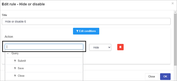
The field picker for example is typically seen in edit rule dialog boxes to allow uses to choose a form field that will be used in rule execution, for example as shown for the Hide or disable rule below.
Other field-related components include field-date, field-group, field-textbox and so on for the 16 predefined fields that exist. These components can be investigated using the Ember inspector add-in, click on the link for details.
How to get started
If you are an experienced developer with an Administrator or Developer role (see Users & Groups), you can create a new custom field/control within Kianda by doing the following:
-
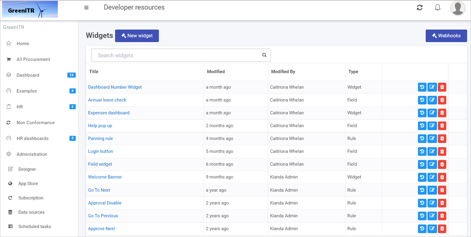
Navigate to Administration in the left-hand side menu, and click on Developer. This will bring you to the Developer resources page. Field widgets are of type ‘Field’ in this list.
Widget view
-
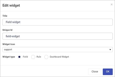
Click on New widget to create a new field/control widget.
-
Fill out the Edit widget dialog box - that is Title, Unique Id (which is autofilled from the title), Widget Icon, where you can select from hundreds of icons, and then Widget type.
-
Click on OK when complete.
-
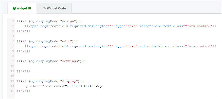
When you create a custom field widget, the Widget UI and Widget Code tabs are displayed. These two screenshots show the default code for ‘Widget UI’ and ‘Widget Code’.
The ‘Widget UI’ defines the HTML, handlers, expressions and more, see Sample widget UI code for an example of code that creates an interactive image display field. The code below uses Ember templating library, Handlebars JS as seen by {{}} below.
Field widget UI
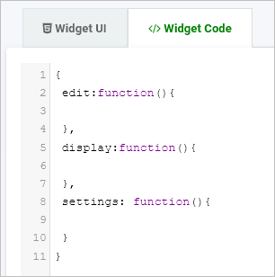
The ‘Widget Code’ defines the logic and functions.
Field widget code
-
Widgets created are visible in the main widget view. From here, you can edit a widget by clicking on the Edit button
 (Pen icon), delete a widget by clicking on the Bin/Trash button
  and restore earlier versions of a widget by clicking on the Version restore button
  .
. -
Custom field widgets you create will be available for use in Kianda Designer by going to Side menu > Administration > Designer > click on an existing process or Add new to add a new process (then click on a form to edit it), and see the Custom fields added under Controls.
Sample widget text
The following sample widget code creates a custom field that can be used to create an interactive form design, see Field output to see how the custom field displays.
You will find commented code that you can try out in the UI tab and code tab of the field widget editor in Kianda Developer.
Sample Custom field Widget UI code is as follows.
{{#if (eq displayMode "design")}}
    <select class="form-control" id="entityType">
  	<option value="">Please configure my settings before use</option> {{! Prompt the user to set the custom fields settings when in design mode}}
	</select>
{{/if}}

{{#if (eq displayMode "edit")}}
  <select class="form-control" id="entityType" onchange={{action 'frameSelected' value="target.value"}}> {{! Dropdown with a call to an action in widget code to change the picture on select}}
  	<option value="">Select</option>
    <option value="https://i.etsystatic.com/9126655/r/il/9e5871/1570989181/il_fullxfull.1570989181_monu.jpg">Green</option> {{! Dropdown is populated with frames to put in the image field}}
    <option value="https://i.etsystatic.com/9126655/r/il/a99539/2385100329/il_570xN.2385100329_l7ju.jpg">Red</option>
    <option value="https://i.etsystatic.com/9126655/r/il/a31b15/2339396272/il_570xN.2339396272_kai0.jpg">Yellow</option>
    <option value="https://i.etsystatic.com/9126655/r/il/b36fd3/3101702890/il_570xN.3101702890_51ek.jpg">Purple</option>
	</select>
{{/if}}

{{#if (eq displayMode "settings")}}
	<div class="form-group">
	<label class="control-label">Image to place pictures into</label>
    {{field-picker process=process required=true allowText=false includes='["fields/field-image"]' value=field.settings.imageDestination}} {{! Allow the user to select an image field to put the frame into}}
    <label class="control-label">Field to display warning message in</label>
	{{field-picker process=process required=true allowText=false value=field.settings.warningMessage}} {{! Allow the user to select a text field to display the warning message in}}
</div>
{{/if}}

{{#if (eq displayMode "display")}}
    <select class="form-control" onchange={{action 'frameSelected' value="target.value"}} > {{! Dropdown with a call to an action in widget code to change the picture on select}}
  	<option value="">Select</option>
    <option value="https://i.etsystatic.com/9126655/r/il/9e5871/1570989181/il_fullxfull.1570989181_monu.jpg">Green</option> {{! Dropdown is populated with frames to put in the image field}}
    <option value="https://i.etsystatic.com/9126655/r/il/a99539/2385100329/il_570xN.2385100329_l7ju.jpg">Red</option>
	</select>
{{/if}}
Sample Custom field widget code is as follows:
{
 edit:function(){
	var field = this.get('field');
    var process = this.get('field.process');
    var warningMessage = process.findFieldByName(this.get("field.settings.warningMessage.name")); //Retrieve the warning message field
    warningMessage.set("visible", true); //Set warning messsage field to visible as we are in edit mode
    warningMessage.set("enabled", false); //Set warning message field to disabled to avoid a user editing the text in it
    warningMessage.set("text", "Preview mode: Not actual process"); //Set the warning message field text
 },
 display:function(){
    var field = this.get('field');
    var process = this.get('field.process');
    var warningMessage = process.findFieldByName(this.get("field.settings.warningMessage.name")); //Retrieve the warning message field
	warningMessage.set("visible", false); //Set warning messsage field to invisible as we are in display mode
 },
  actions: {
    frameSelected: function(image) {
       var field = this.get('field');
       var process = this.get('field.process');
       var imageDestination = process.findFieldByName(this.get("field.settings.imageDestination.name")); //Retrieve the image field selected as the destination
       imageDestination.set("text", image);
     },
  }
}
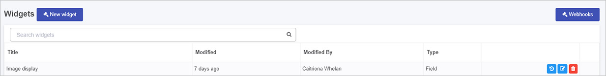
Using the steps in the How to get started section, the sample code above is saved as a field widget called ‘Image display’. This widget is then available in the widget list under Developer resources as shown below.
The widget is then used in a Kianda form as seen in the next section Field output.
Field output
Users with the role Designer or Administrator can access the new control/field widget within Kianda Designer by going to the left-hand side pane, then Administration > Designer.
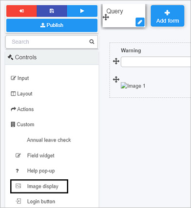
In this example, a process called ‘Support Query’ is created, with a first form called ‘Query’. Two controls are added:
- A text box called ‘Warning’ - this field will hold a warning from the customised field when Preview mode is used.
- An image field called ‘Image 1’ - this field will hold an image from the customised field.
When the new widget is added, it will add a third customised field of field type ‘Image display’ that will populate the other fields in the form.
To use the new widget:
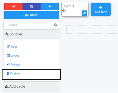
- Go to Controls > Custom > Widget name in this example ‘Image display’. Click on ‘Image display’ to add it to the form.
-
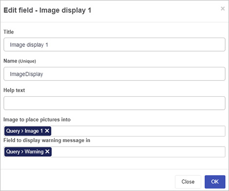
Configure the custom control by clicking on it and completing the Edit field dialog box as follows, mapping the text box and image fields from the form as placeholders for text and images.
-
Click on OK to exit the dialog box and then click on Save
 to save the process.
 -
Click on the Preview button
 to see the new control in action.
 -
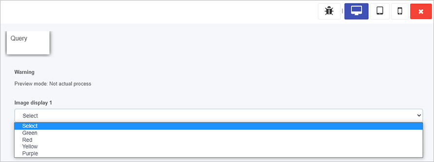
When in Preview mode a warning appears telling you you are in ‘Preview mode’. A drop-down list is available allowing you to choose an image by colour.
-
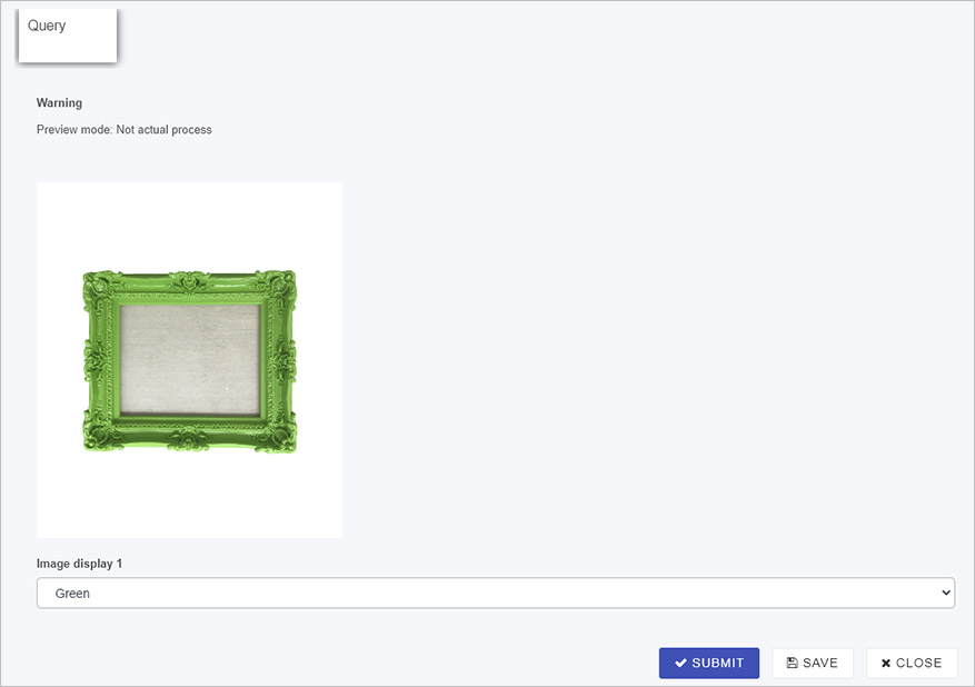
When you choose an option from the drop-down list, then a coloured image appears.
-
From here the user can change to another colour and when complete click on Submit, Save or Close.
-
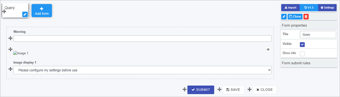
The process design as seen in Kianda Designer is shown in the image below.
What’s next 
To continue with low-code development, you can view Templating basics. If you would like to learn more about ‘no-code versus low-code’ in general, see What is no-code? and What is low-code?.
Feedback
Was this page helpful?
Glad to hear it! Please tell us how we can improve.
Sorry to hear that. Please tell us how we can improve.