Global CSS file
Introduction
Within Kianda there is standard site-wide Cascading Style Sheets (CSS) that forms the default styling on the whole site. However as a workspace Administrator you can add a Global CSS File to make changes to the look and feel of the site as well as the functionality of processes.
You can use the file to target very specific details, for example a button in a particular process as shown below. This code will create specific styling for a button that is defined in a form in a process using Kianda Designer.
.buttonWhite{
    color: white;
    background-color: black;
    padding-bottom: 1px;
    padding-top: 18px
}
CSS can be used not just for to change the look and feel of applications but for functionality within a process, for example to hide a button via CSS and then create a button via JavaScript for a particular action.
The Global CSS file editor exists within the Look and Feel section of the Subscription, within the Administration section of the site, see Subscription for an introduction to the Subscription function.
When to use
Remember the visual style of processes and individual controls like buttons, can be heavily customised using Kianda Designer to achieve a unique look that is both appealing to the eye and practical. Many of these changes can be achieved simply by using the provided customisation controls within Designer, for example selecting a button, and clicking on the Edit/pen icon to make changes.

Selecting the button in this way to edit it, will allow you to select the colour scheme of the control and assign an icon to it from a large library of available icons.
However, you may want to achieve a deeper level of customisation. There are several methods available to combine practicality and ease of user with an aesthetically pleasing design. One option is to modify the Global CSS File when you want to change the look and feel of the site or your processes. You can do this by applying a Custom CSS class name to any of the controls fields available in Kianda, and creating a class selector within the Global CSS File available globally in the Subscription function within Administration.
Before you get started
The key to building functional and aesthetically pleasing workspaces and processes within Kianda is to plan ahead and create a design in advance that you can then use as your vision and mould your process or workspace into. Design tools can be used to create visual mock-ups of the processes and workspaces you would like to create, for example the mock-up below was created using Adobe XD.
Bootstrap has released a library that can be imported into Adobe XD that allows you to create designs using bootstrap elements. This allows you to see all of the available components you have to create your processes and workspaces, and then create visually pleasing and functional designs using these elements.
The mock-up was then used as a plan to create this process. You don’t have to create processes or workspaces exactly the same as the mock-ups to create during the planning stage, but they act as a great reference and allow you to have a solid foundation to build off of whilst still being able to deviate from the design when the need arises. Go to Create your first Kianda process for advice and tips on planning processes. To help you in planning your CSS design, see the sections below.
Effective use of CSS classes in Kianda
You may be familiar with the concept of using CSS classes to apply styling to several elements, Kianda works on the same premises. Simply define a class within the Global CSS file, put some styling into the class and finally apply the same class to a Kianda element.
.tile {
     border-radius: 12px;
     border: 1px solid #e7eaee;
     background: white;
     margin-bottom: 15px;
     padding-bottom: 2px;
     padding-top: 18px;
     padding-right: 15px;
}
It is good practice to use relevant and descriptive names for these style rules. In the example above we have a “tile” section with styling rules to style an element to that the appearance of a tile.
When your class style is defined and ready to apply, add “tile” in the Custom CSS class name field of any Kianda element you want to take the apply that appearance to.
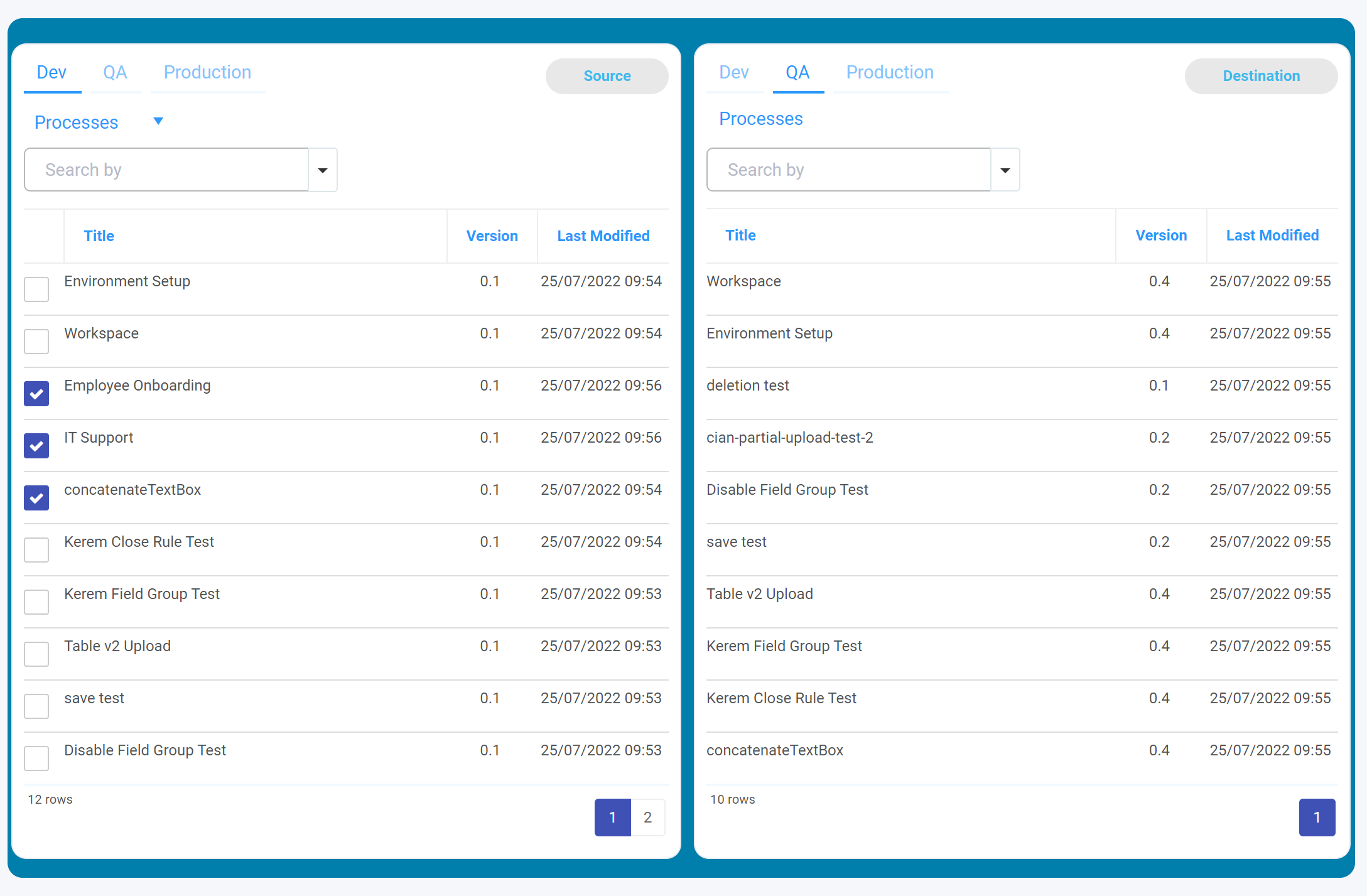
In the image below “tile” was used to style these two panels into two tiles aligned side by side.
The benefit of this method is that styles can be created once and very quickly applied to elements anywhere in your Kianda platform. This saves process designers having to revisit the CSS file every time they are creating a new process or dashboard.
Small touches example
Here is another example of that demonstrates how you can create a defined and recognizable design without bloating the visuals of your workspace. In this example the below style rule is used to add a gold underline to the header titles of processes to separate the title of the page and the specific course you are currently viewing.
.headerTitle {
  font-size: medium;
  text-transform: uppercase;
  color: #004B8B
  margin-right: 10px;
  border-bottom: 3px solid #F9DCC1;
}

Adding small details like this can have a great affect on the aesthetic of your Kianda platform.
Using Font Awesome icons
In addition to creating customised styling, you can add icons to your controls, such as buttons, or to your dashboard display as shown in the image below, to make your workspace features stand out.
Icons from the Font Awesome icon library can be added using HTML to act as buttons. This creates a more visually appealing layout and the function can be instantly recognizable to users by the icon you choose. Once you have found an icon you wish to use you can then use the provided HTML on the website to add it to your Kianda workspace, it can then be wrapped in a HTML link tag to turn it into a usable button.
You can have icons display before or after the controls by using a CSS rule, for example use a ‘before’ selector in CSS to make the icons display as shown in the image above. The CSS rule can be given the Unicode ID of the Font Awesome icon you wish to display and the browser will render the icon at runtime.
a:before {
    font-family:"Font Awesome 5 Free";
    content: "\f007"
    display: inline-block;
    padding-right: 10px;
    vertical-align: middle;
    font-weight: 900;
}
For more information on Font Awesome icons go to this documentation link or see this cheatsheet of Unicode IDs for icons, for example F007 used in the code snippet above is a user icon, while F015 is the home icon, seen in the image above. You can test out designs using this JSFiddle or code playground.
Using modals in form design
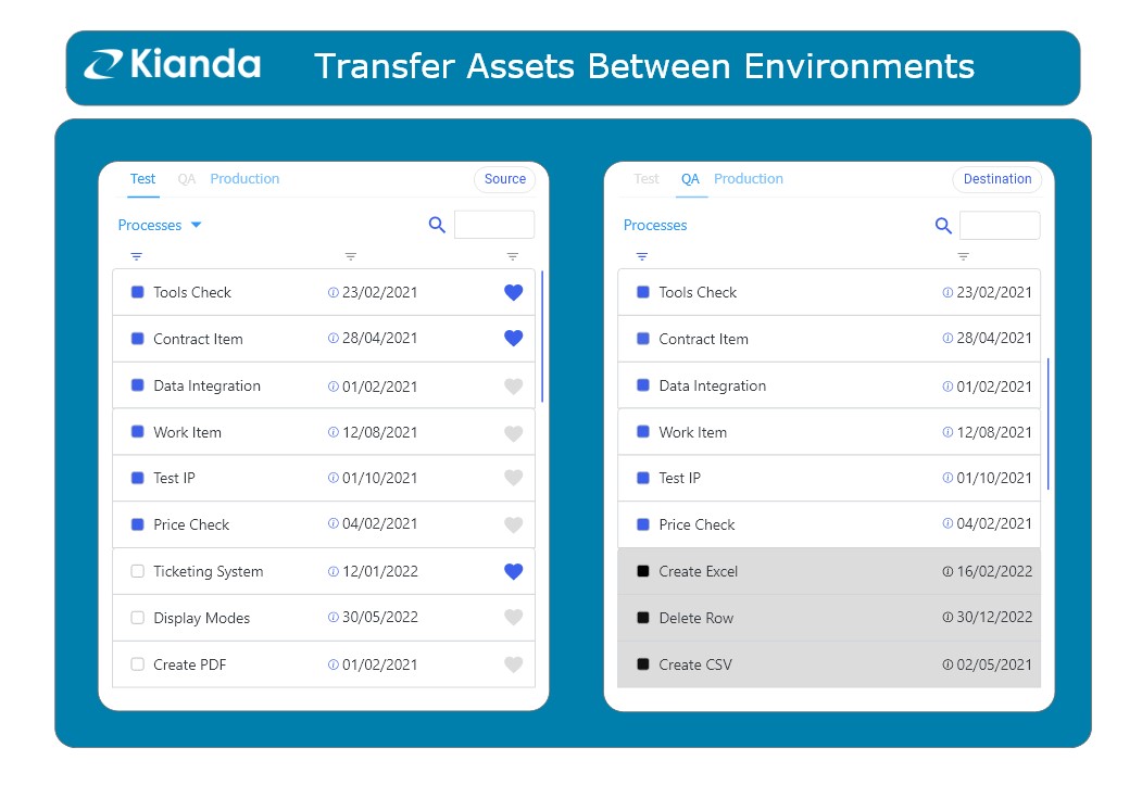
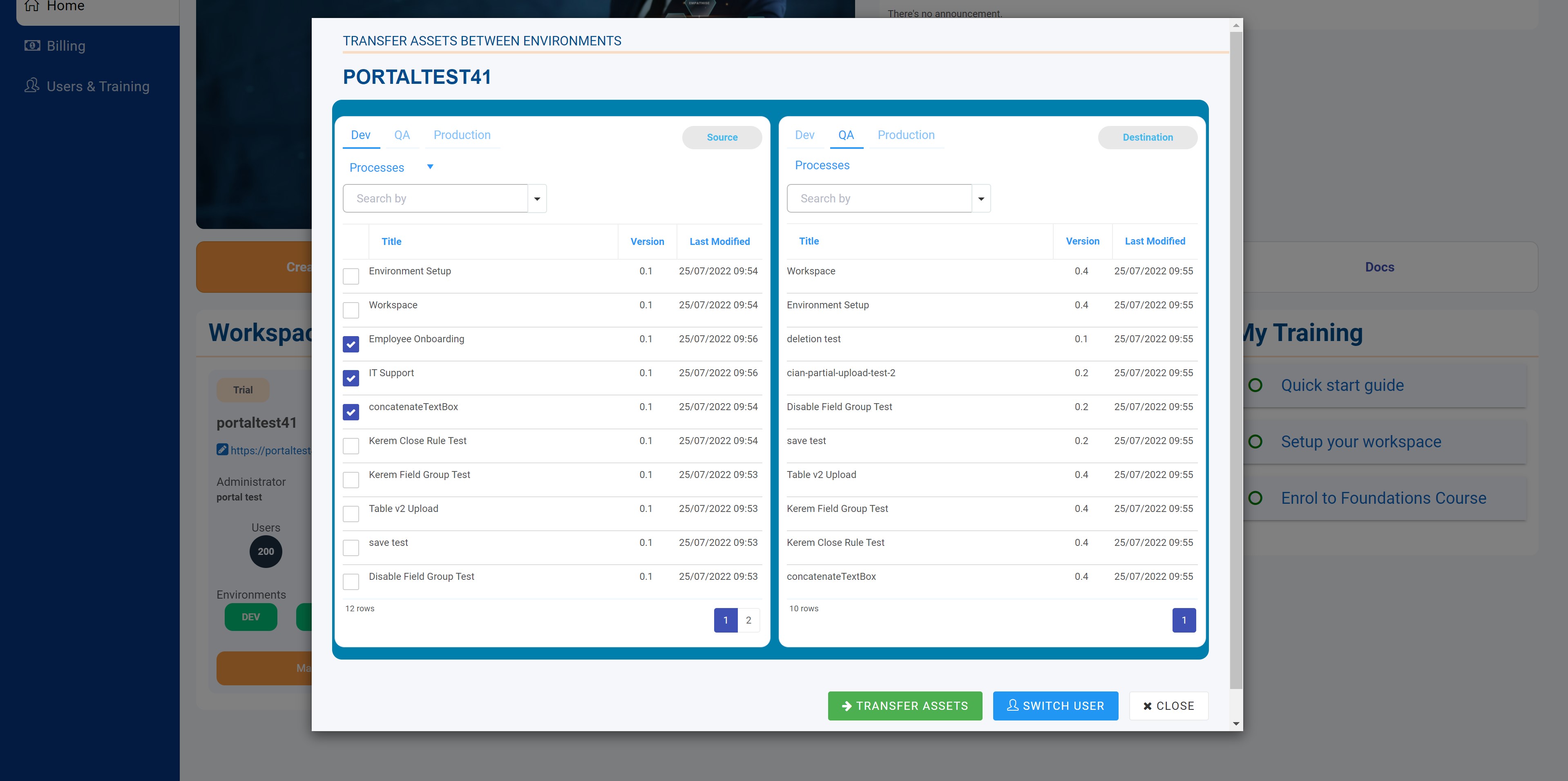
In addition to styling forms and form elements, modals provide a useful way to communicate with users by displaying information in front of page content requiring the user to engage with an action within the modal . In the example below, you can see how the Transfer assets modal appears on the page, requiring users to view and interact with functionality contained within the modal without having to navigate away from the current page they are on. This is not only convenient for the user but it adds a layered design to your Kianda platform and its aesthetically pleasing to view.
A JavaScript function called showModalForm can be called to display a page in a form modal.
<a onclick="showModalForm('demo-process','demo-process-1',true, '&formName=SignUpform')">Open Demo Process</a>
This function also allows you to pass data into the modal for use within that form, typically:
nameOrUrl- you can add in a) name of a process for exampledemo-processor b) a process instance for exampledemo-process-1if you want to go to an existing process instance, and set the next parameter tofalsesee point 2 below, or c) add in a URL, where the URL might be a website to open in the modal.isNewparameter - wheretruecreates a new process instance, otherwise choosefalseto open an existing process instance in preview mode and provide the name of the instance as mentioned in b) above.params- URL parameters appended to the URL, for example ‘SignUpform’ as used above where formName parameter is reserved; if the form is active, the user can be directed to the specified form
Now that you have been introduced to a variety of design considerations, go to the next section to learn how to use the Global CSS Editor.
How to get started with Global CSS
To create a global design and give you the flexibility to change the workspace, use the Global CSS file. You can use the file to target for example buttons in a particular application.
-
As an administrator, go to Administration > Subscription.
-
Click on Look and Feel.
-
On the Look and Feel page, click on the ellipsis button
 beside the Custom CSS Url to access the Global CSS file.
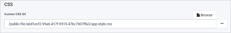
-
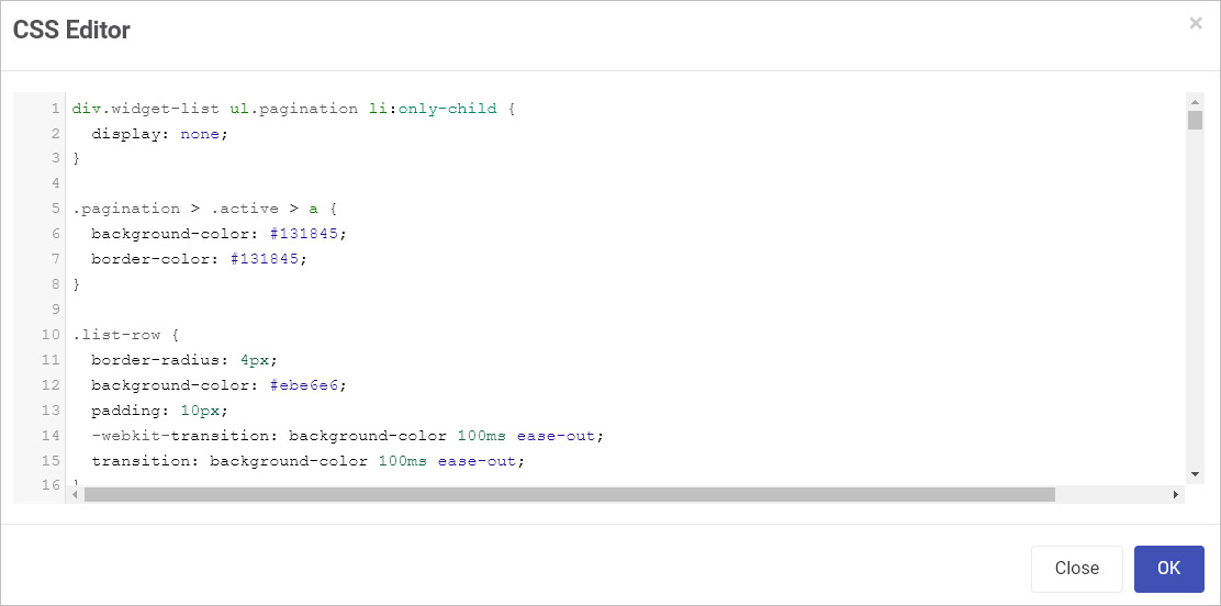
The CSS Editor opens, allowing you to add CSS, or edit code if your organisation has already added in styling. The image below shows an example of code that has been added in.
-
Within the file you can create your own styling, for example:
- Class selectors example
.widget-list-row { border-radius: 5px; background-color: #ffffff; padding: 10px; transition: background-color 100ms ease-out; }- Class selector and element example:
.pagination > .active > a { background-color: #101641; border-color: #101641; }-
Elements and attributes example:
.field-panel[data-name$="?tile-view"].form-group { border-radius: 12px; border: 1px solid #e7eaee; background: white; margin-bottom: 15px; padding-bottom: 0px padding-top: 18px; padding-right: 15px; } -
Media controls example:
@media only screen and (max-width: 767px) {
  .field-panel[data-name$="?tile-view"].form-group:not(.is-design) {
   background: whitesmoke;
  }
}
The next section deals with Adding items to the file.
Adding items to Global CSS
Remember additional items can be added to the file whenever you wish. Best practice is to update only individual items based on the Unique Name which becomes an attribute. The example below uses the concept shown of CSS classes as shown in the section Effective use of CSS classes.
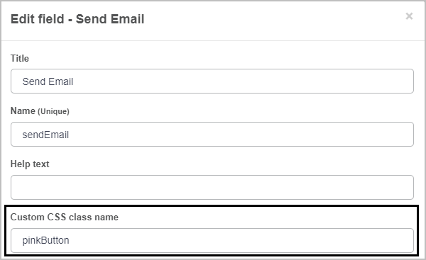
Customised button example
For example, if you have a button in a process and you want to change its background colour and text colour, first you need to add a Custom CSS class name to the provided text box within the button options. Next, because you only want to target the button in a specific process, you will need to use an element selector. This will take the form of:
.pinkButton > button {}
-
Within the Global CSS File add the necessary details, for example the above along with the necessary CSS properties, for example:
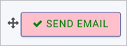
.pinkButton > button { color: green; background-color:pink; } -
When you are finished making changes click on OK or else click on Close at any time to close the dialog box.
-
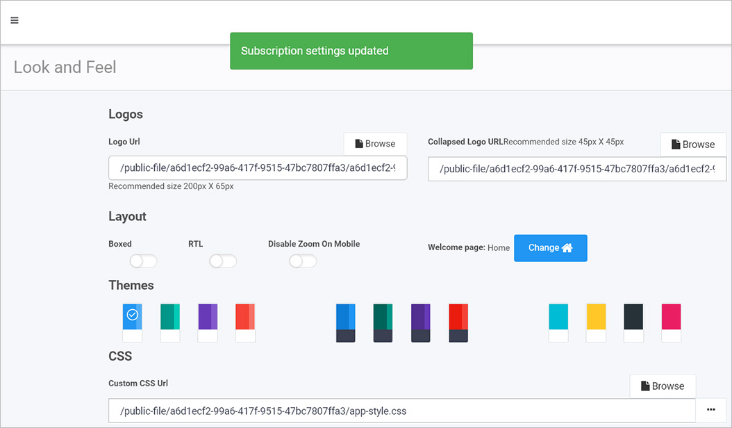
Ensure to save changes to the file by clicking on the Save Changes button in Look and Feel. You should see a notification to say Subscription settings updated.
Once the file is saved ensure to refresh Kianda to download the most recent changes into the cache.
-
Click on Back to return to the Subscription page and go to Administration and Designer to navigate to the desired process. Within that process select the button that needs the custom CSS.
-
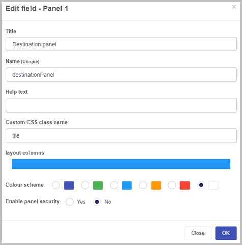
Click on the Edit/Pen button to edit the field and enter the attribute name into the Custom CSS class name field.
-
Click on OK to submit changes or click on Close at any time to exit the dialog box.
-
When the process is viewed in preview mode or published the Global CSS will override the default system CSS.
The steps above can be used to edit any element in the subscription using any standard CSS syntax.
Process and dashboard specific CSS
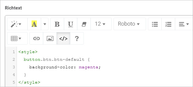
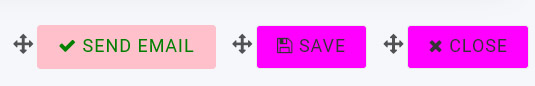
The steps in the Adding items to Global CSS section provide a perfect means to ensure your CSS is available throughout the workspace subscription. However changes may unintentionally cause changes in other parts of the system. For this reason, it possible to add localised CSS to each process and dashboard through a rich text field. For example, if you want to change all buttons in the process to have a background colour of Magenta, you can follow the following steps.
-
Navigate to the process and add a Rich Text field.
-
Give the field a title _CSS. Within the Rich text field click on the Code View button
 to open up the code editor.
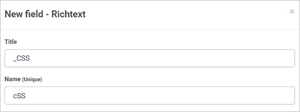
-
Enter the
<style></style>tags into the body.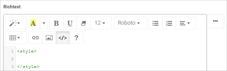
-
Click the Code View button again to commit the change and click OK when you are finished editing the dialog box, or click on Close to exit the dialog box at any time.
-
To make all buttons show the changes, use the class selector by editing the richtext field again and go into the Code View and add the necessary CSS.
-
Click on the Code View button again to commit changes and then click on OK when you are finished editing the dialog box.
-
The buttons now have a background colour of magenta provided they do not have a custom colour already selected.
The steps above can be used to edit any element in a process or dashboard using any standard CSS syntax.
What’s next 
To review the range of fields available in Kianda that can have styling applied go to Controls.
To learn more about designing processes go to Application designer.
To learn more about dashboards go to Dashboard pages.
Feedback
Was this page helpful?
Glad to hear it! Please tell us how we can improve.
Sorry to hear that. Please tell us how we can improve.