Low-code customisation options for the list widget
Introduction
In the dashboard pages how to create a dashboard page is described, so that you can display data from your processes and monitor how processes are performing, for example number of requests submitted, use of the KiandaAI rule to extract a sentiment score from user input, number of ‘completed’ processes and so on.
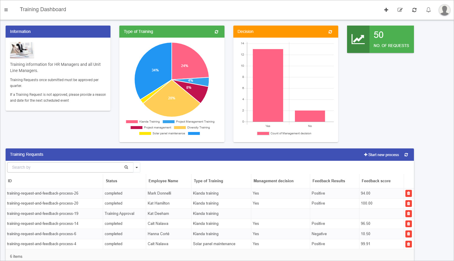
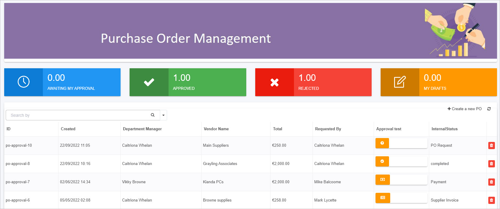
The List widget is introduced within the dashboard pages section. Where the list widget displays the process instances or records of selected process(es) in the dashboard. An example of a list widget is shown in the image below, where the ‘Training Requests’ list displays the ID of a process instance, the status of that process instance and employee name of the person who submitted the initial request, amongst other data.
It is easy to configure this widget to have it filter and display data the way you want by following the steps at Configure your widget. However in addition to these steps you can use HTML to change the display. The next section How to get started runs through an example of how to change the look and feel of a list widget.
How to get started with List widget customisation
As with any of the seven pre-defined dashboard widgets, it is easy to add a List widget to your dashboard simply by clicking on a widget of choice, see How to add widgets to a dashboard page. The List widget as it is offers a huge range of configuration options from using conditions to display the desired data which can include both design fields and Kianda’s built-in process fields to display as well as enabling sorting, filtering and searching.
In addition if you have an administration role, you can customise how the list widget displays as follows:
-
Select a dashboard page and click on Edit current page button
 to go into Edit mode.
 -
Select List from the dashboard widgets menu if a list widget doesn’t exist.

-
If a list widget already exists click on the Edit/pen button to edit the list widget.
-
The Edit widget dialog box opens. Follow the steps in Configure your widget to configure the widget the way you want.
-
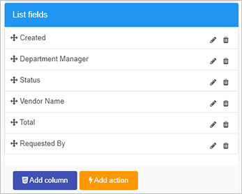
When you have chosen the fields you want to display they will appear in the List fields section of the dialog box, by clicking on List fields.
-
At the bottom of the List fields section there are two buttons:
-
Add column - clicking on this button allows you to add another column to your widget and add styling in the editor section, see step 7.
-
Add action - clicking on this button allows you to select a field that has rules attached to trigger or rule to trigger, see step 8.
-
-
Clicking on Add column
 opens a code editor that allows you to add in code/modify existing code.
- In the Edit List Column dialog box, give the new column a Title and add in/change code by clicking in the central panel.
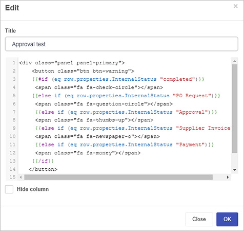
- There is an option to Hide column by checking the checkbox. The example above is explained in more detail in the section below Example of list widget customisation
-
Clicking on Add action
 opens the Add List Action dialog box. This box allows you to add a dashboard button that when clicked will trigger rule execution.
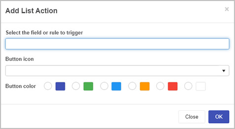
The dialog box has four fields:
-
Select the field or rule to trigger - here you can select a form field or rule attached to a field to execute rules from the dashboard by clicking on a button.
-
Button icon - choose from hundreds of icons for your dashboard button.
-
Button color - choose from a range of colours for your dashboard button.
-
For example if the ‘Submit’ button for a form is chosen for the above, then all rules attached to that button can be executed by the click of a button from the dashboard.
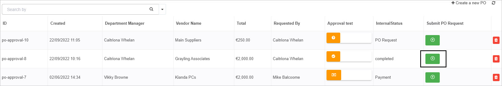
For example for the process instance ‘po-approval-8’ above, even though this process is completed, rules/actions linked to a form field can be triggered again simply by clicking on the button in the dashboard.
-
When you are finished editing code, click on OK or alternatively click on Close at any time to exit the dialog box.
-
Make sure to save changes to the dashboard page by clicking on the Save button
 in the top menu. A pop-up message saying ‘Page saved successfully’ will display.
Example of list widget customisation
In the image above for step 8, Add column, you can add code that adds a button to a dashboard display.
<div class="panel panel-primary">
<button class="btn btn-warning">
{{#if (eq row.properties.InternalStatus "completed")}}
<span class="fa fa-check-circle"></span>
{{else if (eq row.properties.InternalStatus "PO Request")}}
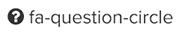
<span class="fa fa-question-circle"></span>
{{else if (eq row.properties.InternalStatus "Approval")}}
<span class="fa fa-thumbs-up"></span>
{{else if (eq row.properties.InternalStatus "Supplier Invoice")}}
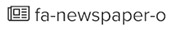
<span class="fa fa-newspaper-o"></span>
{{else if (eq row.properties.InternalStatus "Payment")}}
<span class="fa fa-money"></span>
{{/if}}
</button>
In the code above the new column will show a button based on a field that returns the status of a process instance. This particular process has 5 different states:
- Four states that relate to the current form that the process instance is in, these four forms are named above: ‘PO Request’, ‘Approval’, ‘Supplier Invoice’, ‘Payment’
- One state that indicates that a process instance is complete, that is all four forms have been completed, so the process status is ‘completed’.
These states are derived from the system field ‘Status’ (see Process Common Fields which is mapped to a process form field called ‘Internal status’. The unique ID/name of this form field is InternalStatus as seen in the code above.
Use of Font Awesome icons
As Font Awesome icons are already loaded into Kianda, then we can take advantage of the iconography and map imagery to process instance states. Depending on the process instance status described in the section above, then different icons will appear. The icons chosen in this example are:
| Dashboard Icon | Process Instance Status |
|---|---|
 | PO Request |
 | Approval |
 | Supplier Invoice |
 | Payment |
 | Completed |
When the steps in How to get started are followed and the code is added using the Add column button then the resulting dashboard looks like this.
You could also use JavaScript to add actions to the buttons in the dashboard. These could be functions set in the Global JavaScript file, see Global JavaScript file for details.
Feedback
Was this page helpful?
Glad to hear it! Please tell us how we can improve.
Sorry to hear that. Please tell us how we can improve.