Using the Ember Inspector
Introduction
Kianda uses front-end technologies like CSS and JavaScript and more specifically a framework called Ember.js that is an open-source Javascript web application that allows you to build highly interactive applications that use JavaScript in a quick and efficient manner. Ember UIs use HTML meaning that everything you see on screen in Kianda is defined in a HTML template somewhere within the Kianda application. Ember allows you inspect components found in Kianda forms on screen for example a button, a rule, a panel and so on. You can use this knowledge to create your own rule, field, dashboard and data connector widgets.
To get the make the most out of your Kianda customisation we recommend installing and using the Ember inspector to help you understand what Kianda components are available, what their properties are and how they are used. The next section details how you can get started with Ember.
How to get started with Ember Inspector
The Ember inspector is a Chrome plug-in that allows you to investigate and understand your Ember.js. This browser add-on can be installed on Google Chrome, Firefox and other browsers. For example to install the add-on in Chrome, go to the Chrome web store, search for ‘Ember inspector’ and then in the search results click on the add-on and Add to Chrome.
To get started using the Ember inspector:
-
Click on Add extension.
-
Open your Kianda workspace, for example https://your-organisation.kianda.com
-
Log in to Kianda, then navigate to a form, and open the Ember inspector by right-clicking on a page for example in Google Chrome and click on Inspect.
-
Then click on the Ember tab.
-
In the left-hand pane you will see Components, View Tree, Routes, Data and Depreciations amongst other options.
-
In the central pane you can drill down to a particular component, for example, in the form below, a Hide or disable rule is about to be added. You can see what the components are within this modal/edit rule dialog box by scrolling over the components in the central pane.
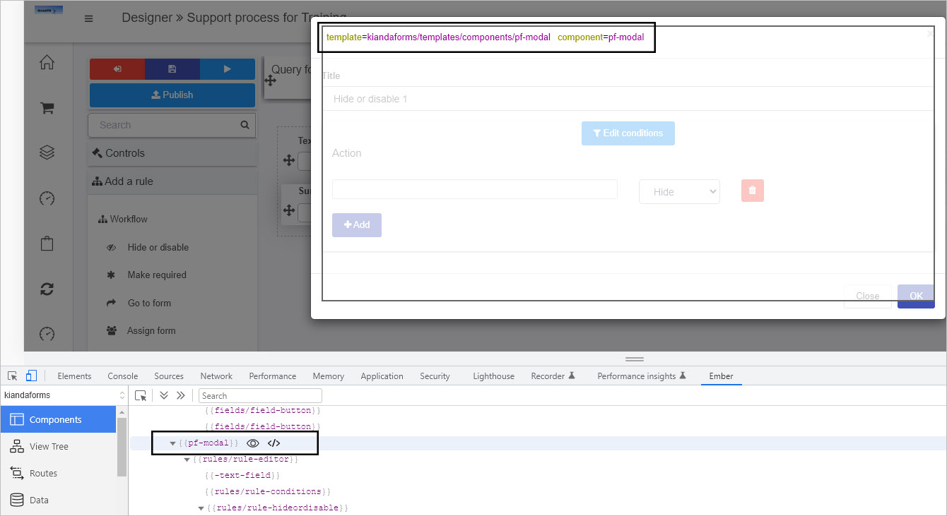
By highlighting the rule editor component we can see the template used.
-
If you click on the component itself, then the properties of that component appear in the right-hand pane. For example the properties of a field-picker component are seen in the image below.
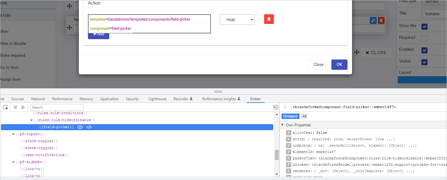
Using the Ember inspector you can view all the components within Kianda and the properties associated, for example by default the field-picker component used in the modal in step 6 has a property ‘allowText’ false, that is text is not typed in but the user chooses form elements from a drop-down list.
Further information is given on the field-picker component below. To read more about Ember.js go to https://guides.emberjs.com/release/ in particular the Components pages as well as other Core concepts.
Component example
The widget UI uses syntax called Handlebars that can be used by multiple languages. Kianda is built using Ember.js framework which in turn uses the Handlebars templating library to make changes to the user interface. The following is an example of widget UI code:
{{#if (eq displayMode "settings")}}
	<div class="form-group">
	<label class="control-label">Image to place pictures into</label>
    {{field-picker process=process required=true allowText=false includes='["fields/field-image"]' value=field.settings.imageDestination}} {{! Allow the user to select an image field to put the frame into}}
    <label class="control-label">Field to display warning message in</label>
	{{field-picker process=process required=true allowText=false value=field.settings.warningMessage}} {{! Allow the user to select a text field to display the warning message in}}
</div>
{{/if}}
In the example code block above, the ’field-picker’ component is called using Ember and the associated component properties include:
- ‘
allowText=false’ meaning text is not entered into the field picker by a user - ‘
required=true’ meaning the field has to be completed, that is a field chosen, for the form to be submitted - ‘
value=field.settings.warningMessage’ meaning an input value will be stored in thewarningMessagefield
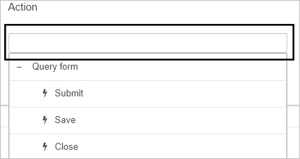
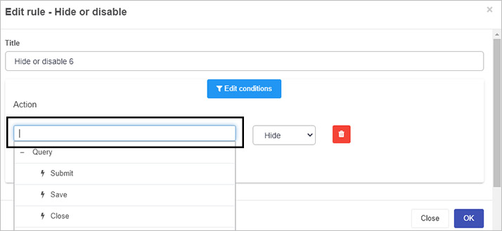
The field picker for example is typically seen in Edit rule dialog boxes to allow users to choose a form field that will be used in rule execution, for example as shown for the Hide or disable rule below.
Other field-related components include field-date, field-group, field-textbox and so on for the 16 predefined fields that exist. A table of field-related components is listed below with attributes that can be found using Ember inspector.
Field-related components
| Component | Example of attributes |
|---|---|
| field-base | field: , displayMode: design … |
| field-button | isFooter: true, field: … |
| field-component | |
| field-date | tagName: , field: [Object] … |
| field-dialog | tagName: , field: [Object] … |
| field-file | tagName: , field: [Object] … |
| field-globalpayments | |
| field-group | tagName: , field: [Object] … |
| field-image | tagName: , field: [Object] … |
| field-imagegallery | |
| field-link | tagName: , field: [Object] … |
| field-list | tagName: , field: [Object] … |
| field-number | tagName: , field: [Object] … |
| field-panel | field: [Object], displayMode: design … |
| field-picker | required: true, selectForms: true … |
| field-signature | tagName: , field: [Object] … |
| field-table-row | tagName: tr, field: … |
| field-table | tagName: , field: [Object], … |
| field-text | placeholder: [Object], required: [Object] … |
| field-textbox | tagName: , field: [Object] … |
| field-toggle | tagName: , field: [Object], … |
| field-userpicker | tagName: , field: [Object], … |
| table-row | tagName: tr, field: …. |
Feedback
Was this page helpful?
Glad to hear it! Please tell us how we can improve.
Sorry to hear that. Please tell us how we can improve.