This is the multi-page printable view of this section.
Click here to print.
Return to the regular view of this page.
Administration
The Administration menu contains all the functions you need to maintain your Kianda workspace.
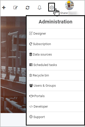
The menu is found in the left-hand side pane when you log in to Kianda, or on the top right toolbar depending on the chosen orientation. This menu will only appear if you have a certain role, for example Administrators will see all items shown in the image below.
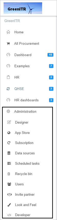
Other roles like Developer, or Design business process role will have access to the Administration menu, but will only see role-related items within the menu. For example a Developer will only see Developer within Administration, while a person with a Design business process role will only see Designer within Administration. User roles are set by Administrator who will have access to the Users function within administration, see Users and Groups for more information.
If you have full administration access then you will see nine functions by default within administration. These are:
-
Designer - users with the Designer business process role and administrators can access this function to design business processes. Designer is the main feature that allows you to create processes, forms, add fields and business rules all using an easy-to-use graphical user interface, without the need for coding.
-
App Store - administrators can access predefined process templates within the App Store, and use these templates to create business processes. There are 20 predefined templates that can be imported and used at the click of a button and cover areas like: IT Support Helpdesk, Purchase Order Approval, Employee Appraisal, Change Request Process, Inspection Checklist and Expense report.
-
Subscription - administrators can update an organisation’s subscription details, including Single Sign On, workspace look and feel, mobile app login design and regional settings.
-
Data sources - users with the Manage datasources role and administrators can access this function to connect a workspace to external data sources such as SAP, SharePoint and Oracle databases. These connectors can be used to retrieve data for processes and processes can automate the update and manipulation at the data source location.
-
Scheduled tasks - administrators can access this function to schedule tasks which can be full processes or parts of a process, for example to execute a rule, and schedule these tasks for a desired period or on demand. Within this function you can also view all existing scheduled tasks that could be rules executing within a process such as scheduled reminders.
-
Recycle bin - administrators can access deleted processes, tasks and process instances in the recycle bin and restore them to their original location.
-
Users - administrators can manage user accounts using this function for example setting roles, profile properties, creating and deleting groups.
-
Invite partner - users with the Manage partners role and administrators can access this function to invite business partners to view processes.
-
Look and Feel - this provides a shortcut to the Look and Feel section of Subscription to allow developers make changes to areas like global CSS file for a customised environment.
-
Developer - developers and administrators can access this function to create customised field, rule and dashboard widgets.
What’s next 
We have briefly introduced each of the nine functions within Administration, including the shortcut Look and Feel also found within Subscription. Now let’s look at each of these functions in more detail:
1 - Kianda Process Designer
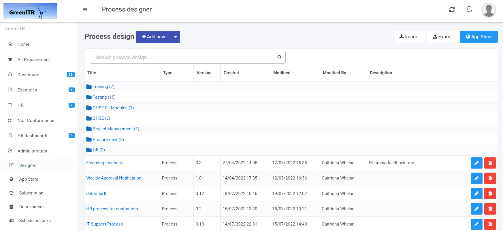
Kianda Designer is available to administrators and those users with the role Design business process. Designer is found in the left-hand side pane, or on the top right toolbar depending on the chosen orientation, under Administration. The Designer function allows you to create processes and forms using the intuitive easy-to-use no-code interface. Within Designer, you can create forms, add controls and add rules to create processes to work the way you want.
How to get started
Using your Administration or Design business process role, start creating or editing a process so that Kianda Designer will open:
-
Click on Administration in the left-hand side pane and then click on Designer.
-
You can view any existing created processes in the main Process design view.
-
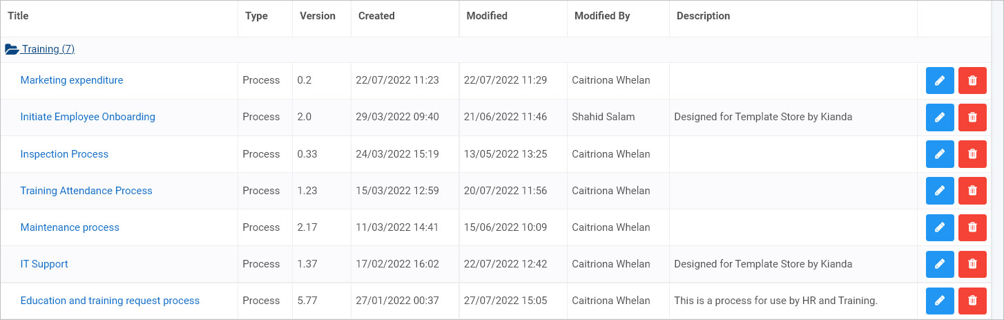
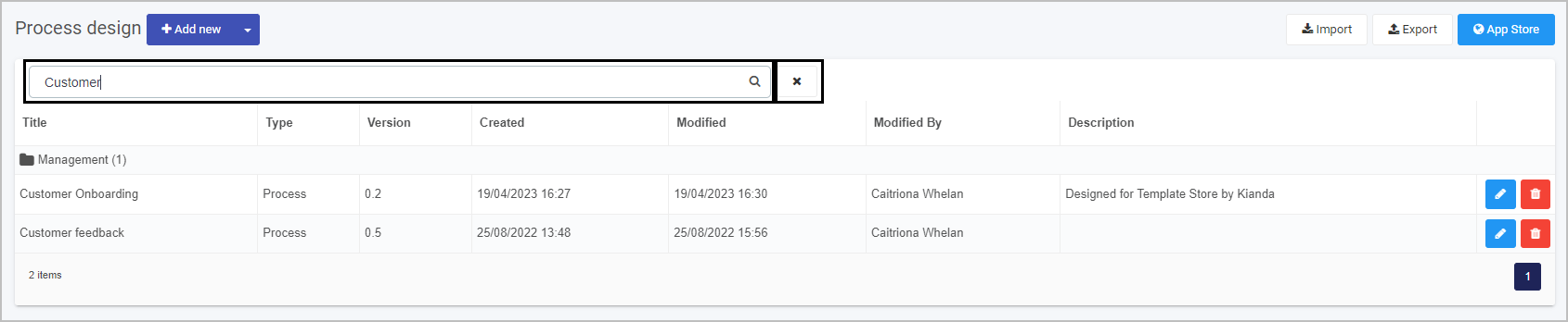
Processes may be arranged in folders or groups. Click on the folder name to see processes within that group, for example a group like Training as shown in the image.
-
You can search for a specific process or process group by typing into the process design Search bar, found above the list of processes. Click on the cancel button  to clear your search query.
-
Click on a process name to see the process design. You are then brought into Kianda Designer, see Designer view details below.
-
To import a process created for example in another workspace, click on Import  . Also note that from the main process view you can also export processes listed here for use in another workspace, by clicking on Export
  .
.
-
To create a process using a predefined template, click on the App Store.
-
To create a new process, click on the Add new button  .
.
-
The Add new process dialog box appears where you can fill out details for your new process.
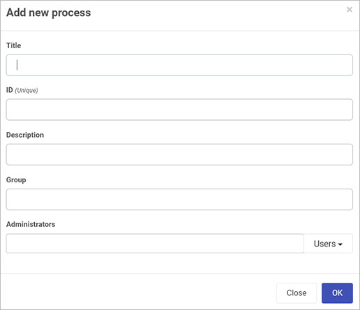
In this dialog box fill out the following fields:
- Title - give the new process a title
- ID - the Unique ID field is autofilled from the title field. Note that this ID is unique for each process.
- Description - a short description that describes the new process
- Group - choose an existing group/folder to add the new process to, or type in a new group name to create a new group of processes
- Administrators - choose from Users, Groups or a mix of both users and groups for people who will be administrators of this process. The process administrator(s) is the only person/people who can edit draft process designs. Once the process design is published, workspace administrators will be able to access the process design.
-
Once a process is opened, you are brought straight into Kianda Designer, see Designer view below.
Designer view
Kianda Designer allows you to create forms within your process, add in fields, rules and set out exactly how you want your form to appear, for example mandatory fields, help text, connection to a data source that pulls in information into the form as well as using settings to control who has access to forms and fields.
Kianda Designer is made up of three panes.
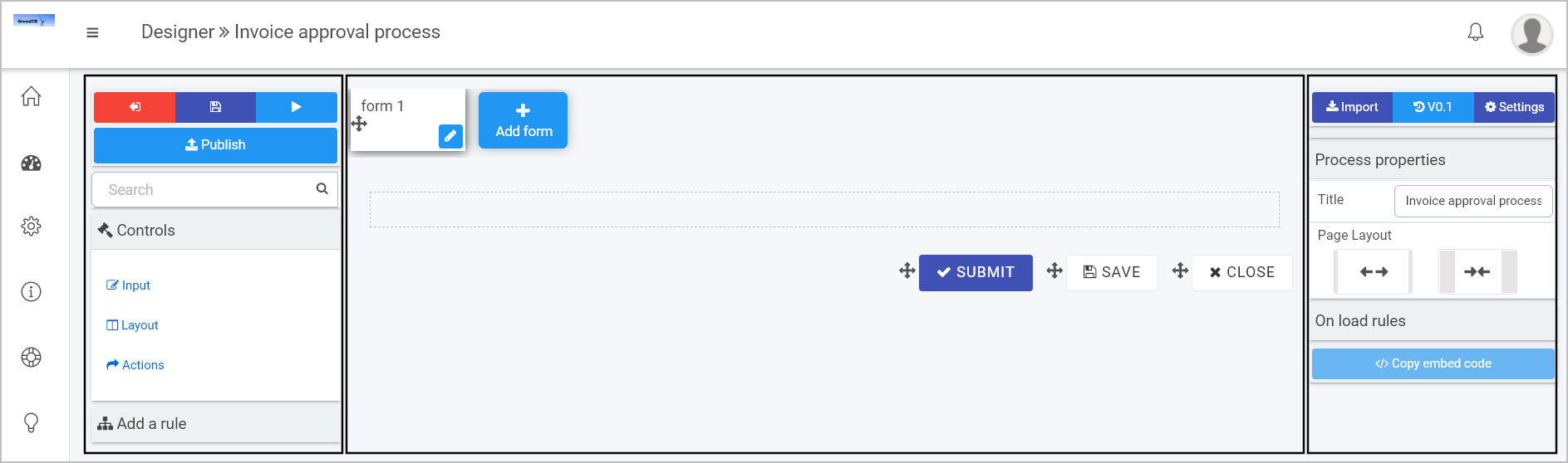
- In the left-hand pane, you will find the Controls and Rules as well as buttons to Save, Preview and Publish processes, as well as exiting Kianda Designer to return to the main process view.
- In the centre pane, also called the canvas, you can view form details and manipulate form fields.
- In the right-hand pane, you can view and edit process and field properties as well as viewing rules assigned to fields, forms and processes.
What’s next
To read more about Designer in detail and how to use the interface to create forms go to Application Designer.
To find out about help and support, go to Help.
2 - Subscription
The Subscription function is available to administrators and is found in the left-hand side pane or on the top right toolbar depending on the chosen orientation, under Administration. This function allows you to update the look and feel of your workspace, set regional, mobile and single sign-on settings and design the login page.
For developers who wish to customise and style their Kianda workspace and processes, there are options to support you in achieving a high level of design that is instantly recognisable for users. These options include creating a custom branding style, customised login page and option to control how your platform will look on mobile devices.
How to get started
To view, use the Subscription function as an administrator:
-
Click on Administration in the left-hand side pane and then click on Subscription.
-
The main Subscription page opens.
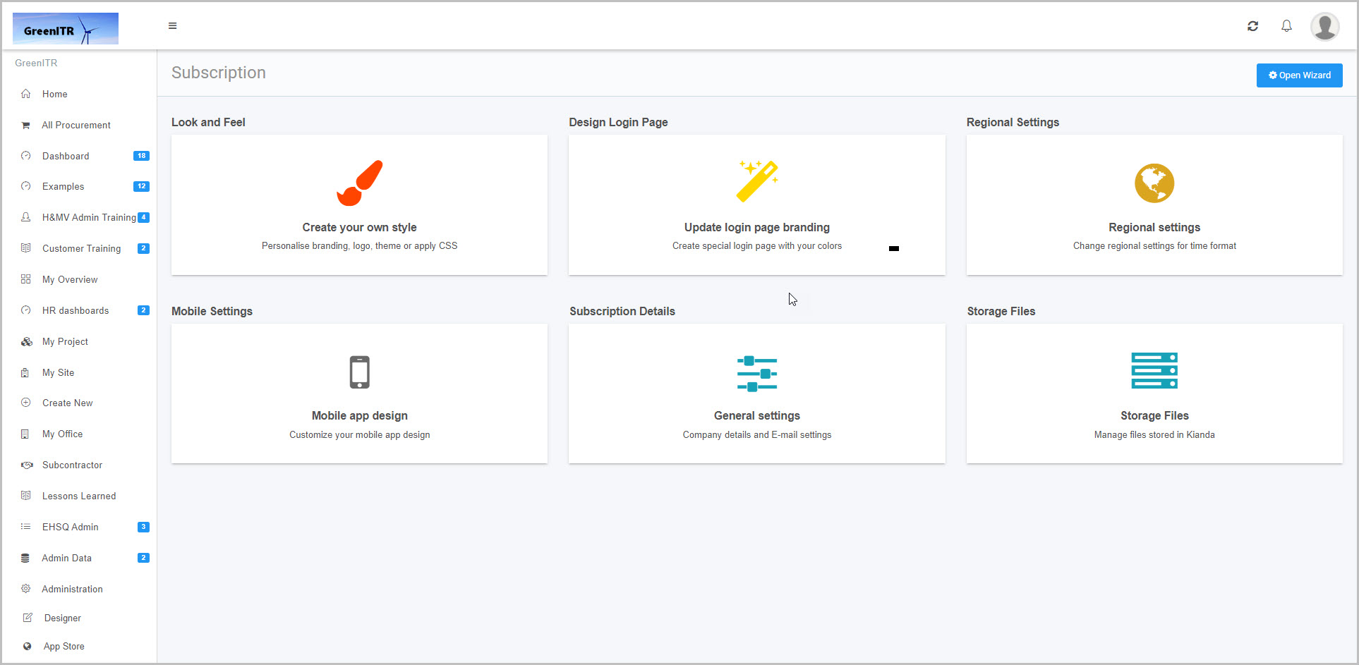
In this view you can typically make changes to six areas:
- Look and Feel allows you to change the look and feel for your workspace, for example adding company logos.
- Design Login Page allows you to design the login page for your workspace, for example to change background and font colours and add taglines.
- Regional Settings allows you to set your operational time zone and regional settings, such as English Ireland for language.
- Mobile Settings allows you to customise how the Kianda workspace will appear as a mobile app.
- Subscription Details allows you to view your company details and enable a Global SMTP Mail connector for sending automated emails.
- Storage Files allows you upload, delete and view public and private files within your subscription. You can also create folders to organise your files.
These areas are covered in more detail in the sections below.
-
Click on a particular area to edit details or click on the Open Wizard  button to use a wizard to edit Look and Feel, Design Login Page, Regional Settings, and Mobile Settings.
Details on each area are available below.
Look and Feel
You can access this section by clicking on Open Wizard > Look and Feel or by clicking on Look and Feel in the main Subscription page.
Alternatively you can access this section by clicking on the Look and Feel shortcut found in the Administration menu.
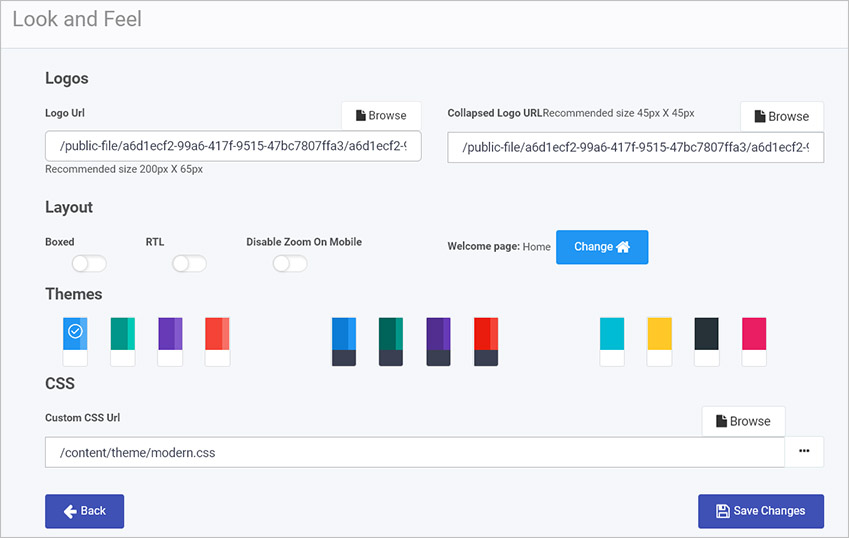
Note: Logo sizes are 200 x 65px for a full-sized logo and 45 x 45px for a collapsed logo. You can also select a colour scheme under Themes and preview the results under Workspace preview on the right.
Details for each of the areas within the page - Logos, Layout, Themes and CSS are available below. Make sure to click on Save Changes 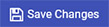 to save any changes made.
Logos
To add a logo for your company:
- Click on Browse beside Logo Url to browse for a logo to add from your PC or network. The recommended size is 200px x 65px.
- To add a logo that will appear when the left-hand side menu is collapsed, click on Browse beside Collapsed Logo URL to browse for a logo to add from your PC or network. The recommended size is 45px x 45px.
Layout
The options for your workspace layout are:
-
Boxed - moving the slider across to enable a boxed layout, that is the workspace appears in a box in the browser, with space appearing around the box and content is centred.
-
RTL - moved the slider across to enable a right-to-left (RTL) layout, that is text, layout, icons and so on are right-hand based.
-
Disable Zoom on Mobile - move the slider across to enable the ‘disable zoom on mobile’ option, which means that the zooming option is disabled on mobile web pages.
-
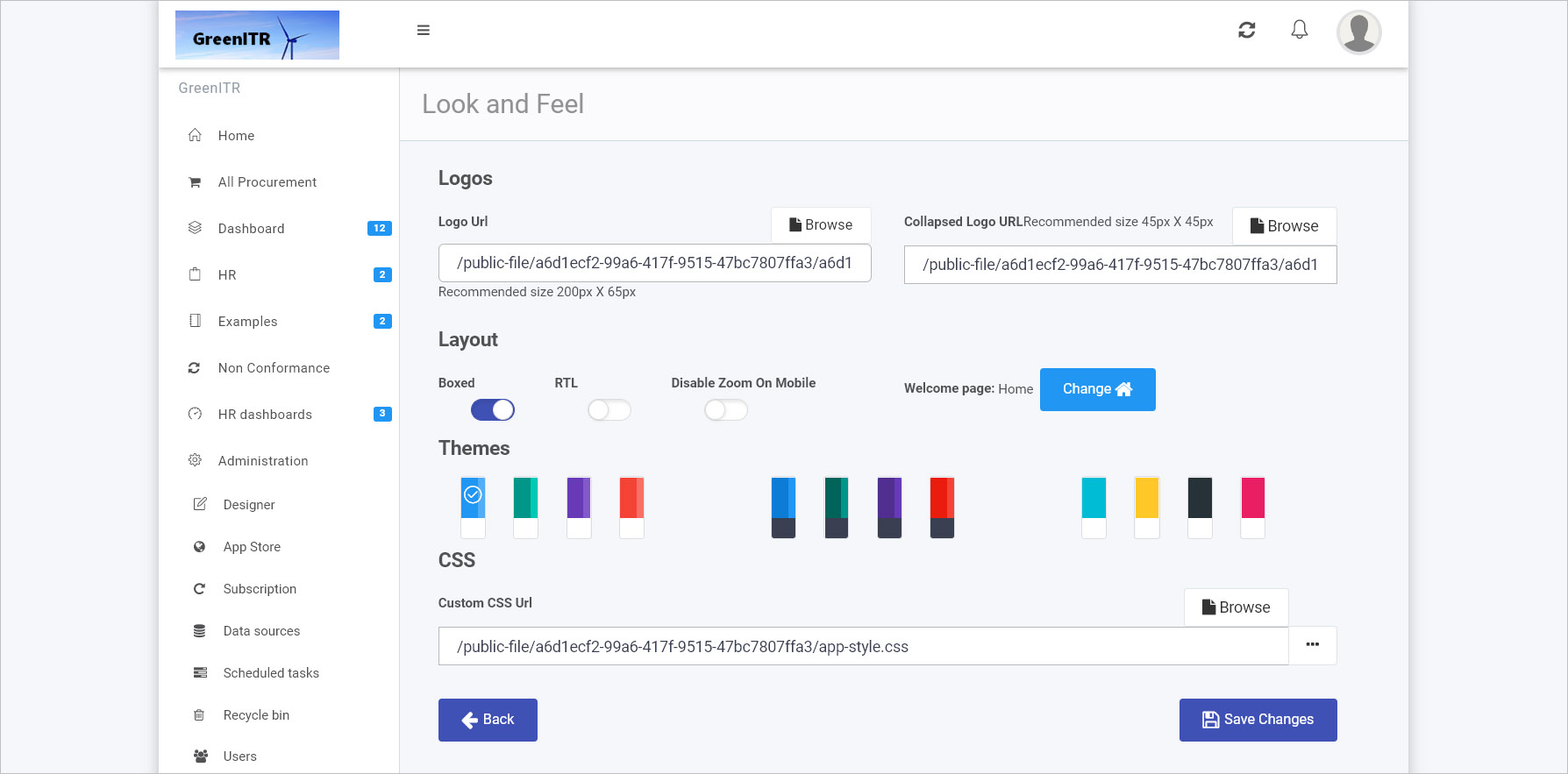
Welcome page - click on the Change button  to change the Welcome page for users of your Kianda workspace. The Update welcome page dialog box opens where you can click on the drop-down list under New welcome page to choose a new welcome page, from the Home page and dashboards.
Click on OK to save changes or Close to exit the dialog box at any time.
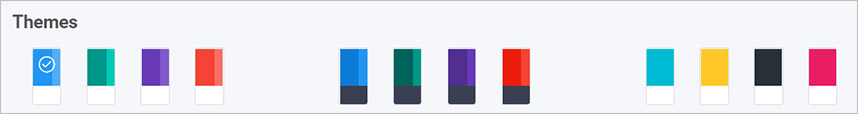
Themes
Click on a Theme of choice. Options range from two-tone layouts, to those with a dark left-hand side menu as shown in the middle of the image below.
CSS
In this section you can modify the Global CSS File to make changes to the look and feel of the site as well as processes. If you have an existing CSS file, you can access the existing CSS details by clicking on the on the ellipsis button  to open a CSS Editor and add to those details, or click on Browse to browse for a CSS file to add in customised styling. See Global CSS file for more details.
Make sure to click on Save Changes to save any changes made and click on Back to go back to the Subscription page.
Design Login Page
This section allows you to design the login page, choose background and font colours and complete fields for Taglines.
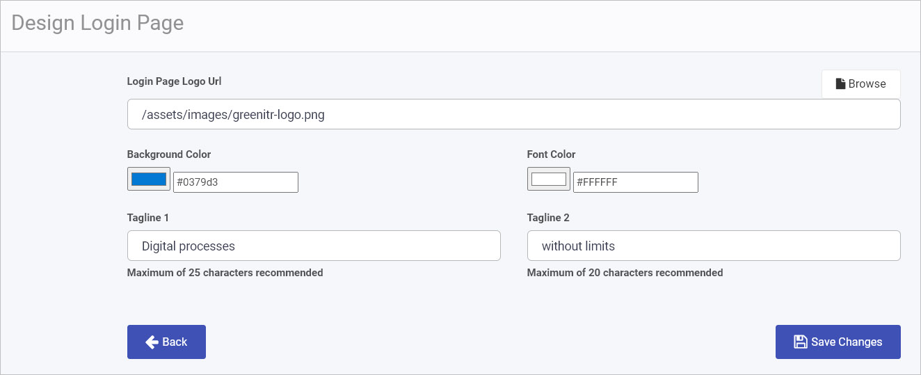
On this page you can make the following changes:
-
Login Page Logo Url - add/change a logo for the login page to Kianda by clicking on Browse to browse for a logo on your PC or network.
-
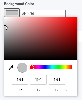
Background Color - to create a background colour for the login page, you can either click on the colour itself and select a colour in the main view, or using the slider, or type in an RGB, HSL or HEX value in the fields above, or click in the box beside it to add in a HEX value for a colour, for example #BFBFBF.
-
Font Color - as with the Background Color, to create a font colour, choose an appropriate colour using the colour box itself or type in a value in the field beside the colour.
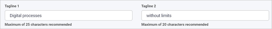
-
Tagline 1 - type in the first tagline that will appear under your company logo on the login page. A maximum of 25 characters is recommended.
-
Tagline 2 - type in the second tagline that will appear under your company logo on the login page. A maximum of 20 characters is recommended.
When you are finished making changes click on Save Changes to save any changes made and click on Back to go back to the Subscription page.
Regional Settings
Here you can set your operational time zone and regional settings, such as English Ireland, from the dropdown.
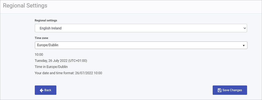
On this page you can make the following changes:
- Regional settings - choose a language setting from the drop-down list.
- Time zone - choose a time zone from the drop-down list.
When you are finished making changes click on Save Changes to save any changes made and click on Back to go back to the Subscription page.
The chosen options are reflected in the text below the fields, for example date and time format.
Mobile Settings
Here you can customise how the Kianda workspace will appear to users on mobile devices. You can choose your App name, App short name, Splash Screen Colour, and Theme Colour and upload a mobile size icon (note the icon size is 512 x 512 px).
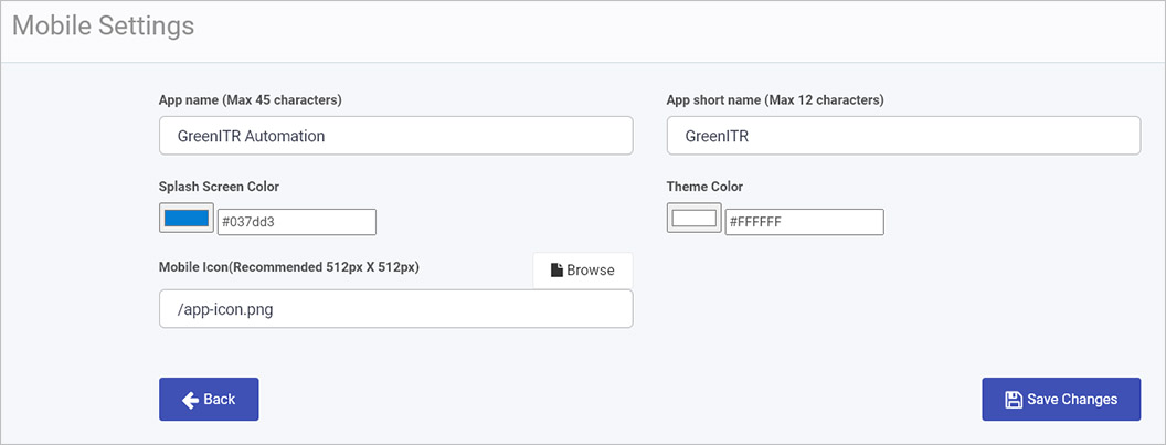
On this page you can make the following changes:
-
App name - add/change a name to set a custom app name for your app/workspace that reflects your business. A maximum of 45 characters is recommended.
-
App short name - add/change a shortened name for your app/workspace, for user in areas without space for longer text strings. A maximum of 12 characters is recommended.
-
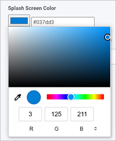
Splash Screen Color - to set the introductory screen colour that appears while your application loads (splash screen), you can either click on the colour itself and select a colour in the main view, or using the slider, or type in an RGB, HSL or HEX value in the fields above, or click in the box beside it to add in a HEX value for a colour, for example #037dd3.
-
Theme Color - as with the Splash Screen Color, choose an appropriate colour for the mobile app theme font using the colour box itself or type in a value in the field beside the colour.
-
Mobile Icon - click on Browse to browse for a logo to add from your PC or network. This will be displayed on the home screen of your users’ mobile devices. The recommended size is 512px x 512px.
When you are finished making changes, click on Save Changes to save any changes made and click on Back to go back to the Subscription page.
Subscription Details
General settings include details like your company name, subscription ID, renewal date and business identity (your workspace URL, for example, green-itr.kianda.com). You can also enable a Global SMTP Mail Connector to enable email flow to/from your Kianda workspace.
Within general settings, administrators can set who the Global Administrator is, or the main administrator for the workspace.
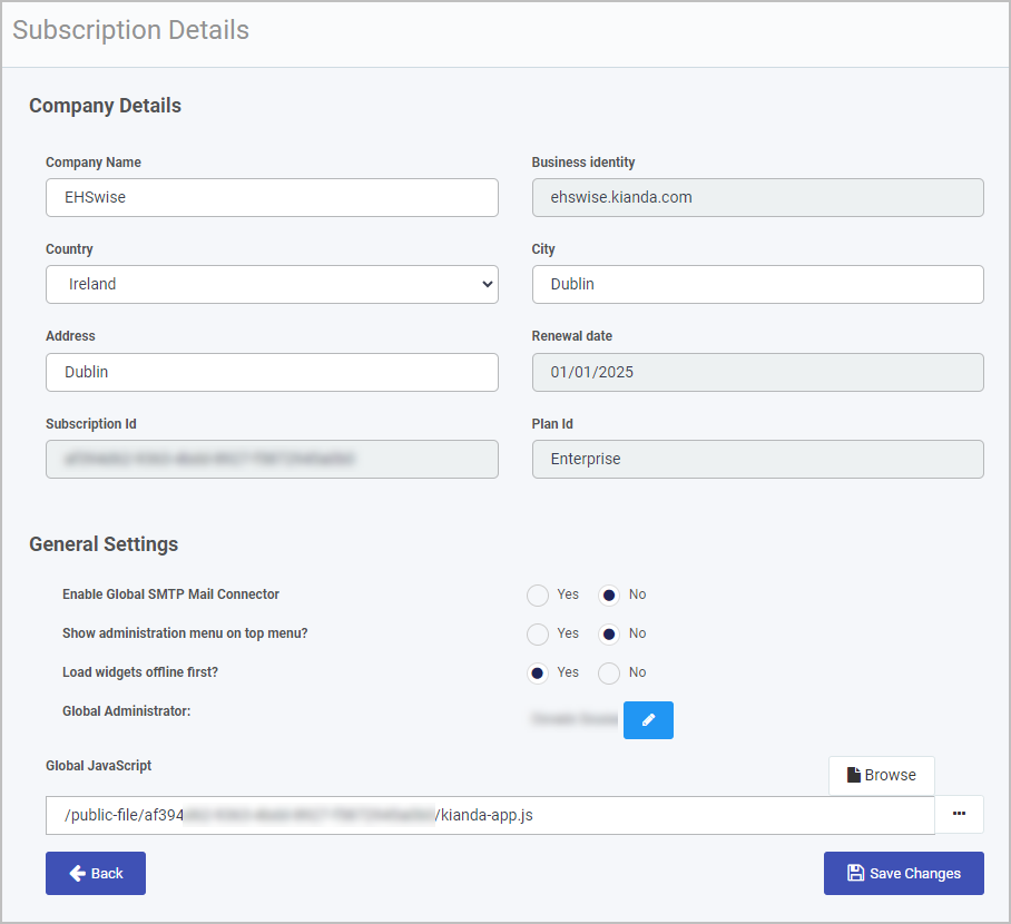
Company details
In this section you can make the following changes:
- Company Name - add in your company name.
- Business identity - the business identity for your company workspace is automatically added in.
- Country - choose a country from the drop-down list.
- City - enter a city into the text field
- Address - add in your company address.
- Renewal date - your subscription renewal date is automatically added in.
- Subscription Id - your company subscription identity is automatically generated. This is needed when you need to perform authorisation to use Instance API.
- Plan Id - your plan Id is automatically added in. For example free, premium and enterprise.
General settings
In this section you can make the following changes:
-
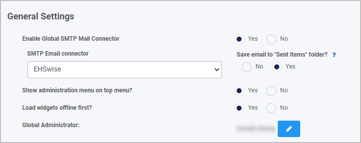
Enable Global SMTP Mail Connector - click on Yes to set a global Simple Mail Transfer Protocol (SMTP) connector used to send emails.
The global connector will ignore all other connectors and will no longer use no-reply@kianda.com as a sender. To enable this you must have an email connector set up in advance. To learn more about email connectors go to Email connector.
In addition you can choose Yes for Enable save to Sent Items so that sent email are automatically saved in a ‘Sent items folder’.
-
Show administration menu on top menu? - selecting ‘Yes’ positions the administration menu on the top right toolbar beside the My profile section, and is then removed from the left hand navigational pane.
-
Load widgets offline first? - selecting ‘Yes’ will prompt the platform to load widgets in offline mode first. This is an optional flag that enables dashboard and process widgets to be loaded faster from the offline cache. It can be useful if you consistently interact with your environment when you are in areas of poor network connectivity.
-
Global Administrator - change the global administrator of your company’s Kianda platform from the list of users that are in it.
-
Global JavaScript - allows you to create a JavaScript file with custom functions as helper or action functions allowing you to perform any functionality you may want. The file is accessible globally and will load when the application first starts. Go to Global JavaScript file for more details.
When you are finished making changes click on Save Changes to save any changes made and click on Back to go back to the Subscription page.
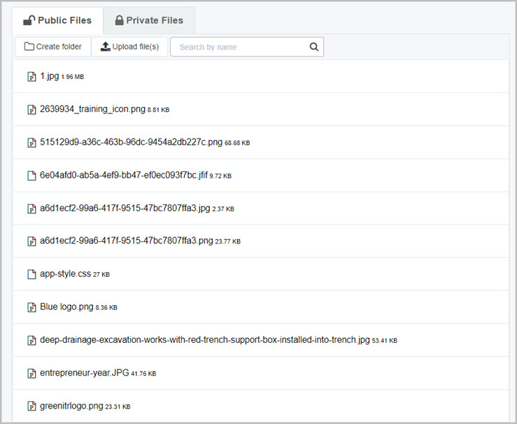
Storage files
You can access this section by clicking on Storage Files in the main Administration > Subscription page. Here you can see all public and private files that are in your platforms storage. You can search for files using the search box and navigate between Public and Private files using the provided tabs.
Upload file(s)
To upload a file to Storage files, click on the 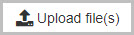 button.
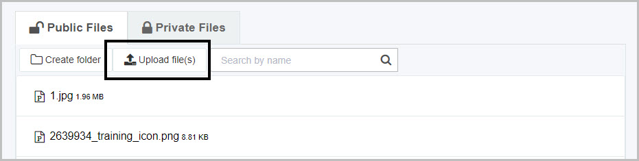
A file explorer will open in which you can select multiple files to upload to you platform.
Create folder
To create a folder, click on the 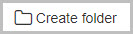 button.
The folder will appear alphabetically in the main view where you can see all your files. To upload a file into folder, first, you need to click on the folder name to open it and then click on button.
At any time, you can go to left-hand side menu and click on Subscription to edit any of the settings for the headings above.
What’s next
To read more about how to create processes and forms go to Application Designer.
To find out about help and support, go to Help.
3 - Data sources
Introduction
The Data sources function is available to administrators and those users with the role Manage datasources. Data sources is found in the left-hand side pane, or on the top right toolbar depending on the chosen orientation, under Administration. The data sources function allows you to connect your processes to external data sources like SharePoint, Salesforce or SAP.
Connecting your data sources in this way allows real-time scalability, so as your organisation and data grows, the processes created in Kianda will continue to operate with these data sources, providing sustainable, flexible growth.
Kianda comes with 19 predefined data connectors allowing you to connect to these data sources. These are listed below:
- Active Directory
- DocuSign
- Dropbox
- Dynamics CRM
- Email
- File system
- FTP
- GlobalPayments
- Google Drive
- MySQL
- Office 365
- Oracle database
- PowerShell
- Salesforce
- SAP
- SharePoint
- SOAP Service
- SQL Server
- REST Service
If you are a developer and want to connect to a datasource that is not included in the predefined set, you can use SOAP or REST to create your own API for data transfer.
How to get started
To start viewing existing data sources:
-
To see the datasource management function, select Administration from the left-hand side pane and then click Data sources.
-
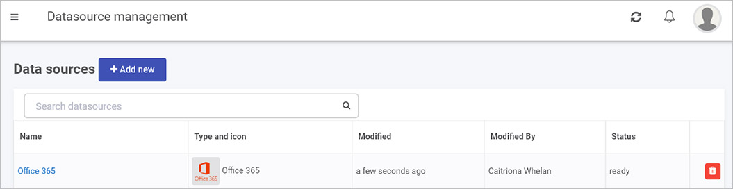
Any existing data sources that have been created for your workspace are shown in the main view under Datasource management.
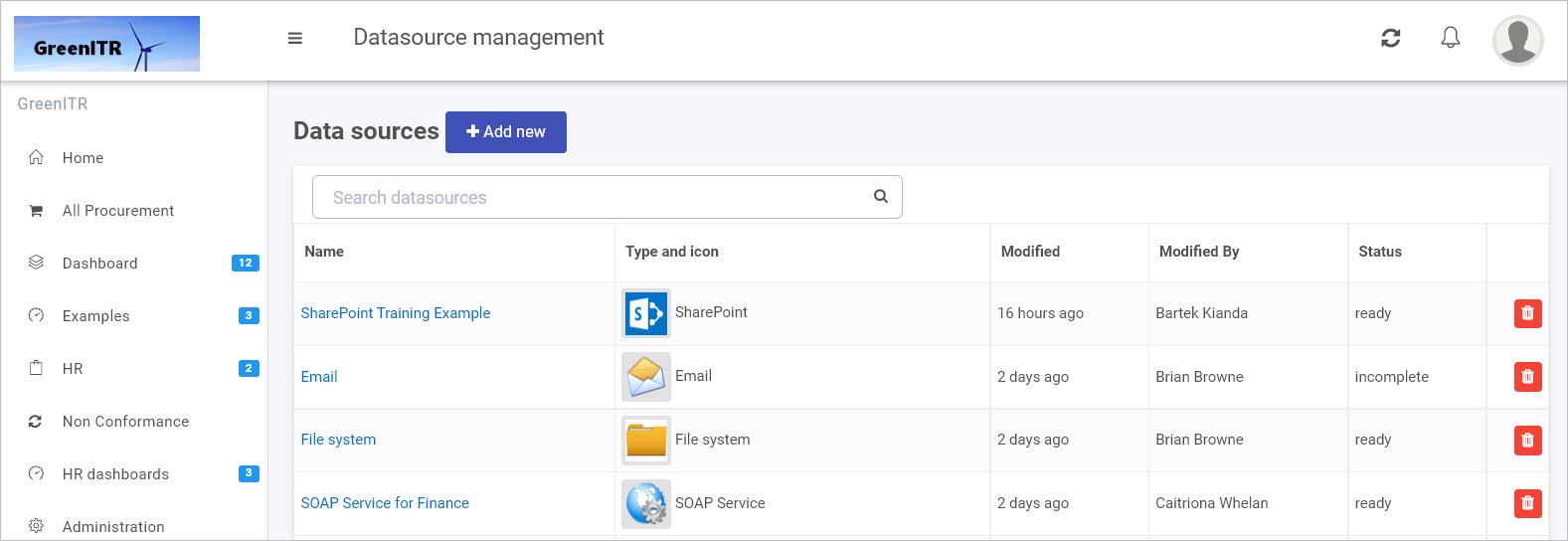
Data sources are listed by:
- Name - assigned title
- Type and icon - assigned data connector type and icon image
- Modified - the date the connector was modified
- Modified By - the person who last made changes
- Status - for example ready means the connection has been tested and is working, while incomplete means that more details still need to be added.
-
To search for a data source, type in the name or type of data source in the search box.
-
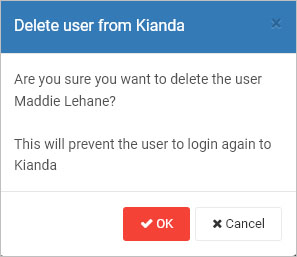
To delete a data source, click on the Bin/Trash button  beside the name of the datasource. You will receive a popup asking to you to confirm deletion by clicking OK, or you can exit the deletion by clicking on Cancel.
-
To see the details of a data source, click on the name of the Data source and from there you are brought to the Data source details page:
-
The details will vary depending on the data source, but there are some common elements:
- Display name - the name of the data source as it will display in your system. Choose something meaningful, as you will use this name in process design to connect your forms to your data source.
- Information about the data source - this could be a URL, Server name, Client ID, root folder path etc.
- Authentication details - this could be a username, password, client secret etc.
- Option to use Kianda Cloud Connect - you enable this feature and download a zip file which you can install on your server, allowing the Kianda system to reach your server and get access to data, for example SQL Server, making system integration quick and efficient.
- Test connection - all data source detail pages will allow you to test your connection using this button to ensure data exchange can happen.
- Save - at any time you can save details, even if some parameters need to be completed, allowing you to return to the configuration at any point.
- Security - all data sources can have different levels of security set up, including administrators for the connection, and users of the connection, see Setting security for data sources for more details.
- Close - allows you to exit from the data source details page.
How to create a new datasource
The following uses SharePoint as an example when creating a new datasource. The main steps for any datasource will be similar, that is: click on the Add new button, fill out the datasource details page, test the connection, save and add security.
-
From the main datasource management view, click on + Add new button and then one of 19 data connectors that appear, for example SharePoint.
-
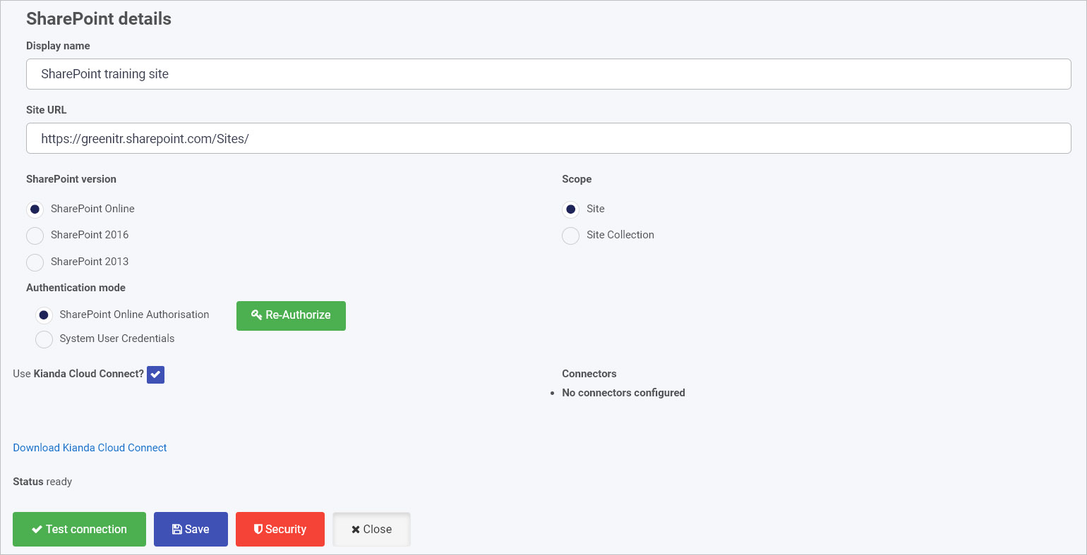
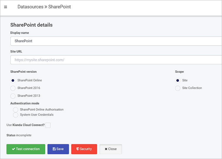
Fill out fields in the SharePoint details screen.
Choose from the edit options:
-
Display name - the name of the data source, for example SharePoint HR
-
Site URL - this is the link to your SharePoint data
-
SharePoint version - choose from a) SharePoint Online (also known as SharePoint in Microsoft 365) b) SharePoint 2016 or c) SharePoint 2013
-
Scope - choose from a) Site for example a particular SharePoint website or b) Site Collection, a collection of SharePoint sites
-
Authentication mode - options are a) SharePoint Online Authorisation and b) System User Credentials
If you choose a) SharePoint Online Authorisation then click on Authorize button  in this instance you will need SharePoint administration rights
If you choose b) System User Credentials then fill out your username and password. In this instance you do not need SharePoint administration rights.
-
When you have added SharePoint details, you are ready to test your connection and add security. At the bottom of the SharePoint details page, click on Test connection button  and if the service has been correctly configured, then you should receive a notification saying Connection test succeeded.
-
Click on Save  to save the connection and you will receive a notification saying Details saved successfully.
-
Add Security settings by clicking on the Security button  , go to Setting security for data sources for more details.
-
Click on Close to close the details page and return to the datasource management main view.
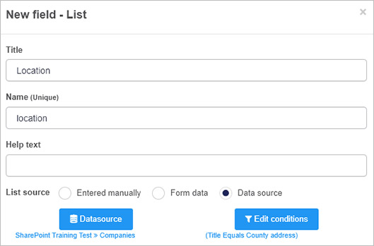
Once the data connector is created, this can be used with controls like lists and rules, for example in the image below, a SharePoint data connector called ‘SharePoint Training Test’ has been setup within the datasources function. Lists within SharePoint can then be linked to list fields in Kianda, by clicking on Datasource in the Edit list dialog box. In the example below, a list called Companies is the data source for the list.
What’s next
To read more about data connectors and how to use them, go to Data Connectors.
To find out about help and support, go to Help.
4 - Scheduled tasks
The Scheduled tasks function is available to administrators and is found in the left-hand side pane, or on the top right toolbar depending on the chosen orientation, under Administration. The Scheduled tasks function allows you to schedule a task, that could be a process or a rule for example to send reminder emails.
How to get started
To use the Scheduled tasks function:
-
Click on Administration in the left-hand side pane and then click on Scheduled tasks.
-
You can view scheduled tasks via this function in the Task automation main tasks view. The current tasks listed is a subset of all tasks, see Step 4 below.
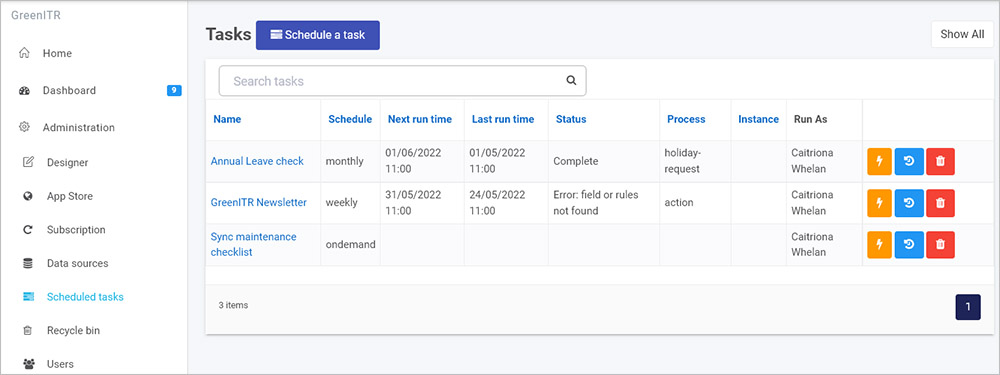
In this main view you can see:
- the Name of the task
- the Schedule for example weekly or monthly
- when the task was last run
- when the task will next run
- the status of the task such as ‘Complete’
- the name of the associated process and process instance where relevant, and
- who is the administrator of the task/who has created the task.
The buttons beside each task are:
- Trigger task manually
 - clicking on this button instantly creates a new process instance/record by executing the task or process. This process instance can be viewed in a list widget in a dashboard.
 - Show task history
 - when you click on this button, a dialog box opens showing a list of all the past executions of the task, listed by date and time and status, for example if there was an error or if the task completed.
 - Delete task
 - to delete a task from the list, click on this button. A popup will appear asking you to confirm if you want to remove the task or not. To continue with the deletion click on OK, otherwise click on Cancel.
-
Click on the name of a task to see the details of the task.
-
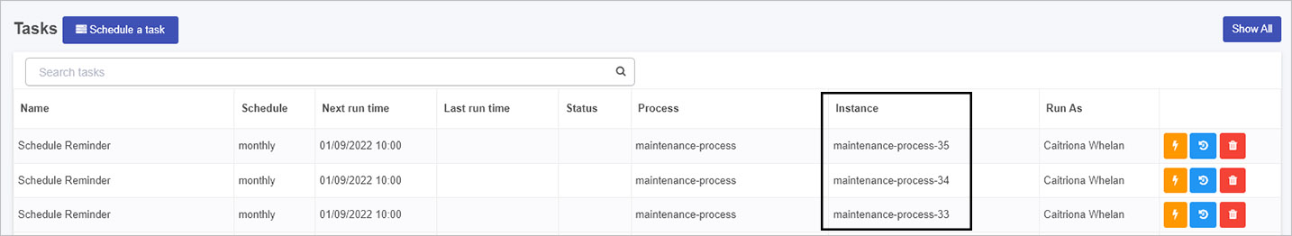
To see a complete list of scheduled tasks click on Show All  . This list will include all tasks that are running as a result of processes, for example scheduled reminders that are running as a result of rules in a process. Each item listed is a process instance related to a process, for example as shown in the image below. The process instances can be viewed in a list widget in a dashboard.
To see the shorter list again of tasks created via this function, click on Show All again.
Scheduling a task
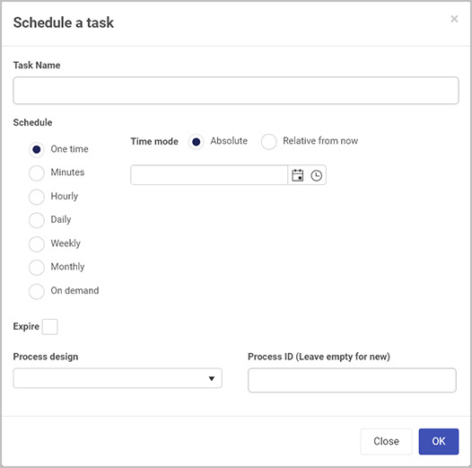
-
To schedule a new task, click on the Schedule a task button  .
.
-
In the Schedule a task dialog box, select a Task name for the task and then a schedule choosing from One time, or a periodic schedule from: Minutes, Hourly, Daily, Weekly, Monthly or On demand.
-
Depending on which option you choose, different time modes or ways of scheduling the task will be presented:
-
One time - choose from Absolute or Relative from now as shown in the image above. Choosing Absolute means the time starts at the date and time entered into the date and time field, choosing Relative from now means you can choose that the schedule starts in X number of days, hours and mins.
-
Minutes - enter a numeric value into the minutes box
-
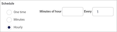
Hourly - enter a numeric value into the minutes and Every field, to set a recurring schedule, see image below:
-
Daily - enter a time in the At field, a numeric value in the Every field, to set a recurring schedule and check the checkbox for Week days only to only schedule the task on weekdays.
-
Weekly - enter a day of the week in the Week day field, a time in the At field, and a numeric value in the Every field.
-
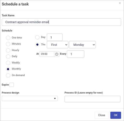
Monthly - enter a numeric value in the Day field to set what day of the month, or choose values to set when the task should happen for example, the First Monday of a month, as shown in the image below. Also select a time in the At field, and a numeric value in the Every field.
-
On demand - if you choose this option then a Task Webhook URL field will appear. If you click on OK the URL is generated by the system. This will send a POST request to the generated URL to trigger the task on demand. If you add an optional instanceID parameter you can run the task on a specific instance.
-
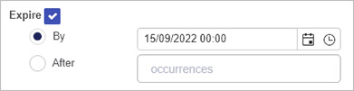
For each time mode chosen, you can check the Expire checkbox, and from there set if you want the schedule to end By a particular date and time or After a set number of occurrences.
-
For each time mode chosen, select a process from the Process design dropdown list.
-
For each time mode chosen, for Process ID leave the field empty if it is a new task or enter the process ID for a given record/process instance.
-
When you have finished editing the Schedule a task dialog box, click on OK or click on Close at any time to exit the dialog box.
What’s next
To read more about how to create processes and forms go to Application Designer.
To find out about help and support, go to Help.
5 - Recycle bin
Introduction
The Recycle bin function is available to administrators and is found in the left-hand side pane, or on the top right toolbar depending on the chosen orientation, under Administration. The recycle bin holds deleted process instances, dashboard pages and process designs. Deleted items are held for 30 days and are permanently deleted after this time.
How to get started
To view items in the Recycle bin:
-
Click on Administration in the left-hand side pane and then click on Recycle bin.
-
Search for an item by typing in key words into the Search items box for example ‘Office’.
-
You can view existing deleted items in the Recycle bin main view.
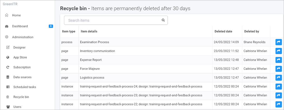
Deleted items are listed by:
- Item type - this is the type of deleted item, for example a widget, process instance, datasource or page.
- Item details - the name of the deleted item, for example the name of a process instance and the unique name (ID) for that process
- Deleted date - the date the item was deleted
- Deleted by - the name of the user who deleted the item.
In the example above there is one process design, four dashboard pages and three process instances.
-
To restore an item click on the Restore item button  beside the item name.
-
When you click on the button you will get a pop-up confirmation asking you to confirm that you want to restore that item.
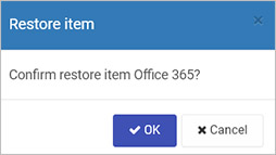
-
Click on OK if you wish to restore the item or Cancel to exit. If you click on OK the item is restored, for example a datasource appears again within the Datasource management main view when you click on Administration > Data sources in the left-hand pane. To learn more about this, see Data sources.
What’s next
To read more about how to create processes and form go to Application Designer.
To read about other parts of the platform go to Administration.
To find out about help and support, go to Help.
6 - Users & Groups
Introduction
The Users function is available to users with the Administrator role and is found in the left-hand side menu, or on the top right toolbar depending on the chosen orientation, under Administration. This function allows you to manage users and groups in your Kianda workspace.
How to get started
To access the Users function:
-
Click on Administration in the left-hand side pane and then click on Users.
-
You can view any existing users and groups that have been created in the main view pane.
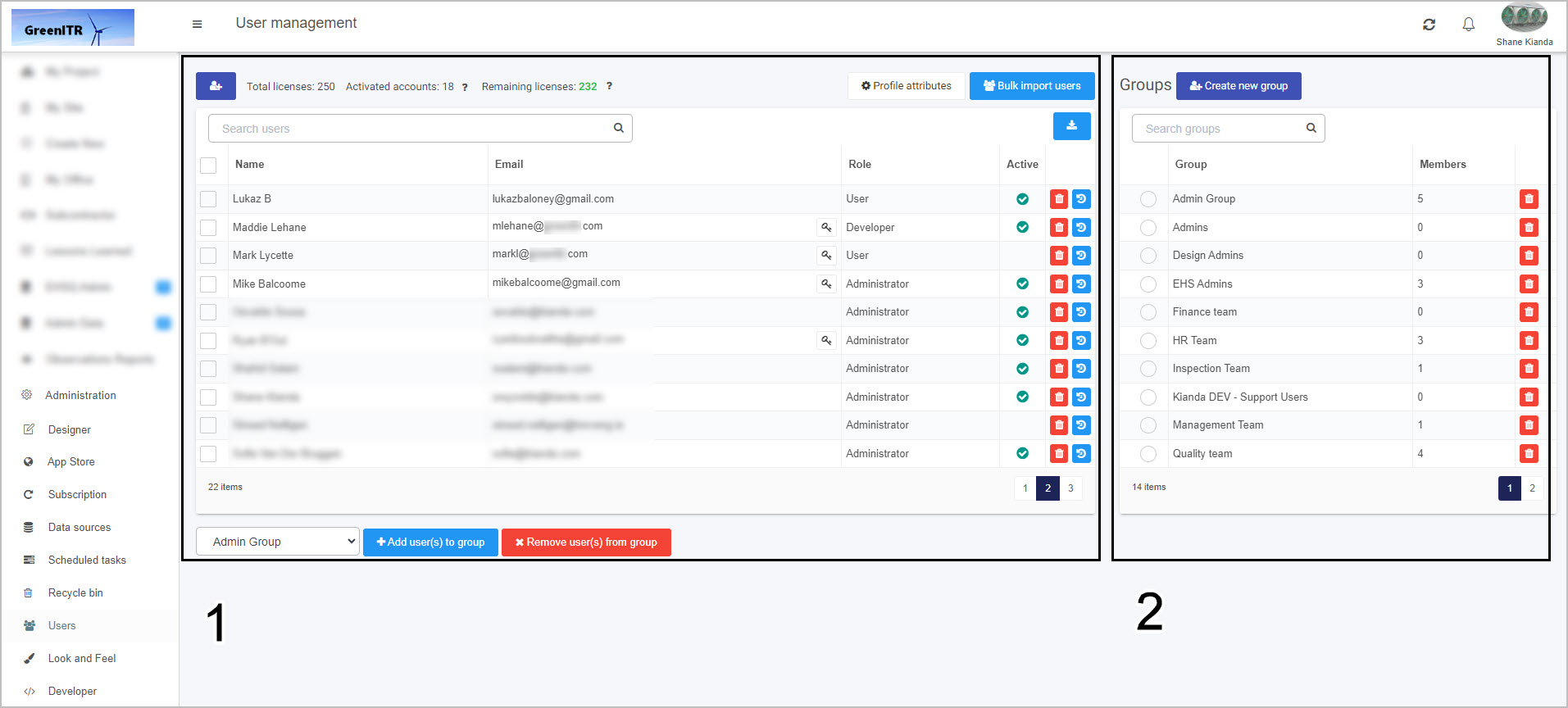
The two main areas are 1. Users and 2. Groups. These two areas are explained in more detail below.
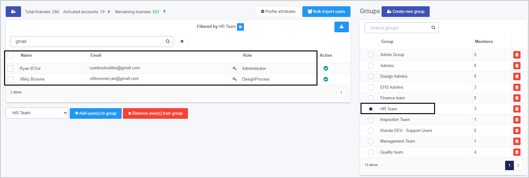
Users
Existing users appear within this section, showing the name of the user, email, role and whether they are active or not in the system.
From this main view, you can:
Click on each of the links above to read more about each function. In addition to the above administrative functions, you can also set passwords and delete users from this main view as follows:
-
To reset a password for a user, click on the Reset password/key button  beside a user name. This will open the reset password dialog box where you can type in a new password for the user.
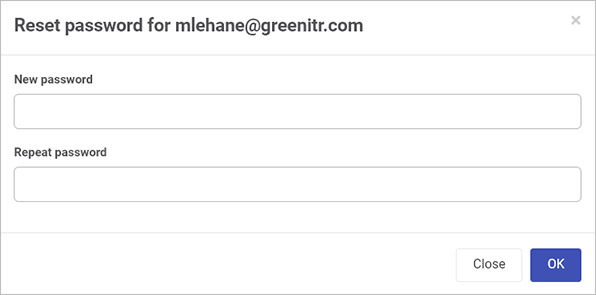
When you are finished adding the new password, click on OK, or click on Close to exit the dialog box.
-
To view the user’s platform history, click on the User History button  beside a user name. This will open up a dialog box displaying a list of all actions carried out by that user, as well as successful/unsuccessful login attempts, when an admin user changes what group they are in, and other useful information when debugging and auditing.
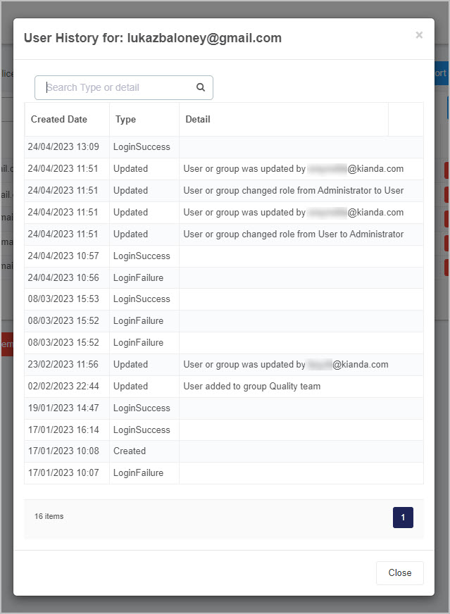
As well as this, you can search the user’s history by type or detail. Click on the Close button to return to the users and groups page.
Licenses
Before managing the user accounts on your platform, you will need to understand the concept of Licenses. Depending on your subscription type, you will be allocated a certain number of licenses, which allow your users to be active on your platform.
A single license is used by each individual active user within your platform, for example if your platform has 250 total licenses and you have 19 activated accounts, you will have 231 remaining licenses. If a user license is issued, the total number of licenses will decrease, and if a user license is revoked, the total number of licenses will increase. If there are no more remaining licenses, new users will be deactivated. You can get more licenses by deactivating users or purchasing additional licenses.

View and edit existing user details
-
Click on the name of a user and the user details appear.
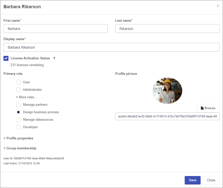
-
In the details box you can edit a user’s:
- First name - user’s first name
- Last name - user’s last name
- Display name - how their name will display in the system. The display name is autofilled based off of the user’s entered first and last names, which can be changed if necessary.
- License activation status - Checking this box will create the user as active. This will consume a license from your subscription. If you are out of licenses you will be prompted to purchase an additional license.
- Primary role - click on More roles to see additional roles and choose from six system defined roles.
-
User - lowest level of access where users with this role can access dashboards and forms, Help and Account details
-
Administrator - highest level of access where users with this role can access all functions under Administration such as Designer and Developer.
-
Manage partners - users with this role can access the same areas as User as well as the Invite partners function under Administration to create shared processes for business partners.
-
Design business process - users with this role can access the same areas as User as well as the Designer function under Administration to create and manage processes and form designs.
-
Manage datasources - users with this role can access the same areas as User as well as the Data sources function under Administration to create and manage data sources such as connections to SAP, Dropbox, SharePoint and Salesforce.
-
Developer - users with this role can access the same areas as User as well as the Developes function under Administration to create custom widgets for fields/controls, rules and dashboards.
- Profile picture URL - click on Browse to browse for a profile picture on a laptop or network drive to add a profile photo for the user.
- Profile properties - click on this option to see additional properties that you can define, see Modify profile attributes.
- Group membership - click on this option to see the groups that a user is added to. Click on the red x button
 to remove a user from a group.
As well as this, you can view:
-
When you are finished editing a user’s details, click on OK, or click on Close to exit the dialog box.
Create a new user
-
Click on the Create new user button  .
.
-
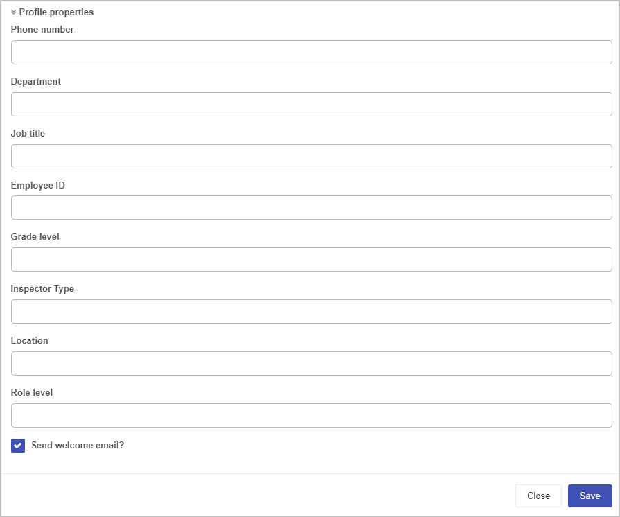
Complete the fields as listed in Step 2 in View and edit existing user details above. If additional profile properties have been set for the workspace, add in details for those properties. These properties can be set by clicking on the Profile attributes button, see Modify profile attributes section.
-
Check the Send welcome email check box if you wish to have a system generated email sent to the new user.
-
Click on Group membership to view a user’s group membership, see Groups for more details.
-
When you are finished editing a user’s details, click on Save, or click on Close to exit the dialog box.
-
When the user is created they will appear in the main Users view.
Modify profile attributes
As an administrator you can set profile attributes for workspace users within your organisation. For example if your organisation uses particular grade levels for roles, then these can be set using this feature. To modify attributes:
-
Click on the Profile attributes button in the main Users section.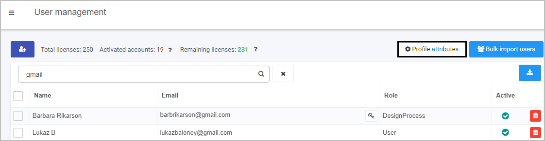
-
In the Modify user attributes dialog box, any existing attributes will be listed under Property. To remove an attribute, click on the Bin/Trash button .
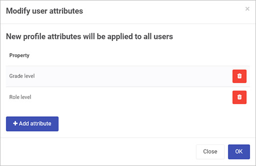
-
To add a new attribute, click on the Add attribute button  , then type in the name of the new attribute.
-
When you are finished editing attributes, click on OK, or click on Close to exit the dialog box.
Importing and exporting users
In addition to clicking on the Create new user button , you can import users using an Excel file by clicking on the Bulk import users button  . The Import users dialog box opens.
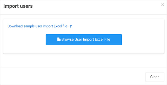
In the Import users dialog box you can:
- Click on Browse User Import Excel File to browse for a file of users to add.
- Click on Download sample user import Excel file to see the file structure needed to import users. The key user fields here are: Email, First Name, Last Name, Display Name and optional is Telephone number.
You can export a list of users by clicking on the Export to csv button  . The resulting file will list users by:
- Display name
- Email
- Primary role
- Groups - they are members of
- Active - if the user is active and is currently using a license
- Last active - when the user was last active in the platform
Seen below is an example CSV output in excel:

Groups
When you create predefined groups, you can use these group names in a myriad of ways, for example to create a set of finance managers who can then be listed as form owners to edit forms in process instances for procurement, or a set of contractors in an SSO bypass group who can go the workspace login page to login to Kianda.
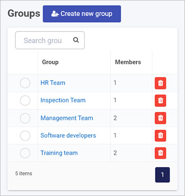
Existing groups appear within the Groups section of the User management page, showing the name of the group and the number of members.
From this main view you can:
Viewing and editing group members
-
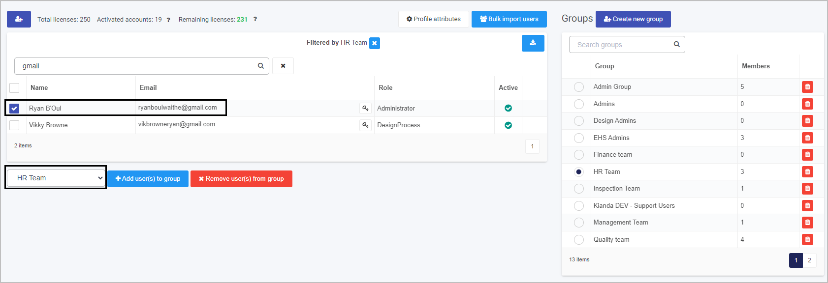
Click on the radio button beside the group name in the main view to see the group members.
-
From this view, you can remove a user from the group by checking the checkbox beside a user name and click on Remove user(s) from group.
-
You can also change users from the current group to another group by clicking on the dropdown list of group names, by choosing a group, checking the checkbox beside the username.
-
Click on Add user(s) to group.
Note: You can only add users to groups, if you yourself are an administrator for the group, see next section.
Viewing and editing group details
-
Click on the group name in the main view to see details for a group.
-
The Edit group ‘Name’ dialog box appears.
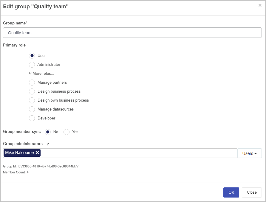
-
In this dialog box you can edit:
-
Group name - the name of the group
-
Primary role - the primary role of the group. You can learn more about them here.
-
Group member sync - options are No or Yes. By choosing Yes this allows synchronisation of the Kianda group with Active Directory or other databases connected to Kianda as data sources. As a result of choosing Yes, other parameters appear:
-
Create new user account - If switched on new user accounts will be created for any users that are listed in the data source but not present in Kianda.
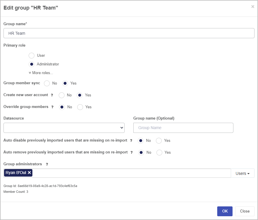
-
Override group members - choose from No or Yes. By choosing Yes, a full synchronisation is enabled between the Kianda group and the data source of users. Any users that are not listed in the data source, will be removed from this group in Kianda.
-
Datasource - choose a data source from the dropdown list. This data source must be already created, see Data connectors for more details.
-
Group name - choose a name for the group if desired.
-
Auto disable previously imported users that are missing on re-import - choose from No or Yes. By choosing Yes, any previously imported users that no longer exist in the data source, will be disabled in Kianda when re-synchronisation is executed. Their account will still exist in the system, but they will no longer be able to login to Kianda.
-
Auto remove previously imported users that are missing on re-import - choose from No or Yes. By choosing Yes, any previously imported users that no longer exist in the data source, will be removed from Kianda when re-synchronisation is executed. They will no longer be able to login to Kianda as their account will be removed from the system.
Note: When a group is synchronised, a scheduled task is created to import users from the data source group every one hour by default. This can be changed by going to Administration > Scheduled tasks. Go to Scheduled tasks to find out more about different schedules.
-
Group administrators - only Users or Groups listed here can manage the group; if you leave the field blank then Kianda administrators can manage the group.
As well as this, you can view:
Deleting groups
-
To delete a group, click on the Bin/Trash button  beside the name of the group.
-
You will receive a popup asking you if you want to delete the particular team. Click on OK to delete the team, or Cancel to cancel the deletion.
Creating new groups
-
To create a new group, click on the Create new group button in the main view.
-
In the Add group dialog box, type in details for the group:
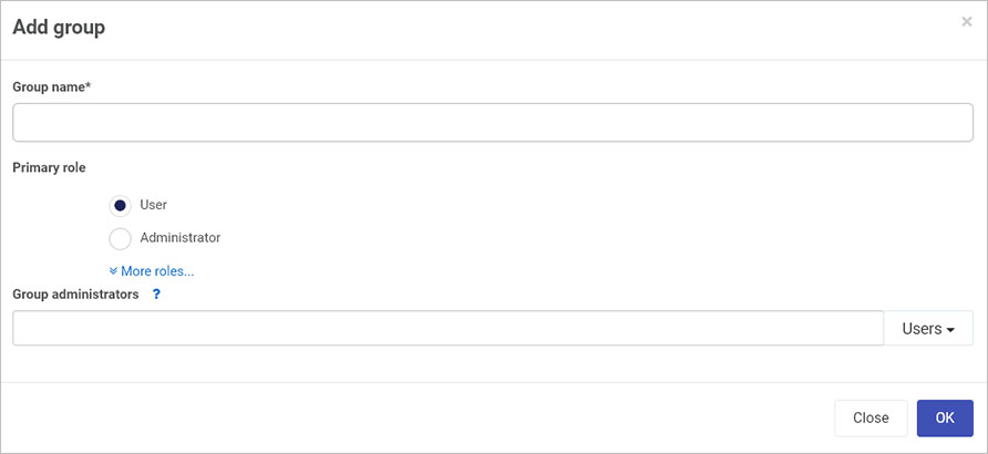
-
Group name - the name of the group
-
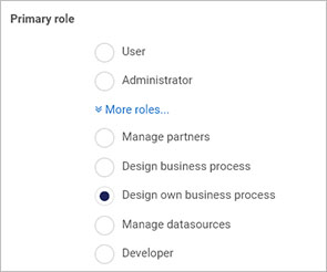
Primary role - choose a role for the group from User, Administrator, Manage partners, Design business process, Manage datasources and Developer as before, see Role details in Viewing and editing existing user details. In addition there is another role, Design own business process that allows groups to design their own process.
-
Group administrators - add Users and/or Groups to add people who can manage group membership. If you leave the field blank, any Kianda administrator can manage the group. If you specify administrators, as group creator you must add yourself as group administrator.
-
When you are finished editing the dialog box click on OK to save changes, otherwise click on Close to exit at any time.
What’s next
To read more about how to create processes and forms go to Application Designer.
To find out about help and support, go to Help.
7 - B2B Portals
B2B Portals is available within the Invite partners function and available to administrators and those users with the role Manage partners. Invite partners is found in the left-hand side pane, or on the top right toolbar depending on the chosen orientation, under Administration. The function allows you to share business processes processes to select business partners as external links.
How to get started
To access B2B portals:
-
Click on Administration in the left-hand side pane and then click on Invite partners.
-
You can view any shared processes or invited partners in the main view.
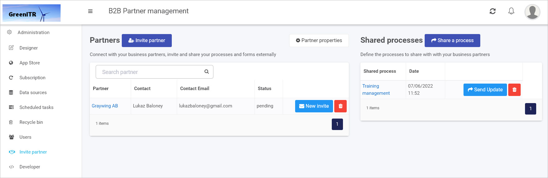
There are two main areas: Partners and Shared processes, these are explained in more detail below.
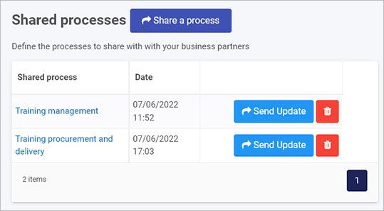
Shared processes
Existing shared processes appear within this section in the right-hand side of the main view. Before you invite a partner you must choose a process to share from within this section first.
To share a process
-
To share a process with a business partner, click on the Share a process button.
-
In the Edit Shared Process dialog box, fill out the fields.
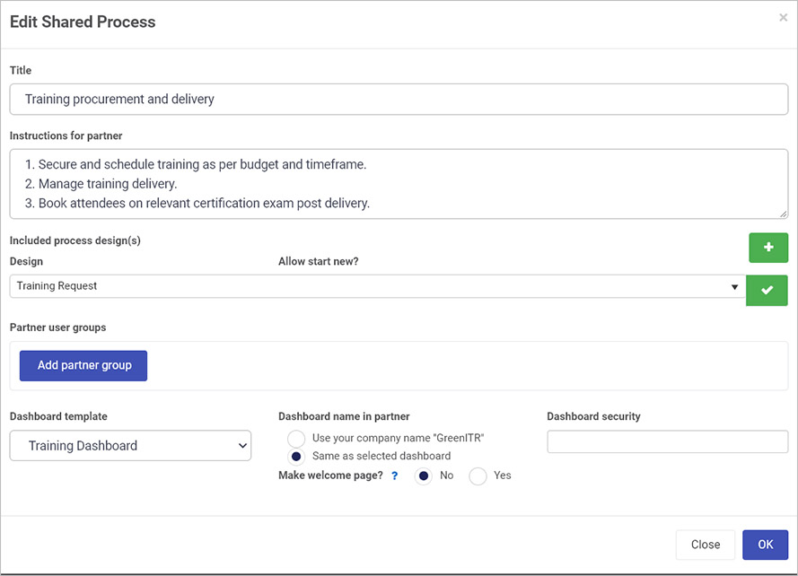
The fields in this box are:
-
Title - provide a title for the shared process
-
Instructions for partner - provide instructions for the selected partner
-
Click on the plus symbol  to add a selected process design to share. Then click on the dropdown list to search for a process to share.
-
Click on the tick symbol  to add the selected shared process. To change the selected shared process properties by clicking on the Cog/Settings button
  or delete the selected shared process by clicking on the Bin/trash button .
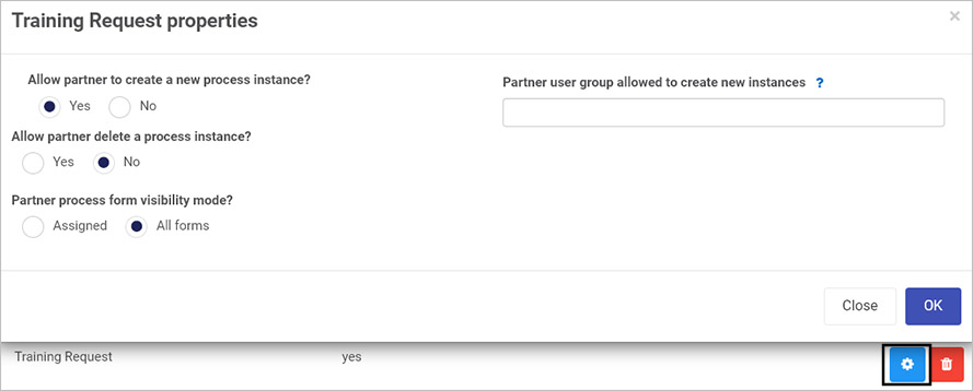
-
If you click on the Cog/Settings button a Process properties dialog box appears, as shown above, for example Training Request properties. You can check radio buttons for:
-
Allow partner to create a new process instance - choose from Yes or No. If you choose Yes, then you are allowing invited partner(s) to create new process instances from the chosen shared process design. A field Partner user group allowed to create new instances appears, where you can define the group(s) in the partner organisation, that can create these new process instances. If you leave the field blank, then anyone in the partner organisation can create process instances.
-
Allow partner delete a process instance - choose from Yes or No. If you choose Yes, then you are allowing invited partner(s) to delete new process instances from the chosen shared process design.
-
Partner process form visibility mode - choose from Assigned or All forms. If you choose Assigned, then the invited partner(s) can view only assigned form versus all forms, if All forms is chosen.
-
When you are finished editing the dialog box, click on OK, or else click on Close to exit the dialog box at any stage.
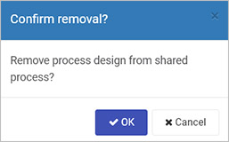
-
If you click on the Bin/trash button then a pop-up appears to Confirm removal, choose from OK or Cancel.
-
Click on the Tick symbol to add further selected processes to share.
-
Click on the Add partner group button to add one or more partner groups. Click on the Bin/trash button to delete partner groups.
-
Under Dashboard template click on the dropdown list to select an existing dashboards to share with the selected processes. If you choose to share a dashboard then you can select parameters:
- Dashboard name in partner - choose from Use your company name ‘Name of your organisation’ or Same as selected dashboard
- Make welcome page - choose from Yes or No. If you choose Yes then the selected dashboard becomes the welcome page for the partner if no other welcome page is configured.
- Dashboard security - choose from created partner groups within this field to ensure that only users in these partner groups can access the dashboard.
- When you are finished editing the dialog box, click on OK, or else click on Close to exit the dialog box at any stage.
To view details of an existing shared process
-
From the main shared processes view, click on the name of a shared process.
-
An Edit Shared Process dialog box appears with the same parameters as described in the To share a process section.
-
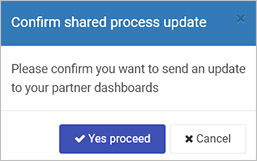
From the main shared processes view click on the Send Update button if you want to send an update to your partner dashboard. Then in the Confirm shared process update dialog box click on Yes proceed to send the update or Cancel to cancel sending the update.
-
Click on the Bin/trash button to delete a shared process.
To invite partners to shared processes go to the Partners section.
Partners
Existing partners appear within this section in the left-hand side of the main view. Before you invite a partner create a shared process as demonstrated in the section To share a process.
To invite partners
-
To invite partners to view shared processes, click on the Invite partner button.
-
In the Invite partner dialog box, fill out the fields.
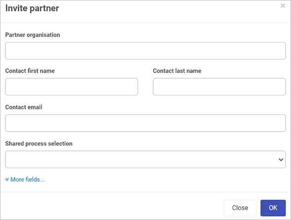
The fields in this box are:
-
Partner organisation - provide the name of the partner organisation
-
Contact first name - provide the first name of a contact in the partner organisation
-
Contact last name - provide the surname of a contact in the partner organisation
-
Contact email - provide the email of a contact
-
Shared process selection - in the dropdown list choose a shared process created using the steps listed in To share a process.
-
Click on More fields to see more fields these include: Partner country, Partner city, and Partner logo which you can add by clicking on Browse and browsing your PC or network.
- When you are finished editing the dialog box, click on OK, or else click on Close to exit the dialog box at any stage.
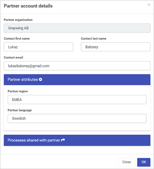
To view details of existing partners
-
From the main partners view, click on the name of an existing partner from the list of partners or type in the name of a partner in the Search partner search box.
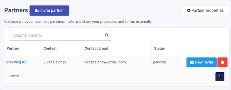
-
The Partner account details dialog box appears and details can be edited.
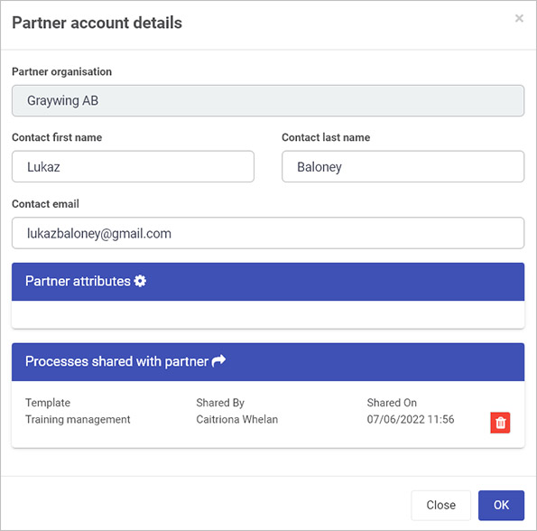
This dialog box contains same parameters as described in the To invite partners section, in addition to:
- Partner attributes - any additional partner attributes are listed here. See Partner properties section.
- Processes shared with partner - any processes shared with the partner organisation, following the steps in the To invite partners section, are listed here.
-
When you are finished editing the dialog box, click on OK, or else click on Close to exit the dialog box at any stage.
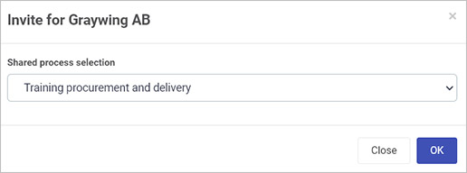
-
From the main shared processes view click on the New invite button if you want to invite a partner to a different shared process from the original one. Click on the dropdown list under Shared process selection and select one of the listed shared processes. When you have made your choice, click on OK, or else click on Close to exit the dialog box at any stage.
-
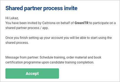
Clicking on OK results in an email invite being sent and the status in the Partners main view for the partner will be Pending until the partner clicks on Accept in the email, as shown in the example below, following by Accept invite in a further screen.
-
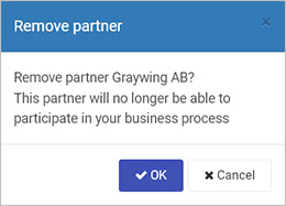
Click on the Bin/trash button to delete a shared process, Then in the Remove partner dialog box click on OK to remove the partner, or Cancel to cancel the removal.
To edit existing partner properties, go to the Partner properties section.
Partner properties
To add new partner properties click on the Partner properties button in the main Partners view.
-
When you click on the button, the Partner account custom attributes dialog box opens.
-
Click on Add attribute and type in a property, for example Partner region as shown in the example below.
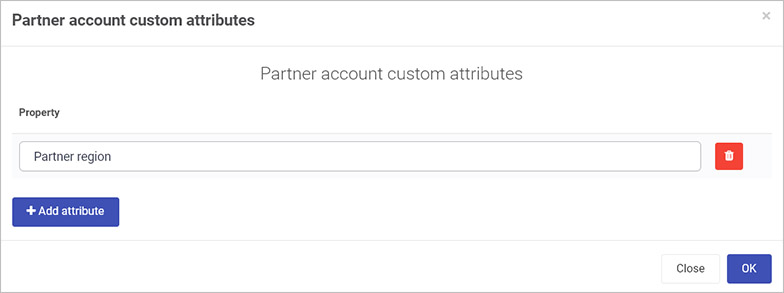
-
Click on Add attribute to add further properties, or click on the Bin/trash button to delete a property.
-
When you are finished editing the dialog box, click on OK, or else click on Close to exit the dialog box at any stage.
When a new property has been added you will receive a notification Global settings updated and the attribute can be edited for partners when you click on the partner name in the main view and edit the Partner attributes details.
What’s next
To read more about creating process designs in Designer and how to use the interface to create forms go to Application Designer.
To find out about help and support, go to Help.
8 - Developer
Kianda Developer is available to administrators and those users with the role Developer. The Developer function is found in the left-hand side pane or on the top right toolbar depending on the chosen orientation, under Administration. The function allows you to create customised field, rule, dashboard and data connector widgets using pre-defined widget UI and code templates that you can add your own code to, to create the effects you want.
You can also quickly use Kianda Developer to add webhooks, providing an efficient way to push GET requests to other applications in real-time as the Kianda process(es) runs and avoiding the need to poll for data.
Kianda uses EmberJS to build widgets, and in particular the Handlebars templating library, to power the application’s user interface. See templating basics to get started.
How to get started
To start using Developer:
-
Click on Administration in the left-hand side pane or on the top right toolbar depending on the chosen orientation and then click on Developer.
-
From here you will see the Developer resources page, with six distinct developer sections. Clicking on each of these sections will direct you to the relevant developer resource page.
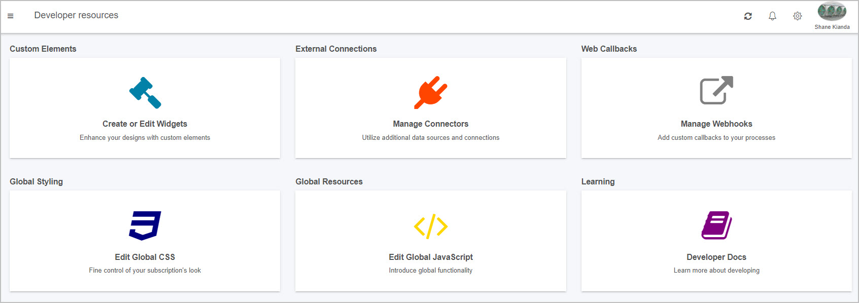
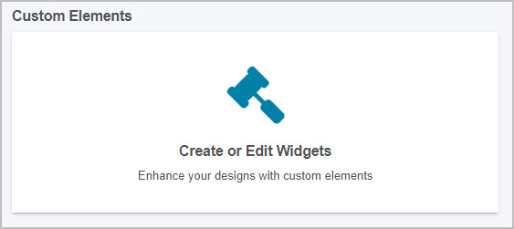
Custom Elements
The first section is Custom Elements, where you can create and edit custom field, rule and dashboard widgets. This powerful feature allows you to enhance your designs with custom elements to further drive your desired logic and creativity.
Inside the custom elements page, you will see a list of all current custom widgets within your platform:
-
You can search for a specific field, rule or dashboard widget by typing into the widget Search bar, found above the list of widgets on the top left. Click on the cancel button to clear your search query.
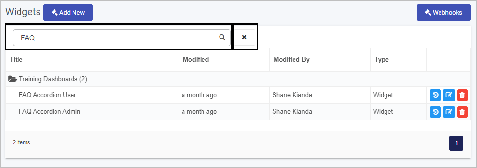
-
From the Developer resources main widget view you can:
- View the widget creation history by clicking on the Version History button

- Edit a widget by clicking on the Edit (Pen) button

- Delete a widget by clicking on the Bin/Trash button

-
To create a new widget click on Add New widget  . This will open the Edit widget dialog box.
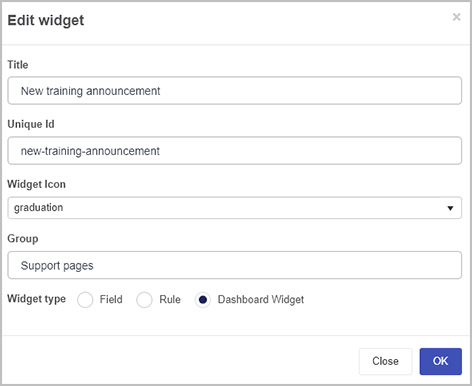
Fill out details as follows:
-
Title - fill out a title for the widget.
-
Unique Id - this is a unique value that is autofilled from the Title.
-
Widget Icon - choose an appropriate icon from the drop-down list.
-
Group - add in a group name to group widgets together in a folder in the main widget view.
-
Widget type - choose from Field, Rule or Dashboard widget.
Go to EmberJS templating basics to find out more about EmberJS to build widgets.
When you are finished editing the dialog box click on OK or click on Close at any time to exit.
-
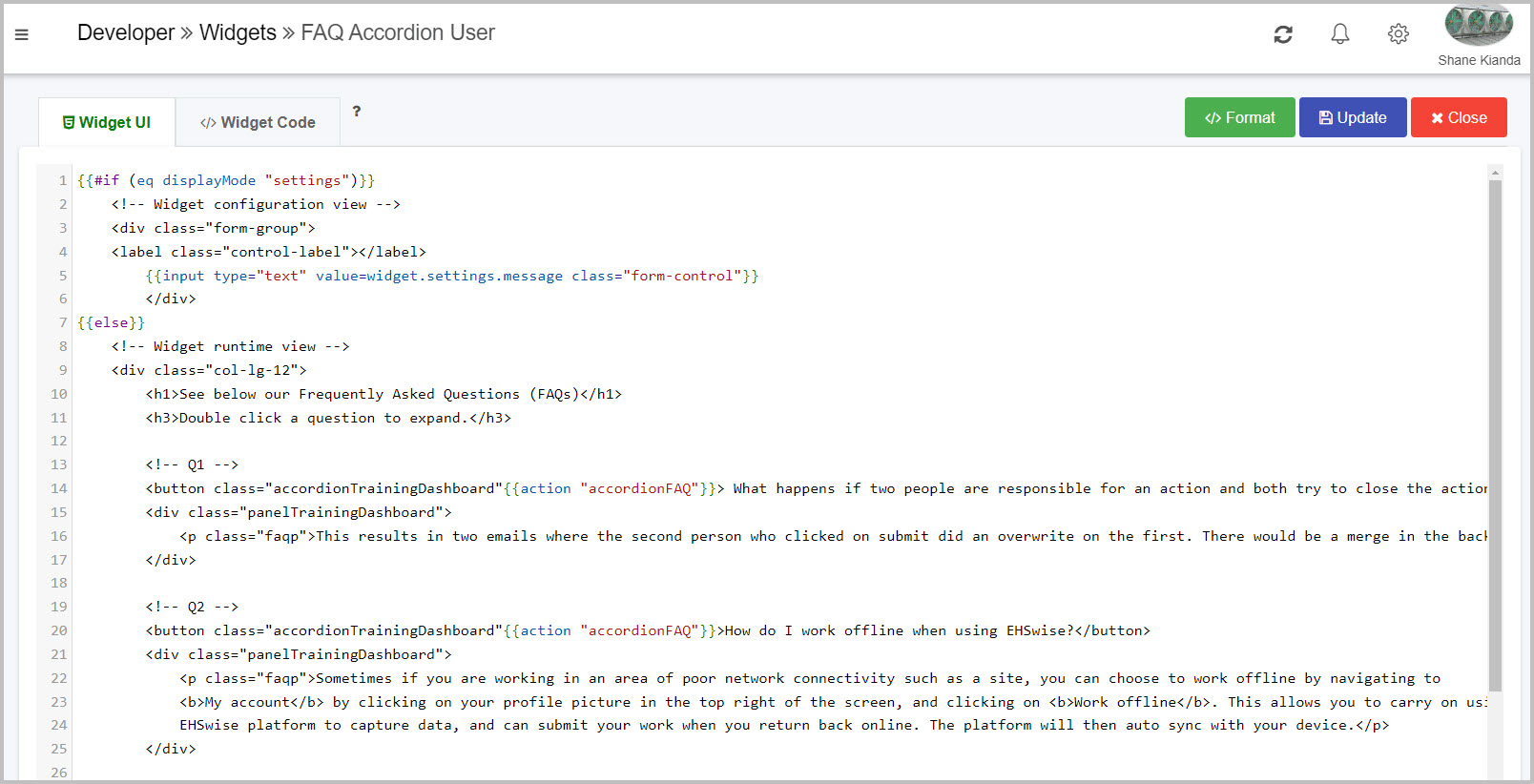
If you click on OK in the creation dialog, you will be navigated to the widget code editor screen. Alternatively, if you click on an existing widget from the widget list, you will be navigated to the relevant widget’s code editor screen.
-
In the Widget pane you can:
-
Edit the visual user interface of the widget via HTML and CSS by clicking on the Widget UI code editor tab.
-
Edit the logic of the widget via JavaScript and Ember.js by clicking on the Widget Code code editor tab. As previously mentioned, you can find out more about widget construction on the EmberJS templating basics page.
-
Tidy and nest the code correctly by clicking on the Format button  .
.
-
Update existing Widget UI and Widget Code within the editor and then click on the Update button  .
.
-
When finished, exit the widget and discard changes by clicking on the Close button  .
.
External Connections
The second section is External Connections, where you can create and edit customised connectors within your Kianda platform. This is useful if one of the many established Kianda data connectors do not meet your requirements. The custom connectors allow you to customise pre and post-processing of queries between your platform and data source.
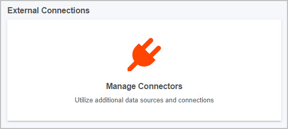
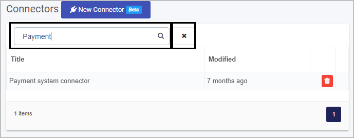
Inside the external connections page, you will see a list of all current connections within your platform:
-
To create a new customised connector click on the New Connector button  and populate the four tabs that appear. Details on how to create a customised connector are found at Custom connectors.
-
You can search for a specific connector by typing into the connector Search bar, found above the list of connectors on the top right. Click on the cancel button to clear your search query.
Web Callbacks
The third section is Web Callbacks, where you can create and add custom webhooks and callbacks to your processes. This allows for communication between your platform and external applications and for alerts from external services.
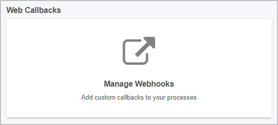
To create your own web callbacks:
-
Click on Web Callbacks to configure URLs to respond to process instance create, update and delete events.
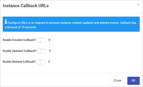
-
Move the slider across for each type of operation (Create, Update, Delete) to add in a URL to enable callback.
- For example, clicking the Enable Deleted Callback slider will enable the URL callback every time a process instance is deleted.
- HTTP GET with parameters
instanceID={instanceID}, processName={processName} and eventType=deleted will be issued to the provided URL. - When you are finished editing the dialog box click on OK or click on Close at any time to exit.
-
When finished, click on OK to apply the changes, or Close to exit and discard the changes.
Global Styling
The fourth section is Global Styling, where you can edit your global CSS file, allowing you to fine tune your subscription’s look and feel. This section is different from the Look and Feel section within Subscription as it provides a larger code editing screen amongst other features.
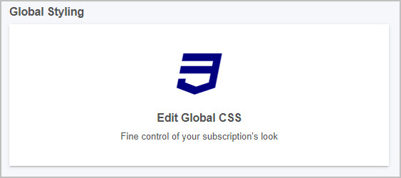
Clicking into this page allows you to:
-
View your code in a large screen code editor, where you can add or remove CSS.
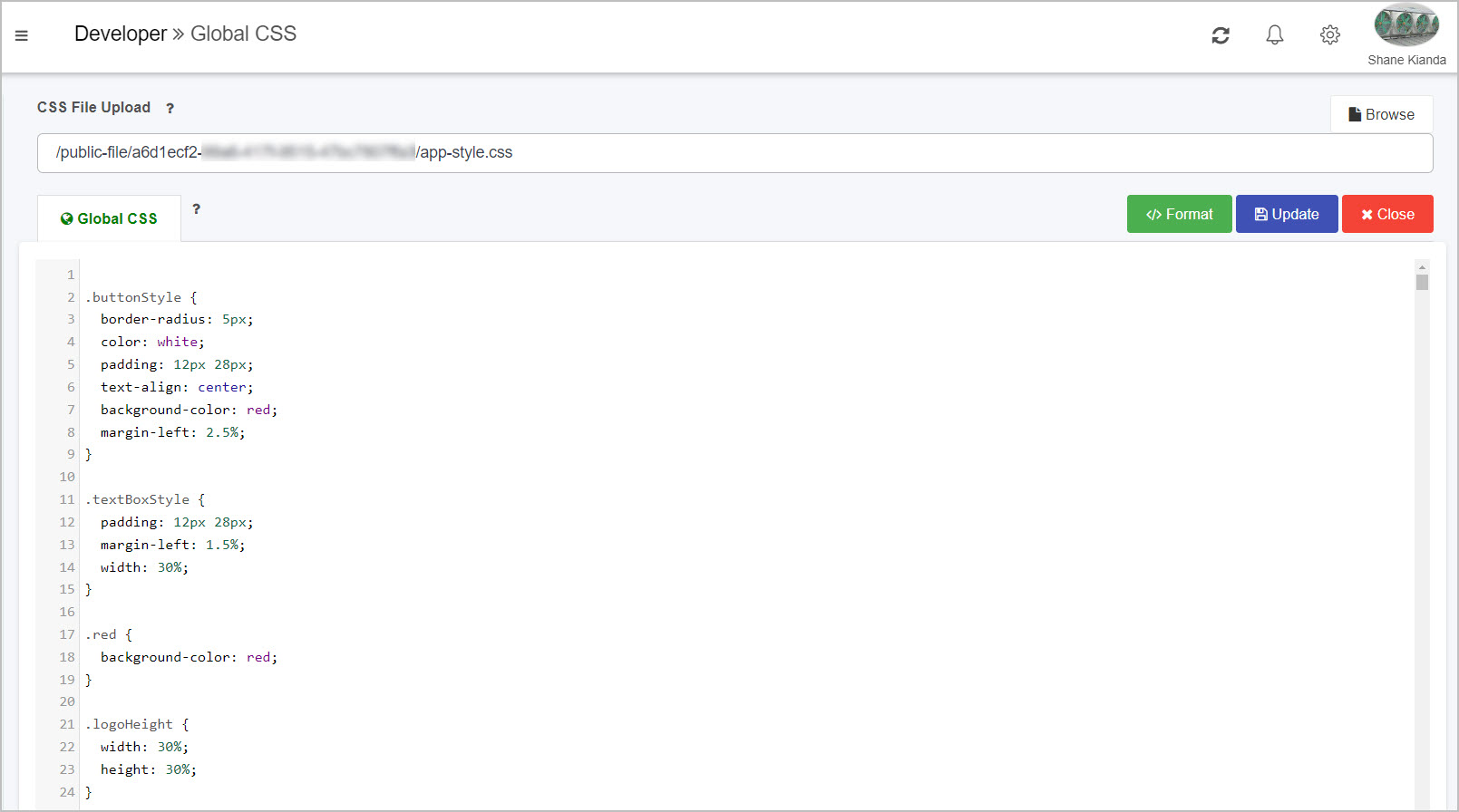
-
Clicking on the Browse button  allows you to browse through your device to select a CSS file to upload to the platform. Note: this will overwrite your current CSS.
As well as this, you can:
-
When finished, exit the widget and discard changes by clicking on the Close button .
Global Resources
The fifth section is Global Resources, where you can edit your global JavaScript file, allowing you to fine tune your subscription’s global functionality. This section is different from the Subscription Details section within Subscription as it provides a larger code editing screen amongst other features.
Clicking into this page allows you to:
-
View your code in a large screen code editor, where you can add or remove JavaScript.
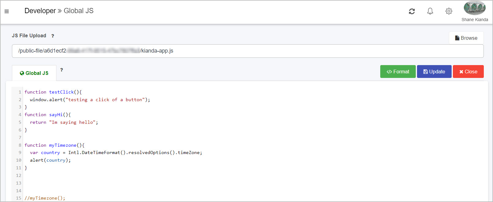
-
Clicking on the Browse button allows you to browse through your device to select a JavaScript file to upload to the platform. Note: this will overwrite your current JavaScript.
As well as this, you can:
-
When finished, exit the widget and discard changes by clicking on the Close button .
Developer Docs
The sixth and final section is Developer Docs, where you can gain access to this Kianda documentation site, where you can learn more about Kianda and how it works.
Clicking on this link will open a new tab and navigate you specifically to the Low-Code Development section of the docs.
EmberJS templating basics
With Handlebars you can quickly build web applications that are made up of different components. Handlebar templates contain static HTML and dynamic content inside Handlebars expressions, which are summoned with double curly braces: {{ }}
Dynamic content inside a Handlebars expression is rendered with data-binding. This means if you update a property, your usage of that property in a template will be automatically updated to the latest value.
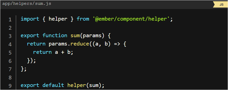
Helpers
Ember gives the ability to write your helpers, to bring a minimum of logic into Ember templating. For example, let’s say you would like the ability to add a few numbers together, without needing to define a computed property everywhere you would like to do so.
Helper example
Conditionals
Statements like if and unless are implemented as built-in helpers. Helpers can be invoked three ways; inline invocation, nested invocation and block invocation. For more details, go to: https://guides.emberjs.com/v2.18.0/templates/conditionals/.
What’s next
To read more about Developer and how to use the platform for low-code development, go to Low code development.
To find out about help and support, go to Help.