Developer
Kianda Developer is available to administrators and those users with the role Developer. The Developer function is found in the left-hand side pane or on the top right toolbar depending on the chosen orientation, under Administration. The function allows you to create customised field, rule, dashboard and data connector widgets using pre-defined widget UI and code templates that you can add your own code to, to create the effects you want.
You can also quickly use Kianda Developer to add webhooks, providing an efficient way to push GET requests to other applications in real-time as the Kianda process(es) runs and avoiding the need to poll for data.
Kianda uses EmberJS to build widgets, and in particular the Handlebars templating library, to power the application’s user interface. See templating basics to get started.
How to get started
To start using Developer:
-
Click on Administration in the left-hand side pane or on the top right toolbar depending on the chosen orientation and then click on Developer.
-
From here you will see the Developer resources page, with six distinct developer sections. Clicking on each of these sections will direct you to the relevant developer resource page.
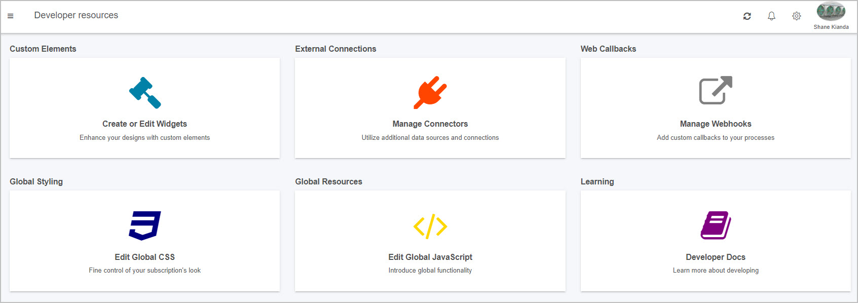
Custom Elements
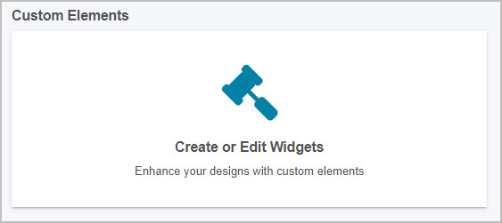
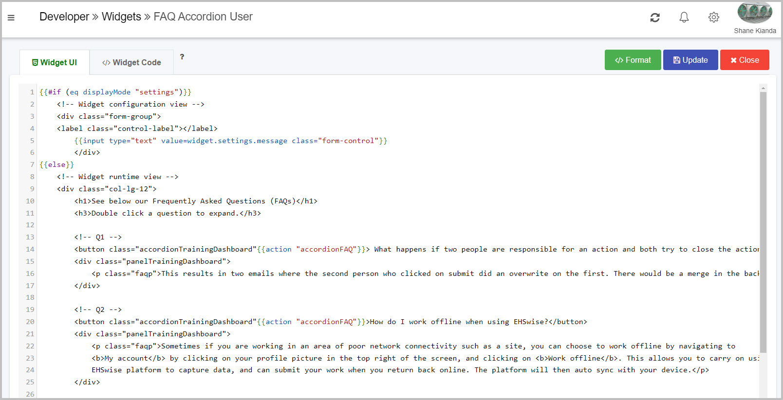
The first section is Custom Elements, where you can create and edit custom field, rule and dashboard widgets. This powerful feature allows you to enhance your designs with custom elements to further drive your desired logic and creativity.
Inside the custom elements page, you will see a list of all current custom widgets within your platform:
-
You can search for a specific field, rule or dashboard widget by typing into the widget Search bar, found above the list of widgets on the top left. Click on the cancel button
 to clear your search query.
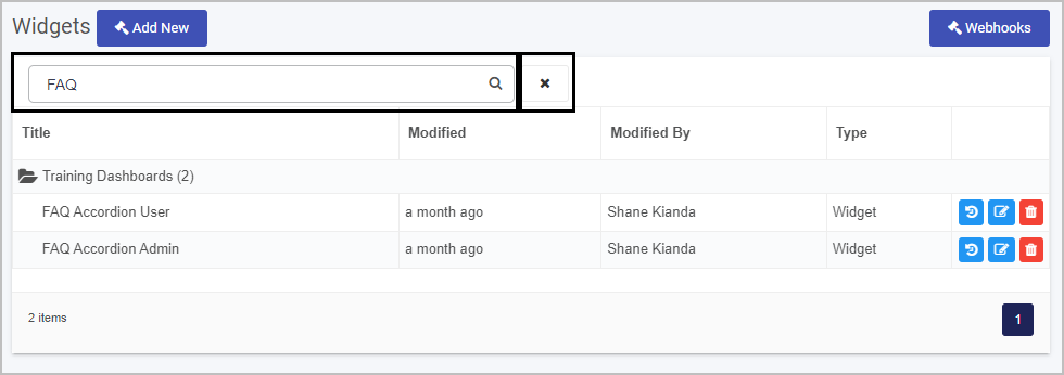
-
From the Developer resources main widget view you can:
- View the widget creation history by clicking on the Version History button

- Edit a widget by clicking on the Edit (Pen) button

- Delete a widget by clicking on the Bin/Trash button

- View the widget creation history by clicking on the Version History button
-
To create a new widget click on Add New widget
 . This will open the Edit widget dialog box.
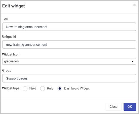
Fill out details as follows:
-
Title - fill out a title for the widget.
-
Unique Id - this is a unique value that is autofilled from the Title.
-
Widget Icon - choose an appropriate icon from the drop-down list.
-
Group - add in a group name to group widgets together in a folder in the main widget view.
-
Widget type - choose from Field, Rule or Dashboard widget.
Go to EmberJS templating basics to find out more about EmberJS to build widgets.
When you are finished editing the dialog box click on OK or click on Close at any time to exit.
-
-
If you click on OK in the creation dialog, you will be navigated to the widget code editor screen. Alternatively, if you click on an existing widget from the widget list, you will be navigated to the relevant widget’s code editor screen.
-
In the Widget pane you can:
-
Edit the visual user interface of the widget via HTML and CSS by clicking on the Widget UI code editor tab.
-
Edit the logic of the widget via JavaScript and Ember.js by clicking on the Widget Code code editor tab. As previously mentioned, you can find out more about widget construction on the EmberJS templating basics page.
-
Tidy and nest the code correctly by clicking on the Format button
 .
. -
Update existing Widget UI and Widget Code within the editor and then click on the Update button
 .
.
-
-
When finished, exit the widget and discard changes by clicking on the Close button
 .
.
External Connections
The second section is External Connections, where you can create and edit customised connectors within your Kianda platform. This is useful if one of the many established Kianda data connectors do not meet your requirements. The custom connectors allow you to customise pre and post-processing of queries between your platform and data source.
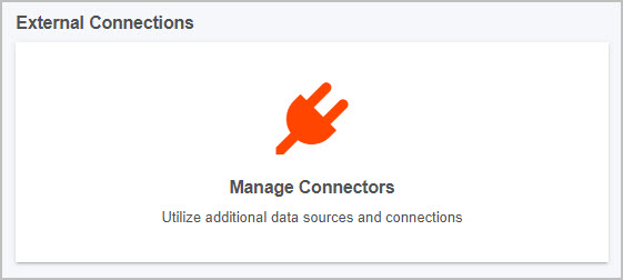
Inside the external connections page, you will see a list of all current connections within your platform:
-
To create a new customised connector click on the New Connector button
 and populate the four tabs that appear. Details on how to create a customised connector are found at Custom connectors.
 -
You can search for a specific connector by typing into the connector Search bar, found above the list of connectors on the top right. Click on the cancel button
to clear your search query.
Web Callbacks
The third section is Web Callbacks, where you can create and add custom webhooks and callbacks to your processes. This allows for communication between your platform and external applications and for alerts from external services.
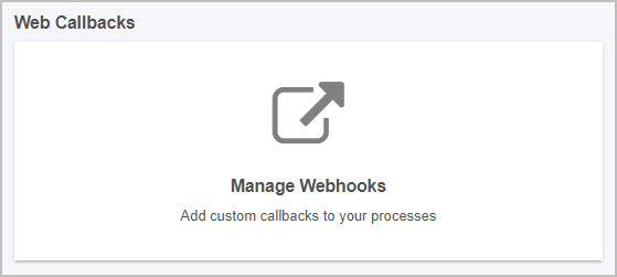
To create your own web callbacks:
-
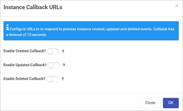
Click on Web Callbacks to configure URLs to respond to process instance create, update and delete events.
-
Move the slider across for each type of operation (Create, Update, Delete) to add in a URL to enable callback.
- For example, clicking the Enable Deleted Callback slider will enable the URL callback every time a process instance is deleted.
- HTTP GET with parameters
instanceID={instanceID}, processName={processName}andeventType=deletedwill be issued to the provided URL. - When you are finished editing the dialog box click on OK or click on Close at any time to exit.
-
When finished, click on OK to apply the changes, or Close to exit and discard the changes.
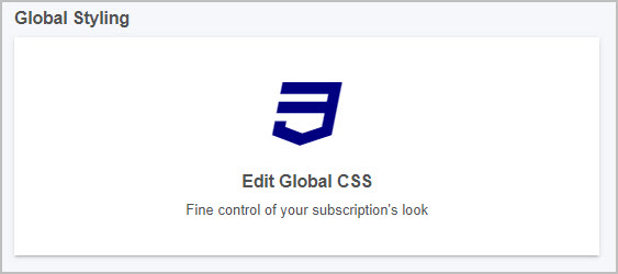
Global Styling
The fourth section is Global Styling, where you can edit your global CSS file, allowing you to fine tune your subscription’s look and feel. This section is different from the Look and Feel section within Subscription as it provides a larger code editing screen amongst other features.
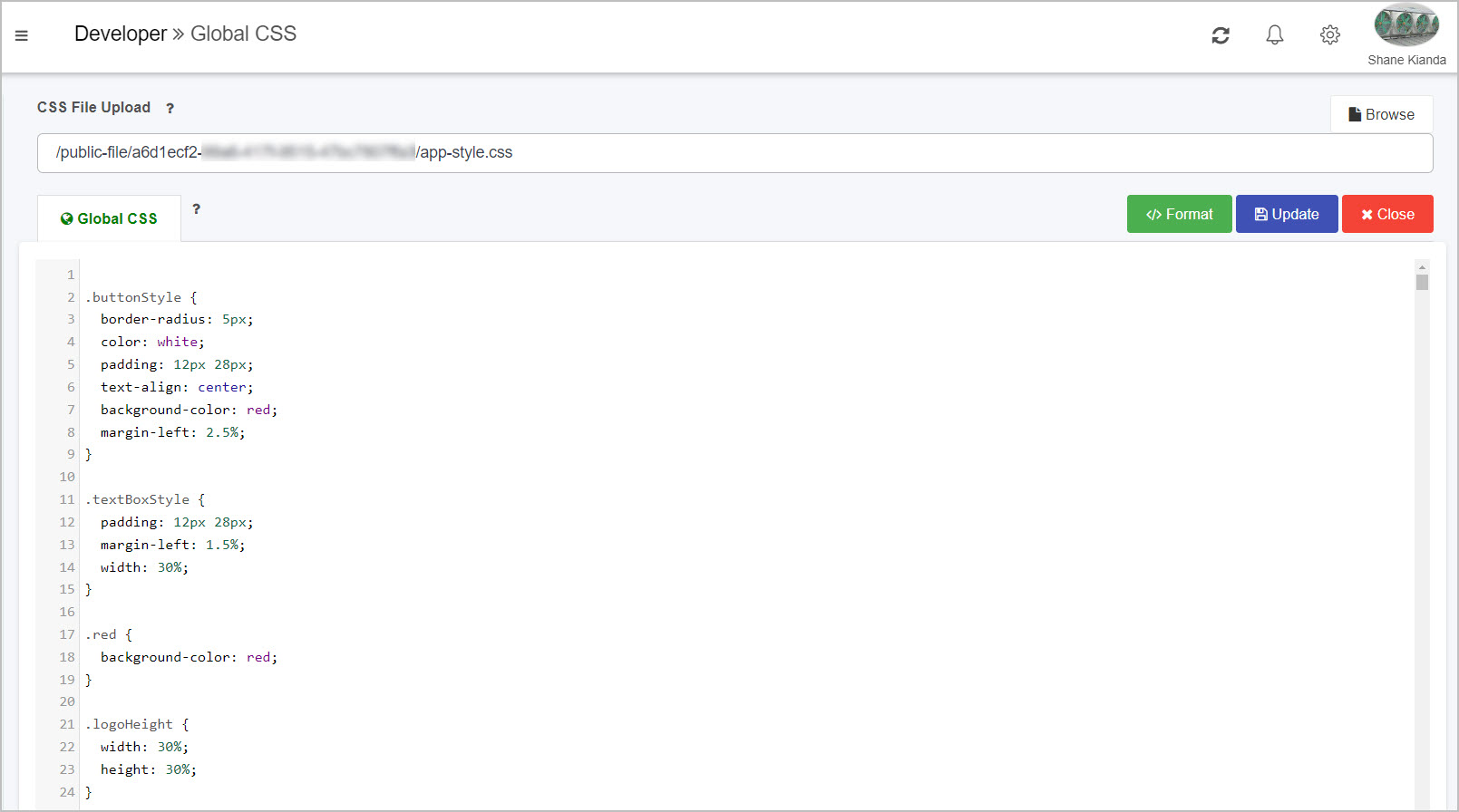
Clicking into this page allows you to:
-
View your code in a large screen code editor, where you can add or remove CSS.
-
Clicking on the Browse button
 allows you to browse through your device to select a CSS file to upload to the platform. Note: this will overwrite your current CSS.
As well as this, you can:
-
Tidy and nest the code correctly by clicking on the Format button
. -
Update existing CSS within the editor and then click on the Update button
.
-
-
When finished, exit the widget and discard changes by clicking on the Close button
.
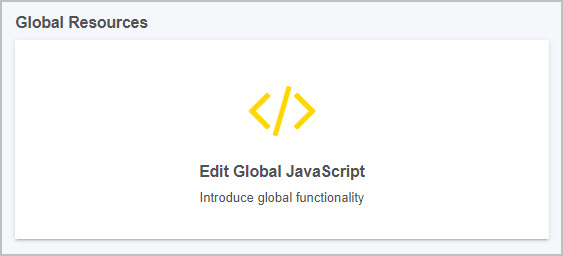
Global Resources
The fifth section is Global Resources, where you can edit your global JavaScript file, allowing you to fine tune your subscription’s global functionality. This section is different from the Subscription Details section within Subscription as it provides a larger code editing screen amongst other features.
Clicking into this page allows you to:
-
View your code in a large screen code editor, where you can add or remove JavaScript.
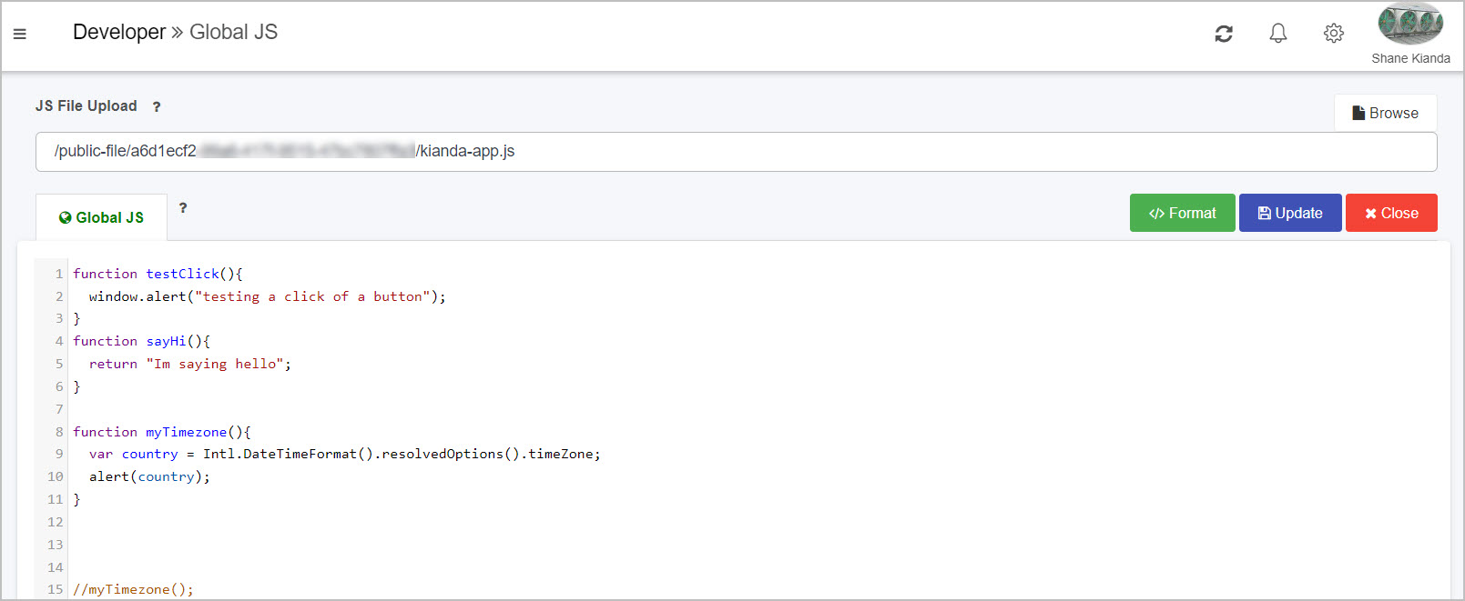
-
Clicking on the Browse button
allows you to browse through your device to select a JavaScript file to upload to the platform. Note: this will overwrite your current JavaScript.As well as this, you can:
-
Tidy and nest the code correctly by clicking on the Format button
. -
Update existing JavaScript within the editor and then click on the Update button
.
-
-
When finished, exit the widget and discard changes by clicking on the Close button
.
Developer Docs
The sixth and final section is Developer Docs, where you can gain access to this Kianda documentation site, where you can learn more about Kianda and how it works.

Clicking on this link will open a new tab and navigate you specifically to the Low-Code Development section of the docs.
-
EmberJS templating basics
With Handlebars you can quickly build web applications that are made up of different components. Handlebar templates contain static HTML and dynamic content inside Handlebars expressions, which are summoned with double curly braces: {{ }}
Dynamic content inside a Handlebars expression is rendered with data-binding. This means if you update a property, your usage of that property in a template will be automatically updated to the latest value.
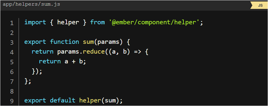
Helpers
Ember gives the ability to write your helpers, to bring a minimum of logic into Ember templating. For example, let’s say you would like the ability to add a few numbers together, without needing to define a computed property everywhere you would like to do so.
Helper example
Conditionals
Statements like if and unless are implemented as built-in helpers. Helpers can be invoked three ways; inline invocation, nested invocation and block invocation. For more details, go to: https://guides.emberjs.com/v2.18.0/templates/conditionals/.
What’s next 
To read more about Developer and how to use the platform for low-code development, go to Low code development.
To find out about help and support, go to Help.
Feedback
Was this page helpful?
Glad to hear it! Please tell us how we can improve.
Sorry to hear that. Please tell us how we can improve.