Introduction
Creating your first process or application in Kianda starts with designing your first form. Users with the role Administrator or Design business process can create forms that can connect to any number of data sources at the same time. The form might be a simple contact form or something else more complex, and you can add more forms like “Follow-up form” or even a “Closure form”. To the form you can add predefined controls or fields, and business rules to define how the processes can behave.
These process elements, processes, forms, controls and rules are explained in the sections below:
Forms, fields and rules are created and edited using Kianda Designer explained in further on this page.
How to get started
Although Kianda aims to be intuitive and easy to get started, it is never difficult to over-engineer. So at Kianda we always recommend doing some simple planning before you design your first form. It could be something as simple as a quick flow chart or a spreadsheet where you can quickly log the key components, fields or rules that are needed in the process.
In general there are three key steps to build a process in an agile manner:
- Plan process design, forms, fields, rules, log into design spreadsheet.
- Build forms and fields connecting to data where applicable.
- Publish to dashboards, launch anonymous forms or publish to data sources for end-user distribution.
Platform getting started video
Creating your first process
To help you plan your process, go to Plan your process to get started. When you have planned what you want to do, it couldn’t be simpler to start creating your new process by following the steps below:
-
Using your Administrator or Design business process role, go to the left- hand side menu and click on Administration > Designer.
-
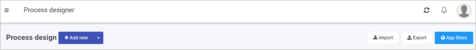
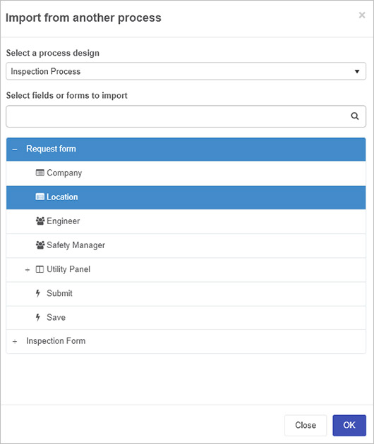
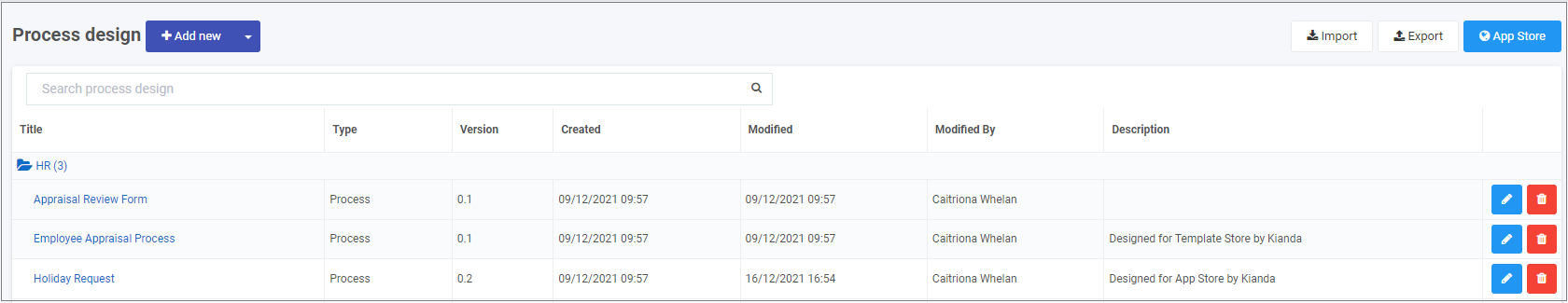
You are now in the main process view. From here, you can click on Import or Export to import or export processes once created. There is also an option to use Kianda’s predefined processes available in the App Store.
Adding a new process
-
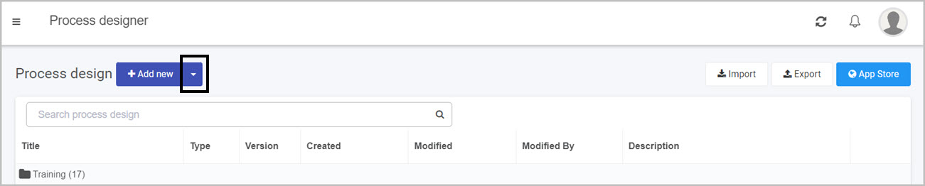
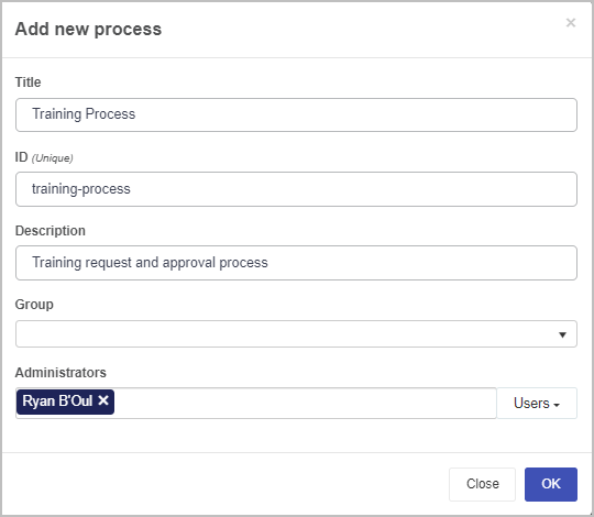
Click on the Add new button to create a process from scratch.
-
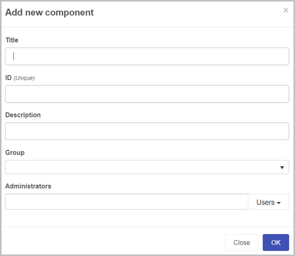
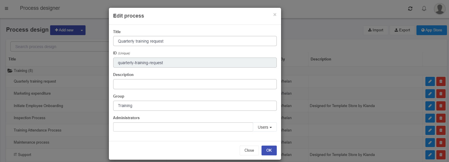
Fill out the details in the Add new process dialog box:
Add new process dialog box
-
Title - the title for your process
-
ID - this is a unique Name that is autofilled from the title, however you can manually edit it.
-
Description - a short description for your process
-
Group - you can click on the fields drop-down button
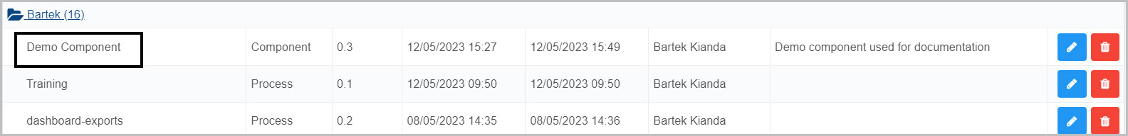
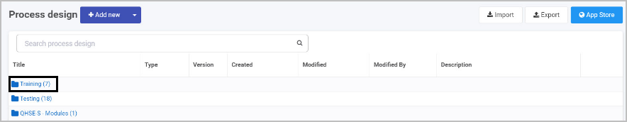
 to browse for existing groups to add your new process to or alternatively, you can select Create new group to create a new folder group for your process to go in. If Create new group is selected, a field New group name will be displayed where you will enter the name of the new group. See below an example of creating a new group labelled ‘Training’.
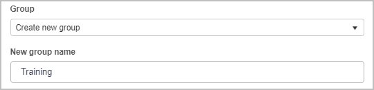
-
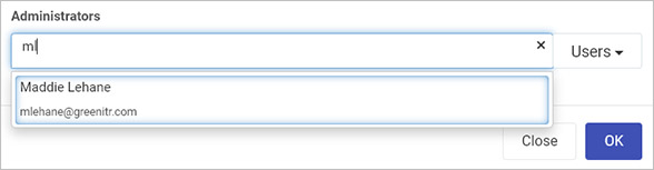
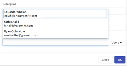
Administrators - these are process administrators or people who will be able to change the process design. Process administrators must have the role administrator or design business process so that they can access Designer to modify the process design. Choose from Users and/or Groups in the drop-down list, or leave blank to allow all those with an administrator role, to have access to this process design.
Users and groups must be already defined in the system by a user with an administrator role, see User management.
Note that there is a limit of 10 names in the drop-down list, displayed alphabetically from the list of users and groups, but you can type in a user or group name to see them appear in the list, for example as shown below.
-
-
Click on OK
 when complete.
 -
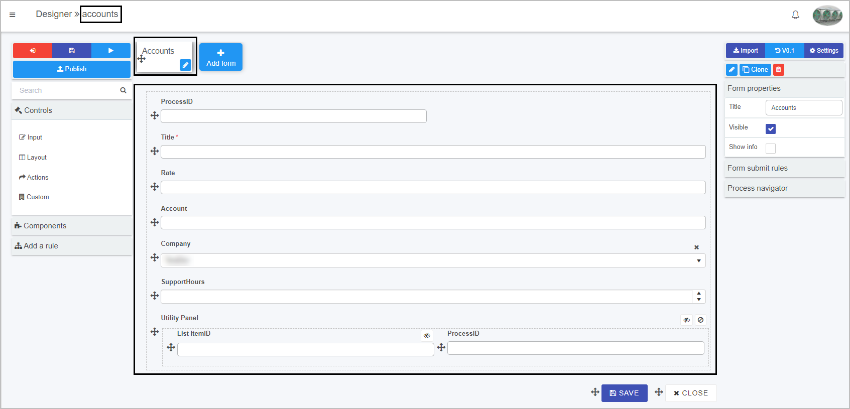
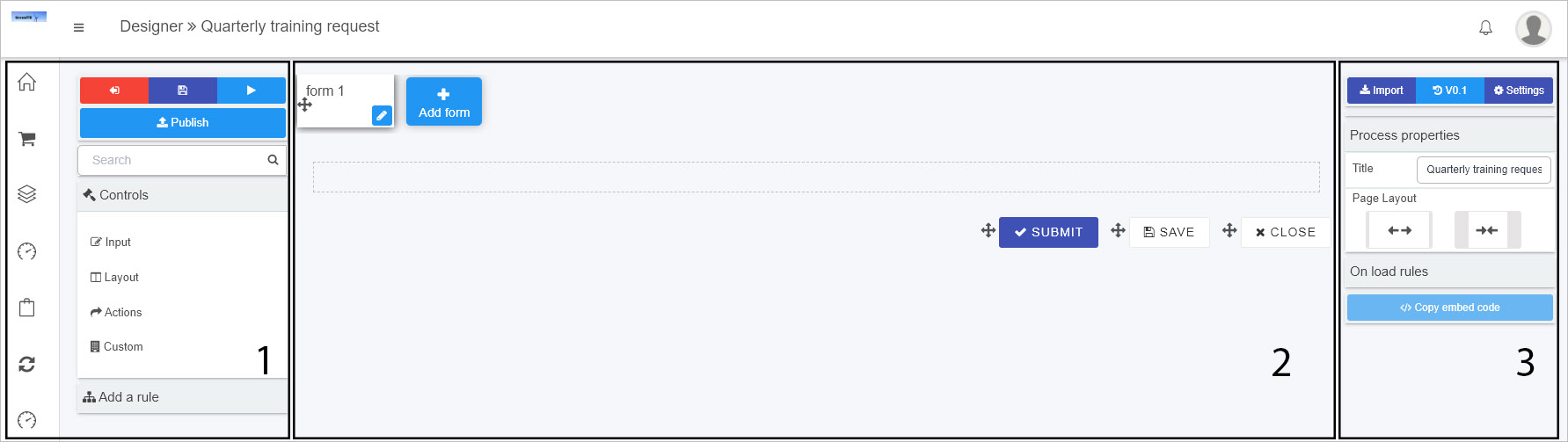
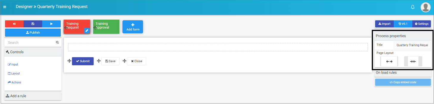
You are now in the Process Design page, that is Kianda Designer. From here, you can add forms, fields and rules, change settings and properties and manage your process design.
Kianda Designer introduction
Kianda Process Designer provides an intuitive interface where you can quickly start building forms for any use case.
The key components of the form designer are:
- Left side panel containing both controls and rules that can be added to forms.
- The central area is where the current form canvas is displayed.
- The right panel is where the currently selected component properties and rules are displayed.
Form designer key components
The following headings highlight the key features of Designer that allow you to build slick, progressive, responsive and customised forms and processes.
Forms
Forms are an important component of any process. They might be used as stages of a process and could be made active individually or at the same time known as parallel forms.
The key rules related to designing forms for user interaction are:
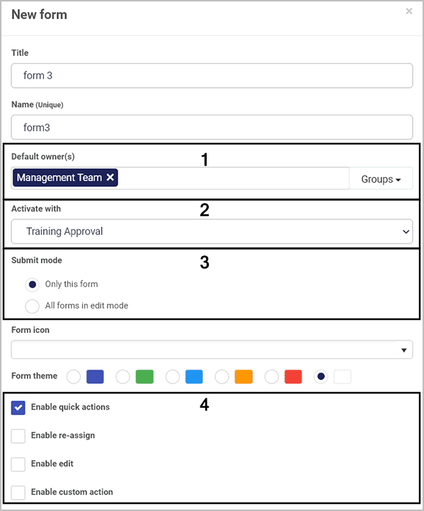
- Forms are assignable, this means that only a form assignee can edit a particular form in a process instance. The form assignee can be a combination of users and groups.
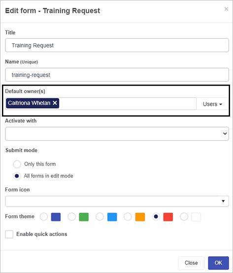
- When a form is created, as a designer you can configure form owners. Only form owners can edit a given form in a process instance by default. Any other user with access to view the form will see it in read-only mode.
- Processes that have several steps use the concept of current form, where only the current form is editable in a process instance. Forms become the current form as the process executes sequentially. Rules like Go to form can be used to make forms the current form. Other forms can be configured to activate with the current form. This means it is also possible to edit these forms at the same point in process execution and togther the forms form a form group.
The rules above work together to determine if the form is in edit mode or display mode. Form designers have at their disposal business rules such as Assign form, Go to form and Submit form to dynamically control the ability for end-users to edit a particular form or a section of a form.
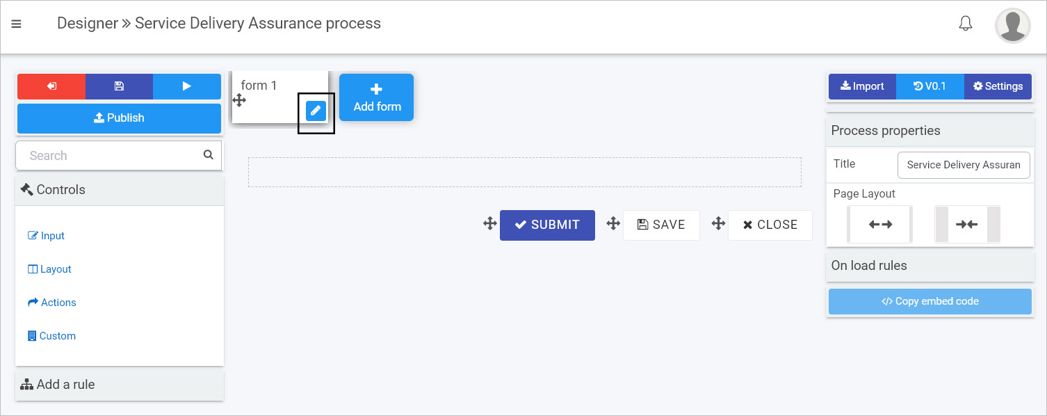
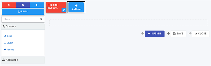
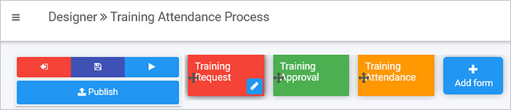
How to add a form
-
To get started with processes, go to the left-hand side menu > Administration > Designer. There are options to import processes, use the App Store or create a new process from scratch by clicking on the Add new button. To learn more about this, see How to get started with processes.
-
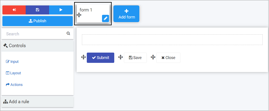
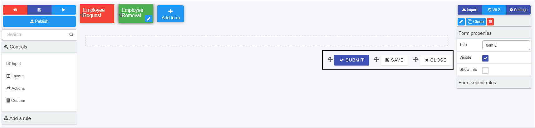
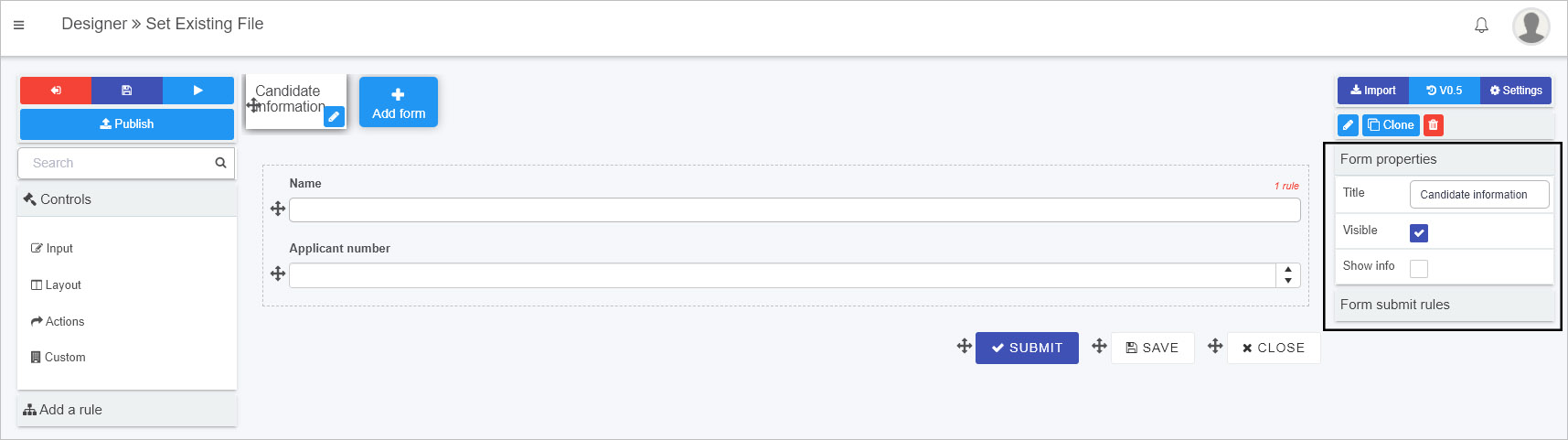
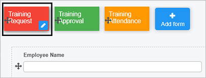
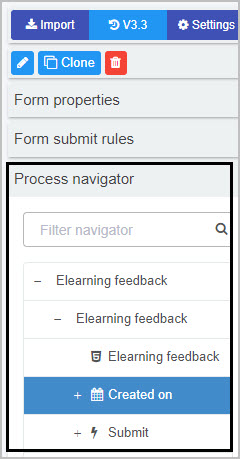
When you open a process or create a new process you are automatically brought into Kianda Designer. In new processes, by default a new form is automatically added to your process called form 1.
-
The form is automatically selected, and controls and rules are ready to be added using the options in the left-hand pane. You can edit the form by clicking on the edit/pen button
 highlighted above. This will open an Edit form dialog box, see Editing forms for more details.
 -
To add another form, click on the Add form button at the top of the page.
-
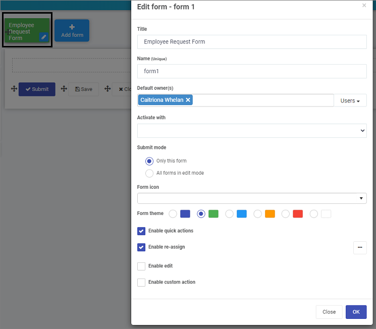
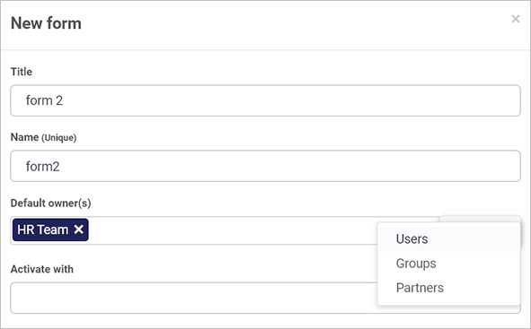
A new form dialog box appears. See Editing forms for more details for example how to add form owners and enable quick actions.
As you create forms, there are some important features to note that will help you get the most out of your form design:
Click on the links above or browse through the following headings to read more.
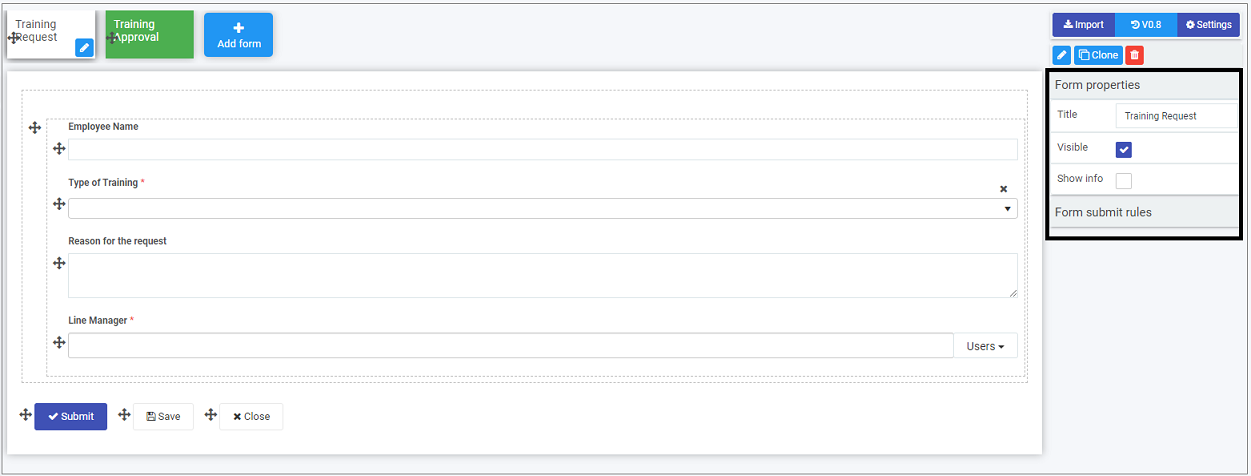
Form fields
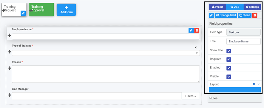
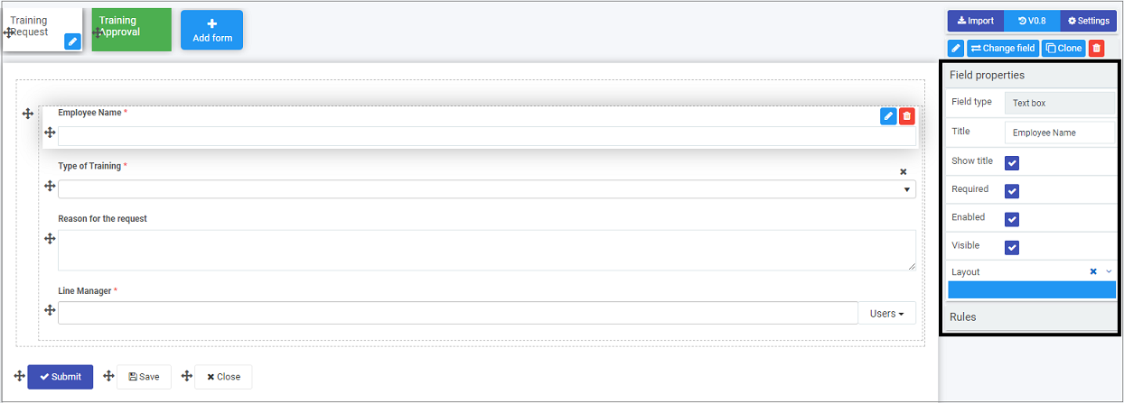
Kianda form usability is brought to life with the help of the various input fields or controls that are specifically adapted to work in mobile, tablet or desktop modes. Fields include textbox, date picker, numeric input, file upload and table, to name a few. Kianda offers a flexible array of controls that can be adjusted to work with a myriad of scenarios.
Example of a form in a process with a text box field
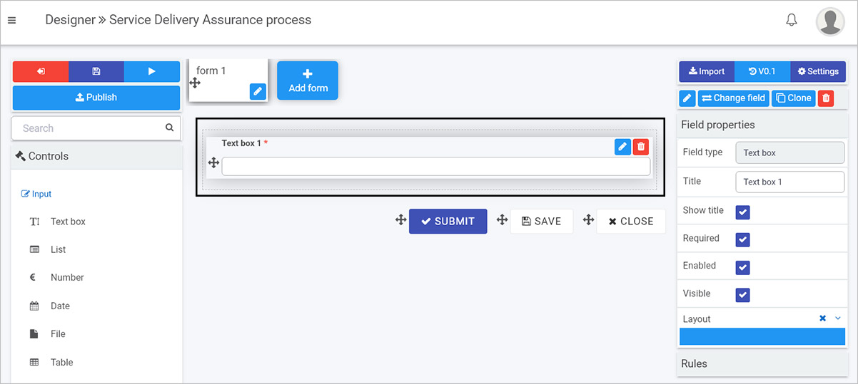
Each field comes with its own set of:
a) settings like autofill for textbox and currency format for numeric input
b) properties that determine how the field will display.
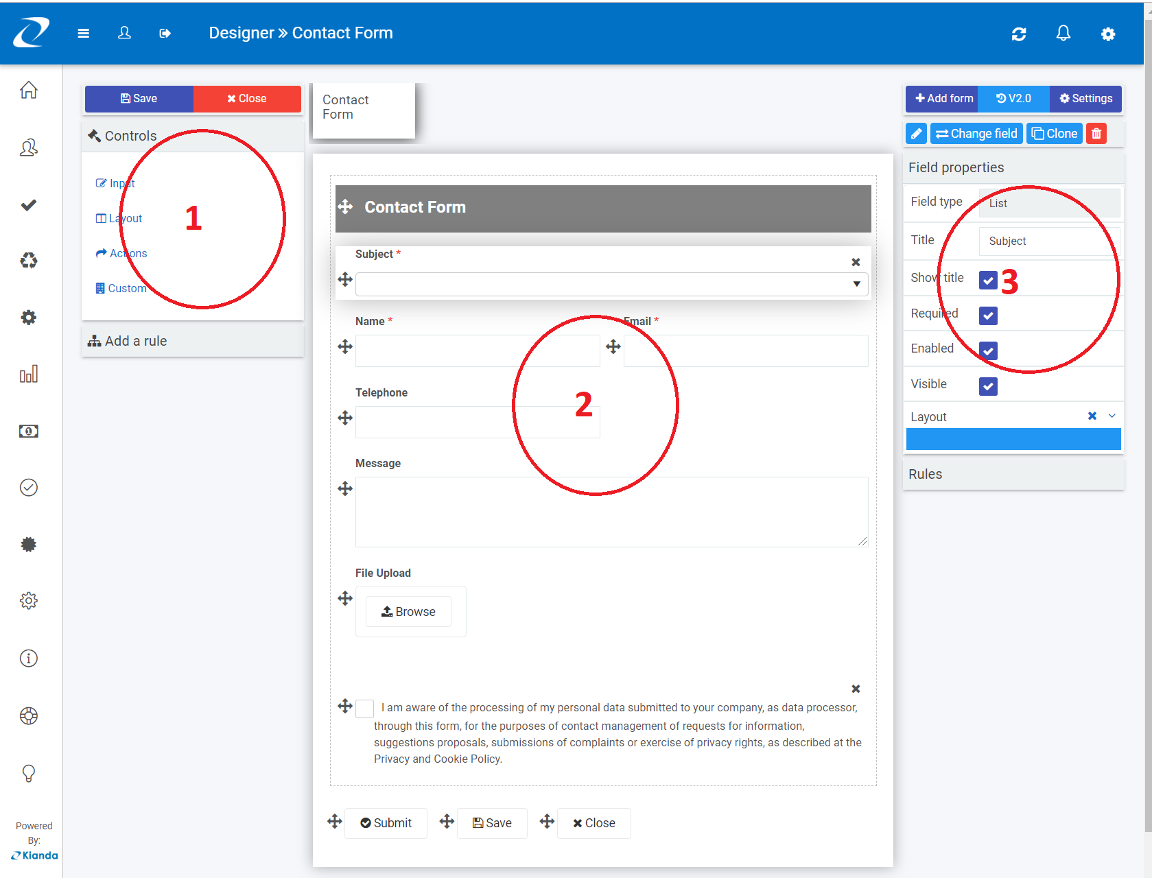
The following are some of the common properties of input fields. Field properties appear when the field is selected within a form, as shown in the image above for the text box field. The properties appear on the right:
-
Title - every field comes with a title property that is usually displayed on top of the field and can serve as a prompt to a user
-
Show title - check this property to show the title of a field in a form
-
Required - this Boolean property allows a form designer to make a field mandatory or not
-
Enabled - check this property to make the field appear in a form for a user to use
-
Visible - displays the field in the form or not depending on checking the checkbox
-
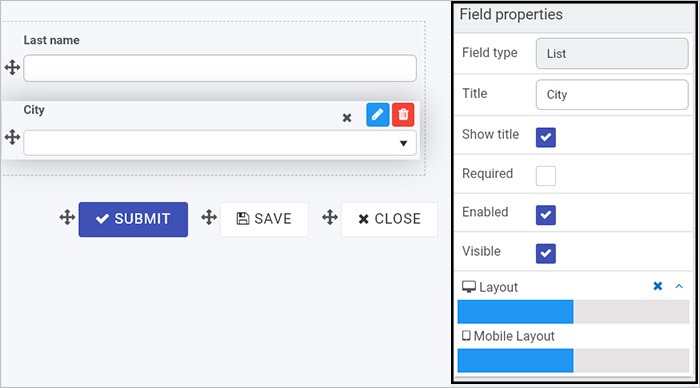
Layout - defines both desktop or mobile layout by selecting a size from the blue bar presented, see Responsive form layout for more details.
In addition to the field properties, each field has it’s own settings that you can change simply by selecting the field and clicking on the Edit/Pen button . This will open an Edit field dialog box where you can change settings.
In total there are 16 predefined field widgets, see Categories of fields below. In case none of these satisfies your specific needs and if you have some level of development skills you can always create your custom field widget.
Categories of fields
Currently the default fields fall into four main categories of fields:
- Input - Input fields include the most common data fields such as textbox, user picker, date field, table, checkbox, drop-down and number fields.
- Layout - Layout fields are the fields that serve the purpose of perfecting the layout of your form. They include responsive panels, dialog box, field groups and rich text fields.
- Action - Action fields are fields that allow user interface actions like buttons, links or even signature components.
- Custom - Under custom fields, you will find any custom-developed fields available under your developer section.
The following headings showcase examples of fields and how they can be used to play an important role when building a modern user interface while allowing you to achieve the pixel perfect layout you want. The examples shown are Modal dialogs and Cascading dropdown lists in the following sections.
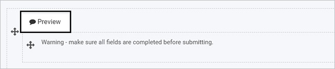
Model dialogs
Model dialogs are a special form of layout fields. It allows a form designer to define an interface with the key intention of grabbing users’ attention to something important.
Typically dialogs are used to create alerts, for example a user confirmation or to help users make a final decision in a process.
How to use a model dialog
In the example above, we use a modal dialog to display a simple warning to the user. The following are the steps involved to create this:
-
Choose a process, or create a new process, and select a form in that process to add fields to. In the left-hand pane of Kianda Designer, click on Controls > Layout > Dialog.
-
Click on the dialog component to edit the dialog, for example give the dialog a Title and then insert other fields within it. You can add any field to your dialog, for example add Richtext by clicking on Controls > Layout > Richtext.
-
Give your Richtext field a title, and add a message in the Richtext body text and change other settings as needed. Click on OK when complete or click on Close at any time to exit the dialog box.
-
To preview how your dialog box will be displayed, you can use the Preview button, on the dialog component.
Cascading dropdown lists
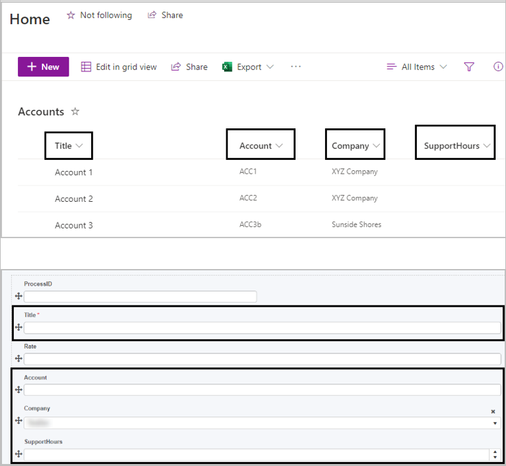
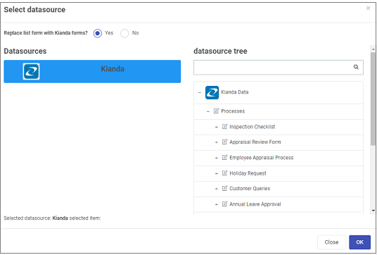
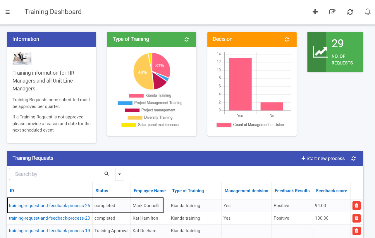
Using the List field provides the opportunity to define an unlimited level cascading dropdown hierarchy very easily. For example in the form below, if a user chooses Denmark as a country from the drop-down list, then Danish cities are displayed, while if another country is chosen, the other cities for that country are displayed.
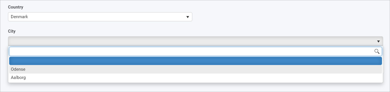
To achieve this effect, you can connect your list to a data source, for example a SharePoint list or table. Then use the list data source conditions options to filter content based on a parent list.
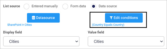
In the example above, the condition used is that a filter is applied if data from the SharePoint list column called Country is chosen as input for the form list field called Country, then data from the SharePoint list column called Cities is displayed, see video below.
How to create cascading dropdowns
Easy to customise form features
Remember with Kianda Designer you don’t need any coding experience, so anyone with Administrator or Design business process access can use Kianda’s easy to use interface to add fields to forms and customise forms to create the desired effects for an optimum user experience. The Kianda interface makes it easy to create sophisticated forms that follow modern web design principles, all at the click of a button. Examples of ways to customise forms are shown in the following sections, Responsive form layout and Input validation.
Responsive form layout
When designing forms, its easy to change the layout of fields to make the field display the way you want. Form fields are made with a mobile-first approach giving you a ‘design once and deploy everywhere’ opportunity.
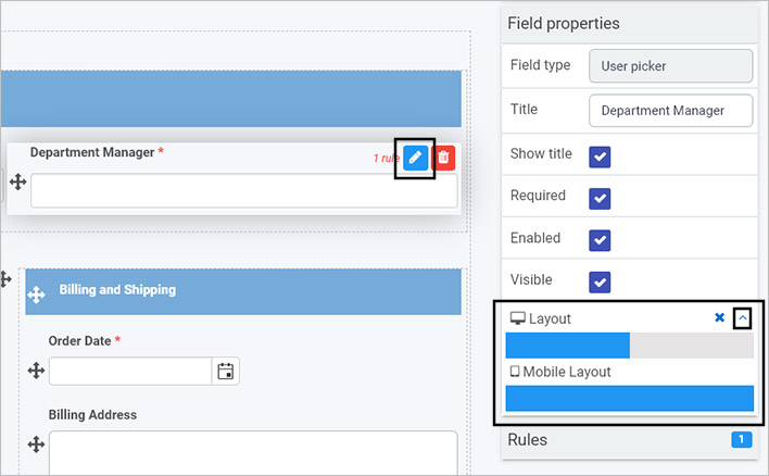
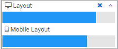
When you select a field, you can go to Field properties in the right-hand pane of Kianda Designer and click on the Layout option.
Clicking on Collapse or expand responsive layout button  uncovers the layout mode for desktop and mobile.
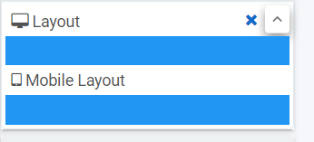
Click on the blue bar for both Layout and Mobile Layout to adjust the size of the field. This allows you to specify a layout made of 1 to 12 columns and is based on Bootstrap, a popular CSS framework that allows designing web interfaces with a mobile-first approach.
Input validation
As with editing the layout of fields, it is easy to validate input, making fields mandatory for users to fill in or not. Go to Field properties in the right-hand pane of Kianda Designer and click on the Required option. If already ticked, uncheck this to make the field not required.
Simply enable the checking the Required property in this way will automatically prevent users from submitting forms with an empty field. The required flag will conveniently be ignored in case the field is not visible, this will allow you to configure conditionally mandatory fields.
Another way of validating input is to use the validate input rule which allows for greater flexibility in terms of when or what to validate. Rules are explained below, but click on Validate input for more information specifically on this rule.
In addition to changing field properties, you can configure settings to make processes perform the way you want.
Settings
In addition to changing field properties like Input validation, you can edit process, form and field settings. Having settings at each level will allow you to tweak your process design in minutes.
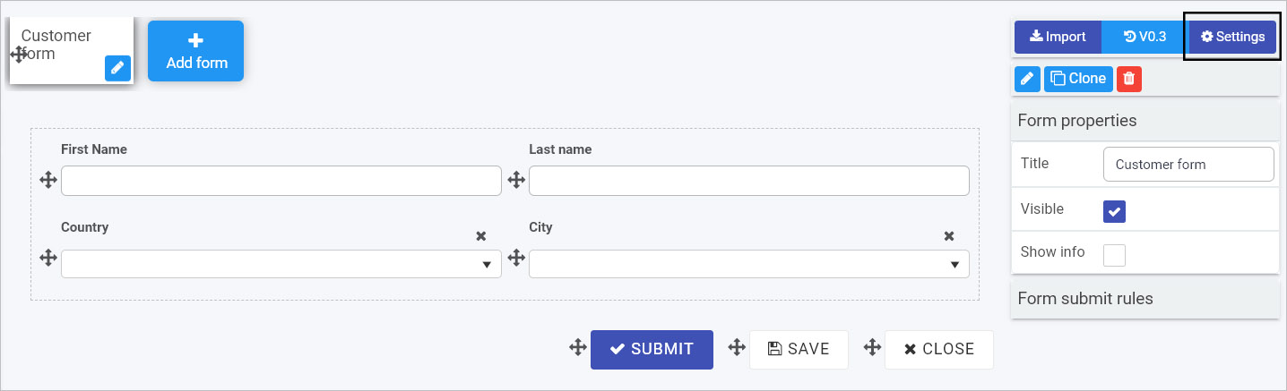
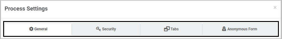
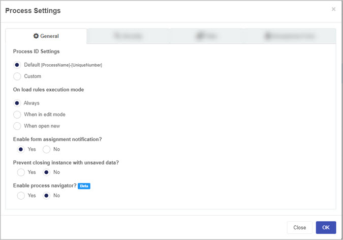
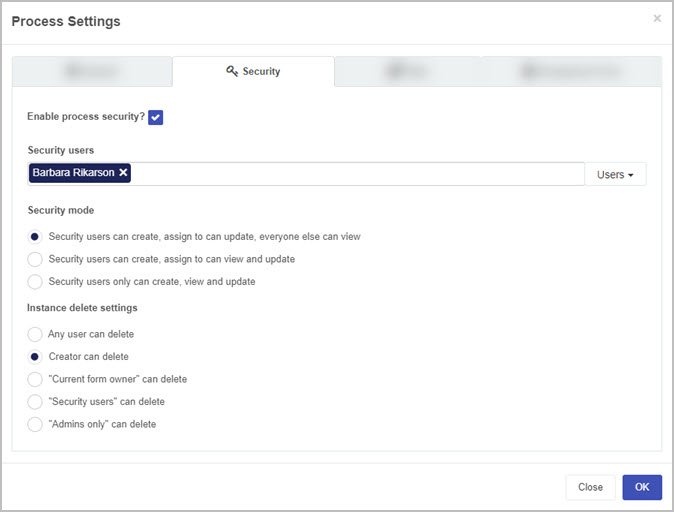
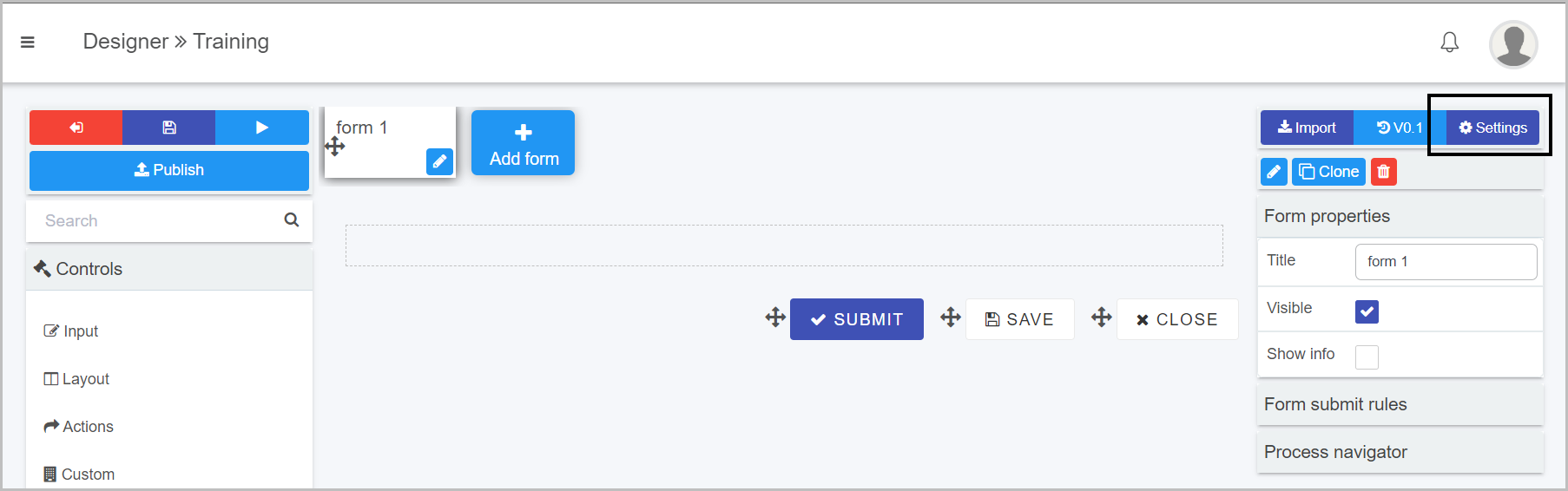
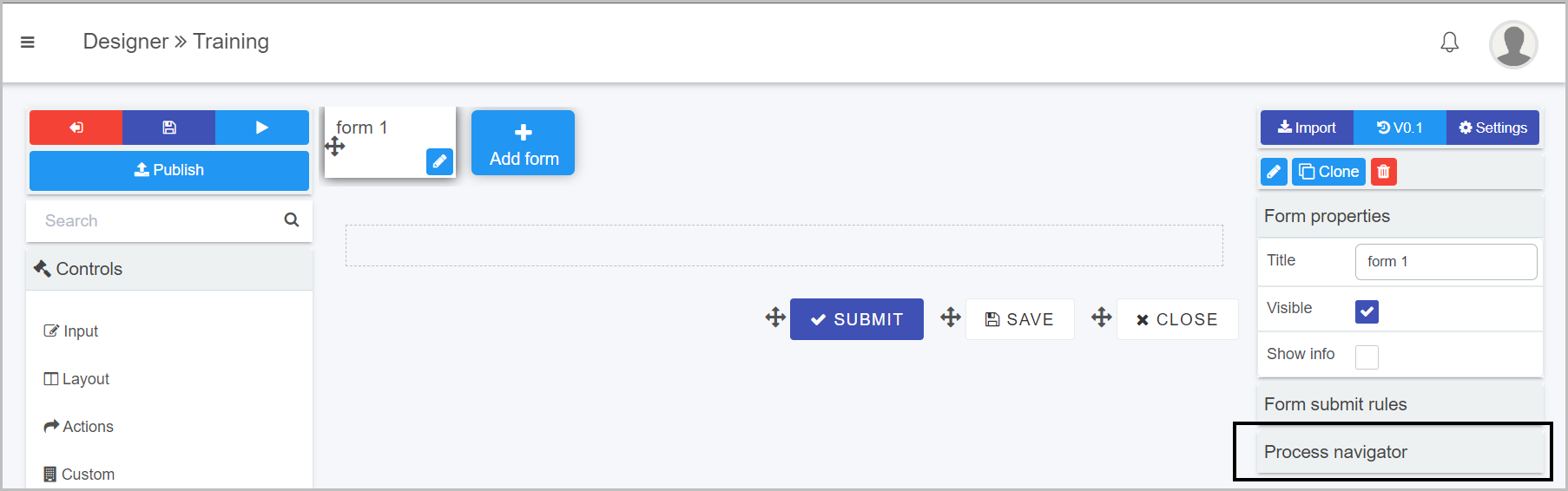
At the highest level, process settings are found in the right-hand side pane of Kianda Designer.
There are many options within Settings to manage for example process security and set process instance settings. One setting example is Enabling anonymous sharing of forms explained in more detail below.
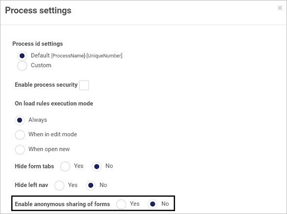
Anonymous forms
Anonymous forms are a great way of allowing people outside of your organisation to interact with your processes. It could be something as simple as a feedback form or a GDPR data request but as we all know a contact form never ends with the contact submission. There is always a process or a series of steps behind each public/anonymous form that might culminate with an actionable result back to the person that started the submission, or person assigned to manage the form.
Anonymous forms can be embedded using iframes or inline frames. Inline frames are HTML elements that allow another HTML page(s) to be loaded within the document, basically allowing one webpage within another. In Kianda there are effectively two types of anonymous forms:
New process instance anonymous form URL
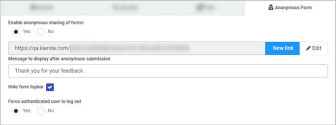
To set up a globally available link to allow external users to create a new process instance, perform the following steps within Kianda designer:
- Within a chosen process, in the top right click on Settings.
- Then beside Enable anonymous sharing of forms select Yes.
- Click the button New Link to generate a new anonymous link.
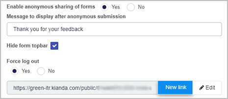
The generated link can be shared to allow sharing of the form to users without the need for a Kianda account.
Existing instance anonymous form URL
To setup an existing instance anonymous form you need to use the Anonymous form link rule to generate a new anonymous link at runtime that will point to an existing process record that can then be shared with external users.
Note that for this to work steps 1 and 2 of New Instance Anonymous form are still required.
The following are some of the key options of the anonymous link rule:
- Choose a Form to share (any form within an existing process).
- Link expires settings: choose from an expiry parameter like number of uses, time-based or never expire.
- Select a Message to display on submission.
Important: There can be only one active link of each type for a given process. Once a new anonymous link is created for a process it will automatically cause an expiry of a previous link of the same type.
Rules
Kianda rules allow for dynamic actions within processes that can be used to change the workflow, send automated emails or notifications, as well as manipulate data in data sources.
There are 60 predefined rules, across 10 categories that allow you to drive your business processes in a myriad of ways. Go to the Rules section to navigate to each of the different field categories.
Rules can be driven by conditions for example based on user input, form fields will dynamically appear or hide according to how the user navigates a form, and all rules are actions which can involve for example retrieving values from a datasource, storing data in a field or automating user addition to Salesforce.
One example of rules already mentioned is the Anonymous form link rule which will dynamically generate and send a link from a form in a process to an external user, without the need for a Kianda account.
If the current suite of predefined rules do not meet your needs, you can use Kianda Developer to create your own rule widget. In a similar fashion you can use this function to create custom controls or fields, see more below.
Custom fields
In case any of the previously mentioned control types don’t suit, you can use Kianda to build your own customised control widgets. The Custom fields section provides access to fields that are built for extensibility of Kianda capabilities. It is particularly useful in those situations where existing fields or rules will not provide the required functionality.
Custom fields have the purpose of providing a user interface for end-users. These custom fields can be built by developers. It allows a developer to build a reusable component that would then be used by process designers in real processes. Check-out the development section for more details on how to build custom widgets in Kianda.
Advanced techniques
Like the cascading drop-down list discussed above, several other advanced scenarios can be easily configured in Kianda. Here is a short-list to give you an idea what is possible:
-
Repeating section - A repeating section can be created by adding a panel to a table field. This table can be configured to include a single column made of the panel that itself will include the repeating fields of your repeating section.
-
The capture of media - Kianda enables mobile users to directly capture pictures, video or audio just like a native application.
-
Background save - By making use of PWA principles (Progressive Web Application), Kianda allows the ability to perform background operations. This is useful when, for example, a mobile user picks-up their phone to perform a quick action and places it back in his pocket. Operations will continue in the background allowing all data to be captured.
-
Image annotation - Kianda allows for image annotation online or offline.
-
Multi-column / row layout - Making multi-column responsive interfaces is quite easy. Simply add two panels into a form that only use half of the screen (6 columns) then add fields inside panels and you have multiple column layouts. Adding a panel using 12 columns gives you a row.
-
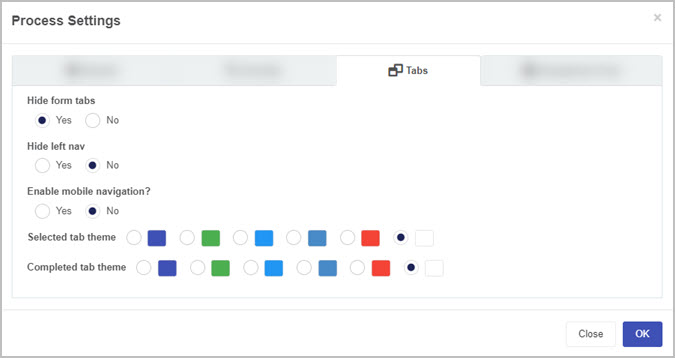
Form tab colour and icon - Form tabs can be quickly customised to display their icons or tab colours, it is also possible to define custom colours for selected and completed form tabs.
-
Hide form tab and left nav - This is self-explanatory, yes you can hide the default navigation elements.
Once you have started creating elements in Kianda forms it is easy to replicate elements and make process design happen even faster, see Cloning below.
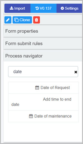
Cloning
In Kianda Designer, almost any of the components can be cloned. This will increase your productivity considerably and will make creating multi-step processes a breeze.
To clone either a field, a panel or even a form, simply select the component then click the clone button in the properties panel in the right-hand side of the panel.
If cloning a field, the cloning dialog box will prompt for the destination of the new cloned field, once your choice is made, simply click ok.
Cloning a form
What’s next 
To read more about process and forms, go to the link below:
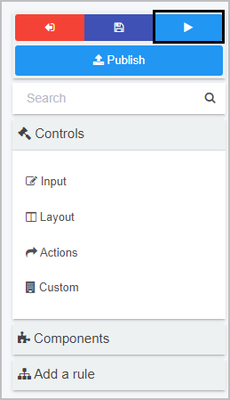
 to go back to the process list, the Save button
  to save your work, the Preview button
  to preview what you have created and the Publish button
  to publish your work.


 and add other owners by clicking on the arrow and choose from Users, Groups or Partners.
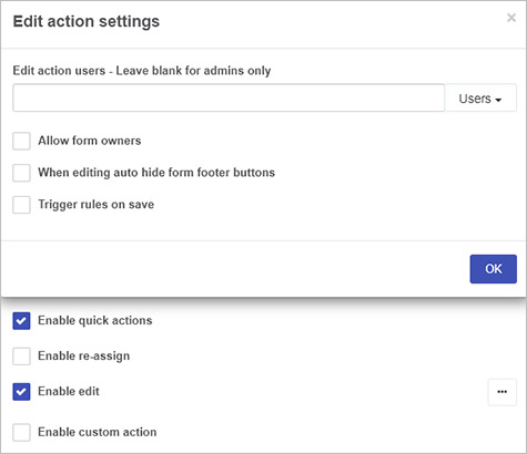
 to further modify the action settings.
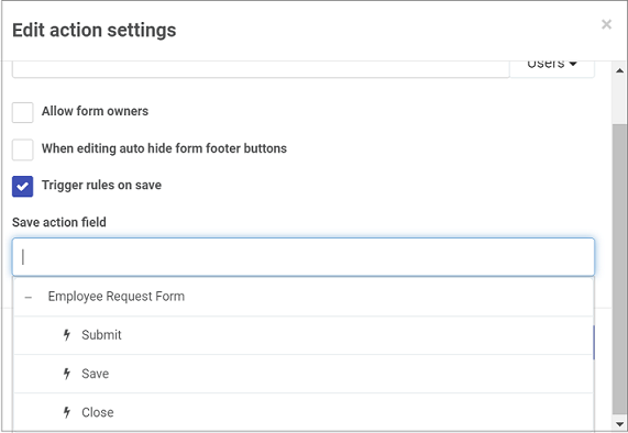
 .
.
 beside the item and dragging it to where you want to place it.
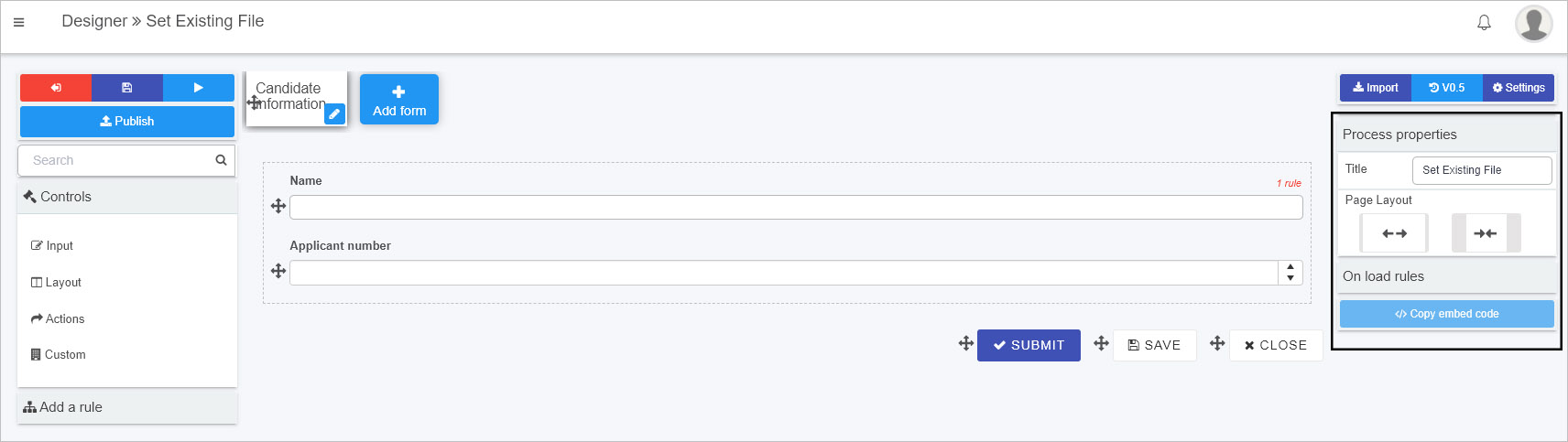
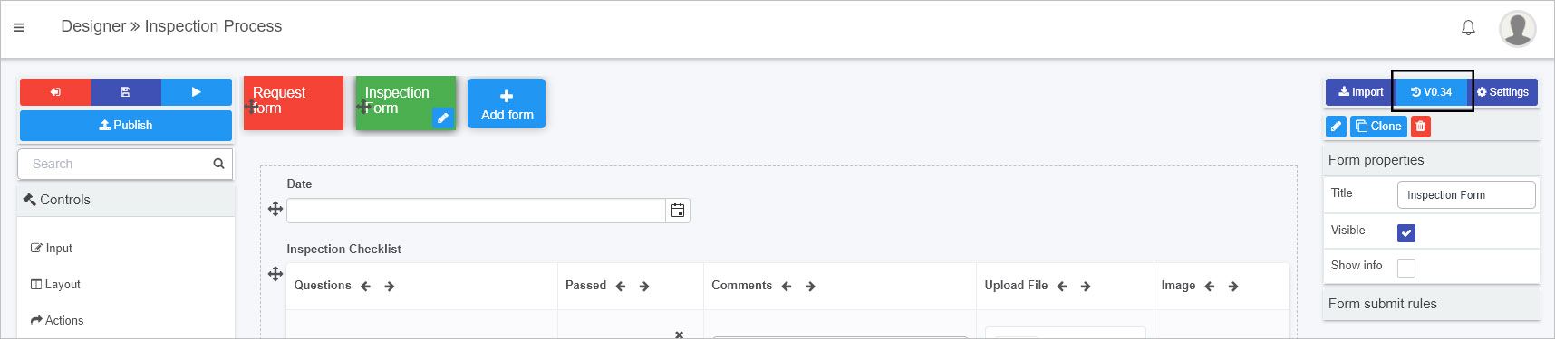
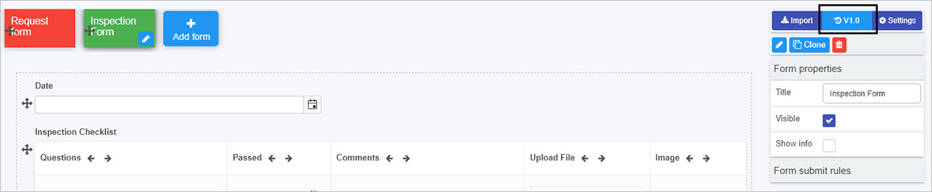
 to allow you to manage version of the process design
 to allow you to apply process security settings amongst other options
 that allows you to make a duplicate form. Click on OK to make a copy or Close to close the dialog box and cancel the copy.
 where clicking on this button opens a popup asking you to confirm that you want to delete the selected form. Click on OK to make a copy or Close to close the dialog box and cancel the deletion.
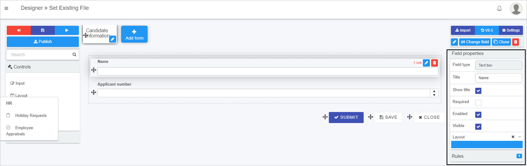
 is visible. To change field type:
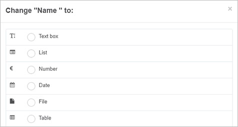
 . This is a useful Kianda feature that allows you to trial out your process, and visualise the logical flow of your design without publishing it yet for your organisation to view/use. Within the preview window, you can also troubleshoot your fields, rules and conditions by utilising the
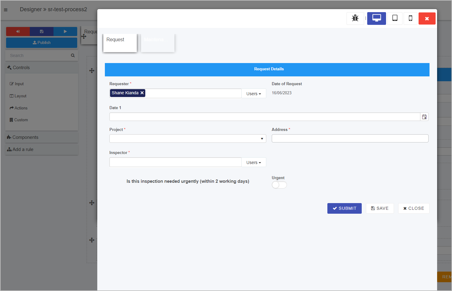
 in the top right corner of the window.
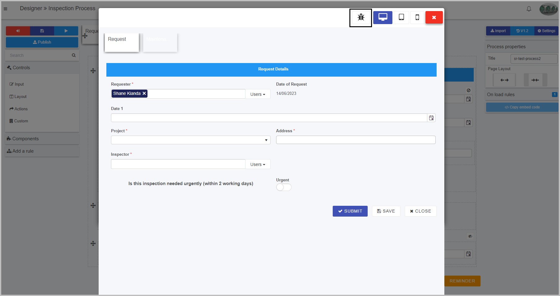

 - displays the process instance as it would look on a desktop device.
 - displays the process instance as it would look on a tablet device.
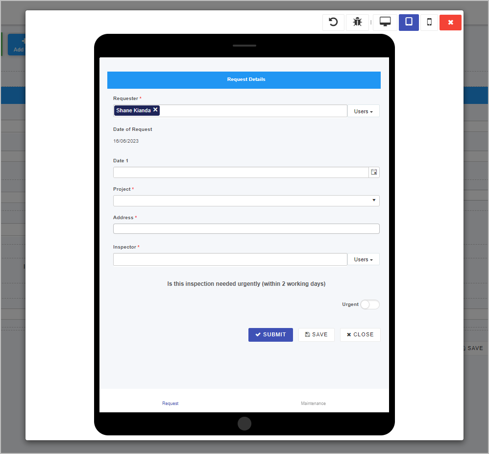
 - displays the process instance as it would look on a mobile device.
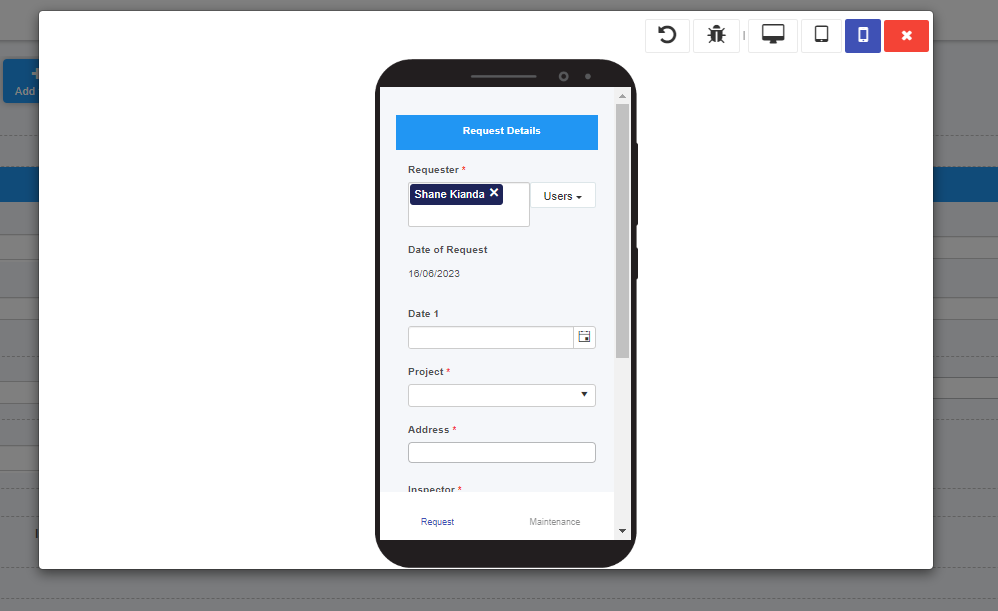
 will appear in the top right-hand corner. Clicking on this button will rotate the device screen from portrait to landscape and vice versa in the preview window.
 in the top right-hand corner of the previewer window.
 .
.
 or
or  .
.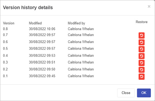
 to go back to the full list of versions.
 beside a particular version and then click on Ok to confirm that you want to restore to that version.
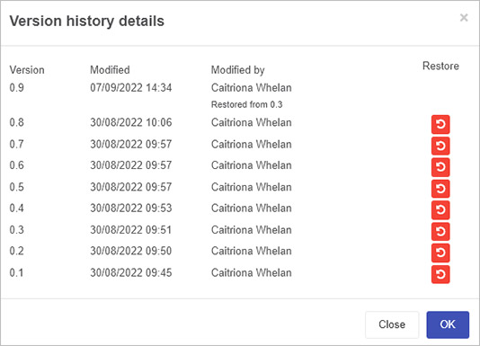

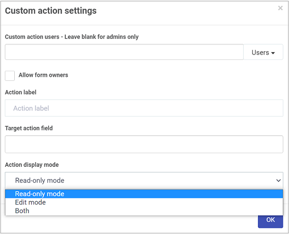
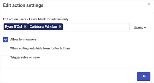
 , for example to reassign a form to someone else, or to perform a custom action like signing off on a purchase order.
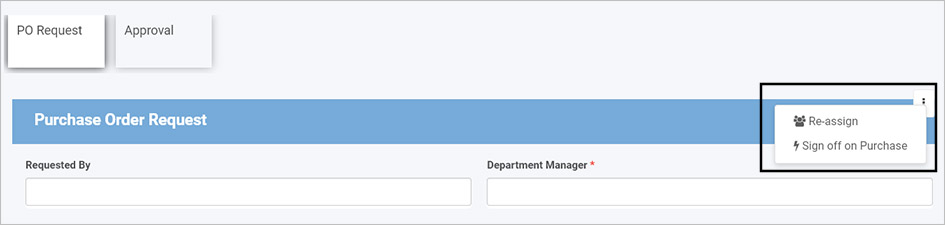
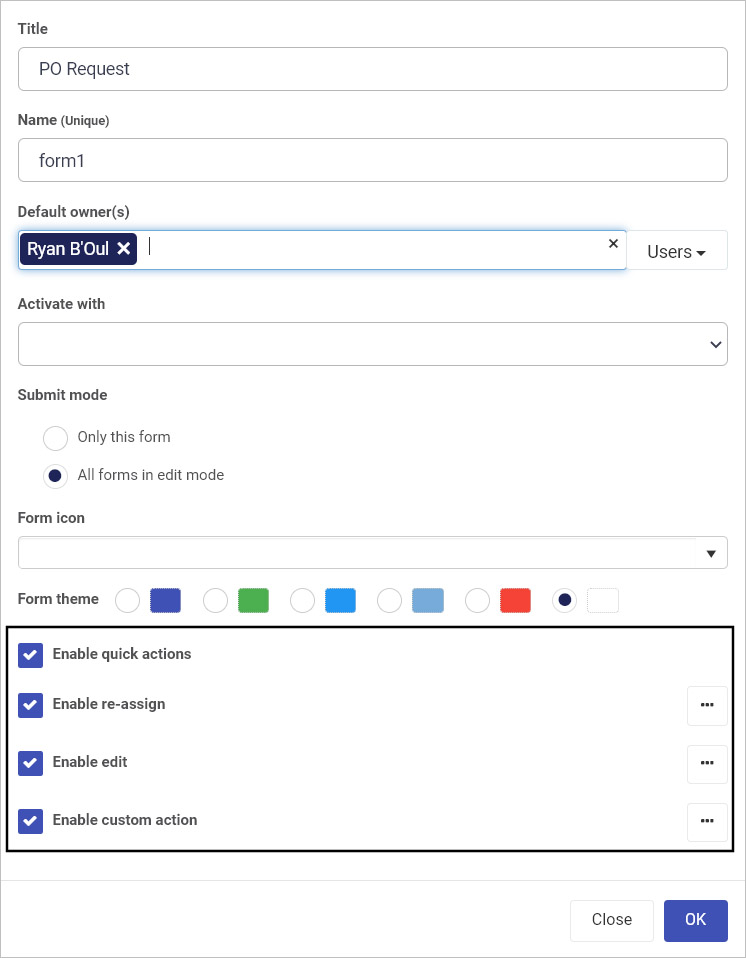
 then you can select Users, Groups and Partners who can be chosen to reassign the form to. There is also a checkbox to allow form owners to reassign forms to other users.
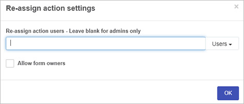
 button within Layout to see desktop layout see Layout bar and Mobile Layout for the field.
 .
.

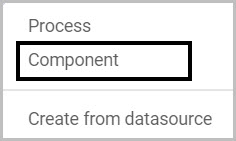
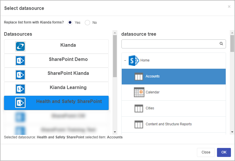
 . Note that if you click on the arrow on the button, you have options to create a Process, a Component or Create from datasource.
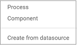
 .
. to browse for Kianda files.
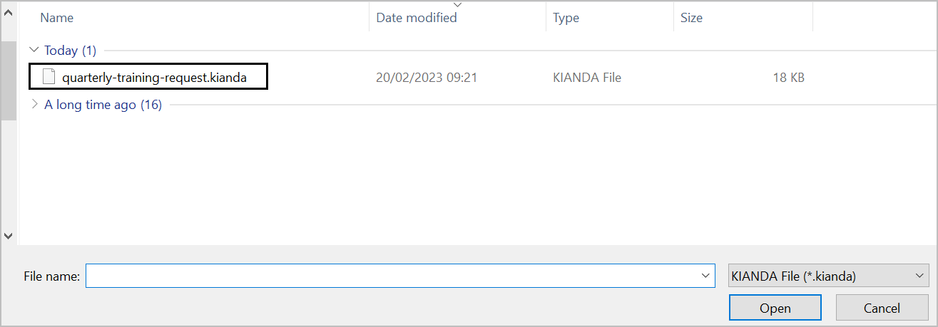
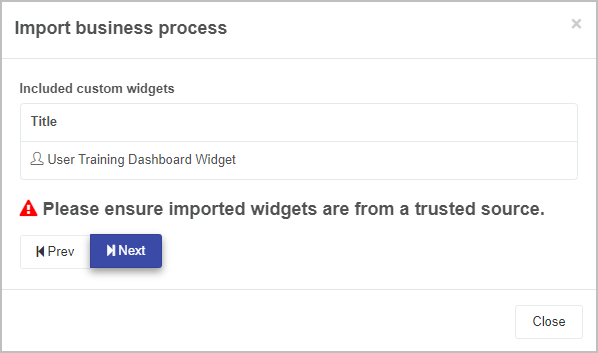
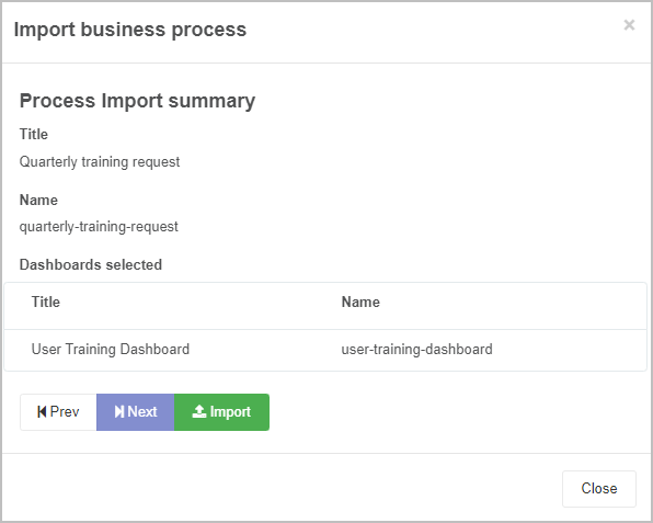
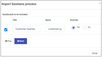
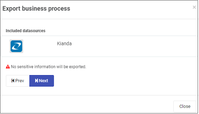
 beside your process of choice.
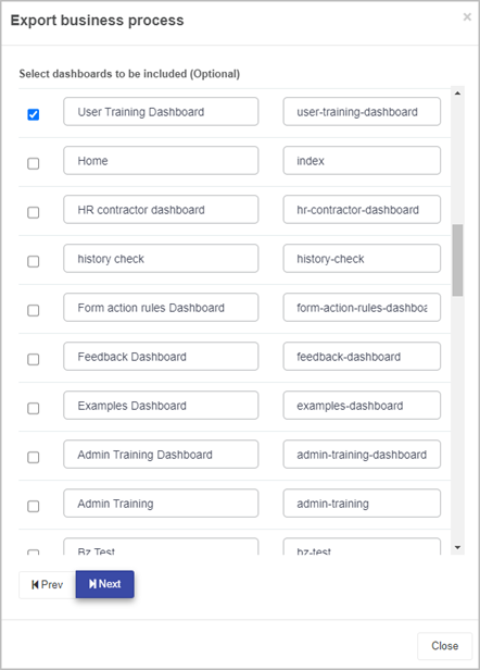
 and select a process to export from the dropdown list. Click on Next when you have selected your desired process.
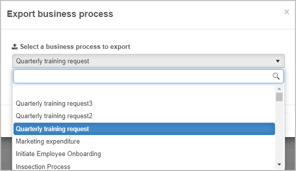
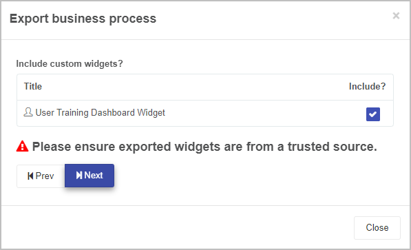
 to export the Kianda file.
 .
.
 or Narrow
  to change the layout.
 button and click the down arrow.