Designer
Kianda no-code low-code development platform - workflows process designer
Kianda Designer provides an intuitive interface where you can quickly start building forms for any business use case. Forms are an important component of any process. They might be used as a stage of a process and can be made active individually or at the same time (parallel forms).
How Designer works
This video introduces Kianda Designer and demonstrates how to start creating a form and add fields.
There are 3 key principles to consider when working with forms:
- Form design - what a form looks like, what elements it contains, for example controls and rules
- Form interaction - how users can use forms depending on certain sequences happening
- Form management - who can edit and access forms
This page presents the information you need related to form design, that is what a form looks like, and what it contains. By default, Administrators and those with the Design business process role can edit forms, but they can also set how other people interact with forms, for example to make forms viewable as read-only. Go to Form owners to find out more about how form ownership works, and Form display modes to find out out more about how forms display.
Designer layout
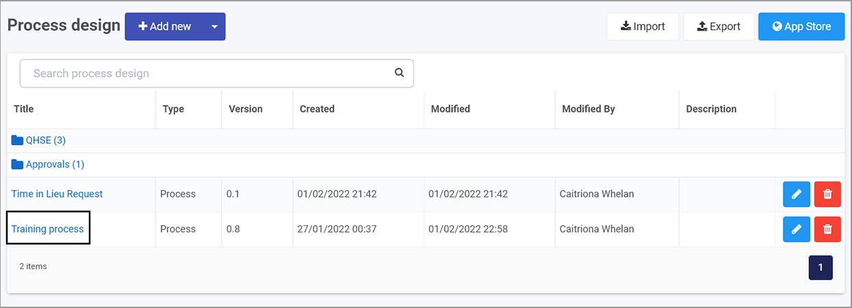
To access processes, go to the left-hand pane and Administration > Designer and click on a process that you have created or imported, see Create your first process.
From the main process view, click on any process to add forms.
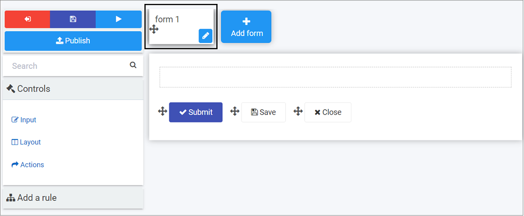
The Designer window opens and is made up of 3 main parts.
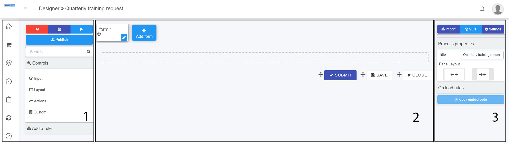
The key components of the designer are:
-
Left-hand pane contains both controls and rules that can be added to forms. Go to Controls and Rules to find out more. The left-hand pane also houses the Exit button
 to go back to the process list, the Save button
  to save your work, the Preview button
  to preview what you have created and the Publish button
  to publish your work.
Note that clicking on Save saves a draft of a process design. Click on Publish to publish the design and update changes to existing process instances.
If you click on the Exit button
to go back to the process list without clicking on the Save button you will be prompted with a dialog box detecting Unsaved changes prompting you to Abandon changes if desired. Click on Yes to exit Designer without saving, or No to exit and save.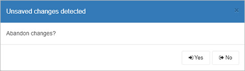
-
The central area is where the current form canvas is displayed. The canvas also houses 3 buttons by default: Submit, Save and Close. Go to Adding form elements to find out more about editing these buttons and adding elements to the canvas.
-
The right-hand pane is where the properties and rules are displayed for the selected item, see Properties for more information. From this pane you can also Import forms, see the Version history for a process and set process Settings. Click on the links to find out more.
Note: The name of the process you are working on is shown in the top menu bar, for example Quarterly Training Request.
Note: Multiple users can view and design a process synchronously, allowing for seamless collaboration on your processess. The below error message is displayed in the bottom right corner when another user(s) is/are viewing/editing the current process.

When another user saves a change to the process design that you are currently viewing, the below error message is displayed in the bottom right corner.

How to get started with forms
-
How you get started with forms depends on if you:
-
have created a process using the App Store, see Predefined forms
-
have created a process from scratch or want to create a form from scratch, see New forms
-
import forms that have already been created, see Import forms
-
-
Once your form is created, you are ready to start adding elements to your form, see Adding form elements.
-
In addition there are a number of settings you can change, see Properties and Settings.
Predefined forms
-
If you have created a process using the App Store, then a number of forms will already be part of the process. For example the process Security Incident Management has 5 forms attached: Incident detail, Data breach, Malware outbreak, Root cause remedy and Caller review.
-
To edit form details, simply click on a form and click on the Pen button
 to edit the form. You can also click on the Add form button to add a new form. Edit options are shown under New forms.
New forms
How to add new form
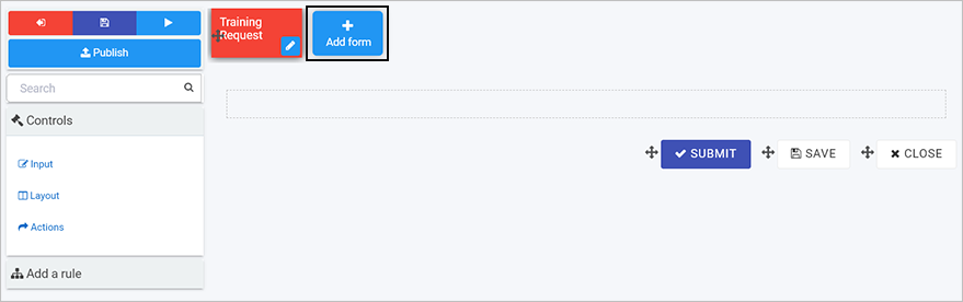
If you have created a process from scratch, an empty form is added to your process by default, called “form 1”. This is the first form. Click on this form and the Edit/Pen button to customise it. You can also click on the Add form button to add a new form.
Editing forms
When you click on a chosen form, then click on the Edit/Pen button to edit the form.
The Edit form dialog box opens where you can edit the fields. There are a number of edit options below.
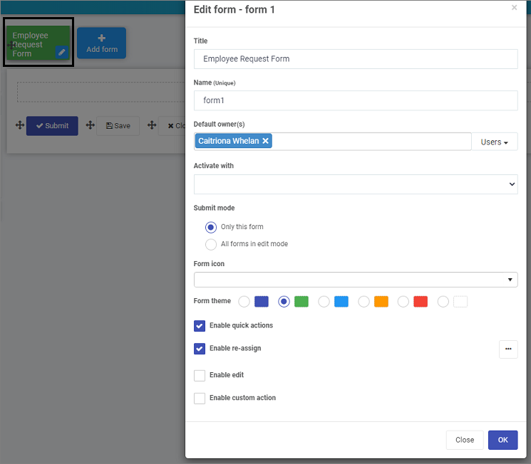
Note: as you change any of the options in the dialog box, the impact will be shown in real-time on the form in the background, for example a title, or colour form theme.
-
Title - the form title, for example Employee Request Form
-
Name - this is a unique name for the form
-
Default owner(s) - by default the form creator is an owner. You can remove this owner by clicking on
 and add other owners by clicking on the arrow and choose from Users, Groups or Partners.
- Users - allows you to choose individual owners
- Groups - allows you to choose from defined groups for example HR Team or Management Team
- Partners - allows you to choose predefined partner organisations that you want to share with or provide permissions
-
Activate with - will decide when the form will be active. If you have several forms attached to a process, then select from a dropdown list the form you want to activate with the current form. If you leave the field blank, the new form will be activated sequentially after the first form is submitted.
-
Submit mode - options are a) Only this form (the current form) or b) All forms in edit mode.
-
Form icon - click on the arrow to choose from hundreds of icons to attach to your form.
-
Form theme - choose from Navy, Green, Blue, Amber, Red or White Colours for your form.
-
Enable quick actions - if you tick the checkbox, you can select from the options a) Enable re-assign b) Enable edit and c) Enable custom action. Click on Ellipsis button
 to further modify the action settings.
-
If you click on Enable re-assign, you can reassign action settings to particular Users, Groups or Partners. Click on Allow form owners if you want form owners to be able to reassign actions.
-
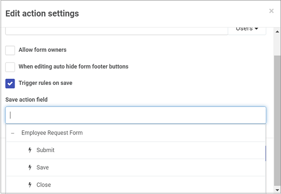
If you click on Enable edit, you can allow certain Users, Groups or Partners to edit the form, along with form owners by clicking on Allow form owners.
Other options include a checkbox for When editing auto hide form footer buttons and Trigger rules on save.
- If you check Trigger rules on save then click into the Save action field, you can choose an action trigger from the drop-down list as to when the form is saved, for example on execution of the Submit, Save or Close buttons. These can be other actions depending on what you have defined.
-
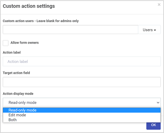
If you click on Enable custom action, you can allow certain Users, Groups or Partners to edit the form, along with form owners by clicking on Allow form owners.
Other options include Action label, Target action field and Action display mode, for example Read-only mode, Edit mode or Both.
-
As a form designer, you can set up actions dependent on certain conditions, for example an Action label that targets a certain button appearing for example Close button, only when a certain display mode is chosen, for example Read-only mode. If Edit mode is chosen, then the button will only appear when the form is being edited. In this way you can create dynamic forms that suit user interactions.
-
-
Click on the OK button when you are finished editing to save your changes or click on Close to exit the dialog box without saving.
-
To save your changes to the form, click on the Save button
.
You are now ready to start adding Controls and Rules to your form. To implement additional settings, see Process Settings.
Import forms
-
You can import a previously designed form by clicking on the Import button
 .
. -
Click on the arrow to select from the drop-down list to Select a process design.
-
Click on a process of interest and then click on the forms to import under Select fields or forms to import. Forms are indicated by a + symbol and can be expanded to show elements within a form for example a panel containing different fields such as lists and text boxes. This means you can import a whole form, or just elements of a form. In this way you can very quickly reuse some or all parts of an existing form.
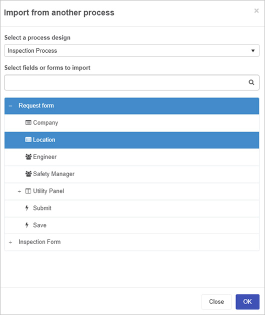
-
Click on the OK button when you are finished editing to save your changes or click on Close to exit the dialog box without saving.
Adding form elements
If you have added a new form during the form creation process, then a blank canvas with three default buttons are available to you: Submit, Save and Close.
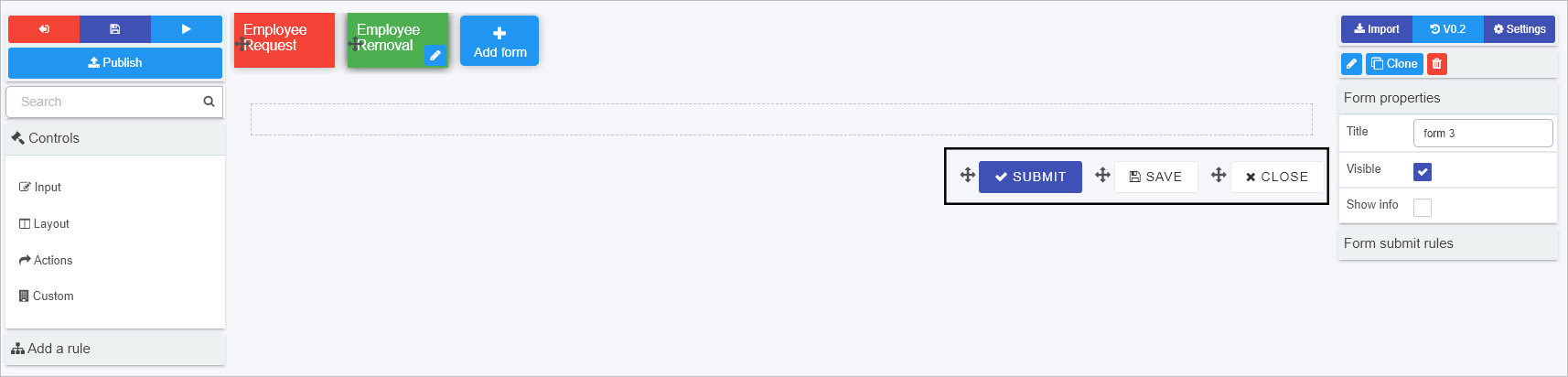
Within a form like the one shown above you can:
- Add elements to this canvas by clicking on Controls and Rules in the left-hand pane. Click on each link to find out more about the 16 control fields and 60 rule types.
- Move elements by clicking on the Drag Handle
 beside the item and dragging it to where you want to place it.
 - Edit elements by clicking on each item and clicking on the Edit/Pen button , for example if you click on the Close button, there are a number of options to choose from when editing, see Button control for more information.
Properties
In addition to adding fields/controls and rules, there are a number of ways to create the form and process design you want. You can set properties at property, form and field level. Properties represent how an element presents itself, for example the title and layout of the element.
Properties at all levels are visible in the right-hand pane of Kianda designer, along with the:
-
Import button
to allow you to import forms and form elements like fields -
Version history button
 to allow you to manage version of the process design
 -
Settings button
 to allow you to apply process security settings amongst other options
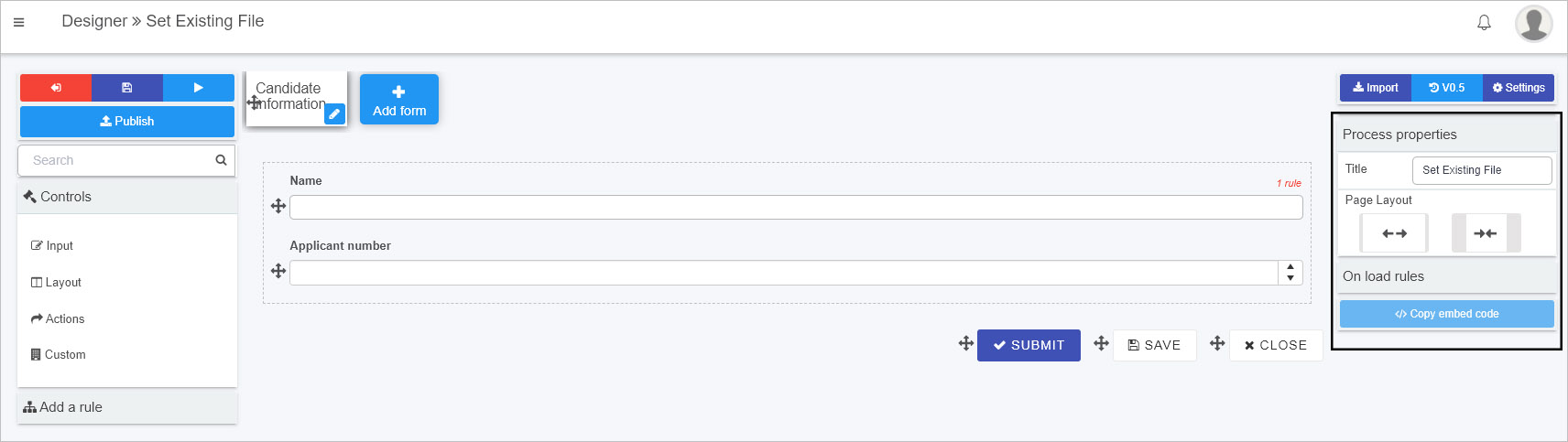
Process level properties
When you click on a process from the main process view, straight away you will see the Process properties in the right-hand pane as shown in the image above. To find out more about process go to the Process properties page.
When you click on a form within a process, then the properties view changes to show Form properties, as shown in the image in Form level properties.
If you want to return to Process properties, click on the process name beside the Designer and chevron symbol, that is:
Form level properties
When you click on a form in Kianda Designer, the properties for that form appear.
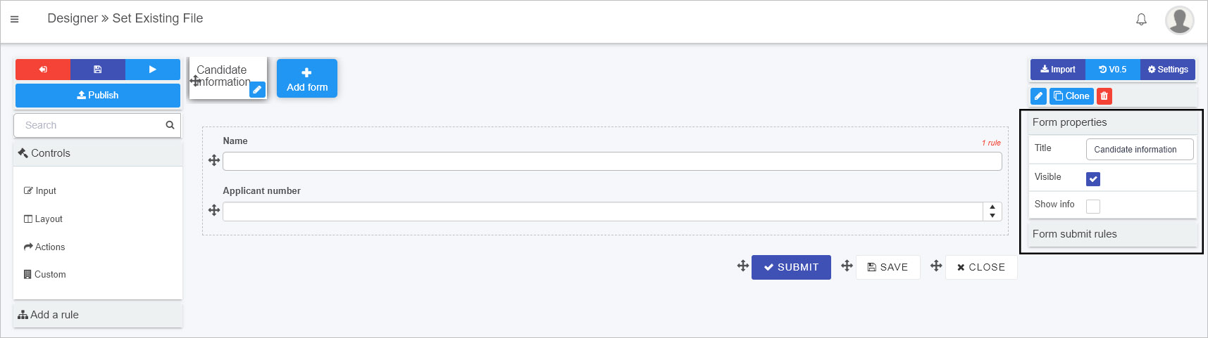
To find out more about form properties go to the Form properties page.
Note that at form level, additional buttons appear above Form properties namely:
-
Edit/Pen button
where clicking on this button opens the Edit dialog box for the chosen item, for example a form. -
Clone button
 that allows you to make a duplicate form. Click on OK to make a copy or Close to close the dialog box and cancel the copy.
 -
Bin/trash button
 where clicking on this button opens a popup asking you to confirm that you want to delete the selected form. Click on OK to make a copy or Close to close the dialog box and cancel the deletion.
Field level properties
When you add controls to forms Kianda Designer, and select a field/control, the properties for that field appear in the right-hand pane.
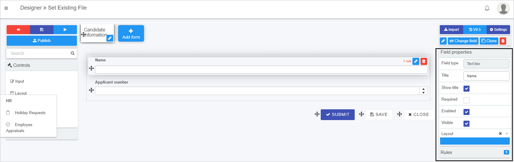
The type of field/control is listed in the properties pane, for example ‘Text box’ as shown in the image above. How the field appears is easy to control simply by checking/unchecking a number of boxes. To find out more about field/control properties go to the Control properties page.
Change field button
Note that at field level, in addition to the buttons visible at Form level, a Change field button  is visible. To change field type:
-
Select a field in a form by clicking on it.
-
Click on the Change field button.
-
A pop-up box appears allowing you to choose from the full range of field types, including customised field widgets created in Kianda Developer.
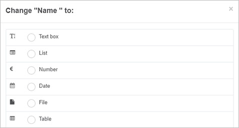
-
Click on the radio button beside the field type of choice and click on OK to make the change, or Close to close the dialog box and cancel the change.
-
An Edit field dialog box appears allowing you to change settings for that new field type.
Settings
In addition to Properties, you can use Settings at process, form and field level to give you the type of processes and forms you want.
Process settings
Basic process information, such as deciding who the process administrators are is available at the main process level, by exiting Designer clicking on the Exit button to go the main process view, and then click on the process name to bring up the Edit process dialog box.
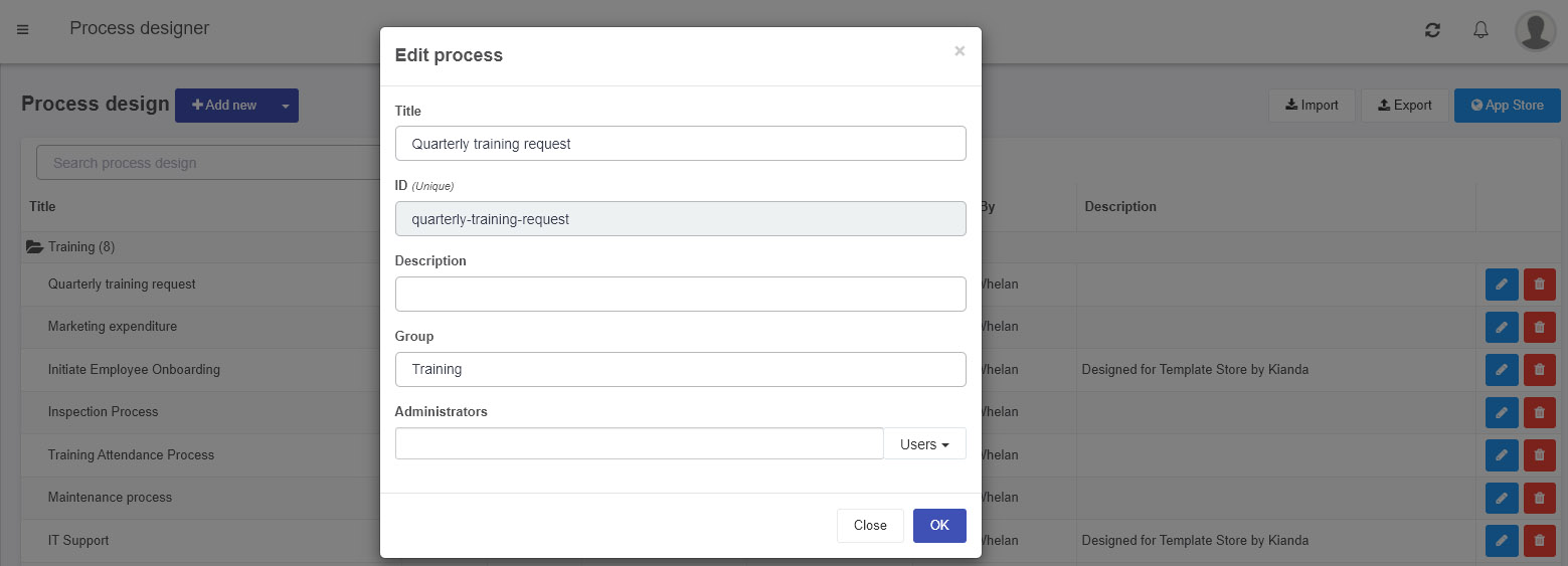
More detailed process settings are available within Kianda Designer in the right-hand pane by clicking on the Settings button and from here use the parameters available in the Process settings dialog box to enable process security, anonymous sharing of forms and custom process ID, amongst other options. Go to Process settings to find out more.
Form and field settings
Form and field settings are available when you select an item in the form canvas so that the Edit/Pen icon is available. An Edit dialog box appears allowing you to make the necessary changes to that item. Edit form dialog box is shown in Editing forms. Field settings will be described within the information page for each field, go to Controls to start navigating to individual control pages.
What’s next 
Click on the links to find out more about aspects of Kianda Designer, namely Processes and Forms.
To read about managing versions of forms, go to the link below:
Version history
How to manage process versions in Kianda.
Feedback
Was this page helpful?
Glad to hear it! Please tell us how we can improve.
Sorry to hear that. Please tell us how we can improve.