Form responsive layout
Responsive layout refers to the fact that all forms will display equally well on laptop screens, tablets and mobile phone screens. As a form designer you can set the appearance of form fields using the layout function.
How to get started
Within Kianda Designer, click on a process, then a form of choice so that the Edit (Pen) icon is visible.
- Click on a field of choice within the form so the Edit (Pen) icon
 is visible for the field.
 - Click on the Edit (Pen) icon button for the field.
- Click on Layout under Field properties in the right-hand pane.
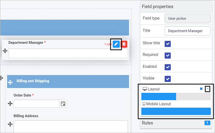
- Click on the Expand
 button within Layout to see desktop layout see Layout bar and Mobile Layout for the field.
 - Click on the blue bars to extend the size of the field, for example in the image above, the desktop layout is 50% of the maximum width available, so the field ‘Department Manager’ would only take up half the width of the form. The mobile layout however is set to 100% and the field would take up the maximum width available. There are 12 possible width options that can be used within these bars.
- Click on the Collapse button to minimise the Layout property.
What’s next 
To read more about how to create processes and forms go to Application Designer.
To find out about help and support, go to Help.
Feedback
Was this page helpful?
Glad to hear it! Please tell us how we can improve.
Sorry to hear that. Please tell us how we can improve.