Controls
Controls (commonly called fields) are predefined field widgets that allow you to add specific elements to your forms and processes, such as lists, text boxes, buttons and tables. There are 16 types of controls (fields) you can add to a form - see Controls list for details.
If you have developer skills, you can create your own custom field widget - see Development for more information.
Getting started with Controls
If you go to Administration > Designer and click on an existing process or create a new process and then select a form within that process so that the Edit Form button (Pen icon  ) is visible, the predefined fields you can add to forms are found in the left-hand pane.
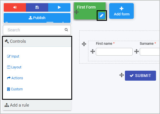
Note: By default, three buttons are automatically added to any new form created - Submit, Save and Close (as shown in this form canvas image).
There are three categories of controls (fields):
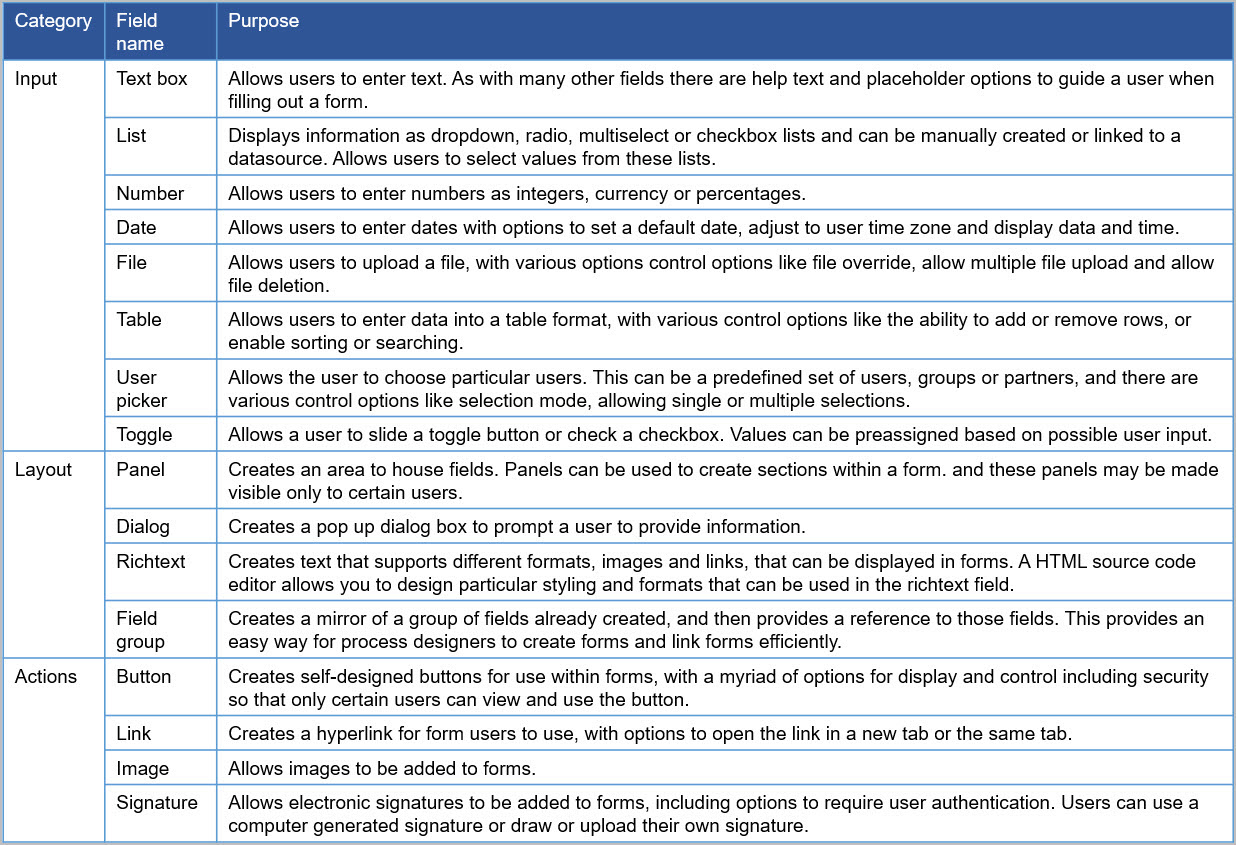
- Input - There are eight types of Input fields. These include the most commonly used data fields such as text box, user picker, date field, table, checkbox, drop-down and number field. See Input for more information.
- Layout - There are four Layout fields that serve the purpose of perfecting the layout of your form. They include responsive panels, dialog box, field groups and rich text fields - see Layout for more information.
- Action - There are four Action fields that allow user interface actions like buttons, links or even signature components - see Actions for more information.
If you develop custom fields, they will be available to form designers under a fourth category of controls called Custom.
Adding, moving and removing controls
To start adding controls or fields to a form:
-
Select the form you want to work on so that the Edit Form button (Pen icon
) appears. -
Click on a Controls category (Input, Layout or Action) and control type in the left-hand pane. For example, you could choose the Input category and select Text box to insert a text box into your form.
-
To move a control, click on the Drag handle button
 .
. -
To remove a control from your form, select the field you want to remove, then click on the Bin/Trash button
 and click on OK to confirm removal.
Editing controls
All controls/fields will have edit options when you start creating the field, as well as Field properties that you can edit to tailor the field (control) to make it work the way you want. Each field can also have rules applied to it to make your processes dynamic.
To edit a control:
-
Click on the added control, so that the Edit button (Pen icon
) appears. -
Then click on the Edit button itself so that the edit control dialog box appears, for example as shown with the textbox control below.

-
Fill out the fields within the dialog box as necessary. All controls need a Title from which a Unique Name is auto-created. This Unique ID is used in expressions to create automated emails for example.
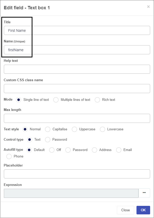
Additional syntax can be added to the Unique name to attribute customised styling, see User tips.
-
The remaining fields within the dialog box will depend on the type of control implemented, where different fields and values can be selected, see Controls list for a full set of controls. Links available at the end of this page will also bring you to each control category and from there you can find out what each parameter means for each control type.
Controls list
This table lists out the full range of available field types.
User tip 
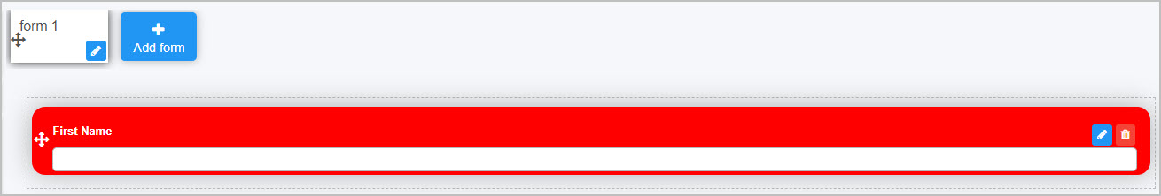
If customised styling has been applied in a Global CSS file, available to administrators under Administration > Subscription, then these attributes can be applied to controls by entering the desired class name into the Custom CSS class name field, as shown below.
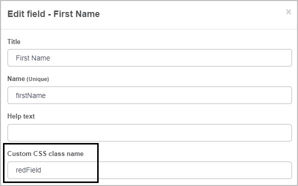
In the example above, redField is defined in the Global CSS file as follows:
.redField{
    background-color: red;
  	color: white;
  	border-radius: 15px;
    padding-bottom: 18px;
    padding-top: 18px;
    padding-right: 15px;
}
When applied to a textbox in forms, a particular colour border with padding is applied to the field, as well as white font colour, as seen below:
Go to Global CSS file for more details.
What’s next 
Now that you know what Controls are, the different types of Controls (fields) and how to add them to a form, find out more about the properties associated with Controls and more about each of the three categories of Controls, as well as Custom controls:
Feedback
Was this page helpful?
Glad to hear it! Please tell us how we can improve.
Sorry to hear that. Please tell us how we can improve.