This is the multi-page printable view of this section.
Click here to print.
Return to the regular view of this page.
Controls
Controls (commonly called fields) are predefined field widgets that allow you to add specific elements to your forms and processes, such as lists, text boxes, buttons and tables. There are 16 types of controls (fields) you can add to a form - see Controls list for details.
If you have developer skills, you can create your own custom field widget - see Development for more information.
Getting started with Controls
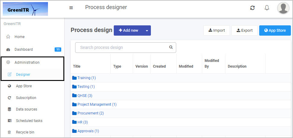
If you go to Administration > Designer and click on an existing process or create a new process and then select a form within that process so that the Edit Form button (Pen icon  ) is visible, the predefined fields you can add to forms are found in the left-hand pane.
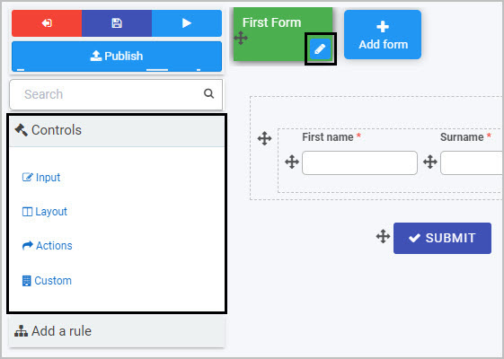
Note: By default, three buttons are automatically added to any new form created - Submit, Save and Close (as shown in this form canvas image).
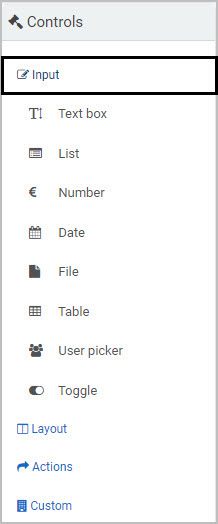
There are three categories of controls (fields):
- Input - There are eight types of Input fields. These include the most commonly used data fields such as text box, user picker, date field, table, checkbox, drop-down and number field. See Input for more information.
- Layout - There are four Layout fields that serve the purpose of perfecting the layout of your form. They include responsive panels, dialog box, field groups and rich text fields - see Layout for more information.
- Action - There are four Action fields that allow user interface actions like buttons, links or even signature components - see Actions for more information.
If you develop custom fields, they will be available to form designers under a fourth category of controls called Custom.
Adding, moving and removing controls
To start adding controls or fields to a form:
-
Select the form you want to work on so that the Edit Form button (Pen icon ) appears.
-
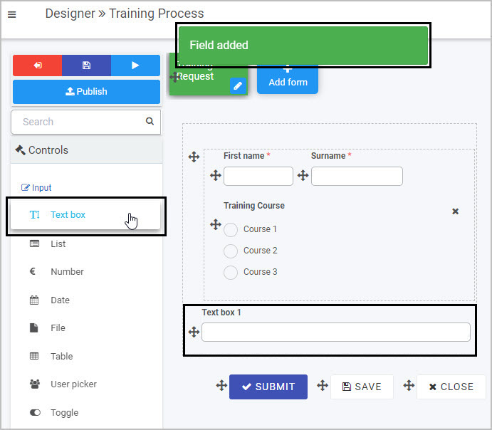
Click on a Controls category (Input, Layout or Action) and control type in the left-hand pane. For example, you could choose the Input category and select Text box to insert a text box into your form.
-
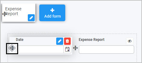
To move a control, click on the Drag handle button  .
.
-
To remove a control from your form, select the field you want to remove, then click on the Bin/Trash button  and click on OK to confirm removal.
Editing controls
All controls/fields will have edit options when you start creating the field, as well as Field properties that you can edit to tailor the field (control) to make it work the way you want. Each field can also have rules applied to it to make your processes dynamic.
To edit a control:
-
Click on the added control, so that the Edit button (Pen icon ) appears.
-
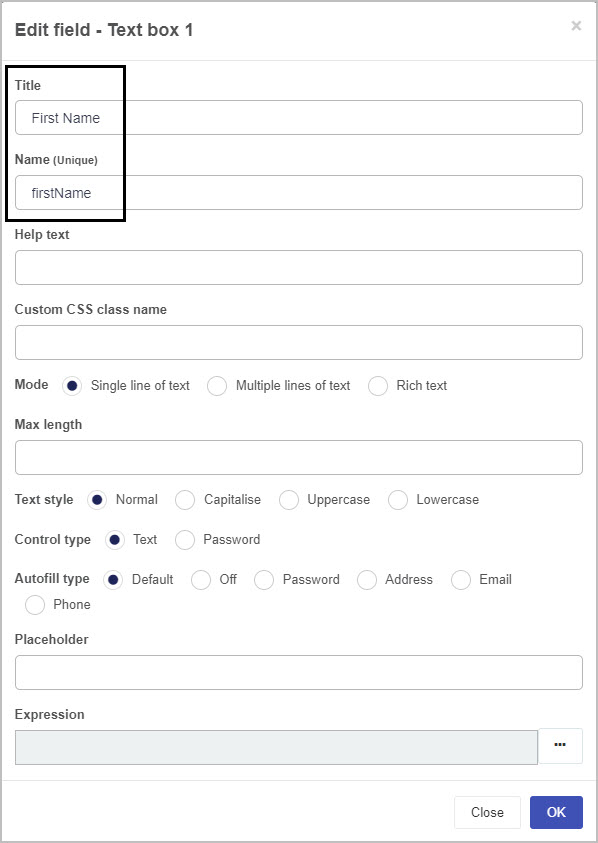
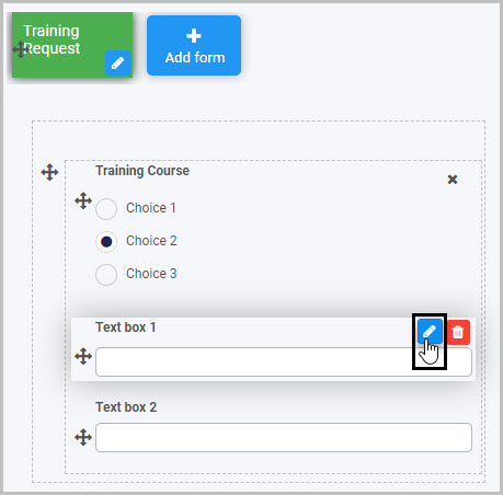
Then click on the Edit button itself so that the edit control dialog box appears, for example as shown with the textbox control below.

-
Fill out the fields within the dialog box as necessary. All controls need a Title from which a Unique Name is auto-created. This Unique ID is used in expressions to create automated emails for example.
Additional syntax can be added to the Unique name to attribute customised styling, see User tips.
-
The remaining fields within the dialog box will depend on the type of control implemented, where different fields and values can be selected, see Controls list for a full set of controls. Links available at the end of this page will also bring you to each control category and from there you can find out what each parameter means for each control type.
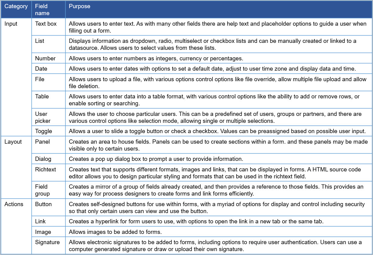
Controls list
This table lists out the full range of available field types.
User tip 
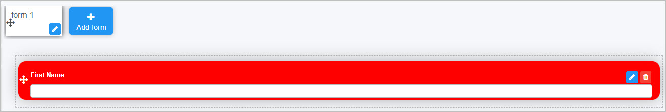
If customised styling has been applied in a Global CSS file, available to administrators under Administration > Subscription, then these attributes can be applied to controls by entering the desired class name into the Custom CSS class name field, as shown below.
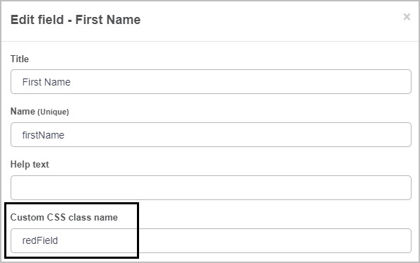
In the example above, redField is defined in the Global CSS file as follows:
.redField{
    background-color: red;
  	color: white;
  	border-radius: 15px;
    padding-bottom: 18px;
    padding-top: 18px;
    padding-right: 15px;
}
When applied to a textbox in forms, a particular colour border with padding is applied to the field, as well as white font colour, as seen below:
Go to Global CSS file for more details.
What’s next 
Now that you know what Controls are, the different types of Controls (fields) and how to add them to a form, find out more about the properties associated with Controls and more about each of the three categories of Controls, as well as Custom controls:
1 - Control properties
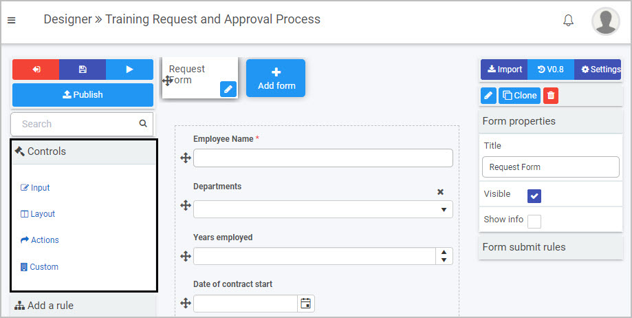
Each process, form and control (field) will have the properties associated with it displayed in the right-hand pane of the Designer view.
Process properties
When you go to Administration > Designer and then click on a process, you will see the Process properties for that process in the right-hand pane.
The Process properties include:
- Title - the title of the process, for example Quarterly Training Request
- Page layout - you can click on Wide
 or Narrow
  to change the process layout.
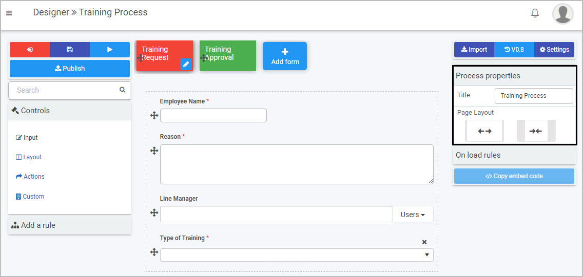
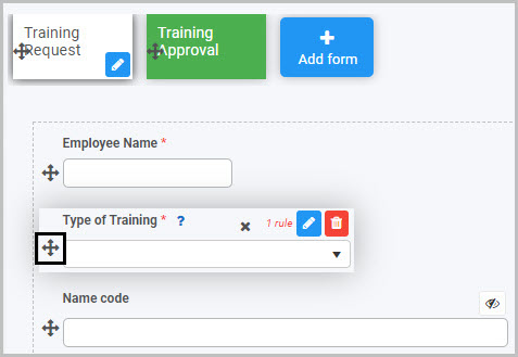
In the example shown here, the ‘Training Process’ has two forms: ‘Training Request’ and ‘Training Approval’. When you open the process, the Process properties are shown. If you click on one of the forms within the process, the Form properties associated with that particular form will then be shown in the right-hand pane.
When you click on a form, the Form properties appear in the right-hand pane.
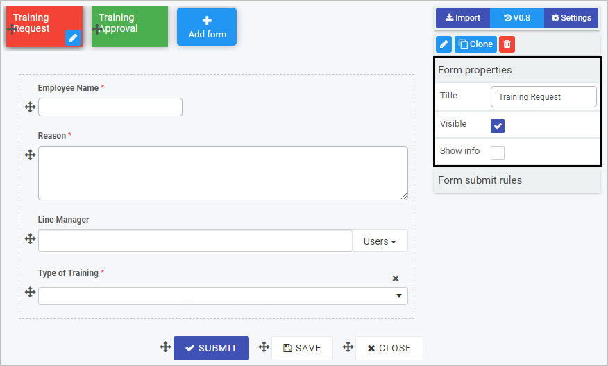
The Form properties include:
-
Title - the form title, for example Training Request
-
Visible - click on this checkbox if you want the form to be visible to users
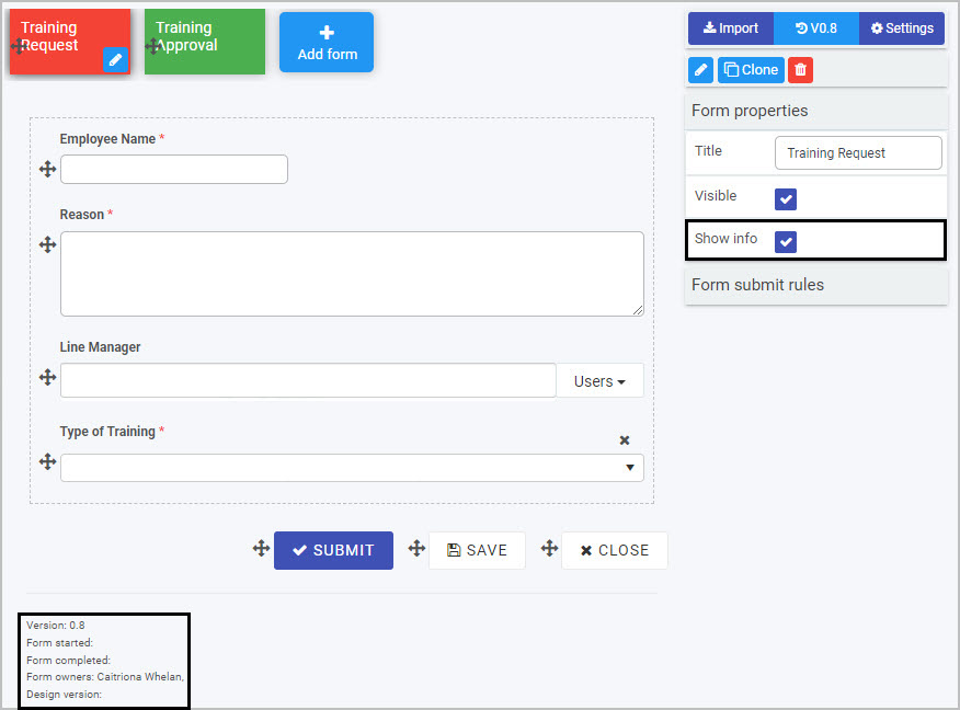
-
Show info - click on this checkbox if you want details (such as the form owner, the design version and when the form was started and completed) to be displayed at the bottom of the form.
Underneath the Form properties you will see Form submit rules - go to Rules to find out more about the rules that can be applied to forms.
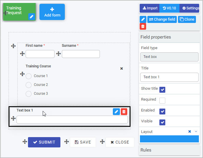
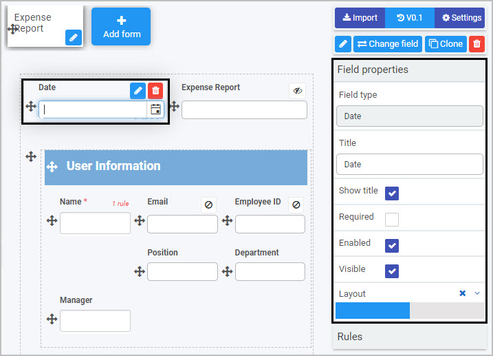
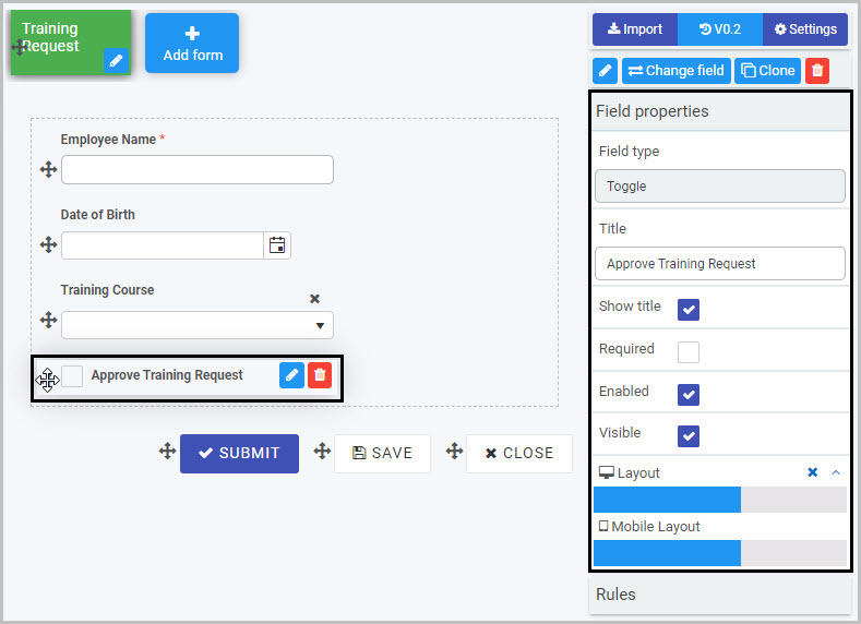
Click on one particular field (control) in the form - for example a text box - to see the Field properties associated with that field.
Field properties
When you select any field within a form (by clicking on the field name or field drag handle button ) - such as User picker, list or text box - the Field properties associated with that field will appear in the right-hand pane.
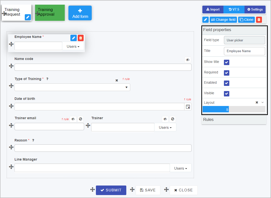
In the example shown here, the Employee Name field has been selected and the Field properties associated with it include the Field type (Text box in this case) and the Title of the field.
The options within the Field properties menu are:
-
Show Title - show the title of the field
-
Required - tick this checkbox to make this field mandatory for users to fill out (this will be denoted by an asterix beside the field name)
-
Enabled - tick this checkbox to make the field enabled for users to fill out
-
Visible - tick this checkbox to make the field visible to users
-
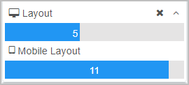
Layout - change the width of the field by clicking on the bar in the Layout box until you see the desired size. Click on the arrow beside Layout to see the Mobile Layout and click on the bar to change the width of the field when viewed on a mobile phone. The layout is split into 12 different bootstrap grid columns (a responsive CSS framework) - for example, a layout set to 6 columns would make the element span half of the screen/canvas.
Underneath the Field properties menu, you will see Rules - go to Rules to find out more about the rules that can be applied to fields.
Saving changes and version history
Make sure to save any changes you make by clicking on the Save button  . You will always have the option to revert back to previous versions of your form by clicking the Design Version History
  button in the top right corner.
What’s next
Now that you’ve learned about the Properties associated with processes, forms and fields, find out more about the different categories and types of fields (controls):
2 - Input controls
Input fields are one category of controls and include the most common data fields used to obtain user input - for example text boxes, lists and tables.
To start adding Input controls (fields) to your Kianda forms:
- First, either open an existing process or create a new process by going to Administration > Designer in the left side menu. See Create First Process to learn how to create your first process.
- Once you have opened your process, select the form you want to work on (so that the Edit Form button is shown).
- Click on Controls in the left-hand pane so the Controls menu expands to show the four categories of Controls (fields): Input, Layout, Actions and Custom.
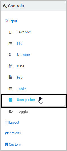
- Select Input to view the eight types of Input fields:
The eight types of input fields are:
- Text box - A text box field is a section in your form where users can enter text, for example, an Address field. See Text box control for more information.
- List - A list field lists information, for example from a SharePoint data source. This is particularly useful for drop-down menus, when you want a user to fill out a form and choose an item from a list. See List control for more information.
- Number - A number field provides an input box that only allows numeric input, such as currencies or percentages. See Number control for more information.
- Date - A date field provides a date and time picker that allows users to input both date and time. See Date control for more information.
- File - A file field allows users to upload multiple files. Uploaded files are stored within the configured data structures or folders. See File upload control for more information.
- Table - A table field creates a table for input in a form. This table can be filled by the user, or autofilled as part of a rule. See Table control for more information.
- User picker - A user picker field allows users to choose from a list of users. This can be a preconfigured group (like HR Managers) or a list of users - see User picker control for more information.
- Toggle - A toggle field can be used as a toggle or checkbox that allows users to turn on/off components of the form. See Toggle control for more information.
To insert an Input field into your form click on the field type you want to add from the Input menu.
For example, to add a new text box field, click on Text box - a pop-up message will appear saying ‘Field added’ and a new text box with the default name Text box 1 will be added to your form.
To edit whatever type of input field you have added to your form:
- Select the field (by either clicking on the field name or on the Drag handle button )
- Then click on the Edit Field button (Pen icon) .
- The Edit Field dialog box will automatically open, providing you with a variety of options for editing the field - such as changing the Title of the field - depending on the type of Input field you are working with.
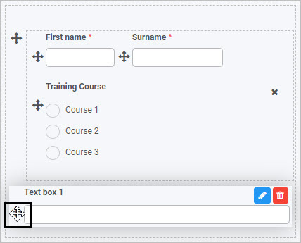
To move an Input field, simply
- Select the field’s Drag handle button
- Drag and drop the field wherever you want to move it within your form. This example shows how you could move a Text box field in a form:
To delete an Input field from your form:
- Select the field (by either clicking on the field’s name or its Drag handle button )
- Click on the Bin/Trash button
- Click on OK to confirm.
You can also view and edit an input field’s Field Properties by selecting the field - for more details, see Field Properties.
Saving changes and version history
Make sure to save any changes you make by clicking on the Save button . You will always have the option to revert back to previous versions of your form by clicking the Design Version History button in the top right corner.
What’s next
We have briefly introduced each of the eight types of Input controls. Now let’s look at each of these types of input fields in more detail:
2.1 - Date control
Date controls or Date fields can be inserted in a form when you want a user to be able to input a date and time by using a date and time picker.
For example, in a Training Request form, you may want the user to select the date and time of the training course they want to attend.
How to get started
-
To add a Date field to a form, first open the relevant process.
-
Then select the form within that process that you want to add the field to (so that the Edit Form button is visible).
-
Click on Controls in the left-hand pane to expand the Controls menu.
-
Select Input to view the range of Input controls and click on Date.
A date field will be added to your form with the default title of ‘Date 1’ and a pop-up message will say ‘Field added’.
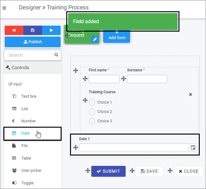
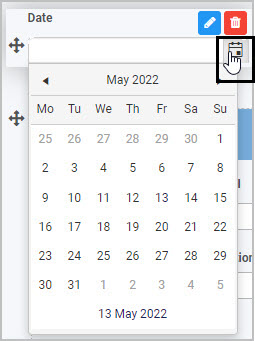
The Date field has a small calendar icon on the right hand side - when the user clicks on this icon a calendar is displayed, allowing them to select a date.
How to edit, move and delete Date fields
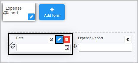
To edit a Date field:
-
Select the field (by either clicking on the field title or on the field’s Drag handle button ).
-
Click on the Edit field button (Pen icon) .
-
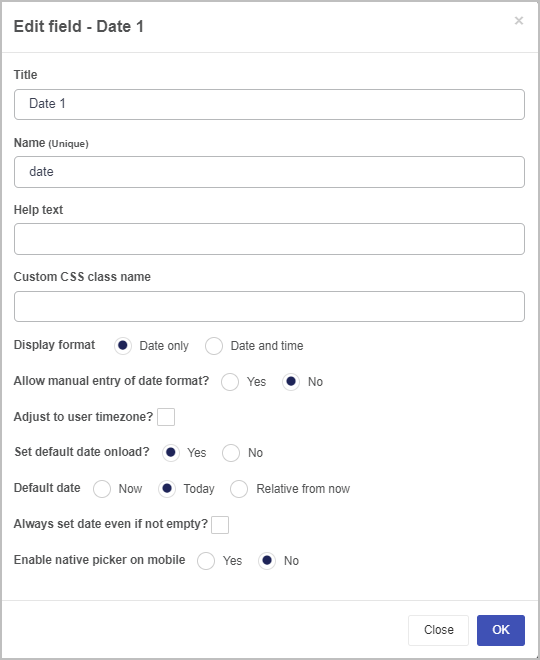
The Edit field dialog box will open, enabling you to choose from a range of options.
-
Title - you can change the title of the date field.
-
Name - This is a unique name for the field and inherits a camel case version of the entered Title.
-
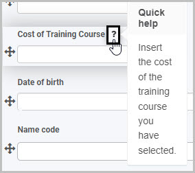
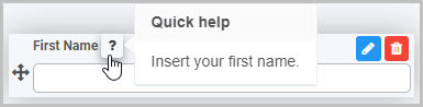
Help text - you can insert help text a user can view when completing the date field. If you add help text, a question mark  icon will appear next to the field title and, if the user clicks on this, they will see the help text you have inserted.
-
Custom CSS class name - You can type the name of a CSS class to allow the Date to inherit specific styles defined in the Global CSS file.
-
Display format - you can choose whether the date field shows the date only or the date and time.
-
Allow manual entry of date format? - choosing yes will allow you to manually type in the date into the field, whereas choosing no will only allow you to utilise the date drop-down feature.
-
Adjust to user timezone - you can select this if you want the date field to adjust to the time zone of the form user.
-
Set default date onload - if you choose ‘Yes’, this means that the date field will automatically be populated (with a date stamp) when a user opens the form to start completing it; by default, the date that will be inserted is today’s date. If you choose ‘No’, then the user will need to manually complete the date field.
If you choose ‘Yes’, two additional options then appear in the dialog box:
-
Default date - this is where you can choose the default date that will be automatically inserted in the form when a user opens it. You can choose from ‘Now’, ‘Today’ (which inserts today’s date and a time of 00:00 midnight) or ‘Relative from now’ (you can insert the date you want to use, in terms of the number of days, hours and minutes from now).
-
Always set date even if not empty - if you select this option, this means that the default date you’ve chosen to be automatically inserted when a user opens the form will be updated/changed each time the user goes into the form. In other words, the initial date that was inserted when the form was first opened will be replaced/updated when the user goes back into the form. If you want the date field to retain the initial date the user started to complete the form, do not tick this checkbox.
-
Enable native picker on mobile - you can choose to allow users who are completing the date field on a mobile phone to use the default pop-up date picker associated with their mobile phone.
To move a Date field, simply
-
Select the field’s Drag handle button .
-
Drag and drop the field wherever you want to move it to within your form.
To delete a Date field from your form:
- Select the field (by either clicking on the field’s name or its Drag handle button ).
- Click on the Bin/Trash button .
- Click on OK to confirm.
How to edit Date field properties
To view or edit the field properties associated with a Date field, select the field (by clicking on the field title or field drag handle button ) - the Field properties menu will appear in the right-hand pane.
For example, the Field Properties associated with a Date field titled ‘Date’ are shown here and include:
- Field type - The type of field, in this case a Date field.
- Title - The Title of the field, in this case ‘Date’.
- Show title - If this is selected, the Date field title will be shown in the form.
- Required - If this is selected, the Date field will be mandatory for the form user.
- Enabled - If this is selected, the user will be able to edit or interact with the field.
- Visible - If this is selected, the Date field will be visible in the form.
- Layout - The width of the blue bar can be adjusted to change the width of the Date field as it appears on a PC or mobile phone (to view the Mobile layout, click on the expand button
 to the right).
To learn more about the different options within the Field properties menu, go to Field Properties.
Saving changes and version history
Make sure to save any changes you make by clicking on the Save button . You will always have the option to revert back to previous versions of your form by clicking the Design Version History button in the top right corner.
What’s next
Now that you’ve learned about Date controls, find out more about the other types of Input fields you can add to a Kianda process:
2.2 - File upload control
File upload controls (fields) can be inserted in a form if you want form users to be able to upload or store a file(s). File upload fields can also be useful if you want a file to be generated from the information entered in a form or if you want a file to be sent as part of your process - see Rules for more information.
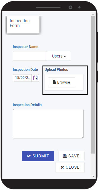
For example, in an Inspection process, you may want the user (an inspector) to be able to upload the details of their inspection as a PDF file or photos as they complete an Inspection Form; or you may want the Kianda system to generate a report based on the information in the Inspection Form and to email this as a PDF file to a supervisor.
How to get started
-
To add a File upload field to a form, first open the relevant process.
-
Select the form within that process that you want to add the field to (so that the Edit Form button is visible).
-
Click on Controls in the left-hand pane to expand the Controls menu.
-
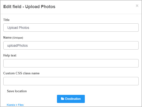
Select Input to view the range of Input controls and click on File. A New field - File dialog box will open with a range of options you can choose from for your new File upload field.
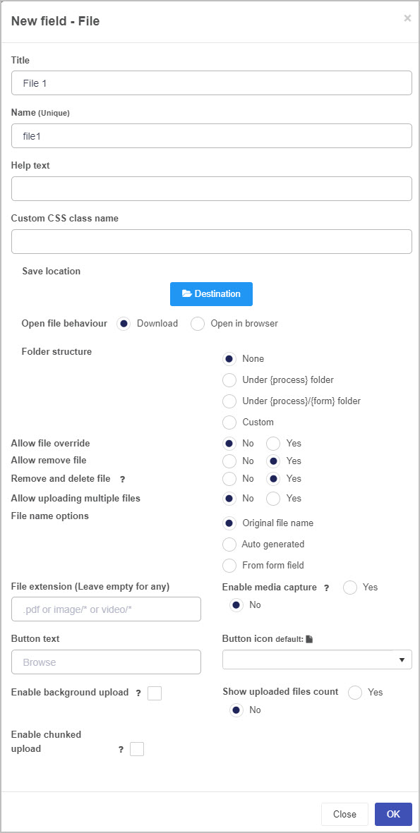
-
Title: You can change the name of the File upload field from the default ‘File 1’.
-
Name - This is a unique name for the field and inherits a camel case version of the entered Title.
-
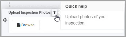
Help text: You can insert text to help the form user to complete the File upload field - if you add help text, a question mark icon will appear next to the field title and, if the user clicks on this, they will see the help text you have inserted.
-
Custom CSS class name - You can type the name of a CSS class to allow the File upload to inherit specific styles defined in the Global CSS file.
-
Save location: This is the location the file will be saved to. When you click on the Destination button, a Select datasource dialog box opens in which you can choose where to save the file(s):
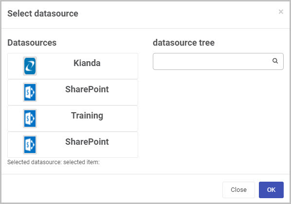
You can choose to save the file or files to Kianda or to another external data source.
-
Open file behaviour: You can choose whether the file is downloaded or opens in an internet browser.
-
Folder structure: If you have chosen an external data source as the ‘Save location’ for the file(s) uploaded to the file upload field, you can then choose the folder structure you want to use for saving the files to that external data source.
-
Allow file override: You can choose whether or not to allow file override. If you choose ‘Yes’, if a user goes back into the form and uploads another file to the File upload field, this will override the original file they had uploaded. This option works in conjunction with the Allow uploading multiple files option - if you choose to allow multiple files to be uploaded, then the ‘Allow file override’ option is no longer relevant (as uploading more files will not override file/files already uploaded).
-
Allow remove file: If you select Yes, this allows the form user to come back into the form and remove the file they had previously uploaded, and another option appears - Remove and delete file: if you choose Yes, when the file is removed, it will also be deleted from the location where it was stored specified in the Save location; if you choose No, then only the reference to the file is removed from the form and the file remains in the Save location.
-
Allow uploading multiple files: Choose No to only allow the user to upload one file or choose Yes to allow the user to upload multiple files.
-
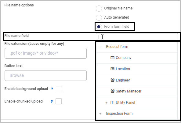
File name options: Choose whether to keep the original file name, to have the file name auto generated by the system, or to be based on a form field. If you choose From form field, another option appears - File name field - allows you to select a field representing the name of the file:
-
File extension: You can set/limit the type of file(s) that can be uploaded by inserting a specific file type. For example, if you insert .pdf in the File extension box, when the user browses for the file to attach, the file type will automatically be set to .pdf. If you want to allow any type of file to be attached, leave this option blank.
-
Enable media capture: If you choose Yes, this enables the user to capture media to upload - on a mobile device, when the user clicks on the Upload button their camera/video recorder will open (depending on whether you’ve selected the file extension to be image or video).
-
Button text: By default, the File upload icon has the text Browse, but you can change this here.
-
Button icon: By default, the file upload icon is  but you can change this by clicking the Button icon drop-down menu and choosing a different icon from the large range of icons available.
-
Enable background upload: Select this checkbox to enable files to be uploaded using a background operation. This option is typically used in conjunction with the Enable chunked upload option.
-
Enable chunked upload: Select this checkbox to upload files using resumable chunks. This option can be useful if the file size is likely to be large or the network speed is likely to be slow.
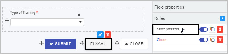
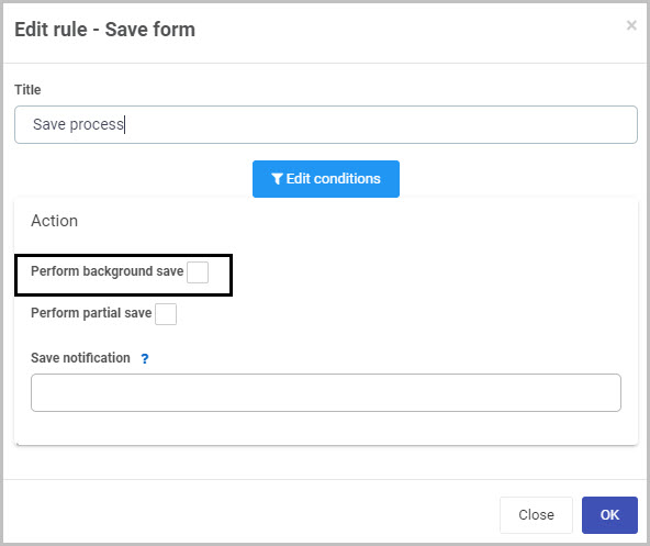
Note: If you select Enable background upload and Enable chunked upload there is an additional step you need to take to ensure that these upload options work. In your form, you need to select each field or button that has a Save process rule applied to it, click on that rule to open the Edit rule dialog box and select the Perform background save checkbox. Then click OK. This will ensure that the upload options you’ve chosen for your File upload field work as intended.
For example, you would need to select the ‘Save process’ rule attached to the ‘Save’ button in your form (by clicking on the Save button and then clicking on the Save process rule):
This opens the Edit rule - Save form dialog box - check the Perform background save option and then click OK:
If the Enable background upload and Enable chunked upload options are chosen and a user completes a form while they are in an area with poor coverage, once the user re-establishes internet connection they will need to go back into Kianda and click the Force refresh button  at the top right of the Home page.
- Show uploaded files count: Select Yes to show the number of uploaded files.
-
Once you complete the New field - File dialog box and click OK, a new File upload field is added to your form, with the name you inserted as the Title in the dialog box (by default the title is File 1 unless you change it).
In the example of our Inspection Form, the new File upload field (titled Upload photos) added to the form could look like this when a user views it on a mobile phone (to see how your form or field will look on a mobile, view it in Mobile preview by using the Preview option which can be opened by clicking the play button icon  ):
):
How to edit, move and delete File upload fields
To edit a File upload field:
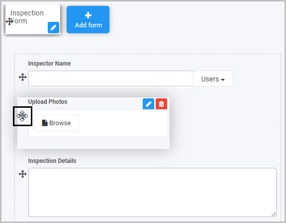
- Select the File upload field (by either clicking on the field title or on the field’s drag handle button ).
- Click on the Edit field button (Pen icon) .
- The Edit field - File dialog box will open, enabling you to choose from the same range of options as appear in the New field - File dialog box (as already discussed in How to get started).
You can make any changes you wish in this dialog box and then click OK to confirm.
To move a File upload field, simply:
- Select the field’s drag handle button .
- Drag and drop the field wherever you want to move it to within your form.
To delete a File upload field from your form:
- Select the field (by either clicking on the field’s name or its drag handle button ).
- Click on the Bin/Trash button .
- Click on OK to confirm.
How to edit File upload field properties
To view or edit the field properties associated with a File upload field, select the field (by clicking on the field title or field drag handle button ) - the Field properties menu will appear in the right-hand pane.
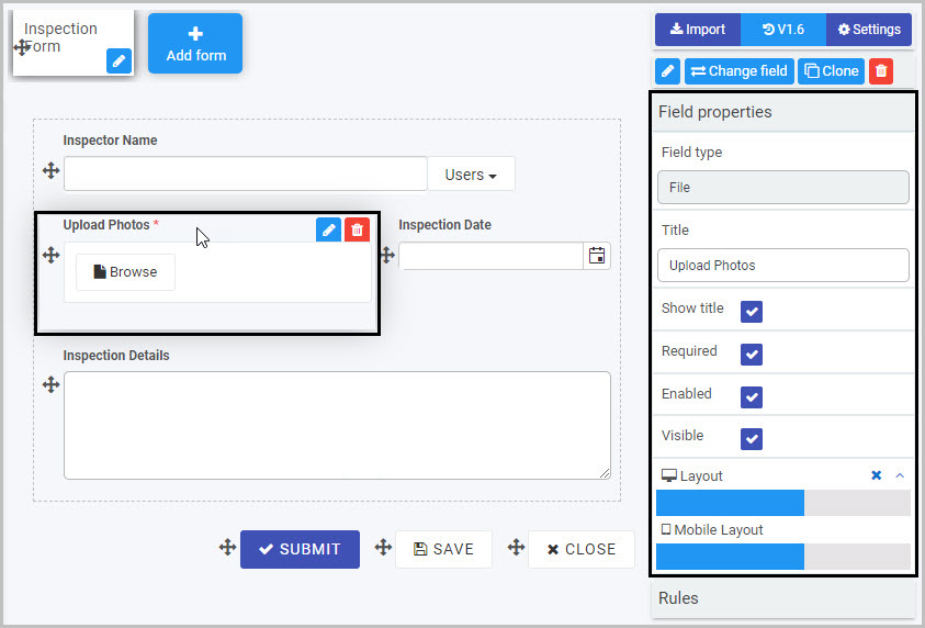
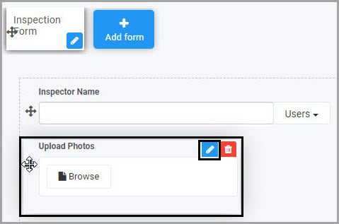
For example, the Field Properties associated with a File upload field titled ‘Upload photos’ are shown here and include:
- Field type - The type of field, in this case a File field.
- Title - The Title of the field, in this case ‘Upload photos’.
- Show title - If this is selected, the File upload field title will be shown in the form.
- Required - If this is selected, the File upload field will be mandatory for the form user.
- Enabled - If this is selected, the user will be able to edit or interact with the field.
- Visible - If this is selected, the File upload field will be visible in the form.
- Layout - The width of the blue bar can be adjusted to change the width of the File upload field as it appears on a PC or mobile phone (to view the Mobile layout, click on the expand button to the right).
To learn more about the different options within the Field properties menu, go to Field Properties.
Saving changes and version history
Make sure to save any changes you make by clicking on the Save button . You will always have the option to revert back to previous versions of your form by clicking the Design Version History button in the top right corner.
What’s next
Now that you’ve learned about the File upload control, find out more about the other types of Input fields you can add to a Kianda process:
2.3 - List control
List fields (controls) can be manually entered into a form or can be linked to from an external site like SharePoint. There are different display options - from drop-down lists to checklists - as well as other options (like the ability to make a list field mandatory for a user to complete).
For example, you could insert a list field in your form that will show a drop-down list of Types of Training that is maintained on SharePoint. The advantage of linking to an external data source like this is that your list will stay up-to-date with any changes made to the list on SharePoint.
How to get started
-
To add a List field to a form, first open the relevant process.
-
Select the form within that process that you want to add the field to (so that the Edit Form button is visible). If you want to add the List field to a panel within your form, first select the panel by clicking on it and then add the List field.
-
Click on Controls in the left-hand pane to expand the Controls menu.
-
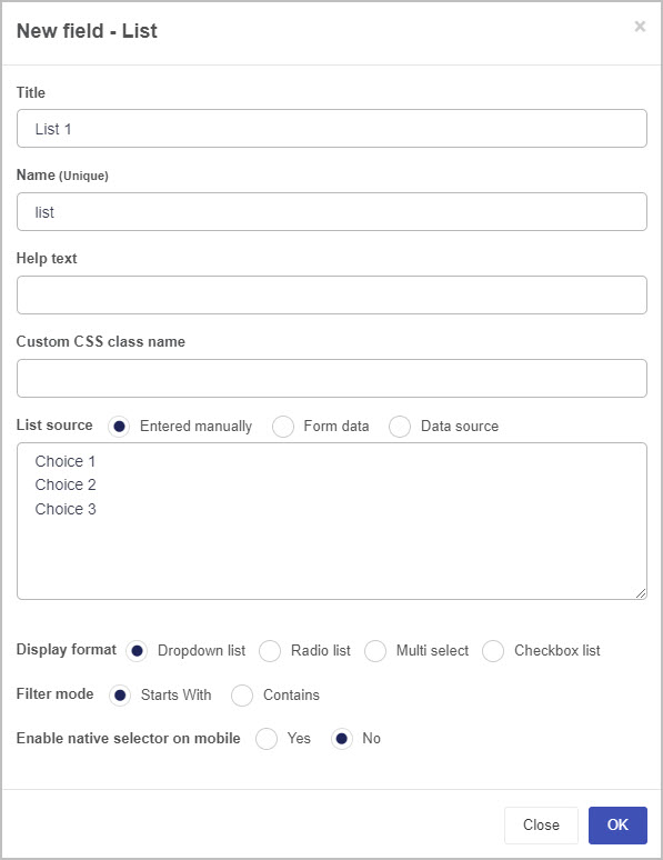
Select Input to view the range of Input controls and click on List. A New field - List dialog box will open with a range of options you can choose from for your new List field.
-
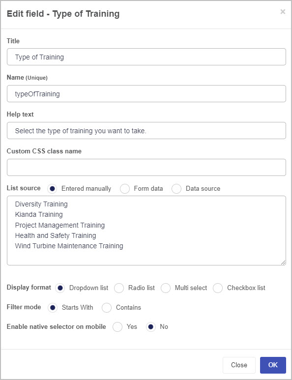
Title - You can change the name of the List field from the default title List 1. For example, if you are working on a Training Request form, you may want to insert a List field to contain the types of training and may choose to title this ‘Type of Training’.
-
Name - This is a unique name for the field and inherits a camel case version of the entered Title.
-
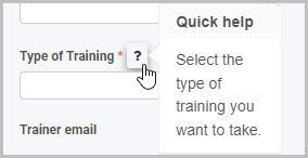
Help text - You can insert text to help the form user to complete the List field. If you add help text, a question mark icon will appear next to the field title and, if the user clicks on this, they will see the help text you have inserted. In this example, the list field is titled ‘Type of Training’ and has associated help text:
-
Custom CSS class name - You can type the name of a CSS class to allow the List to inherit specific styles defined in the Global CSS file.
-
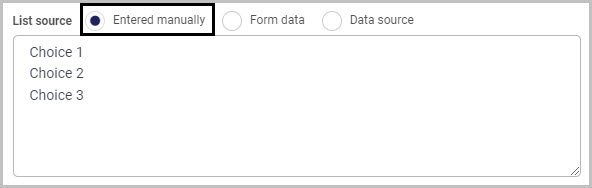
List source - You have three main options in terms of the source of the choices that will appear in your List field:
a) Entered manually
b) Form data
c) Data source
We will look at each of these three list source options in turn.
If you select the Entered manually checkbox, you must then manually type the choices you want to appear in your list into the List source box. Three default choices are shown - simply replace these with the choices you want to appear in your list (keeping the same format of one choice per line). You can insert more than three choices.
If you select the Form data checkbox (so the source of your list options is a form field), then the box under List source will now show the instruction ‘Select a form field…’ and two further options will appear below this - Display field and Value field.
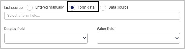
Click into the List source box and select the form field you wish to use as your List source and then choose a Display field (the field used to display values) and Value field to specify how you want to map the values from your data source into your list field.
Select the Data source checkbox if you want to use an external data source as the source for the choices to appear in your list:
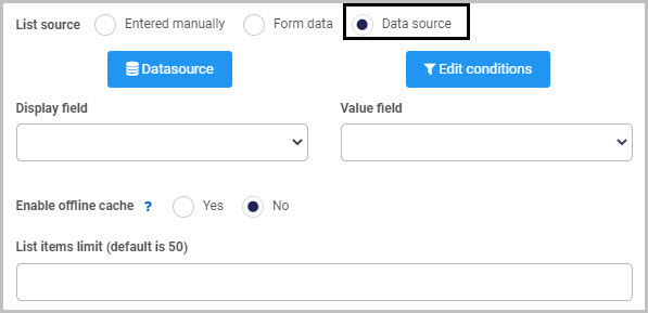
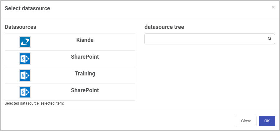
Then click on the Datasource button  to open the Select datasource dialog box and choose the data source you want to connect to - for example, SharePoint. From there you can drill down into the datasource tree and select a specific data item to pull into the list. For more information on how to connect to data sources in Kianda, go to Data connectors.
Once you’ve selected a data source, click OK - a range of new options will now be shown below the Datasource button in the New field - List dialog box.
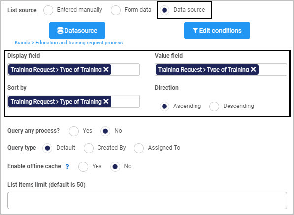
Select the Display field, Value field and a field to Sort by (the ‘Sort by’ option appears once you’ve selected a data source). As the datasource chosen in the example is a Kianda process, the fields will appear as form fields. Once you’ve chosen a field to sort by, an additional option - Direction - appears, enabling you to choose to sort values in Ascending or Descending order. In the example shown here, Kianda has been chosen as the data source and a field titled ‘Type of Training’ from a form called ‘Training Request’ has been chosen as both the Display field and Value field.
Click on the Edit conditions button if you want to add a condition to your List field - for example, if you want to create a cascading list where the options available in a second list are dependent upon the option the user has chosen from a first list. To learn more about applying conditions, go to Conditions and to find out more about creating cascading lists, watch the video on How to create cascading dropdown lists.
If you choose Kianda as the data source for your list field, two additional options will be displayed - Query any process (checks all processes within Kianda for the field you have selected as the source for your list) and Query type (you can select anything created by or assigned to a particular user).
Once you’ve selected your List source and the various options associated with it, complete the remaining options in the New field - List dialog box:
-
Enable offline cache - You can choose this option to make list data available when offline (only available for lists with less than 500 options). This can be useful if you know you are going to be working in areas with poor connectivity such as remote environments with known dead zones.
-
Display format - You can choose to have your list field appear as either a Drop-down list, a Radio list, Multi-select or a Checkbox list.
By default, the Dropdown list radio button is selected, along with two additional options - Filter mode (you can choose either ‘Starts With’ or ‘Contains’) and Enable native selector on mobile (so a user completing the list field on their mobile phone can use the default list selector on it).
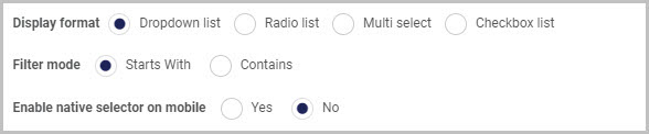
If you choose Radio list or Checkbox list you can choose a List display position of either Vertical or Horizontal.
-
Once you complete the New field - List dialog box and click OK button, a new List field is added to your form, with the name you inserted as the Title in the dialog box (by default, the title is List 1 unless you change it).
If we take the example of a Training Request form with a list field that contains the different types of training a user can request, the list field (which is titled ‘Type of Training’ and has a drop-down list format) could look like this when a user views it on their mobile phone:
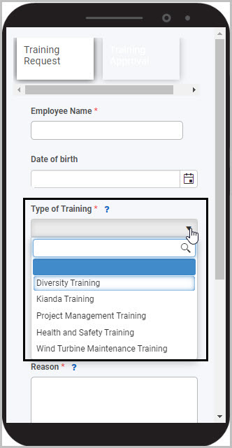
To see how your form or field will look like on a mobile, view it in Mobile preview by clicking the Preview button (play icon) after first saving your changes.
How to edit, move and delete File upload fields
To edit a List field:
- Select the field (by either clicking on the field title or on the field’s Drag handle button ).
- Click on the Edit field button (Pen icon) .
The Edit field - List dialog box will open, enabling you to choose from the same range of options as appear in the New field - List dialog box (as already discussed in How to get started).
You can make any changes you wish in this dialog box and then click OK to confirm.
To move a List field, simply
- Select the field’s drag handle button .
- Drag and drop the field wherever you want to move it to within your form.
To delete a List field from your form:
- Select the field (by either clicking on the field’s name or its drag handle button ).
- Click on the Bin/Trash button .
- Click on OK to confirm.
How to edit List field properties
To view or edit the field properties associated with a List field, select the field (by clicking on the field title or field drag handle button ) - the Field properties menu will appear in the right-hand pane.
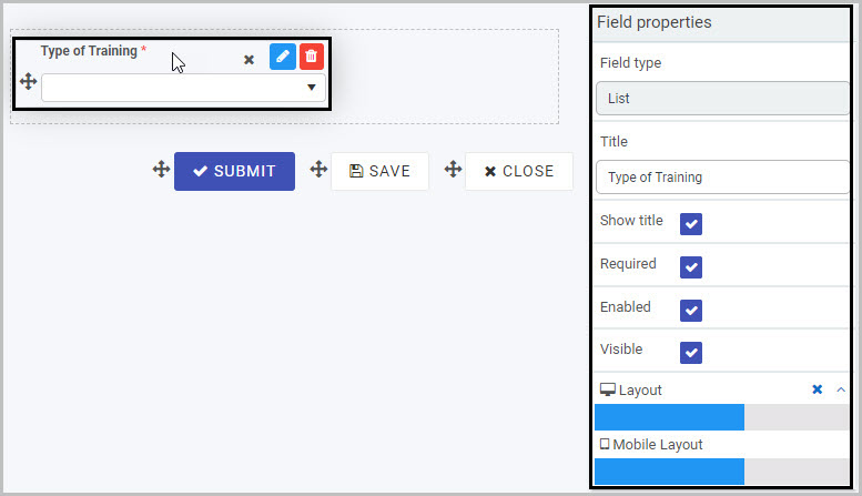
For example, the Field Properties associated with a List field titled ‘Type of Training’ are shown here and include:
- Field type - The type of field, in this case a List field.
- Title - The Title of the field, in this case ‘Type of Training’.
- Show title - If this is selected, the List field title will be shown in the form.
- Required - If this is selected, the List field will be mandatory for the form user.
- Enabled - If this is selected, the user will be able to edit or interact with the field.
- Visible - If this is selected, the List field will be visible in the form.
- Layout - The width of the blue bar can be adjusted to change the width of the List field as it appears on a PC or mobile phone (to view the Mobile layout, click on the expand button to the right).
To learn more about the different options within the Field properties menu, go to Field Properties.
Saving changes and version history
Make sure to save any changes you make by clicking on the Save button . You will always have the option to revert back to previous versions of your form by clicking the Design Version History button in the top right corner.
What’s next
Now that you’ve learned about List controls, find out more about the other types of Input fields you can add to a Kianda process:
2.4 - Number control
Number controls (fields) can be inserted in a form if you want form users to insert a numerical value. Number fields can be formatted to be integers (whole numbers), currency or percentages.
For example, in a Purchase Order Request form, you may want to use Number fields to allow the user to insert the number, unit price and total cost of items being ordered and you may apply rules to some of those fields so that they perform calculations or pull values from other fields or forms. Go to Rules and Expression builder for more information on how you make your forms dynamic.
How to get started
-
To add a Number field to a form, first open the relevant process.
-
Then select the form within that process that you want to add the field to (so that the Edit Form button is visible).
-
Click on Controls in the left-hand pane to expand the Controls menu.
-
Select Input to view the range of Input controls and click on Number.
A number field will be added to your form with the default title of ‘’Number 1’’ and a pop-up message will say ‘Field added’.
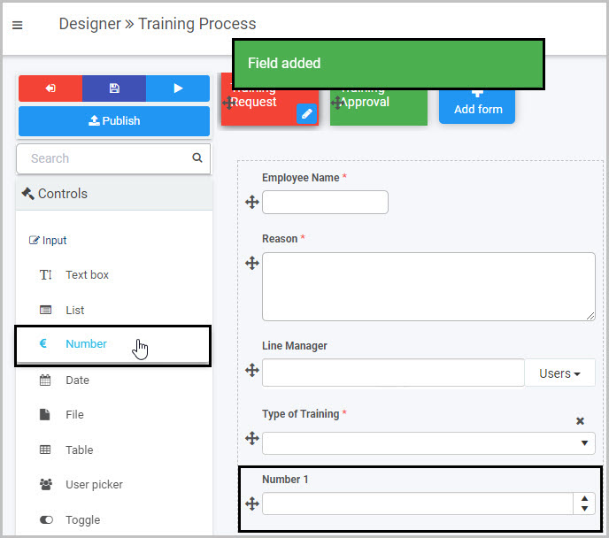
By default, the new Number field will have up and down arrow buttons  at the right that users can click to increase or decrease the number in the field and will show any numbers entered to two decimal places. These settings can be amended by editing the field.
In the example shown here, a new Number field has been added to form called ‘Training Request’. This new Number field could be edited to rename it ‘Cost of Training Course’ and could be formatted as currency (Euro) so that users could insert the cost of the training course they want to take.
How to edit, move and delete Number fields
To edit a Number field:
-
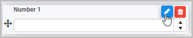
Select the field (by either clicking on the field title or on the field’s Drag handle button ).
-
Click on the Edit field button (Pen icon) .
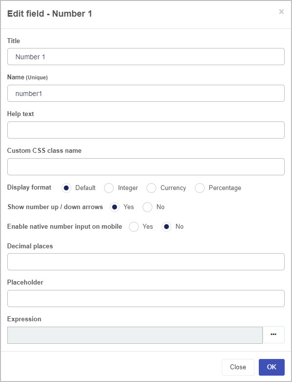
The Edit field - Number dialog box will open, enabling you to choose from a range of options:
-
Title - you can change the title of the Number field from the default ‘Number 1’.
-
Name - This is a unique name for the field and inherits a camel case version of the entered Title.
-
Help text - you can insert text to help the form user to complete the Number field. If you add help text, a question mark icon will appear next to the field title and, if the user clicks on this, they will see the help text you have inserted.
-
Custom CSS class name - You can type the name of a CSS class to allow the Number to inherit specific styles defined in the Global CSS file.
-
Display format - you can choose whether the number inserted by the user is formatted to be an integer (whole number), currency or a percentage.
If you select Currency as the Display format, a new option will appear - Currency format - where you can select the currency you want to use.
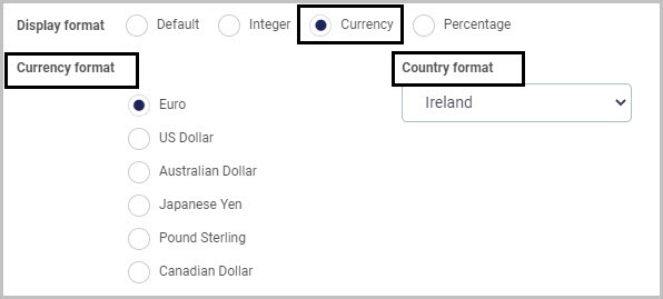
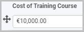
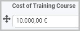
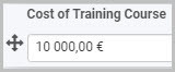
If you select Euro as the Currency format, a new format option called Country format appears to the right. This is a drop-down list from which you can choose from three different ways that Euro amounts can be displayed:
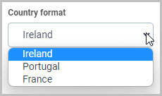
If you choose Ireland as the Country format, Euro amounts will be displayed like this:
If you choose Portugal as the Country format, Euro amounts will be displayed like this:
If you choose France as the Country format, Euro amounts will be displayed like this:
-
Show number up/down arrows - you can choose whether or not you want the Number field to have up/down arrow buttons that enable the user to increase or decrease the number in the field.
-
Enable native number input on mobile - you can select this to enable native number input when a user is completing the Number field on their mobile phone.
-
Decimal places - you can insert the number of decimal places you want the figure in the Number field to have.
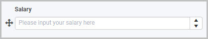
-
Placeholder - you can insert placeholder text to appear in the Number field to assist the user. For example, this Number field titled ‘Salary’ has placeholder text:
-
Expression - you can add an expression to your Number field if, for example, you want the field to contain a calculation based on another field or want it to pull values from other fields. To add an expression, click on the expression button (ellipsis)  to open the Expression builder dialog box - here you can add expressions to perform math operations and various other actions.
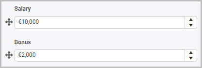
For example, let’s say you have a Number field called ‘Salary’ where the user inputs their salary and another Number field called ‘Bonus’ which you want to be automatically populated with a figure that is 20% of the ‘Salary’ figure. To do this, you add an Expression to the ‘Bonus’ field:
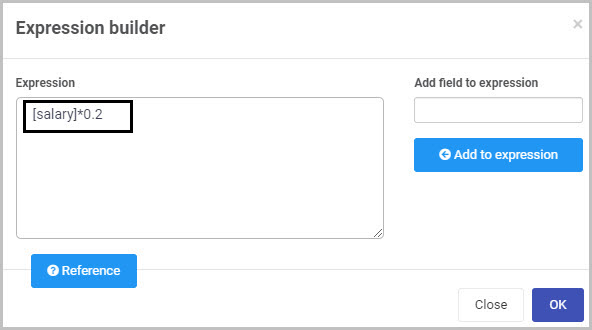
Now when a user completes the ‘Salary’ field, the Bonus field automatically populates with a figure that is 20% of their salary:
To learn more about applying rules and expressions to Number fields, go to Rules and Expression builder.
-
Make whatever changes you want in this Edit field - Number dialog box and then click OK to confirm.
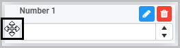
To move a Number field:
- Select the field’s Drag handle button .
- Drag and drop the field wherever you want to move it to within your form.
To delete a Number field from your form:
- Select the field (by either clicking on the field’s name or its drag handle button ).
- Click on the Bin/Trash button .
- Click on OK to confirm.
How to edit Number field properties
To view or edit the field properties associated with a Number field, select the field (by clicking on the field title or field drag handle button ) - the Field properties menu will appear in the right-hand pane.
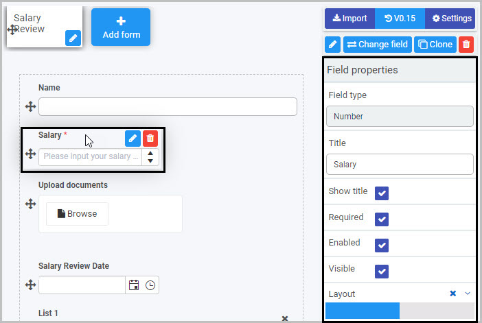
For example, the Field Properties associated with a Number field titled ‘Salary’ are shown here and include:
- Field type - The type of field, in this case a Number field.
- Title - The Title of the field, in this case ‘Salary’.
- Show title - If this is selected, the Number field title will be shown in the form.
- Required - If this is selected, the Number field will be mandatory for the form user.
- Enabled - If this is selected, the user will be able to edit or interact with the field.
- Visible - If this is selected, the Number field will be visible in the form.
- Layout - The width of the blue bar can be adjusted to change the width of the Number field as it appears on a PC or mobile phone (to view the Mobile layout, click on the expand button to the right).
To learn more about the different options within the Field properties menu, go to Field Properties.
Saving changes and version history
Make sure to save any changes you make by clicking on the Save button . You will always have the option to revert back to previous versions of your form by clicking the Design Version History button in the top right corner.
What’s next
Now that you’ve learned about the Number control, find out more about the other types of Input fields you can add to a Kianda process:
2.5 - Table control
Table controls (fields) can be inserted in a form if you want form users to complete a table, if you want display data pulled from external sources in a table, or if you want a table to be autofilled as part of a rule. Tables can include different types of fields, such as text boxes, date fields, number fields, and list fields.
For example, in a Purchase Order Request form, you may want to use a Table field to display certain information about items or suppliers and/or to capture details the user inputs about items being ordered. In addition, you could apply rules to some of the fields within the table to, for example, automatically calculate totals or percentages or to pull in data from external data sources.
For more information about applying rules to fields and forms go to Rules and for more specific information about applying rules to Table fields see Table rules.
We will now go through:
How to get started
-
To add a Table field to a form, first open the relevant process.
-
Then select the form within that process that you want to add the field to (so that the Edit Form button is visible).
-
Click on Controls in the left-hand pane to expand the Controls menu.
-
Select Input to view the range of Input controls and click on Table.
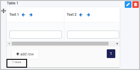
A Table field will be added to your form with the default title of ‘’Table 1’’ and a pop-up message will say ‘Field added’.
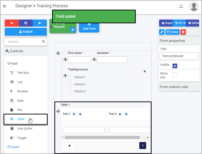
By default, the new Table field will have one row with two columns of text fields, titled Text 1 and Text 2. You can add rows, columns and various different types of fields to the table by editing the table field, as outlined in the next section. In the example shown here, a new table has been added to a form called ‘Training Request’.
How to edit, move and delete Table fields
As we go through the options available for editing a Table, we will keep in mind the example of the table we added to the ‘Training Request’ form above.
How to edit column fields in a Table
First, decide how many columns you need in your table and what type of input field you want to use for each column. To learn more about the eight different types of Input fields that you can use, go to Input controls.
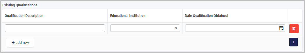
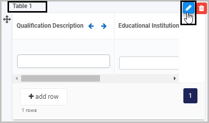
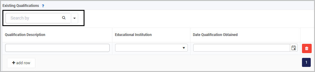
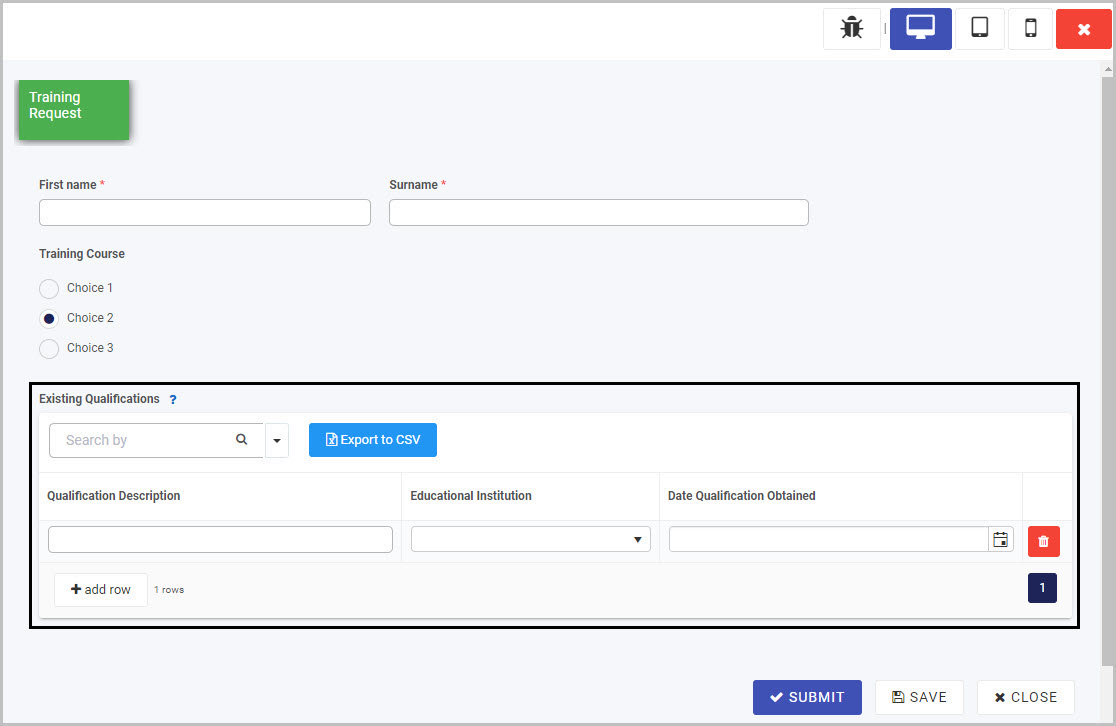
In our example, we want to change the default table that was inserted - titled Table 1 with two columns of text box fields - into a table called ‘Existing Qualifications’ to capture the existing qualifications of the user who is requesting further training.
We want our table to have three columns: the first column will be a text box field titled ‘Qualification Description’ where the user will manually type in the name of a qualification, the second column will be a drop-down list titled ‘Educational Institution’ (which could link to an external data source) where the user will choose the relevant institution, and the third column will be a date field titled ‘Date Qualification Obtained’, as shown here:
How to change the title of a Table column
To change the default title of the first column texbox field from Text 1:
- Select that field by either clicking on the field title or by clicking into the blank text box so that the Edit field button (Pen icon) displays.
- Click the Edit field button.
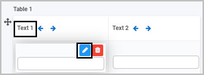
The Edit field - Text dialog box will open and you can change the title of the field here. There are also a number of other options available to you - see Text box control for more information on how you can edit text box fields.
Note: The unique names of fields outside of a table do not conflict with the unique names of fields within a table. Fields with duplicate unique names within the same table are not allowed however.
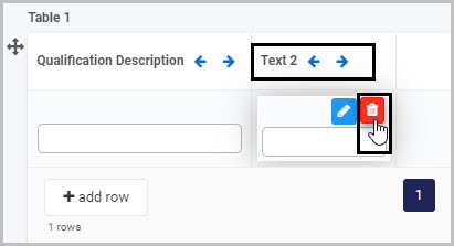
How to delete a column from a Table
To delete a column from a Table field:
- Select the column field you want to delete (either by clicking on the title or clicking into the blank field below the title) so that the Edit field and Bin/Trash button is shown.
- Click on the Bin/Trash button.
How to change the field type of an existing Table column
In our example, we want the second column in our table to be a drop-down list. We can either delete the default second text box column and then insert a new list column or we can change the field type of the existing column from text box to list.
To change the field type of an existing column:
-
Select the column field you want to change (by either clicking on the column Title or clicking into the blank box below it) so that the Edit field button (Pen icon) is shown.
-
Click on the Change field button in the right-hand pane:
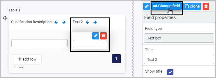
A Change dialog box will open up, allowing you to change the existing column field type to another type of input field - there are many options to choose from (only some of which are shown here):
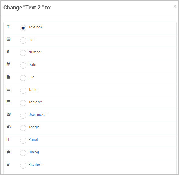
In our example, if we want to change the ‘Text 2’ text box column to be a List field, we would select the List radio box and then click OK to confirm. An Edit field dialog box for the type of input field you have chosen will then open, allowing you to change the column field title (in our case, we will rename it as ‘Educational Institution’) and to choose from a range of options relevant to that field type.
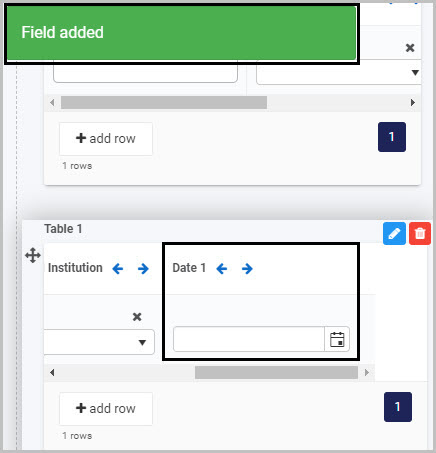
How to insert new columns in a Table
To insert new columns into a Table:
-
Either select the Table field itself or select one of the individual columns.
-
Go to Controls>Input in the menu in the left-hand pane and click on the type of input field you want to insert.
The new column will be inserted to the right of the existing columns, or, if you selected one of the existing columns before inserting the new column, it will be inserted to that right of that column.
In our example, we will insert a date field to be our third column (and can then rename it as ‘Date Qualification Obtained’ by clicking on Edit field button (Pen icon) and changing it in the Edit field - Date dialog box):
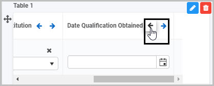
How to move columns in a Table
To re-order columns in a Table, simply
- Select the column field you want to move (by either clicking the column title or clicking into the blank box below the title) so the Edit field button (Pen icon) displays.
- Click on the left or right arrow buttons
 to move that column to the left or right:
How to edit the Table field
To edit the Table field itself:
-
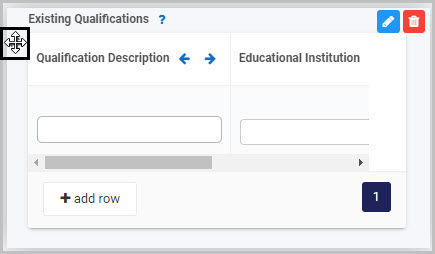
Select the Table (by either clicking on the Table title or on the table’s Drag handle button ).
-
Click on the Edit field button (Pen icon) .
The Edit field - Table dialog box will open, enabling you to choose from a range of options:
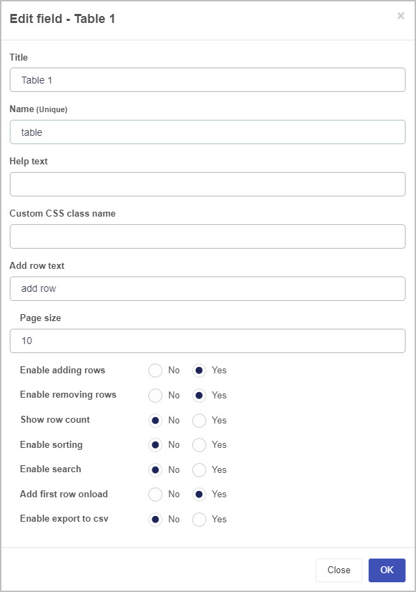
-
Title - you can change the title of the Table from the default ‘Table 1’. In our example, we could change the name of the table to ‘Existing Qualifications’.
-
Name - This is a unique name for the field and inherits a camel case version of the entered Title.
-
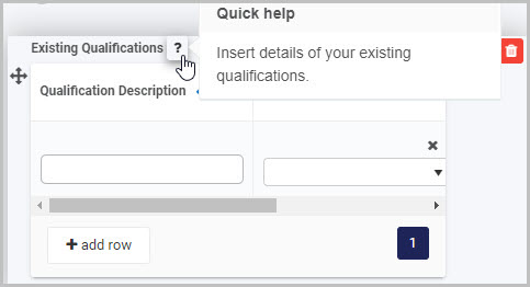
Help text - you can insert text to help the form user to complete the Table. If you add help text, a question mark icon will appear next to the field title and, if the user clicks on this, they will see the help text you have inserted.
-
Custom CSS class name - You can type the name of a CSS class to allow the Table to inherit specific styles defined in the Global CSS file.
-
Add row text - you can insert the text you want to appear with the Add Row button  . By default, this will be ‘add row’.
-
Page size - you can increase or decrease the number of row items you will see per page by clicking the up/down arrow buttons at the right of the field. By default, it is set to show 10 row items per page.
-
Enable adding rows - selecting ‘Yes’ enables the user to add rows to the table when they are completing it and displays the Add row button and selecting ‘No’ removes this option. By default, this option is set to ‘Yes’.
-
Enable removing rows - selecting ‘Yes’ enables the user to remove rows from the table as they are completing it (by clicking on the Bin/Trash button at the end of each table row) and selecting ‘No’ removes this option. By default, this option is set to ‘Yes’.
-
Show row count - you can choose to display text showing the number of rows in the table. This text will appear below the Add row button:
-
Enable sorting - you can select ‘Yes’ to enable the form user to sort the data in the table
-
Enable search - you can select ‘Yes’ to enable the form user to search the data in the table. If you choose this option, the form user will see a search field at the top of the table:
-
Add first row onload - by default, this is set to ‘Yes’, meaning that when the form is loaded the first row is automatically shown.
-
Enable export to csv - you can select ‘Yes’ to enable the form user to export the table contents to a csv file. If you select ‘Yes’, some additional options appear in the Edit field - Table dialog box:
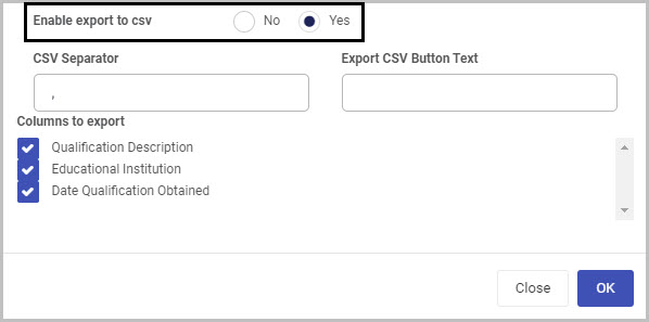
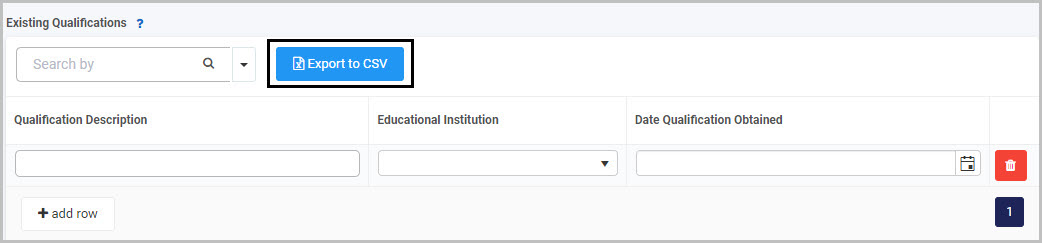
The CSV Separator is set to be a comma by default (but you can change this) and you can insert text you want to appear on the Export CSV button. For example, if you insert ‘Export to CSV’ as the text to appear on the button, it will appear like this in the form to the user:
The Columns to export will automatically show the columns in your table
-
Make whatever changes you want to make to the table in the Edit field - Table dialog box and then click OK to confirm.
If you want to make your table more dynamic - for example, so that calculations are made or information is autofilled into part of the table - you can add rules to it. To learn about applying rules to fields and forms go to Rules and for more specific information about applying rules to Table fields see Table rules.
How to move Table fields
To move a Table field within your form:
- Select the field’s Drag handle button .
- Drag and drop the field wherever you want to move it to.
How to delete Table fields
To delete a Table field from your form:
- Select the field (by either clicking on the field’s name or its Drag handle button ).
- Click on the Bin/Trash button .
- Click on OK to confirm.
How to edit Table field properties
To view or edit the field properties associated with a Table field, select the table (by clicking on the field title or field drag handle button ) - the Field properties menu will appear in the right-hand pane.
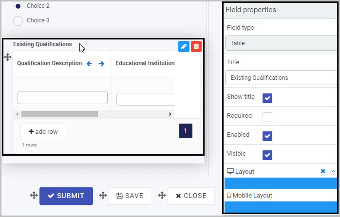
For example, the Field Properties associated with a Table field titled ‘Existing Qualifications’ are shown here and include:
- Field type - The type of field, in this case a Table field.
- Title - The Title of the field, in this case ‘Existing Qualifications’.
- Show title - If this is selected, the Table field title will be shown in the form.
- Required - If this is selected, the Table field will be mandatory for the form user.
- Enabled - If this is selected, the user will be able to edit or interact with the field.
- Visible - If this is selected, the Table field will be visible in the form.
- Layout - The width of the blue bar can be adjusted to change the width of the Table field as it appears on a PC or mobile phone (to view the Mobile layout, click on the expand button to the right).
You can then check how the Table will appear to users on their PC or mobile phone by first saving your form and then clicking on the Preview button . Our sample table, Existing Qualifications could look like this when viewed on a PC:
You can also view and edit the properties of the individual column fields within the Table by selecting the column field.
To learn more about the different options within the Field properties menu, go to Field Properties.
Saving changes and version history
Make sure to save any changes you make by clicking on the Save button . You will always have the option to revert back to previous versions of your form by clicking the Design Version History button in the top right corner.
What’s next
Now that you’ve learned about the Table control, find out more about the other types of Input fields you can add to a Kianda process:
2.6 - Text box control
The Text box control can be used if you want a user to manually input text into a form. For example, in a Training Request form, you may want the user to insert their first name and surname and may want those fields to be mandatory for the user to complete.
There are various options available when creating a Text box field, such as formatting it to allow multiple lines of text, to contain a password (text input is not shown) or to autofill with saved information such as the user’s address or email. More advanced options include applying a rule or expression to a Text box field - for more information, see Rules and Expression builder.
How to get started
-
To add a Text box field to a form, first open the relevant process.
-
Then select the form within that process that you want to add the field to (so that the Edit Form button is visible).
-
Click on Controls in the left-hand pane to expand the Controls menu.
-
Select Input to view the range of Input controls and click on Text box.
A Text box field will be added to your form with the default title of ‘’Text box 1’’ and a pop-up message will say ‘Field added’.
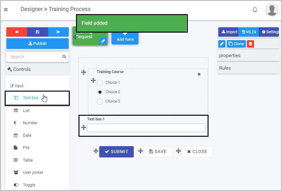
In the example shown here, a Text box field has been added to a form called ‘Training Request’ in a process called ‘Training Process’, as the first step in adding two Text box fields (which will be used to capture the first name and surname of the user who is completing the form).
You can also place a Text box within an element - such as within a panel in a form. In the example above, the Text box was inserted outside the panel in the form. If you wanted to insert it within the panel, simply select the panel itself by clicking on its drag handle and then click on Controls > Input > Text box - this will result in the new Text box being added inside the panel, as shown here:
How to edit, move and delete Text box fields
As we go through the options available for editing a Text box, we will keep in mind the example of adding two text boxes to the ‘Training Request’ form to capture a user’s first name and surname.
How to edit a Text box field
To edit a Text box field:
-
Select the Text box (by either clicking on its title or its Drag handle button ).
-
Click on the Edit field button (Pen icon) .
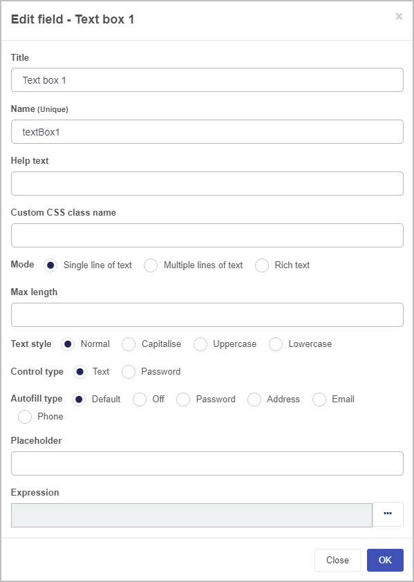
The Edit field - Text box dialog box will open, enabling you to choose from a range of options:
-
Title - you can change the title of the Text box from the default ‘Text box 1’. In our example, we could change the name of the first Text box to ‘First Name’ and the second Text box to ‘Surname’.
-
Name - This is a unique name for the field and inherits a camel case version of the entered Title.
-
Help text - you can insert text to help the form user to complete the Table. If you add help text, a question mark icon will appear next to the field title and, if the user clicks on this, they will see the help text you have inserted.
-
Custom CSS class name - You can type the name of a CSS class to allow the Textbox to inherit specific styles defined in the Global CSS file.
-
Mode - you can decide whether your Text box is limited to a Single line of text or will allow for Multiple lines of text or can choose Rich text. Different additional options will then be shown, depending on the Mode you have chosen.
If you choose ‘Single line of text’ as the Mode for your Text box - as in the example shown above - these additional options will be shown:
-
Max length - choose the maximum number of characters for the text inserted in your Text box by either typing in a number or by clicking the up/down arrow buttons at the right side of the blank field beneath it
-
Text style - choose Normal, Capitalise, Uppercase or Lowercase, depending on how you want the text input in the Text box to appear
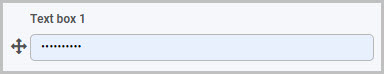
-
Control type - choose either Text or Password. If you choose Password, then the text input by the user in the Text box will not be visible:
-
Autofill type - you can choose between Default, Off, Password, Address, Email and Phone. If, for example, you select Address, this means that when the user is completing this Text box field, it will automatically populate with the user’s saved address information (if the user has that saved information on their PC or mobile phone).
-
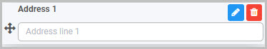
Placeholder - you can insert placeholder text to appear in the Text box field to assist the user. For example, this Text box field titled ‘Address 1’ has placeholder text:
If you choose ‘Multiple lines of text’ as the Mode for your Text box, these additional options will be shown:
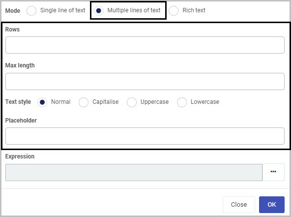
-
Rows - you can decide how many rows of text you want your Text box to have. Either manually type in a number or use the up/down arrows on the right-side of the field
-
Max length - you can set a maximum number of characters for the Text box
-
Text style - choose from Normal, Capitalise, Uppercase or Lowercase
-
Placeholder - you can insert placeholder text to appear in the Text box field to assist the user.
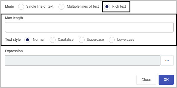
If you choose ‘Rich text’ as the Mode for your Text box, you will have the additional options of setting a Max length (maximum number of characters that can be input in the field) and choosing a Text style, as shown here:
-
Expression - If you want to use your Text box field in a way that is more dynamic, you could decide to add an expression to it. For example, an Expression can be used to return a value - if you apply the Expression ‘Date()’ to your Text box field, it will return the current date and time.
To add an Expression to your Text box field, click on the ellipsis button to the right. This will open the Expression builder dialog box:
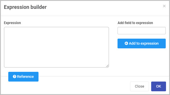
You can click on the Reference button  to see some of the most commonly used Expressions. To learn more about using Expressions, go to Expression builder.
-
Make whatever changes you want to make to the Text box field in the Edit field - Text box dialog box and then click OK to confirm.
How to move Text box fields
To move a Text box within your form:
-
Select the field’s Drag handle button .
-
Drag and drop the field wherever you want to move it to.
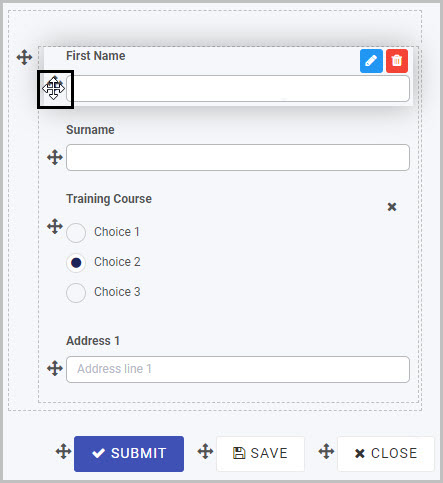
In our example, the two new Text boxes titled ‘First Name’ and ‘Surname’ can be moved from the bottom of the form to the top:
How to delete Text box fields
To delete a Text box field from your form:
- Select the field (by either clicking on the field’s name or its Drag handle button ).
- Click on the Bin/Trash button .
- Click on OK to confirm (or click on Cancel if you wish to cancel the deletion).
How to edit Text box field properties
To view or edit the field properties associated with a Text box field, select the field (by clicking on its title or its drag handle button ) - the Field properties menu will appear in the right-hand pane.
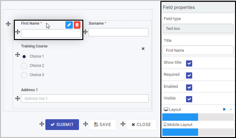
For example, the Field Properties associated with a Text box field titled ‘First Name’ are shown here and include:
-
Field type - The type of field, in this case a Text box field.
-
Title - The Title of the field, in this case ‘First Name’.
-
Show title - If this is selected, the Text box field title will be shown in the form.
-
Required - If this is selected, the Text box field will be a mandatory field that users must complete (denoted by a red asterisk next to the field title).
-
Enabled - If this is selected, the user will be able to edit or interact with the field.
-
Visible - If this is selected, the Text box field will be visible in the form.
-
Layout - The width of the blue bar can be adjusted to change the width of the Text box field as it appears on a PC or mobile phone (to view the Mobile layout, click on the expand button to the right).
To learn more about the different options within the Field properties menu, go to Field Properties.
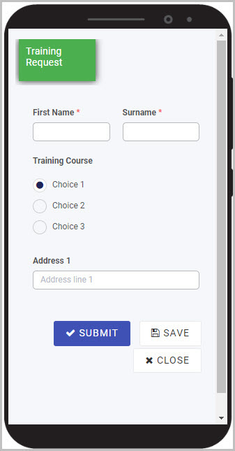
You can check how the Text box will appear to users on their PC or mobile phone by first saving your form and then clicking on the Preview button . Our simple example of the ‘First Name’ and ‘Surname’ fields in a Training Request form could look like this when viewed on a user’s mobile phone:
Saving changes and version history
Make sure to save any changes you make by clicking on the Save button . You will always have the option to revert back to previous versions of your form by clicking the Design Version History button in the top right corner.
What’s next
Now that you’ve learned about the Text box control, find out more about the other types of Input fields you can add to a Kianda process:
2.7 - Toggle control
Toggle fields (controls) can be used in a form to record a decision, confirm that an action has been taken or an item has been received, or to record a yes/no type answer. They can be used as either a toggle or as a checkbox - for example, Toggle fields could be used to create a series of checkboxes in an Onboarding Form to record whether a new employee has received required training, been assigned an employee number and so on.
Rules can be applied to Toggle fields to make your form more dynamic. One such rule, the Show, hide or disable rule can be applied to a Toggle field to have the effect of showing or hiding remaining options/sections in the form dependent on whether the toggle/checkbox is selected or not.
For example, in a Training Request form, a Toggle field could be used to record a manager’s decision to either approve or reject an employee’s training request - by applying the Show, hide or disable rule to this field, a different last section of the form will display based on the manager’s decision. If the manager select’s to approve the training, a sign-off button then appears; if the manager reject’s the request, a ‘Reason’ text box appears for them to insert their feedback. To learn more about applying rules to fields, see Rules and Expression builder. To find out more about this specific rule, go to Show, hide or disable.
How to get started
-
To add a Toggle field to a form, first open the relevant process.
-
Then select the form within that process that you want to add the field to (so that the Edit Form button is visible). If you want to add the Toggle field to a panel within your form, first select the panel by clicking on it and then add the Toggle field.
-
Insert the new Toggle field by clicking on Controls in the left-hand pane to expand the Controls menu, then select Input to view the range of Input controls and click on Toggle.
-
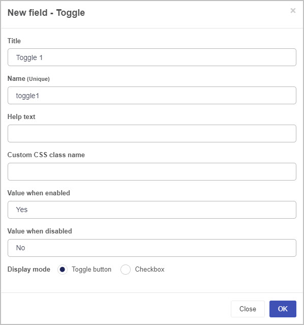
A New field - Toggle dialog box will open with a range of options you can choose from for your new Toggle field.
-
Title - You can change the name of the Toggle field from the default title Toggle 1.
-
Name - This is a unique name for the field and inherits a camel case version of the entered Title.
-
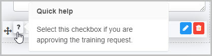
Help text - You can insert text to explain to the form user what selecting the toggle/checkbox means. If you add help text, a question mark icon will appear next to the field title and, if the user clicks on this, they will see the help text you have inserted. In this example, the Toggle field is titled ‘Approve Training’ and has associated help text:
-
Custom CSS class name - You can type the name of a CSS class to allow the Toggle to inherit specific styles defined in the Global CSS file.
-
Value when enabled - You can set the value for when the user selects the toggle/checkbox. For example, the value when it is selected could be ‘Yes’.
-
Value when disabled - You can set the value for when the user does not select the toggle/checkbox. For example, the value when it is not selected could be ‘No’.
-
Display mode - You can choose to have the Toggle field display as either a Toggle button  or Checkbox
  .
.
-
Once you complete the New field - Toggle dialog box and click OK button, a new Toggle field is added to your form, with the name you inserted as the Title in the dialog box (by default, the title is Toggle 1 unless you change it).
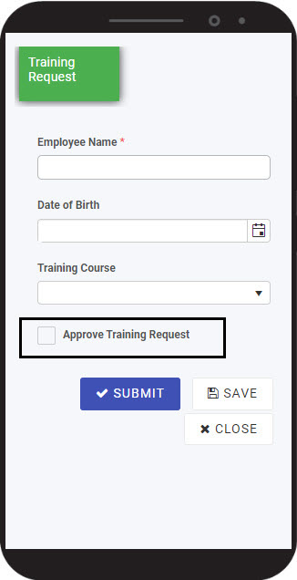
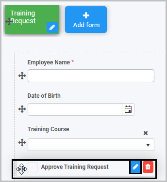
If we take the example of the Training Request form we already discussed, with a Toggle field called ‘Approve Training Request’ that is formatted to be a checkbox, the Toggle field could look like this when a user views it on their mobile phone:
To check how your form or field will look like on a mobile, view it in Mobile preview by clicking the Preview button (play icon) after first saving your changes.
How to edit, move and delete Toggle fields
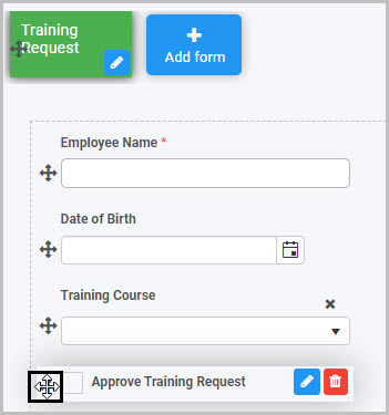
As we go through the options available for editing a Toggle field, we will keep in mind the example of the ‘Approve Training Request’ Toggle field in our Training Request form.
How to edit a Toggle field
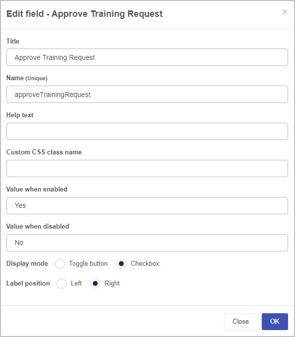
To edit a Toggle field:
-
Select the field (by either clicking on the field title or on the field’s Drag handle button ).
-
Click on the Edit field button (Pen icon) .
The Edit field - Toggle dialog box will open, enabling you to choose from the same range of options as appear in the New field - Toggle dialog box (as already discussed in How to get started).
-
You can make any changes you wish in this dialog box and then click OK to confirm.
You can apply rules to a Toggle field to make it more dynamic so that, for example, it generates information that is automatically inserted into another field.
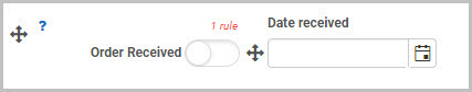
For example, you could apply a ‘Set date’ rule to your ‘’Order Received’ toggle field so that it generates a date to be displayed in a ‘Date received’ field when Order received is selected by the user - this will mean that when the user selects the Order Received toggle field, this automatically generates a date stamp for when the order was received:
To learn more about applying rules to fields, see Rules and Expression builder. To find out more about the specific rule added in our example - where a date is automatically populated in another field - go to Set form field.
How to move a Toggle field
To move a Toggle field:
- Simply select the field’s Drag handle button .
- Drag and drop the field wherever you want to move it to within your form.
How to delete a Toggle field
To delete a Toggle field from your form:
- Select the field (by either clicking on the field’s name or its Drag handle button ).
- Click on the Bin/Trash button .
- Click on OK to confirm.
How to edit Toggle field properties
To view or edit the field properties associated with a Toggle field, select the field (by clicking on the field title or field drag handle button ) - the Field properties menu will appear in the right-hand pane.
For example, the Field Properties associated with a Toggle field titled ‘Approve Training Request’ are shown here and include:
-
Field type - The type of field, in this case a Toggle field.
-
Title - The Title of the field, in this case ‘Approve Training Request’.
-
Show title - If this is selected, the Toggle field title will be shown in the form.
-
Required - If this is selected, the Toggle field will be a mandatory field that users must complete (denoted by a red asterix next to the field title).
-
Enabled - If this is selected, the user will be able to edit or interact with the field.
-
Visible - If this is selected, the Toggle field will be visible in the form.
-
Layout - The width of the blue bar can be adjusted to change the width of the Toggle field as it appears on a PC or mobile phone (to view the Mobile layout, click on the expand button to the right).
To learn more about the different options within the Field properties menu, go to Field Properties.
Saving changes and version history
Make sure to save any changes you make by clicking on the Save button . You will always have the option to revert back to previous versions of your form by clicking the Design Version History button in the top right corner.
What’s next
Now that you’ve learned about Toggle controls, find out more about the other types of Input fields you can add to a Kianda process:
2.8 - User picker control
The User picker field can be used in a form if you want the form user to select a user, multiple users or a group of users. You can format the User picker field so that, for example, the form user can choose any user, can only choose a user or users from a pre-configured group - for example, users in the HR Department - or can choose multiple users.
You can pre-define Groups on Kianda by using the Users function under Kianda Administration. To learn more about how you can set up and manage Groups, go to Users & Groups.
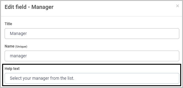
For example, in a ‘Training Request’ form, you may insert a User picker field titled ‘Manager’ so that the user can select their manager (who will subsequently need to approve or reject their training request once it has been submitted).
How to get started
-
To add a User picker field to a form, first open the relevant process.
-
Then select the form within that process that you want to add the field to (so that the Edit Form button is visible).
-
Click on Controls in the left-hand pane to expand the Controls menu.
-
Select Input to view the range of Input controls and click on User picker. If you want to insert the new field into a panel in your form, first select the panel by clicking on the drag handle button and then insert the new User picker field from the Controls menu.
-
A New field - User picker dialog box will open with a range of options you can choose from for your new User picker field.

-
Title - You can change the name of the User picker field from the default ‘’User picker 1’.
-
Name - This is a unique name for the field and inherits a camel case version of the entered Title.
-
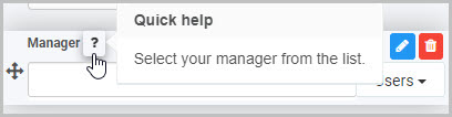
Help text - You can insert text to help the form user to complete the User Picker field. Taking the example of the ‘Manager’ User picker field in a ‘Training Request’ form, you could insert help text to this effect:
If you add help text, a question mark icon will appear next to the field title and, if the user clicks on this, they will see the help text you have inserted.
-
Custom CSS class name - You can type the name of a CSS class to allow the User picker to inherit specific styles defined in the Global CSS file.
-
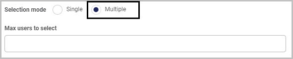
Selection Mode - You can choose whether the user will only be able to select one user from the User Picker list (by selecting Single) or whether the user will be able to select multiple users (by selecting Multiple).
If you choose to allow the user to select multiple users, by selecting Multiple as the Selection mode, an additional option then displays - Max users to select. Here you can set a maximum number of users that can be selected - you can do this by either manually typing the number into the box or by clicking on the up/down buttons at the right-hand side of the box.
-
Default to current user - You can choose to have the current user display in the User picker field once the form is opened to be edited. If you select ‘Yes’, so the User picker field shows the current user by default, an additional option then displays - Allow override picker value.
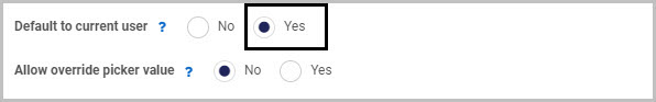
If you choose Yes for Allow override picker value, this automatically allows the override of the user in the User Picker field.
For example, in an ‘Annual Leave Request’ form, there could be an ‘Employee Name’ User picker field that defaults to the current user; but we may want the Employee’s Manager to be able to override the name in this field if they are submitting an annual leave request on behalf of an employee.
-
Member of group - You can choose to restrict the users available to be selected in the User picker field to a certain group - for example, only users in the HR Team. Alternatively, you can leave this field blank.
When you click into the Member of group field, you will see a drop-down list of all of the Groups you can select:
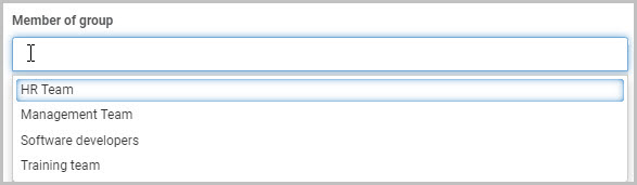
In Kianda, Groups can be configured under the Administration menu - to learn more about how you can set up and manage Groups, go to Users & Groups.
For example, if you select ‘HR Team’, the end user completing the form will only be able to select users who are members of the ‘HR Team’ group in this User picker field.
-
Selection options - You can choose what selection options are available to the form user to the right of the User picker field. You can choose to show as many of these three selection options as like: Users (all users), Groups (such as HR) and Partners.
For example, if you choose to make all three selection options available, your User picker field will have a drop-down menu to the right where the form user can switch between Users, Groups and Partners:
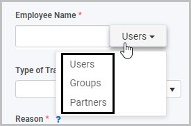
Note: If you have inserted a Group in the Member of group field, this selection will limit the users or groups available to be selected in the User picker field, regardless of what Selection options you choose to make available to the form user.
-
Default selection option - You can choose to have a certain selection option displayed to the right of the User picker field by default - either Users, Groups or Partners.
-
Show selection option menu - You can choose whether or not the selection option menu (where the form user can switch between Users, Groups and Partners) is shown on the right-hand side of the User picker field.
If you choose No, there will not be a selection option menu:
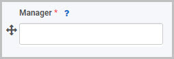
If you choose Yes, a selection option menu will be available to the form user to click (to change the list of users they can select from):
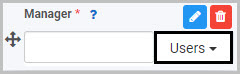
-
Once you complete the New field - User picker dialog box and click OK, a new User picker field is added to your form, with the name you inserted as the Title in the dialog box (by default the title is User picker 1 unless you change it).
In the example of our Training Request Form, the new User picker field (titled Manager) added to the form could look like this when a user views it on their mobile phone:
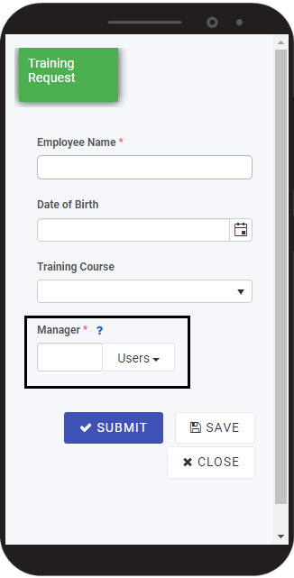
To see how your form or field will look on a mobile, view it in Mobile preview by using the Preview option which can be opened by clicking the play button icon . You also have the options to see how it will look on a PC or tablet.
How to edit, move and delete User picker fields
As we go through the options available for editing a User picker field, we will keep in mind the example of the ‘Manager’ User picker field in the ‘Training Request’ form.
How to edit a User picker field
To edit a User picker field:
- Select the field (by either clicking on the field title or on the field’s Drag handle button ).
- Click on the Edit field button (Pen icon) .
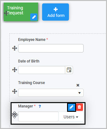
The Edit field - User picker dialog box will open, enabling you to choose from the same range of options as appear in the New field - User picker dialog box (as already discussed in How to get started).
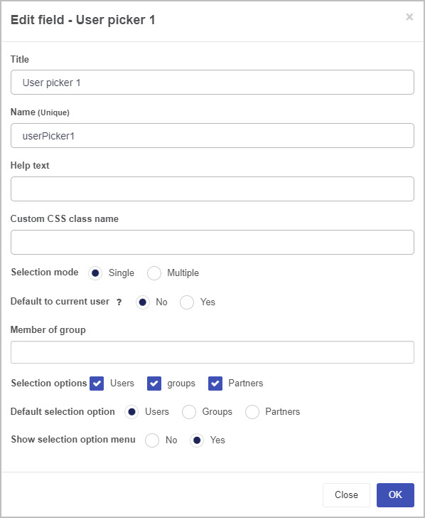
You can make any changes you wish in this dialog box and then click OK to confirm.
How to move a User picker field
To move a User picker field simply select the field’s Drag handle button and drag and drop the field wherever you want to move it to within your form.
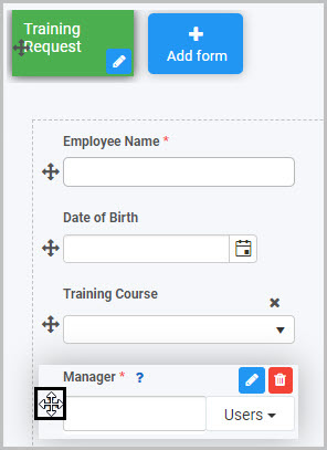
How to delete a User picker field
To delete a User picker field from your form:
- Select the field (by either clicking on the field’s title or its Drag handle button ).
- Click on the Bin/Trash button .
- Click on OK to confirm.
How to edit User picker field properties
To view or edit the field properties associated with a User picker field, select the field (by clicking on the field title or field drag handle button ) - the Field properties menu will appear in the right-hand pane.
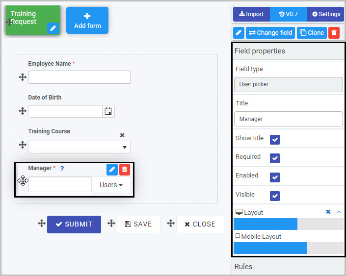
For example, the Field Properties associated with a User picker field titled ‘Manager’ are shown here and include:
-
Field type - The type of field, in this case a User picker field.
-
Title - The Title of the field, in this case ‘Manager’.
-
Show title - If this is selected, the User picker field title will be shown in the form.
-
Required - If this is selected, the User picker field will be a mandatory field that users must complete (denoted by a red asterix next to the field title).
-
Enabled - If this is selected, the user will be able to edit or interact with the field.
-
Visible - If this is selected, the User picker field will be visible in the form.
-
Layout - The width of the blue bar can be adjusted to change the width of the User picker field as it appears on a PC or mobile phone (to view the Mobile layout, click on the expand button to the right).
To learn more about the different options within the Field properties menu, go to Field Properties.
Saving changes and version history
Make sure to save any changes you make by clicking on the Save button . You will always have the option to revert back to previous versions of your form by clicking the Design Version History button in the top right corner.
User tips
Rules can be applied to User picker fields to make your form dynamic. Rules allow actions based upon conditions resulting from user interaction with fields. To learn about the different types of rules you can apply, go to Rules.
For example, you could apply a Set form field rule so that the User picker field is set to be the current user or the user who started the process off. The section below describes how to use a User picker field in forms with two rules in order to extract a value from a datasource.
Example of User Picker use with Find Items and Lookup User rules
The steps below detail how to use a User Picker field to pull a value from a datasource and use properties within the Kianda system associated with that value within a Kianda form to auto-populate a user picker field. This procedure is used when you need to populate more than one value in a user picker. Two rules are applied Find Items rule and Lookup user by property.
For example we start with a SharePoint list or other datasource that has a list of values, for example we could use a Kianda process as a datasource that holds values called ‘Employee number’ and ‘Employee’ in the system.
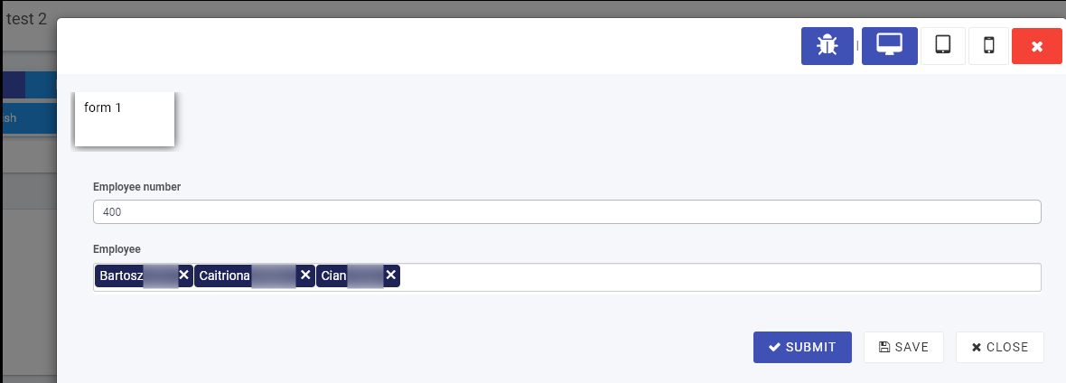
In the image above an Employee number or code is entered via a process for 3 system users, in this example the number ‘400’ represents 3 users, Bartosz, Caitriona and Cian. More records could be created with Employee numbers representing other employees or combinations of users.
We will use the values from the first process which acts as a datasource in a second process called ‘User Lookup’ where fields will be auto-populated based on the Employee No. value entered.
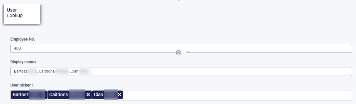
For example if ‘400’ is entered into this process, then the fields ‘Display names’ and ‘User picker 1’ are auto-filled. This is as a result of 2 rules on the Employee No. field the system property to display a value linked to these 3 users.
What’s next
Now that you’ve learned about the User picker control, find out more about the other types of Input fields you can add to a Kianda process:
3 - Layout controls
Layout fields are one category of controls (fields). They are fields that can be used to enhance the layout of your form - for example, responsive panels, dialog boxes and rich text fields.
Getting started with Layout fields
- To insert a Layout field into a form, first open an existing process or create a new process by going to Administration>Designer in the left side menu. See Create First Process to learn how to create your first process.
-
Then select the form within that process that you want to add the Layout field to (so that the Edit Form button is visible).
-
Next, click on Controls in the left-hand pane to expand the Controls menu and select Layout to view the Layout fields.
-
Click on the Layout field you want to insert.
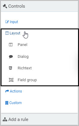
There are 4 types of layout fields:
-
Panel - The Panel field provides responsive panels to hold elements of your form like text boxes and lists and enables flexible layout options for better design. To learn more, go to Panel control.
-
Dialog - The Dialog field is used to create modal dialogs to alert or prompt form users. For example, a warning message could display to remind the user to complete part of a form before they proceed to the next section. To learn more, go to Modal Dialog control.
-
Richtext - The Richtext field is used to create rich content in forms, such as an attractive banner or static html, and provides optimum formatting options. To learn more, go to Richtext control.
-
Field group - The Field Group control can be used to mirror a group of fields from another form or location and reference those fields in your new form, making process design sleeker and more efficient. To learn more, go to Field group control.
How to add, edit, move and delete Layout fields
How to add Layout fields
To insert a Layout field into your form, click on the field type you want to add from the Layout menu.
For example, to add a new panel to your form, click on Panel - a pop-up message will appear saying ‘Field added’ and a panel field with the default name Panel 1 will be added to your form (by default, the title of the new panel will not be shown but you can make it visible by selecting the ‘Show title’ checkbox in the Field properties panel to the right).
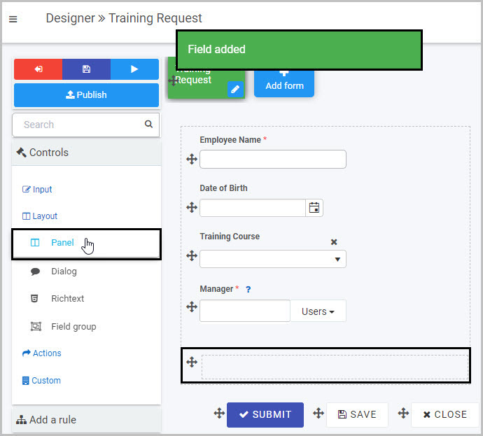
How to edit Layout fields
To edit whatever type of Layout field you have added to your form:
-
Select the field (by either clicking on the field name or on the Drag handle button )
-
Click on the Edit Field button (Pen icon) .
In our example, we have selected the Panel field by clicking the Drag handle button and can then click on the Edit field button to edit it.
-
This will open up the Edit Field dialog box where you can make various changes (such as changing the Title of the field) and where a variety of options will be available to you, depending on the type of Layout field you have selected.
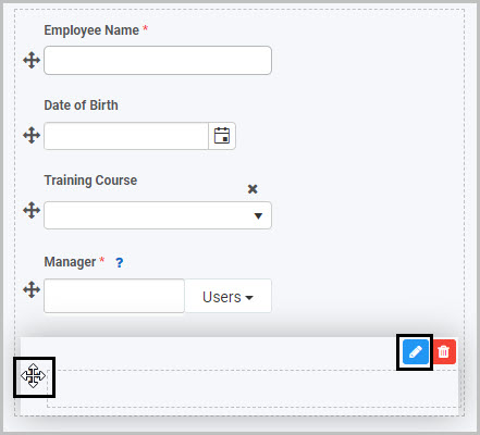
How to move Layout fields
To move a Layout field:
- Select the field’s Drag handle button
- Drag and drop the field wherever you want to move it within your form
How to delete Layout fields
To delete an input field from your form:
- Select the field (by either clicking on the field’s name or its Drag handle button )
- Click on the Bin/Trash button
- Click on OK to confirm
How to edit Layout field properties
To view or edit the field properties associated with a Layout field, select the field (by clicking on the field title or drag handle button ) - the Field properties menu will appear in the right-hand pane.
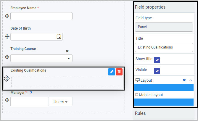
For example, the Field Properties associated with a Panel field titled ‘Existing Qualifications’ are shown here and include:
-
Field type - The type of field, in this case a Panel.
-
Title - The Title of the field, in this case ‘Existing Qualifications’.
-
Show title - If this is selected, the field title will be shown in the form.
-
Required - If this is selected, the field will be a mandatory field that users must complete (denoted by a red asterix next to the field title).
-
Enabled - If this is selected, the user will be able to edit or interact with the field.
-
Visible - If this is selected, the field will be visible in the form.
-
Layout - The width of the field is denoted by the width of the blue bar. Click on the bar to change the width of the field as it will appear on a PC or mobile phone (to view the Mobile layout, click on the expand button to the right).
To learn more about the different options within the Field properties menu, go to Field Properties.
Saving changes and version history
Make sure to save any changes you make by clicking on the Save button . You will always have the option to revert back to previous versions of your form by clicking the Design Version History button in the top right corner.
What’s next
We have briefly introduced each of the four types of Layout controls. Now let’s look at each of these types of Layout controls in more detail:
3.1 - Field group control
A Field group control is a convenient way to mirror a group of fields that are in another form within your process and reference those fields in your new form, making process design sleeker and more efficient.
For example, in an Education Request Process - where employees can request training in a ‘Training Request’ form and their manager can either approve or reject that request in a ‘Training Approval’ form - we may want to mirror some of the fields from the first form in the process, ‘Training Request’, into the second form ‘Training Approval’. We will keep this example in mind as we learn more about using the Field group control.
How to get started
-
To add a Field group to a form, first open the relevant process - in our case, we will open the Education Request Process.
-
Then select the form within that process that you want to add the field to (so that the Edit Form button is visible) - we will select the ‘Training Approval’ form. Go to Create First Process to learn how to create your first process.
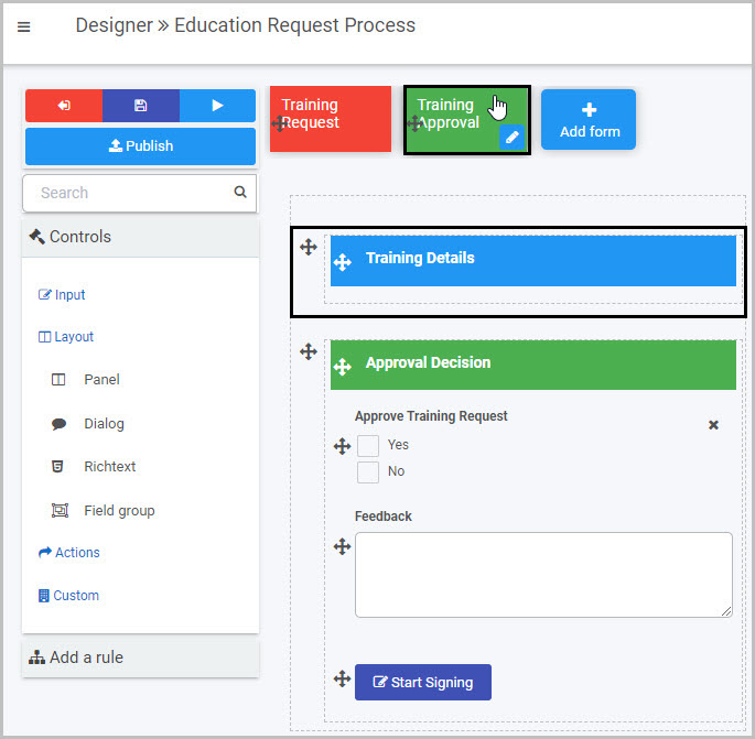
Our Training Approval form contains two Panels - the first Panel currently only contains the Richtext field titled ‘Training Details’, the second Panel contains fields related to the approval decision. Panels are sections within your form - to learn more, go to Panel control. We will use the Field group control to add fields from the ‘Training Request’ form to the first panel.
-
Insert the Field group by clicking on Controls in the left-hand pane to expand the Controls menu, then select Layout to view the range of Layout controls and click on Field group.
-
A New field - Field group dialog box will open with a range of options you can choose from for your new Field group:
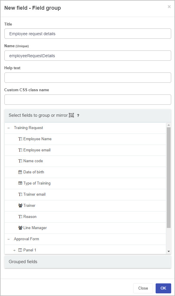
-
Title - You can change the title of the Field group from the default title of ‘Field group 1’.
-
Name - This is a unique name for the field and inherits a camel case version of the entered Title.
-
Help text - You can insert text to help the form user to complete the Field group - if you add help text, a question mark icon will appear next to the field title and, if the user clicks on this, they will see the help text you have inserted.
-
Custom CSS class name - You can type the name of a CSS class to allow the Field group to inherit specific styles defined in the Global CSS file.
-
Select fields to group or mirror - You can choose one or more fields from the current process to group or mirror by clicking on the field or fields to select them. You can expand forms (listed with a plus sign beside them) to view all of the fields within them by clicking on the form title in the list. Select as many fields as you want.
In our example, we will select three fields in the ‘Training Request’ form that we want to be shown on the ‘Training Approval’ form - Employee Name, Type of Training and Reason:
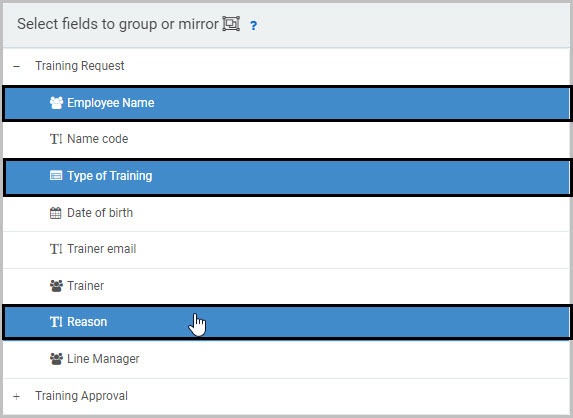
-
Grouped fields - The field(s) you select will automatically be grouped together in the Grouped fields section at the bottom of the dialog box - click on Grouped fields so that it expands to show the list of fields you have chosen:
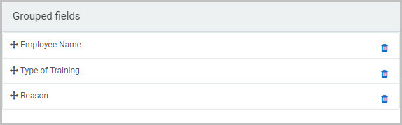
The fields you have chosen being ‘grouped’ together will mean that you will be able to edit them and move them around your form as a group (rather than as individual fields).
If there is a field or fields you do not want to be grouped, simply click on the Bin/Trash icon  to the right and that field will no longer be grouped with the others.
You can also change the order of the fields within the Field group by simply clicking on the field’s drag handle button and dragging and dropping the field where you want it to be.
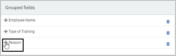
Note that selected fields grouped under the current field group are not copied only referenced.
-
Once you have completed the New field - Field group dialog box, click OK and the new Field group will be added to your form.
By default, the Title of the new Field group will not be shown (unless you choose to display it, by selecting the Show title checkbox in the Field properties menu to the right).
In our example, our new Field group contains the three fields we chose:
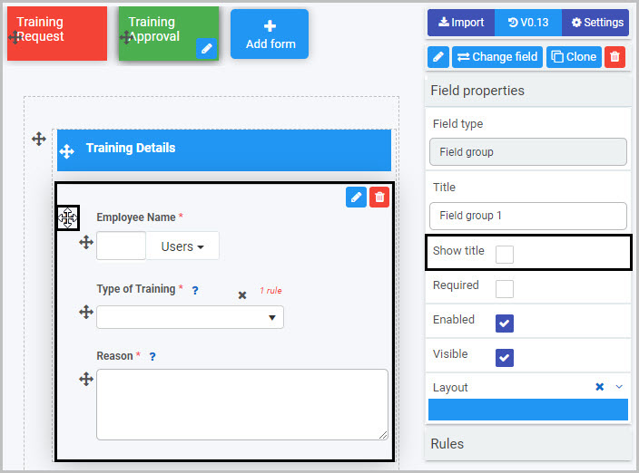
How to edit, move and delete Field groups
To edit a Field group:
- Select the field (by either clicking on the field title or on the field’s Drag handle button ).
- Click on the Edit field button (Pen icon) .
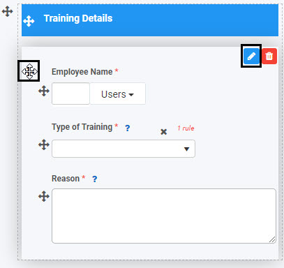
- The Edit field - Field group dialog box will open, enabling you to choose from the same range of options as appear in the New field - Field group dialog box (as already discussed in How to get started).
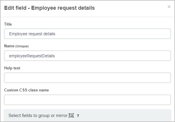
To move a Field group:
- Select the field’s Drag handle button .
- Drag and drop the field wherever you want to move it to within your form. Note that the grouped fields are available to move and edit as a group within the form.
To delete a Field group from your form:
- Select the group by clicking on the group’s Drag handle button .
- Click on the Bin/Trash button .
- Click on OK to confirm (or click on Cancel if you wish to cancel the deletion).
How to edit Field group properties
To view or edit the field properties associated with a Field group, select the field (by clicking on the field title or field drag handle button ) - the Field properties menu will appear in the right-hand pane.
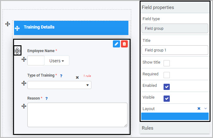
For example, the Field Properties associated with a Field group field titled ‘Field group 1’ are shown here and include:
-
Field type - The type of field, in this case a Field group.
-
Title - The Title of the field, in this case ‘Field group 1’.
-
Show title - If this is selected, the Field group title will be shown in the form. In this case, the ‘Show title’ checkbox has not been selected, so it won’t be shown in the form.
-
Required - If this is selected, the field will be mandatory for form users to complete.
-
Enabled - If this is selected, the user will be able to edit or interact with the field.
-
Visible - If this is selected, the Field group will be visible in the form.
-
Layout - The width of the blue bar can be adjusted to change the width of the Field group as it appears on a PC or mobile phone (to view the Mobile layout, click on the expand button to the right).
To learn more about the different options within the Field properties menu, go to Field Properties.
Saving changes and version history
Make sure to save any changes you make by clicking on the Save button . You will always have the option to revert back to previous versions of your form by clicking the Design Version History button in the top right corner.
What’s next
Now that you’ve learned about the Field group control, find out more about the other types of Layout fields you can add to a Kianda process:
3.2 - Modal dialog control
The Modal dialog field allows you to design pop-up dialog messages that alert or provide reminders or warnings to form end-users.
You can apply a rule - to a field, form or button - so that the pop-up Dialog displays to the user when you want it to, for example, when the user clicks a certain button. Rules allow actions based upon conditions resulting from user interaction with fields. Go to Rules to learn about the different categories of rules that can be applied. One such rule that can be used in conjunction with the Dialog field is the Show, hide or disable rule - to learn more, see Show, hide or disable.
For example, in a simple Training Request form that employees can complete if they want to request training, it could be useful to insert a Dialog field so that a reminder message pops up when the employee clicks on the Save or Submit buttons, to remind them to check that they have completed all fields before they submit their form. We will keep this example in mind as we learn more about Dialog fields.
To view a video example of how to create a Modal dialog field, see How to create a modal dialog.
How to get started
-
To add a Modal dialog field to a form, first open the relevant process.
-
Then select the form within that process that you want to add the field to (so that the Edit Form button is visible). Go to Create First Process to learn how to create your first process.
-
Click on Controls in the left-hand pane to expand the Controls menu.
-
Select Layout to view the range of Layout controls and click on Dialog. A pop-up message will appear saying ‘Field added’ and a Dialog field will be added to the bottom of your form.
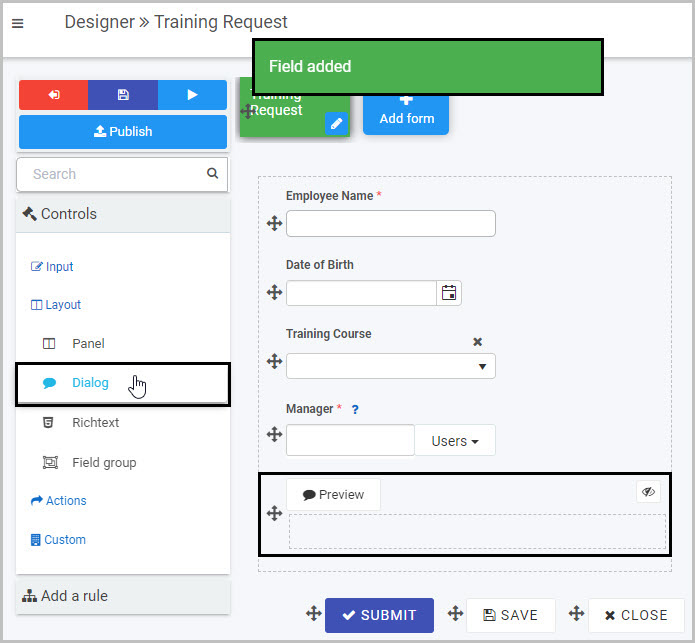
By default, the Dialog field will not be displayed in the form to users (as denoted by the eye symbol with the line through it  ). This is because, as already mentioned, Dialog fields are typically used in conjunction with a rule being applied to a field or button - such as the Submit or Save buttons - so that the pop-up message is only shown to users in certain circumstances, rather than being displayed in the form all the time.
In our example of the Training Request form, we may only want the Dialog to display when the user clicks on either Submit or Save, to remind them to check that they have completed all fields.
How to set the heading for the Dialog
The title of the Dialog field will display as the heading at the top of the pop-up Dialog message. By default, the title of the new Dialog field is ‘Dialog 1’.
To change the title of a Dialog field:
- Select the new Dialog field (by either clicking on the drag handle or clicking in the area of the Dialog field) so that the Edit field button is visible.
- Edit the Title in the Field properties panel to the right.
For example, we could decide to give our pop-up Dialog message a heading of ‘Reminder’. To learn more about editing the Field properties associated with Modal dialog fields, go to How to edit Modal dialog field properties.
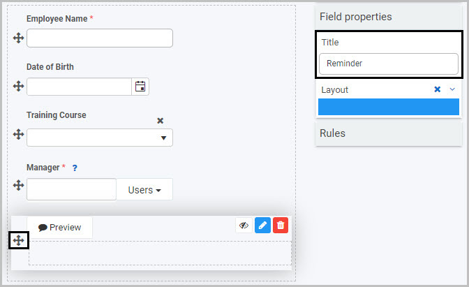
How to insert body text for the Dialog
To create the body of the pop-up Dialog, you can insert any of the field types from the Controls menu, such as a text box, list, table or richtext. First, select the Dialog field (so that the Edit field button is visible) and then go to the Controls menu and click on the field type you want to insert.
The Richtext field is a very flexible option to use for the body of the pop-up message as it gives you the most options - such as formatting and styling the text or inserting images or links. We will use a Richtext field to step through how to add text to the body of the Dialog field for our Training Request form.
-
Select the Dialog field and then insert a Richtext field into it by clicking Controls >Layout >Richtext in the right-hand pane. To learn more about Richtext fields, go to Richtext control.
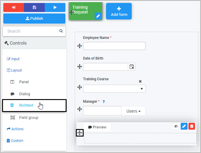
-
A New field - Richtext dialog box will open:
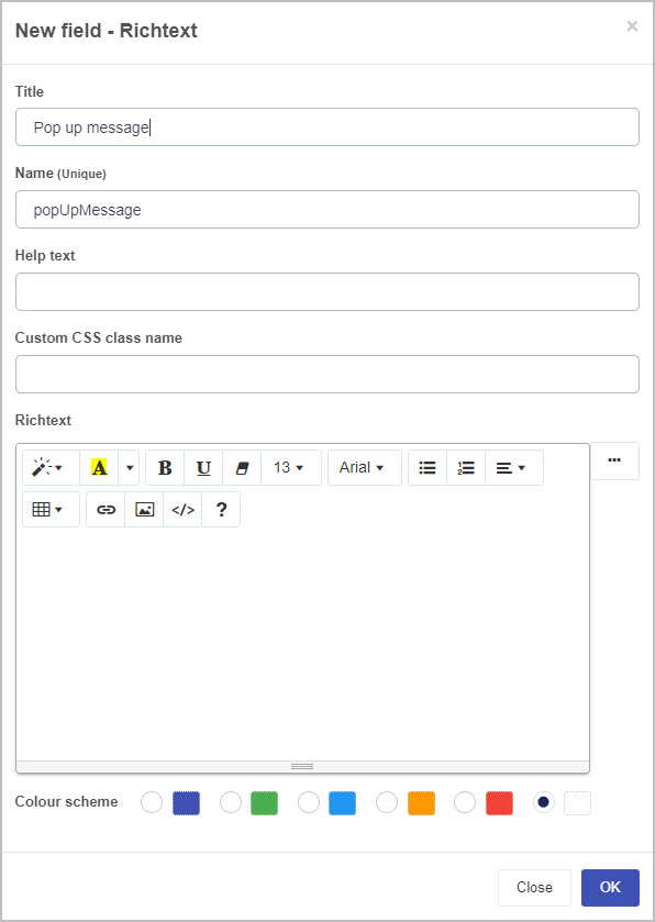
-
Title - You can change the title of the Richtext field from the default ‘Richtext 1’. Note: It is the Dialog field title that will show as the heading of the pop-up Dialog, not the Richtext title.
-
Name - This is a unique name for the field and inherits a camel case version of the entered Title.
-
Helptext - You can insert text to help the form user to complete the field - if you add help text, a question mark icon will appear next to the field title and, if the user clicks on this, they will see the help text you have inserted. This option is not as relevant to the Dialog field as it is to other fields, as the Dialog field is not a field the user needs to complete.
-
Custom CSS class name - You can type the name of a CSS class to allow the Richtext to inherit specific styles defined in the Global CSS file.
-
Richtext - Type the text that you want to be shown as the main body text in the pop-up Dialog into this field and format it as you want - there are options to highlight text, change the font style and font colour, bold, underline, increase or decrease font size, use a bulleted or numbered list, format the text to align left/centre/right, insert a table or a link, insert an image or to switch to code view.
-
Colour scheme - You can choose from five colour options for the colour that will appear in the background behind the Dialog richtext body text.
For our example of the Training Request form, we will insert text to remind the employee completing the form to check that they have completed all fields before submitting it and will choose an orange background colour:
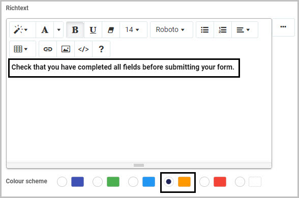
-
Once you have completed the New field - Richtext dialog box, click OK. You will now see the body text of your Dialog field in the Richtext field you added to it:
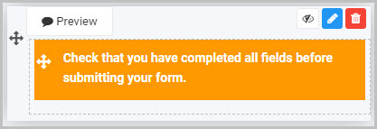
- To preview how the pop-up Dialog will look tp users, either click on the Dialog Preview button
 or click on the eye symbol :
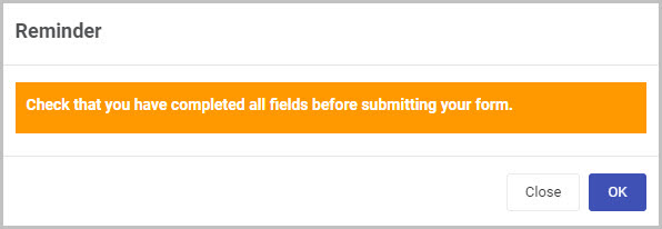
- Click on Close or OK to close the preview.
How to edit, move and delete Modal dialog fields
As we go through the options available for editing, moving or deleting a Modal dialog field in a form, we will keep in mind our example of the ‘Reminder’ pop-up Dialog in the Training Request form.
How to edit a Modal dialog field
To edit a Modal dialog field:
-
Select the Dialog field (by either clicking on the drag handle or clicking in the area of the Dialog field).
-
Then click on the Edit field button (Pen icon) .
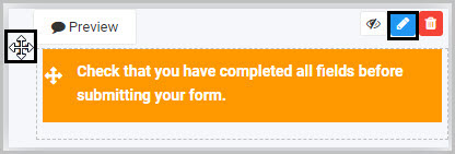
-
The Edit field - Dialog dialog box will open, enabling you to choose from a range of options (we already changed the Dialog field title to ‘Reminder’ so this name will be shown in the dialog box name):
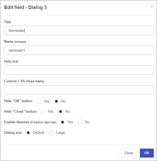
The options within the Edit field - Dialog dialog box include:
-
Title - You can change the title of the Modal Dialog field here. We already changed it to ‘Reminder’ from the default Dialog 1 in the ‘Title’ field in the Field properties pane.
-
Name - This is a unique name for the field
-
Help text - You can insert text to help the form user. If you add help text, a question mark icon will appear next to the field title and, if the user clicks on this, they will see the help text you have inserted. This option is less relevant for the Dialog field as it is for other field types, as the Dialog field is not a field the user needs to complete.
-
Custom CSS class name - You can type the name of a CSS class to allow the Dialog to inherit specific styles defined in the Global CSS file.
-
Hide “OK” button - Select Yes if you do not want the user to see an ‘OK’ button at the bottom of the Dialog message.
-
Hide “Close” button - Select Yes if you do not want the user to see a ‘Close’ button at the bottom of the Dialog message.
-
Enable dismiss (X button right top) - Choosing Yes means an X button (that the user can click on to dismiss the pop-up message) will be shown at the top right of the Dialog.
-
Dialog size - You can choose from the Default size or Large size for your Dialog message.
-
Once you have finished editing the Dialog field in the Edit field - Dialog dialog box, click on the OK button  to save your changes or click on Close to exit the dialog box without saving.
-
To see how your form or Dialog field will look on a mobile, view it in Mobile preview by using the Preview option which can be opened by clicking the play button icon . You also have the options to see how it will look on a PC or tablet.
How to move a Modal dialog field
To move a Modal dialog field:
-
Select the field’s Drag handle button .
-
Drag and drop it wherever you want to move it within your form.
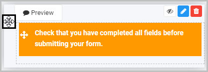
How to delete a Modal dialog field
To delete a Modal dialog field from your form:
- Select it (by either clicking on the Panel field’s name or its Drag handle button ).
- Click on the Bin/Trash button .
- Click on OK to confirm the deletion (or click Cancel if you wish to cancel the deletion).
How to edit Modal dialog field properties
To view or edit the field properties associated with a Modal dialog field, select the Dialog field (by clicking on the drag handle button or clicking in the area of the Dialog field) - the Field properties menu will appear in the right-hand pane.
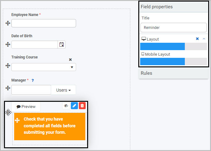
In the example shown here, a Dialog field titled ‘Reminder’ has been selected and the Field properties associated with it are shown in the Field properties menu to the right:
- Title - The title of the Modal Dialog field. In this case, ‘Reminder’.
- Layout - How wide the Modal Dialog field will be on a PC and mobile phone, denoted by the width of the blue bar. You can change the width by clicking on the blue bar.
Saving changes and version history
Make sure to save any changes you make by clicking on the Save button . You will always have the option to revert back to previous versions of your form by clicking the Design Version History button in the top right corner.
What’s next
Now that you’ve learned about the Modal dialog control, find out more about the other types of Layout fields you can add to a Kianda process:
3.3 - Panel layout control
A Panel field is section within a form. Panels hold other elements of your form, such as text box fields, list fields and tables, and enable flexible layout options that result in a better end-user experience.
It is a good idea when first creating a form to insert a panel for each section of your form and then insert the fields you require into each of these panels. One advantage of having related fields contained within a panel is that you can then easily move that panel (and all of the fields within it) to another location within your form.
For example, in a ‘Training Request’ form, you may decide to insert two panels - one panel to contain the details relating to the employee requesting the training and a second panel to contain the details of the training course being requested.
How to get started
-
To add a Panel to a form, first open the relevant process.
-
Then select the form within that process that you want to add the field to (so that the Edit Form button is visible). Go to Create First Process to learn how to create your first process.
-
Insert the Panel by clicking on Controls in the left-hand pane to expand the Controls menu.
-
Select Layout to view the range of Layout controls and click on Panel.
A pop-up message will appear saying ‘Field added’ and a panel field with the default name Panel 1 will be added to your form.
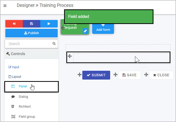
By default, the title of the new panel will not be displayed in your form, but you can make it visible by selecting the ‘Show title’ checkbox in the Field properties panel to the right) - to learn more about editing the Field properties associated with Panels, go to How to edit Panel field properties.
How to edit, move and delete Panels
As we go through the options available for editing a Panel in a form, we will keep in mind the example of adding two panels to a ‘Training Request’ form - one titled ‘Employee Details’ and one titled ‘Training Details’.
How to edit a Panel
To edit a Panel:
-
Select the field.
-
Click on the Edit field button (Pen icon) .
The Edit field - Panel dialog box will open, enabling you to choose from a range of options:
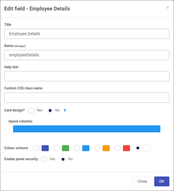
-
Title - You can change the title of the Panel from the default ‘Panel 1’.
In our example, after inserting two panels into our form, we could edit each of them in turn and change their titles to ‘Employee Details’ and ‘Training Details’.
In order to have the title of a Panel display in your form, you need to take one further step - select each panel and then select the ‘Show title’ checkbox in the Field properties panel to the right. Now the titles of the two Panels will be shown - here we have selected the first panel in order to display the ‘Show title’ checkbox associated with it:
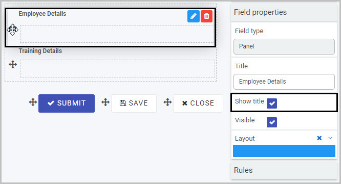
You will learn more about the Field properties associated with Panels in How to edit Panel Field properties.
-
Name (unique) - This is a unique name for the Panel field and inherits a camel case version of the entered Title.
-
Help text - You can insert text to help the form user to complete the Panel.
In our example, we could insert this help text to assist the user in completing the ‘Employee Details’ panel:
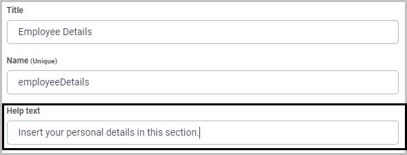
If you add help text, a question mark icon will appear next to the Panel title and, if the user clicks on this, they will see the help text you have inserted.
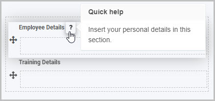
-
Custom CSS class name - You can type the name of a CSS class to allow the panel to inherit specific styles defined in the Global CSS file.
-
Card design? - This option allows you to add a border radius to your panel, which rounds the edges. If you select the Yes radio button, you can choose between defining:
-
The total border radius in pixels by clicking the all corners button  and entering a value into the input field.
-
Each corner’s border radius individually in pixels by clicking on the individual corners button  and entering values for each corner in the four input fields.
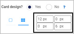
This feature can give your forms an added level of unique styling.
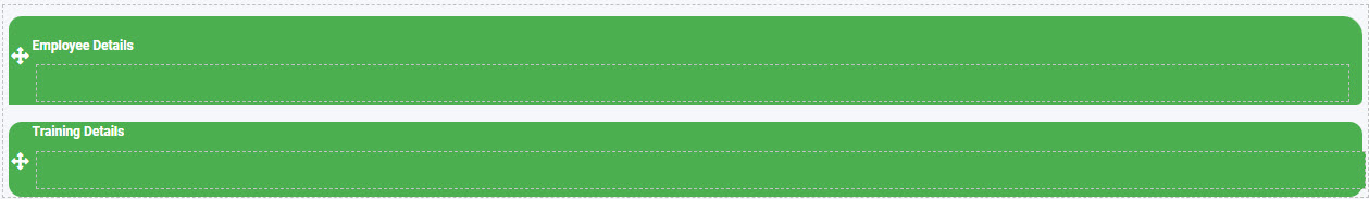
-
Layout columns - Here you can decide how wide you want your Panel to be in your form - choose from 1 to 12 columns in width. For example click half-way across the blue bar to create a panel that is 6 columns wide, or click at the far right side of the blue bar to create a column that is 12 columns wide.
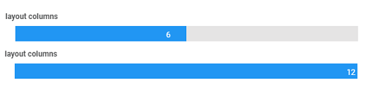
-
Colour scheme - You can choose from six different colour options: navy, green, blue, amber, red, white. By default, the colour is set to white.
-
Enable panel security - If you want to restrict who can see the contents of the Panel, choose Yes. Two additional options will then be shown - ‘Add security’ and ‘Allow anonymous link’:
To limit who can view the Panel contents, click the ‘Add security’ button. A new row is displayed, within which you can select the user(s) or groups who will be able to vie the Panel:
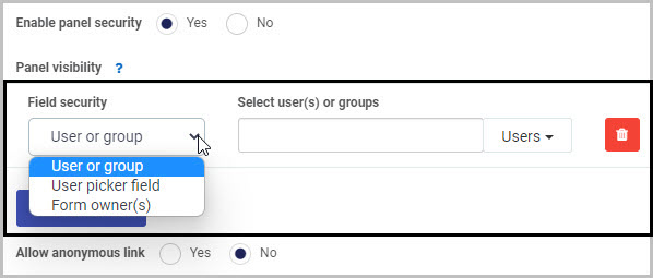
In Field security, you can choose from three options in terms of who will be able to view the Panel you are inserting: User or group, User picker field or Form owner(s).
(i) If you choose to limit the Panel visibility to a ‘User or group’, you can then select the user(s) or groups you want to be able to see it in the ‘Select user(s) or groups’ box.
(ii) If you choose to limit the Panel visibility to a ‘User picker field’, you then select the User picker field in the ‘Select a userpicker field’ box:
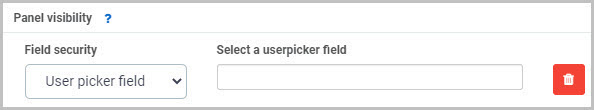
This will limit the visibility of the Panel to the user(s) selected in that User picker field.
(iii) If you choose to limit the Panel visibility to ‘Form owner(s)’, you then select the form in the ‘Select a form’ box - only the owner(s) of the selected form will be able to view the Panel you are inserting:
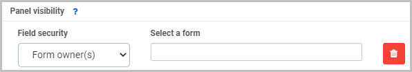
The second main option in terms of Panel security is ‘Allow anonymous link’:

-
If you choose Yes, this will mean that the Panel will be visible when the form is accessed via an anonymous link.
-
If you choose No, anyone accessing the form from an anonymous link will not be able to see the Panel.
Anonymous links can be useful if, for example, you want members of the public to complete your form without needing to log into Kianda. To learn more about how you can create anonymous links to a form that can be shared with external users, see Anonymous form link.
-
Once you are finished editing the Panel in the Edit field dialog box, click on the OK button to save your changes or click on Close to exit the dialog box without saving.
How to add fields to a Panel
Once you have inserted a Panel and completed the Edit field - Panel dialog box, you can then start to add the elements you need into the Panel - such as text boxes, lists, tables, number fields or date fields. Go to Controls to see the full list of fields available and Rules to learn about different categories of rules that can be applied.
To add fields to your Panel:
- Select the Panel (by either clicking on the field title or on the field’s Drag handle button ) so that the Edit field button is visible.
- Click on whatever type of field you want to insert from the Controls menu in the left-hand pane.
Let’s take the example of our first Panel, titled ‘Employee Details’. To add a Text box field to this Panel we can:
- Select the Panel by clicking on the ‘Employee Details’ field Drag handle.
- Click on Controls > Input > Text box in the Controls menu to insert a Text box. A pop-up message says ‘Field added’ and a new Text box, titled ‘Text box 1’, is added to the ‘Employee Details’ panel:
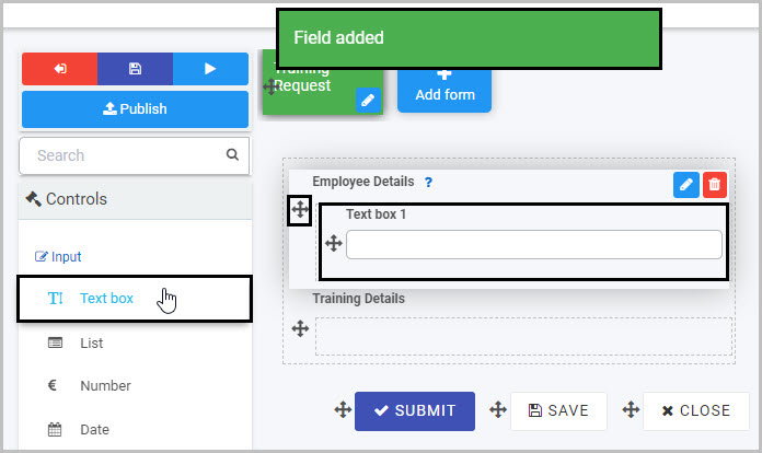
- You can then edit this new Text box field as needed - in our example, we will rename it as ‘First Name’. To learn more about Text box fields, go to Text box control.
By adding two text box fields (titled ‘First Name’ and ‘Surname’) and a date field (titled ‘Date of Birth’) to our ‘Employee Details’ Panel, and then adding the fields we need to the ‘Training Details’ Panel, our ‘Training Request’ form - with its two Panels - could look like this when viewed on a user’s mobile phone:
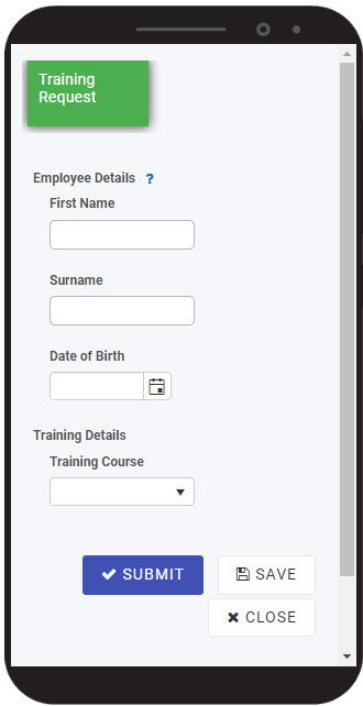
To see how your form or field will look on a mobile, view it in Mobile preview by using the Preview option which can be opened by clicking the play button icon . You also have the options to see how it will look on a PC or tablet.
How to move a Panel
To move a Panel, simply:
- Select the Panel field’s Drag handle button .
- Drag and drop it wherever you want to move it within your form.
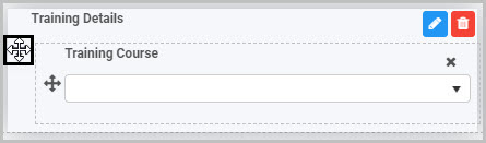
How to delete a Panel
To delete a Panel from your form:
- Select it (by either clicking on the Panel field’s name or its Drag handle button ), click on the Bin/Trash button
- Click on OK to confirm or click on Cancel if you wish to cancel the deletion.
Note: Remember that deleting a Panel will result in all of the fields contained within that Panel also being deleted.
How to edit Panel Field properties
To view or edit the field properties associated with a Panel, select the Panel field (by clicking on the field title or drag handle button ) - the Field properties menu will appear in the right-hand pane.
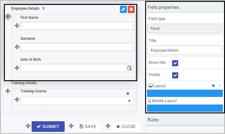
In the example shown here, the Field properties associated with the ‘Employee Details’ Panel include:
- Field type - the type of field. In this case, Panel.
- Title - the title of the Panel field (default name ‘Panel 1’ unless you change it). In this case, ‘Employee Details’.
- Show title - this is selected, which means that the Panel title will be shown in the form.
- Visible - this is selected, so the Panel will be visible to form users.
- Layout - the width of the blue bars can be adjusted to change the width of the Richtext field on PC or mobile. To view the mobile width, click on the expand button to the right of the Layout option.
To learn more about the different options within the Field properties menu, go to Field Properties.
Saving changes and version history
Make sure to save any changes you make by clicking on the Save button . You will always have the option to revert back to previous versions of your form by clicking the Design Version History button in the top right corner.
What’s next
Now that you’ve learned about the Panel control, find out more about the other types of Layout fields you can add to a Kianda process:
3.4 - Richtext control
Richtext fields can be used to create custom rich text content in forms, such as an attractive banner. They provide optimum formatting options, such as bold and italics, or the option to insert images or links.
For example, we may want to insert some colourful headings into a Training Approval form within an Education Request process (where employees can request training in a Training Request form and their manager then either approves or rejects this request in a Training Approval form).
How to get started
-
To add a Richtext field to a form, first open the relevant process - in our case, we will open the Education Request process. Go to Create First Process to learn how to create your first process.
-
Then select the form within that process to which you want to add the Richtext field (so that the Edit Form button is visible). We will select the ‘Training Approval’ form:
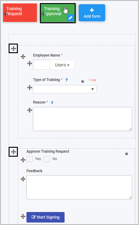
The Training Approval form contains two panels (as indicated above), neither of which currently has a heading. For the first panel, we will insert a Richtext heading titled ‘Training Details’ and, for the second panel, we will insert a Richtext heading titled ‘Approval Decision’.
-
To insert a Richtext field into the first panel in the form:
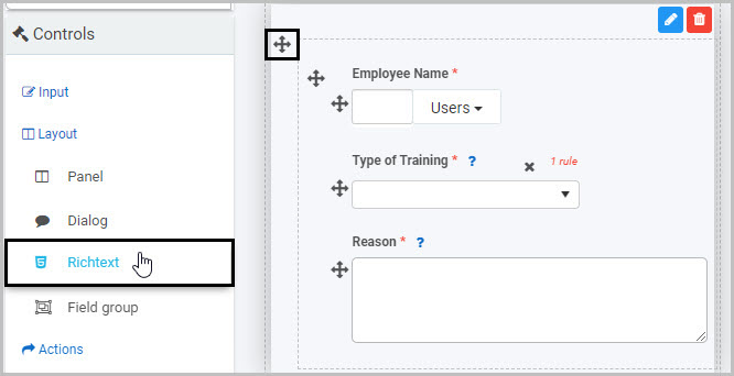
-
A New field - Richtext dialog box will open with a range of options you can choose from for your new Richtext field:
-
Title - You can change the title of the Richtext field from the default title of ‘Richtext 1’.
-
Name - This is a unique name for the field and inherits a camel case version of the entered Title.
-
Help text - You can insert text to help the form user - if you add help text, a question mark icon will appear next to the field title and, if the user clicks on this, they will see the help text you have inserted.
-
Custom CSS class name - You can type the name of a CSS class to allow the Richtext to inherit specific styles defined in the Global CSS file.
-
Richtext - Here you can insert the text you want to appear and can choose from an wide array of styles and formats, including Style, Colour, Bold, Underline, Remove font style, Font size, Font family, Unordered list, Ordered list, Paragraph, and Table. You can also choose to insert a Link or Picture, if you click on the Picture button  you will be redirected to the File storage area where you can search for existing images stored in the Kianda file system. Here you can create a folder, upload a file and delete files.
You can also switch to Code view. For example, if you click on Code view button  you can copy HTML code directly into the text.
Type in the text you want to use into the body of the Richtext box - in our example, we will insert the text ‘Training Details’ (the title we want to use for the first panel in our form), bold it, choose font size 14 and a blue colour scheme:
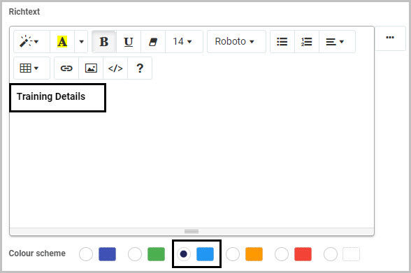
You can click on the Help button  to get a list of over 20 keyboard shortcuts that you can use to style your text.
Click on the Ellipsis button  if you want to add an expression - see Expression builder for more details.
-
Colour scheme - You can choose from Navy, Green, Blue, Amber, Red or White Colours for your rich text background.
-
Once you have completed the New field - Richtext dialog box, click OK and the new Richtext field will be added to your form.
In our example, it is inserted at the bottom of the panel we added it to. The same steps can be repeated in order to insert a Richtext heading in the second panel, titled ‘Approval Decision’.
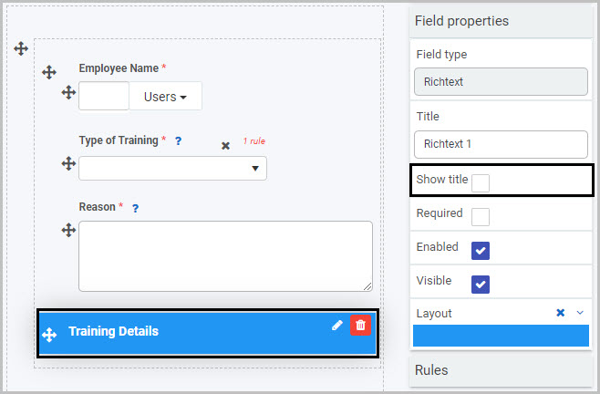
By default, the Richtext Title will not be shown (unless you choose to display it, by selecting the Show title checkbox in the Field properties menu to the right).
How to edit, move and delete Richtext fields
To edit a Richtext field:
- Select the field (by either clicking on the field title or on the field’s Drag handle button ).
- Click on the Edit field button (Pen icon) .
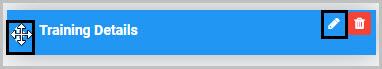
The Edit field - Richtext dialog box will open, enabling you to choose from the same range of options as appear in the New field - Richtext dialog box (as already discussed in How to get started).
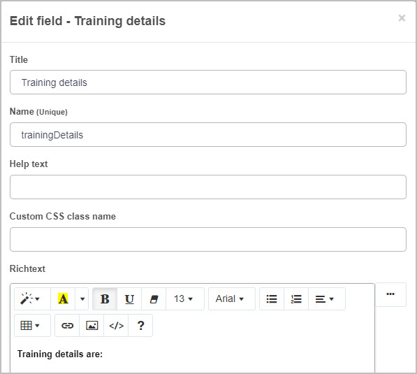
To move a Richtext field:
- Select the field’s Drag handle button .
- Drag and drop the field wherever you want to move it to within your form.
In our example, we can move the new Richtext heading to the top of the first panel in the Training Approval form:
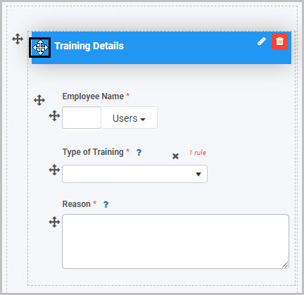
To delete a Richtext field from your form:
-
Select the field (by clicking on the Drag handle button ).
-
Click on the Bin/Trash button .
-
Click on OK to confirm. Click on Cancel if you wish to cancel the deletion.
How to preview your Richtext field
To see how your Richtext field or fields will look to a user on a PC or mobile phone:
- Save your changes.
- Click on the Preview button .
- Click on Desktop preview button
 to see how the form will look when viewed on a PC or click on the Mobile preview button
  to see how it will look on a mobile phone.
From our example, the new Richtext headings - ‘Training Details’ and ‘Approval Decision’ - could look like this when a user views the form on their mobile phone:
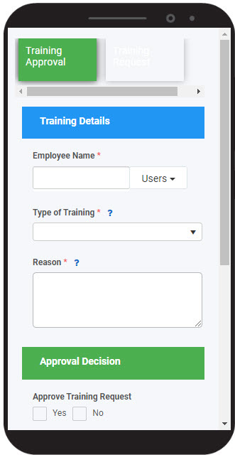
How to edit Richtext field properties
To view or edit the field properties associated with a Richtext field, select the field (by clicking on the title or drag handle button ) - the Field properties menu will appear in the right-hand pane.
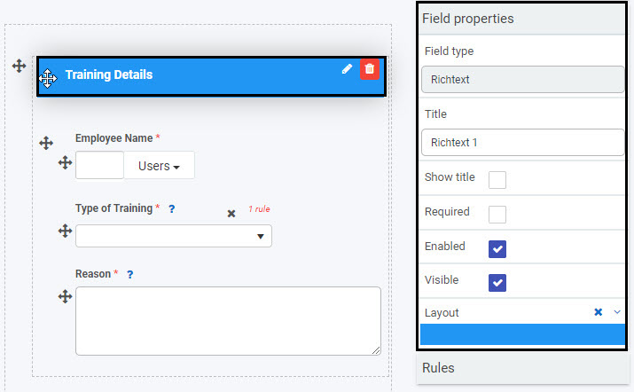
In the example shown here, the Field properties associated with the ‘Training Details’ Richtext field include:
- Field type - Richtext
- Title - the title of the Richtext field (default name ‘Richtext 1’ unless you change this)
- Show title - this is not selected, which means that the Richtext title will not be shown in the form
- Required - this is not selected, so the Richtext field is not a mandatory field for the user to complete
- Enabled - the field is enabled so the user can edit it (not relevant for a richtext heading which the user will not interact with)
- Visible - this is selected, so the Richtext field will be visible to users
- Layout - the width of the blue bar can be adjusted to change the width of the Richtext field on PC or mobile. To view the mobile width, click on the expand button to the right of the Layout option.
To learn more about the different options within the Field properties menu, go to Field Properties.
Saving changes and version history
Make sure to save any changes you make by clicking on the Save button . You will always have the option to revert back to previous versions of your form by clicking the Design Version History button in the top right corner.
What’s next
Now that you’ve learned about the Richtext control, find out more about the other types of Layout fields you can add to a Kianda process:
4 - Actions
Action fields are one category of controls and include the fields that allow user interface actions like buttons or links.
Getting started with Action controls
There are four types of Action fields:
-
Button - Buttons can be used to allow user interaction and to enable rules to be applied to actions taken by users. Applying rules to buttons can help to create smart, dynamic forms that follow business logic, without the need for coding. See Rules and Button control to learn more.
-
Link - Link fields can be used to create custom links to forms. These can be external links. See Link control for more information.
-
Image - Image fields can be used to display images, either statically or from file fields. Go to Image control to find out more.
-
Signature - Signature fields provide a very neat way to electronically sign-off on a form or process. To learn more, go to Signature control.
To add an Action field to a Kianda form:
-
Open an existing process by going to Administration > Designer in the left side menu and clicking on a process, or create a new process in Designer. See Create First Process to learn how to create your first process.
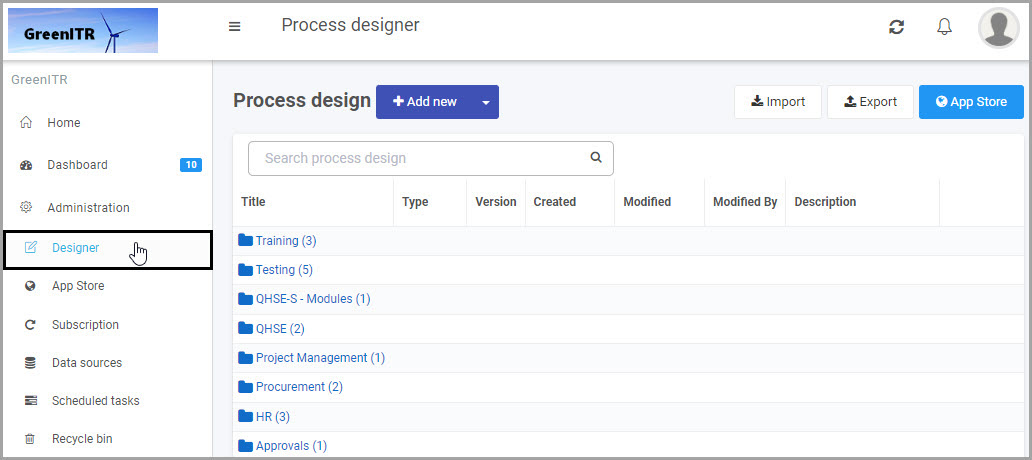
-
Once you have opened your process, select the form you want to work on (so that the Edit Form button is shown).
In this example, a Training Request form has been selected:
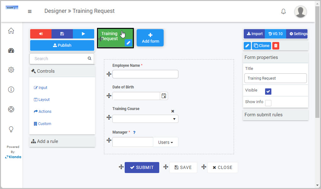
-
Click on Controls in the left-hand pane so the Controls menu expands to show the four categories of Controls (fields): Input, Layout, Actions and Custom.
-
Click on Actions to see the four types of Action fields: Button, Link, Image and Signature.
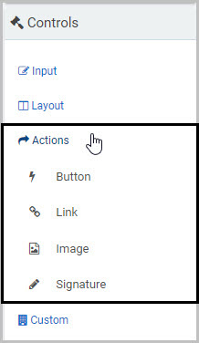
-
Click on the Action field type you want to insert.
For example, to insert an Image field:
- Click on Image
- A New field - Image dialog box opens automatically, giving you a range of options for your new Image field.
- Once you complete this dialog box and click OK, the new Image field is inserted into your form. To learn more about the Image field, go to Image control.
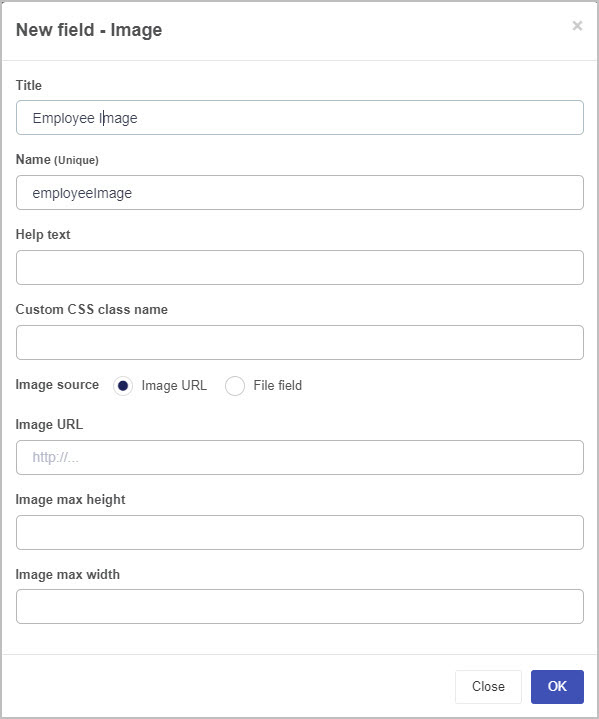
How to edit, move and delete Action fields
To edit whatever type of Action field you have added to your form:
-
Select the field (by either clicking on the field name or on the field’s drag handle button ).
-
Click on the Edit Field button (Pen icon) .
-
The Edit Field dialog box will open, giving you a different range of options to make changes to the Action field - such as changing the Title of the field - depending on the type of Action field you are working with.
To move an Action field, simply:
-
Select the field’s Drag handle button .
-
Drag and drop the Action field wherever you want to move it within your form.
For example, the ‘Training Documentation’ Link field shown here can be moved in the form by selecting the drag handle button and dragging and dropping it wherever you want to put it:
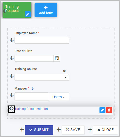
To delete an Action field from your form:
- Select the Action field (by either clicking on the field’s title or its drag handle button ).
- Click on the Bin/Trash button .
- Click on OK to confirm.
How to view and edit Action control Field Properties
To view or edit an Action control’s Field properties:
-
Select the Action field (by either clicking on the field title or on the field’s drag handle button ).
-
The Field Properties associated with the Action field will be displayed (and can be changed) in the Field properties menu on the right-hand side.
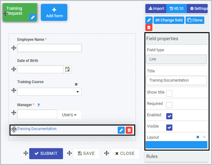
For example, the Field properties associated with a Link field titled ‘Training Documentation’ are shown here:
- Field type - The type of field, in this case a Link field.
- Title - The Title of the field, in this case ‘Training Documentation’.
- Show title - If this is selected, the field title will be shown in the form.
- Required - If this is selected, the field will be mandatory for the form user to complete (and a red star will be shown next to the field title to denote this).
- Enabled - If this is selected, the user will be able to edit the field.
- Visible - If this is selected, the field will be visible in the form.
- Layout - The width of the blue bar can be adjusted to change the width of the field as it appears on a PC or mobile phone (to view the Mobile layout, click on the expand button to the right).
For more details, go to Field Properties.
Saving changes and version history
Make sure to save any changes you make by clicking on the Save button . You will always have the option to revert back to previous versions of your form by clicking the Design Version History button in the top right corner.
What’s next
We have briefly introduced each of the four types of Action fields. Now let’s look at each of these Action fields in more detail:
4.1 - Button control
Button fields can be used in forms to allow user interface actions. Often, rules are applied to buttons so that actions are automatically executed once the user clicks on the button. In this way, Button fields with rules can be used to trigger a sequence of events. To learn more about rules, go to Rules.
For example, as part of an Employee Appraisal Process, a manager may complete a Performance Plan form for each employee, setting out their Key Performance Areas and goals. It could be useful to add a button to this form - titled ‘Schedule Meeting’ - that will automatically schedule a performance review meeting between the manager and the employee at a pre-determined date in the future. We will keep this example in mind as we learn more about using Button controls.
How to get started
To add a Button field to a Kianda form:
-
Open an existing process by going to Administration > Designer in the left side menu and clicking on a process, or create a new process in Designer. See Create First Process to learn how to create your first process.
-
Once you have opened your process, select the form you want to work on (so that the Edit Form button is shown).
In this example, a Performance Plan form has been selected:
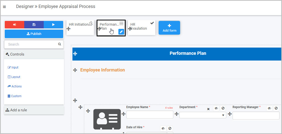
-
Select the area within the form where you want to insert the new Button field - in our example, we will select the panel containing the ‘Schedule performance plan review meeting’ information.
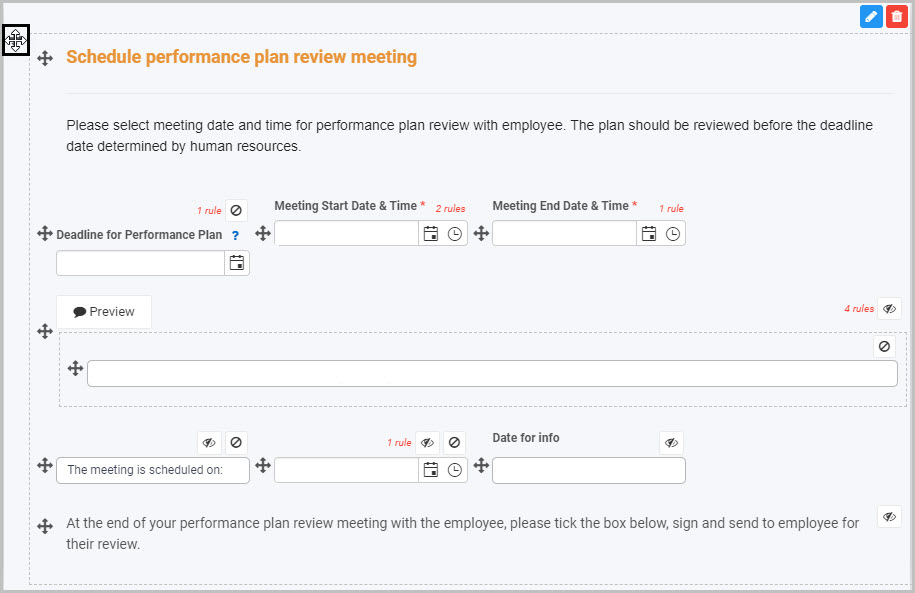
-
Click on Controls in the left-hand pane, and, from the four categories of Controls (Input, Layout, Actions and Custom), click on Actions.
-
Select Button from the four types of Action fields: Button, Link, Image and Signature:
-
A New field - Button dialog box will automatically open, giving you options for your new Button field:
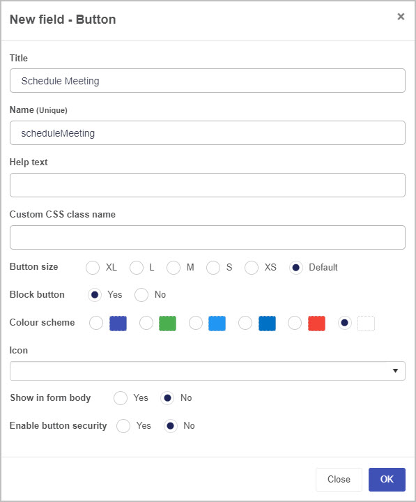
-
Title - You can change the name of the Button from the default ‘Button 1’.
-
Name (Unique) - This is a unique name for the Button and inherits a camel case version of the entered Title.
-
Help text - You can insert text to help the form user. If you add help text, a question mark icon will appear next to the field title and, if the user clicks on this, they will see the help text you have inserted.
-
Custom CSS class name - You can type the name of a CSS class to allow the Button to inherit specific styles defined in the Global CSS file.
-
Button size - You can choose the size of the Button ranging from XL (extra large) to XS (extra small). By default, the Button size is medium.
-
Block button - If you choose Yes, the button will span the entire width of the button’s allocated space. If you choose No, an additional field called Align button will appear that allows you to select what direction the Button aligns to. By default, the Button is aligned to the center.

-
Color scheme - You can choose a colour for your new Button field from six options.
-
Icon - You can choose an icon to appear on your Button by clicking on the down arrow to the right and scrolling to select the icon you want to use (or can opt not to add an icon).
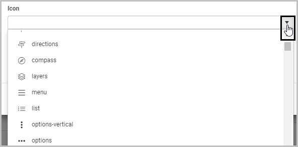
-
Show in form body - Select Yes if you want your Button to be shown in the Form.
-
Enable button security - Select Yes if you want to limit who can see the Button you are adding to the form.
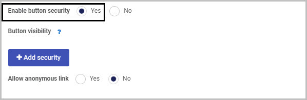
If you select Yes, two additional options are displayed: Add security and Allow anonymous link.
When you click on Add security, a new line appears with the options Field security and Select user(s) or groups:
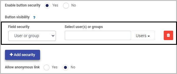
In Field security, you can choose from three options in terms of who will be able to view the Button you are inserting:
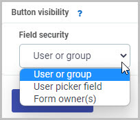
(i) If you choose to limit the Button visibility to a ‘User or group’, you can then select the user(s) or groups you want to be able to see the Button in the ‘Select user(s) or groups’ box.
(ii) If you choose to limit the Button visibility to a ‘User picker field’, you then select the User picker field in the ‘Select a userpicker field’ box:
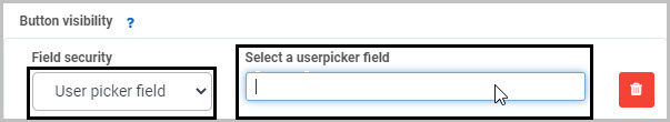
This will limit the visibility of the Button to the user(s) selected in that User picker field.
(iii) If you choose to limit the Button visibility to ‘Form owner(s)’, you then select the form in the ‘Select a form’ box - only the owner(s) of the selected form will be able to view the new Button you are inserting:
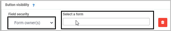
The second main option in terms of Button security is ‘Allow anonymous link’:
-
If you choose Yes, this will mean that the Button field will be visible when the form is accessed via an anonymous link.
-
If you choose No, anyone accessing the form from an anonymous link will not be able to see the Button field.
Anonymous links can be useful if, for example, you want members of the public to complete your form without needing to log into Kianda. To learn more about how you can create anonymous links to a form that can be shared with external users, see Anonymous form link.
-
Once you complete the New field - Button dialog box, click OK and the new Button field is added to your form.
In our example, if we changed the Button field title to ‘Schedule Meeting’ and chose a green colour scheme and ‘people’ icon, set button size to small and aligned the button to the right, our new Button could look like this when added to our ‘Performance Plan’ form:

-
You may then decide to add rules to your new Button field - to learn more, go to Rules. The rules we add will be executed in the order in which they are listed under Rules in the right hand pane.
For example, we could add a series of rules to our new Schedule Meeting button:
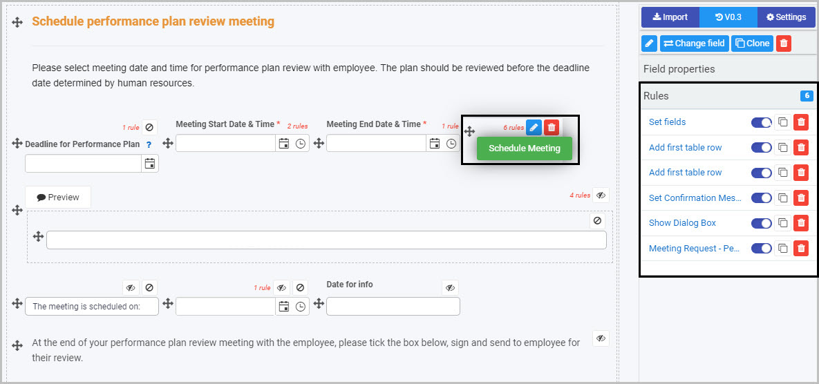
In our example, the sixth rule is a Meeting Request rule which will mean that, once the Schedule Meeting button is clicked, an automated email will be sent to the employee scheduling a performance review meeting - to learn more, go to Meeting request rule.
To edit a Button field:
-
Select the Button field (by either clicking on the field name or on the field’s drag handle button ).
-
Click on the Edit Field button (Pen icon) .
-
The Edit Field dialog box will open (with the Button title you chose reflected in the dialog box name), enabling you to choose from the same range of options as appear in the New field - Button dialog box (as already discussed in How to get started).
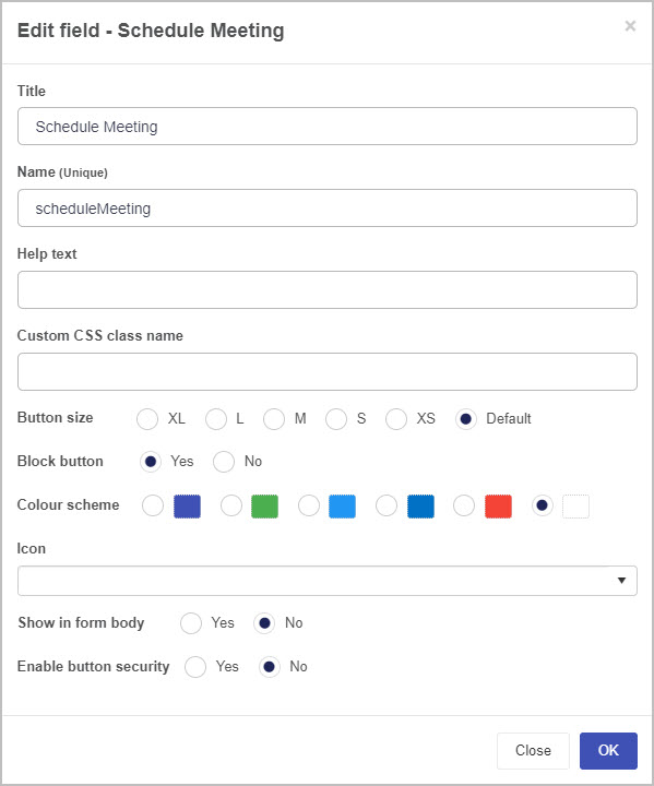
To move a Button, simply:
-
Select the Button’s Drag handle button .
-
Drag and drop the Button wherever you want to move it within your form.
For example, the ‘Schedule Meeting’ Button could be moved from where it was automatically added at the bottom of the panel to the location where we want it to go:
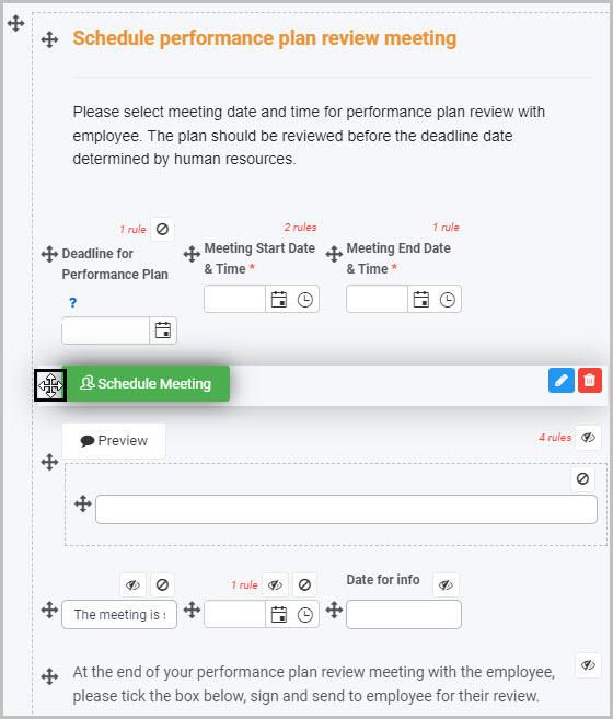
To delete a Button from your form:
- Select the Button (by either clicking on the Button’s title or its drag handle button ).
- Click on the Bin/Trash button .
- Click on OK to confirm.
To view or edit a Button’s Field properties:
-
Select the Button field (by either clicking on the field title or on the field’s drag handle button ).
-
The Field Properties associated with the Button field will be displayed (and can be changed) in the Field properties menu to the right.
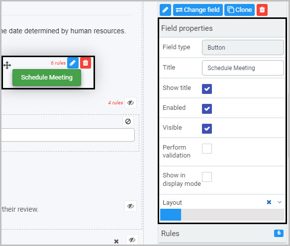
For example, the Field Properties associated with a Button field titled ‘Schedule Meeting’ are shown here and include:
- Field type - The type of field, in this case a Button.
- Title - The Title of the field, in this case ‘Schedule Meeting’.
- Show title - If this is selected, the Button field title will be shown in the form.
- Required - If this is selected, the Button will be mandatory for the form user.
- Enabled - If this is selected, the user will be able to edit or interact with the field.
- Visible - If this is selected, the Button will be visible in the form.
- Layout - The width of the blue bar can be adjusted to change the width of the Button as it appears on a PC or mobile phone (to view the Mobile layout, click on the expand button to the right).
For more details, go to Field Properties.
Saving changes and version history
Make sure to save any changes you make by clicking on the Save button . You will always have the option to revert back to previous versions of your form by clicking the Design Version History button in the top right corner.
What’s next
Now that you’ve learned about Button controls, find out more about the other types of Action fields you can add to Kianda forms:
4.2 - Image control
Image fields can be used to insert and display images, either statically or images captured from File upload fields. For example, you may wish to insert an image at the top of your form or may wish to enable form users to annotate an image.
How to get started
To add an Image field to a Kianda form:
-
Open an existing process by going to Administration > Designer in the left side menu and clicking on a process, or create a new process in Designer. See Create First Process to learn how to create your first process.
-
Once you have opened your process, select the form you want to work on (so that the Edit Form button is shown).
In this example, a Training Approval form in an Education Request Process has been selected:
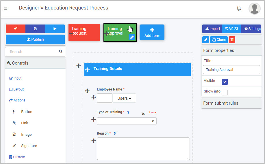
-
Select the area within the form where you want to insert the Image field - in our example, we will select the first panel in the form - Training Details:
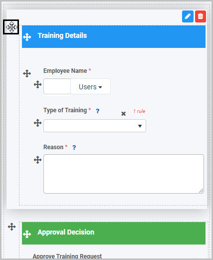
-
Click on Controls in the left-hand pane, and, from the four categories of Controls (Input, Layout, Actions and Custom), click on Actions.
-
Select Image from the four types of Action fields: Button, Link, Image and Signature:
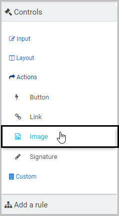
-
A New field - Image dialog box will automatically open, giving you options for your new Image field:
-
Title - You can change the name of the Image field from the default ‘Image 1’. In our example, we could change the title to ‘Employees’.
-
Name (Unique) - This is a unique name for the new field and inherits a camel case version of the entered Title.
-
Help text - You can insert text to help the form user. If you add help text, a question mark icon will appear next to the field title and, if the user clicks on this, they will see the help text you have inserted.
-
Custom CSS class name - You can type the name of a CSS class to allow the Image to inherit specific styles defined in the Global CSS file.
-
Image source - You can choose to insert the image either from an Image URL or from a File field within the form. Different additional options will be available to you, dependent on the Image source you choose.
(i) If you choose Image URL as the Image source, insert the URL for the image into the Image URL field:
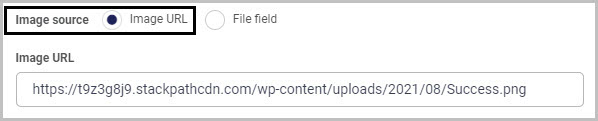
Then complete the Image max height and Image max width options:
-
Image max height - Insert the maximum height (in pixels) for your new Image field by either manually inserting a number or using the up down arrows to the right of the field.
-
Image max width - Insert the maximum width (in pixels) for your new Image field by either manually inserting a number or using the up down arrows to the right of the field.
When you’ve completed the New field - Image dialog box and clicked OK, your new Image field will be inserted at the bottom of the area you selected - in our case, at the bottom of the first panel in the Training Approval form:
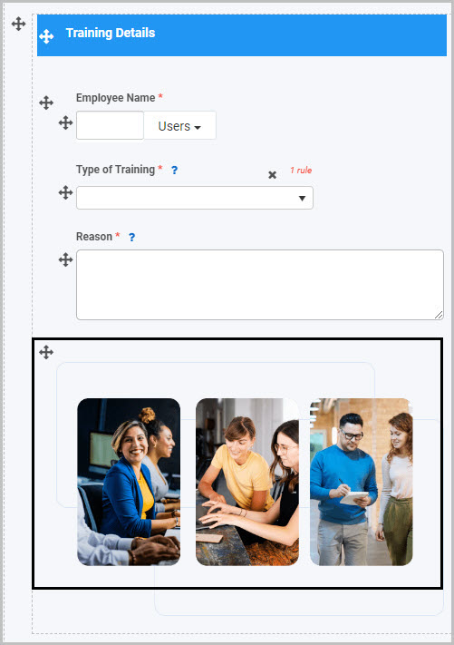
(ii) If you choose File field as the Image source, three additional options will be displayed below the ‘Image max height’ and ‘Image max width’ options - Enable image annotations, Display images inline and Enable quick remove image:
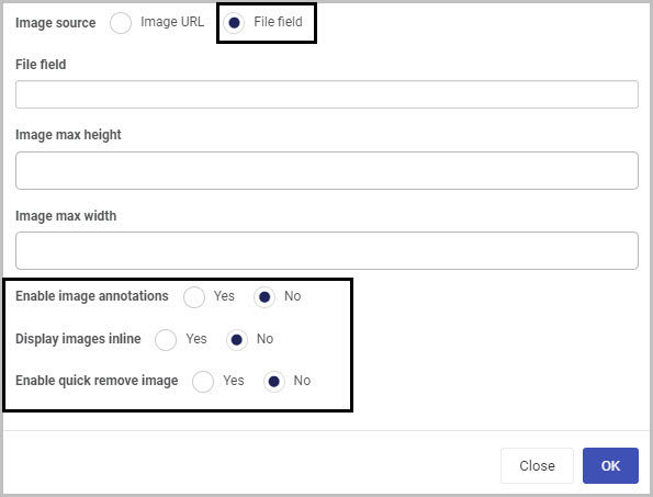
To use a File field as the Image source, you must first have inserted a File Upload field into your form and it must hold an image file.
In our example, you could insert a File Upload field titled ‘Image file’ into the panel where you want to insert the new Image field and then browse to find an image you have saved on your computer:
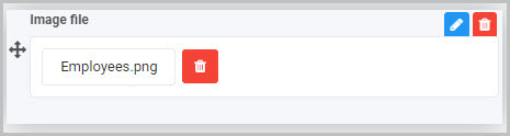
You could choose to make this File Upload field invisible to form users, by ensuring the Visible checkbox is not selected in the Field Properties menu to the right.
If you want to allow form users to make annotations on the Image, make sure to select Yes to the Allow file override option in the New field - File dialog box. To learn more about File Upload fields, see File Upload field.
Once the File Upload field has been added to the form and it contains the image file you want to use, you can then insert an Image field and, in the dialog box, choose File field as your Image source, click into the File field and select the field containing the image:
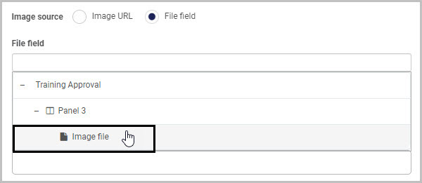
Then complete the Image max height and Image max width fields:
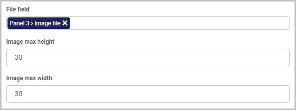
In our example, if we inserted an Image field using a File field as the Image source (and choose not to make the File field visible to form users), the new Image field could look like this once inserted in our form:
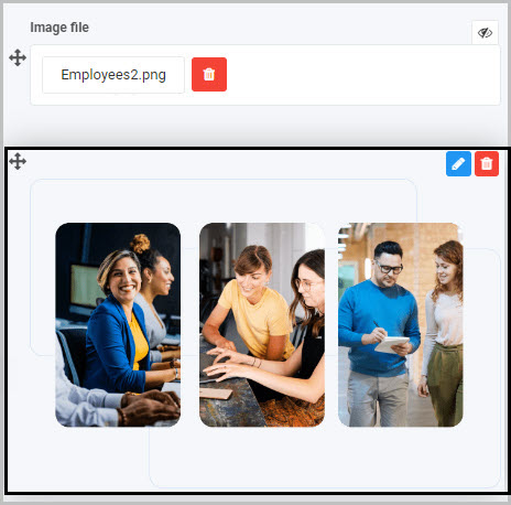
You have three additional options if you choose File field as your Image source:
-
Enable image annotations - If you choose Yes, this will enable both you (as the Form Designer) and the end user (the form user) to make annotations to the Image - such as adding a text comment or inserting a shape.
To make annotations to the Image as the Form Designer, choose Yes to ‘Enable image annotations’ and after clicking OK at the bottom of the New field - Image dialog box, click on the new Image field that has been added to your form:

When you click on the Image, a new pop-up box will open, with an Annotate Image button at the top right:

Click on this Annotate Image button and a menu will display with a range of options for annotating the image:
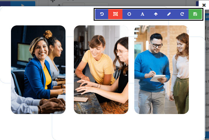
The options available for annotating the image include:
- Undo the last annotation 
- Draw a rectangle 
- Draw a circle 
- Write some text 
- Draw an arrow 
- Pen tool  (which allows you to do a free hand drawing on the image)
- Redo the last undone annotation 
An end user completing the form will be able to make annotations to the image in the same way - by clicking on the Image in the form and then clicking the Annotate Image button to view the menu.
When you have made the changes you want to the image, click on the green Save button  . This annotation will then be visible in the image in your form.
If you choose Yes to Enable image annotations, another option is shown - Keep original image:
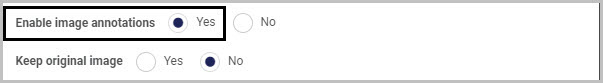
If you choose Yes for Keep original image, when the Image field is annotated, both the original image and annotated image will be shown side by side and will both be saved in the location you chose as the ‘Destination’ in the File Upload field.
-
Display images inline - Select Yes if you want the Image field to appear in line with the text in your form.
-
Enable quick remove image - If you select Yes, a Bin/Trash button will be available to the form user at the bottom of the Image field in the form, enabling them to delete the image by clicking on it.
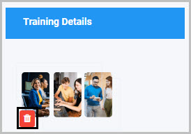
-
When you have finished selecting the options you want for your new Image field in the New field - Image dialog box, click OK and the Image will be added to your form.
-
You can preview how the image will look to an end user by first saving the changes you’ve made to your form (by clicking on the Save button ) and then clicking the Preview button.
In our example, if we added an Image field to our Training Approval form and choose a File field as the Image source and to allow the user to make annotations to the image - it could look like this to user completing the form on their mobile phone:
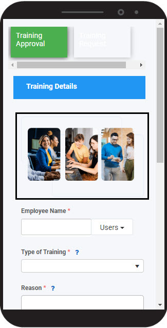
If you chose to enable image annotations, the form user can click on the image, click on the Annotate image button  and then use the options in the menu to make annotations on the image and save these.
How to edit, move and delete Image fields
To edit an Image field:
-
Select the Image field (by either clicking on the field name or on the field’s drag handle button ).
-
Click on the Edit Field button (Pen icon) .
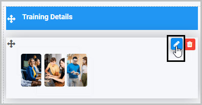
-
The Edit Field - Image dialog box will open (with the Image field title you chose reflected in the dialog box name), enabling you to choose from the same range of options as appear in the New field - Image dialog box (as already discussed in How to get started).
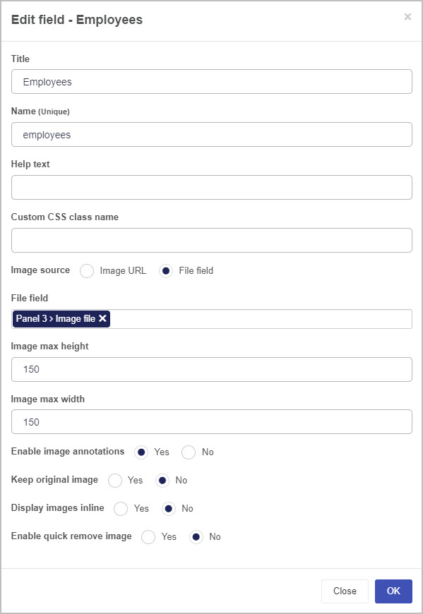
To move an Image field, simply:
-
Select the Image field’s drag handle button .
-
Drag and drop the Image field wherever you want to move it within your form.
For example, when we added the ‘Employees’ Image field to the first panel in the Training Approval form, it was automatically inserted at the bottom of the panel - if we want it to show at the top of the panel, we can simply drag the image to the top of the panel and drop it there:
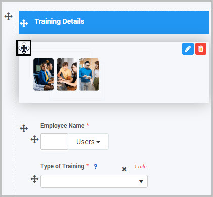
To delete an Image field from your form:
- Select the Image field (by either clicking on the field’s title or drag handle button ).
- Click on the Bin/Trash button .
- Click on OK to confirm.
How to view and edit Image control Field properties
To view or edit an Image control’s Field properties:
-
Select the Image field (by either clicking on the field title or on its drag handle button ).
-
The Field Properties associated with the Image field will be displayed (and can be changed) in the Field properties menu to the right.
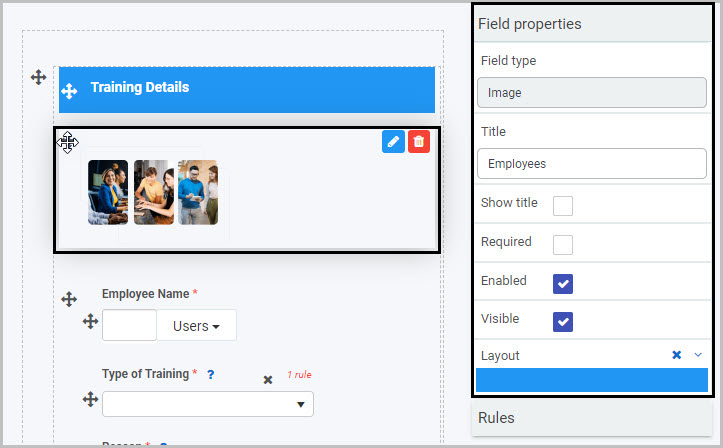
For example, the Field Properties associated with an Image field titled ‘Employees’ are shown here and include:
-
Field type - The type of field, in this case an Image field.
-
Title - The Title of the field, in this case ‘Employees’.
-
Show title - If this is selected, the Image field title will be shown in the form.
-
Required - If this is selected, the field will be mandatory for the form user.
-
Enabled - If this is selected, the user will be able to edit or interact with the field.
-
Visible - If this is selected, the Image field will be visible in the form.
-
Layout - The width of the blue bar can be adjusted to change the width of the Image field as it appears on a PC or mobile phone (to view the Mobile layout, click on the expand button to the right).
For more details, go to Field Properties.
Saving changes and version history
Make sure to save any changes you make by clicking on the Save button . You will always have the option to revert back to previous versions of your form by clicking the Design Version History button in the top right corner.
What’s next
Now that you’ve learned about Image controls, find out more about the other types of Action fields you can add to Kianda forms:
4.3 - Link control
Link fields can be used to add custom links to forms, including external links.
For example, as part of an Employee Appraisal Process, a manager may complete a Performance Plan form for each employee, setting out their Key Performance Areas and goals. It could be useful to add a Link Field to this form that links to the company’s Employee Handbook. We will keep this example in mind as we learn more about using Link controls.
How to get started
To add a Link field to a Kianda form:
-
Open an existing process by going to Administration > Designer in the left side menu and clicking on a process, or create a new process in Designer. See Create First Process to learn how to create your first process.
-
Once you have opened your process, select the form you want to work on (so that the Edit Form button is shown).
In this example, a Performance Plan form within an Employee Appraisal Process has been selected:
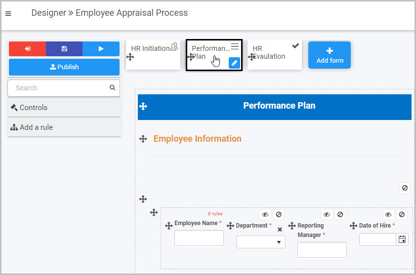
-
Select the area within the form where you want to insert the new Link field - in our example, we will select the first panel in the ‘Employee Information’ section of the form.
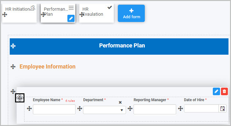
-
Click on Controls in the left-hand pane, and, from the four categories of Controls (Input, Layout, Actions and Custom), click on Actions.
-
Select Link from the four types of Action fields: Button, Link, Image and Signature:
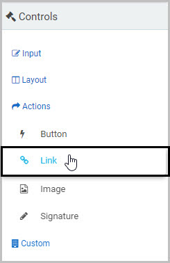
-
A New field - Link dialog box will automatically open, giving you options for your new Link field.
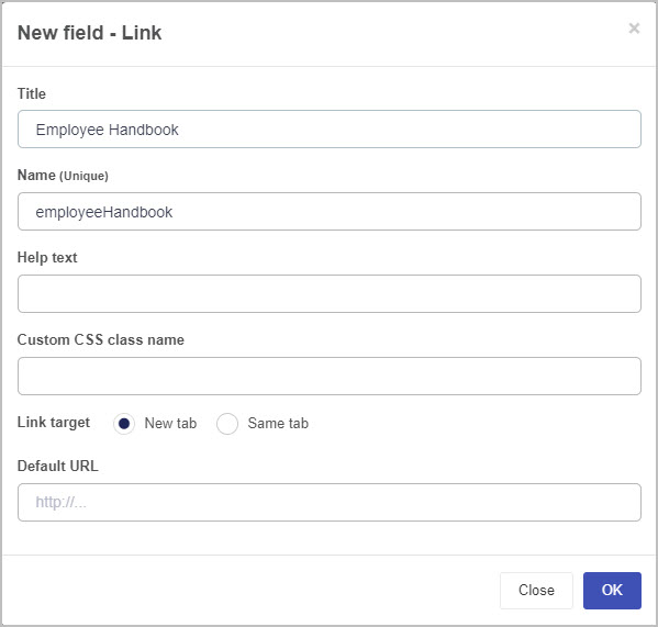
-
Title - You can change the name of the Link field from the default ‘Link 1’. In our example, we will change the title to ‘Employee Handbook’.
-
Name (Unique) - This is a unique name for the new field and inherits a camel case version of the entered Title.
-
Help text - You can insert text to help the form user. If you add help text, a question mark icon will appear next to the field title and, if the user clicks on this, they will see the help text you have inserted.
In our example, we could insert this help text:
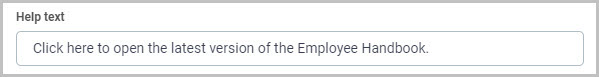
The user will then be able to view this help text by clicking on the question mark icon next to the Link field title:
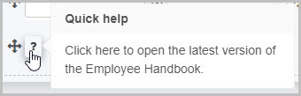
-
Custom CSS class name - You can type the name of a CSS class to allow the Link to inherit specific styles defined in the Global CSS file.
-
Link target - You can choose to have the link either open as a New tab or open in the Same tab the form user is currently in.
-
Default URL - This is where you can insert the URL you want the user to be brought to when they click on the Link field.
-
Once you complete the New field - Link dialog box, click OK and the new Link field is added to your form.
In our example, if we changed the default Link field title to ‘Employee Handbook’ and inserted help text (as shown previously), our new Link field could look like this when added to our ‘Performance Plan’ form:
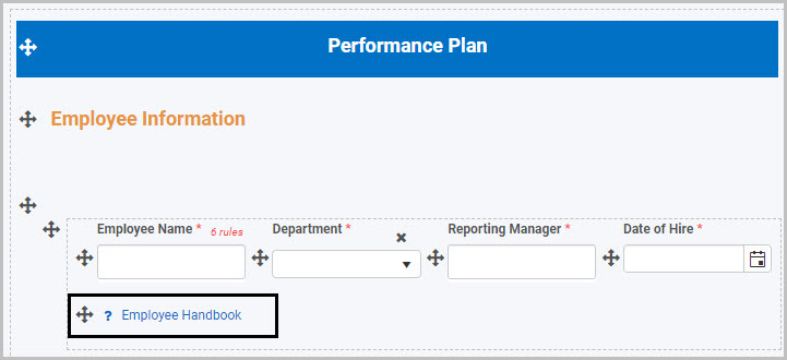
How to edit, move and delete Link fields
To edit a Link field:
-
Select the Link field (by either clicking on the field name or on the field’s drag handle button ).
-
Click on the Edit Field button (Pen icon) .
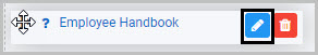
-
The Edit Field - Link dialog box will open (with the Link field title you chose reflected in the dialog box name), enabling you to choose from the same range of options as appear in the New field - Link dialog box (as already discussed in How to get started).
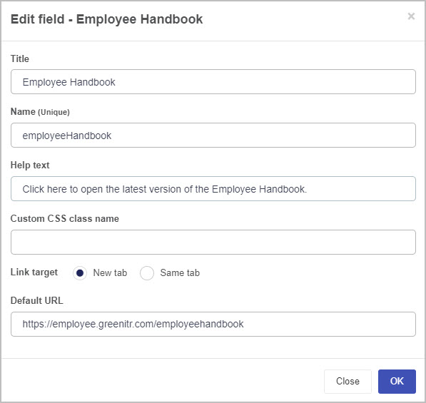
To move a Link field, simply:
-
Select the Link field’s drag handle button .
-
Drag and drop the Link field wherever you want to move it within your form.
For example, we could move the ‘Employee Handbook’ Link field by selecting its drag handle and dragging and dropping it wherever we want within our Performance Plan form:
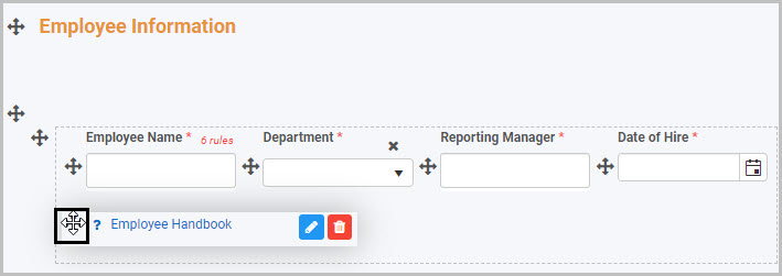
To delete a Link field from your form:
- Select the Link field (by either clicking on its title or its drag handle button ).
- Click on the Bin/Trash button .
- Click on OK to confirm.
How to view and edit Link control Field properties
To view or edit a Link control’s Field properties:
-
Select the Link field (by either clicking on the field’s title or drag handle button ).
-
The Field Properties associated with the Link field field will be displayed (and can be changed) in the Field properties menu to the right.
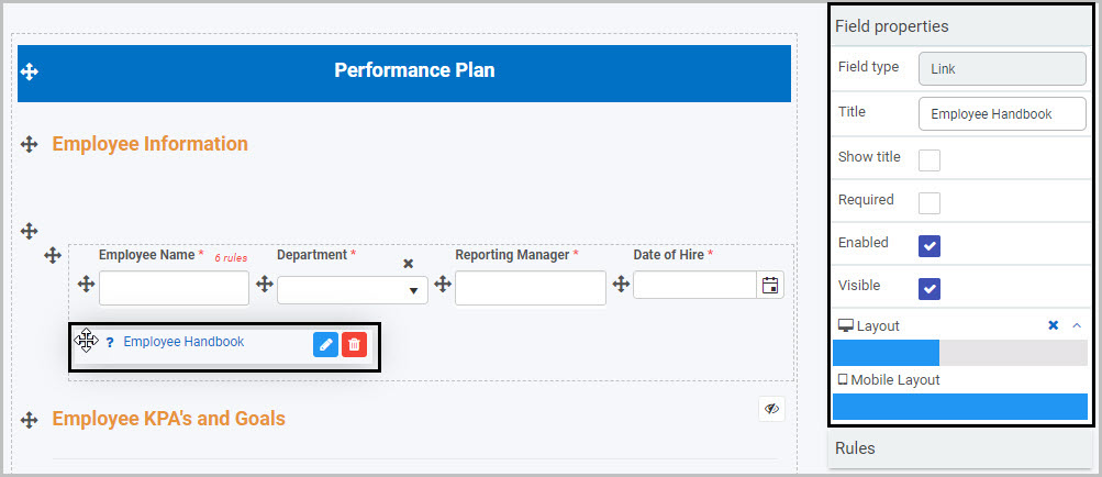
For example, the Field Properties associated with a Link control titled ‘Employee Handbook’ are shown here and include:
- Field type - The type of field, in this case a Link field.
- Title - The Title of the field, in this case ‘Employee Handbook’.
- Show title - If this is selected, the Link field title will be shown in the form.
- Required - If this is selected, the Link field will be mandatory for the form user.
- Enabled - If this is selected, the user will be able to edit or interact with the field.
- Visible - If this is selected, the Link field will be visible in the form.
- Layout - The width of the blue bar can be adjusted to change the width of the Button as it appears on a PC or mobile phone (to view the Mobile layout, click on the expand button to the right).
For more details, go to Field Properties.
Saving changes and version history
Make sure to save any changes you make by clicking on the Save button . You will always have the option to revert back to previous versions of your form by clicking the Design Version History button in the top right corner.
User tips
If you want the Link to be automatically emailed to someone once the form user clicks on the Submit button, for example, you could apply a Send email rule to the Submit button and reference the Link field in an expression in the email.
Rules allow actions based upon conditions resulting from user interaction with fields. To learn about the different types of rules that you can apply go to Rules, to learn about expressions see Expression builder or for more information specifically about the Send email rule, see Send email.
What’s next
Now that you’ve learned about Link controls, find out more about the other types of Action fields you can add to Kianda forms:
4.4 - Signature control
A Signature control can be used in a form to capture a user’s electronic signature. This can be particularly useful in a form that needs to be signed off as part of an approval process.
For example, a manager may complete a Performance Plan form for each employee, setting out their Key Performance Areas and goals. It could be useful to add two Signature fields to this form - titled ‘Manager Signature’ and ‘Employee Signature’ - to record the Manager and Employee each signing off on the Performance Plan. We will keep this example in mind as we learn more about using Signature fields.
How to get started
-
To add a Signature field to a Kianda form:
-
Open an existing process by going to Administration > Designer in the left side menu and clicking on a process, or create a new process in Designer. See Create First Process to learn how to create your first process.
-
Once you have opened your process, select the form you want to work on (so that the Edit Form button is shown).
In this example, we have opened an Employee Appraisal Process and selected a Performance Plan form within it:
-
Select the area within the form where you want to insert the new Signature field(s) - in our example, we want to insert one new Signature field below the ‘For Manager’ table and a second new Signature field below the ‘For Employee’ table in our Performance Plan form:
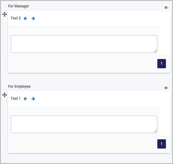
-
Click on Controls in the left-hand pane, and, from the four categories of Controls (Input, Layout, Actions and Custom), click on Actions.
-
Select Signature from the four types of Action fields: Button, Link, Image and Signature:
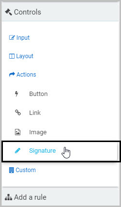
-
A New field - Signature dialog box will automatically open, giving you options for your new Signature field:
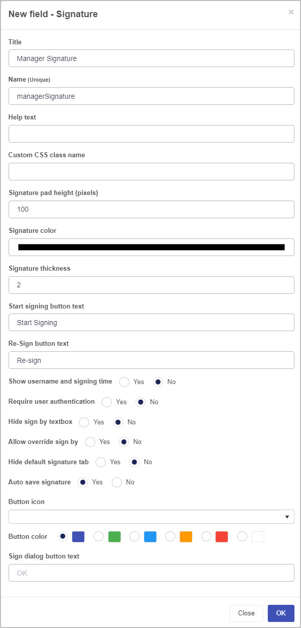
-
Title - You can change the name of the Signature field from the default ‘Signature 1’. In our example, we can change it to ‘Manager Signature’.
-
Name (Unique) - This is a unique name for the new field and inherits a camel case version of the entered Title.
-
Help text - You can insert text to help the form user. If you add help text, a question mark icon will appear next to the field title and, if the user clicks on this, they will see the help text you have inserted.
For example, we could insert this Help text to go with our new ‘Manager Signature’ Signature field:
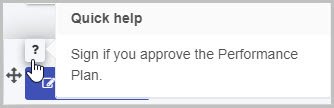
-
Custom CSS class name - You can type the name of a CSS class to allow the Signature to inherit specific styles defined in the Global CSS file.
-
Signature pad height (pixels) - You can choose the height of the signature in pixels. To do this, either manually type in the number of pixels you want the height to be or use the up and down arrows to the right.
-
Signature color - You can choose the colour for the signature itself, i.e. the name of the user electronically signing the form. To do this, click on the field and then either:
(i) use the slider to move between colours and click on the palette to choose a particular hue
(ii) click on the dropper icon  and then choose a colour from your open PC window(s)
(iii) type in the R G B value if you know the colour you want to use
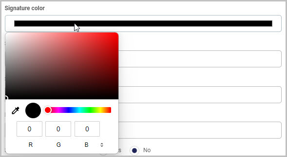
-
Signature thickness - Insert a numerical value for how thick you want the signature font to be. By default, this is set to 2.
-
Start signing button text - You can choose the text you want to appear on the Signature field button. By default, the text is ‘Start Signing’ but you can change this to whatever you want.
-
Re-Sign button text - You can choose the text you want to appear on the ‘Re-Sign’ button. This ‘Re-Sign’ button appears after the user has clicked the Start signing button and completed the dialog box and it enables the user to replace or override the original signature they input. By default, the text is ‘Re-sign’ but you can change this to whatever you want.
In our example of adding a Signature field titled ‘Manager Signature’, once the manager has signed, the ‘Re-sign’ button will be shown:
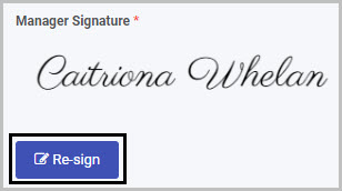
-
Show username and signing time - Select Yes to show the Kianda username of the person who has electronically signed with the Signature field and the time they signed at (per the local time settings on the user’s Kianda account).
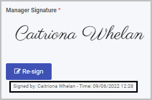
-
Require user authentication - Select Yes to require user authentication for the user clicking the Signature field button to sign the section/form. If you select Yes, an additional option will display - Authenticate via SSO.
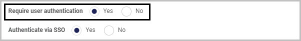
If you then choose Yes for authenticating the user via Single Sign-on, an initial pop-up box will appear to check whether the user is signed in and, after clicking on the Signature button a second pop-up will appear to confirm the user’s credentials.
If you choose No for Authenticate via SSO, a pop-up appears requiring the user to confirm their login credentials.
-
Hide sign by textbox - Select Yes if you want to hide the sign by textbox.
For example, if we choose Yes for this option for our new ‘Manager Signature’, when the user clicks the ‘Start signing’ button and the pop-up box opens, they will just see an area where they can either choose Signature (with an electronically generated signature) or Draw or Upload (to draw or upload their signature):
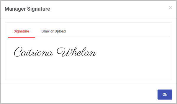
If we choose No to Hide sign by textbox, when the user clicks Start signing they will see a ‘Sign by’ textbox at the top of the pop-up that appears:
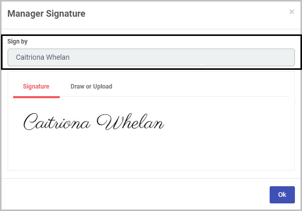
-
Allow override sign by - Select Yes if you want to allow override of the signature inserted in the Signature field. If you choose Yes, an additional option will be shown - Default title of sign by:
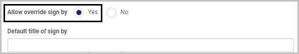
If you select Yes to ‘Allow override sign by’ and then click into the ‘Default title of sign by’ field, you can then select a field to be used to populate the default name in the Signature field. For example, you could select a User picker field within your form as the ‘Default title of sign by’ - this would then mean that the user that is selected in that User picker field will be the default name shown in the Signature field.
-
Hide default signature tab - Select Yes if you want to hide the default signature tab (where an electronic signature is automatically generated). If you choose Yes, the next option - Auto save signature - will no longer be available to you.
In our example, if we select No to hiding the default signature tab, the user will see the electronically generated signature:
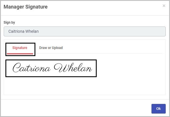
-
Auto save signature - Select Yes if you want to auto save the signature.
-
Button icon - You can choose an icon to appear on your Signature field button (or can opt not to have an icon on it). Click on the down arrow to the right of the field and select the icon you want from several hundred icons in the dropdown list.
-
Button color - Choose the colour you want for your Signature field button. The options are Navy, Green, Blue, Amber, Red or White.
-
Sign dialog button text - You can choose the text to appear on the button at the bottom right of the Signature dialog box. By default, the text is ‘OK’ but you can change this to whatever you want.
-
Once you complete the New field - Signature dialog box, click OK and the new Signature field will be added to your form.
In our example, if we insert a new Signature field titled ‘Manager Signature’, it will be added to the bottom of the Performance Plan form and look like this:
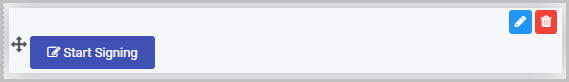
-
By default, the Title of the new Signature field will not be shown but you can change this by selecting the the field and checking the Show title checkbox in the Field properties menu to the right.
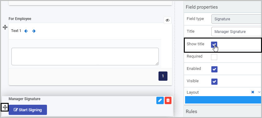
-
You can then click on the new Signature field within the form to see how it will appear to users.
In our case, we can click on the ‘Start Signing’ Manager Signature button to see the dialog box that will appear when the form user clicks on it:
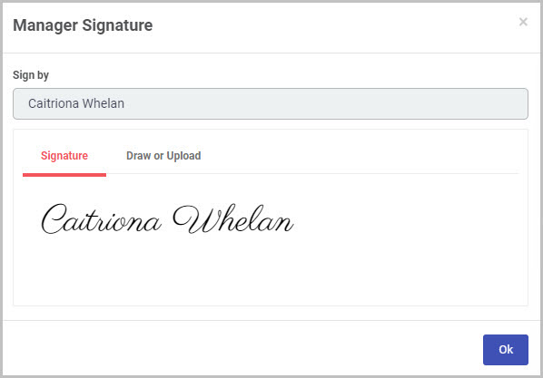
The user can choose between a system-created Signature or to Draw or Upload their own version. If you click on Draw or Upload you can see how the user can either sign on the dotted line (and click on Clear at any stage to erase a mistake) or click on Upload handwritten signature and browse for a file.
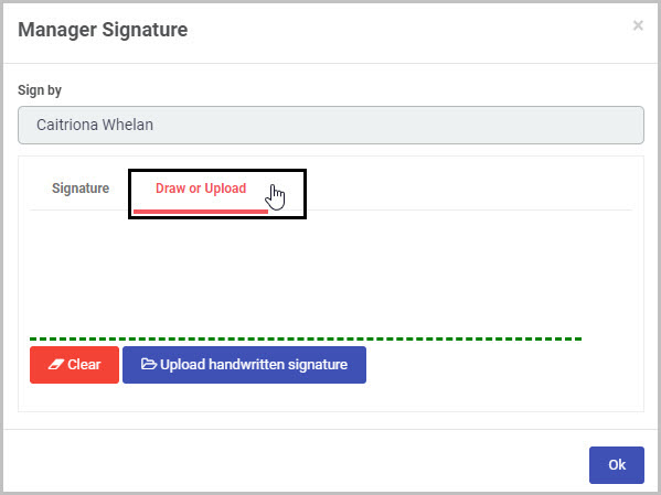
Click on the OK button to close the dialog box.
-
You may decide to add rules to your Signature field - to learn more about the different categories of rules available, go to Rules. The rules we add will be executed in the order in which they are listed under Rules in the right hand pane.
How to edit, move and delete Signature fields
To edit a Signature field:
-
Select the Signature field (by either clicking on the field name or on the field’s drag handle button )
-
Click on the Edit Field button (Pen icon)
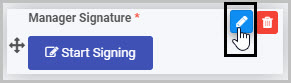
-
The Edit Field dialog box will open (with the Signature field title you chose reflected in the dialog box name), enabling you to choose from the same range of options as appear in the New field - Signature dialog box (as already discussed in How to get started).
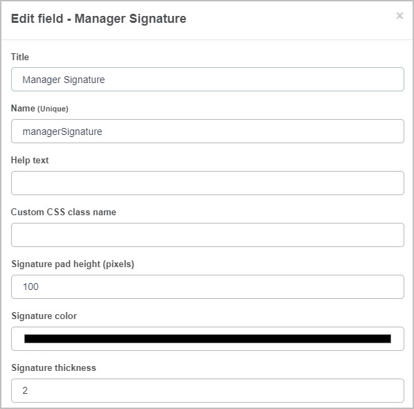
To move a Signature field, simply:
-
Select the Signature field’s Drag handle button .
-
Drag and drop the Signature field wherever you want to move it within your form.
For example, we can move the ‘Employee Signature’ Signature field from where it was automatically added at the bottom of the panel to the location where we want it to go:
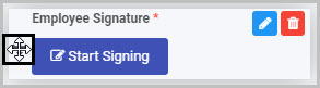
In our example, if we moved the two Signature fields we inserted in the Performance Plan form - one titled ‘Manager Signature’ and a second titled ‘Employee Signature’ - to go under the ‘For Manager’ and ‘For Employee’ sections, they could look like this:
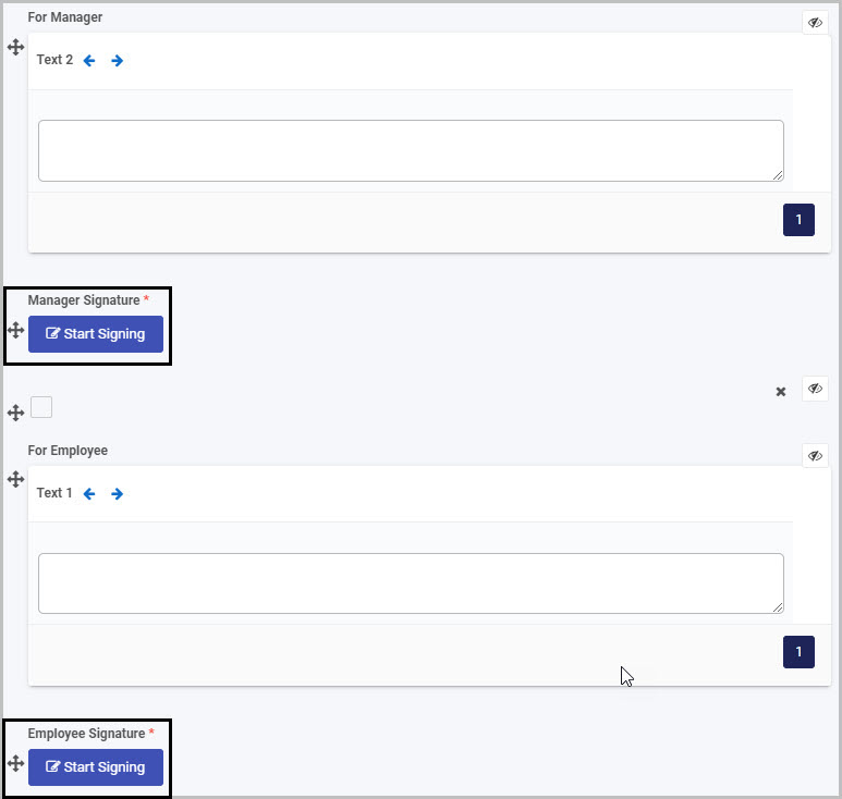
To delete a Signature field from your form:
- Select the Signature field (by either clicking on the field’s title or its drag handle button ).
- Click on the Bin/Trash button .
- Click on OK to confirm.
How to view and edit Signature field properties
To view or edit a Signature control’s Field properties:
-
Select the Signature field (by either clicking on the field title or drag handle button ).
-
The Field Properties associated with the Signature field will be displayed (and can be changed) in the Field properties menu to the right.
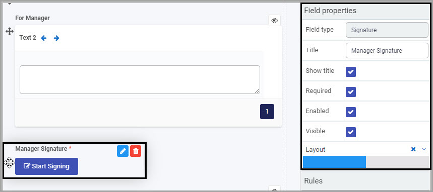
For example, the Field Properties associated with a Signature field titled ‘Manager Signature’ are shown here and include:
- Field type - The type of field, in this case a Signature field.
- Title - The Title of the field, in this case ‘Manager Signature’.
- Show title - If this is selected, the Signature field title will be shown in the form.
- Required - If this is selected, the Signature field will be mandatory for the form user.
- Enabled - If this is selected, the user will be able to edit or interact with the field.
- Visible - If this is selected, the Signature field will be visible in the form.
- Layout - The width of the blue bar can be adjusted to change the width of the Signature field as it appears on a PC or mobile phone (to view the Mobile layout, click on the expand button to the right).
For more details, go to Field Properties.
Saving changes and version history
Make sure to save any changes you make by clicking on the Save button . You will always have the option to revert back to previous versions of your form by clicking the Design Version History button in the top right corner.
What’s next
Now that you’ve learned about the Signature control, find out more about the other types of Action fields you can add to Kianda forms:
5 - Custom controls
Custom fields are a fourth category of controls that are only available to you as a Designer in Kianda if Custom controls have been created by an Administrator or Designer in your Kianda workspace.
How to get started
To add a Custom field to a Kianda form:
-
Open an existing process by going to Administration > Designer in the left side menu and clicking on a process, or create a new process in Designer. See Create First Process to learn how to create your first process.
-
Once you have opened your process, select the form you want to work on (so that the Edit Form button is shown).
In this example, a Training Request form in an Education Request Process has been selected:
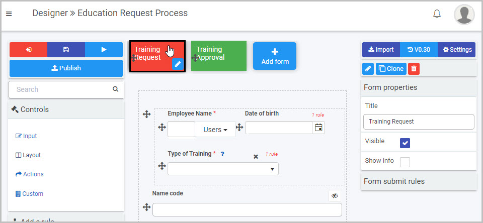
-
Select the area within the form where you want to insert the new Custom field - in our example, we will select the first panel in the Training Request form:
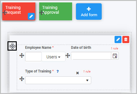
-
Click on Controls in the left-hand pane, and, from the four categories of Controls (Input, Layout, Actions and Custom), click on Custom.
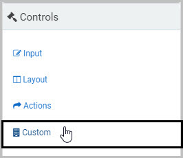
Note: This fourth category of Controls will only be available to you if Custom controls have been created by Administrators or Developers in your Kianda workspace.
-
The Custom fields available to you will be shown in the expanded Custom menu - in the example shown here, there are three Custom fields available to the form Designer:
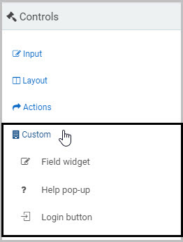
Click on the Custom field you want to insert and it will be added to your form at the bottom of the form section you have selected.
In our example, we can click on the first Custom field listed in the Custom sub-menu - Field widget - the new Custom widget (‘Field widget 1’) is added to the bottom of the panel we had selected and a pop-up message says ‘Field added’:
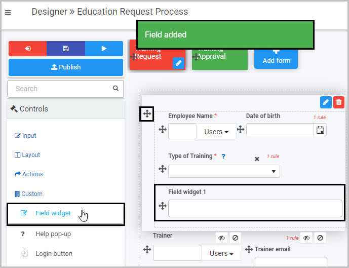
-
You can then edit the new Custom field as you want - to do this, select the Custom field (by either clicking on its field title or on its drag handle button ) and then click the Edit field button.
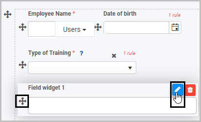
The Edit field dialog box will open, showing the range of options available for that particular Custom field.
How Custom controls are created
A Kianda Administrator or Developer can create Custom controls by opening the Administration menu from the left-side menu and clicking on Developer:
The Developer resources page opens and displays all of the Custom widgets that have been created - these include Custom field widgets, Custom rule widgets and Custom Dashboard widgets.
Note: Only Custom field widgets will be shown in the Custom controls menu in Kianda Designer - that is, only Custom widgets with a ‘Type’ of ‘Field’.
To create a new Custom Widget, the Developer/Administrator clicks on the New widget button  .
.
An Edit widget dialog box opens, in which the Title, Unique ID, Widget icon and Widget type can be chosen:
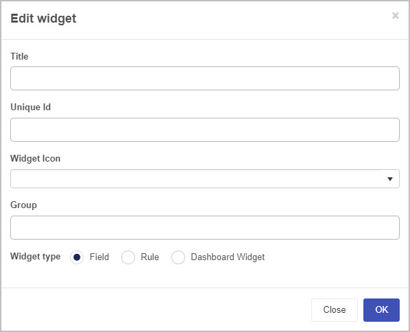
When the Developer/Administrator completes the dialog box and clicks on OK, a workspace opens where they can create their Custom widget:
Once a Custom field widget has been created, Designers will then be able to see and use that Custom field widget in the Custom section of the Controls menu when designing Kianda forms.
To learn more about how to create Custom field widgets, go to Creating a custom field widget.
How to edit, move and delete Custom fields
To edit a Custom field:
- Select the field (by either clicking on the field title or drag handle button )
- Click on the Edit field button (Pen icon)
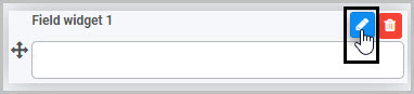
The Edit field dialog box will open, enabling you to choose from a range of options specific to that particular Custom field. The functionality of the field will depend on what the Custom field was designed to do.
To move a Custom field:
- Select the field’s drag handle button
- Drag and drop the field wherever you want to move it to within your form.
In our example, we could drag and drop the new Custom field titled ‘Field widget 1’ so that it comes before the ‘Type of Training’ List field:
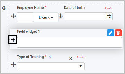
To delete a Custom field from your form:
- Select the field (by either clicking on the field’s name or its drag handle button )
- Click on the Bin/Trash button
- Click on OK to confirm.
How to view or edit Custom control Field properties
To view or edit the Field properties associated with a Custom field, select the field (by clicking on the field title or its drag handle button ) - the Field properties menu will appear in the right-hand pane.
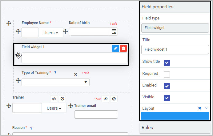
In the example shown here, a Custom field titled ‘Field widget 1’ has been selected and the Field properties associated with this field are shown in the Field properties menu to the right, including:
-
Field type - For Custom field widgets, the ‘Field type’ will be ‘Field widget’.
-
Title - The Title of the field, in this case ‘Field widget 1’. You can change the title here, in Field properties, or in the Edit field dialog box.
-
Show title - If this is selected, the Custom field title will be shown in the form.
-
Required - If this is selected, the field will be mandatory for the form user.
-
Enabled - If this is selected, the user will be able to edit or interact with the field.
-
Visible - If this is selected, the Custom field will be visible in the form.
-
Layout - The width of the blue bar can be adjusted to change the width of the Custom field as it appears on a PC or mobile phone (to view the Mobile layout, click on the expand button to the right).
For more details, go to Field Properties.
Saving changes and version history
Make sure to save any changes you make by clicking on the Save button . You will always have the option to revert back to previous versions of your form by clicking the Design Version History button in the top right corner.
What’s next
Now that you’ve learned about Custom controls, find out more about how you can use Controls, how you can get started as a Kianda low-code developer, and more about the three other categories of Controls you can add to a Kianda process: