Action fields are one category of controls and include the fields that allow user interface actions like buttons or links.
Getting started with Action controls
There are four types of Action fields:
-
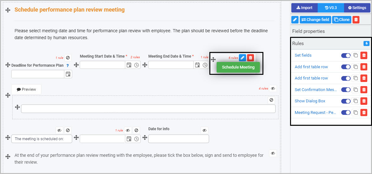
Button - Buttons can be used to allow user interaction and to enable rules to be applied to actions taken by users. Applying rules to buttons can help to create smart, dynamic forms that follow business logic, without the need for coding. See Rules and Button control to learn more.
-
Link - Link fields can be used to create custom links to forms. These can be external links. See Link control for more information.
-
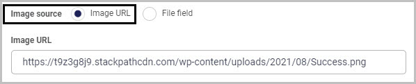
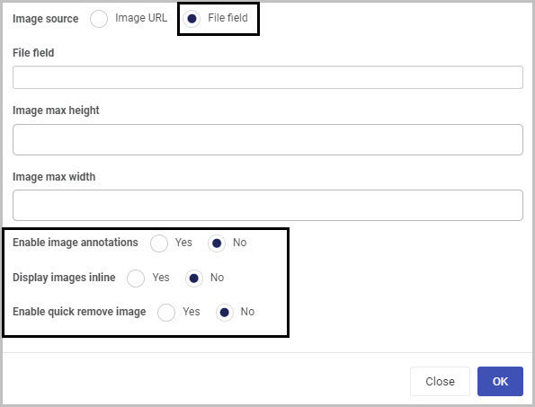
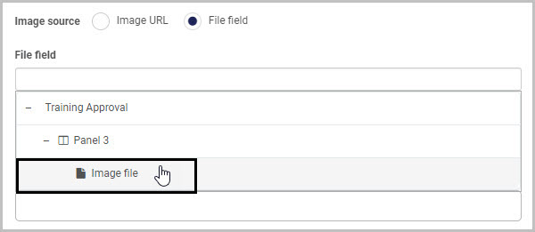
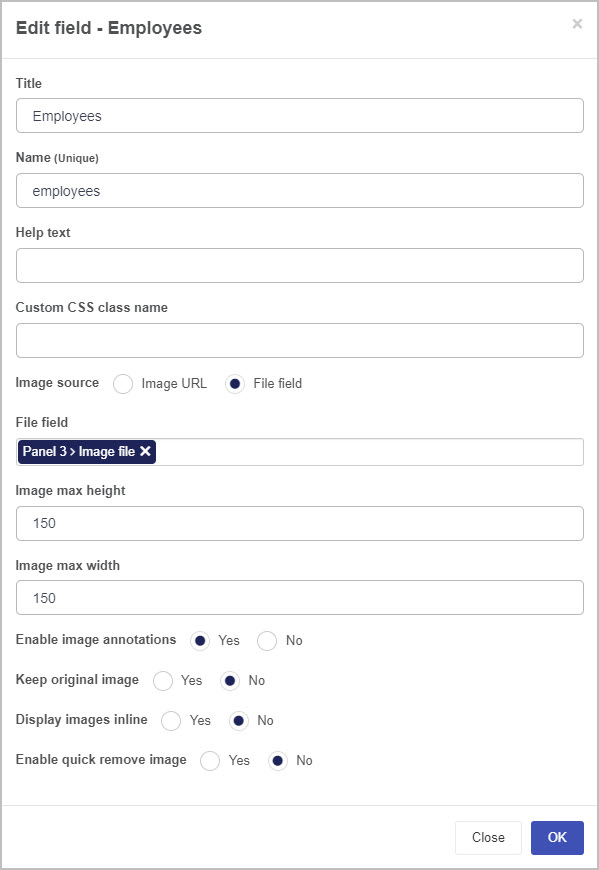
Image - Image fields can be used to display images, either statically or from file fields. Go to Image control to find out more.
-
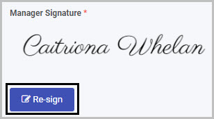
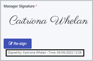
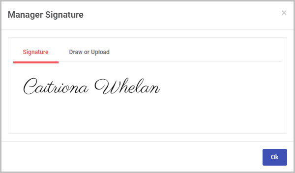
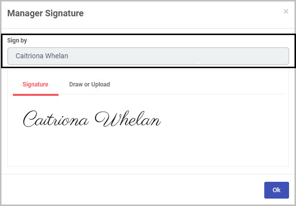
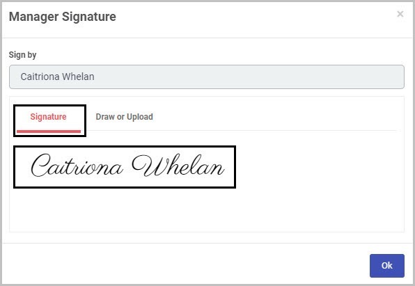
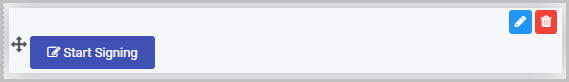
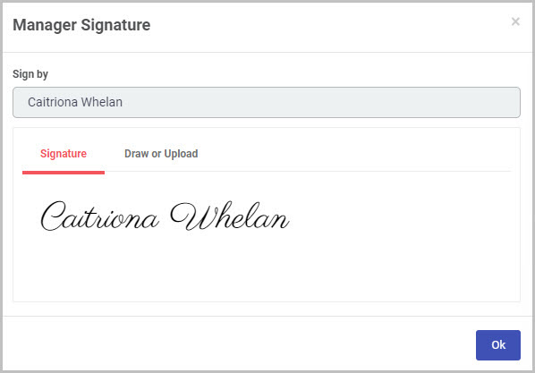
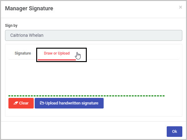
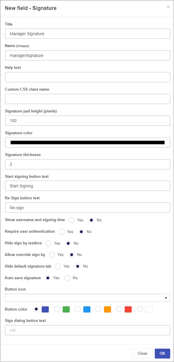
Signature - Signature fields provide a very neat way to electronically sign-off on a form or process. To learn more, go to Signature control.
To add an Action field to a Kianda form:
-
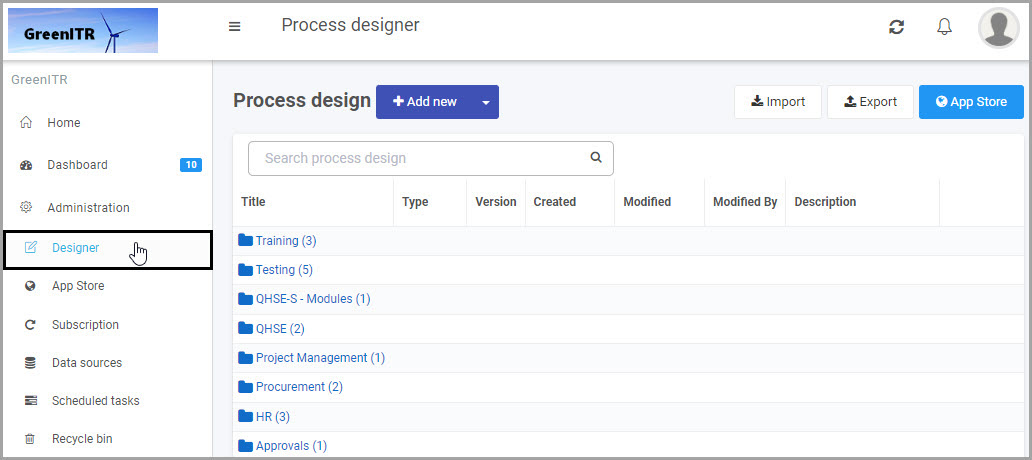
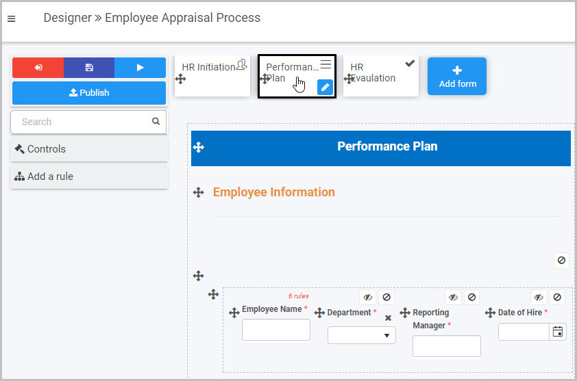
Open an existing process by going to Administration > Designer in the left side menu and clicking on a process, or create a new process in Designer. See Create First Process to learn how to create your first process.
-
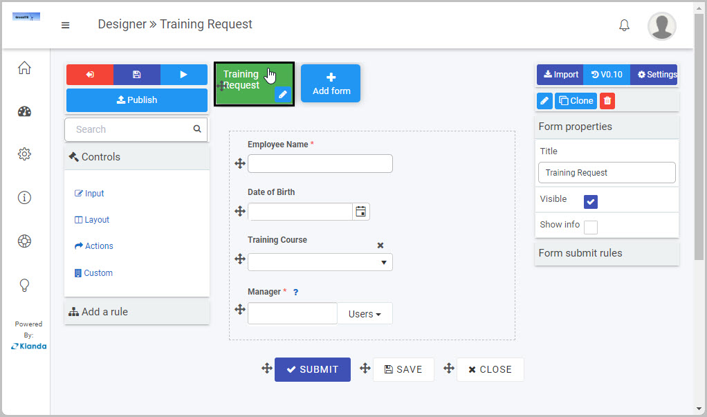
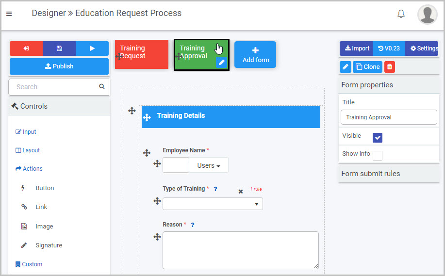
Once you have opened your process, select the form you want to work on (so that the Edit Form button
 is shown).
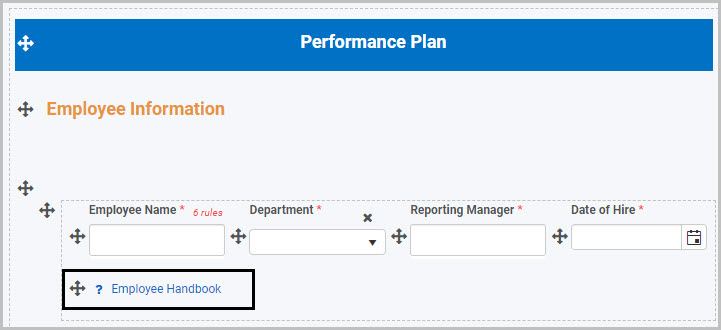
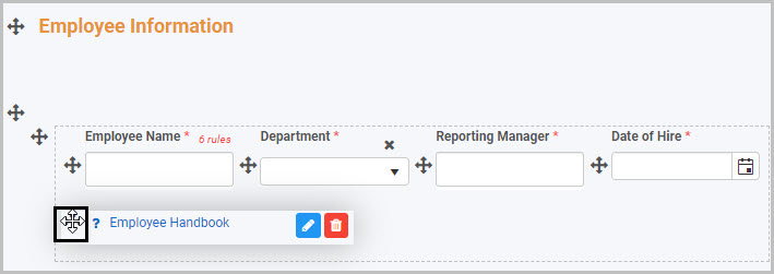
In this example, a Training Request form has been selected:
-
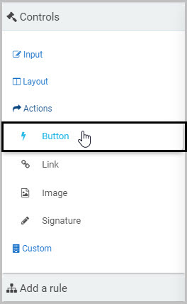
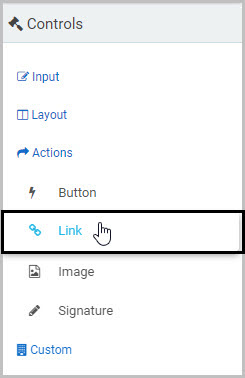
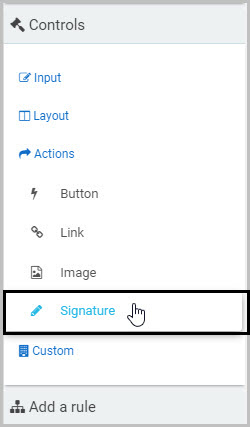
Click on Controls in the left-hand pane so the Controls menu expands to show the four categories of Controls (fields): Input, Layout, Actions and Custom.
-
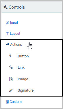
Click on Actions to see the four types of Action fields: Button, Link, Image and Signature.
-
Click on the Action field type you want to insert.
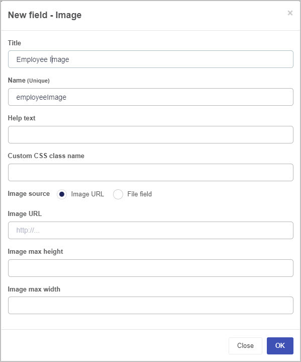
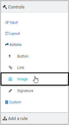
For example, to insert an Image field:
- Click on Image
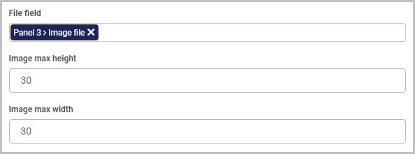
- A New field - Image dialog box opens automatically, giving you a range of options for your new Image field.
- Once you complete this dialog box and click OK, the new Image field is inserted into your form. To learn more about the Image field, go to Image control.
How to edit, move and delete Action fields
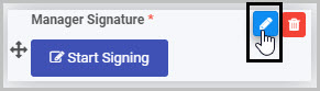
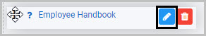
To edit whatever type of Action field you have added to your form:
-
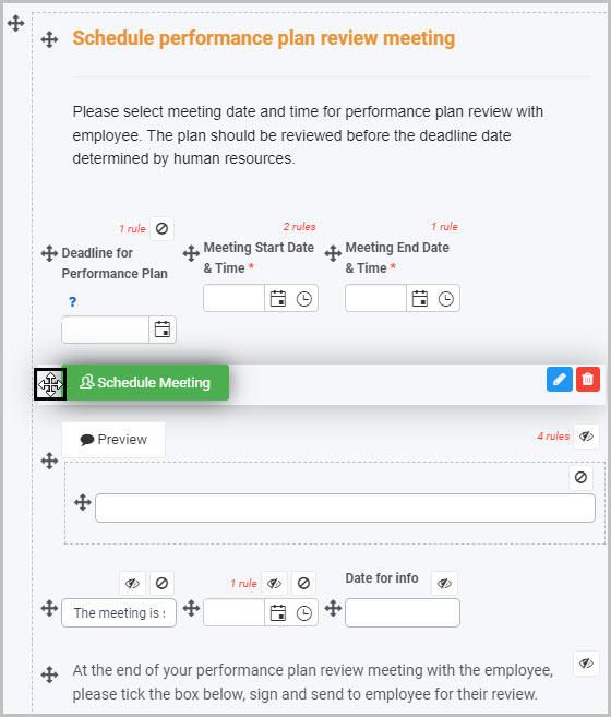
Select the field (by either clicking on the field name or on the field’s drag handle button
 ).
). -
Click on the Edit Field button (Pen icon)
. -
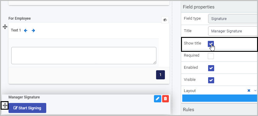
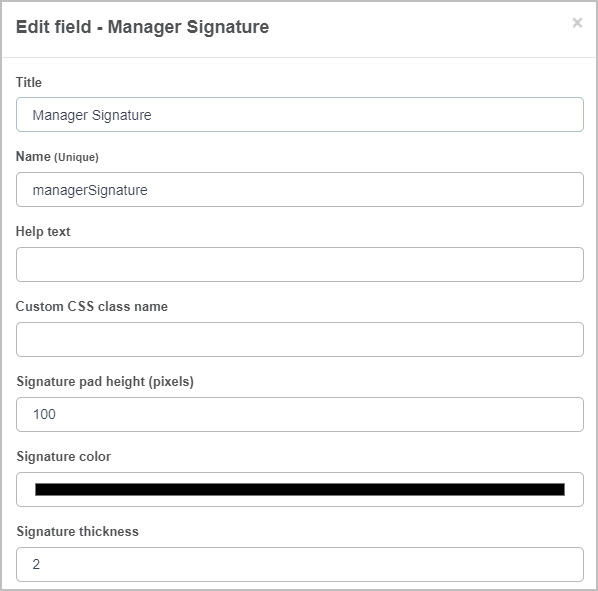
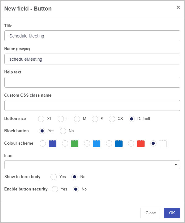
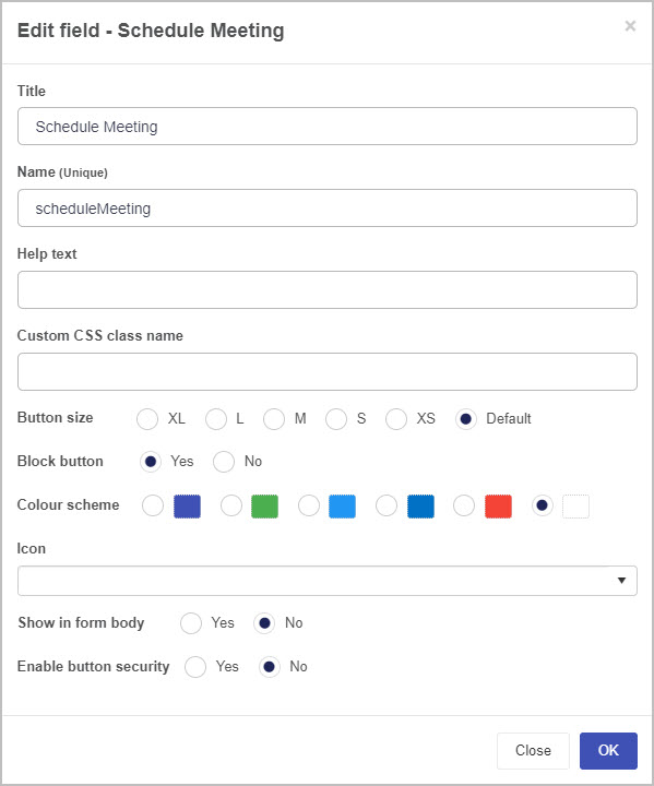
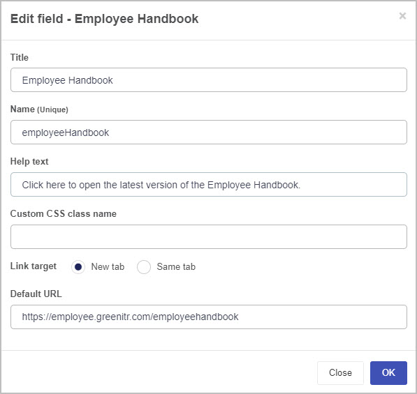
The Edit Field dialog box will open, giving you a different range of options to make changes to the Action field - such as changing the Title of the field - depending on the type of Action field you are working with.
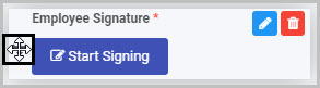
To move an Action field, simply:
-
Select the field’s Drag handle button
. -
Drag and drop the Action field wherever you want to move it within your form.
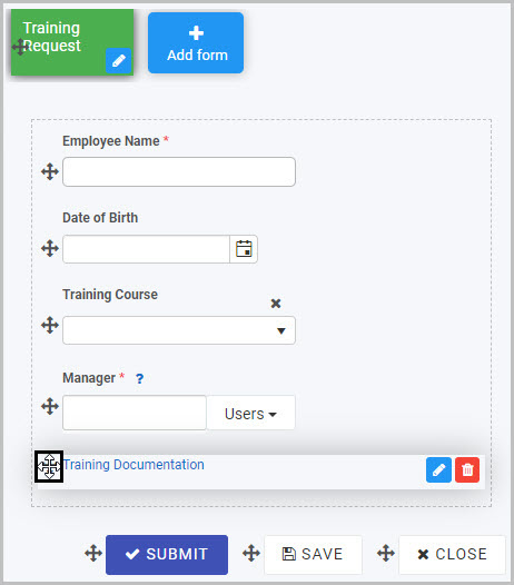
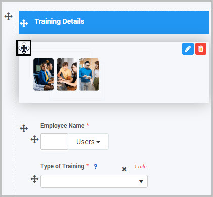
For example, the ‘Training Documentation’ Link field shown here can be moved in the form by selecting the drag handle button and dragging and dropping it wherever you want to put it:
To delete an Action field from your form:
- Select the Action field (by either clicking on the field’s title or its drag handle button ).
- Click on the Bin/Trash button
 .
. - Click on OK to confirm.
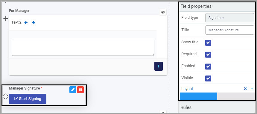
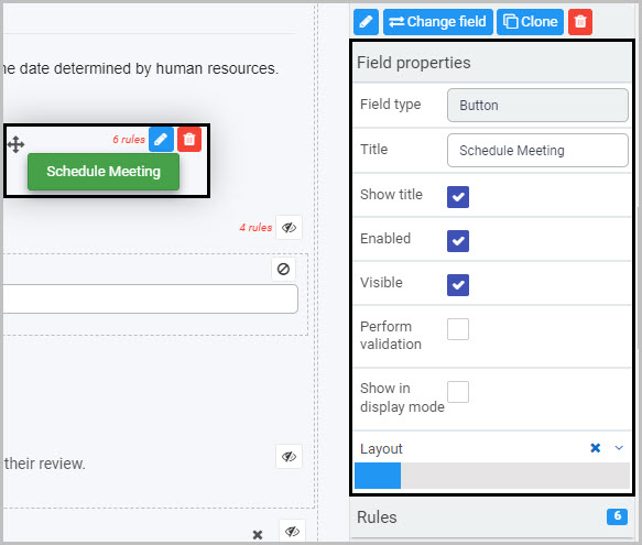
How to view and edit Action control Field Properties
To view or edit an Action control’s Field properties:
-
Select the Action field (by either clicking on the field title or on the field’s drag handle button
). -
The Field Properties associated with the Action field will be displayed (and can be changed) in the Field properties menu on the right-hand side.
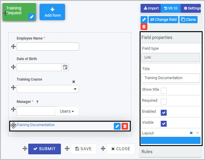
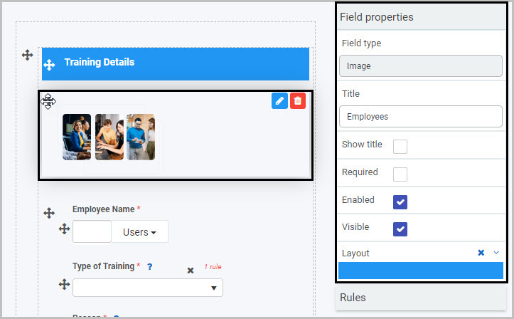
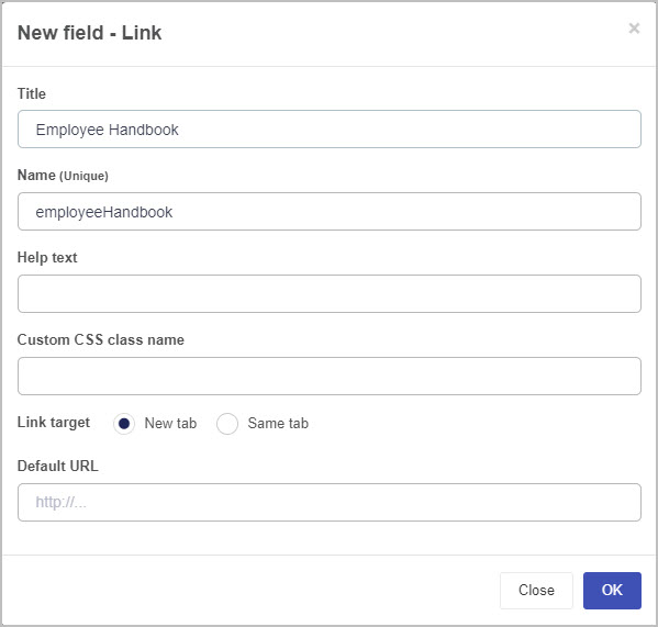
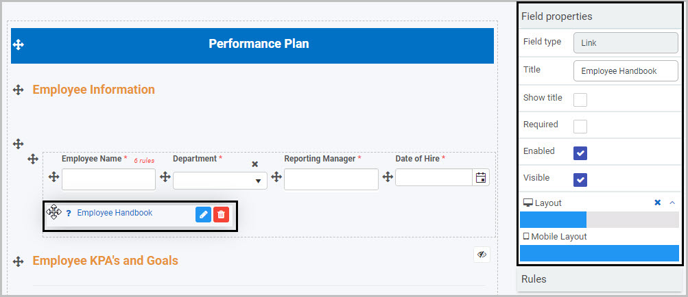
For example, the Field properties associated with a Link field titled ‘Training Documentation’ are shown here:
- Field type - The type of field, in this case a Link field.
- Title - The Title of the field, in this case ‘Training Documentation’.
- Show title - If this is selected, the field title will be shown in the form.
- Required - If this is selected, the field will be mandatory for the form user to complete (and a red star will be shown next to the field title to denote this).
- Enabled - If this is selected, the user will be able to edit the field.
- Visible - If this is selected, the field will be visible in the form.
- Layout - The width of the blue bar can be adjusted to change the width of the field as it appears on a PC or mobile phone (to view the Mobile layout, click on the expand button
 to the right).
For more details, go to Field Properties.
Saving changes and version history
Make sure to save any changes you make by clicking on the Save button  . You will always have the option to revert back to previous versions of your form by clicking the Design Version History
  button in the top right corner.
What’s next 
We have briefly introduced each of the four types of Action fields. Now let’s look at each of these Action fields in more detail:
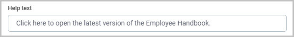
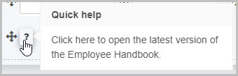
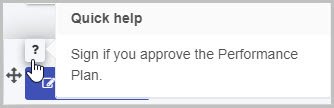
 icon will appear next to the field title and, if the user clicks on this, they will see the help text you have inserted.

 to the right of the field.
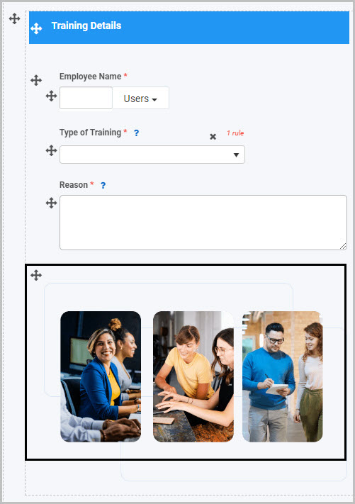


 (which allows you to do a free hand drawing on the image)
 . This annotation will then be visible in the image in your form.
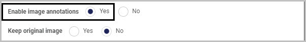

 button.
 and then use the options in the menu to make annotations on the image and save these.
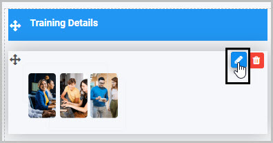

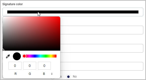
 and then choose a colour from your open PC window(s)