Button control
Button fields can be used in forms to allow user interface actions. Often, rules are applied to buttons so that actions are automatically executed once the user clicks on the button. In this way, Button fields with rules can be used to trigger a sequence of events. To learn more about rules, go to Rules.
For example, as part of an Employee Appraisal Process, a manager may complete a Performance Plan form for each employee, setting out their Key Performance Areas and goals. It could be useful to add a button to this form - titled ‘Schedule Meeting’ - that will automatically schedule a performance review meeting between the manager and the employee at a pre-determined date in the future. We will keep this example in mind as we learn more about using Button controls.
How to get started
To add a Button field to a Kianda form:
-
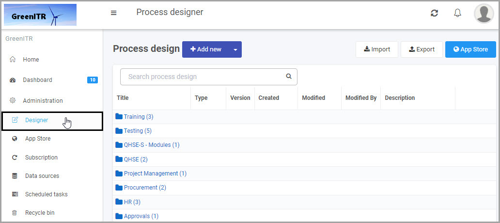
Open an existing process by going to Administration > Designer in the left side menu and clicking on a process, or create a new process in Designer. See Create First Process to learn how to create your first process.
-
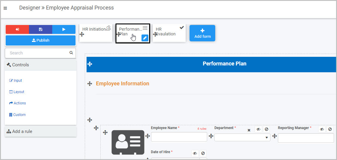
Once you have opened your process, select the form you want to work on (so that the Edit Form button
 is shown).
In this example, a Performance Plan form has been selected:
-
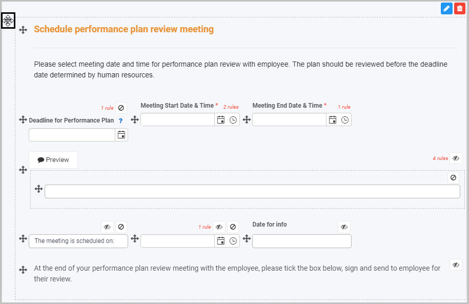
Select the area within the form where you want to insert the new Button field - in our example, we will select the panel containing the ‘Schedule performance plan review meeting’ information.
-
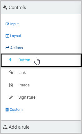
Click on Controls in the left-hand pane, and, from the four categories of Controls (Input, Layout, Actions and Custom), click on Actions.
-
Select Button from the four types of Action fields: Button, Link, Image and Signature:
-
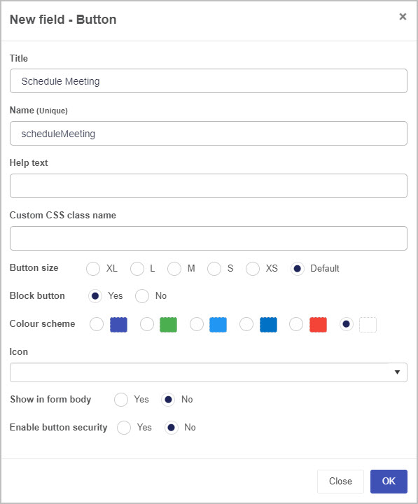
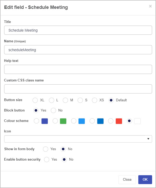
A New field - Button dialog box will automatically open, giving you options for your new Button field:
-
Title - You can change the name of the Button from the default ‘Button 1’.
-
Name (Unique) - This is a unique name for the Button and inherits a camel case version of the entered Title.
-
Help text - You can insert text to help the form user. If you add help text, a question mark
 icon will appear next to the field title and, if the user clicks on this, they will see the help text you have inserted.
 -
Custom CSS class name - You can type the name of a CSS class to allow the Button to inherit specific styles defined in the Global CSS file.
-
Button size - You can choose the size of the Button ranging from XL (extra large) to XS (extra small). By default, the Button size is medium.
-
Block button - If you choose Yes, the button will span the entire width of the button’s allocated space. If you choose No, an additional field called Align button will appear that allows you to select what direction the Button aligns to. By default, the Button is aligned to the center.

-
Color scheme - You can choose a colour for your new Button field from six options.
-
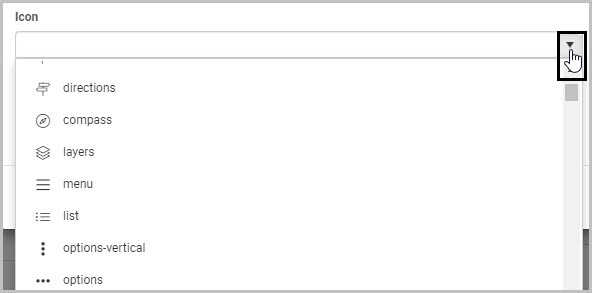
Icon - You can choose an icon to appear on your Button by clicking on the down arrow to the right and scrolling to select the icon you want to use (or can opt not to add an icon).
-
Show in form body - Select Yes if you want your Button to be shown in the Form.
-
Enable button security - Select Yes if you want to limit who can see the Button you are adding to the form.
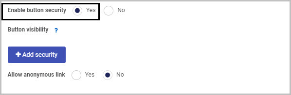
If you select Yes, two additional options are displayed: Add security and Allow anonymous link.
When you click on Add security, a new line appears with the options Field security and Select user(s) or groups:
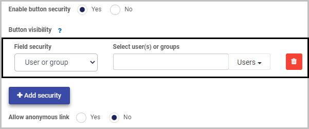
In Field security, you can choose from three options in terms of who will be able to view the Button you are inserting:
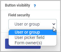
(i) If you choose to limit the Button visibility to a ‘User or group’, you can then select the user(s) or groups you want to be able to see the Button in the ‘Select user(s) or groups’ box.
(ii) If you choose to limit the Button visibility to a ‘User picker field’, you then select the User picker field in the ‘Select a userpicker field’ box:
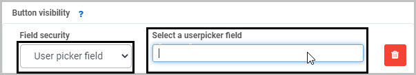
This will limit the visibility of the Button to the user(s) selected in that User picker field.
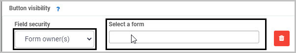
(iii) If you choose to limit the Button visibility to ‘Form owner(s)’, you then select the form in the ‘Select a form’ box - only the owner(s) of the selected form will be able to view the new Button you are inserting:
The second main option in terms of Button security is ‘Allow anonymous link’:
-
If you choose Yes, this will mean that the Button field will be visible when the form is accessed via an anonymous link.
-
If you choose No, anyone accessing the form from an anonymous link will not be able to see the Button field.
Anonymous links can be useful if, for example, you want members of the public to complete your form without needing to log into Kianda. To learn more about how you can create anonymous links to a form that can be shared with external users, see Anonymous form link.
-
-
Once you complete the New field - Button dialog box, click OK and the new Button field is added to your form.
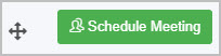
In our example, if we changed the Button field title to ‘Schedule Meeting’ and chose a green colour scheme and ‘people’ icon, set button size to small and aligned the button to the right, our new Button could look like this when added to our ‘Performance Plan’ form:
-
You may then decide to add rules to your new Button field - to learn more, go to Rules. The rules we add will be executed in the order in which they are listed under Rules in the right hand pane.
For example, we could add a series of rules to our new Schedule Meeting button:
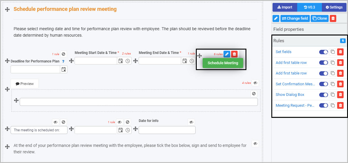
In our example, the sixth rule is a Meeting Request rule which will mean that, once the Schedule Meeting button is clicked, an automated email will be sent to the employee scheduling a performance review meeting - to learn more, go to Meeting request rule.
How to edit, move and delete Button fields
To edit a Button field:
-
Select the Button field (by either clicking on the field name or on the field’s drag handle button
 ).
). -
Click on the Edit Field button (Pen icon)
. -
The Edit Field dialog box will open (with the Button title you chose reflected in the dialog box name), enabling you to choose from the same range of options as appear in the New field - Button dialog box (as already discussed in How to get started).
To move a Button, simply:
-
Select the Button’s Drag handle button
. -
Drag and drop the Button wherever you want to move it within your form.
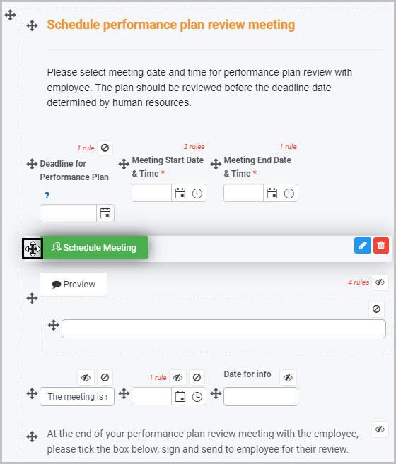
For example, the ‘Schedule Meeting’ Button could be moved from where it was automatically added at the bottom of the panel to the location where we want it to go:
To delete a Button from your form:
- Select the Button (by either clicking on the Button’s title or its drag handle button ).
- Click on the Bin/Trash button
 .
. - Click on OK to confirm.
How to view and edit Button field properties
To view or edit a Button’s Field properties:
-
Select the Button field (by either clicking on the field title or on the field’s drag handle button
). -
The Field Properties associated with the Button field will be displayed (and can be changed) in the Field properties menu to the right.
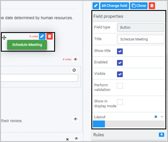
For example, the Field Properties associated with a Button field titled ‘Schedule Meeting’ are shown here and include:
- Field type - The type of field, in this case a Button.
- Title - The Title of the field, in this case ‘Schedule Meeting’.
- Show title - If this is selected, the Button field title will be shown in the form.
- Required - If this is selected, the Button will be mandatory for the form user.
- Enabled - If this is selected, the user will be able to edit or interact with the field.
- Visible - If this is selected, the Button will be visible in the form.
- Layout - The width of the blue bar can be adjusted to change the width of the Button as it appears on a PC or mobile phone (to view the Mobile layout, click on the expand button
 to the right).
For more details, go to Field Properties.
Saving changes and version history
Make sure to save any changes you make by clicking on the Save button  . You will always have the option to revert back to previous versions of your form by clicking the Design Version History
  button in the top right corner.
What’s next 
Now that you’ve learned about Button controls, find out more about the other types of Action fields you can add to Kianda forms:
Feedback
Was this page helpful?
Glad to hear it! Please tell us how we can improve.
Sorry to hear that. Please tell us how we can improve.