Input controls
Input fields are one category of controls and include the most common data fields used to obtain user input - for example text boxes, lists and tables.
Getting started with Input controls
To start adding Input controls (fields) to your Kianda forms:
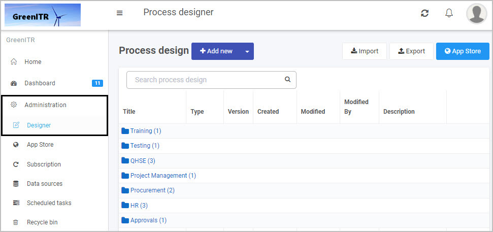
- First, either open an existing process or create a new process by going to Administration > Designer in the left side menu. See Create First Process to learn how to create your first process.
- Once you have opened your process, select the form you want to work on (so that the Edit Form button
 is shown).
 - Click on Controls in the left-hand pane so the Controls menu expands to show the four categories of Controls (fields): Input, Layout, Actions and Custom.
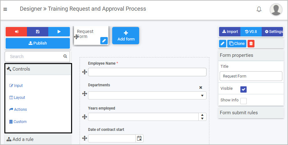
- Select Input to view the eight types of Input fields:
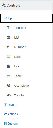
The eight types of input fields are:
- Text box - A text box field is a section in your form where users can enter text, for example, an Address field. See Text box control for more information.
- List - A list field lists information, for example from a SharePoint data source. This is particularly useful for drop-down menus, when you want a user to fill out a form and choose an item from a list. See List control for more information.
- Number - A number field provides an input box that only allows numeric input, such as currencies or percentages. See Number control for more information.
- Date - A date field provides a date and time picker that allows users to input both date and time. See Date control for more information.
- File - A file field allows users to upload multiple files. Uploaded files are stored within the configured data structures or folders. See File upload control for more information.
- Table - A table field creates a table for input in a form. This table can be filled by the user, or autofilled as part of a rule. See Table control for more information.
- User picker - A user picker field allows users to choose from a list of users. This can be a preconfigured group (like HR Managers) or a list of users - see User picker control for more information.
- Toggle - A toggle field can be used as a toggle or checkbox that allows users to turn on/off components of the form. See Toggle control for more information.
How to add, edit, move and delete Input fields
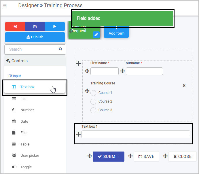
To insert an Input field into your form click on the field type you want to add from the Input menu.
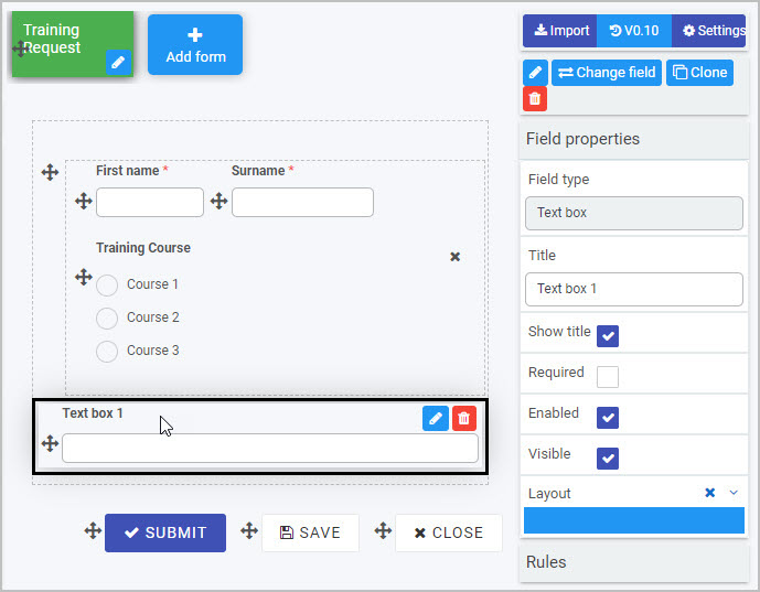
For example, to add a new text box field, click on Text box - a pop-up message will appear saying ‘Field added’ and a new text box with the default name Text box 1 will be added to your form.
To edit whatever type of input field you have added to your form:
- Select the field (by either clicking on the field name or on the Drag handle button
 )
) - Then click on the Edit Field button (Pen icon) .
- The Edit Field dialog box will automatically open, providing you with a variety of options for editing the field - such as changing the Title of the field - depending on the type of Input field you are working with.
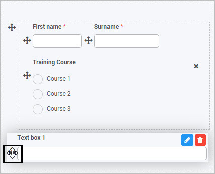
To move an Input field, simply
- Select the field’s Drag handle button
- Drag and drop the field wherever you want to move it within your form. This example shows how you could move a Text box field in a form:
To delete an Input field from your form:
- Select the field (by either clicking on the field’s name or its Drag handle button )
- Click on the Bin/Trash button

- Click on OK to confirm.
You can also view and edit an input field’s Field Properties by selecting the field - for more details, see Field Properties.
Saving changes and version history
Make sure to save any changes you make by clicking on the Save button  . You will always have the option to revert back to previous versions of your form by clicking the Design Version History
  button in the top right corner.
What’s next 
We have briefly introduced each of the eight types of Input controls. Now let’s look at each of these types of input fields in more detail:
Feedback
Was this page helpful?
Glad to hear it! Please tell us how we can improve.
Sorry to hear that. Please tell us how we can improve.