Date control
Date controls or Date fields can be inserted in a form when you want a user to be able to input a date and time by using a date and time picker.
For example, in a Training Request form, you may want the user to select the date and time of the training course they want to attend.
How to get started
-
To add a Date field to a form, first open the relevant process.
-
Then select the form within that process that you want to add the field to (so that the Edit Form button
 is visible).
 -
Click on Controls in the left-hand pane to expand the Controls menu.
-
Select Input to view the range of Input controls and click on Date.
A date field will be added to your form with the default title of ‘Date 1’ and a pop-up message will say ‘Field added’.
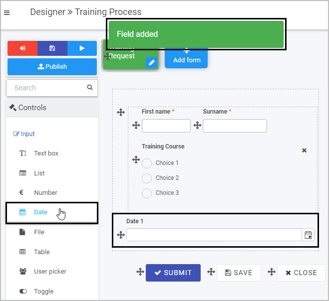
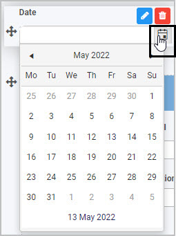
The Date field has a small calendar icon on the right hand side - when the user clicks on this icon a calendar is displayed, allowing them to select a date.
How to edit, move and delete Date fields
To edit a Date field:
-
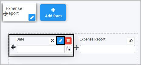
Select the field (by either clicking on the field title or on the field’s Drag handle button
 ).
). -
Click on the Edit field button (Pen icon)
.
-
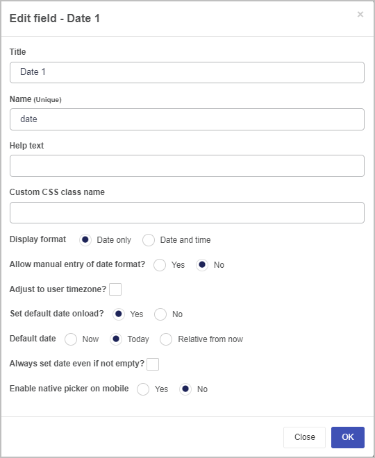
The Edit field dialog box will open, enabling you to choose from a range of options.
-
Title - you can change the title of the date field.
-
Name - This is a unique name for the field and inherits a camel case version of the entered Title.
-
Help text - you can insert help text a user can view when completing the date field. If you add help text, a question mark
 icon will appear next to the field title and, if the user clicks on this, they will see the help text you have inserted.
 -
Custom CSS class name - You can type the name of a CSS class to allow the Date to inherit specific styles defined in the Global CSS file.
-
Display format - you can choose whether the date field shows the date only or the date and time.
-
Allow manual entry of date format? - choosing yes will allow you to manually type in the date into the field, whereas choosing no will only allow you to utilise the date drop-down feature.
-
Adjust to user timezone - you can select this if you want the date field to adjust to the time zone of the form user.
-
Set default date onload - if you choose ‘Yes’, this means that the date field will automatically be populated (with a date stamp) when a user opens the form to start completing it; by default, the date that will be inserted is today’s date. If you choose ‘No’, then the user will need to manually complete the date field.
If you choose ‘Yes’, two additional options then appear in the dialog box:
-
Default date - this is where you can choose the default date that will be automatically inserted in the form when a user opens it. You can choose from ‘Now’, ‘Today’ (which inserts today’s date and a time of 00:00 midnight) or ‘Relative from now’ (you can insert the date you want to use, in terms of the number of days, hours and minutes from now).
-
Always set date even if not empty - if you select this option, this means that the default date you’ve chosen to be automatically inserted when a user opens the form will be updated/changed each time the user goes into the form. In other words, the initial date that was inserted when the form was first opened will be replaced/updated when the user goes back into the form. If you want the date field to retain the initial date the user started to complete the form, do not tick this checkbox.
-
Enable native picker on mobile - you can choose to allow users who are completing the date field on a mobile phone to use the default pop-up date picker associated with their mobile phone.
-
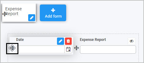
To move a Date field, simply
-
Select the field’s Drag handle button
. -
Drag and drop the field wherever you want to move it to within your form.
To delete a Date field from your form:
- Select the field (by either clicking on the field’s name or its Drag handle button ).
- Click on the Bin/Trash button
 .
. - Click on OK to confirm.
How to edit Date field properties
To view or edit the field properties associated with a Date field, select the field (by clicking on the field title or field drag handle button ) - the Field properties menu will appear in the right-hand pane.
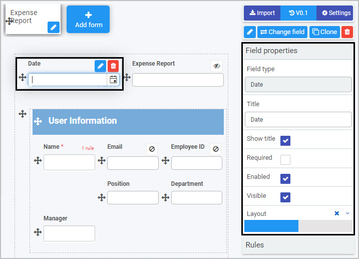
For example, the Field Properties associated with a Date field titled ‘Date’ are shown here and include:
- Field type - The type of field, in this case a Date field.
- Title - The Title of the field, in this case ‘Date’.
- Show title - If this is selected, the Date field title will be shown in the form.
- Required - If this is selected, the Date field will be mandatory for the form user.
- Enabled - If this is selected, the user will be able to edit or interact with the field.
- Visible - If this is selected, the Date field will be visible in the form.
- Layout - The width of the blue bar can be adjusted to change the width of the Date field as it appears on a PC or mobile phone (to view the Mobile layout, click on the expand button
 to the right).
To learn more about the different options within the Field properties menu, go to Field Properties.
Saving changes and version history
Make sure to save any changes you make by clicking on the Save button  . You will always have the option to revert back to previous versions of your form by clicking the Design Version History
  button in the top right corner.
What’s next 
Now that you’ve learned about Date controls, find out more about the other types of Input fields you can add to a Kianda process:
- File upload control
- List control
- Number control
- Table control
- Text box control
- Toggle control
- User picker control
Feedback
Was this page helpful?
Glad to hear it! Please tell us how we can improve.
Sorry to hear that. Please tell us how we can improve.