List control
List fields (controls) can be manually entered into a form or can be linked to from an external site like SharePoint. There are different display options - from drop-down lists to checklists - as well as other options (like the ability to make a list field mandatory for a user to complete).
For example, you could insert a list field in your form that will show a drop-down list of Types of Training that is maintained on SharePoint. The advantage of linking to an external data source like this is that your list will stay up-to-date with any changes made to the list on SharePoint.
How to get started
-
To add a List field to a form, first open the relevant process.
-
Select the form within that process that you want to add the field to (so that the Edit Form button
 is visible). If you want to add the List field to a panel within your form, first select the panel by clicking on it and then add the List field.
 -
Click on Controls in the left-hand pane to expand the Controls menu.
-
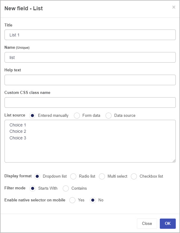
Select Input to view the range of Input controls and click on List. A New field - List dialog box will open with a range of options you can choose from for your new List field.
-
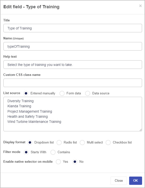
Title - You can change the name of the List field from the default title List 1. For example, if you are working on a Training Request form, you may want to insert a List field to contain the types of training and may choose to title this ‘Type of Training’.
-
Name - This is a unique name for the field and inherits a camel case version of the entered Title.
-
Help text - You can insert text to help the form user to complete the List field. If you add help text, a question mark
 icon will appear next to the field title and, if the user clicks on this, they will see the help text you have inserted. In this example, the list field is titled ‘Type of Training’ and has associated help text:
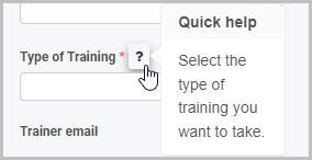
-
Custom CSS class name - You can type the name of a CSS class to allow the List to inherit specific styles defined in the Global CSS file.
-
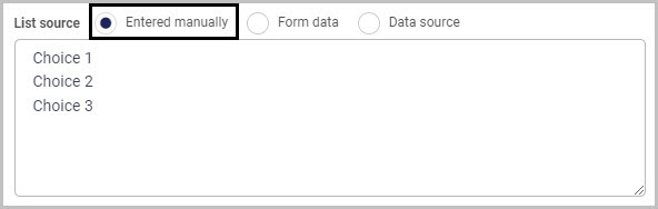
List source - You have three main options in terms of the source of the choices that will appear in your List field:
a) Entered manually
b) Form data
c) Data source
We will look at each of these three list source options in turn.
If you select the Entered manually checkbox, you must then manually type the choices you want to appear in your list into the List source box. Three default choices are shown - simply replace these with the choices you want to appear in your list (keeping the same format of one choice per line). You can insert more than three choices.
If you select the Form data checkbox (so the source of your list options is a form field), then the box under List source will now show the instruction ‘Select a form field…’ and two further options will appear below this - Display field and Value field.
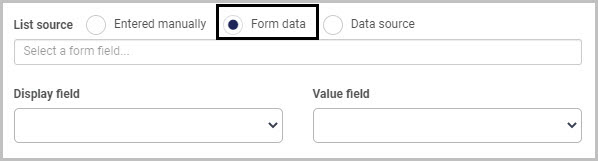
Click into the List source box and select the form field you wish to use as your List source and then choose a Display field (the field used to display values) and Value field to specify how you want to map the values from your data source into your list field.
Select the Data source checkbox if you want to use an external data source as the source for the choices to appear in your list:
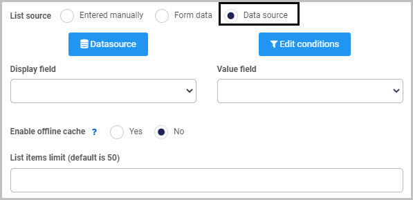
Then click on the Datasource button
 to open the Select datasource dialog box and choose the data source you want to connect to - for example, SharePoint. From there you can drill down into the datasource tree and select a specific data item to pull into the list. For more information on how to connect to data sources in Kianda, go to Data connectors.
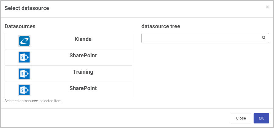
Once you’ve selected a data source, click OK - a range of new options will now be shown below the Datasource button in the New field - List dialog box.
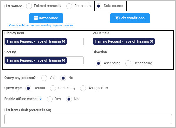
Select the Display field, Value field and a field to Sort by (the ‘Sort by’ option appears once you’ve selected a data source). As the datasource chosen in the example is a Kianda process, the fields will appear as form fields. Once you’ve chosen a field to sort by, an additional option - Direction - appears, enabling you to choose to sort values in Ascending or Descending order. In the example shown here, Kianda has been chosen as the data source and a field titled ‘Type of Training’ from a form called ‘Training Request’ has been chosen as both the Display field and Value field.
Click on the Edit conditions button if you want to add a condition to your List field - for example, if you want to create a cascading list where the options available in a second list are dependent upon the option the user has chosen from a first list. To learn more about applying conditions, go to Conditions and to find out more about creating cascading lists, watch the video on How to create cascading dropdown lists.
If you choose Kianda as the data source for your list field, two additional options will be displayed - Query any process (checks all processes within Kianda for the field you have selected as the source for your list) and Query type (you can select anything created by or assigned to a particular user).
Once you’ve selected your List source and the various options associated with it, complete the remaining options in the New field - List dialog box:
-
Enable offline cache - You can choose this option to make list data available when offline (only available for lists with less than 500 options). This can be useful if you know you are going to be working in areas with poor connectivity such as remote environments with known dead zones.
-
Display format - You can choose to have your list field appear as either a Drop-down list, a Radio list, Multi-select or a Checkbox list.
By default, the Dropdown list radio button is selected, along with two additional options - Filter mode (you can choose either ‘Starts With’ or ‘Contains’) and Enable native selector on mobile (so a user completing the list field on their mobile phone can use the default list selector on it).
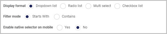
If you choose Radio list or Checkbox list you can choose a List display position of either Vertical or Horizontal.
-
Once you complete the New field - List dialog box and click OK button, a new List field is added to your form, with the name you inserted as the Title in the dialog box (by default, the title is List 1 unless you change it).
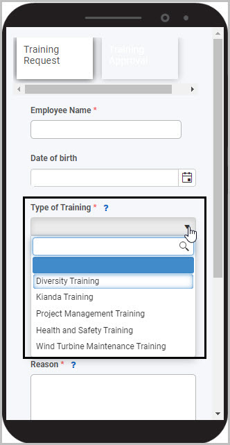
If we take the example of a Training Request form with a list field that contains the different types of training a user can request, the list field (which is titled ‘Type of Training’ and has a drop-down list format) could look like this when a user views it on their mobile phone:
To see how your form or field will look like on a mobile, view it in Mobile preview by clicking the Preview button  (play icon) after first saving your changes.
How to edit, move and delete File upload fields
To edit a List field:
- Select the field (by either clicking on the field title or on the field’s Drag handle button
 ).
). - Click on the Edit field button (Pen icon) .
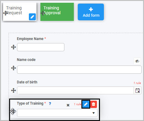
The Edit field - List dialog box will open, enabling you to choose from the same range of options as appear in the New field - List dialog box (as already discussed in How to get started).
You can make any changes you wish in this dialog box and then click OK to confirm.
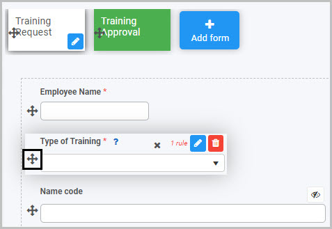
To move a List field, simply
- Select the field’s drag handle button .
- Drag and drop the field wherever you want to move it to within your form.
To delete a List field from your form:
- Select the field (by either clicking on the field’s name or its drag handle button ).
- Click on the Bin/Trash button
 .
. - Click on OK to confirm.
How to edit List field properties
To view or edit the field properties associated with a List field, select the field (by clicking on the field title or field drag handle button ) - the Field properties menu will appear in the right-hand pane.
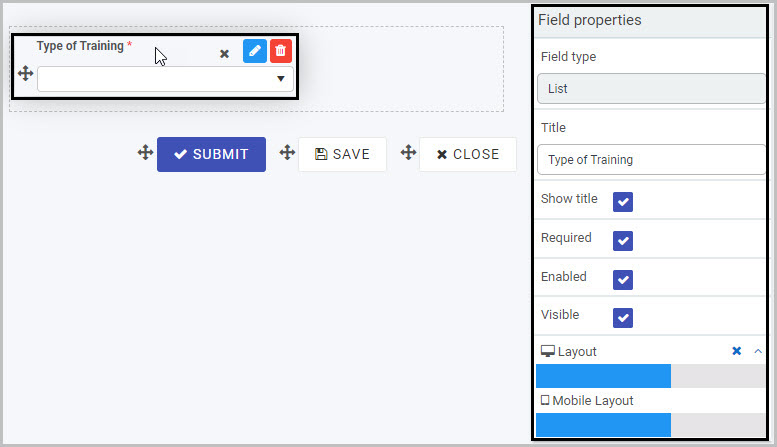
For example, the Field Properties associated with a List field titled ‘Type of Training’ are shown here and include:
- Field type - The type of field, in this case a List field.
- Title - The Title of the field, in this case ‘Type of Training’.
- Show title - If this is selected, the List field title will be shown in the form.
- Required - If this is selected, the List field will be mandatory for the form user.
- Enabled - If this is selected, the user will be able to edit or interact with the field.
- Visible - If this is selected, the List field will be visible in the form.
- Layout - The width of the blue bar can be adjusted to change the width of the List field as it appears on a PC or mobile phone (to view the Mobile layout, click on the expand button
 to the right).
To learn more about the different options within the Field properties menu, go to Field Properties.
Saving changes and version history
Make sure to save any changes you make by clicking on the Save button  . You will always have the option to revert back to previous versions of your form by clicking the Design Version History
  button in the top right corner.
What’s next 
Now that you’ve learned about List controls, find out more about the other types of Input fields you can add to a Kianda process:
- Date control
- File upload control
- Number control
- Table control
- Text box control
- Toggle control
- User picker control
Feedback
Was this page helpful?
Glad to hear it! Please tell us how we can improve.
Sorry to hear that. Please tell us how we can improve.