Number control
Number controls (fields) can be inserted in a form if you want form users to insert a numerical value. Number fields can be formatted to be integers (whole numbers), currency or percentages.
For example, in a Purchase Order Request form, you may want to use Number fields to allow the user to insert the number, unit price and total cost of items being ordered and you may apply rules to some of those fields so that they perform calculations or pull values from other fields or forms. Go to Rules and Expression builder for more information on how you make your forms dynamic.
How to get started
-
To add a Number field to a form, first open the relevant process.
-
Then select the form within that process that you want to add the field to (so that the Edit Form button
 is visible).
 -
Click on Controls in the left-hand pane to expand the Controls menu.
-
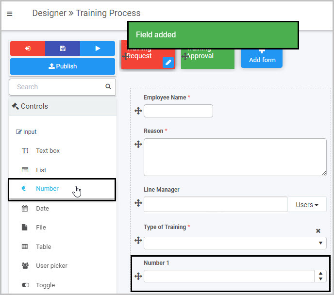
Select Input to view the range of Input controls and click on Number.
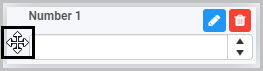
A number field will be added to your form with the default title of ‘’Number 1’’ and a pop-up message will say ‘Field added’.
By default, the new Number field will have up and down arrow buttons
 at the right that users can click to increase or decrease the number in the field and will show any numbers entered to two decimal places. These settings can be amended by editing the field.
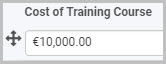
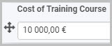
In the example shown here, a new Number field has been added to form called ‘Training Request’. This new Number field could be edited to rename it ‘Cost of Training Course’ and could be formatted as currency (Euro) so that users could insert the cost of the training course they want to take.
How to edit, move and delete Number fields
To edit a Number field:
-
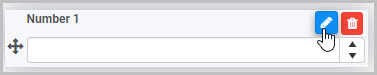
Select the field (by either clicking on the field title or on the field’s Drag handle button
 ).
). -
Click on the Edit field button (Pen icon)
.
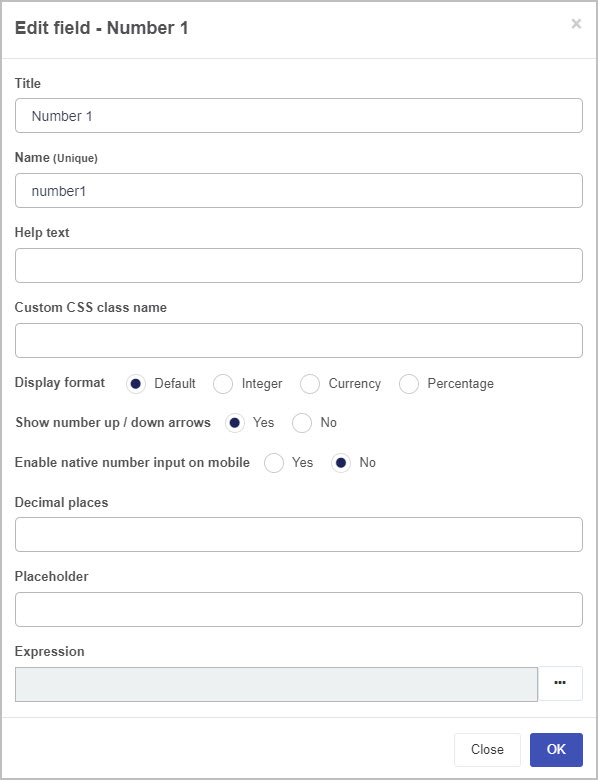
The Edit field - Number dialog box will open, enabling you to choose from a range of options:
-
Title - you can change the title of the Number field from the default ‘Number 1’.
-
Name - This is a unique name for the field and inherits a camel case version of the entered Title.
-
Help text - you can insert text to help the form user to complete the Number field. If you add help text, a question mark
 icon will appear next to the field title and, if the user clicks on this, they will see the help text you have inserted.
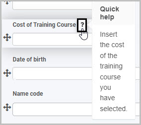
-
Custom CSS class name - You can type the name of a CSS class to allow the Number to inherit specific styles defined in the Global CSS file.
-
Display format - you can choose whether the number inserted by the user is formatted to be an integer (whole number), currency or a percentage.
If you select Currency as the Display format, a new option will appear - Currency format - where you can select the currency you want to use.
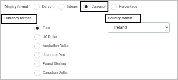
If you select Euro as the Currency format, a new format option called Country format appears to the right. This is a drop-down list from which you can choose from three different ways that Euro amounts can be displayed:
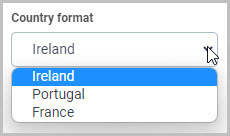
If you choose Ireland as the Country format, Euro amounts will be displayed like this:
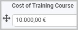
If you choose Portugal as the Country format, Euro amounts will be displayed like this:
If you choose France as the Country format, Euro amounts will be displayed like this:
-
Show number up/down arrows - you can choose whether or not you want the Number field to have up/down arrow buttons
that enable the user to increase or decrease the number in the field. -
Enable native number input on mobile - you can select this to enable native number input when a user is completing the Number field on their mobile phone.
-
Decimal places - you can insert the number of decimal places you want the figure in the Number field to have.
-
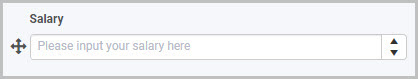
Placeholder - you can insert placeholder text to appear in the Number field to assist the user. For example, this Number field titled ‘Salary’ has placeholder text:
-
Expression - you can add an expression to your Number field if, for example, you want the field to contain a calculation based on another field or want it to pull values from other fields. To add an expression, click on the expression button (ellipsis)
 to open the Expression builder dialog box - here you can add expressions to perform math operations and various other actions.
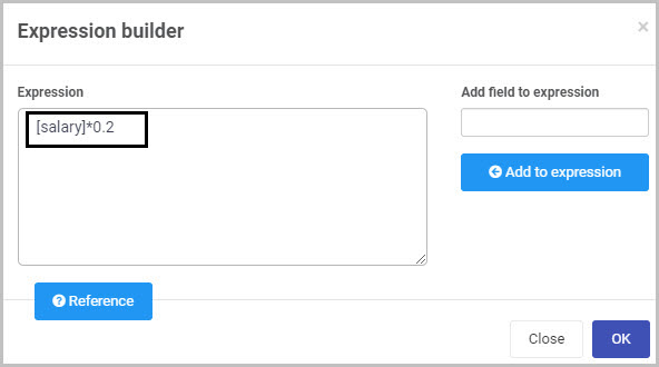
For example, let’s say you have a Number field called ‘Salary’ where the user inputs their salary and another Number field called ‘Bonus’ which you want to be automatically populated with a figure that is 20% of the ‘Salary’ figure. To do this, you add an Expression to the ‘Bonus’ field:
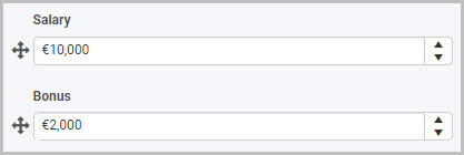
Now when a user completes the ‘Salary’ field, the Bonus field automatically populates with a figure that is 20% of their salary:
To learn more about applying rules and expressions to Number fields, go to Rules and Expression builder.
-
Make whatever changes you want in this Edit field - Number dialog box and then click OK to confirm.
To move a Number field:
- Select the field’s Drag handle button .
- Drag and drop the field wherever you want to move it to within your form.
To delete a Number field from your form:
- Select the field (by either clicking on the field’s name or its drag handle button ).
- Click on the Bin/Trash button
 .
. - Click on OK to confirm.
How to edit Number field properties
To view or edit the field properties associated with a Number field, select the field (by clicking on the field title or field drag handle button ) - the Field properties menu will appear in the right-hand pane.
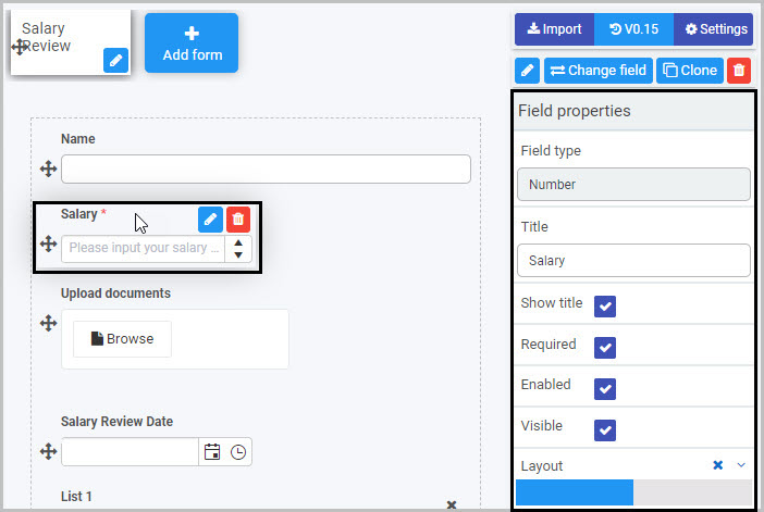
For example, the Field Properties associated with a Number field titled ‘Salary’ are shown here and include:
- Field type - The type of field, in this case a Number field.
- Title - The Title of the field, in this case ‘Salary’.
- Show title - If this is selected, the Number field title will be shown in the form.
- Required - If this is selected, the Number field will be mandatory for the form user.
- Enabled - If this is selected, the user will be able to edit or interact with the field.
- Visible - If this is selected, the Number field will be visible in the form.
- Layout - The width of the blue bar can be adjusted to change the width of the Number field as it appears on a PC or mobile phone (to view the Mobile layout, click on the expand button
 to the right).
To learn more about the different options within the Field properties menu, go to Field Properties.
Saving changes and version history
Make sure to save any changes you make by clicking on the Save button  . You will always have the option to revert back to previous versions of your form by clicking the Design Version History
  button in the top right corner.
What’s next 
Now that you’ve learned about the Number control, find out more about the other types of Input fields you can add to a Kianda process:
- Date control
- File upload control
- List control
- Table control
- Text box control
- Toggle control
- User picker control
Feedback
Was this page helpful?
Glad to hear it! Please tell us how we can improve.
Sorry to hear that. Please tell us how we can improve.