Text box control
The Text box control can be used if you want a user to manually input text into a form. For example, in a Training Request form, you may want the user to insert their first name and surname and may want those fields to be mandatory for the user to complete.
There are various options available when creating a Text box field, such as formatting it to allow multiple lines of text, to contain a password (text input is not shown) or to autofill with saved information such as the user’s address or email. More advanced options include applying a rule or expression to a Text box field - for more information, see Rules and Expression builder.
How to get started
-
To add a Text box field to a form, first open the relevant process.
-
Then select the form within that process that you want to add the field to (so that the Edit Form button
 is visible).
 -
Click on Controls in the left-hand pane to expand the Controls menu.
-
Select Input to view the range of Input controls and click on Text box.
A Text box field will be added to your form with the default title of ‘’Text box 1’’ and a pop-up message will say ‘Field added’.
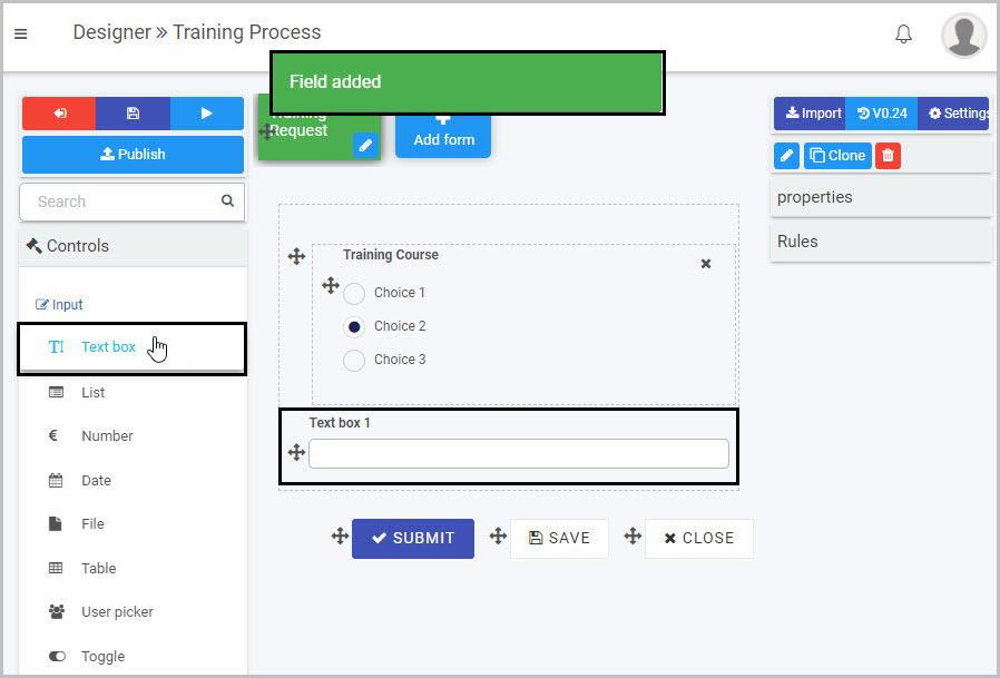
In the example shown here, a Text box field has been added to a form called ‘Training Request’ in a process called ‘Training Process’, as the first step in adding two Text box fields (which will be used to capture the first name and surname of the user who is completing the form).
You can also place a Text box within an element - such as within a panel in a form. In the example above, the Text box was inserted outside the panel in the form. If you wanted to insert it within the panel, simply select the panel itself by clicking on its drag handle
 and then click on Controls > Input > Text box - this will result in the new Text box being added inside the panel, as shown here:
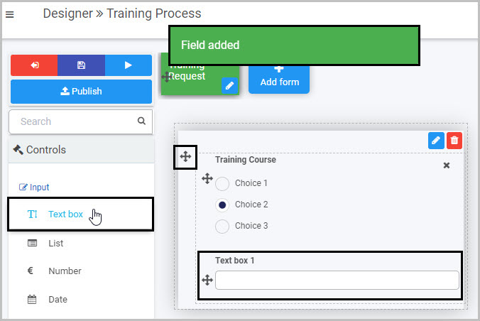
How to edit, move and delete Text box fields
As we go through the options available for editing a Text box, we will keep in mind the example of adding two text boxes to the ‘Training Request’ form to capture a user’s first name and surname.
How to edit a Text box field
To edit a Text box field:
-
Select the Text box (by either clicking on its title or its Drag handle button
). -
Click on the Edit field button (Pen icon)
.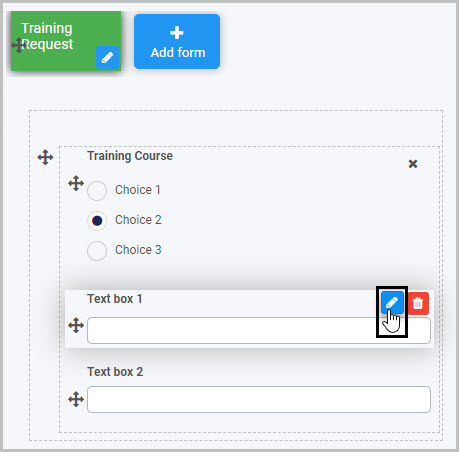
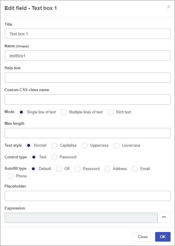
The Edit field - Text box dialog box will open, enabling you to choose from a range of options:
-
Title - you can change the title of the Text box from the default ‘Text box 1’. In our example, we could change the name of the first Text box to ‘First Name’ and the second Text box to ‘Surname’.
-
Name - This is a unique name for the field and inherits a camel case version of the entered Title.
-
Help text - you can insert text to help the form user to complete the Table. If you add help text, a question mark
 icon will appear next to the field title and, if the user clicks on this, they will see the help text you have inserted.
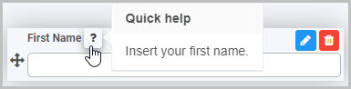
-
Custom CSS class name - You can type the name of a CSS class to allow the Textbox to inherit specific styles defined in the Global CSS file.
-
Mode - you can decide whether your Text box is limited to a Single line of text or will allow for Multiple lines of text or can choose Rich text. Different additional options will then be shown, depending on the Mode you have chosen.
If you choose ‘Single line of text’ as the Mode for your Text box - as in the example shown above - these additional options will be shown:
-
Max length - choose the maximum number of characters for the text inserted in your Text box by either typing in a number or by clicking the up/down arrow buttons
 at the right side of the blank field beneath it
 -
Text style - choose Normal, Capitalise, Uppercase or Lowercase, depending on how you want the text input in the Text box to appear
-
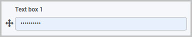
Control type - choose either Text or Password. If you choose Password, then the text input by the user in the Text box will not be visible:
-
Autofill type - you can choose between Default, Off, Password, Address, Email and Phone. If, for example, you select Address, this means that when the user is completing this Text box field, it will automatically populate with the user’s saved address information (if the user has that saved information on their PC or mobile phone).
-
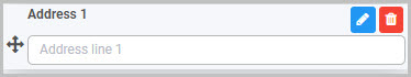
Placeholder - you can insert placeholder text to appear in the Text box field to assist the user. For example, this Text box field titled ‘Address 1’ has placeholder text:
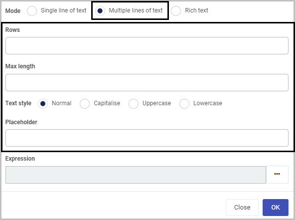
If you choose ‘Multiple lines of text’ as the Mode for your Text box, these additional options will be shown:
-
Rows - you can decide how many rows of text you want your Text box to have. Either manually type in a number or use the up/down arrows
on the right-side of the field -
Max length - you can set a maximum number of characters for the Text box
-
Text style - choose from Normal, Capitalise, Uppercase or Lowercase
-
Placeholder - you can insert placeholder text to appear in the Text box field to assist the user.
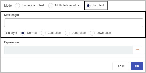
If you choose ‘Rich text’ as the Mode for your Text box, you will have the additional options of setting a Max length (maximum number of characters that can be input in the field) and choosing a Text style, as shown here:
-
-
Expression - If you want to use your Text box field in a way that is more dynamic, you could decide to add an expression to it. For example, an Expression can be used to return a value - if you apply the Expression ‘Date()’ to your Text box field, it will return the current date and time.
To add an Expression to your Text box field, click on the ellipsis button
 to the right. This will open the Expression builder dialog box:
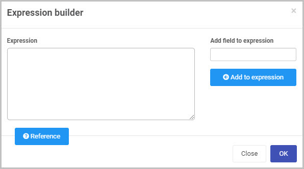
You can click on the Reference button
 to see some of the most commonly used Expressions. To learn more about using Expressions, go to Expression builder.
 -
Make whatever changes you want to make to the Text box field in the Edit field - Text box dialog box and then click OK to confirm.
How to move Text box fields
To move a Text box within your form:
-
Select the field’s Drag handle button
. -
Drag and drop the field wherever you want to move it to.
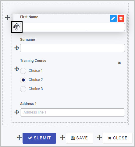
In our example, the two new Text boxes titled ‘First Name’ and ‘Surname’ can be moved from the bottom of the form to the top:
How to delete Text box fields
To delete a Text box field from your form:
- Select the field (by either clicking on the field’s name or its Drag handle button ).
- Click on the Bin/Trash button
 .
. - Click on OK to confirm (or click on Cancel if you wish to cancel the deletion).
How to edit Text box field properties
To view or edit the field properties associated with a Text box field, select the field (by clicking on its title or its drag handle button ) - the Field properties menu will appear in the right-hand pane.
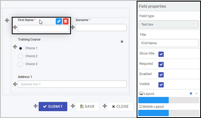
For example, the Field Properties associated with a Text box field titled ‘First Name’ are shown here and include:
-
Field type - The type of field, in this case a Text box field.
-
Title - The Title of the field, in this case ‘First Name’.
-
Show title - If this is selected, the Text box field title will be shown in the form.
-
Required - If this is selected, the Text box field will be a mandatory field that users must complete (denoted by a red asterisk next to the field title).
-
Enabled - If this is selected, the user will be able to edit or interact with the field.
-
Visible - If this is selected, the Text box field will be visible in the form.
-
Layout - The width of the blue bar can be adjusted to change the width of the Text box field as it appears on a PC or mobile phone (to view the Mobile layout, click on the expand button
 to the right).
To learn more about the different options within the Field properties menu, go to Field Properties.
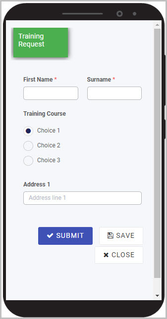
You can check how the Text box will appear to users on their PC or mobile phone by first saving your form and then clicking on the Preview button  . Our simple example of the ‘First Name’ and ‘Surname’ fields in a Training Request form could look like this when viewed on a user’s mobile phone:
Saving changes and version history
Make sure to save any changes you make by clicking on the Save button  . You will always have the option to revert back to previous versions of your form by clicking the Design Version History
  button in the top right corner.
What’s next 
Now that you’ve learned about the Text box control, find out more about the other types of Input fields you can add to a Kianda process:
- Date control
- File upload control
- List control
- Number control
- Table control
- Toggle control
- User picker control
Feedback
Was this page helpful?
Glad to hear it! Please tell us how we can improve.
Sorry to hear that. Please tell us how we can improve.