Toggle control
Toggle fields (controls) can be used in a form to record a decision, confirm that an action has been taken or an item has been received, or to record a yes/no type answer. They can be used as either a toggle or as a checkbox - for example, Toggle fields could be used to create a series of checkboxes in an Onboarding Form to record whether a new employee has received required training, been assigned an employee number and so on.
Rules can be applied to Toggle fields to make your form more dynamic. One such rule, the Show, hide or disable rule can be applied to a Toggle field to have the effect of showing or hiding remaining options/sections in the form dependent on whether the toggle/checkbox is selected or not.
For example, in a Training Request form, a Toggle field could be used to record a manager’s decision to either approve or reject an employee’s training request - by applying the Show, hide or disable rule to this field, a different last section of the form will display based on the manager’s decision. If the manager select’s to approve the training, a sign-off button then appears; if the manager reject’s the request, a ‘Reason’ text box appears for them to insert their feedback. To learn more about applying rules to fields, see Rules and Expression builder. To find out more about this specific rule, go to Show, hide or disable.
How to get started
-
To add a Toggle field to a form, first open the relevant process.
-
Then select the form within that process that you want to add the field to (so that the Edit Form button
 is visible). If you want to add the Toggle field to a panel within your form, first select the panel by clicking on it and then add the Toggle field.
 -
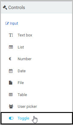
Insert the new Toggle field by clicking on Controls in the left-hand pane to expand the Controls menu, then select Input to view the range of Input controls and click on Toggle.
-
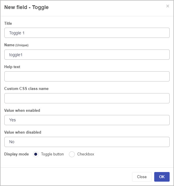
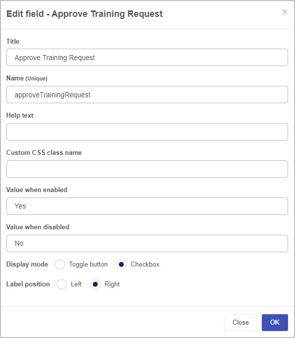
A New field - Toggle dialog box will open with a range of options you can choose from for your new Toggle field.
-
Title - You can change the name of the Toggle field from the default title Toggle 1.
-
Name - This is a unique name for the field and inherits a camel case version of the entered Title.
-
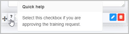
Help text - You can insert text to explain to the form user what selecting the toggle/checkbox means. If you add help text, a question mark
 icon will appear next to the field title and, if the user clicks on this, they will see the help text you have inserted. In this example, the Toggle field is titled ‘Approve Training’ and has associated help text:
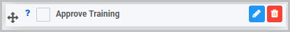
-
Custom CSS class name - You can type the name of a CSS class to allow the Toggle to inherit specific styles defined in the Global CSS file.
-
Value when enabled - You can set the value for when the user selects the toggle/checkbox. For example, the value when it is selected could be ‘Yes’.
-
Value when disabled - You can set the value for when the user does not select the toggle/checkbox. For example, the value when it is not selected could be ‘No’.
-
Display mode - You can choose to have the Toggle field display as either a Toggle button
 or Checkbox
  .
. -
Once you complete the New field - Toggle dialog box and click OK button, a new Toggle field is added to your form, with the name you inserted as the Title in the dialog box (by default, the title is Toggle 1 unless you change it).
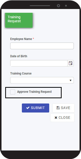
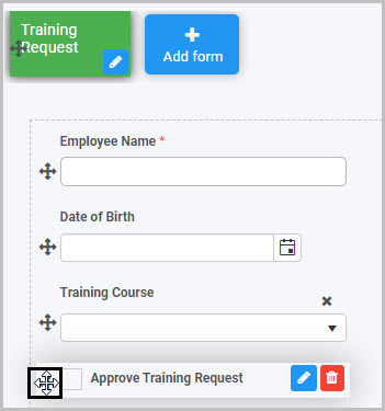
If we take the example of the Training Request form we already discussed, with a Toggle field called ‘Approve Training Request’ that is formatted to be a checkbox, the Toggle field could look like this when a user views it on their mobile phone:
To check how your form or field will look like on a mobile, view it in Mobile preview by clicking the Preview button  (play icon) after first saving your changes.
How to edit, move and delete Toggle fields
As we go through the options available for editing a Toggle field, we will keep in mind the example of the ‘Approve Training Request’ Toggle field in our Training Request form.
How to edit a Toggle field
To edit a Toggle field:
-
Select the field (by either clicking on the field title or on the field’s Drag handle button
 ).
). -
Click on the Edit field button (Pen icon)
.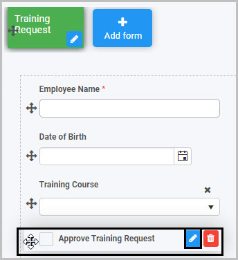
The Edit field - Toggle dialog box will open, enabling you to choose from the same range of options as appear in the New field - Toggle dialog box (as already discussed in How to get started).
-
You can make any changes you wish in this dialog box and then click OK to confirm.
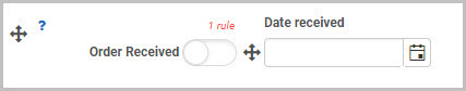
You can apply rules to a Toggle field to make it more dynamic so that, for example, it generates information that is automatically inserted into another field.
For example, you could apply a ‘Set date’ rule to your ‘’Order Received’ toggle field so that it generates a date to be displayed in a ‘Date received’ field when Order received is selected by the user - this will mean that when the user selects the Order Received toggle field, this automatically generates a date stamp for when the order was received:
To learn more about applying rules to fields, see Rules and Expression builder. To find out more about the specific rule added in our example - where a date is automatically populated in another field - go to Set form field.
How to move a Toggle field
To move a Toggle field:
- Simply select the field’s Drag handle button .
- Drag and drop the field wherever you want to move it to within your form.
How to delete a Toggle field
To delete a Toggle field from your form:
- Select the field (by either clicking on the field’s name or its Drag handle button ).
- Click on the Bin/Trash button
 .
. - Click on OK to confirm.
How to edit Toggle field properties
To view or edit the field properties associated with a Toggle field, select the field (by clicking on the field title or field drag handle button ) - the Field properties menu will appear in the right-hand pane.
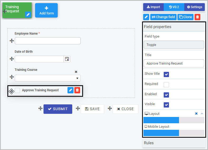
For example, the Field Properties associated with a Toggle field titled ‘Approve Training Request’ are shown here and include:
-
Field type - The type of field, in this case a Toggle field.
-
Title - The Title of the field, in this case ‘Approve Training Request’.
-
Show title - If this is selected, the Toggle field title will be shown in the form.
-
Required - If this is selected, the Toggle field will be a mandatory field that users must complete (denoted by a red asterix next to the field title).
-
Enabled - If this is selected, the user will be able to edit or interact with the field.
-
Visible - If this is selected, the Toggle field will be visible in the form.
-
Layout - The width of the blue bar can be adjusted to change the width of the Toggle field as it appears on a PC or mobile phone (to view the Mobile layout, click on the expand button
 to the right).
To learn more about the different options within the Field properties menu, go to Field Properties.
Saving changes and version history
Make sure to save any changes you make by clicking on the Save button  . You will always have the option to revert back to previous versions of your form by clicking the Design Version History
  button in the top right corner.
What’s next 
Now that you’ve learned about Toggle controls, find out more about the other types of Input fields you can add to a Kianda process:
- Date control
- File upload control
- List control
- Number control
- Table control
- Text box control
- User picker control
Feedback
Was this page helpful?
Glad to hear it! Please tell us how we can improve.
Sorry to hear that. Please tell us how we can improve.