User picker control
The User picker field can be used in a form if you want the form user to select a user, multiple users or a group of users. You can format the User picker field so that, for example, the form user can choose any user, can only choose a user or users from a pre-configured group - for example, users in the HR Department - or can choose multiple users.
You can pre-define Groups on Kianda by using the Users function under Kianda Administration. To learn more about how you can set up and manage Groups, go to Users & Groups.
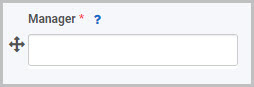
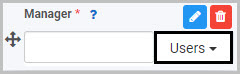
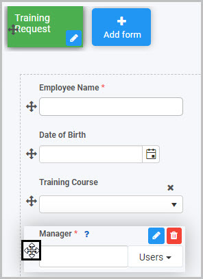
For example, in a ‘Training Request’ form, you may insert a User picker field titled ‘Manager’ so that the user can select their manager (who will subsequently need to approve or reject their training request once it has been submitted).
How to get started
-
To add a User picker field to a form, first open the relevant process.
-
Then select the form within that process that you want to add the field to (so that the Edit Form button
 is visible).
 -
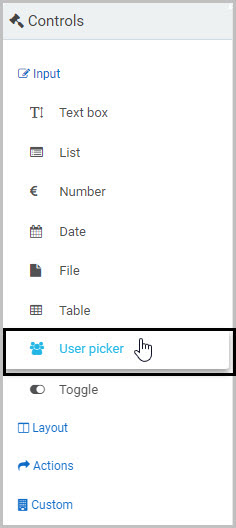
Click on Controls in the left-hand pane to expand the Controls menu.
-
Select Input to view the range of Input controls and click on User picker. If you want to insert the new field into a panel in your form, first select the panel by clicking on the drag handle button
 and then insert the new User picker field from the Controls menu.
-
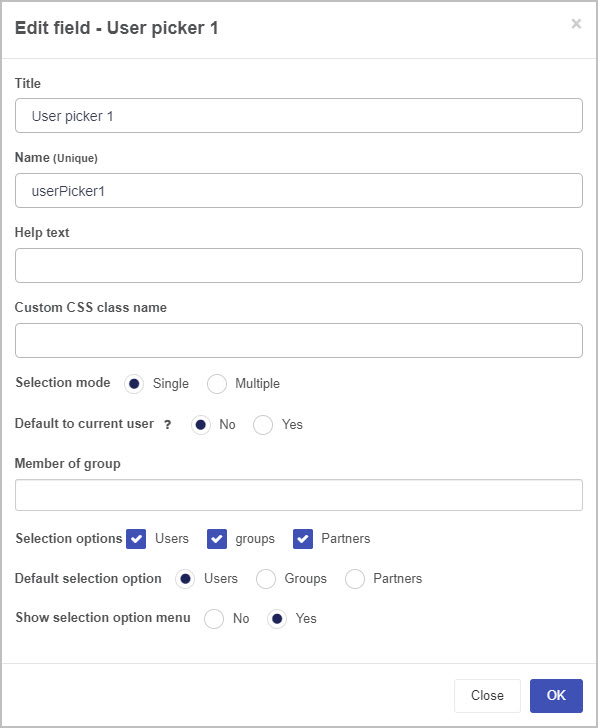
A New field - User picker dialog box will open with a range of options you can choose from for your new User picker field.

-
Title - You can change the name of the User picker field from the default ‘’User picker 1’.
-
Name - This is a unique name for the field and inherits a camel case version of the entered Title.
-
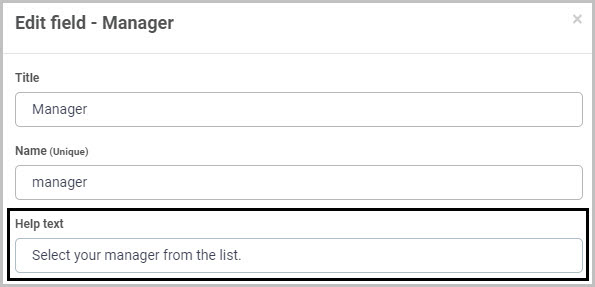
Help text - You can insert text to help the form user to complete the User Picker field. Taking the example of the ‘Manager’ User picker field in a ‘Training Request’ form, you could insert help text to this effect:
If you add help text, a question mark
 icon will appear next to the field title and, if the user clicks on this, they will see the help text you have inserted.
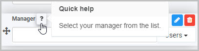
-
Custom CSS class name - You can type the name of a CSS class to allow the User picker to inherit specific styles defined in the Global CSS file.
-
Selection Mode - You can choose whether the user will only be able to select one user from the User Picker list (by selecting Single) or whether the user will be able to select multiple users (by selecting Multiple).
If you choose to allow the user to select multiple users, by selecting Multiple as the Selection mode, an additional option then displays - Max users to select. Here you can set a maximum number of users that can be selected - you can do this by either manually typing the number into the box or by clicking on the up/down buttons
 at the right-hand side of the box.
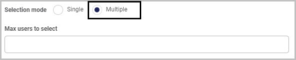
-
Default to current user - You can choose to have the current user display in the User picker field once the form is opened to be edited. If you select ‘Yes’, so the User picker field shows the current user by default, an additional option then displays - Allow override picker value.
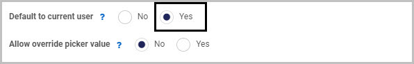
If you choose Yes for Allow override picker value, this automatically allows the override of the user in the User Picker field.
For example, in an ‘Annual Leave Request’ form, there could be an ‘Employee Name’ User picker field that defaults to the current user; but we may want the Employee’s Manager to be able to override the name in this field if they are submitting an annual leave request on behalf of an employee.
-
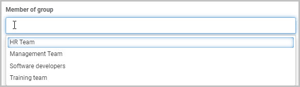
Member of group - You can choose to restrict the users available to be selected in the User picker field to a certain group - for example, only users in the HR Team. Alternatively, you can leave this field blank.
When you click into the Member of group field, you will see a drop-down list of all of the Groups you can select:
In Kianda, Groups can be configured under the Administration menu - to learn more about how you can set up and manage Groups, go to Users & Groups.
For example, if you select ‘HR Team’, the end user completing the form will only be able to select users who are members of the ‘HR Team’ group in this User picker field.
-
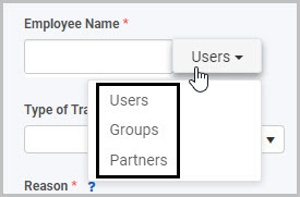
Selection options - You can choose what selection options are available to the form user to the right of the User picker field. You can choose to show as many of these three selection options as like: Users (all users), Groups (such as HR) and Partners.
For example, if you choose to make all three selection options available, your User picker field will have a drop-down menu to the right where the form user can switch between Users, Groups and Partners:
Note: If you have inserted a Group in the Member of group field, this selection will limit the users or groups available to be selected in the User picker field, regardless of what Selection options you choose to make available to the form user.
-
Default selection option - You can choose to have a certain selection option displayed to the right of the User picker field by default - either Users, Groups or Partners.
-
Show selection option menu - You can choose whether or not the selection option menu (where the form user can switch between Users, Groups and Partners) is shown on the right-hand side of the User picker field.
If you choose No, there will not be a selection option menu:
If you choose Yes, a selection option menu will be available to the form user to click (to change the list of users they can select from):
-
Once you complete the New field - User picker dialog box and click OK, a new User picker field is added to your form, with the name you inserted as the Title in the dialog box (by default the title is User picker 1 unless you change it).
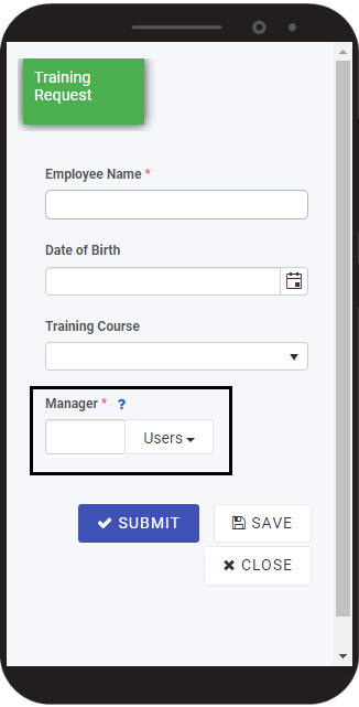
In the example of our Training Request Form, the new User picker field (titled Manager) added to the form could look like this when a user views it on their mobile phone:
To see how your form or field will look on a mobile, view it in Mobile preview by using the Preview option which can be opened by clicking the play button icon
 . You also have the options to see how it will look on a PC or tablet.
How to edit, move and delete User picker fields
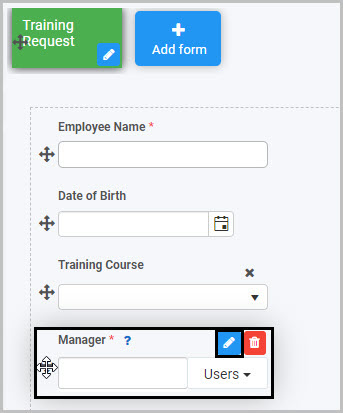
As we go through the options available for editing a User picker field, we will keep in mind the example of the ‘Manager’ User picker field in the ‘Training Request’ form.
How to edit a User picker field
To edit a User picker field:
- Select the field (by either clicking on the field title or on the field’s Drag handle button ).
- Click on the Edit field button (Pen icon) .
The Edit field - User picker dialog box will open, enabling you to choose from the same range of options as appear in the New field - User picker dialog box (as already discussed in How to get started).
You can make any changes you wish in this dialog box and then click OK to confirm.
How to move a User picker field
To move a User picker field simply select the field’s Drag handle button and drag and drop the field wherever you want to move it to within your form.
How to delete a User picker field
To delete a User picker field from your form:
- Select the field (by either clicking on the field’s title or its Drag handle button ).
- Click on the Bin/Trash button
 .
. - Click on OK to confirm.
How to edit User picker field properties
To view or edit the field properties associated with a User picker field, select the field (by clicking on the field title or field drag handle button ) - the Field properties menu will appear in the right-hand pane.
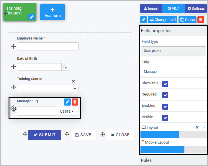
For example, the Field Properties associated with a User picker field titled ‘Manager’ are shown here and include:
-
Field type - The type of field, in this case a User picker field.
-
Title - The Title of the field, in this case ‘Manager’.
-
Show title - If this is selected, the User picker field title will be shown in the form.
-
Required - If this is selected, the User picker field will be a mandatory field that users must complete (denoted by a red asterix next to the field title).
-
Enabled - If this is selected, the user will be able to edit or interact with the field.
-
Visible - If this is selected, the User picker field will be visible in the form.
-
Layout - The width of the blue bar can be adjusted to change the width of the User picker field as it appears on a PC or mobile phone (to view the Mobile layout, click on the expand button
 to the right).
To learn more about the different options within the Field properties menu, go to Field Properties.
Saving changes and version history
Make sure to save any changes you make by clicking on the Save button  . You will always have the option to revert back to previous versions of your form by clicking the Design Version History
  button in the top right corner.
User tips 
Rules can be applied to User picker fields to make your form dynamic. Rules allow actions based upon conditions resulting from user interaction with fields. To learn about the different types of rules you can apply, go to Rules.
For example, you could apply a Set form field rule so that the User picker field is set to be the current user or the user who started the process off. The section below describes how to use a User picker field in forms with two rules in order to extract a value from a datasource.
Example of User Picker use with Find Items and Lookup User rules
The steps below detail how to use a User Picker field to pull a value from a datasource and use properties within the Kianda system associated with that value within a Kianda form to auto-populate a user picker field. This procedure is used when you need to populate more than one value in a user picker. Two rules are applied Find Items rule and Lookup user by property.
For example we start with a SharePoint list or other datasource that has a list of values, for example we could use a Kianda process as a datasource that holds values called ‘Employee number’ and ‘Employee’ in the system.
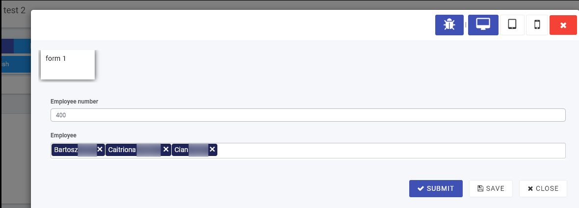
In the image above an Employee number or code is entered via a process for 3 system users, in this example the number ‘400’ represents 3 users, Bartosz, Caitriona and Cian. More records could be created with Employee numbers representing other employees or combinations of users.
We will use the values from the first process which acts as a datasource in a second process called ‘User Lookup’ where fields will be auto-populated based on the Employee No. value entered.
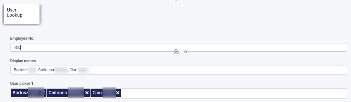
For example if ‘400’ is entered into this process, then the fields ‘Display names’ and ‘User picker 1’ are auto-filled. This is as a result of 2 rules on the Employee No. field the system property to display a value linked to these 3 users.
What’s next 
Now that you’ve learned about the User picker control, find out more about the other types of Input fields you can add to a Kianda process:
- Date control
- File upload control
- List control
- Number control
- Table control
- Text box control
- Toggle control
Feedback
Was this page helpful?
Glad to hear it! Please tell us how we can improve.
Sorry to hear that. Please tell us how we can improve.