Modal dialog control
The Modal dialog field allows you to design pop-up dialog messages that alert or provide reminders or warnings to form end-users.
You can apply a rule - to a field, form or button - so that the pop-up Dialog displays to the user when you want it to, for example, when the user clicks a certain button. Rules allow actions based upon conditions resulting from user interaction with fields. Go to Rules to learn about the different categories of rules that can be applied. One such rule that can be used in conjunction with the Dialog field is the Show, hide or disable rule - to learn more, see Show, hide or disable.
For example, in a simple Training Request form that employees can complete if they want to request training, it could be useful to insert a Dialog field so that a reminder message pops up when the employee clicks on the Save or Submit buttons, to remind them to check that they have completed all fields before they submit their form. We will keep this example in mind as we learn more about Dialog fields.
To view a video example of how to create a Modal dialog field, see How to create a modal dialog.
How to get started
-
To add a Modal dialog field to a form, first open the relevant process.
-
Then select the form within that process that you want to add the field to (so that the Edit Form button
 is visible). Go to Create First Process to learn how to create your first process.
 -
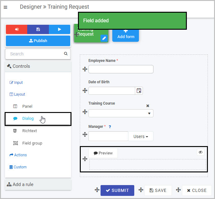
Click on Controls in the left-hand pane to expand the Controls menu.
-
Select Layout to view the range of Layout controls and click on Dialog. A pop-up message will appear saying ‘Field added’ and a Dialog field will be added to the bottom of your form.
By default, the Dialog field will not be displayed in the form to users (as denoted by the eye symbol with the line through it
 ). This is because, as already mentioned, Dialog fields are typically used in conjunction with a rule being applied to a field or button - such as the Submit or Save buttons - so that the pop-up message is only shown to users in certain circumstances, rather than being displayed in the form all the time.
In our example of the Training Request form, we may only want the Dialog to display when the user clicks on either Submit or Save, to remind them to check that they have completed all fields.
How to set the heading for the Dialog
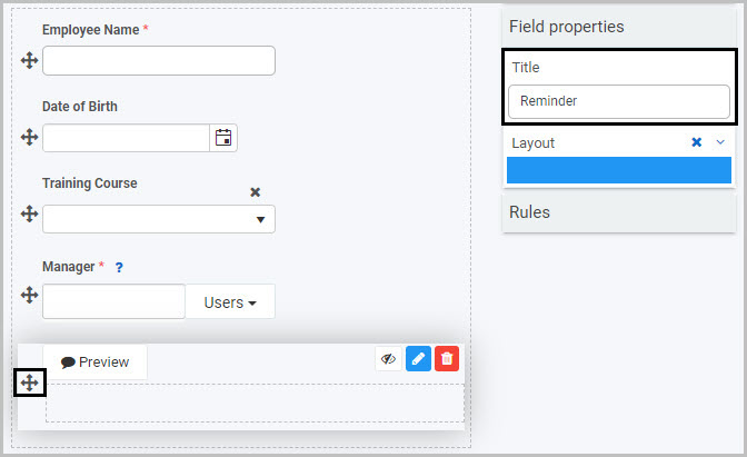
The title of the Dialog field will display as the heading at the top of the pop-up Dialog message. By default, the title of the new Dialog field is ‘Dialog 1’.
To change the title of a Dialog field:
- Select the new Dialog field (by either clicking on the drag handle
 or clicking in the area of the Dialog field) so that the Edit field button is visible.
 - Edit the Title in the Field properties panel to the right.
For example, we could decide to give our pop-up Dialog message a heading of ‘Reminder’. To learn more about editing the Field properties associated with Modal dialog fields, go to How to edit Modal dialog field properties.
How to insert body text for the Dialog
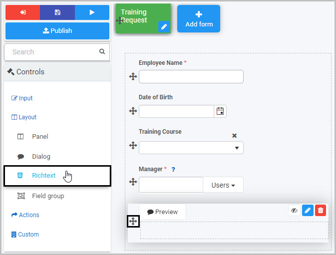
To create the body of the pop-up Dialog, you can insert any of the field types from the Controls menu, such as a text box, list, table or richtext. First, select the Dialog field (so that the Edit field button is visible) and then go to the Controls menu and click on the field type you want to insert.
The Richtext field is a very flexible option to use for the body of the pop-up message as it gives you the most options - such as formatting and styling the text or inserting images or links. We will use a Richtext field to step through how to add text to the body of the Dialog field for our Training Request form.
-
Select the Dialog field and then insert a Richtext field into it by clicking Controls >Layout >Richtext in the right-hand pane. To learn more about Richtext fields, go to Richtext control.
-
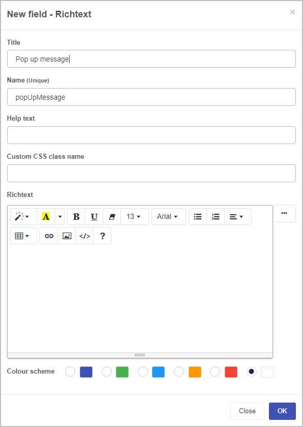
A New field - Richtext dialog box will open:
-
Title - You can change the title of the Richtext field from the default ‘Richtext 1’. Note: It is the Dialog field title that will show as the heading of the pop-up Dialog, not the Richtext title.
-
Name - This is a unique name for the field and inherits a camel case version of the entered Title.
-
Helptext - You can insert text to help the form user to complete the field - if you add help text, a question mark
 icon will appear next to the field title and, if the user clicks on this, they will see the help text you have inserted. This option is not as relevant to the Dialog field as it is to other fields, as the Dialog field is not a field the user needs to complete.
 -
Custom CSS class name - You can type the name of a CSS class to allow the Richtext to inherit specific styles defined in the Global CSS file.
-
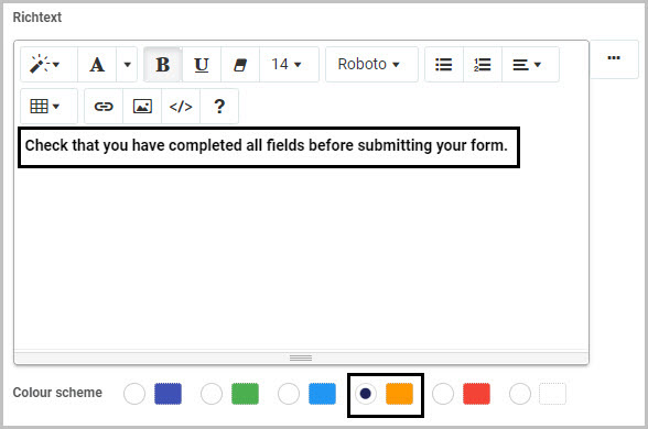
Richtext - Type the text that you want to be shown as the main body text in the pop-up Dialog into this field and format it as you want - there are options to highlight text, change the font style and font colour, bold, underline, increase or decrease font size, use a bulleted or numbered list, format the text to align left/centre/right, insert a table or a link, insert an image or to switch to code view.
-
Colour scheme - You can choose from five colour options for the colour that will appear in the background behind the Dialog richtext body text.
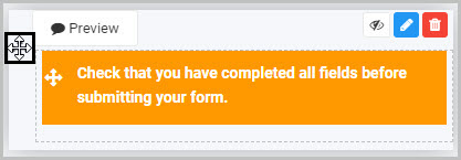
For our example of the Training Request form, we will insert text to remind the employee completing the form to check that they have completed all fields before submitting it and will choose an orange background colour:
-
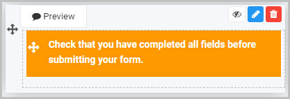
Once you have completed the New field - Richtext dialog box, click OK. You will now see the body text of your Dialog field in the Richtext field you added to it:
- To preview how the pop-up Dialog will look tp users, either click on the Dialog Preview button
 or click on the eye symbol :
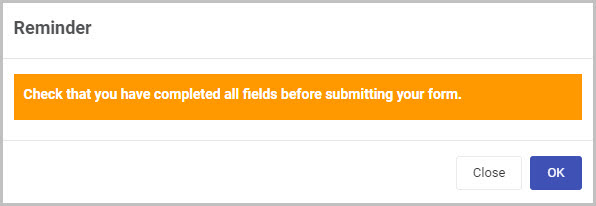
- Click on Close or OK to close the preview.
How to edit, move and delete Modal dialog fields
As we go through the options available for editing, moving or deleting a Modal dialog field in a form, we will keep in mind our example of the ‘Reminder’ pop-up Dialog in the Training Request form.
How to edit a Modal dialog field
To edit a Modal dialog field:
-
Select the Dialog field (by either clicking on the drag handle
or clicking in the area of the Dialog field). -
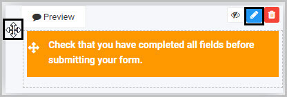
Then click on the Edit field button (Pen icon)
.
-
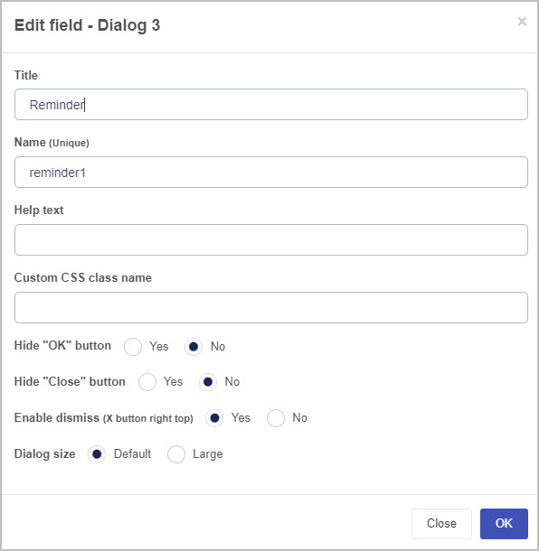
The Edit field - Dialog dialog box will open, enabling you to choose from a range of options (we already changed the Dialog field title to ‘Reminder’ so this name will be shown in the dialog box name):
The options within the Edit field - Dialog dialog box include:
-
Title - You can change the title of the Modal Dialog field here. We already changed it to ‘Reminder’ from the default Dialog 1 in the ‘Title’ field in the Field properties pane.
-
Name - This is a unique name for the field
-
Help text - You can insert text to help the form user. If you add help text, a question mark
icon will appear next to the field title and, if the user clicks on this, they will see the help text you have inserted. This option is less relevant for the Dialog field as it is for other field types, as the Dialog field is not a field the user needs to complete. -
Custom CSS class name - You can type the name of a CSS class to allow the Dialog to inherit specific styles defined in the Global CSS file.
-
Hide “OK” button - Select Yes if you do not want the user to see an ‘OK’ button at the bottom of the Dialog message.
-
Hide “Close” button - Select Yes if you do not want the user to see a ‘Close’ button at the bottom of the Dialog message.
-
Enable dismiss (X button right top) - Choosing Yes means an X button (that the user can click on to dismiss the pop-up message) will be shown at the top right of the Dialog.
-
Dialog size - You can choose from the Default size or Large size for your Dialog message.
-
Once you have finished editing the Dialog field in the Edit field - Dialog dialog box, click on the OK button
 to save your changes or click on Close to exit the dialog box without saving.
 -
To see how your form or Dialog field will look on a mobile, view it in Mobile preview by using the Preview option which can be opened by clicking the play button icon
 . You also have the options to see how it will look on a PC or tablet.
How to move a Modal dialog field
To move a Modal dialog field:
-
Select the field’s Drag handle button
. -
Drag and drop it wherever you want to move it within your form.
How to delete a Modal dialog field
To delete a Modal dialog field from your form:
- Select it (by either clicking on the Panel field’s name or its Drag handle button ).
- Click on the Bin/Trash button
 .
. - Click on OK to confirm the deletion (or click Cancel if you wish to cancel the deletion).
How to edit Modal dialog field properties
To view or edit the field properties associated with a Modal dialog field, select the Dialog field (by clicking on the drag handle button or clicking in the area of the Dialog field) - the Field properties menu will appear in the right-hand pane.
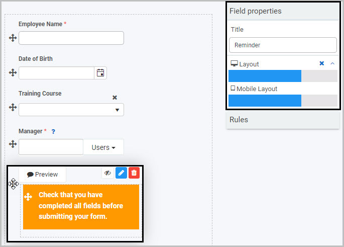
In the example shown here, a Dialog field titled ‘Reminder’ has been selected and the Field properties associated with it are shown in the Field properties menu to the right:
- Title - The title of the Modal Dialog field. In this case, ‘Reminder’.
- Layout - How wide the Modal Dialog field will be on a PC and mobile phone, denoted by the width of the blue bar. You can change the width by clicking on the blue bar.
Saving changes and version history
Make sure to save any changes you make by clicking on the Save button  . You will always have the option to revert back to previous versions of your form by clicking the Design Version History
  button in the top right corner.
What’s next 
Now that you’ve learned about the Modal dialog control, find out more about the other types of Layout fields you can add to a Kianda process:
Feedback
Was this page helpful?
Glad to hear it! Please tell us how we can improve.
Sorry to hear that. Please tell us how we can improve.