Panel layout control
A Panel field is section within a form. Panels hold other elements of your form, such as text box fields, list fields and tables, and enable flexible layout options that result in a better end-user experience.
It is a good idea when first creating a form to insert a panel for each section of your form and then insert the fields you require into each of these panels. One advantage of having related fields contained within a panel is that you can then easily move that panel (and all of the fields within it) to another location within your form.
For example, in a ‘Training Request’ form, you may decide to insert two panels - one panel to contain the details relating to the employee requesting the training and a second panel to contain the details of the training course being requested.
How to get started
-
To add a Panel to a form, first open the relevant process.
-
Then select the form within that process that you want to add the field to (so that the Edit Form button
 is visible). Go to Create First Process to learn how to create your first process.
 -
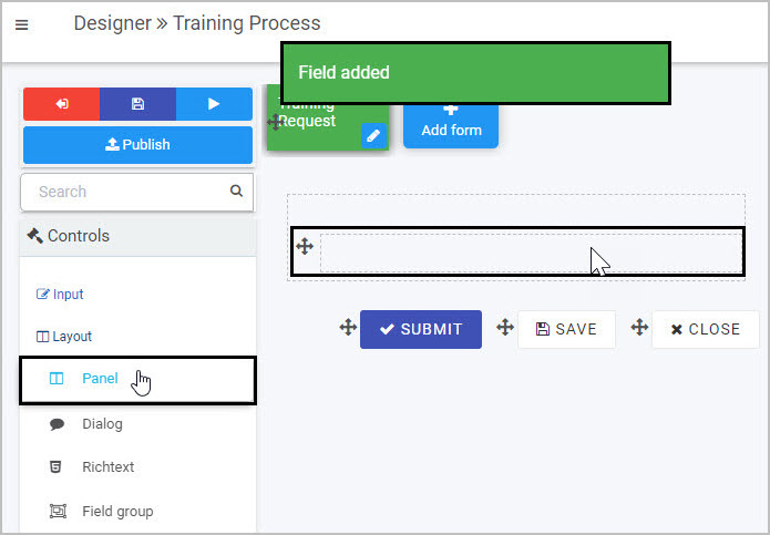
Insert the Panel by clicking on Controls in the left-hand pane to expand the Controls menu.
-
Select Layout to view the range of Layout controls and click on Panel.
A pop-up message will appear saying ‘Field added’ and a panel field with the default name Panel 1 will be added to your form.
By default, the title of the new panel will not be displayed in your form, but you can make it visible by selecting the ‘Show title’ checkbox in the Field properties panel to the right) - to learn more about editing the Field properties associated with Panels, go to How to edit Panel field properties.
How to edit, move and delete Panels
As we go through the options available for editing a Panel in a form, we will keep in mind the example of adding two panels to a ‘Training Request’ form - one titled ‘Employee Details’ and one titled ‘Training Details’.
How to edit a Panel
To edit a Panel:
-
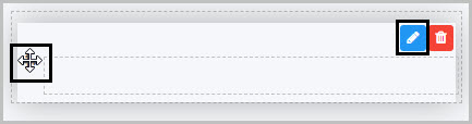
Select the field.
-
Click on the Edit field button (Pen icon)
.
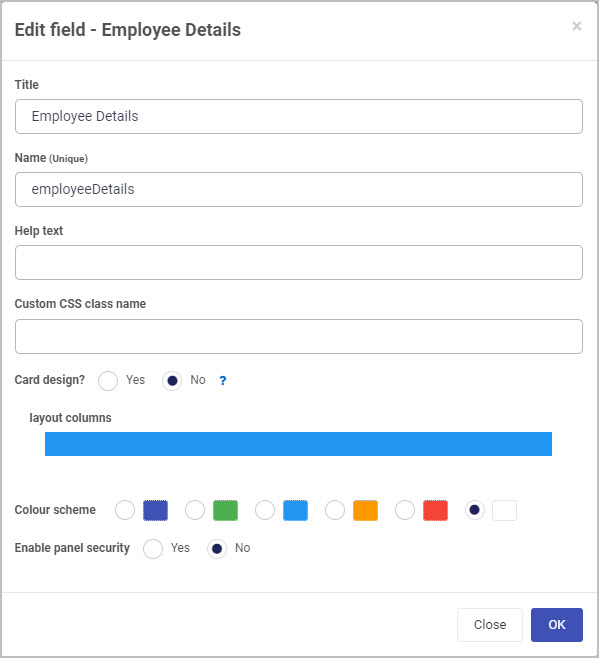
The Edit field - Panel dialog box will open, enabling you to choose from a range of options:
-
Title - You can change the title of the Panel from the default ‘Panel 1’.
In our example, after inserting two panels into our form, we could edit each of them in turn and change their titles to ‘Employee Details’ and ‘Training Details’.
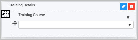
In order to have the title of a Panel display in your form, you need to take one further step - select each panel and then select the ‘Show title’ checkbox in the Field properties panel to the right. Now the titles of the two Panels will be shown - here we have selected the first panel in order to display the ‘Show title’ checkbox associated with it:
You will learn more about the Field properties associated with Panels in How to edit Panel Field properties.
-
Name (unique) - This is a unique name for the Panel field and inherits a camel case version of the entered Title.
-
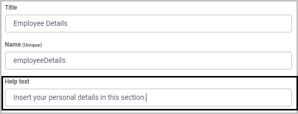
Help text - You can insert text to help the form user to complete the Panel.
In our example, we could insert this help text to assist the user in completing the ‘Employee Details’ panel:
If you add help text, a question mark
 icon will appear next to the Panel title and, if the user clicks on this, they will see the help text you have inserted.
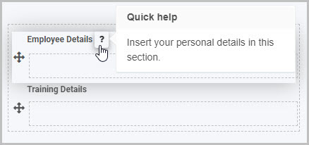
-
Custom CSS class name - You can type the name of a CSS class to allow the panel to inherit specific styles defined in the Global CSS file.
-
Card design? - This option allows you to add a border radius to your panel, which rounds the edges. If you select the Yes radio button, you can choose between defining:
-
The total border radius in pixels by clicking the all corners button
 and entering a value into the input field.
 -
Each corner’s border radius individually in pixels by clicking on the individual corners button
 and entering values for each corner in the four input fields.
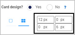
This feature can give your forms an added level of unique styling.
-
-
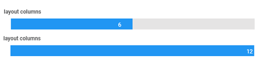
Layout columns - Here you can decide how wide you want your Panel to be in your form - choose from 1 to 12 columns in width. For example click half-way across the blue bar to create a panel that is 6 columns wide, or click at the far right side of the blue bar to create a column that is 12 columns wide.
-
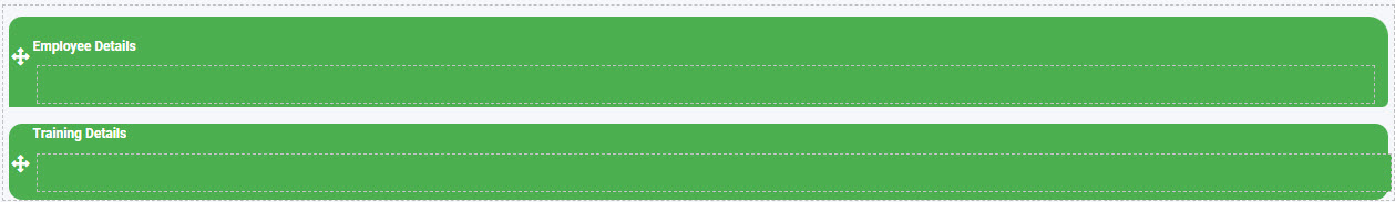
Colour scheme - You can choose from six different colour options: navy, green, blue, amber, red, white. By default, the colour is set to white.
-
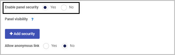
Enable panel security - If you want to restrict who can see the contents of the Panel, choose Yes. Two additional options will then be shown - ‘Add security’ and ‘Allow anonymous link’:
To limit who can view the Panel contents, click the ‘Add security’ button. A new row is displayed, within which you can select the user(s) or groups who will be able to vie the Panel:
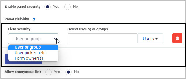
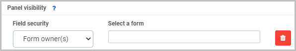
In Field security, you can choose from three options in terms of who will be able to view the Panel you are inserting: User or group, User picker field or Form owner(s).
(i) If you choose to limit the Panel visibility to a ‘User or group’, you can then select the user(s) or groups you want to be able to see it in the ‘Select user(s) or groups’ box.
(ii) If you choose to limit the Panel visibility to a ‘User picker field’, you then select the User picker field in the ‘Select a userpicker field’ box:
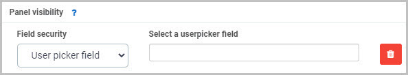
This will limit the visibility of the Panel to the user(s) selected in that User picker field.
(iii) If you choose to limit the Panel visibility to ‘Form owner(s)’, you then select the form in the ‘Select a form’ box - only the owner(s) of the selected form will be able to view the Panel you are inserting:
The second main option in terms of Panel security is ‘Allow anonymous link’:

-
If you choose Yes, this will mean that the Panel will be visible when the form is accessed via an anonymous link.
-
If you choose No, anyone accessing the form from an anonymous link will not be able to see the Panel.
Anonymous links can be useful if, for example, you want members of the public to complete your form without needing to log into Kianda. To learn more about how you can create anonymous links to a form that can be shared with external users, see Anonymous form link.
-
-
Once you are finished editing the Panel in the Edit field dialog box, click on the OK button
 to save your changes or click on Close to exit the dialog box without saving.
How to add fields to a Panel
Once you have inserted a Panel and completed the Edit field - Panel dialog box, you can then start to add the elements you need into the Panel - such as text boxes, lists, tables, number fields or date fields. Go to Controls to see the full list of fields available and Rules to learn about different categories of rules that can be applied.
To add fields to your Panel:
- Select the Panel (by either clicking on the field title or on the field’s Drag handle button
 ) so that the Edit field button is visible.
 - Click on whatever type of field you want to insert from the Controls menu in the left-hand pane.
Let’s take the example of our first Panel, titled ‘Employee Details’. To add a Text box field to this Panel we can:
- Select the Panel by clicking on the ‘Employee Details’ field Drag handle.
- Click on Controls > Input > Text box in the Controls menu to insert a Text box. A pop-up message says ‘Field added’ and a new Text box, titled ‘Text box 1’, is added to the ‘Employee Details’ panel:
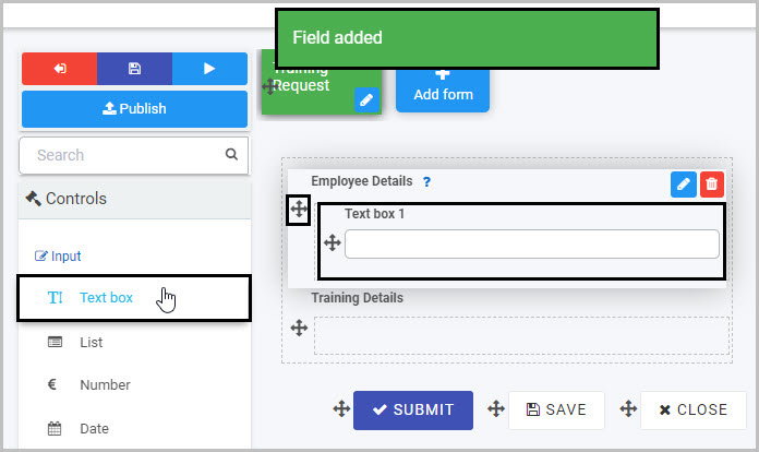
- You can then edit this new Text box field as needed - in our example, we will rename it as ‘First Name’. To learn more about Text box fields, go to Text box control.
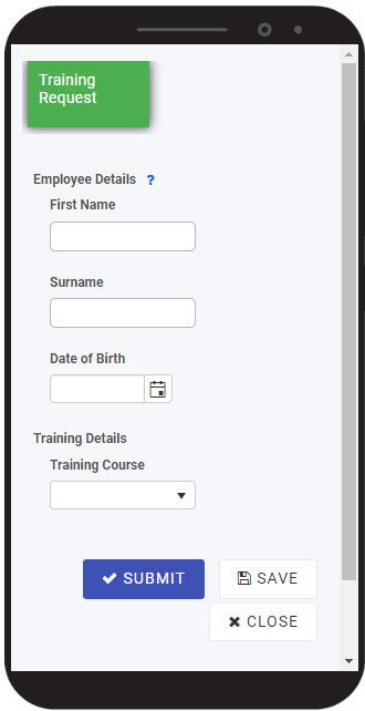
By adding two text box fields (titled ‘First Name’ and ‘Surname’) and a date field (titled ‘Date of Birth’) to our ‘Employee Details’ Panel, and then adding the fields we need to the ‘Training Details’ Panel, our ‘Training Request’ form - with its two Panels - could look like this when viewed on a user’s mobile phone:
To see how your form or field will look on a mobile, view it in Mobile preview by using the Preview option which can be opened by clicking the play button icon  . You also have the options to see how it will look on a PC or tablet.
How to move a Panel
To move a Panel, simply:
- Select the Panel field’s Drag handle button .
- Drag and drop it wherever you want to move it within your form.
How to delete a Panel
To delete a Panel from your form:
- Select it (by either clicking on the Panel field’s name or its Drag handle button ), click on the Bin/Trash button

- Click on OK to confirm or click on Cancel if you wish to cancel the deletion.
Note: Remember that deleting a Panel will result in all of the fields contained within that Panel also being deleted.
How to edit Panel Field properties
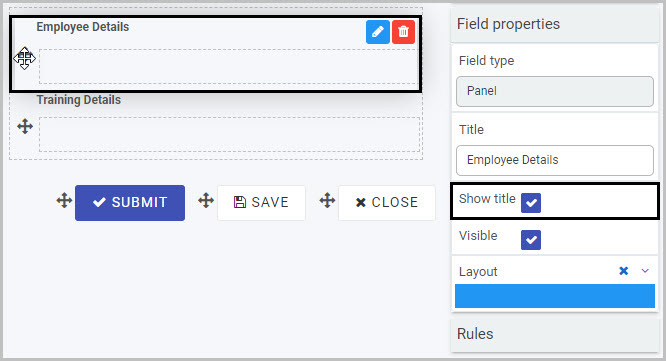
To view or edit the field properties associated with a Panel, select the Panel field (by clicking on the field title or drag handle button ) - the Field properties menu will appear in the right-hand pane.
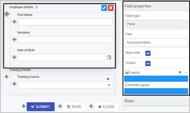
In the example shown here, the Field properties associated with the ‘Employee Details’ Panel include:
- Field type - the type of field. In this case, Panel.
- Title - the title of the Panel field (default name ‘Panel 1’ unless you change it). In this case, ‘Employee Details’.
- Show title - this is selected, which means that the Panel title will be shown in the form.
- Visible - this is selected, so the Panel will be visible to form users.
- Layout - the width of the blue bars can be adjusted to change the width of the Richtext field on PC or mobile. To view the mobile width, click on the expand button
 to the right of the Layout option.
To learn more about the different options within the Field properties menu, go to Field Properties.
Saving changes and version history
Make sure to save any changes you make by clicking on the Save button  . You will always have the option to revert back to previous versions of your form by clicking the Design Version History
  button in the top right corner.
What’s next 
Now that you’ve learned about the Panel control, find out more about the other types of Layout fields you can add to a Kianda process:
Feedback
Was this page helpful?
Glad to hear it! Please tell us how we can improve.
Sorry to hear that. Please tell us how we can improve.