Kianda dashboards deliver a convenient way to provide insights into how your business processes are performing. Dashboards offer easy reporting, permissions management, quick build, condition-based filtering and many more useful features.
From lists to tiles, filters and charts, dashboards allow you to build full digital experiences to monitor your real-time processes in a few minutes.
There are 3 steps involved in creating a dashboard:
Create a dashboard page.
Add one or more widgets.
Configure or edit the widgets to make the page look the way you want.
If you are using Kianda predefined processes from the App Store, then dashboards have already been created for you! These are available by clicking on Dashboard from the main side menu or left-hand pane.
Before you begin, it is important to be aware that there are two modes involved in dashboard pages, an Edit mode and View mode as described below.
Edit mode and View mode
When using dashboards, there are two modes: Edit mode and View mode.
Dashboards View mode
When you are in View mode, the Edit button will be visible to the right in the top menu bar.
Dashboards Edit mode
When you click on the Edit current page button you will be in Edit mode. When you are viewing a page in Edit mode, these options will be available to you along the top of the dashboard page:
the Widget menu where you can insert any of the seven available dashboard widgets
the Settings button to make changes to the dashboard page
the Bin/Trash button to delete the dashboard page
the Add layout container button to add a layout container to the dashboard page in order to organise the widgets on the page and achieve the layout you want
three buttons on each widget on the dashboard that allow you to edit the options relating to that widget type (Update configuration), edit the widget settings (Update widget settings) or delete the widget from the dashboard (Remove widget)
Kianda offers a user-friendly interface to create dashboards in minutes. This video covers the steps for creating a new dashboard:
To create a new Dashboard page:
Click on Home in the left-hand pane
Click on the Create a new page icon
A Create dashboard page dialog box will open, allowing you to choose from a range of options for your new dashboard page:
The options in the Create dashboard page dialog box include:
Title - The title of the dashboard page. You can insert whatever title you want - for example, ‘Training Requests’.
Name - This is a unique name for the dashboard.
Visible to - You can decide who will be able see the dashboard. You can select single or multiple users or Groups or a combination of the two (as shown here):
Note: Levels of Security
Dashboard-level security can only be applied if you are an Administrator and can set the visibility of dashboards and widgets. The dashboard page-level security you are setting here - who can see the dashboard page - will override any security you set for the visibility of individual widgets on that dashboard. See Dashboard security and Widget security for more information.
Widget security: You will also be able to set security for each of the individual widgets that you add to the dashboard, i.e. who can view each dashboard widget.
Icon - You can choose an icon for your dashboard page from a drop-down list of hundreds of available icons.
The icon you select will appear next to the dashboard title when you click on Dashboard in the left side menu to view all of the available dashboards:
Sort order - Choose a numeric value - by either typing it into the field or by clicking on the up down arrows at the right of the field - for the place you want this dashboard to go in terms of the order of the dashboard pages in your main left side menu.
Group - You can choose to group this dashboard as a sub-page of an existing dashboard page. If you want to do this, insert the name of the dashboard page you want to group this new dashboard page under.
Enable favourites - Select this checkbox if you want to insert an ‘Add to favourites’ button to the top menu in the dashboard.
Once you complete the Create dashboard page dialog box and click OK, and then click the Save button in the top dashboard menu, a new ‘Add to favourites’ button will be added to your top dashboard menu:
If you want to add the current dashboard to your favourites:
Click the Add to favourites button
Complete the Add to favourite dialog box that opens and then click the Add favourite button to add this dashboard to your favourites (or click Close to cancel adding it to your favourites):
If you click ‘Add favourite’, the dialog box will close and a pop-up message will display saying ‘Favourite saved successfully’. A new star icon will now appear next to this dashboard page in the Dashboards menu in the main left side menu (denoting that it is a favourite page).
Click on the OK button when you are have completed the Create dashboard page dialog box (or click on Close to close the dialog box and cancel the creation of the new dashboard page).
The output is a menu with a number of widgets available that you can add to the dashboard.
Click on the Save button in the top menu to save any changes you make to the new Dashboard page - a pop-up message saying ‘Page saved successfully’ will display.
Alternatively, if you don’t want to save the changes you’ve made to the page, click on the Stop editing page button to return to View mode without saving changes:
You are now in View mode. To make further changes to the dashboard page, return to Edit mode by clicking on the Edit button in the top menu.
How to edit a Dashboard page
Click on the Edit current page button to go into Edit mode.
Click on the Save button in the top dashboard menu to save the changes to the page.
How to delete a Dashboard page
Click on the Edit current page button to go into Edit mode.
Click on the Trash/Bin icon .
A Delete page dialog box will open:
Click on OK to confirm that you want to delete the dashboard page (or click on Cancel to cancel the deletion).
Click on the Save button in the top dashboard menu to save the changes to the page.
How to add layout containers to a Dashboard page
A layout container is a simple way to organise, arrange and move the widgets you add to your dashboard. It works in a way that is similar to how a Panel layout control is used in a form to organise the fields in a form.
To add a layout container to a Dashboard:
Click on the Edit current page button to go into Edit mode.
Click the green Add layout container button at the bottom right of the dashboard page.
Complete the Create a layout container dialog box that opens by inserting a name and then selecting the width you want for the layout container (by selecting how wide the blue bar is):
Note:
If you know the layout you want for your Dashboard, in terms of what widgets you want to put where, and how large you want the various widgets to be, insert layout containers before you start adding widgets to your dashboard page. Then, when you insert each widget, you can choose which layout container you want to assign it to when you are creating the widget.
Alternatively, if you aren’t sure what widgets you are going to add or what layout you want for your dashboard, you can simply start adding widgets to your dashboard without any layout containers. Once you have added the widgets to the dashboard, you can either drag and drop the widgets to get the dashboard page layout you want or you can go back and insert layout containers and assign widgets to those containers but clicking on the Update widget settings button for each widget.
For example, for this existing widget, by opening the Edit widget dialog box, we can now choose to assign it to any of the four available layout containers:
How to edit and delete a layout container
To edit a layout container:
Find the layout container you would like to edit and click on the Edit layout container button in the bottom left corner of the layout container.
In the Create a layout container dialog box, apply any necessary changes to the fields.
When finished click on OK to confirm your changes, or click on Close to cancel your changes.
Click on the Save button in the top dashboard menu to save the changes to the page.
To delete a layout container:
Find the layout container you would like to edit and click on the Delete button .
Click on the Save button in the top dashboard menu to save the changes to the page.
The widgets that were previously within that layout container will then be appended to the end of the dashboard page.
How to add widgets to a Dashboard page
To add a widget to a Dashboard page:
Click on the Edit current page button to go into Edit mode.
If you know the layout you want for your Dashboard, click the green Add layout container button to create a layout container or several layout containers. See How to add layout containers to a Dashboard page.
Click on the type of widget you want to insert, from the seven available widget types in the dashboard widgets menu.
Complete the relevant dialog boxes for the widget type you have chosen. To learn more, go to Dashboard widgets and click on the widget type you want to add to your dashboard to find out more about it.
Once you have added your widget(s), click on the Save button in the top dashboard menu to save the changes to the page.
Dashboard widgets
Kianda comes with 7 predefined dashboard widgets that you can add to a dashboard page once you are in Edit mode. Using these widgets, you can quickly and easily create a process dashboard in minutes.
To learn more about each widget type and how to add it to a dashboard, click on the name of the widget:
Rich Text widget: The Rich Text widget can be used to display text, links or images in a dashboard.
Tile widget: The Tile widget can be used to display a count of instances with different colour schemes. You could also add conditions to a display count - for example, you could add a condition of “Status” equals “In-progress” so that the count of process instances with a status of “In-progress” is displayed.
Chart widget: Using a Chart widget, you could display a pie chart, bar chart or a line chart in your dashboard. These charts can be used to represent various conditions in a process.
List widget: The List widget displays the instances (individual records) of the selected process. It can also be used to connect with any other widget to display the filtered items.
Filter widget: The Filter widget can be used to filter process instances based on a field. For example, process instances could be filtered by status.
Link widget: The Link widget can be used to add a link to a new process, dashboard or any external sources (such as SharePoint or a website).
Walk-through widget: The Walk-through widget allows you to create a walk-through of a process quickly which could be made available to a user, group or organisation.
When you have added one or more dashboard widgets, you can move the widgets around the dashboard page using the Drag handle button. This is possible when you are in Edit mode, see Edit mode and View mode.
How to edit Dashboard page settings
To edit a Dashboard page:
Click on the Edit current page button to go into Edit mode.
Click on the Settings button .
An Edit dashboard page dialog box opens:
The options available are the same as those available in the Create dashboard page dialog box used to create a new dashboard page - see How to create a dashboard page - but there are also two additional options:
Display in mobile footer - Select this checkbox to display a link to the dashboard in the footer of a mobile phone when the Kianda workspace is accessed on a mobile. Here we can see the example of a link to a dashboard page called ‘Staff onboarding’ available in the footer of a mobile phone:
Hide from navigation - Select this checkbox if you want to hide this dashboard from the navigation in the left side menu.
Note: Selecting this option will override whatever options you may have inserted in the ‘Visible to’ option in the Create dashboard page dialog box (which allows you to restrict who can see the dashboard). Selecting Hide from navigation will mean the dashboard page will not be visible to anyone in the main side menu.
Click on the Version history information button to view the version history of the dashboard. This allows you to view the current dashboard version as well as all the previously saved dashboard versions, when they were modified, and by who they were saved. Clicking on the Restore page version button allows you to rollback to that version, which changes all the current dashboard widgets and settings to reflect the version selected. It should be noted that when rolling back to a previous version for example version 2.0 from version 5.0, you can still restore a version that succeeds version 2.0 if necessary as the version numbers are incremental.
Click on the OK button to save the changes you have made in the Edit dashboard page dialog box (or click on Close to exit the dialog box without saving).
Click on the Save button in the top dashboard menu to save the changes to the page.
Enabling data export from dashboards
Kianda allows users to export the data from dashboards with a simple click.
This video explains how to set up the configuration to export data from dashboards:
Offline availability
Kianda is a progressive web application. This enables Kianda dashboards to provide insights to the business processes, even in offline mode.
This can be beneficial for businesses with users who will need to complete forms when their device is offline - for example, a business with users who carry out inspections or maintenance in remote locations with no access to the internet. While working offline, the user can still create new process instances or carry out actions on an existing instance.
Saving changes
Make sure to save any changes you make to your Dashboard by clicking on the Save button .
What’s next
We have briefly introduced Kianda Dashboards. Now let’s look at each of available Dashboard widgets - and Conditions that can be applied to some of them - in more detail:
1 - Rich Text widget
A dashboard Rich Text widget can be used to create custom rich text content on a dashboard page, such as an attractive banner or heading. It can provide optimum formatting options, such as bold and italics and the option to insert images or links.
How to get started
To add a Rich Text widget to a dashboard:
Open the relevant dashboard page. To learn how to create your first dashboard page, go to How to create a dashboard page.
For this example, we’ll open a dashboard page called ‘Annual Leave’ that currently only has a List widget on it:
Click on the Edit current page button from the top dashboard menu to go into Dashboard Edit mode (in which the Widget menu, Settings button , Bin/Trash button and Add layout container button are available):
Click on the Rich Text widget button in the Dashboard Widget menu.
The Add widget dialog box opens with a range of options for your new Rich Text widget.
Choose the options you want:
Title - You can insert the title you want for your Rich Text widget. In our example, we’ll call it ‘Information’.
Layout columns - You can choose how wide you want your Rich Text widget to be. You can choose from 1 to 12 columns in width by clicking on the blue bar. For example click half-way across the blue bar to create a widget that is 6 columns wide, or click on the right of the blue bar to create a column that is 12 columns wide.
Colour scheme - You can choose from six colour options for the header of the widget (Navy, Green, Blue, Amber, Red or White).
Show header - You can choose whether or not you want the header of your Dashboard widget to be shown.
Visible to - You can determine who will be able to see the Rich Text widget. You can select single or multiple Users or Groups, or a combination of the two. You can select Users or Groups in the right-hand menu so that the options shown in the drop-down list are either individual users or Groups.
To find out more about pre-defined Groups on Kianda, go to Users & Groups.
Note - Dashboard page security: When a dashboard page is first created, the users(s)/group(s) who will be able to view the dashboard are selected in the ‘Visible to’ option in the Create dashboard page dialog box (see Step 3 in How to create a Dashboard page).
You can also edit or update this setting at any point to change who has permission to view a particular dashboard page. This higher dashboard-level security setting will take precedence over the security settings (‘Visible to’) that are applied to the individual widgets within the dashboard (such as the Rich Text widget, in this case).
Layout container - This option will only display if you have already created layout containers for your Dashboard page. Here, you can select which layout container you want your new Link widget to be placed in.
A layout container is a simple way to organise, arrange and move the widgets you add to your dashboard. To learn more about layout containers, go to How to add layout containers to a Dashboard page.
In this example, we can select to place our new Rich Text widget into one of three layout containers - Top, Middle or Bottom:
Device visibility - You can choose what devices and types of internet connections the dashboard Rich Text widget will be visible on - select all the options you want from Desktop, Tablet, Mobile, Wi-Fi and Flight mode as to when the device can view the dashboards. By default, all options are selected.
Click on OK when you’ve completed the Add widget dialog box.
An Edit content dialog box automatically opens:
Insert the content you want to appear in your Rich Text widget by using the available options.
Insert the text you want to appear in the body of the Edit content dialog box. You can choose from an wide array of styles and formats, including: Style, Colour, Bold, Underline, Remove font style, Font size, Font family, Unordered list, Ordered list, Paragraph, and Table.
You can also choose to insert a Link or Picture or to switch to Code view (if you click on Code view button you can copy HTML code directly into the text).
If you click on the Picture button you will be redirected to the File storage area where you can search for existing images stored in the Kianda file system, you can also create a folder, upload or delete a file.
For our example, we will insert text details relating to the Annual Leave dashboard, format them as we want, and also insert a suitable image:
Click on the OK button when you are finished inserting the content you want in your Rich Text widget or click on Close to exit the dialog box without saving.
Your Rich Text widget will now be displayed on your dashboard. Click on Save in the dashboard top menu to save the insertion of the new widget.
How to edit Rich Text widgets
To edit a Rich Text widget on a dashboard:
In the dashboard, click on the Edit current page button in the top menu to view the page in Dashboard Edit mode (in which the Widget menu, Settings button and Bin/Trash button are available).
Click on the Rich Text widget’s Update configuration (Edit) button .
The Edit content dialog box opens, enabling you to make whatever changes you want to the content of the Rich Text widget using the same range of options as outlined in Step 6 of How to get started.
Making the changes you want and then click OK.
The updated Rich Text widget will be shown on the Dashboard. Click on Save in the dashboard top menu to save the changes you’ve made.
How to move Rich Text widgets
To move a Rich Text widget on a dashboard:
On your dashboard, click on the Edit current page button in the top menu to go into Dashboard Edit mode.
Select the widget’s drag handle button .
Drag and drop the widget where you want it to go on your dashboard.
Click on Save in the dashboard top menu to save the changes you’ve made.
In our example, we could move the new Rich Text widget to the left of the List widget:
How to delete Rich Text widgets
To delete a Rich Text widget from your dashboard:
On your dashboard, click on the Edit current page button in the top menu to go into Dashboard Edit mode.
Click on the widget’s Remove widget (Bin/Trash icon) button .
A Delete widget dialog box will open. Click on OK to delete the widget (or click on Cancel if you wish to cancel the deletion).
Click on Save in the dashboard top menu to save the changes you’ve made.
How to edit Rich Text widget settings
To update or edit your Rich Text widget settings:
On your dashboard, click on the Edit current page button in the top menu to go into Dashboard Edit mode.
Click on the Update widget settings (Cog) button .
The Edit widget dialog box will open, enabling you to make changes to any of the available options (the same options as were available in the Create widget dialog box discussed in Step 4 of How to get started).
In our example, we could choose to make increase the width of the Rich Text widget to be 7 columns wide, by clicking to the right of the existing blue bar.
Click on OK to confirm the changes you’ve made to the widget settings (or click on Close if you don’t want to retain any changes).
The updated Rich Text widget will display on your dashboard. Click on Save in the dashboard top menu to save the changes you’ve made.
Saving changes
Make sure to save any changes you make to your Rich Text widget by clicking on the Save button in the dashboard top menu. If you leave the dashboard without saving the changes you have made to a widget, the next time you visit the dashboard it won’t include any of the changes made to it since the dashboard page was last saved.
What’s next
Now that you’ve learned about the Dashboard Rich Text widget, find out more about the other types of Dashboard widget you can add to your Kianda dashboard:
A dashboard Tile widget allows you to display a count of instances. This is a really useful way to showcase whole numbers - for example, the total budget requested through Purchase Orders, the number of customer queries solved in a week or the number of training requests that have been approved.
How to get started
After creating a dashboard page, make sure you are in Edit mode, by clicking on the Edit button at the top of the page, so the Widget menu with 7 widget types is available. Then click on the Tile widget .
The Add widget dialog box opens.
Choose from the edit options:
Title - the dashboard title, for example Type of Training
Layout columns - control the size of the dashboard, choose from 1 to 12 columns in width. For example click half-way across the blue bar to create a panel that is 6 columns wide, or click on the right of the blue bar to create a column that is 12 columns wide.
Colour scheme - choose from Navy, Green, Blue, Amber, Red or White Colours for your dashboard.
Show header checkbox - tick this checkbox if you wish to show a header on your dashboard.
Visible to - You can determine who will be able to see the Tile widget. You can select single or multiple Users or Groups, or a combination of the two. You can select Users or Groups in the right-hand menu so that the options shown in the drop-down list are either individual users or Groups.
To find out more about pre-defined Groups on Kianda, go to Users & Groups.
Note - Dashboard page security: When a dashboard page is first created, the users(s)/group(s) who will be able to view the dashboard are selected in the ‘Visible to’ option in the Create dashboard page dialog box (see Step 3 in How to create a Dashboard page).
You can also edit or update this setting at any point to change who has permission to view a particular dashboard page. This higher dashboard-level security setting will take precedence over the security settings (‘Visible to’) that are applied to the individual widgets within the dashboard (such as the Tile widget, in this case).
Layout container - This option will only display if you have already created layout containers for your Dashboard page. Here, you can select which layout container you want your new Tile widget to be placed in.
A layout container is a simple way to organise, arrange and move the widgets you add to your dashboard. To learn more about layout containers, go to How to add layout containers to a Dashboard page.
In this example, we can select to place our new Tile widget into one of three layout containers - Top, Middle or Bottom:
Device visibility - choose from icons for deshtop, tablet, mobile, wifi and flightmode as to when the device can view the dashboards.
Click on the OK button when you are finished editing the dashboard to save your changes or click on Close to exit the dialog box without saving.
You can then edit the widget to display certain fields from your form, that relates to the data you are interested in. Go to Configure your widget to find out more.
When you are finished making edits, click on the Save button in the top menu to ensure your dashboard changes are saved and you see a pop-up message Page saved successfully.
To make further changes later on, click on the Edit button in the top menu and then click on the Pen button.
To re-edit the title, colour scheme or other options in Step 2, click on the Settings button and the Edit widget dialog box options, allowing you to make changes.
To delete the widget at any stage, click on the Bin icon beside the cog button, and then click on Ok to confirm that you want to delete the dashboard page or click on Cancel if you wish to cancel the deletion.
Configure your widget
Click on the Update configuration or Pen button in a tile widget you have created.
A dialog box opens with filter options in the left-hand pane, a Conditions button in the middle of the box, and tile view fields and Key performance indicators in the right-hand pane. Go to Conditions to read more about conditions you can apply to dashboard widgets, and go to Tile view fields to read more about changing how a tile looks.
The second option Show processes has 3 radio buttons associated with it a) Matching condition b) Matching condition and assigned to current user c) Matching condition and created by current user.
The third option Show decimals allows you to choose if a decimal point is used in the number displayed. Choose from a) Yes or b) No if you want to only show a whole number.
The fourth option Connect to List widget allows you to choose if this widget should connect to List widgets you have created for this dashboard page. Choose from a) Yes or b) No if you want to connect the widgets. If you click on Yes then click into the List Widget field and choose from previously created list widgets.
Tile expression allows you to select if the displayed number in the tile is a count, sum, or average of the data.
Tile icon is where you can choose what icon will be displayed in the tile to suit your specific needs.
Change color or text of tile based on condition/s - this section allows you to add key performance indicators (KPI) to your tile widget. For example, if the value you’re monitoring rises above 10, the colour and icon can be changed to indicate. This can draw your attention to key indicators such as emergencies or unacceptable levels of non-conformance within your organisation.
To create a KPI, click on the white Plus button to bring up the Add Tile KPI screen.
On the Add Tile KPI screen, fill out:
KPI condition - choose an operator such as greater than, equal to - followed by a value. When this condition is met, the tile will change to the below properties:
Tile title - the new title of the tile
Tile icon - the new icon of the tile
Tile colour - the new colour of the tile
When finished, click OK to save your changes, or click Close to cancel your changes.
All KPIS will be displayed in the modal dialog, and can be deleted by clicking on the Bin/Trash icon button . You can click on pen edit icon to edit the associated KPI also.
When you are finished choosing options, click on the OK button to save your changes or click on Close to exit the dialog box without saving.
Choosing data from a Process
If you choose data from a Process, then the options below become available.
Choose from the following options:
Business process - click into the field to choose a process which will be the input for the dashboard.
Show processes - choose from a) Matching condition b) Matching condition and assigned to current user c) Matching condition and created by current user.
Choosing data from a Partner Process
If you choose data from a Partner Process, then the options below become available.
Choose from the following options:
Partner - click into the field to choose from a pre-configured Partner who has created the process you are interested in.
Business process - click into the field to choose a process which will be the input for the dashboard.
Show processes - choose from a) Matching condition b) Matching condition and assigned to current user c) Matching condition and created by current user
Choosing data from a Data source
If you choose data from a Data source, then click on the Select data source button.
You will be directed to different data sources where you can search in the datasource tree search box or drill down to the data source you want.
Click on the OK button when you are finished editing to save your changes or click on Close to exit the dialog box without saving.
How to move Tile widgets
To move a Tile widget on a dashboard:
On your dashboard, click on the Edit current page button in the top menu to go into Dashboard Edit mode.
Select the widget’s drag handle button .
Drag and drop the widget where you want it to go on your dashboard.
Click on Save in the dashboard top menu to save the changes you’ve made.
How to delete Tile widgets
To delete a Tile widget from your dashboard:
On your dashboard, click on the Edit current page button in the top menu to go into Dashboard Edit mode.
Click on the widget’s Remove widget (Bin/Trash icon) button .
A Delete widget dialog box will open. Click on OK to delete the widget (or click on Cancel if you wish to cancel the deletion).
Click on Save in the dashboard top menu to save the changes you’ve made.
How to edit Tile widget settings
To update or edit your Tile widget settings:
On your dashboard, click on the Edit current page button in the top menu to go into Dashboard Edit mode.
Click on the Update widget settings (Cog) button .
The Edit widget dialog box will open, enabling you to make changes to any of the available options (the same options as were available in the Add widget dialog box discussed in Step 2 of How to get started).
For example, we could choose to reduce the width of the Tile widget by clicking to the left of the blue bar which denotes layout column width.
Click on OK to confirm the changes you’ve made to the widget settings (or click on Close if you don’t want to retain any changes).
The updated Tile widget will display on your dashboard. Click on Save in the dashboard top menu to save the changes you’ve made.
Saving changes
Make sure to save any changes you make to your dashboard Tile widget by clicking on the Save button in the dashboard top menu. If you leave the dashboard without saving the changes you have made to a widget, the next time you visit the dashboard it won’t include any of the changes made to it since the dashboard page was last saved.
What’s next
Now that you’ve learned about Dashboard Tile widgets, find out more about the other types of Dashboard widgets you can add to your Kianda dashboard:
A dashboard List widget displays the instances of the selected process in a dashboard. The List widget can also be used to connect with any other dashboard widgets to display filtered items.
How to get started
After creating a dashboard page, make sure you are in Edit mode, by clicking on the Edit button at the top of the page, so the Widget menu with 7 widget types is available. Then click on the List widget .
The Add widget dialog box opens.
Choose from the edit options:
Title - the dashboard title, for example Training Requests
Layout columns - control the size of the dashboard, choose from 1 to 12 columns in width. For example click half-way across the blue bar to create a panel that is 6 columns wide, or click on the right of the blue bar to create a column that is 12 columns wide.
Colour scheme - choose from Navy, Green, Blue, Amber, Red or White Colours for your dashboard.
Show header checkbox - tick this checkbox if you wish to show a header on your dashboard.
Visible to - You can choose who will be able to see the List widget. Select single or multiple Users or Groups, or a combination of the two. You can use the menu on the right to either filter the drop-down list by Users or Groups. To find out more about pre-defined Groups on Kianda, go to Users & Groups.
Note - Dashboard page security: When a dashboard page is first created, the users(s)/group(s) who will be able to view the dashboard are selected in the ‘Visible to’ option in the Create dashboard page dialog box (see Step 3 in How to create a Dashboard page).
You can also edit or update this setting at any point to change who has permission to view a particular dashboard page. This higher dashboard-level security setting will take precedence over the security settings (‘Visible to’) that are applied to the individual widgets within the dashboard (such as a dashboard List widget, in this case).
Layout container - This option will only display if you have already created layout containers for your Dashboard page. Here, you can select which layout container you want your new List widget to be placed in.
A layout container is a simple way to organise, arrange and move the widgets you add to your dashboard. To learn more about layout containers, go to How to add layout containers to a Dashboard page.
In this example, we can select to place our new List widget into one of three layout containers - Top, Middle or Bottom:
Device visibility - choose from icons for deshtop, tablet, mobile, wifi and flightmode as to when the device can view the dashboards.
Click on the OK button when you are finished editing the dashboard to save your changes or click on Close to exit the dialog box without saving.
You can then edit the widget to display certain fields from your form, that relates to the data you are interested in. Go to Configure your widget to find out more.
When you are finished making edits, click on the Save button in the top menu to ensure your dashboard changes are saved and you see a pop-up message Page saved successfully.
To make further changes later on, click on the Edit button in the top menu and then click on the Pen button.
To re-edit the title, colour scheme or other options in Step 2, click on the Settings button and the Edit widget dialog box options, allowing you to make changes.
To delete the widget at any stage, click on the Bin icon beside the cog button, and then click on Ok to confirm that you want to delete the dashboard page or click on Cancel if you wish to cancel the deletion.
Configure your widget
Click on the Update configuration or Pen button in a list widget you have created.
A dialog box opens with filter options in the left-hand pane, a Conditions button in the middle of the box, and list view fields in the right-hand pane. Go to Conditions to read more about conditions you can apply to dashboard widgets and go to List view fields to read more about how to apply fields to your list view.
Once a data source is chosen, then there are a number of other options available, see Filter options.
When you are finished choosing options, click on the OK button to save your changes or click on Close to exit the dialog box without saving.
Choosing data from a Process
If you choose data from a Process, then the options below become available.
Choose from the following options:
Business process - click into the field to choose a process which will be the input for the dashboard.
Show processes - choose from a) Matching condition b) Matching condition and assigned to current user c) Matching condition and created by current user.
If you choose data from a Partner Process, then the options below become available.
Choose from the following options:
Partner - click into the field to choose from a pre-configured Partner who has created the process you are interested in.
Business process - click into the field to choose a process which will be the input for the dashboard.
Show processes - choose from a) Matching condition b) Matching condition and assigned to current user c) Matching condition and created by current user.
If you choose data from a Data source, then the options below become available.
Click on Select data source. You will be directed to different data sources where you can search in the datasource tree search box or drill down to the data source you want.
Click on the OK button when you are finished editing to save your changes or click on Close to exit the dialog box without saving.
Once you have chosen where the dashboard data will come from then there are a number of other options available.
Choose from the edit options:
Enable sorting - choose from a) Yes or b) No if you wish to enable sorting in the dashboard
Enable filtering - choose from a) Yes or b) No if you wish to enable filtering in the dashboard
Enable search - choose from a) Yes or b) No if you wish to enable a search in the dashboard
Enable “Load more” mode - choose from a) Yes or b) No if you wish to enable more data records to be visible. If you click on Yes, then you can decide on what text should appear on screen, by typing the text in the Load more button text field.
Enter a number in Items per page for the number items you wish to load at a time. The default value is ‘20’.
Show ‘Add process’ button? - choose from a) Yes or b) No if you wish to Add process to your dashboard. If you click on Yes, then you can decide on what text should appear on screen, by typing the text in the ‘Add process’ button text field.
By default, the process used to generate the data is added, click on No beside the Add ‘Process Name’ by default if you don’t wish to add the input process.
Show delete button? - choose from a) Yes or b) No if you wish to add a Delete button to your dashboard. If you choose Yes, then the option Enable bulk delete appears allowing you to choose a) Yes or b) No to enable bulk deletion of records.
Enable show history? - choose from a) Yes or b) No if you wish to show the history of the dashboard.
Enable data export? - choose from a) Yes or b) No if you wish to allow data export. If you select Yes, a new option will appear:
Enable data format? - choose from a) OData, b) CSV or c) Excel. To watch a video tutorial about exporting your process data from a list widget using OData, click here.
Sort by - click into the Sort By field and choose from options a) Common fields or b) fields within a form.
Common fields are fields commonly used in dashboards such as ‘Created’ or ‘Status’ or choose from a field within a form by clicking and drilling down to the field name that you want to sort by, for example a text box field called ‘Name’ in a form called ‘Training Request’.
When a field is chosen then the options for Sort Direction appear as either a) Ascending or b) Descending.
Enable empty list template - click on a) Yes or b) No to enable.
Go to List view fields to read about options in the right-hand pane of this dialog box on how to choose fields to filter data.
Click on the OK button when you are finished editing to save your changes or click on Close to exit the dialog box without saving.
List view fields
When you choose the List widget for your dashboard, there are a number of ways to select fields that you want to view.
Click on the Pen button on the widget you have created, to see the List view fields visible in the right-hand pane.
Click on Common fields to see a list of commonly used dashboard fields such as ‘Status’, ‘Created by’ and ‘Modified’. Click on as many fields as needed to add to the dashboard, for example 3 fields are selected below.
Click on Common fields again to close the options.
Click on Design fields to see a list of all the fields used in the design of the forms used in the chosen process. For example the Training Process shown below has 2 forms, ‘Training Request’ and ‘Training Approval’ and all control fields used in the form design are available to choose as filters for the dashboard. Click on the + symbol to drill down into the form, and click on the relevant fields to use them, for example Name, Type of Training and Management Decision have been chosen below.
Click on Design fields again to close the options.
Clicking on List fields shows you a list of all the fields you have already chosen from Common fields and Design fields. There is also an option to Add column and Add action. You can change the order of the fields as they appear in the list from left to right by clicking on the Drag handle button .
Click on the OK button when you are finished editing to save your changes or click on Close to exit the dialog box without saving.
To change the list settings, that is the way the list looks, title and so on, click on the Settings button and go to How to edit List widget settings to find out more about edit options.
When you are finished making edits, click on the Save button in the top menu to ensure your dashboard changes are saved and you see a pop-up message Page saved successfully.
To make further changes later on, click on the Edit button in the top menu and then click on the Pen button.
When you have completed your changes, click on the Save button to save your changes or X to quit without saving.
Add column
If the numerous Common fields and Design fields are not enough, you can add your own columns using the Add column button in List view fields pane. To add a new column:
Click on the Add column button to display a HTML and CSS code editor that allows you to design the custom column.
In the code editor, enter the Title of your new column add the code to achieve the desired look and effect for your new column. For example, a common practice would be to code a conditional function checking the internal status of each row’s record - if it’s equal to ‘Open’, create a red button to draw attention to records that are still open, and vice versa with the closed records. You can interact with and perform operations on the list’s fields by utilising the row.properties.enterFieldName method. The conditional statement uses Ember.js, learn more by clicking here.
When finished, click on OK to save your changes, or click on Close to cancel your changes.
Your new column will then appear to the right of your previously added column. To learn how to move these columns, see here.
Add action
You can also add an action to your list widget, which will trigger a field or rule to be executed within the list’s associated process. To add an action:
Click on the Add action button to display the Add List Action dialog box.
Fill out the following fields:
Select the field or rule to trigger - when the action button is clicked, which field or rule will be executed.
Button icon - the visual icon associated with the button
Button color
When finished, click on OK to save your changes, or click on Close to cancel your changes.
Your new action will now appear as a button to the right of previously added column. To learn how to move these columns/actions, see here.
The code for the new action is automatically generated upon creating the action, as seen below with the created action generating a PDF report relating to the record in the same row. You can view the code and program extra features if desired by editing the action.
How to move List widgets
To move a List widget on a dashboard:
On your dashboard, click on the Edit current page button in the top menu to go into Dashboard Edit mode.
Select the widget’s drag handle button .
Drag and drop the widget where you want it to go on your dashboard.
Click on Save in the dashboard top menu to save the changes you’ve made.
How to delete List widgets
To delete a List widget from your dashboard:
On your dashboard, click on the Edit current page button in the top menu to go into Dashboard Edit mode.
Click on the widget’s Remove widget (Bin/Trash icon) button .
A Delete widget dialog box will open. Click on OK to delete the widget (or click on Cancel if you wish to cancel the deletion).
Click on Save in the dashboard top menu to save the changes you’ve made.
How to edit List widget settings
To update or edit your List widget settings:
On your dashboard, click on the Edit current page button in the top menu to go into Dashboard Edit mode.
Click on the Update widget settings (Cog) button .
The Edit widget dialog box will open, enabling you to make changes to any of the available options (the same options as were available in the Add widget dialog box discussed in Step 2 of How to get started).
For example, we could choose to reduce the width of the List widget to be 4 columns wide, by clicking to the left of the existing blue bar.
Click on OK to confirm the changes you’ve made to the widget settings (or click on Close if you don’t want to retain any changes).
The updated List widget will display on your dashboard. Click on Save in the dashboard top menu to save the changes you’ve made.
Saving changes
Make sure to save any changes you make to your List widget by clicking on the Save button in the dashboard top menu. If you leave the dashboard without saving the changes you have made to a widget, the next time you visit the dashboard it won’t include any of the changes made to it since the dashboard page was last saved.
What’s next
Now that you’ve learned about the Dashboard List widget, find out more about the other types of Dashboard widgets you can add to your Kianda dashboard:
A dashboard Chart widget enables you to create pie charts, bar charts or line charts on your dashboard page. These charts can be used to represent various conditions or values in a process.
How to get started
After creating a dashboard page, make sure you are in Edit mode, by clicking on the Edit button at the top of the page, so the Widget menu with 7 widget types is available. Then click on the Chart widget .
The Add widget dialog box opens.
Choose the options you want for your new Chart widget:
Title - You can insert the title you want for your Chart widget (instead of the default title that is shown).
Layout columns - You can choose how wide you want your Chart widget to be. You can choose from 1 to 12 columns in width by clicking on the blue bar. For example, click half-way across the blue bar to create a widget that is 6 columns wide.
Colour scheme - You can choose from six colour options for the header of the widget (Navy, Green, Blue, Amber, Red or White), if you choose to display it.
Show header - You can choose whether or not you want the header of your Chart widget to be displayed in the dashboard. This checkbox is selected by default, so de-select it if you don’t want the header to be displayed.
Visible to - You can choose who will be able to see the Chart widget. Select single or multiple Users or Groups, or a combination of the two. You can use the menu on the right to either filter the drop-down list by Users or Groups. To find out more about pre-defined Groups on Kianda, go to Users & Groups.
Note - Dashboard page security: When a dashboard page is first created, the users(s)/group(s) who will be able to view the dashboard are selected in the ‘Visible to’ option in the Create dashboard page dialog box (see Step 3 in How to create a Dashboard page).
You can also edit or update this setting at any point to change who has permission to view a particular dashboard page. This higher dashboard-level security setting will take precedence over the security settings (‘Visible to’) that are applied to the individual widgets within the dashboard (such as the Chart widget, in this case).
Layout container: This option will only display if you have already created layout containers for your Dashboard page. Here, you can select the layout container you want to place your new Chart widget in.
A layout container is a simple way to organise, arrange and move the widgets you add to your dashboard. To learn more about layout containers, go to How to add layout containers to a Dashboard page.
In this example, we can select to place our new Chart widget into one of three layout containers - Top, Middle or Bottom:
Device visibility - You can choose what devices and types of internet connections the dashboard Chart widget will be visible on - select all the options you want from Desktop, Tablet, Mobile, Wi-Fi and Flight mode as to when the device can view the dashboards. By default, all options are selected.
Click on OK when you’ve completed the Add widget dialog box.
An Edit chart dialog box automatically opens showing the options for your new Chart widget. To learn more about these options and how to complete the Edit chart dialog box so the Chart widget displays certain fields from your form, see Step 3 of How to edit Chart widgets.
Once you have finished choosing the options you want in the Edit chart dialog box, click on the OK button (or click on Close to exit the dialog box without saving).
Click on the Save button in the top dashboard menu to save the insertion of the new Chart widget.
Your new Chart widget will now be displayed on your dashboard.
Here is an example of how Chart widgets can look on a dashboard page:
How to edit Chart widgets
To edit a Chart widget on a dashboard:
In the dashboard, click on the Edit current page button in the top menu to view the page in Dashboard Edit mode (in which the Widget menu, Settings button and Bin/Trash button are available).
Click on the Chart widget’s Update configuration (Edit) button .
The Edit chart dialog box opens, enabling you to choose from a range of options for your Chart widget. Filter options are shown in the left-hand pane, a Conditions button in the middle of the dialog box, and chart edit fields in the right-hand pane.
Go to Conditions to read more about conditions you can apply to data and go to Chart view fields to read more about changing how a chart looks.
The second option Show processes has 3 radio buttons associated with it a) Matching condition b) Matching condition and assigned to current user c) Matching condition and created by current user.
The third option Connect to List Widget allows you to choose if this widget should connect to List widgets you have created for this dashboard page. Choose from a) Yes or b) No if you want to connect the widgets. If you click on Yes, then click into the List Widget field, you can choose from previously created list widgets.
Go to Chart view fields to read about options in the right-hand pane of this dialog box to make changes to your chart like size, labels and adding a chart legend.
When you are finished choosing options, click on the OK button to save your changes or click on Close to exit the dialog box without saving.
Making the changes you want and then click OK.
The updated Chart widget will be shown on the Dashboard. Click on Save in the dashboard top menu to save the changes you’ve made.
Choosing data from a Process
If you choose data from a Process, then the options below become available.
Choose from the following options:
Business process - click into the field to choose a process which will be the input for the dashboard.
Show processes - choose from a) Matching condition b) Matching condition and assigned to current user c) Matching condition and created by current user.
Choosing data from a Partner Process
If you choose data from a Partner Process, then the options below become available.
Choose from the following options:
Partner - click into the field to choose from a pre-configured Partner who has created the process you are interested in.
Business process - click into the field to choose a process which will be the input for the dashboard.
Show processes - choose from a) Matching condition b) Matching condition and assigned to current user c) Matching condition and created by current user.
Choosing data from a Data source
If you choose data from a Data source, then click on the Select data source button.
You will be directed to different data sources where you can search in the data source tree search box or drill down to the data source you want.
Click on the OK button when you are finished editing to save your changes or click on Close to exit the dialog box without saving.
Chart view fields
When you choose the Chart widget for your dashboard, there are a number of options to configure the chart to make it look the way you want.
Click on the Pen button in the widget you have created, to see the fields used to edit the chart, visible in the right-hand pane.
Choose from the edit options:
Chart type - choose from a) Pie chart b) Bar chart c) Line chart.
Labels field - click into the field to drill down to find what you want to use. You can use Common fields such as Status and Created, commonly used in dashboards, and use design fields that are part of processes attached to forms, for example fields within the forms Training Request and Training Approval below.
Values field - choose from a) Count b) Sum c) Average and click into the field itself to drill down to the fields you want, as with the Labels field.
Chart width - use the arrow to choose a numeric value.
Chart height - use the arrow to choose a numeric value.
Limit label names - options are a) Yes or b) No
Show values - options are a) Yes or b) No
Hide legend - options are a) Yes or b) No
Click on the OK button when you are finished editing to save your changes or click on Close to exit the dialog box without saving.
To change the chart settings, that is the way the chart looks, title and so on, click on the Settings button and go to How to edit Chart widget settings to find out more about edit options.
When you are finished making edits to your widget, click on the Save button in the top menu to ensure your dashboard changes are saved and you will see a pop-up message Page saved successfully.
To make further changes later on, click on the Edit button in the top menu and then click on the Pen button.
How to move Chart widgets
To move a Chart widget on a dashboard:
On your dashboard, click on the Edit current page button in the top menu to go into Dashboard Edit mode.
Select the widget’s drag handle button .
Drag and drop the widget where you want it to go on your dashboard.
Click on Save in the dashboard top menu to save the changes you’ve made.
How to delete Chart widgets
To delete a Chart widget from your dashboard:
On your dashboard, click on the Edit current page button in the top menu to go into Dashboard Edit mode.
Click on the widget’s Remove widget (Bin/Trash icon) button .
A Delete widget dialog box will open. Click on OK to delete the widget (or click on Cancel if you wish to cancel the deletion).
Click on Save in the dashboard top menu to save the changes you’ve made.
How to edit Chart widget settings
To update or edit your Chart widget settings:
On your dashboard, click on the Edit current page button in the top menu to go into Dashboard Edit mode.
Click on the Update widget settings (Cog) button .
The Edit widget dialog box will open, enabling you to make changes to any of the available options (the same options as were available in the Add widget dialog box discussed in Step 2 of How to get started).
For example, we could choose to reduce the width of the Chart widget by clicking to the left of the blue bar which denotes layout column width.
Click on OK to confirm the changes you’ve made to the widget settings (or click on Close if you don’t want to retain any changes).
The updated Chart widget will display on your dashboard. Click on Save in the dashboard top menu to save the changes you’ve made.
Saving changes
Make sure to save any changes you make to your Chart widget by clicking on the Save button in the dashboard top menu. If you leave the dashboard without saving the changes you have made to a widget, the next time you visit the dashboard it won’t include any of the changes made to it since the dashboard page was last saved.
What’s next
Now that you’ve learned about the Dashboard Chart widget, find out more about the other types of Dashboard widgets you can add to your Kianda dashboard:
A dashboard Chart v2 widget enables you to create pie charts, bar charts, line charts, radar charts, doughnut and polar area charts on your dashboard page. These charts can be used to represent various conditions or values in a process.
How to get started
After creating a dashboard page, make sure you are in Edit mode, by clicking on the Edit button at the top of the page, so the Widget menu with 7 widget types is available. Then click on the Chart widget .
The Add widget dialog box opens.
Choose the options you want for your new Chart widget:
Title - You can insert the title you want for your Chart widget (instead of the default title that is shown).
Layout columns - You can choose how wide you want your Chart widget to be. You can choose from 1 to 12 columns in width by clicking on the blue bar. For example, click half-way across the blue bar to create a widget that is 6 columns wide.
Custom CSS - here you can assign a class name for your widget. You can create or edit the CSS for your custom class in the global CSS file. To learn more about the global CSS visit Global CSS file.
Colour scheme - You can choose from six colour options for the header of the widget (Navy, Green, Blue, Amber, Red or White), if you choose to display it.
Show header - You can choose whether or not you want the header of your Chart widget to be displayed in the dashboard. This checkbox is selected by default, so de-select it if you don’t want the header to be displayed.
Visible to - You can choose who will be able to see the Chart widget. Select single or multiple Users or Groups, or a combination of the two. You can use the menu on the right to either filter the drop-down list by Users or Groups. To find out more about pre-defined Groups on Kianda, go to Users & Groups.
Note - Dashboard page security: When a dashboard page is first created, the users(s)/group(s) who will be able to view the dashboard are selected in the ‘Visible to’ option in the Create dashboard page dialog box (see Step 3 in How to create a Dashboard page).
You can also edit or update this setting at any point to change who has permission to view a particular dashboard page. This higher dashboard-level security setting will take precedence over the security settings (‘Visible to’) that are applied to the individual widgets within the dashboard (such as the Chart widget, in this case).
Device visibility - You can choose what devices and types of internet connections the dashboard Chart widget will be visible on - select all the options you want from Desktop, Tablet, Mobile, Wi-Fi and Flight mode as to when the device can view the dashboards. By default, all options are selected.
Click on OK when you’ve completed the Add widget dialog box.
An Edit chart wizard automatically opens showing the options for your new Chart widget. To learn more about these options and how to complete the chart wizard, see How to create a chart from the wizard.
Once you have finished completing the options you want in the wizard, click on the OK button (or click on Close to exit the dialog box without saving).
Click on the Save button in the top dashboard menu to save the insertion of the new Chart widget.
Your new Chart widget will now be displayed on your dashboard.
Here is an example of how Chart widgets can look on a dashboard page:
How to create a chart from the wizard
To create a Chart widget on a dashboard using the wizard:
Once you are in the chart wizard, first you need to choose a type of chart you want to create. There are six option:
Pie chart - A pie chart is a circular statistical graphic, which is divided into slices to illustrate numerical proportion. In a pie chart, the arc length of each slice is proportional to the quantity it represents. To learn how to create a pie chart using Chart v2, visit How to create a Pie Chart.
Bar chart - A bar chart or bar graph is a chart or graph that presents categorical data with rectangular bars with heights or lengths proportional to the values that they represent. The bars can be plotted vertically or horizontally. A vertical bar chart is sometimes called a column chart. To learn how to create a pie chart using Chart v2, visit How to create a Bar Chart.
Line chart - A line chart or line graph or curve chart is a type of chart which displays information as a series of data points called ‘markers’ connected by straight line segments. It is a basic type of chart common in many fields. To learn how to create a pie chart using Chart v2, visit How to create a Line Chart.
Radar chart - Radar Charts are used to compare two or more items or groups on various features or characteristics. Example: Compare two anti-depressant drugs on features such as: efficacy for severe depression, prevalence of specific side effects, interaction with alcohol, continuation of relief over time, cost to the consumer etc. To learn how to create a pie chart using Chart v2, visit How to create a Radar Chart.
Doughnut chart - Donut charts are used to show the proportions of categorical data, with the size of each piece representing the proportion of each category. A donut chart is created using a string field and a count of features, number, or rate/ratio field. To learn how to create a pie chart using Chart v2, visit How to create a Doughnut Chart.
Polar area chart - Polar area charts are similar to pie charts, but each segment has the same angle - the radius of the segment differs depending on the value. This type of chart is often useful when we want to show a comparison data similar to a pie chart, but also show a scale of values for context. To learn how to create a pie chart using Chart v2, visit How to create a Polar area Chart.
After choosing your chart type, click on to move to the next step.
In this step of the wizard, click on .
An Add or edit dataset dialog will open, fill in the following details:
Dataset label - enter the label for your dataset. This label will appear when you hover over the chart.
Labels field - use the drop-down list to select the label of the data you want displayed. This can be any field from your process.
Values field - use the drop-down list to select the value of the data you want displayed. This can be any field from your process. Count represents the total amount that the chosen value has appeared in a process. Sum is only available if your process contains a number field. Selecting sum, will add up all value for each process instance. Average is also only available for number fields which will return the average of all instances added up.
- add conditions to your chart. Go to Conditions to read more about conditions.
When you are finished choosing options in the Add or edit dataset dialog box, click on the OK button to save your changes.
In this example, we created a Sport dataset.
To add more datasets, click on .
When you added all the datasets you require, click on .
In the Chart labels section of the wizard, fill in the following information:
Labels sorting - choose a sorting order for the label:
Default
Ascending
Descending
Labels colour - here will be displayed the number of labels from your process. Select a colour for a specific piece of data from your process.
When you complete the chart labels section, click on .
The final step in the wizard is Chart option, fill in the following information:
Chart width - use the arrow to choose a numeric value.
Chart height - use the arrow to choose a numeric value.
Limit label names - you can select yes to limit the number of labels in your chart. If you select no, the chart will display all labels available from your datasets.
Show values - select yes or no to show values within your chart.
Hide legend - select yes or no to hide or show the legend of your chart.
Set legend Position - select the position of the legend.
Hide chart title - select yes or no to hide or show the title of the chart.
Connect to List Widget - select yes or no to connect an existing list widget in your dashboard to the chart.
List Widget - from the drop-down list, select the list widget you want to connect to the chart.
When you are finished with the Chart options section, click on .
Choosing data from a Process
If you choose data from a Process, then the options below become available.
Choose from the following options:
Business process - click into the field to choose a process which will be the input for the dashboard.
Show processes - choose from a) Matching condition b) Matching condition and assigned to current user c) Matching condition and created by current user.
Choosing data from a Partner Process
If you choose data from a Partner Process, then the options below become available.
Choose from the following options:
Partner - click into the field to choose from a pre-configured Partner who has created the process you are interested in.
Business process - click into the field to choose a process which will be the input for the dashboard.
Show processes - choose from a) Matching condition b) Matching condition and assigned to current user c) Matching condition and created by current user.
Choosing data from a Data source
If you choose data from a Data source, then click on the Select data source button.
You will be directed to different data sources where you can search in the data source tree search box or drill down to the data source you want.
Click on the OK button when you are finished editing to save your changes or click on Close to exit the dialog box without saving.
How to create a Pie Chart
Create a Chart v2 widget in a dashboard of your choice.
In the Chart Wizard, select Pie chart radio button and click on to move to the next step.
In this step of the wizard, click on . The first dataset will represent a segment of the pie chart.
As an example, we will link the first dataset to the number of jobs in a building site project. We will display the Project as a label and Jobs as the value.
First, link the dataset to our Building completion process in the Business process drop-down list.
Select the Projects as the Labels field.
Select Jobs in the values field 1 and select Count from the radio list. This will result in presenting the number of jobs in each project.
Click on OK in the Add or Edit dataset dialog to save your dataset.
To have multiple pie representations in one chart, follow the same step described in step 4.
Click Continue to move to the next step. Here select a colour scheme for your datasets.
When you are finished with your colour scheme, click on Continue to move to the last section of the wizard.
Follow step 10 of How to create a chart from the wizard to complete your chart. To display each segment as a percentage, select No in the Show values? option in the last section of the chart wizard.
How to create a Bar Chart
Create a Chart v2 widget in a dashboard of your choice.
In the Chart Wizard, select Bar chart radio button and click on to move to the next step.
In this step of the wizard, click on The first dataset will represent a segment of the pie chart.
As an example, we will link the first dataset to the number of jobs in a building site project. We will display the Year as a label and Salary as the value.
First, link the dataset to our Salary process in the Business process drop-down list.
Select the Projects as the Labels field.
Select Jobs in the values field 1 and select Count from the radio list. This will result in presenting the number of jobs in each project.
Click on OK in the Add or Edit dataset dialog to save your dataset.
To have multiple pie representations in one chart, follow the same step described in step 4.
Click Continue to move to the next step. Here select a colour scheme for your datasets.
When you are finished with your colour scheme, click on Continue to move to the last section of the wizard.
Follow step 10 of How to create a chart from the wizard to complete your chart. To display each segment as a percentage, select No in the Show values? option in the last section of the chart wizard.
How to create a Line Chart
Create a Chart v2 widget in a dashboard of your choice.
In the Chart Wizard, select Line chart radio button and click on to move to the next step.
In this step of the wizard, click on The first dataset will represent the first piece of data and its label will be visible on the bottom of the line chart.
As an example, we will link the first dataset to display a salary number depending on the year. We will display the Year as a label and Salary as the value.
First, link the dataset to our Salary process in the Business process drop-down list.
Select the Projects as the Labels field.
Select Year in the values field 1 and select Sum from the radio list. This will result in presenting the total number of the salary earned each year.
Click on OK in the Add or Edit dataset dialog to save your dataset.
To have multiple pie representations in one chart, follow the same step described in step 4.
Click Continue to move to the next step. Here select a colour scheme for your datasets.
When you are finished with your colour scheme, click on Continue to move to the last section of the wizard.
Follow step 10 of How to create a chart from the wizard to complete your chart. To display each segment as a percentage, select No in the Show values? option in the last section of the chart wizard.
How to create a Radar Chart
Create a Chart v2 widget in a dashboard of your choice.
In the Chart Wizard, select Radar chart radio button and click on to move to the next step.
In this step of the wizard, click on The first dataset represents your labels. The labels on a radar chart is each point on the outer part of the radar.
As an example, we will link the first dataset to one of our sites from a process. We will display the Risk as a label and Percentage as the value.
Link the dataset to our risk assessment process in the Business process drop-down list.
Click on button to set a condition. Here we’ll set a condition to only display the percentage of a risk if a site is equal to Dublin Bay (one of our existing sites in the process). This is our first radar diagram.
Select the Risk as the Labels field.
Select Percentage in the values field 1 and select sum from the radio list. This will result in displaying the percentage of each risk of Dublin Bay.
Click on OK in the Add or Edit dataset dialog to save your dataset.
To have multiple radar diagram in one chart, follow the same step described in step 4.
Click Continue to move to the next step. Here select a colour scheme for your datasets.
When you are finished with your colour scheme, click on Continue to move to the last section of the wizard.
Create a Chart v2 widget in a dashboard of your choice.
In the Chart Wizard, select Radar chart radio button and click on to move to the next step.
In this step of the wizard, click on The first dataset represents your most outer doughnut.
As an example, we will link the process to our Building process. We will display the Projects as a label. The value field for this dataset is set to jobs which will result in the doughnut displaying number of jobs for each project.
Link the dataset to our risk assessment process in the Business process drop-down list.
Select the Projects as the Labels field.
Select Jobs in the values field 1 and select Count from the radio list.
Click on OK in the Add or Edit dataset dialog to save your dataset.
To have multiple doughnut diagram in one chart, follow the same step described in step 4.
Click Continue to move to the next step. Here select a colour scheme for your datasets.
When you are finished with your colour scheme, click on Continue to move to the last section of the wizard.
Create a Chart v2 widget in a dashboard of your choice.
In the Chart Wizard, select Radar chart radio button and click on to move to the next step.
In this step of the wizard, click on The first dataset represents your labels. The labels on a radar chart is each point on the outer part of the radar.
As an example, we will link the first dataset to one of our sites from a process. We will display the Risk as a label and Percentage as the value.
Link the dataset to our risk assessment process in the Business process drop-down list.
Click on button to set a condition. Here we’ll set a condition to only display the percentage of a risk if a site is equal to Dublin Bay (one of our existing sites in the process). This is our first radar diagram.
Select the Risk as the Labels field.
Select Percentage in the values field 1 and select sum from the radio list. This will result in displaying the percentage of each risk of Dublin Bay.
Click on OK in the Add or Edit dataset dialog to save your dataset.
To have multiple radar diagram in one chart, follow the same step described in step 4.
Click Continue to move to the next step. Here select a colour scheme for your datasets.
When you are finished with your colour scheme, click on Continue to move to the last section of the wizard.
On your dashboard, click on the Edit current page button in the top menu to go into Dashboard Edit mode.
Select the widget’s drag handle button .
Drag and drop the widget where you want it to go on your dashboard.
Click on Save in the dashboard top menu to save the changes you’ve made.
How to delete Chart widgets
To delete a Chart widget from your dashboard:
On your dashboard, click on the Edit current page button in the top menu to go into Dashboard Edit mode.
Click on the widget’s Remove widget (Bin/Trash icon) button .
A Delete widget dialog box will open. Click on OK to delete the widget (or click on Cancel if you wish to cancel the deletion).
Click on Save in the dashboard top menu to save the changes you’ve made.
How to edit Chart widget settings
To update or edit your Chart widget settings:
On your dashboard, click on the Edit current page button in the top menu to go into Dashboard Edit mode.
Click on the Update widget settings (Cog) button .
The Edit widget wizard will open, enabling you to make changes to any of the available options.
Click on OK to confirm the changes you’ve made to the widget settings (or click on Close if you don’t want to retain any changes).
The updated Chart widget will display on your dashboard. Click on Save in the dashboard top menu to save the changes you’ve made.
Saving changes
Make sure to save any changes you make to your Chart widget by clicking on the Save button in the dashboard top menu. If you leave the dashboard without saving the changes you have made to a widget, the next time you visit the dashboard it won’t include any of the changes made to it since the dashboard page was last saved.
What’s next
Now that you’ve learned about the Dashboard Chart widget, find out more about the other types of Dashboard widgets you can add to your Kianda dashboard:
In your dashboards you can create a Filter Widget. This widget is typically used to filter data in other dashboard widgets, for example, a List Widget, so your filter choice will influence how the list widget displays. You can use the filter to search for specific type of data within other widgets helping you to breakdown information without having to look for it manually.
You can create four types of filters:
Manual/datasource filter - this filter will allow you to search for data by selecting an option which can be entered in manually or pulled from a datasource. There are two styles of manual/datasource filters: a Dropdown or a Radio list:
Date range filter - this filter allows you to enter two sets of dates which can be then used to filter your data based on a date input in a connected dashboard widget.
Free text filter - this filter allows you to filter data in a connected dashboard widget by typing text freely into the search bar.
Note: by default you are required to connect this filter to another dashboard widget so that the filter knows which widget your are searching for data.
Current user filter - this filter allows you to pull a profile attribute from the currently logged in user which can be then used to filter data in another dashboard widget. For example you can pull the display name attribute from the user and based on that, you could filter data in other widgets that belong to the current user. To learn more about users and profile attributes visit Modify profile attributes.
How to get started
To add a Filter widget to a dashboard:
Open the relevant dashboard page. To learn how to create your first dashboard page, go to How to create a dashboard page.
Click on the Edit current page button from the top dashboard menu to go into Dashboards Edit mode (in which the Widget menu, Settings button , Bin/Trash button and Add layout container button are available):
Click on the Filter widget button in the Dashboard Widget menu.
The Add widget dialog box opens with a range of options for your new Filter widget.
Choose the options you want:
Title - You can insert the title you want for your Filter widget (instead of the default title that is shown).
Layout columns - You can choose how wide you want your Filter widget to be. You can choose from 1 to 12 columns in width by clicking on the blue bar. For example click half-way across the blue bar to create a widget that is 6 columns wide, or click to the very end of the bar to create a column that is 12 columns wide.
Colour scheme - You can choose from six colour options for the header of the widget (Navy, Green, Blue, Amber, Red or White), if you choose to display it.
Show header - You can choose whether or not you want the header of your widget to be shown when the dashboard is not in edit mode. This checkbox is selected by default, so de-select it if you don’t want the header to be displayed.
Visible to - You can choose who will be able to see the Filter widget. Select single or multiple Users or Groups, or a combination of the two. You can use the menu on the right to either filter the drop-down list by Users or Groups. To find out more about pre-defined Groups on Kianda, go to Users & Groups.
Note - Dashboard page security: When a dashboard page is first created, the users(s)/group(s) who will be able to view the dashboard are selected in the ‘Visible to’ option in the Create dashboard page dialog box (see Step 3 in How to create a Dashboard page).
You can also edit or update this setting at any point to change who has permission to view a particular dashboard page. This higher dashboard-level security setting will take precedence over the security settings (‘Visible to’) that are applied to the individual widgets within the dashboard (such as the Filter widget, in this case).
Layout container: This option will only display if you have already created layout containers for your Dashboard page. Here, you can select the layout container you want to place your new Filter widget in.
A layout container is a simple way to organise, arrange and move the widgets you add to your dashboard. To learn more about layout containers, go to How to add layout containers to a Dashboard page.
Device visibility - You can choose what devices and types of internet connections the dashboard Filter widget will be visible on - select all the options you want from Desktop, Tablet, Mobile, Wi-Fi and Flight mode as to when the device can view the dashboards. By default, all options are selected.
Click on OK when you’ve completed the Add widget dialog box. A Filter settings dialog will open automatically:
In the Filter settings dialog, select Dropdown list or Radio list as your Filter type.
In the Filter options select from:
Manual entries - this option will provide you a text box in which you can specify your filter options. Each option needs to be on a separate line of the text box, see image below:
Your filter will display filter options in a different manner depending on the style you choose: Dropdown or Radio list. Dropdown list displays one additional setting (explained below).
Data source - once you select this option, additional settings will appear:
Datasource button - this button will allow you to connect to datasource which will allow you to pull the filter options. For example, you can connect to a SharePoint list that contains all your filter options or any other datasource that has been created within your system. See Data connectors for a full list of datasources you can create.
Edit condition button - this button allows you to create a condition to pull data from the datasource, once the condition is matched the data will be pulled from the datasource. See Conditions to learn more.
Display field & Value field - Display field will be the option visible to the user while the Value field will be the actual value when the option is selected. For example, if you are pulling your filter options form a SharePoint list which has multiple columns, you can select one of those columns to be displayed for the user and use another column for the value. To further extend the example, you could have the display field set to a username (title) and in the background pull the users role as the value.
If you choose to create Dropdown list filter, an additional option in the settings will be required to fill out:
Filter mode - this options will allow you to search either the beginning of a string by selecting Starts With or by selecting Contains, the filter will search if the chosen option is contained in a string.
You can set a default value of your filter by typing one of your options into the Default value text box. This means that whenever your dashboard is loaded, the text you enter in the Default value will be automatically set as the default option.
Enable query string - check this checkbox if you wish to include a query string when filtering data. When enabled, an additional textbox will appear under the Default value textbox:
Type the name of your parameter into the textbox provided (where the place holder says “Parameter name”). Check the Auto update URL checkbox to allow the URL be updated automatically when you select an option. To learn more about query strings within Kianda, visit Query Strings and for an additional example of query strings within the Filter widget, visit Filter Widget Query Strings.
Control placeholder - if you select Dropdown list as your filter type, an additional text field will appear called Control placeholder. The text entered here will appear as the placeholder text for your dropdown filter.
Click on Add connection to connect your filter to another dashboard widget which you want to target while filtering data based on the option selected.
Click on the Widget dropdown list to select an existing dashboard widget. Once a widget is selected a Data source filter button will appear.
Data source filter button is used to create a condition. Once this condition is met, the connected widget will then display data that matches the condition.
The left dropdown is the value from the widget you’re connecting to, while the right most textbox is the value chosen in the filter.
Confirm your settings of the filter by clicking OK on all dialog boxes and click on save dashboard button to see all changes to the filter widget.
In the Filter settings dialog, select Date range as your Filter type.
In the filter options select a Date format, once your date range filter is set up, the filter will allow you to:
Date - allows you to select a date from a date picker.
Date and time - allows you to select a date from a date picker and a time from a time picker.
Click on Add connection to connect your filter to another dashboard widget which you want to target while filtering data based on the date selected.
Click on the Widget dropdown list to select an existing dashboard widget. Once a widget is selected a Data source filter button will appear.
Data source filter button is used to create a condition. Once this condition is met, the connected widget will then display data that matches the condition. Note that because you are using a date filter, the widget you are targeting must contain a date value. See the below image of a condition that allows us to filter a last modified date field (available in common fields of each process instance) between the range of our two inputs on List widget which is attached to a process.
In the image below, you can see that the list only displays process instances between the dates we provided in the date filter.
Confirm your settings of the filter by clicking OK on all dialog boxes and click on save dashboard button to see all changes to the date filter widget.
In the Filter settings dialog, select Free text as your Filter type.
You can set a default value of your filter by typing one into the Default value text box. This means that whenever your dashboard is loaded, the text you enter in the Default value will be automatically set as the default option. If you don’t need a default value, you can also create a placeholder by typing text into the placeholder provided:
Enable query string - check this checkbox if you wish to include a query string when filtering data. When enabled, an additional textbox will appear under the Default value textbox:
Type the name of your parameter into the textbox provided (where the place holder says “Parameter name”). Check the Auto update URL checkbox to allow the URL be updated automatically when you select an option. To learn more about query strings within Kianda, visit Query Strings and for an additional example of query strings within the Filter widget, visit Filter Widget Query Strings.
Click on Add connection to connect your filter to another dashboard widget which you want to target while filtering data based on the free text provided by a user.
Click on the Widget dropdown list to select an existing dashboard widget. Once a widget is selected a Data source filter button will appear.
Data source filter button is used to create a condition. Once this condition is met, the connected widget will then display data that matches the condition.
The left dropdown is the value from the widget you’re connecting to, while the right most textbox is the free text value.
Confirm your settings of the filter by clicking OK on all dialog boxes and click on save dashboard button to see all changes to the filter widget.
In the Filter settings dialog, select Current user as your Filter type.
In the Current user property dropdown list, select the property you want to extract as the value of your filter. To learn more about users and profile attributes visit Modify profile attributes.
Click on Add connection to connect your filter to another dashboard widget which you want to target while filtering data based on the Current user property value.
Click on the Widget dropdown list to select an existing dashboard widget. Once a widget is selected a Data source filter button will appear.
Data source filter button is used to create a condition. Once this condition is met, the connected widget will then display data that matches the condition.
The left dropdown is the value from the widget you’re connecting to, while the right most textbox is the free text value.
Confirm your settings of the filter by clicking OK on all dialog boxes and click on save dashboard button to see all changes to the filter widget.
How to edit Filter widgets
To edit a Filter widget on a dashboard:
In the dashboard, click on the Edit current page button in the top menu to view the page in Dashboards Edit mode (in which the Widget menu, Settings button and Bin/Trash button are available).
Click on the Filter widget’s Update configuration (Edit) button .
The Filter settings dialog box opens, enabling you to make whatever changes you want to the filter using the same range of options as outlined in Step 6 of How to get started.
Making the changes you want and then click OK.
The updated Filter widget will be shown on the Dashboard. Click on Save in the dashboard top menu to save the changes you’ve made.
How to move Filter widgets
To move a Filter widget on a dashboard:
On your dashboard, click on the Edit current page button in the top menu to go into Dashboards Edit mode.
Select the widget’s drag handle button .
Drag and drop the widget where you want it to go on your dashboard.
In our example, we could move the new Filter widget to the top left of the dashboard:
Click on Save in the dashboard top menu to save the changes you’ve made.
How to delete Filter widgets
To delete a Filter widget from your dashboard:
On your dashboard, click on the Edit current page button in the top menu to go into Dashboards Edit mode.
Click on the widget’s Remove widget (Bin/Trash icon) button .
A Delete widget dialog box will open. Click on OK to delete the widget (or click on Cancel if you wish to cancel the deletion).
Click on Save in the dashboard top menu to save the changes you’ve made.
How to edit Filter widget settings
To update or edit your Filter widget settings:
On your dashboard, click on the Edit current page button in the top menu to go into Dashboards Edit mode.
Click on the Update widget settings (Cog) button .
The Edit widget dialog box will open, enabling you to make changes to any of the available options (the same options as were available in the Add widget dialog box discussed in Step 4 of How to get started).
In our example, we could choose to reduce the width of the Filter widget to be 4 columns wide, by clicking to the left of the existing blue bar.
Click on OK to confirm the changes you’ve made to the widget settings (or click on Close if you don’t want to retain any changes).
The updated Filter widget will display on your dashboard. Click on Save in the dashboard top menu to save the changes you’ve made.
Saving changes
Make sure to save any changes you make to your Filter widget by clicking on the Save button in the dashboard top menu. If you leave the dashboard without saving the changes you have made to a widget, the next time you visit the dashboard it won’t include any of the changes made to it since the dashboard page was last saved.
What’s next
Now that you’ve learned about the Dashboard Filter widget, find out more about the other types of Dashboard widgets you can add to your Kianda dashboard:
A dashboard Link widget can be used to create a button link on a dashboard page that initiates a new process instance (by bringing the user straight into the first form of a particular process), links to another dashboard or links to an external website.
How to get started
To add a Link widget to a dashboard:
Open the relevant dashboard page. To learn how to create your first dashboard page, go to How to create a dashboard page.
For this example, we’ll open a dashboard page called ‘Annual Leave’ that currently has a Rich Text widget and List widget on it:
Click on the Edit current page button from the top dashboard menu to go into Dashboard Edit mode (in which the Widget menu, Settings button , Bin/Trash button and Add layout container button are available):
Click on the Link widget button in the Dashboard Widget menu.
The Add widget dialog box opens with a range of options for your new Link widget.
Choose the options you want:
Title - You can insert the title you want for your Link widget. In our example, we’ll call it ‘Start New Process’.
Layout columns - You can choose how wide you want your Link widget to be. You can choose from 1 to 12 columns in width by clicking on the blue bar. For example click half-way across the blue bar to create a widget that is 6 columns wide, or click to the very end of the bar to create a column that is 12 columns wide.
Custom CSS - You can add a custom CSS class name to your link widget which you can use this to style the link. To learn more on adding CSS to your platform, visit Global CSS.
Colour scheme - You can choose from six colour options for the header of the widget (Navy, Green, Blue, Amber, Red or White), if you choose to display it.
Show header - You can choose whether or not you want the header of your Dashboard widget to be shown. You will need to select this checkbox if you want the Link widget header to be displayed, as it is not selected by default. If the widget header is not shown, the user will just see the link button.
Visible to - You can choose who will be able to see the Link widget. Select single or multiple Users or Groups, or a combination of the two. You can use the menu on the right to either filter the drop-down list by Users or Groups. To find out more about pre-defined Groups on Kianda, go to Users & Groups.
Note - Dashboard page security: When a dashboard page is first created, the users(s)/group(s) who will be able to view the dashboard are selected in the ‘Visible to’ option in the Create dashboard page dialog box (see Step 3 in How to create a Dashboard page).
You can also edit or update this setting at any point to change who has permission to view a particular dashboard page. This higher dashboard-level security setting will take precedence over the security settings (‘Visible to’) that are applied to the individual widgets within the dashboard (such as a Link widget, in this case).
Device visibility - You can choose what devices and types of internet connections the dashboard Link widget will be visible on - select all the options you want from Desktop, Tablet, Mobile, Wi-Fi and Flight mode as to when the device can view the dashboards. By default, all options are selected.
Click on OK when you’ve completed the Add widget dialog box.
An Edit button links dialog box automatically opens showing the Link widget title you inserted in the Add widget dialog box:
Click on the title of the Link widget or on the Edit link button to open the Edit link dialog box.
Note: You can click on the Add link button to add more link buttons to the Link widget. You will be able to edit the options relating to each of these individual link buttons by clicking on their title or on their Edit link button.
Select the options you want for this link button in your Link widget in the Edit link dialog box.
The options available for your Link widget include:
Link text - You can insert the text you want to appear on your Link widget button.
New Process/ Dashboard/ External - You can select whether you want the Link widget to link to a new instance of an existing Kianda process, to an existing dashboard or to an external website.
If you select to link to a New Process:
Click on the down arrow in the Target process field to open a drop-down list of Kianda processes.
Select the Kianda process that you want to open when the user clicks on the Link widget. You can type the start of a process name into the field so the drop-down list is filtered to show processes starting with that letter or word.
In our example, we will select the ‘Annual leave request and approval process’ as the Target process for our new Link widget; this will mean that a new instance of the ‘Annual Leave request form’ will open when the user clicks on the ‘Start New Process’ Link widget button on the dashboard.
If you want the process to open in a pop-up dialog box without the user leaving the dashboard page, select the Show in dialog? checkbox. Otherwise, the user will be brought directly into the first form in the process that you have linked to.
If you select to link to a Dashboard, the option below it changes to Target dashboard’:
Click on the down arrow in the Target dashboard field to open a drop-down-list of Kianda processes.
Select the Kianda dashboard that you want to open when the user clicks on the link button.
If you select to link to an External website, two options display below it - URL and ‘Open in new window?’:
Insert the URL you want the user to be brought to when they click on the Link widget.
Select the ‘Open in new window?’ checkbox if you want the external website to open in a new window.
QueryString parameters - QueryString parameters can be added to the URL of the destination selected. You must define a process or dashboard as a destination to add a QueryString to the URL. To learn more about query strings, visit Query Strings.
Append Query - there are two ways the append query works, that depends whether it redirects you to a Process or a Dashboard. When redirecting to a process, you should always check this box as the query will not automatically append to your URL. When redirecting to a dashboard and the checkbox is checked, the query will append to the existing query string. But if the checkbox is unchecked, the query string will be overwritten. This is useful when working when passing query string parameters through multiple dashboards.
As an example, let’s say that when the user clicks on the link in the Link widget, you want the First Name field of the new Annual Leave Request form they are brought to to be pre-populated with the name ‘John’.To do this, insert the unique name of that field, as well as the value you want that field to be pre-populated with into the QueryString parameters box - in this case that will be ‘firstName=John’. [The grey text that appears in the QueryString parameters field when you open the dialog box - param1=value1 is just placeholder text.]
Note: The unique name of a field can be found by selecting the field in the form it is in and clicking on the Edit field button. The field’s unique name can then be copied from the Name (Unique) field.
In our example, the unique name of the ‘First Name’ field in the ‘Leave Request’ form is ‘firstName’:
For our query string parameter example to work, we now need to add an On load Set form field rule (that is, a rule that is executed when the form is opened that will run a query string to automatically populate a field in the form).
To do this, we go to Designer, and add a Set form field rule to execute when the form is loaded. In our example, the rule will set the ‘First Name’ field when the form is loaded:
Once the rule has been saved, it can be viewed in the On load rules section of the right side menu when the process is opened:
To learn more about the Set form field rule, go to Set form field rule or to learn more about Rules in general, see Rules.
Link icon - You can choose the icon you want to appear on your Link widget button. Click on the down arrow and select the icon you want to use from the large number of options available.
Text colour - You can choose the colour of the text that appears on the Link widget button. For example, if we choose orange, our Link widget button could look like this:
Link size - You can choose the width of the Link widget button, from 1 column wide to 12 columns wide. Change the width by clicking on the blue bar.
Link visible to administrators only? - Select Yes if you want to limit the visibility of this particular link button in the Link widget to Kianda Administrators only.
Link security (optional) - You can limit visibility of this link button - the ‘Start New Process’ link, in our example - in the Link widget by selecting the user(s) and/or group(s) you want to be able to see it on the dashboard.
If you choose ‘Yes’ to the ‘Link visible to administrators only’ option, you could then add in other users (in addition to administrators) who you want to be able to see the link button using this ‘Link security’ option.
Note: If you have multiple button links in your Link widget, you can limit the users/groups who can view each of the link buttons within that Link widget.
Click on the OK button when you are finished choosing the options you want for your Link widget (or click on Close to exit the Edit link dialog box without saving).
Your Link widget will now be displayed on your dashboard. Click on Save in the dashboard top menu to save the insertion of the new widget.
How to edit Link Text widgets
To edit a Link widget on a dashboard:
In the dashboard, click on the Edit current page button in the top menu to view the page in Dashboard Edit mode (in which the Widget menu, Settings button and Bin/Trash button are available).
Click on the Link widget’s Update configuration (Edit) button .
The Edit button links dialog box opens, enabling you to make whatever changes you want to the link button(s) in the Link widget using the same range of options as outlined in Step 6 of How to get started.
Making the changes you want and then click OK.
The updated Link widget will be shown on the Dashboard. Click on Save in the dashboard top menu to save the changes you’ve made.
How to move Link widgets
To move a Link widget on a dashboard:
On your dashboard, click on the Edit current page button in the top menu to go into Dashboard Edit mode.
Select the widget’s drag handle button .
Drag and drop the widget where you want it to go on your dashboard.
Click on Save in the dashboard top menu to save the changes you’ve made.
In our example, we could move the new Link widget to the top left of the dashboard:
How to delete Link widgets
To delete a Link widget from your dashboard:
On your dashboard, click on the Edit current page button in the top menu to go into Dashboard Edit mode.
Click on the widget’s Remove widget (Bin/Trash icon) button .
A Delete widget dialog box will open. Click on OK to delete the widget (or click on Cancel if you wish to cancel the deletion).
Click on Save in the dashboard top menu to save the changes you’ve made.
How to edit Link widget settings
To update or edit your Link widget settings:
On your dashboard, click on the Edit current page button in the top menu to go into Dashboard Edit mode.
Click on the Update widget settings (Cog) button .
The Edit widget dialog box will open, enabling you to make changes to any of the available options (the same options as were available in the Add widget dialog box discussed in Step 4 of How to get started).
In our example, we could choose to reduce the width of the Link widget to be 4 columns wide, by clicking to the left of the existing blue bar.
Click on OK to confirm the changes you’ve made to the widget settings (or click on Close if you don’t want to retain any changes).
The updated Link widget will display on your dashboard. Click on Save in the dashboard top menu to save the changes you’ve made.
Saving changes
Make sure to save any changes you make to your Link widget by clicking on the Save button in the dashboard top menu. If you leave the dashboard without saving the changes you have made to a widget, the next time you visit the dashboard it won’t include any of the changes made to it since the dashboard page was last saved.
What’s next
Now that you’ve learned about the Dashboard Link widget, find out more about the other types of Dashboard widgets you can add to your Kianda dashboard:
A dashboard Walk-through widget can be used to walk a user through the features of a dashboard or steps in a process by displaying a series of prompts.
For example, if you have a Procurement dashboard page that displays key information relating to your procurement process (using Chart widgets, Tile widgets, a Link widget and a List widget), it could be useful to insert a Walk-through widget that can bring a new user through the various features of the page or through steps in the procurement process.
How to get started
To add a Walk-through widget to a dashboard:
Open the relevant dashboard page. To learn how to create your first dashboard page, go to How to create a dashboard page.
For this example, we’ll open a dashboard page called ‘All Procurement’ that has several widgets on it displaying various information relating to a procurement process.
Click on the Edit current page button from the top dashboard menu to go into Dashboard Edit mode (in which the Widget menu, Settings button , Bin/Trash button and Add layout container button are available):
Click on the Walk-through widget button in the Dashboard Widget menu.
The Add widget dialog box opens with a range of options for your new Walk-through widget.
Choose the options you want:
Title - You can insert the title you want for your Walk-through widget (instead of the default title shown). In our example, we’ll call it ‘Procurement Walk through’.
Layout columns - You can choose how wide you want your Walk-through widget to be. You can choose from 1 to 12 columns in width by clicking on the blue bar. For example click half-way across the blue bar to create a widget that is 6 columns wide, or click to the very end of the bar to create a column that is 12 columns wide.
Colour scheme - You can choose from six colour options for the header of the widget (Navy, Green, Blue, Amber, Red or White), if you choose to display it.
Show header - You can choose whether or not you want the header of your Dashboard widget to be shown. This checkbox is not selected by default, so select it if you want the widget header to be displayed.
Visible to - You can choose who will be able to see the Walk-through widget. You can select single or multiple Users or Groups, or a combination of the two. Use the menu on the right to filter the drop-down list by Users or Groups. To find out more about pre-defined Groups on Kianda, go to Users & Groups.
Note - Dashboard page security: When a dashboard page is first created, the users(s)/group(s) who will be able to view the dashboard are selected in the ‘Visible to’ option in the Create dashboard page dialog box (see Step 3 in How to create a Dashboard page).
You can also edit or update this setting at any point to change who has permission to view a particular dashboard page. This higher dashboard-level security setting will take precedence over the security settings (‘Visible to’) that are applied to the individual widgets within the dashboard (such as the Walk-through widget, in this case).
Layout container: This option will only display if you have already created layout containers for your Dashboard page. Here, you can select the layout container you want to place your new Walk-through widget in.
A layout container is a simple way to organise, arrange and move the widgets you add to your dashboard. To learn more about layout containers, go to How to add layout containers to a Dashboard page.
In this example, we can select to place our new Walk-through widget into one of three layout containers - Top, Middle or Bottom:
Device visibility - You can choose what devices and types of internet connections the dashboard Walk-through widget will be visible on - select all the options you want from Desktop, Tablet, Mobile, Wi-Fi and Flight mode as to when the device can view the dashboards. By default, all options are selected.
Click on OK when you’ve completed the Add widget dialog box.
A Walk-through steps dialog box automatically opens showing the options for the Walk-through widget:
Select the options you want for your Walk-through widget:
Title - You can give your Walk-through a title. In our example, we’ll call it ‘Procurement Walk-through’.
Walk-through steps - This is where you can add all of the individual walk-through steps that you want to bring the user through.
To add your first walk-through step:
Click on the Add step button.
The Edit step dialog box opens, allowing you to choose from a range of options for your walk-through step.
Once you’ve completed the options in the Edit step dialog box, click OK to add the step to the Walk-through steps dialog box.
Repeat these three steps to add as many steps as you want to your Walk-through widget.
The options for the first step in your Walk-through widget in the Edit step dialog box include:
Title - Insert a title for this walk-through step. In our example, we’ll title our first step ‘Welcome step’.
Step type - You have a choice of three step types: Popup, App Navigation and Element click.
a. A Popup step is a pop-up dialog box containing whatever content you choose to display (including texts, links or pictures).
b. An App Navigation step brings the user to a new URL - for example, it could bring them into the first form of a process.
c. An Element click step shows the result of clicking on one of the elements in the dashboard.
Popup Steps
If you choose Popup as the step type, you can then complete the Popup content box to insert the content you want to appear in the pop-up walk-through step, including text, images or links.
You can choose from an wide array of styles and formats, including: Style, Colour, Bold, Underline, Remove font style, Font size, Font family, Unordered list, Ordered list, Paragraph, Table, Link, Picture, Code view (which allows you to switch to a code view of the step content) and Help (which displays a range of shortcut keys for different formatting options).
In our example, we will make the first step of our walk-through a Popup and will insert the content we want to appear:
Example - Pop-up step
This first Popup walk-through step could look like this to the end user when they click on the Procurement Walk-through widget:
The Element selector field at the bottom of the Edit step dialog box can be used if you want an element on the page to be highlighted, to show the user where they need to click.
We could add a second step in our walk-through to be another pop-up that explains that the user should click the ‘New Procurement Process’ button to start a new procurement process. This time we can add an Element selector so that the button is highlighted during this step.
How to find the name of an element to insert
Right-click on the element on the page that you want to higlight.
In our case, we right-click on the New Procurement Process link button on the dashboard (as this is what we want to highlight during this step of the walk-through).
Click Inspect.
Copy the element you want to be highlighted in this walk-through step. In our case, we copy the element relating to the New Procurement Process link button:
Paste the name of the element into the Element selector box in the Edit step dialog box. You can choose the position of the pop-up text in relation to the element being highlighted from the Position drop-down menu.
Example - Element Selector
This Popup step that includes an Element selector could look like this to the end user as the second step in the walk-through:
App Navigation steps
If you choose App Navigation as the step type, complete the Destination URL field that appears.
In our example, we will make the third step of our walk-through an App Navigation step type and will title it ‘Go to Procurement form’. The URL inserted as the Destination URL will bring the user into the first form of the Procurement process.
Example - App Navigation
This third App Navigation step in our walk-through example could look like this to the end user - the user is brought to the website we insered as the ‘Destination URL’:
Element click steps
If you choose Element click as the step type, complete the Element selector field that appears - see How to find the name of an element to insert to find out how to find the code to insert in order to show different clickable elements of the dashboard or process.
Auto-start - Select Yes if you want the Walk-through widget to automatically launch when a user opens the dashboard page.
On tour end return to starting page - Select Yes if you want the user to be returned to the dashboard page once the Walk-through steps have been completed.
You can delete any of the walk-through steps you added to the Walkthrough steps dialog box by simply clicking on the Bin/Trash button to the right of the step.
Once you have completed the Walk-through steps dialog box - by choosing the options and adding the steps you want - click on OK (or click on Close to exit the dialog box without saving).
The completed Walk-through steps dialog box for our simplified example could look like this:
Click on the Save button in the top dashboard menu to save the insertion of the new Walk-through widget to the dashboard.
Your new Walk-through widget will now be shown on your dashboard.
Our ‘Procurement walk-through widget could look like this on our All Procurement dashboard:
How to edit Walk-through widgets
To edit a Walk-through widget on a dashboard:
In the dashboard, click on the Edit current page button in the top menu to view the page in Dashboard Edit mode (in which the Widget menu, Settings button , Bin/Trash button and Add layout container button are available).
Click on the Walk-through widget’s Update configuration (Edit) button .
The Walk-through steps dialog box opens, enabling you to make whatever changes you want to the Walk-through widget using the same range of options as outlined in Step 6 of How to get started but also showing the walk-through steps you created.
Making the changes you want and then click OK.
The updated Walk-through widget will be shown on the Dashboard. Click on Save in the dashboard top menu to save the changes you’ve made.
How to move Walk-through widgets
To move a Walk-through widget on a dashboard:
On your dashboard, click on the Edit current page button in the top menu to go into Dashboard Edit mode.
Select the widget’s drag handle button .
Drag and drop the widget where you want it to go on your dashboard.
Click on Save in the dashboard top menu to save the changes you’ve made.
In our example, we could move the new ‘Procurement Walk-through widget to the top right section of the dashboard:
How to delete Walk-through widgets
To delete a Walk-through widget from your dashboard:
On your dashboard, click on the Edit current page button in the top menu to go into Dashboard Edit mode.
Click on the widget’s Remove widget (Bin/Trash icon) button .
A Delete widget dialog box will open. Click on OK to delete the widget (or click on Cancel if you wish to cancel the deletion).
Click on Save in the dashboard top menu to save the changes you’ve made.
How to edit Walk-through widget settings
To update or edit your Walk-through widget settings:
On your dashboard, click on the Edit current page button in the top menu to go into Dashboard Edit mode.
Click on the Update widget settings (Cog) button .
The Edit widget dialog box will open, enabling you to make changes to any of the available options (the same options as were available in the Add widget dialog box discussed in Step 4 of How to get started).
In our example, we could change the width of the Walk-through widget to be 6 columns wide (the same width as the tiles beside and below it on the dashboard), by clicking on the blue bar.
Click on OK to confirm the changes you’ve made to the widget settings (or click on Close if you don’t want to retain any changes).
The updated Walk-through widget will display on your dashboard. Click on Save in the dashboard top menu to save the changes you’ve made.
Saving changes
Make sure to save any changes you make to your Walk-through widget by clicking on the Save button in the dashboard top menu. If you leave the dashboard without saving the changes you have made to a widget, the next time you visit the dashboard it won’t include any of the changes made to it since the dashboard page was last saved.
What’s next
Now that you’ve learned about the Dashboard Walk-through widget, find out more about the other types of Dashboard widgets you can add to your Kianda dashboard:
There are currently seven pre-defined dashboard widgets that you can add to your dashboard page. However, you can also create and use your own customised dashboard widgets.
Custom dashboard widgets will only be available to add to your dashboard page from the widget menu if custom widgets have been created by an Administrator or Designer in your Kianda workspace.
How to get started
To add a Custom widget to a Kianda dashboard:
Open the relevant dashboard page. To learn how to create your first dashboard page, go to How to create a dashboard page.
For this example, we’ll open a dashboard page called ‘Annual Leave’ that currently has a Rich Text widget and List widget on it:
Click on the Edit current page button from the top dashboard menu to go into Dashboard Edit mode (in which the Widget menu, Settings button , Bin/Trash button and Add layout container button are available):
Click on the down arrow button in the Dashboard Widget menu to view the available Custom dashboard widgets.
In this example, there are two custom dashboard widgets available - the ‘Expenses dashboard’ widget and ‘Welcome Banner’. We will use the Welcome Banner custom widget for our example.
Note: This eighth type of dashboard widget will only be available to you if Custom dashboard widgets have been created by Administrators or Developers in your Kianda workspace.
The Add widget dialog box opens with a range of options for your new Custom dashboard widget.
Choose the options you want:
Title - You can insert the title you want for your Custom dashboard widget (by replacing the default title shown). In our example, we’ll call it ‘Welcome’.
Layout columns - You can choose how wide you want your Custom widget to be. You can choose from 1 to 12 columns in width by clicking on the blue bar. For example, click half-way across the blue bar to create a widget that is 6 columns wide, or click to the very end of the bar to create a column that is 12 columns wide.
Colour scheme - You can choose from six colour options for the header of the widget (Navy, Green, Blue, Amber, Red or White), if you choose to display it.
Show header - You can choose whether or not you want the header of your Custom widget to be shown in the dashboard. In our example, we will de-select the ‘Show header’ option so that the header is not shown.
Visible to - You can choose who will be able to see the Custom widget. Select single or multiple Users or Groups, or a combination of the two. You can use the menu on the right to either filter the drop-down list by Users or Groups. To find out more about pre-defined Groups on Kianda, go to Users & Groups.
Note - Dashboard page security: When a dashboard page is first created, the users(s)/group(s) who will be able to view the dashboard are selected in the ‘Visible to’ option in the Create dashboard page dialog box (see Step 3 in How to create a Dashboard page).
You can also edit or update this setting at any point to change who has permission to view a particular dashboard page. This higher dashboard-level security setting will take precedence over the security settings (‘Visible to’) that are applied to the individual widgets within the dashboard (such as a Custom dashboard widget, in this case).
Layout container - This option will only display if you have already created layout containers for your Dashboard page. Here, you can select which layout container you want your new Custom widget to be placed in.
A layout container is a simple way to organise, arrange and move the widgets you add to your dashboard. To learn more about layout containers, go to How to add layout containers to a Dashboard page.
In this example, we can select to place our new Custom dashboard widget into one of three layout containers - Top, Middle or Bottom:
Device visibility - You can choose what devices and types of internet connections the dashboard Custom widget will be visible on - select all the options you want from Desktop, Tablet, Mobile, Wi-Fi and Flight mode as to when the device can view the dashboards. By default, all options are selected.
Click on OK when you’ve completed the Add widget dialog box.
An Edit widget dialog box automatically opens showing the options you can choose for that particular Custom dashboard widget. The options available will be dependent on the functionality of the custom widget.
Click on the OK button when you are finished choosing the options you want (or click on Close to exit the Edit widget dialog box without saving).
Your Custom widget will now be displayed on your dashboard. Click on Save in the dashboard top menu to save the insertion of the new widget.
Our example of the ‘Welcome banner’ custom dashboard widget could look like this when inserted and moved to the top of the dashboard page:
How Custom dashboard widgets are created
A Kianda Administrator or Developer can create Custom dashboard widgets by opening the Administration menu from the left-side menu and clicking on Developer:
The Developer resources page opens and displays all of the Custom widgets that have been created - these include Custom field widgets, Custom rule widgets and Custom Dashboard widgets.
Note: Only Custom dashboard widgets will be shown in the Custom drop-down list in the Widget menu on dashboard pages.
To create a new Custom dashboard widget, a Developer/Administrator needs to:
Click on the New widget button .
An Edit widget dialog box opens, in which they can choose the Title, Unique ID, Widget icon and Widget type for the new custom widget.
To create a new Dashboard Widget, the Developer/Administrator must choose ‘Dashboard widget’ as the Widget type, as shown in this example:
Once the Developer/Administrator has completed the Edit widget dialog box and clicks on OK, a workspace opens where they can create their Custom dashboard widget (and a pop-up message displays saying ‘Success saving the widget’):
The two workspaces that are shown, Widget UI and Widget Code, show the default code that the Developer/Administrator can then add to this in order to create a dashboard widget with the functionality they want.
When they have finished working on the new custom dashboard widget, they need to click on the Update button and a pop-up message will say ‘Widget updated’.
Click on the Close button to close the custom dashboard widget workspace.
The new custom dashboard widget will now be listed in the Widgets screen in the Developer section:
Designers will now be able to see and use the new custom dashboard widget from the Custom section of the Dashboard Widgets menu when they are adding widgets to dashboard pages.
To edit a Custom dashboard widget on a dashboard page:
In the dashboard, click on the Edit current page button in the top menu to view the page in Dashboard Edit mode (in which the Widget menu, Settings button and Bin/Trash button are available).
Click on the Custom dashboard widget’s Update configuration (Edit) button .
The Edit widget dialog box opens, enabling you to make whatever changes are available to you for that particular custom dashboard widget (this will depend on the range of options and functionality the Developer/Administrator who created it gave it). These will be the same options as were outlined in Step 6 of How to get started.
Making the changes you want and then click OK.
The updated Custom dashboard widget will be shown on the Dashboard. Click on Save in the dashboard top menu to save the changes you’ve made.
How to move Custom dashboard widgets
To move a Custom widget on a dashboard page:
On your dashboard, click on the Edit current page button in the top menu to go into Dashboard Edit mode.
Select the Custom dashboard widget’s drag handle button .
Drag and drop the widget where you want it to go on your dashboard.
How to delete Custom dashboard widgets
To delete a Custom dashboard widget from your dashboard:
On your dashboard, click on the Edit current page button in the top menu to go into Dashboards Edit mode.
Click on the widget’s Remove widget (Bin/Trash icon) button .
A Delete widget dialog box will open. Click on OK to delete the widget (or click on Cancel if you wish to cancel the deletion).
How to edit Custom dashboard widget settings
To update or edit your Custom dashboard widget settings:
On your dashboard, click on the Edit current page button in the top menu to go into Dashboards Edit mode.
Click on the Update widget settings (Cog) button .
The Edit widget dialog box will open, enabling you to make changes to any of the available options (the same options as were available in the Add widget dialog box discussed in Step 4 of How to get started).
In our example, we could choose to reduce the width of the Custom dashboard widget to be 4 columns wide, by clicking to the left of the existing blue bar.
Click on OK to confirm the changes you’ve made to the widget settings (or click on Close if you don’t want to retain any changes).
The updated Custom dashboard widget will display on your dashboard. Click on Save in the dashboard top menu to save the changes you’ve made.
Saving changes
Make sure to save any changes you make to your Custom dashboard widget by clicking on the Save button in the dashboard top menu. If you leave the dashboard without saving the changes you have made to a widget, the next time you visit the dashboard it won’t include any of the changes made to it since the dashboard page was last saved.
What’s next
Now that you’ve learned about Custom dashboard widgets, find out more about the other types of Dashboard widgets you can add to your Kianda dashboard:
Conditions allow you to make forms and dashboards fully dynamic. They are easy to configure in the Kianda platform, using natural language to create triggers for rule execution.
Click on Add a conditions group button to add a condition.
The Edit conditions dialog box opens.
Click into the first empty field to choose a field to filter on. This field can be a Common field or a Design field as found in a form. Click on the + symbol to drill down to the relevant fields to use. Click on a field to use, for example the Common field, ‘Status’. If you want to replace the field with a different one, click on the beside the field name.
Click on the operator field and choose from a relevant operator to apply, for example Equals, Contains, Is blank, Matches pattern and so on.
If a time-based field is chosen then a drop-down list of time-related operators become available, for example Is Today, Is Between Days, Is Before Today and so on.
Depending on the operator chosen, then a value field may be visible where you can either a) type in a value that you want to hone in on, or b) click into the field to drill down to a design field as found in a form. In the example below, we are looking for a particular value called ‘completed’ against the Common field, ‘Status’.
Click on Add condition to add further conditions and group together into an expression using the drop-down list of Boolean operators a) And or b) Or
Then add further condition groups using the Add a conditions group button to add and apply the radio buttons of Boolean operators a) And or b) Or to tie groups together.
Delete conditions by clicking on the Bin/Trash button .
Click on the OK button to save your changes or click on Close to exit the dialog box without saving.
Click on OK button again for the Edit widget dialog box to apply the changes or click on Close to exit the dialog box without saving.
Saving changes
Make sure to save any changes you make to your dashboard by clicking on the Save button in the dashboard top menu. If you leave the dashboard without saving the changes you have made, the next time you visit the dashboard it won’t include any of the changes made to it since the dashboard page was last saved.
What’s next
Now that you’ve learned about the Conditions that can be applied to Tile, List and Chart widgets, find out more about all of the types of Dashboard widgets you can add to your Kianda dashboard:
Before we explain how and where you can use query strings within Kianda, you’ll need to understand what a query string is, to help your understanding of how to use them. To put it simply, a query string is a set of characters that gets appended onto the end of a URL path beginning with a question mark ?.
A query string contains parameters also know as a key and value pair. Each key and value is separated by an equal sign =. An example of such query string with a single parameter is:
?name=John
where name is the key or object and John is a particular value assigned to name.
You can have multiple parameters within a query string and those parameters are separated by an ampersand& for example:
?firstName=John&lastName=Rea
A full example of a URL and a query string would for instance look like this:
Both of the examples above classify as a query string, the only difference is the amount of parameters they hold, for example the latter holds two parameters which are a) firstName=John and b) lastName=Rea.
Query Strings in Kianda
By using query string in Kianda, you are able to transfer information and data easily within different areas of the platform such as Dashboards pages and Processes. Query strings allow you to pass data from a dashboard page into a processes or vice versa if required depending on your needs. How query strings are used in both areas are explained as follows:
When working with query strings in Kianda dashboard pages, we need to create a query string and append it to the URL. Once a query string is created and appended onto the URL, you can then use them in Processes or other Dashboard pages.
You can create query strings in a dashboard by utilising the Filter and Link widgets which you can then use to navigate from a dashboard to a process or from a dashboard to another dashboard, while keeping the query string in order to use its parameters. Read more on specific widgets under Link Widget Query Strings and Filter Widget Query Strings.
Link Widget Query Strings
Within the Link widget, we create parameters and assign them values which are then added into the URL creating a query string. To learn what a query string is, go to What is a Query String.
To create a query string using the Link widget, first, you need to create the Link Widget in your dashboard, to do so follow steps 1 - 6 under How to get started so that the Edit link dialog opens as shown in the image below.
The QueryString parameters textbox in the Edit link dialog box is where you can create parameters and assign them values. For example we want to create a country parameter with a value of Ireland, our QueryString parameters textbox will look like this:
Once we click on the link in our link widget, our URL will be updated to https://{website-domain}/some/ulr/path?country=Ireland.
The Append query? checkbox is used when you want to have the ability for the link to add another parameter with its value to the query string. We’ll explain this concept in two examples, an unchecked version and checked version.
Append query Unchecked
When the Append query checkbox is unchecked we have two ways the functionality will work:
If the URL does not contain a query string, the click of the link will create a new query string with the given parameter and value. For example if the URL looks like this before clicking the link: https://{website-domain}/some/ulr/path. Then after the link is clicked, the URL will look like this: https://{website-domain}/some/ulr/path?country=Ireland. The question mark is added automatically by the system so there is no need to add it into the textbox.
If the URL already contains a query string, the existing query string will be overwritten. This means that, for example, if the URL already holds parameters in the query string such as this:
After the link is clicked, the URL will be overwritten to: https://{website-domain}/some/ulr/path?country=Ireland
Append query Checked
When the Append query checkbox is checked we have two ways the functionality will work:
If the URL does not contain a query string, the click of the link will create a new query string with the given parameter and value. For example if the URL looks like this before clicking the link: https://{website-domain}/some/ulr/path. Then after the link is clicked, the URL will look like this: https://{website-domain}/some/ulr/path?country=Ireland. The question mark is added automatically by the system so there is no need to add it into the textbox.
If the URL already contains a query string, the parameter with its value will be appended to the query string. For example, if the URL already holds parameters in the query string such as this: https://{website-domain}/some/ulr/path?firstName=John&lastName=Rea. After the link is clicked, the URL will be updated to: https://{website-domain}/some/ulr/path?firstName=John&lastName=Rea&country=Ireland
By using the link to navigate to a process, you can then use the query string parameters by populating their values into a process field, to learn how to do so, visit Expression builder Query Strings.
Filter Widget Query Strings
To create a query string using the Filter widget, first, you need to create the Filter Widget in your dashboard, to do so follow steps 1 - 6 under How to get started so that the Edit link dialog opens as shown in the image below. You can use a query string with the Dropdown list, Radio list and Free text Filter types.
To add a query string to your filter, you must check the Enable query string? checkbox. This will allow you to specify a parameter in the textbox with the place holder text that says “Parameter name”. In the example below a parameter called ‘name’ is used which will have the values ‘Paul’, ‘John’ or ‘David’ assigned to it by user interaction.
The Auto update URL checkbox is used to automatically update URL in real time when an option is selected and therefore it is recommended if other dashboard widgets require query strings based on the input of the filter.
When working with a Dropdown or a Radio list filter type, the specified parameter name will hold the value of the option you select. For example if the parameter name is name and the option John is chosen, the query string will be ?name=John
When working with a Free text filter type, the idea of the parameter name is exactly the same as explained when working with Dropdown or Radio list, the only difference is that the value of your parameter will be the text you type into the filter search bar. The URL will be updated when you click away from the filter search bar which signals the system to update the query string parameter:
How to use Query Strings in Processes
To use query strings in a process, you first need to create query strings from a dashboard and pass parameters from your dashboard into a process, to learn more on how create query strings in a dashboard, see How to use Query Strings in Dashboard pages above.
You can use query strings within a process in a number of ways namely:
a) retrieve the query string parameters from the URL within a process using an expression builder which is explained in more detail under Expression builder Query Strings
b) create query string parameter from a process and pass it on into a dashboard using the Close rule available from the Form actions set of rules. Passing query strings using the close rule is explained in more detail under Close rule Query Strings.
Expression builder Query Strings
To retrieve a query string parameter from the URL, you can use the expression builder which is available for use using the Set form field. Typically the retrieval of a query string parameter is done using in the Onload rules section of a process so that the query string parameter will automatically (onload of a process) load the parameters value into a desired process field. To achieve this follow the steps below:
Attach a Set form field into the Onload rules and select a form field from your process in the From field to set dropdown.
Open the expression builder using the Ellipsis button:
In the Expression builder dialog box click on the Reference button to open a menu of reference to functions available in the expression builder.
Copy the QueryString(‘parameter’) function and paste it into the expression text box.
Replace the ‘parameter’ text within the brackets of the function with the query string parameter you want to retrieve. For example if your URL contains a name parameter like this: . Then to retrieve the value, the expression textbox will look as follows:
Click on OK in the expression builder dialog box.
Close rule Query Strings
You can create query strings using the Close rule available from the Action forms set of rules. The close rule query strings are typically used when navigating to a dashboard when a process instance is completed and submitted. The idea is that when you’re navigated to a dashboard after completing a process, you can pass some information from the process into a dashboard to display certain data in that dashboard. You can also use the close rule to start a new process and pass some data from the process itself to populate process fields that you’re starting. Passing parameters in both scenarios works the same:
In the On form close navigate to option, select Return to a dashboard or Go to process.
In the dropdown above the Query string parameters option, select the respective dashboard or process you wish to navigate to. To learn more about the close rule, visit Close rule.
In the Query string parameters dropdown/textbox you can select a process field as a parameter. This will force the system to use the fields unique name as a parameter name and the value of that field will be the value of the parameter. For example, when a fields unique name is firstName and the value of that field is John, the final URL will look something like this: https://green-itr.kianda.com/some/ulr/path?firstName=John. See image below for the setup of the example:
 will be visible to the right in the top menu bar.
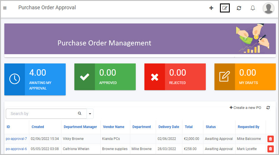
 to make changes to the dashboard page
 to delete the dashboard page
 to add a layout container to the dashboard page in order to organise the widgets on the page and achieve the layout you want
 on each widget on the dashboard that allow you to edit the options relating to that widget type (Update configuration), edit the widget settings (Update widget settings) or delete the widget from the dashboard (Remove widget)
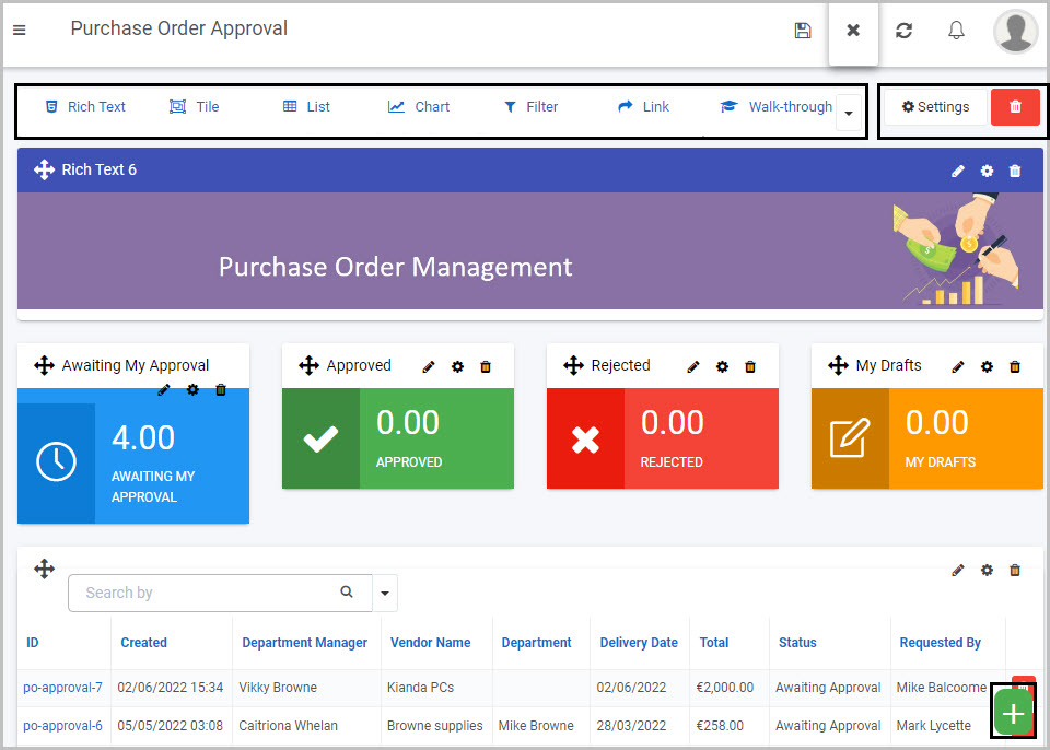
 in the left-hand pane
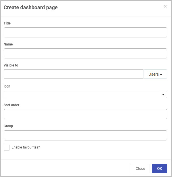
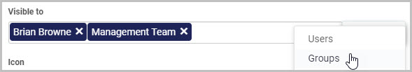
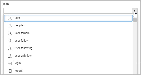
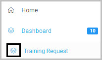
 - for the place you want this dashboard to go in terms of the order of the dashboard pages in your main left side menu.
 in the top dashboard menu, a new ‘Add to favourites’ button will be added to your top dashboard menu:
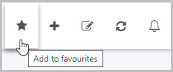

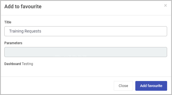
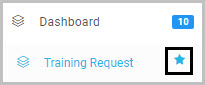
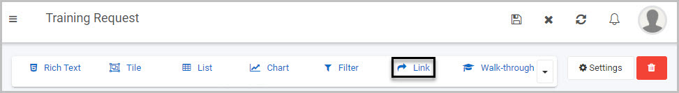
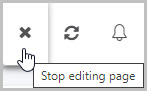
 .
.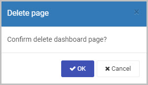
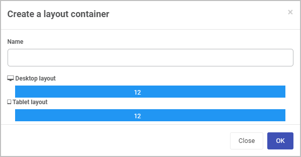
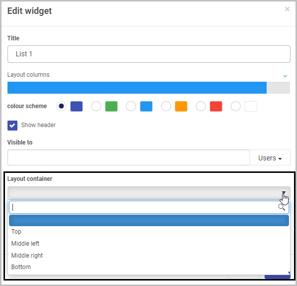
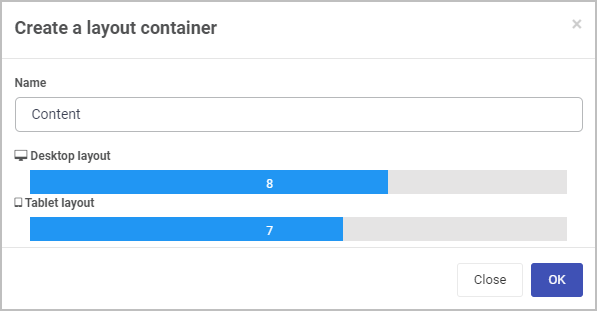
 .
.
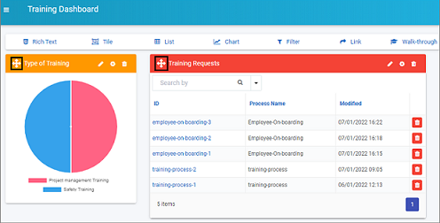
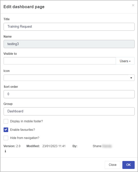
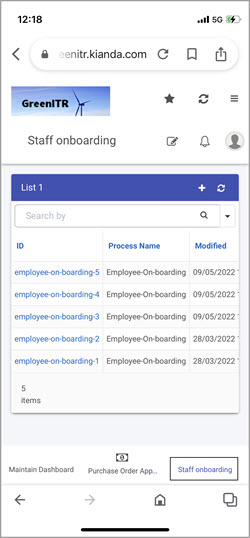
 to view the version history of the dashboard. This allows you to view the current dashboard version as well as all the previously saved dashboard versions, when they were modified, and by who they were saved. Clicking on the Restore page version button
  allows you to rollback to that version, which changes all the current dashboard widgets and settings to reflect the version selected. It should be noted that when rolling back to a previous version for example version 2.0 from version 5.0, you can still restore a version that succeeds version 2.0 if necessary as the version numbers are incremental.
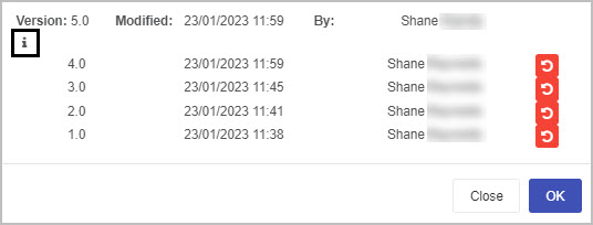

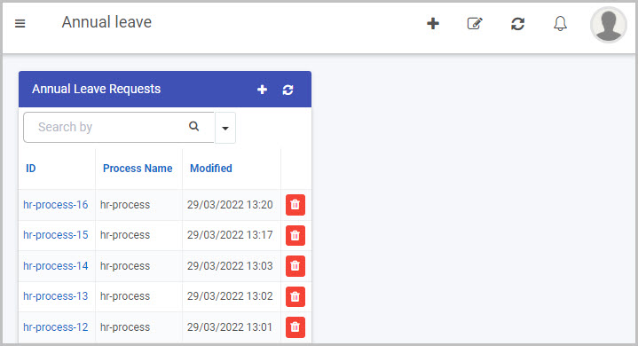
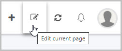

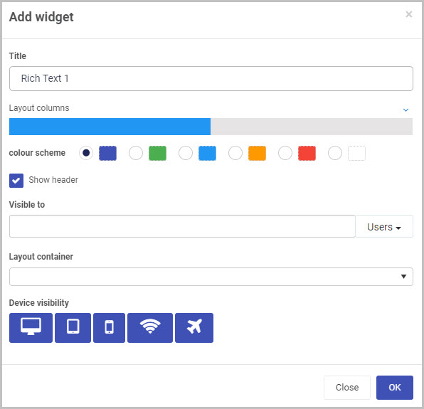
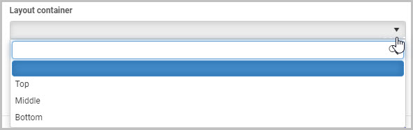
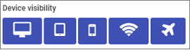
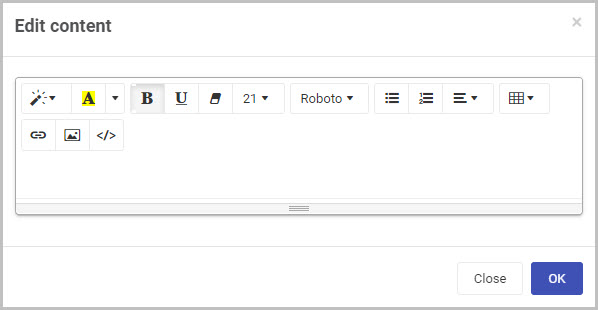
 you can copy HTML code directly into the text).
 you will be redirected to the File storage area where you can search for existing images stored in the Kianda file system, you can also create a folder, upload or delete a file.
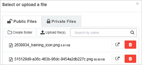
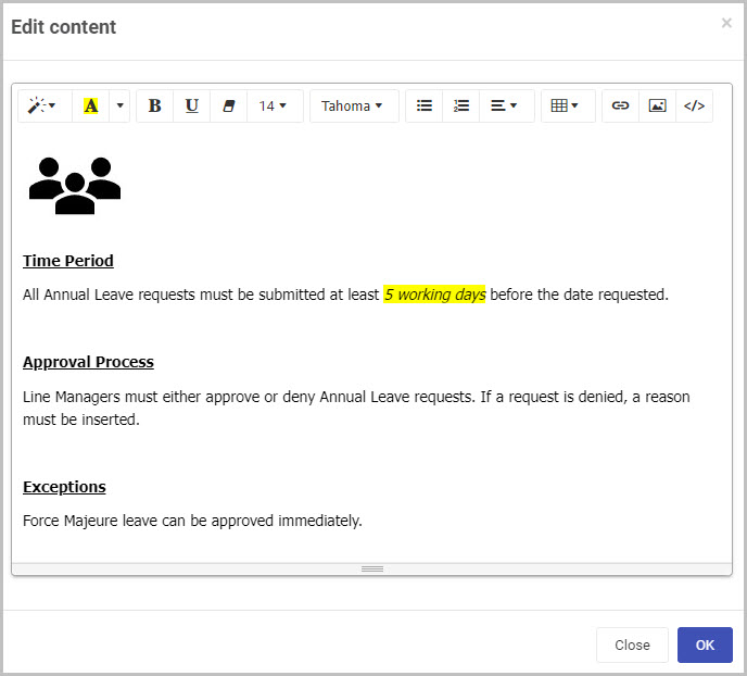
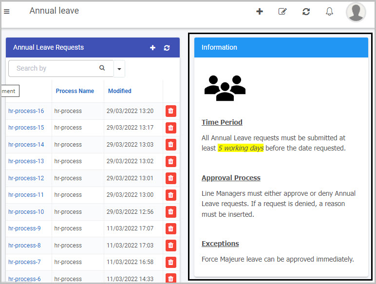
 .
.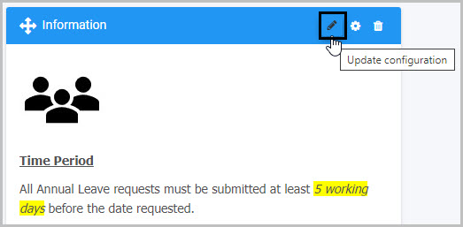
 .
.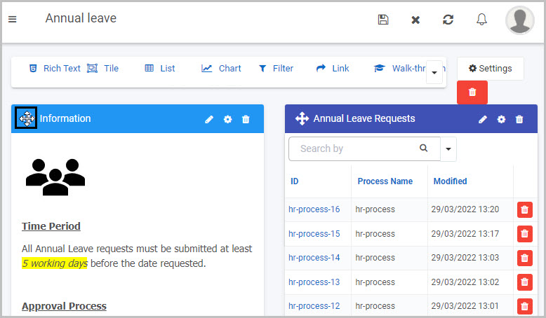
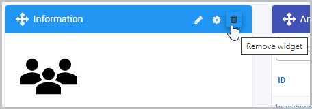
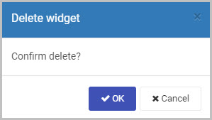
 .
.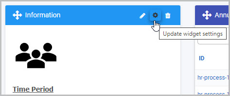
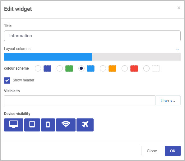
 at the top of the page, so the Widget menu with 7 widget types is available. Then click on the Tile widget
  .
.
 in the top menu to ensure your dashboard changes are saved and you see a pop-up message Page saved successfully.
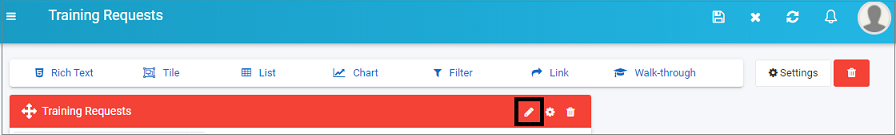
 and the Edit widget dialog box options, allowing you to make changes.
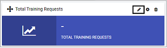
 in the middle of the box, and tile view fields and Key performance indicators in the right-hand pane. Go to
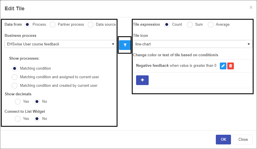
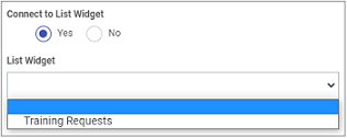
 to bring up the Add Tile KPI screen.
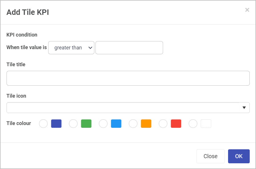
 to edit the associated KPI also.
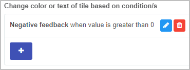
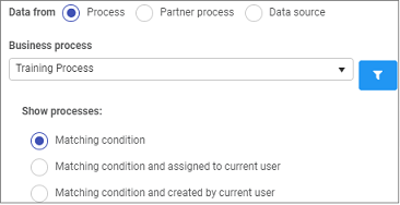
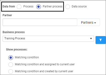
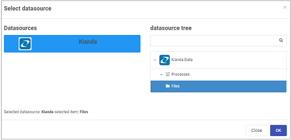
 .
.
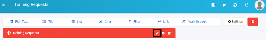

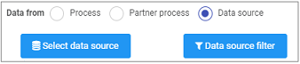
 on the widget you have created, to see the List view fields visible in the right-hand pane.
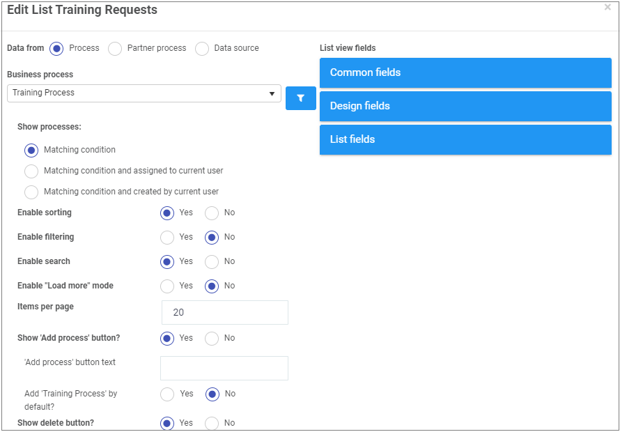
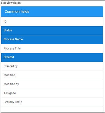
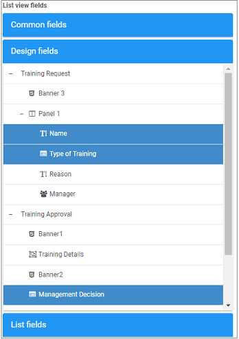
 .
.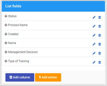
 to display a HTML and CSS code editor that allows you to design the custom column.
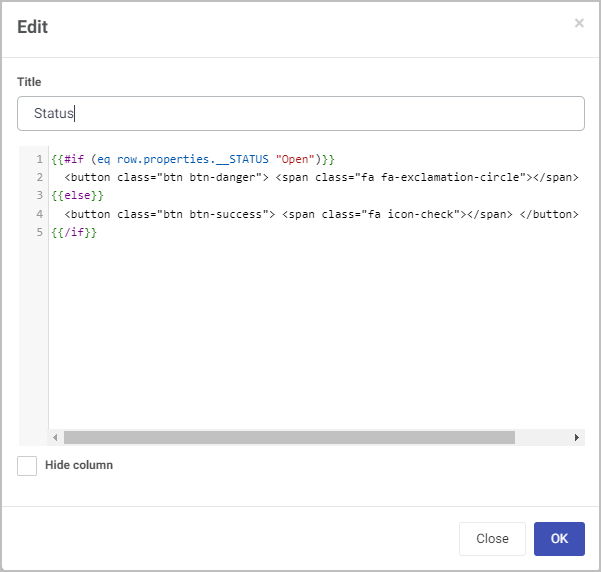

 to display the Add List Action dialog box.
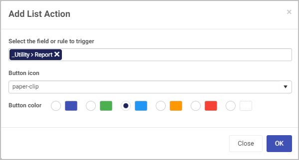
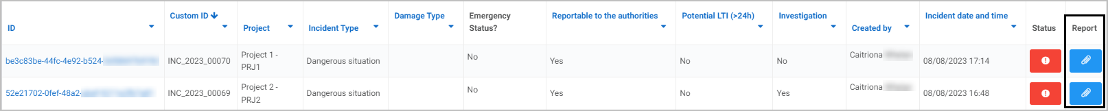
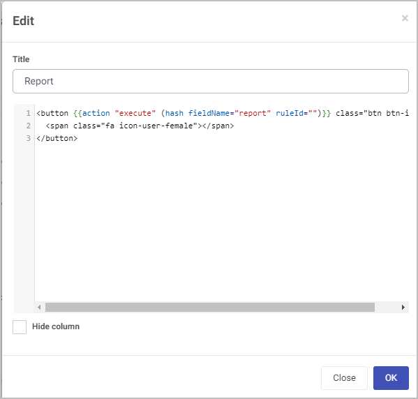
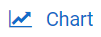 .
.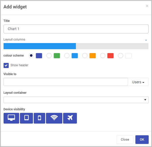
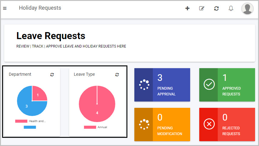
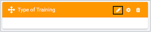
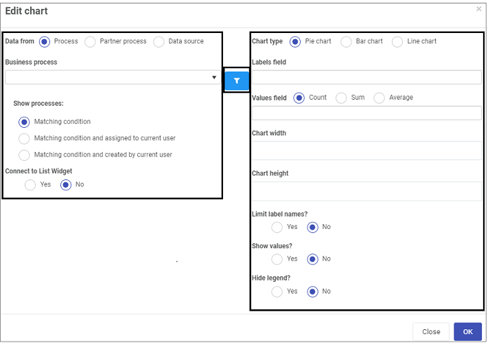
 in the widget you have created, to see the fields used to edit the chart, visible in the right-hand pane.
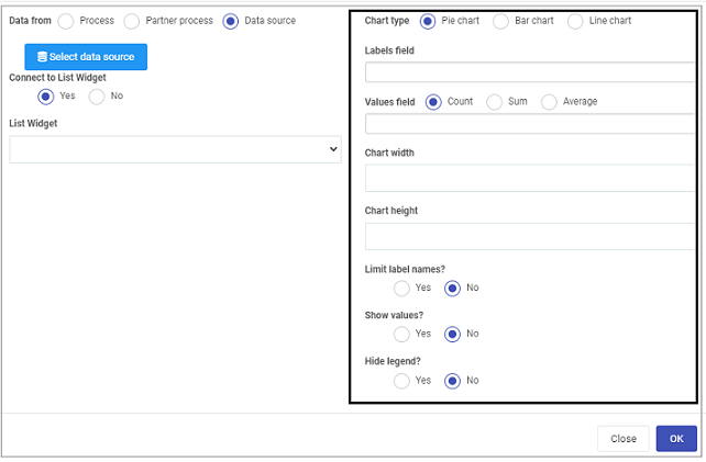
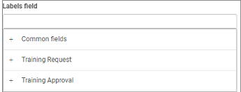
 .
.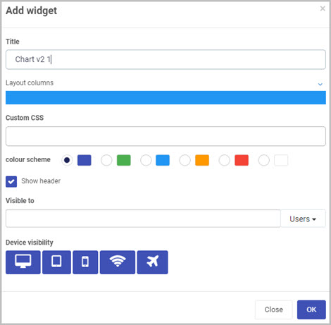
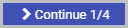 to move to the next step.
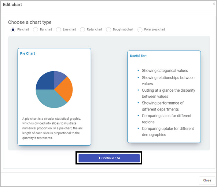
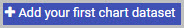 .
.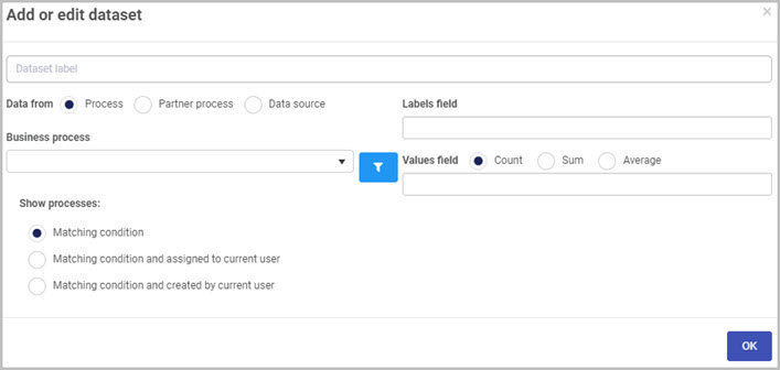
 - add conditions to your chart. Go to
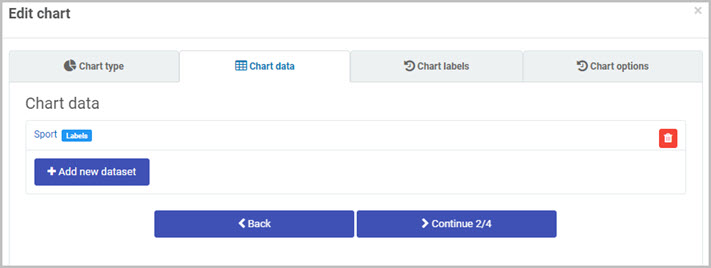
 .
. .
.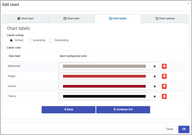
 .
.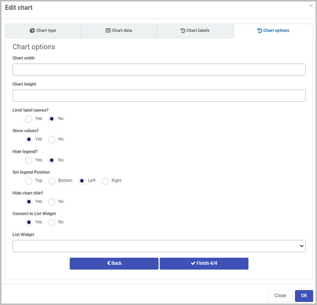
 .
.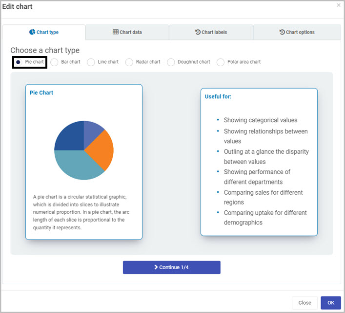
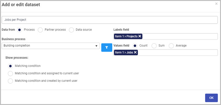
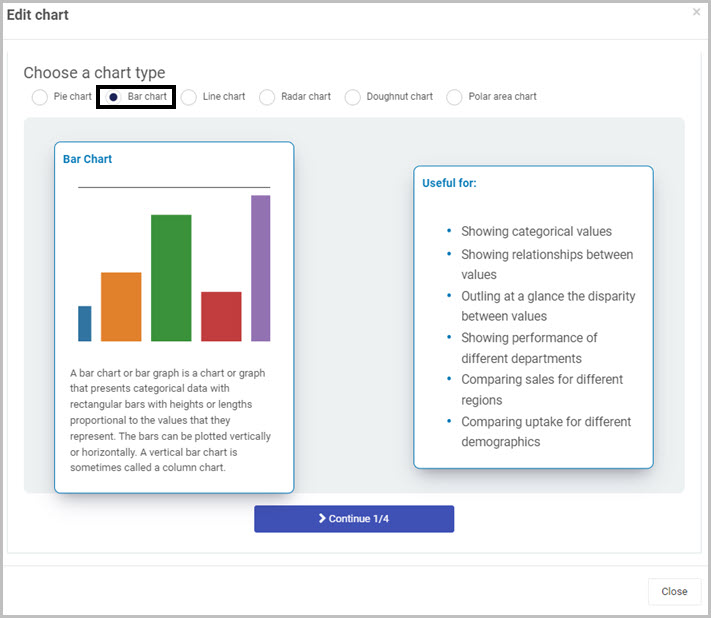
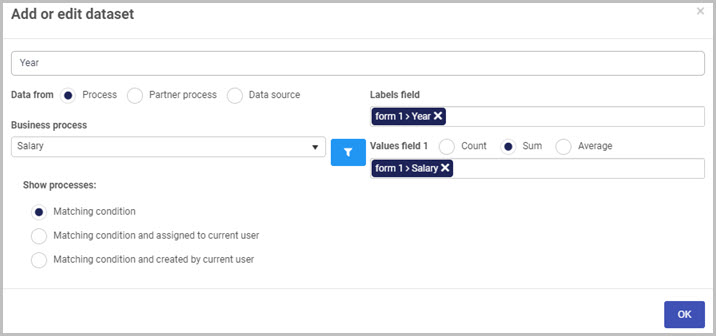
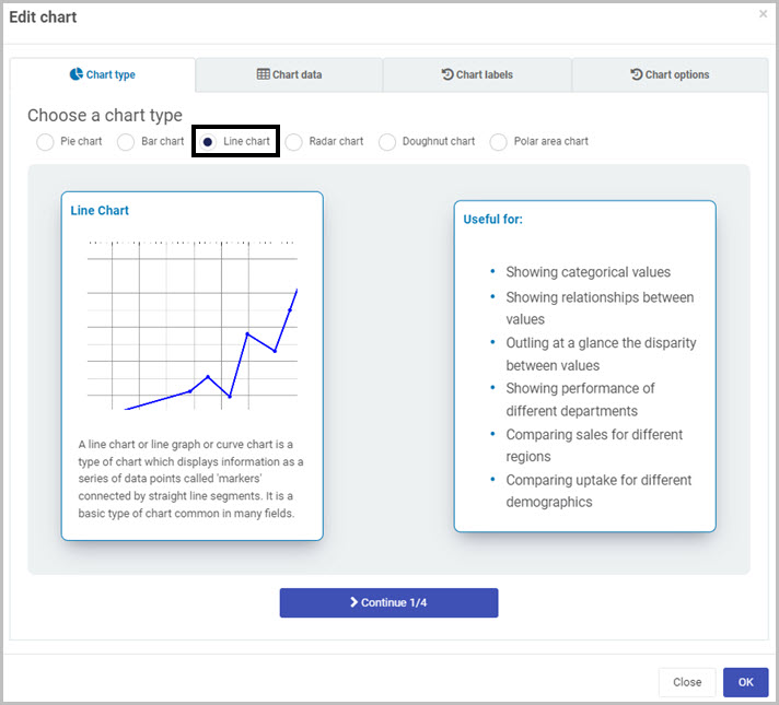
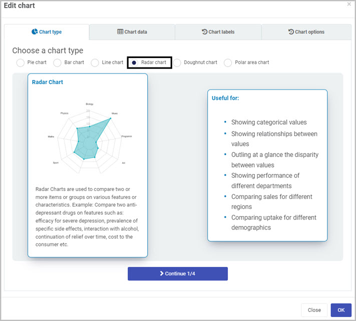
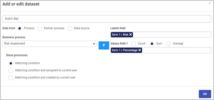
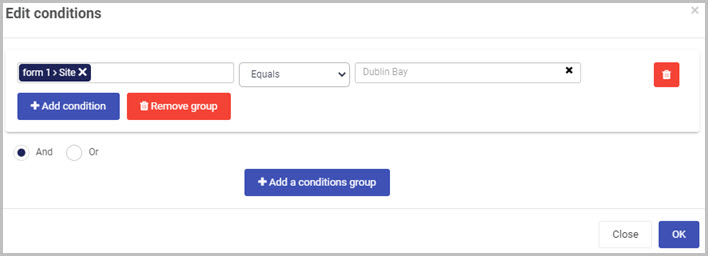
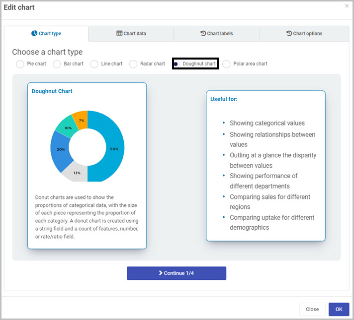

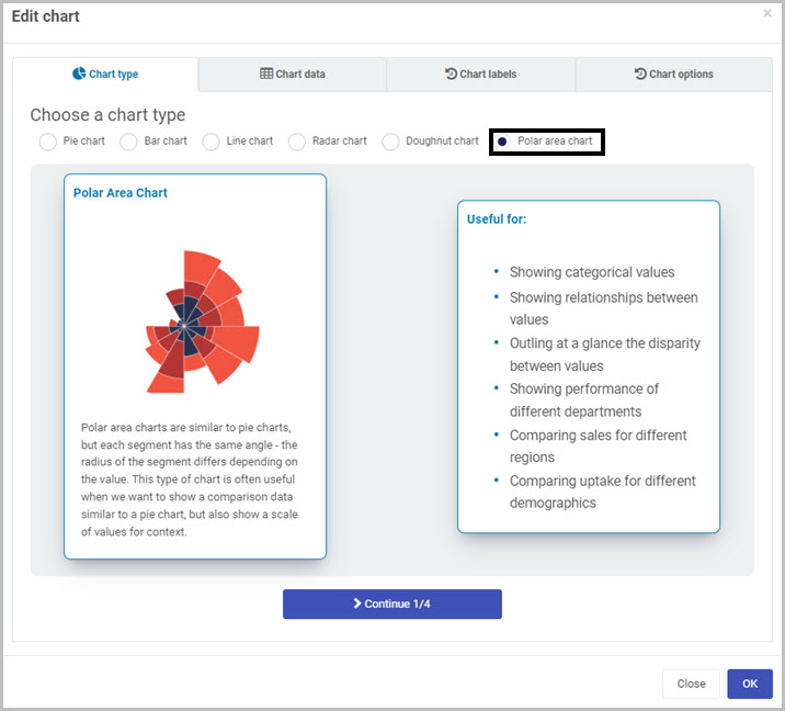
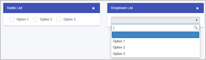
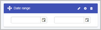
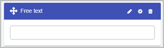
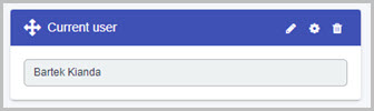

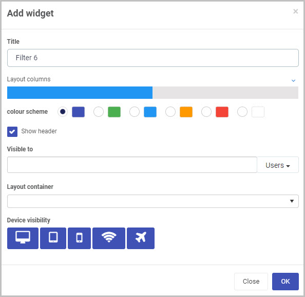
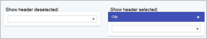
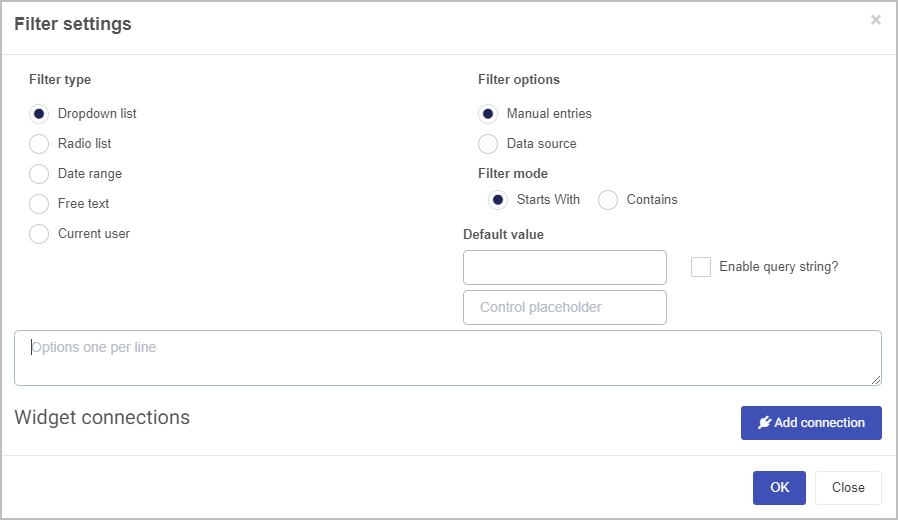
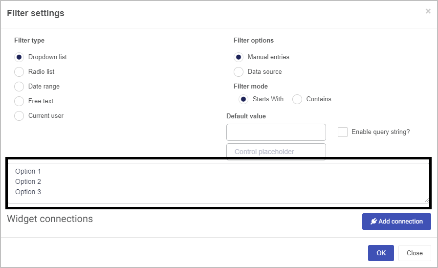
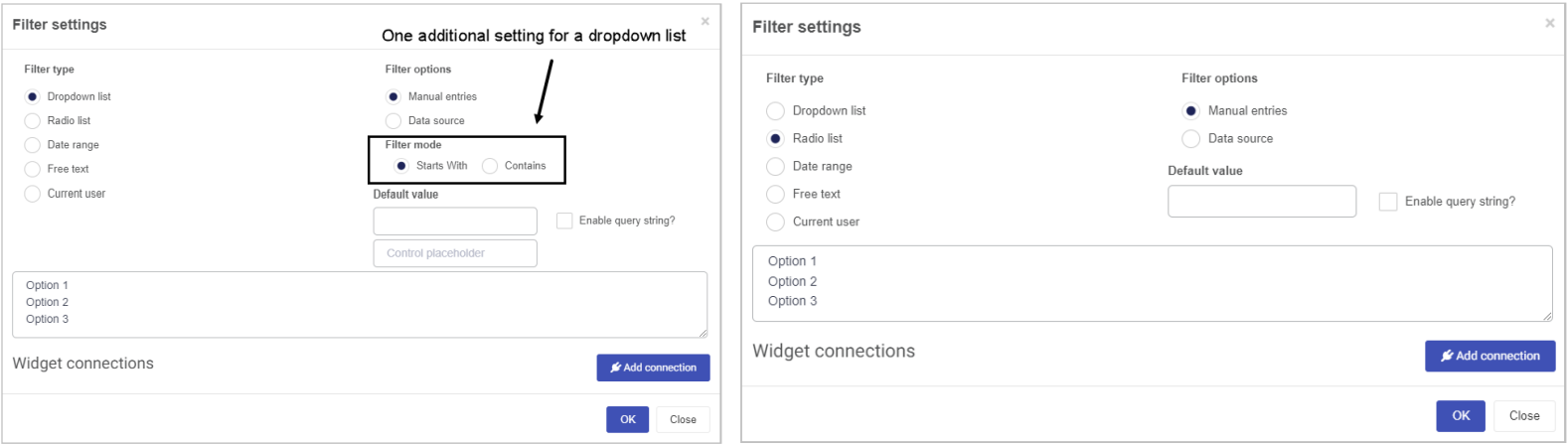
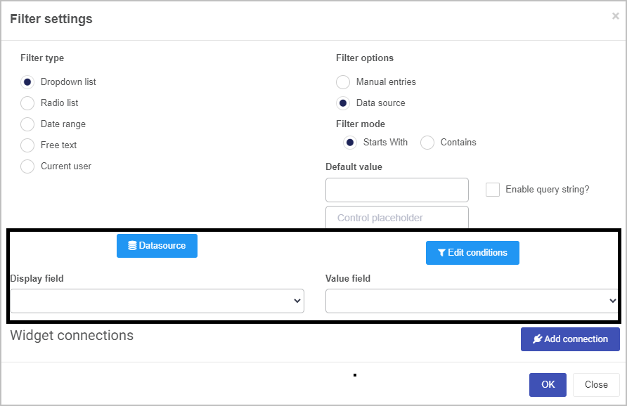
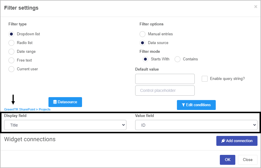
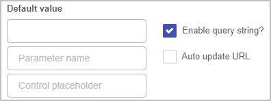
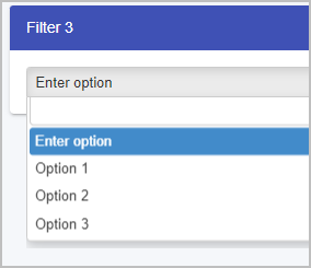
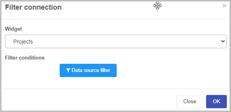
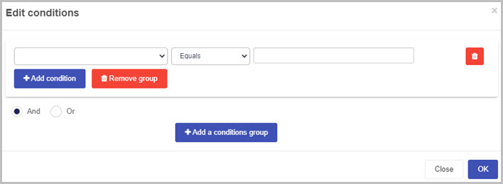
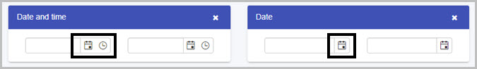
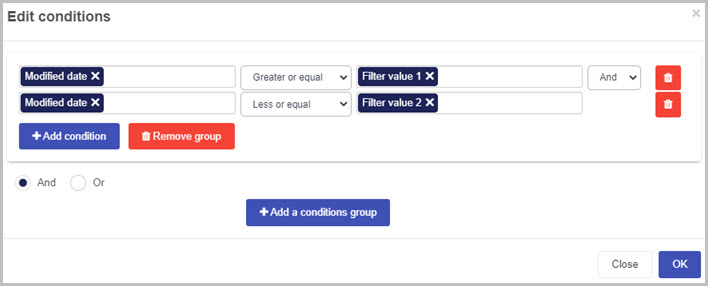
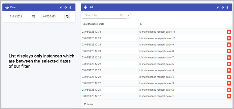
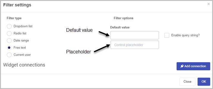
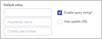
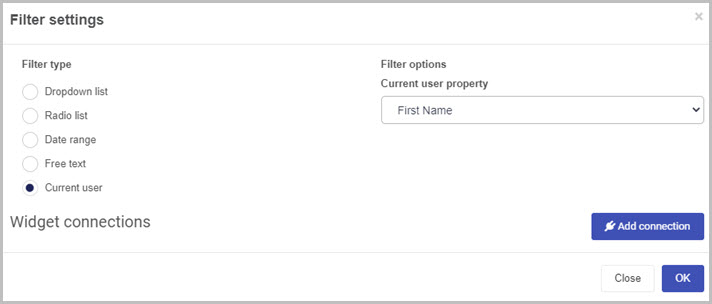
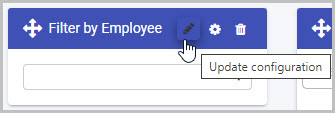
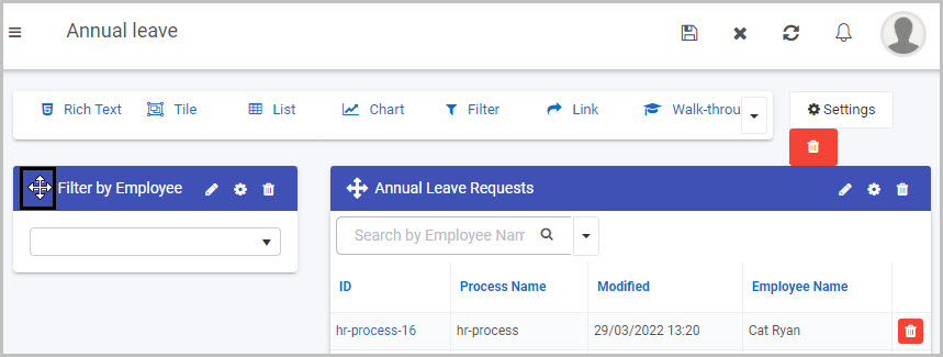
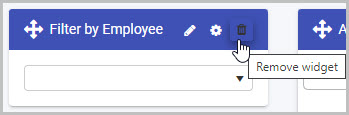
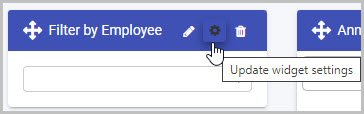
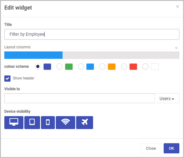
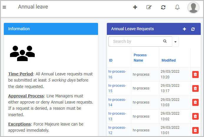

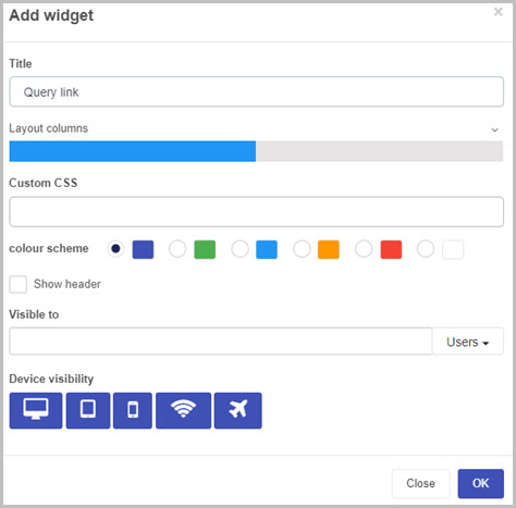
 to open the Edit link dialog box.
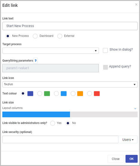
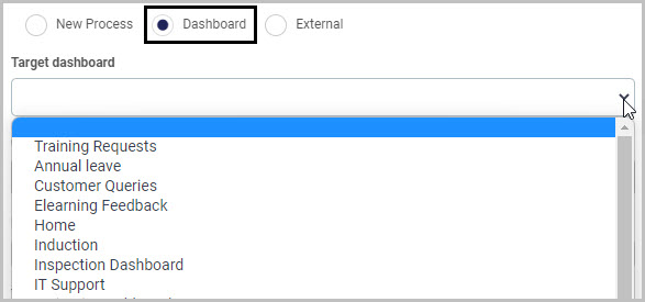
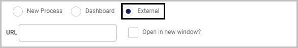
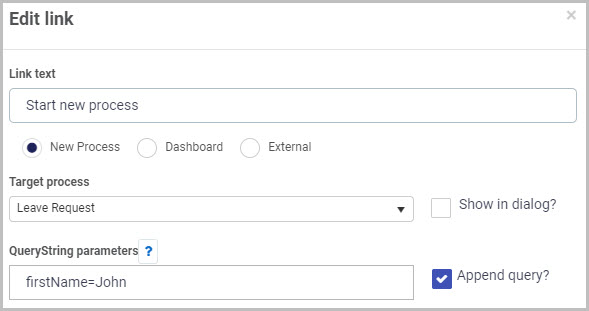
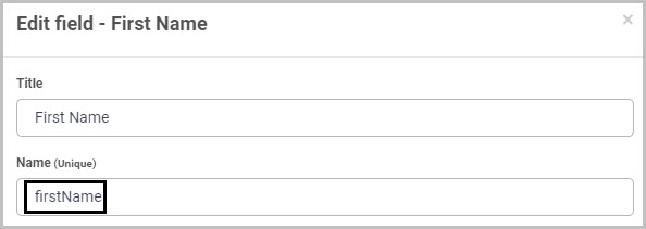
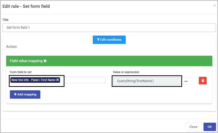
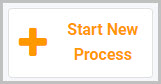
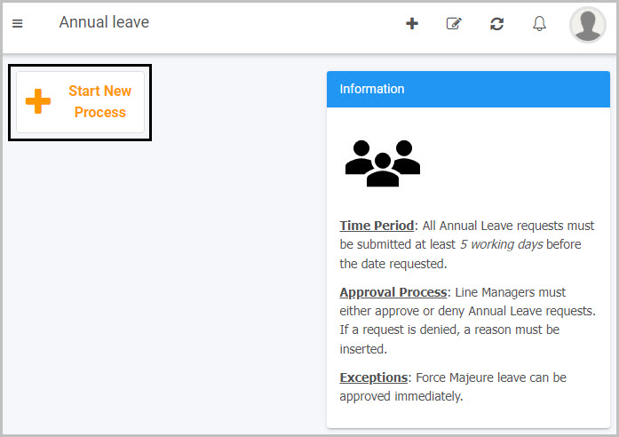
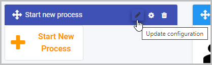
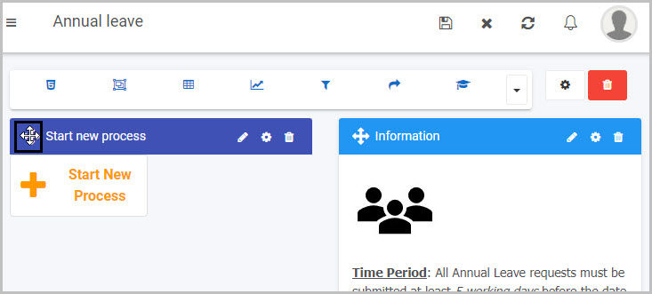
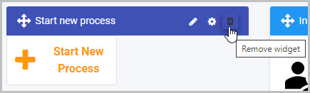
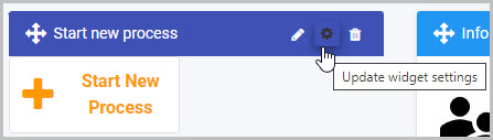
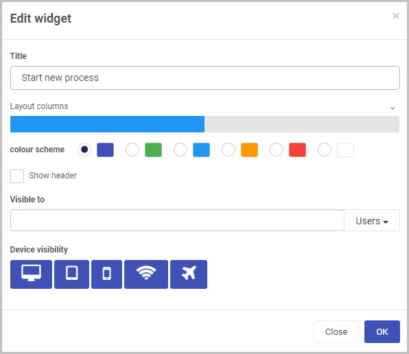
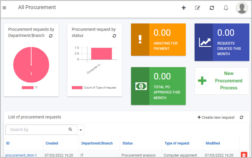


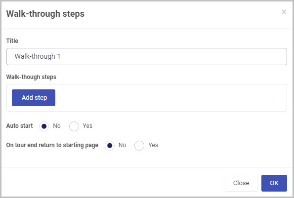
 button.
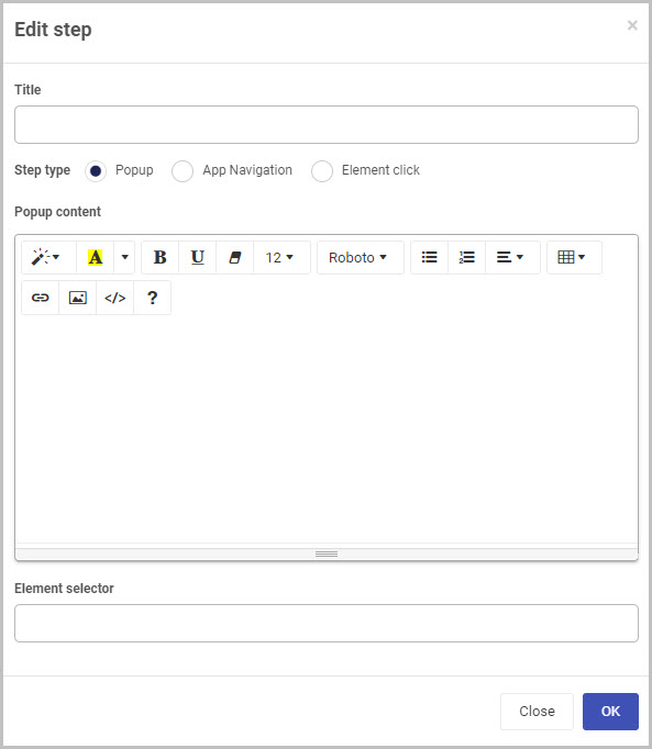
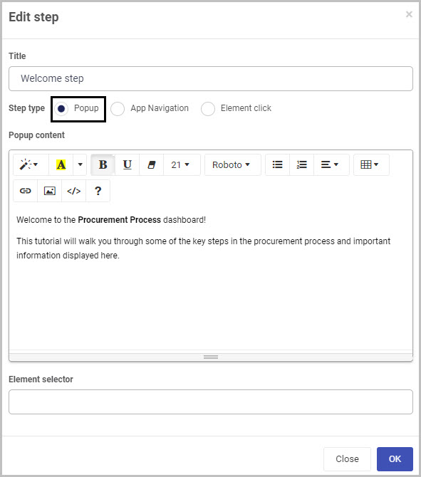
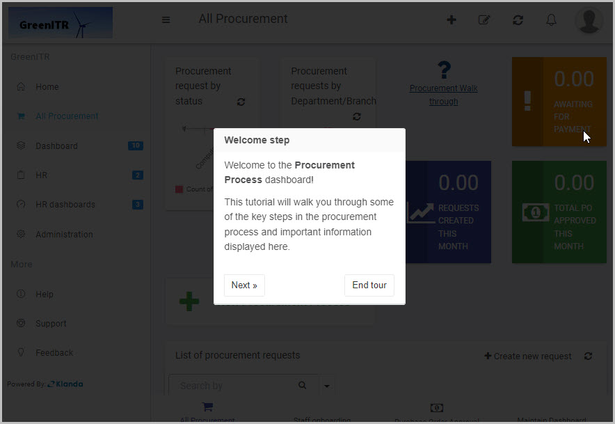
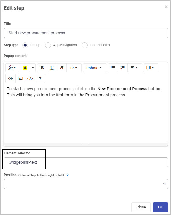
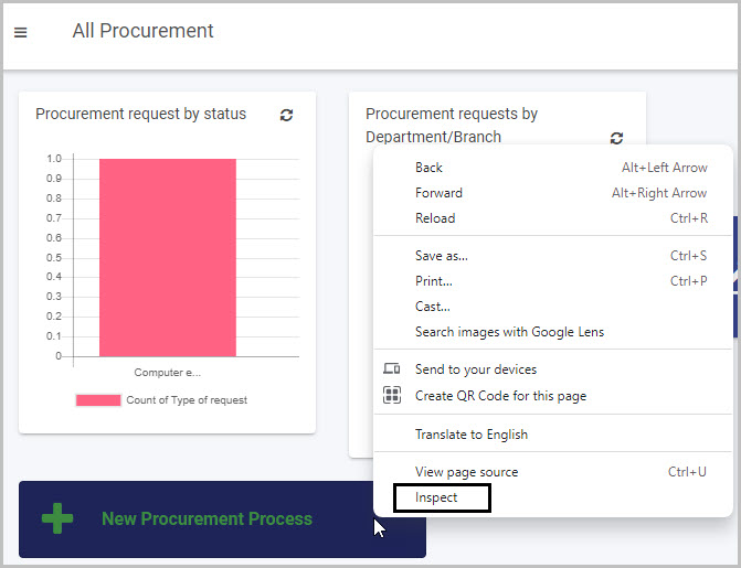
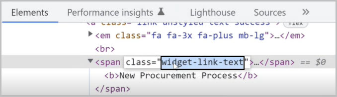
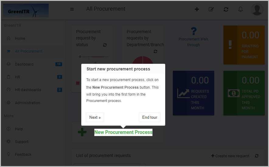
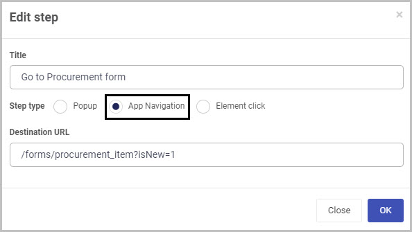
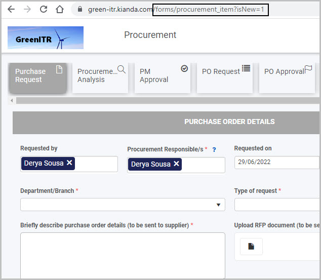
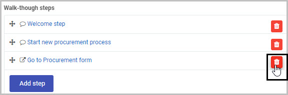
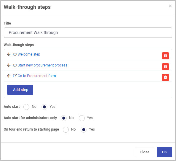
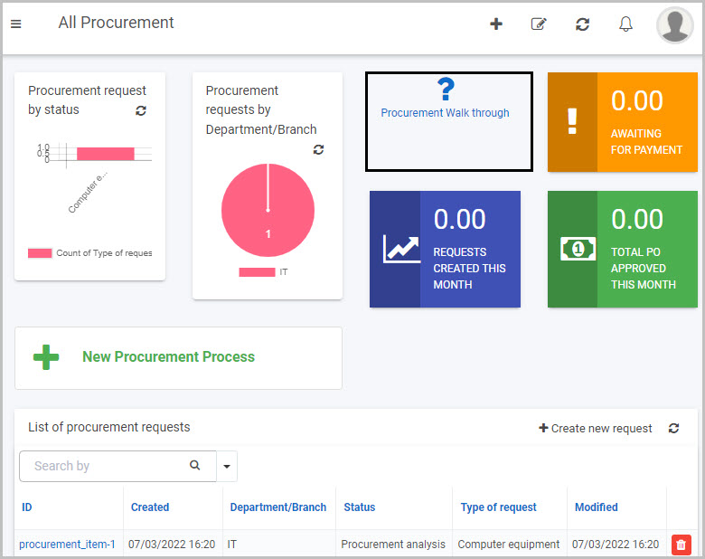
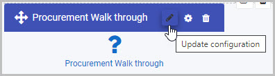
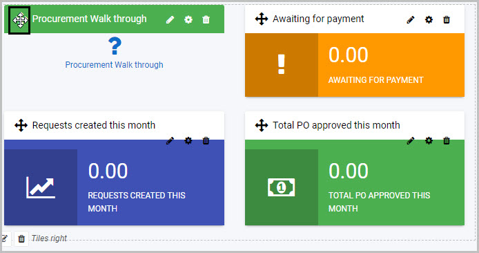
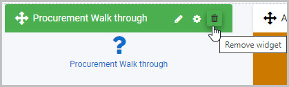
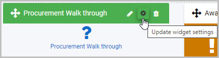
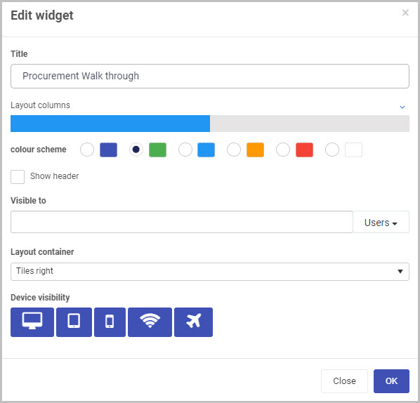
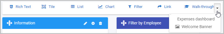
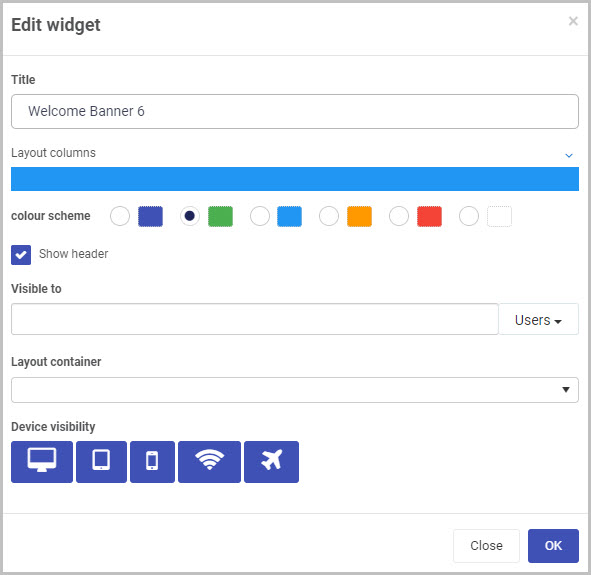
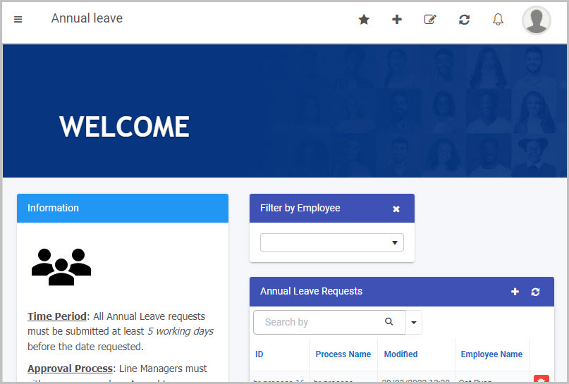
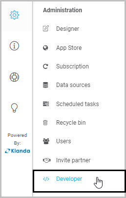
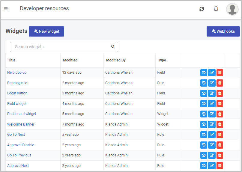
 .
.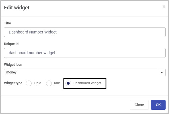
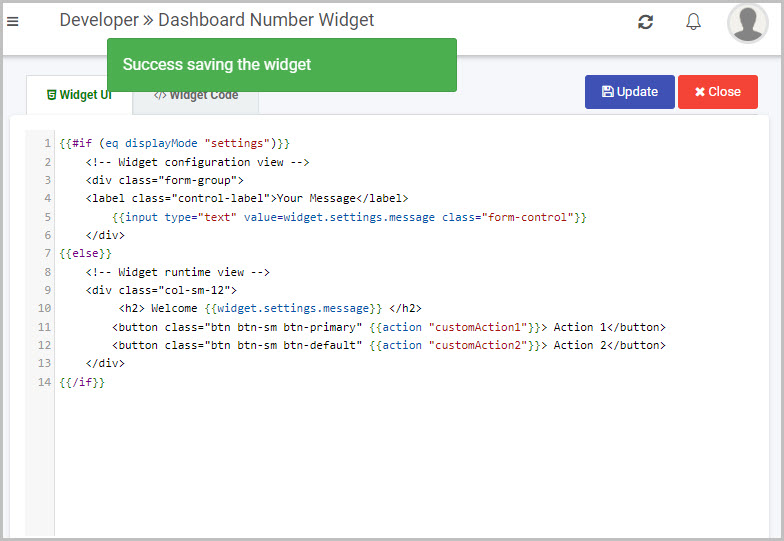
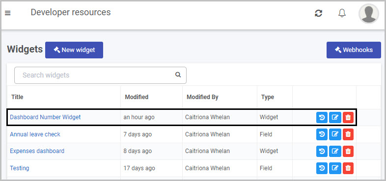
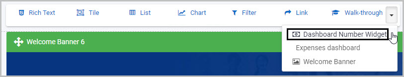
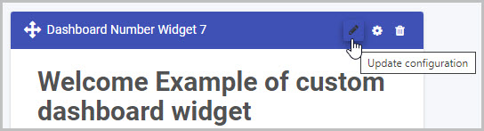
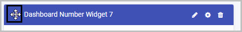
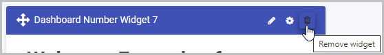
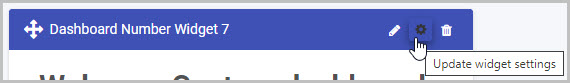

 button to add a condition.
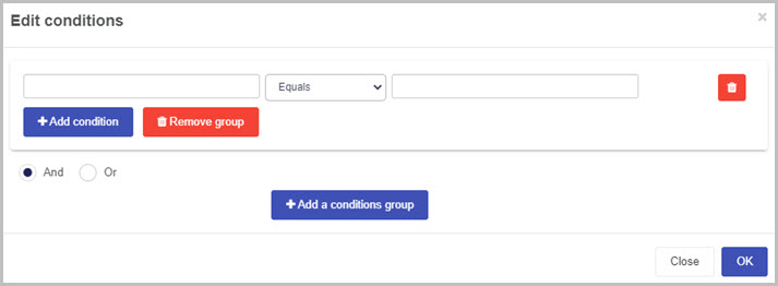
 beside the field name.
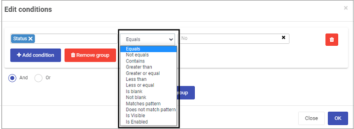
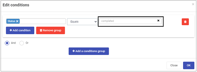
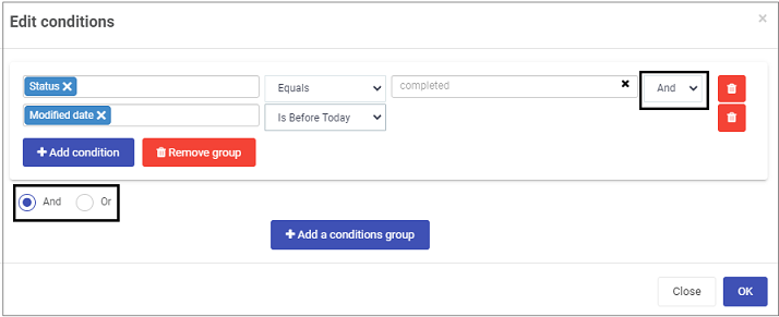
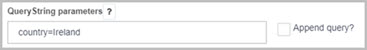
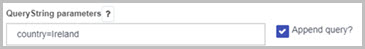
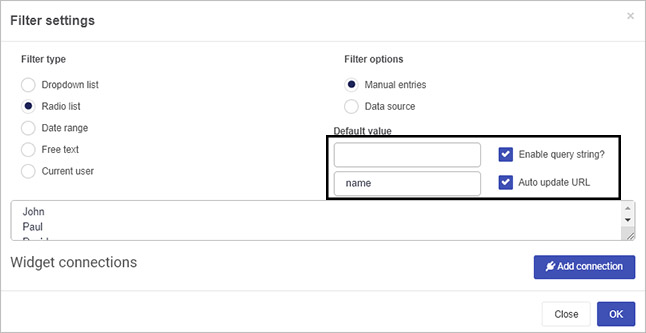
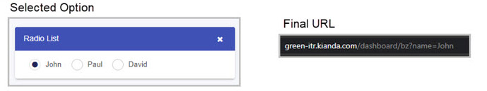
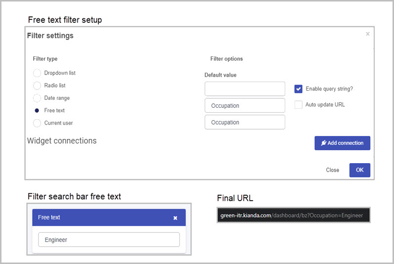
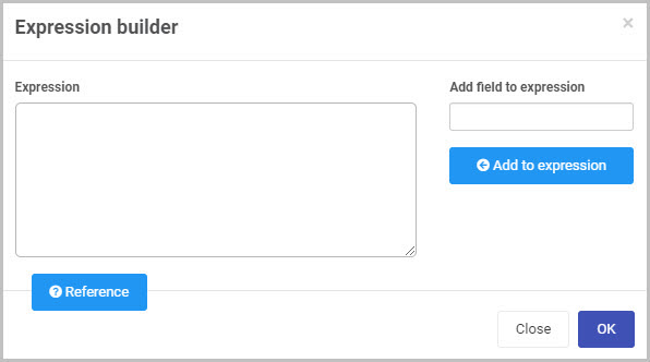
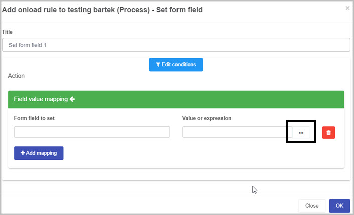
 to open a menu of reference to functions available in the expression builder.
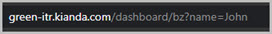 . Then to retrieve the value, the expression textbox will look as follows: