Chart v2 widget
A dashboard Chart v2 widget enables you to create pie charts, bar charts, line charts, radar charts, doughnut and polar area charts on your dashboard page. These charts can be used to represent various conditions or values in a process.
How to get started
-
After creating a dashboard page, make sure you are in Edit mode, by clicking on the Edit button
 at the top of the page, so the Widget menu with 7 widget types is available. Then click on the Chart widget
  .
. -
The Add widget dialog box opens.
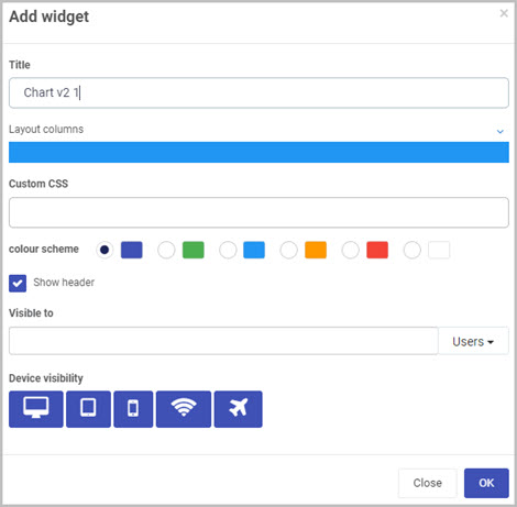
Choose the options you want for your new Chart widget:
-
Title - You can insert the title you want for your Chart widget (instead of the default title that is shown).
-
Layout columns - You can choose how wide you want your Chart widget to be. You can choose from 1 to 12 columns in width by clicking on the blue bar. For example, click half-way across the blue bar to create a widget that is 6 columns wide.
-
Custom CSS - here you can assign a class name for your widget. You can create or edit the CSS for your custom class in the global CSS file. To learn more about the global CSS visit Global CSS file.
-
Colour scheme - You can choose from six colour options for the header of the widget (Navy, Green, Blue, Amber, Red or White), if you choose to display it.
-
Show header - You can choose whether or not you want the header of your Chart widget to be displayed in the dashboard. This checkbox is selected by default, so de-select it if you don’t want the header to be displayed.
-
Visible to - You can choose who will be able to see the Chart widget. Select single or multiple Users or Groups, or a combination of the two. You can use the menu on the right to either filter the drop-down list by Users or Groups. To find out more about pre-defined Groups on Kianda, go to Users & Groups.
-
Note - Dashboard page security: When a dashboard page is first created, the users(s)/group(s) who will be able to view the dashboard are selected in the ‘Visible to’ option in the Create dashboard page dialog box (see Step 3 in How to create a Dashboard page).
You can also edit or update this setting at any point to change who has permission to view a particular dashboard page. This higher dashboard-level security setting will take precedence over the security settings (‘Visible to’) that are applied to the individual widgets within the dashboard (such as the Chart widget, in this case).
See Dashboard security and Widget security for more information.
-
-
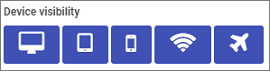
Device visibility - You can choose what devices and types of internet connections the dashboard Chart widget will be visible on - select all the options you want from Desktop, Tablet, Mobile, Wi-Fi and Flight mode as to when the device can view the dashboards. By default, all options are selected.
-
-
Click on OK when you’ve completed the Add widget dialog box.
-
An Edit chart wizard automatically opens showing the options for your new Chart widget. To learn more about these options and how to complete the chart wizard, see How to create a chart from the wizard.
-
Once you have finished completing the options you want in the wizard, click on the OK button (or click on Close to exit the dialog box without saving).
-
Click on the Save button
 in the top dashboard menu to save the insertion of the new Chart widget.
 -
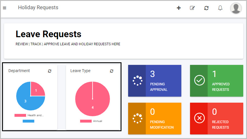
Your new Chart widget will now be displayed on your dashboard.
Here is an example of how Chart widgets can look on a dashboard page:
How to create a chart from the wizard
To create a Chart widget on a dashboard using the wizard:
-
Once you are in the chart wizard, first you need to choose a type of chart you want to create. There are six option:
- Pie chart - A pie chart is a circular statistical graphic, which is divided into slices to illustrate numerical proportion. In a pie chart, the arc length of each slice is proportional to the quantity it represents. To learn how to create a pie chart using Chart v2, visit How to create a Pie Chart.
- Bar chart - A bar chart or bar graph is a chart or graph that presents categorical data with rectangular bars with heights or lengths proportional to the values that they represent. The bars can be plotted vertically or horizontally. A vertical bar chart is sometimes called a column chart. To learn how to create a pie chart using Chart v2, visit How to create a Bar Chart.
- Line chart - A line chart or line graph or curve chart is a type of chart which displays information as a series of data points called ‘markers’ connected by straight line segments. It is a basic type of chart common in many fields. To learn how to create a pie chart using Chart v2, visit How to create a Line Chart.
- Radar chart - Radar Charts are used to compare two or more items or groups on various features or characteristics. Example: Compare two anti-depressant drugs on features such as: efficacy for severe depression, prevalence of specific side effects, interaction with alcohol, continuation of relief over time, cost to the consumer etc. To learn how to create a pie chart using Chart v2, visit How to create a Radar Chart.
- Doughnut chart - Donut charts are used to show the proportions of categorical data, with the size of each piece representing the proportion of each category. A donut chart is created using a string field and a count of features, number, or rate/ratio field. To learn how to create a pie chart using Chart v2, visit How to create a Doughnut Chart.
- Polar area chart - Polar area charts are similar to pie charts, but each segment has the same angle - the radius of the segment differs depending on the value. This type of chart is often useful when we want to show a comparison data similar to a pie chart, but also show a scale of values for context. To learn how to create a pie chart using Chart v2, visit How to create a Polar area Chart.
-
After choosing your chart type, click on
 to move to the next step.
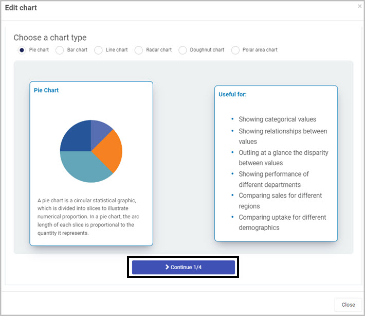
-
In this step of the wizard, click on
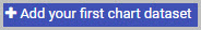 .
. -
An Add or edit dataset dialog will open, fill in the following details:
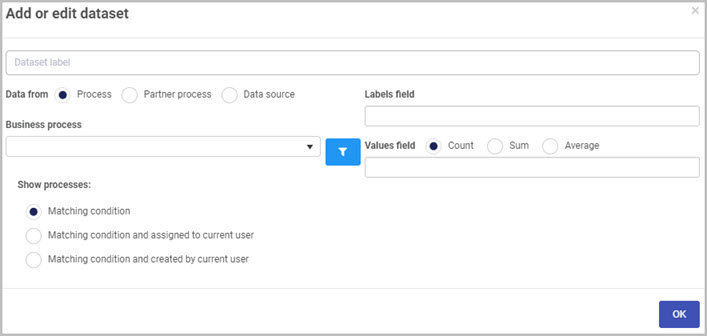
- Dataset label - enter the label for your dataset. This label will appear when you hover over the chart.
- Data from - Choose from a) Process b) Partner process or c) Data source. Depending on which option you choose go to the relevant area to read more on Choosing data from a Process, Choosing data from a Partner process and Choosing data from a Data source.
- Labels field - use the drop-down list to select the label of the data you want displayed. This can be any field from your process.
- Values field - use the drop-down list to select the value of the data you want displayed. This can be any field from your process. Count represents the total amount that the chosen value has appeared in a process. Sum is only available if your process contains a number field. Selecting sum, will add up all value for each process instance. Average is also only available for number fields which will return the average of all instances added up.
 - add conditions to your chart. Go to Conditions to read more about conditions.
-
When you are finished choosing options in the Add or edit dataset dialog box, click on the OK button to save your changes.
-
In this example, we created a Sport dataset.
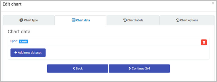
To add more datasets, click on
 .
. -
When you added all the datasets you require, click on
 .
. -
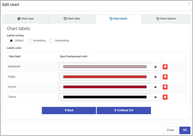
In the Chart labels section of the wizard, fill in the following information:
-
Labels sorting - choose a sorting order for the label:
- Default
- Ascending
- Descending
-
Labels colour - here will be displayed the number of labels from your process. Select a colour for a specific piece of data from your process.
-
-
When you complete the chart labels section, click on
 .
. -
The final step in the wizard is Chart option, fill in the following information:
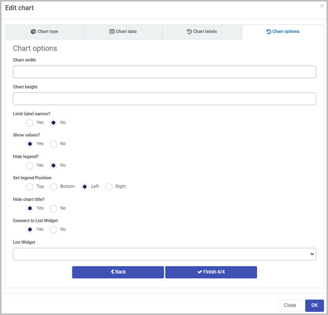
-
Chart width - use the arrow to choose a numeric value.
-
Chart height - use the arrow to choose a numeric value.
-
Limit label names - you can select yes to limit the number of labels in your chart. If you select no, the chart will display all labels available from your datasets.
-
Show values - select yes or no to show values within your chart.
-
Hide legend - select yes or no to hide or show the legend of your chart.
- Set legend Position - select the position of the legend.
-
Hide chart title - select yes or no to hide or show the title of the chart.
-
Connect to List Widget - select yes or no to connect an existing list widget in your dashboard to the chart.
- List Widget - from the drop-down list, select the list widget you want to connect to the chart.
-
-
When you are finished with the Chart options section, click on
 .
.
Choosing data from a Process
If you choose data from a Process, then the options below become available.
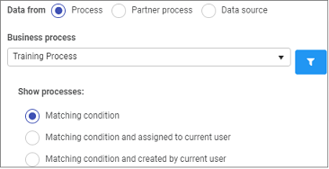
Choose from the following options:
- Business process - click into the field to choose a process which will be the input for the dashboard.
- Show processes - choose from a) Matching condition b) Matching condition and assigned to current user c) Matching condition and created by current user.
Choosing data from a Partner Process
If you choose data from a Partner Process, then the options below become available.
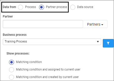
Choose from the following options:
- Partner - click into the field to choose from a pre-configured Partner who has created the process you are interested in.
- Business process - click into the field to choose a process which will be the input for the dashboard.
- Show processes - choose from a) Matching condition b) Matching condition and assigned to current user c) Matching condition and created by current user.
Choosing data from a Data source
If you choose data from a Data source, then click on the Select data source button.
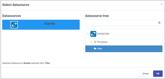
You will be directed to different data sources where you can search in the data source tree search box or drill down to the data source you want.
Click on the OK button when you are finished editing to save your changes or click on Close to exit the dialog box without saving.
How to create a Pie Chart
-
Create a Chart v2 widget in a dashboard of your choice.
-
In the Chart Wizard, select Pie chart radio button and click on
to move to the next step.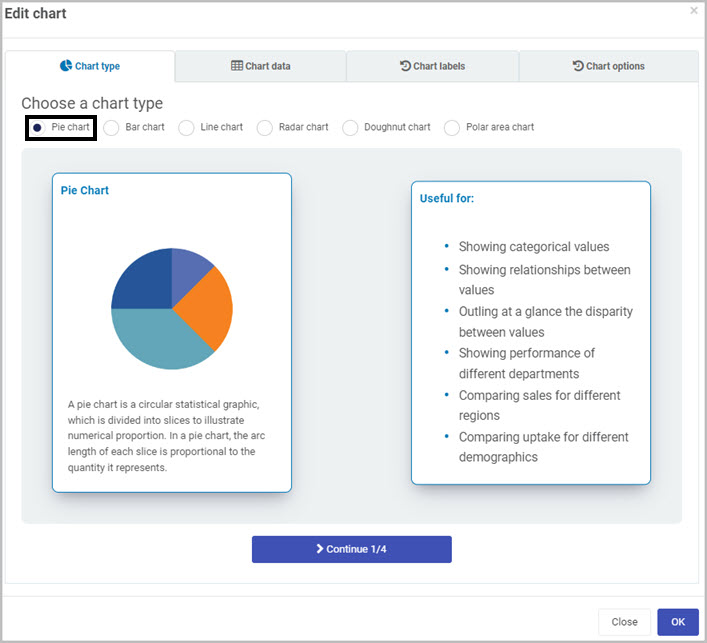
-
In this step of the wizard, click on
. The first dataset will represent a segment of the pie chart. -
As an example, we will link the first dataset to the number of jobs in a building site project. We will display the Project as a label and Jobs as the value.
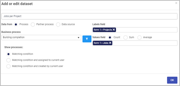
- First, link the dataset to our Building completion process in the Business process drop-down list.
- Select the Projects as the Labels field.
- Select Jobs in the values field 1 and select Count from the radio list. This will result in presenting the number of jobs in each project.
- Click on OK in the Add or Edit dataset dialog to save your dataset.
- To have multiple pie representations in one chart, follow the same step described in step 4.
-
Click Continue to move to the next step. Here select a colour scheme for your datasets.
-
When you are finished with your colour scheme, click on Continue to move to the last section of the wizard.
-
Follow step 10 of How to create a chart from the wizard to complete your chart. To display each segment as a percentage, select No in the Show values? option in the last section of the chart wizard.
How to create a Bar Chart
-
Create a Chart v2 widget in a dashboard of your choice.
-
In the Chart Wizard, select Bar chart radio button and click on
to move to the next step.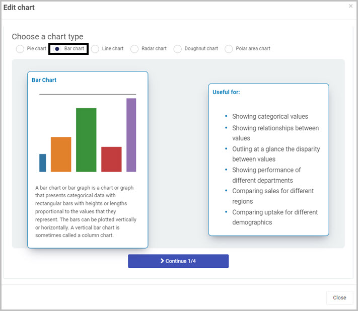
-
In this step of the wizard, click on
The first dataset will represent a segment of the pie chart. -
As an example, we will link the first dataset to the number of jobs in a building site project. We will display the Year as a label and Salary as the value.
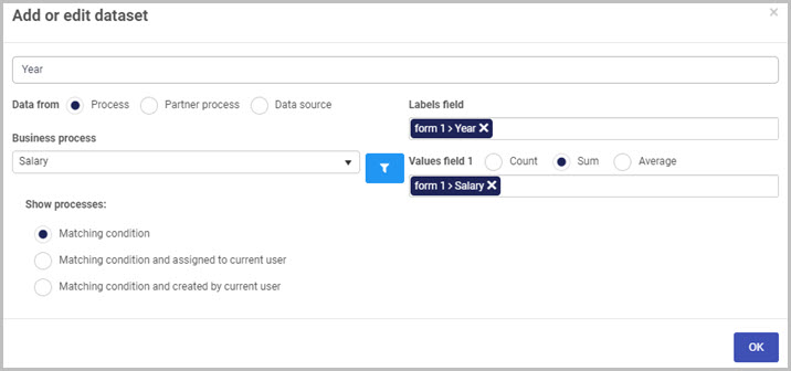
- First, link the dataset to our Salary process in the Business process drop-down list.
- Select the Projects as the Labels field.
- Select Jobs in the values field 1 and select Count from the radio list. This will result in presenting the number of jobs in each project.
- Click on OK in the Add or Edit dataset dialog to save your dataset.
- To have multiple pie representations in one chart, follow the same step described in step 4.
-
Click Continue to move to the next step. Here select a colour scheme for your datasets.
-
When you are finished with your colour scheme, click on Continue to move to the last section of the wizard.
-
Follow step 10 of How to create a chart from the wizard to complete your chart. To display each segment as a percentage, select No in the Show values? option in the last section of the chart wizard.
How to create a Line Chart
-
Create a Chart v2 widget in a dashboard of your choice.
-
In the Chart Wizard, select Line chart radio button and click on
to move to the next step.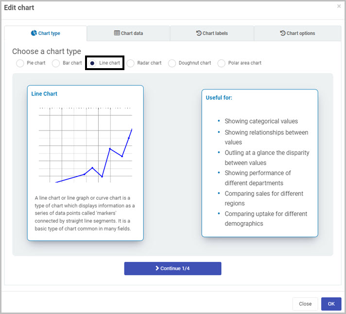
-
In this step of the wizard, click on
The first dataset will represent the first piece of data and its label will be visible on the bottom of the line chart. -
As an example, we will link the first dataset to display a salary number depending on the year. We will display the Year as a label and Salary as the value.
- First, link the dataset to our Salary process in the Business process drop-down list.
- Select the Projects as the Labels field.
- Select Year in the values field 1 and select Sum from the radio list. This will result in presenting the total number of the salary earned each year.
- Click on OK in the Add or Edit dataset dialog to save your dataset.
- To have multiple pie representations in one chart, follow the same step described in step 4.
-
Click Continue to move to the next step. Here select a colour scheme for your datasets.
-
When you are finished with your colour scheme, click on Continue to move to the last section of the wizard.
-
Follow step 10 of How to create a chart from the wizard to complete your chart. To display each segment as a percentage, select No in the Show values? option in the last section of the chart wizard.
How to create a Radar Chart
-
Create a Chart v2 widget in a dashboard of your choice.
-
In the Chart Wizard, select Radar chart radio button and click on
to move to the next step.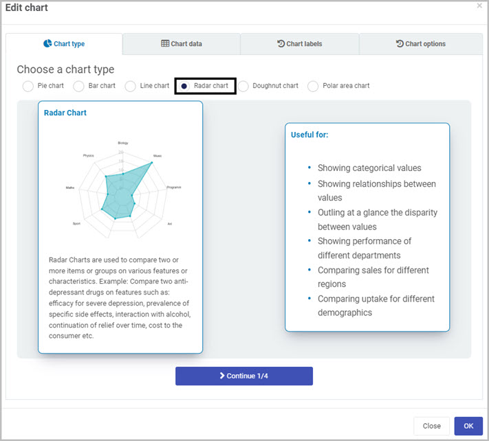
-
In this step of the wizard, click on
The first dataset represents your labels. The labels on a radar chart is each point on the outer part of the radar. -
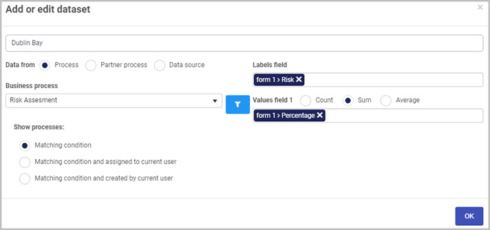
As an example, we will link the first dataset to one of our sites from a process. We will display the Risk as a label and Percentage as the value.
-
Link the dataset to our risk assessment process in the Business process drop-down list.
-
Click on
button to set a condition. Here we’ll set a condition to only display the percentage of a risk if a site is equal to Dublin Bay (one of our existing sites in the process). This is our first radar diagram.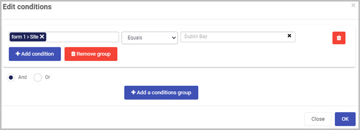
-
Select the Risk as the Labels field.
-
Select Percentage in the values field 1 and select sum from the radio list. This will result in displaying the percentage of each risk of Dublin Bay.
-
Click on OK in the Add or Edit dataset dialog to save your dataset.
-
To have multiple radar diagram in one chart, follow the same step described in step 4.
-
-
Click Continue to move to the next step. Here select a colour scheme for your datasets.
-
When you are finished with your colour scheme, click on Continue to move to the last section of the wizard.
-
Follow step 10 of How to create a chart from the wizard to complete your chart.
How to create a Doughnut Chart
-
Create a Chart v2 widget in a dashboard of your choice.
-
In the Chart Wizard, select Radar chart radio button and click on
to move to the next step.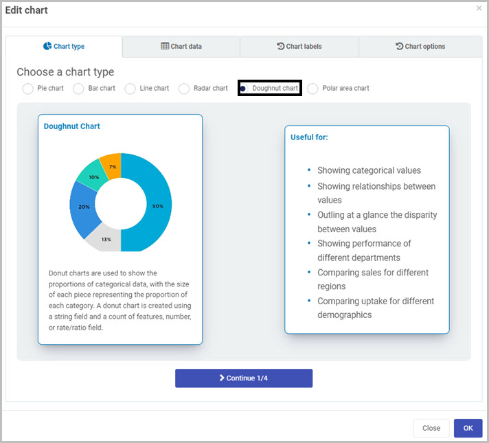
-
In this step of the wizard, click on
The first dataset represents your most outer doughnut. -
As an example, we will link the process to our Building process. We will display the Projects as a label. The value field for this dataset is set to jobs which will result in the doughnut displaying number of jobs for each project.

- Link the dataset to our risk assessment process in the Business process drop-down list.
- Select the Projects as the Labels field.
- Select Jobs in the values field 1 and select Count from the radio list.
- Click on OK in the Add or Edit dataset dialog to save your dataset.
- To have multiple doughnut diagram in one chart, follow the same step described in step 4.
-
Click Continue to move to the next step. Here select a colour scheme for your datasets.
-
When you are finished with your colour scheme, click on Continue to move to the last section of the wizard.
-
Follow step 10 of How to create a chart from the wizard to complete your chart.
How to create a Polar area Chart
-
Create a Chart v2 widget in a dashboard of your choice.
-
In the Chart Wizard, select Radar chart radio button and click on
to move to the next step.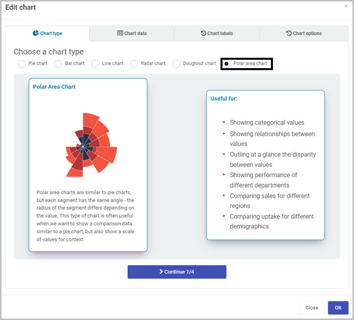
-
In this step of the wizard, click on
The first dataset represents your labels. The labels on a radar chart is each point on the outer part of the radar. -
As an example, we will link the first dataset to one of our sites from a process. We will display the Risk as a label and Percentage as the value.
-
Link the dataset to our risk assessment process in the Business process drop-down list.
-
Click on
button to set a condition. Here we’ll set a condition to only display the percentage of a risk if a site is equal to Dublin Bay (one of our existing sites in the process). This is our first radar diagram. -
Select the Risk as the Labels field.
-
Select Percentage in the values field 1 and select sum from the radio list. This will result in displaying the percentage of each risk of Dublin Bay.
-
Click on OK in the Add or Edit dataset dialog to save your dataset.
-
To have multiple radar diagram in one chart, follow the same step described in step 4.
-
-
Click Continue to move to the next step. Here select a colour scheme for your datasets.
-
When you are finished with your colour scheme, click on Continue to move to the last section of the wizard.
-
Follow step 10 of How to create a chart from the wizard to complete your chart.
How to move Chart widgets
To move a Chart widget on a dashboard:
- On your dashboard, click on the Edit current page button
 in the top menu to go into Dashboard Edit mode.
 - Select the widget’s drag handle button
 .
. - Drag and drop the widget where you want it to go on your dashboard.
- Click on Save in the dashboard top menu to save the changes you’ve made.
How to delete Chart widgets
To delete a Chart widget from your dashboard:
-
On your dashboard, click on the Edit current page button
in the top menu to go into Dashboard Edit mode. -
Click on the widget’s Remove widget (Bin/Trash icon) button
 .
. -
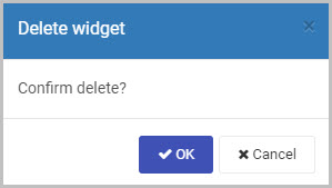
A Delete widget dialog box will open. Click on OK to delete the widget (or click on Cancel if you wish to cancel the deletion).
-
Click on Save
in the dashboard top menu to save the changes you’ve made.
How to edit Chart widget settings
To update or edit your Chart widget settings:
-
On your dashboard, click on the Edit current page button
in the top menu to go into Dashboard Edit mode. -
Click on the Update widget settings (Cog) button
 .
. -
The Edit widget wizard will open, enabling you to make changes to any of the available options.
-
Click on OK to confirm the changes you’ve made to the widget settings (or click on Close if you don’t want to retain any changes).
-
The updated Chart widget will display on your dashboard. Click on Save
in the dashboard top menu to save the changes you’ve made.
Saving changes
Make sure to save any changes you make to your Chart widget by clicking on the Save button in the dashboard top menu. If you leave the dashboard without saving the changes you have made to a widget, the next time you visit the dashboard it won’t include any of the changes made to it since the dashboard page was last saved.
What’s next 
Now that you’ve learned about the Dashboard Chart widget, find out more about the other types of Dashboard widgets you can add to your Kianda dashboard:
- Link widget
- Rich Text widget
- List widget
- Tile widget
- Walk-through widget
- Custom dashboard widget
- Filter widget
Feedback
Was this page helpful?
Glad to hear it! Please tell us how we can improve.
Sorry to hear that. Please tell us how we can improve.