List widget
A dashboard List widget displays the instances of the selected process in a dashboard. The List widget can also be used to connect with any other dashboard widgets to display filtered items.
How to get started
-
After creating a dashboard page, make sure you are in Edit mode, by clicking on the Edit button
 at the top of the page, so the Widget menu with 7 widget types is available. Then click on the List widget
  .
. -
The Add widget dialog box opens.
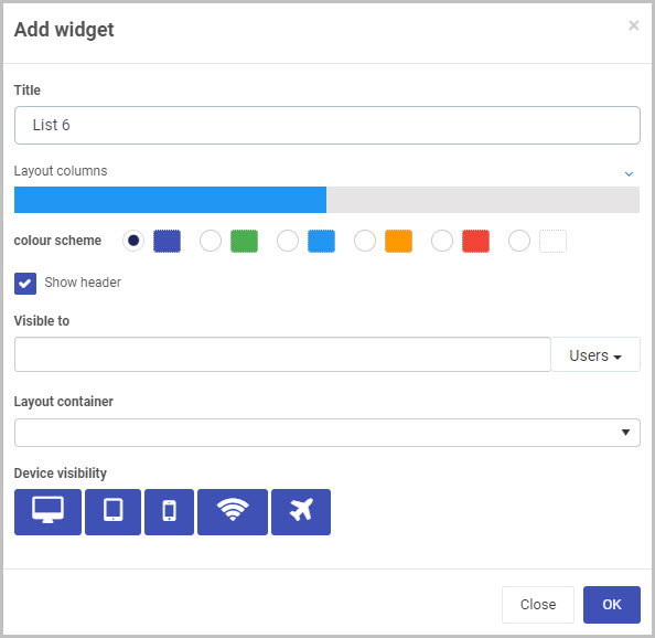
Choose from the edit options:
-
Title - the dashboard title, for example Training Requests
-
Layout columns - control the size of the dashboard, choose from 1 to 12 columns in width. For example click half-way across the blue bar to create a panel that is 6 columns wide, or click on the right of the blue bar to create a column that is 12 columns wide.
-
Colour scheme - choose from Navy, Green, Blue, Amber, Red or White Colours for your dashboard.
-
Show header checkbox - tick this checkbox if you wish to show a header on your dashboard.
-
Visible to - You can choose who will be able to see the List widget. Select single or multiple Users or Groups, or a combination of the two. You can use the menu on the right to either filter the drop-down list by Users or Groups. To find out more about pre-defined Groups on Kianda, go to Users & Groups.
-
Note - Dashboard page security: When a dashboard page is first created, the users(s)/group(s) who will be able to view the dashboard are selected in the ‘Visible to’ option in the Create dashboard page dialog box (see Step 3 in How to create a Dashboard page).
You can also edit or update this setting at any point to change who has permission to view a particular dashboard page. This higher dashboard-level security setting will take precedence over the security settings (‘Visible to’) that are applied to the individual widgets within the dashboard (such as a dashboard List widget, in this case).
See Dashboard security and Widget security for more information.
-
-
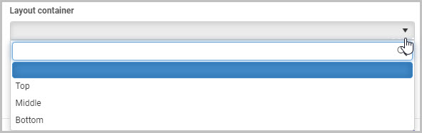
Layout container - This option will only display if you have already created layout containers for your Dashboard page. Here, you can select which layout container you want your new List widget to be placed in.
A layout container is a simple way to organise, arrange and move the widgets you add to your dashboard. To learn more about layout containers, go to How to add layout containers to a Dashboard page.
In this example, we can select to place our new List widget into one of three layout containers - Top, Middle or Bottom:
-
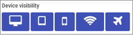
Device visibility - choose from icons for deshtop, tablet, mobile, wifi and flightmode as to when the device can view the dashboards.
-
-
Click on the OK button when you are finished editing the dashboard to save your changes or click on Close to exit the dialog box without saving.
-
You can then edit the widget to display certain fields from your form, that relates to the data you are interested in. Go to Configure your widget to find out more.
-
When you are finished making edits, click on the Save button
 in the top menu to ensure your dashboard changes are saved and you see a pop-up message Page saved successfully.
 -
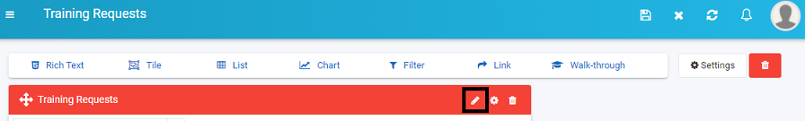
To make further changes later on, click on the Edit button
in the top menu and then click on the Pen button.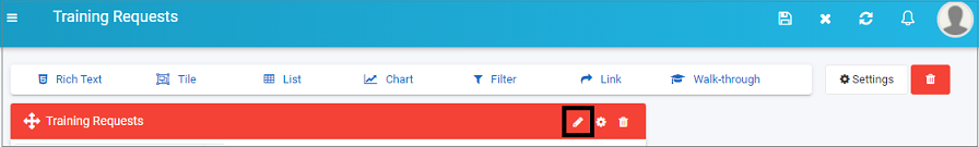
-
To re-edit the title, colour scheme or other options in Step 2, click on the Settings button
 and the Edit widget dialog box options, allowing you to make changes.
 -
To delete the widget at any stage, click on the Bin icon
 beside the cog button, and then click on Ok to confirm that you want to delete the dashboard page or click on Cancel if you wish to cancel the deletion.
Configure your widget
-
Click on the Update configuration or Pen button in a list widget you have created.
-
A dialog box opens with filter options in the left-hand pane, a Conditions button
 in the middle of the box, and list view fields in the right-hand pane. Go to Conditions to read more about conditions you can apply to dashboard widgets and go to List view fields to read more about how to apply fields to your list view.
-
The first option to choose is where the data should originate from using the Data from radio buttons. Choose from a) Process b) Partner process c) Data source. Depending on which option you choose go to the relevant area to read more on Choosing data from a Process, Choosing data from a Partner process and Choosing data from a Data source.
-
Once a data source is chosen, then there are a number of other options available, see Filter options.
-
When you are finished choosing options, click on the OK button to save your changes or click on Close to exit the dialog box without saving.
Choosing data from a Process
If you choose data from a Process, then the options below become available.
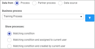
Choose from the following options:
- Business process - click into the field to choose a process which will be the input for the dashboard.
- Show processes - choose from a) Matching condition b) Matching condition and assigned to current user c) Matching condition and created by current user.
- For all other available options see Filter options.
Choosing data from a Partner Process
If you choose data from a Partner Process, then the options below become available.
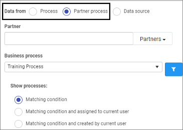
Choose from the following options:
- Partner - click into the field to choose from a pre-configured Partner who has created the process you are interested in.
- Business process - click into the field to choose a process which will be the input for the dashboard.
- Show processes - choose from a) Matching condition b) Matching condition and assigned to current user c) Matching condition and created by current user.
- For all other available options see Filter options.
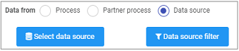
Choosing data from a Data source
If you choose data from a Data source, then the options below become available.
-
Click on Select data source. You will be directed to different data sources where you can search in the datasource tree search box or drill down to the data source you want.
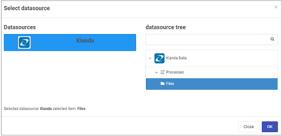
Click on the OK button when you are finished editing to save your changes or click on Close to exit the dialog box without saving.
-
Click on Data source filter.
-
For all other available options see Filter options.
Filter options
Once you have chosen where the dashboard data will come from then there are a number of other options available.
-
Choose from the edit options:
-
Enable sorting - choose from a) Yes or b) No if you wish to enable sorting in the dashboard
-
Enable filtering - choose from a) Yes or b) No if you wish to enable filtering in the dashboard
-
Enable search - choose from a) Yes or b) No if you wish to enable a search in the dashboard
-
Enable “Load more” mode - choose from a) Yes or b) No if you wish to enable more data records to be visible. If you click on Yes, then you can decide on what text should appear on screen, by typing the text in the Load more button text field.
Enter a number in Items per page for the number items you wish to load at a time. The default value is ‘20’.
-
Show ‘Add process’ button? - choose from a) Yes or b) No if you wish to Add process to your dashboard. If you click on Yes, then you can decide on what text should appear on screen, by typing the text in the ‘Add process’ button text field.
By default, the process used to generate the data is added, click on No beside the Add ‘Process Name’ by default if you don’t wish to add the input process.
-
Show delete button? - choose from a) Yes or b) No if you wish to add a Delete button to your dashboard. If you choose Yes, then the option Enable bulk delete appears allowing you to choose a) Yes or b) No to enable bulk deletion of records.
-
Enable show history? - choose from a) Yes or b) No if you wish to show the history of the dashboard.
-
Enable data export? - choose from a) Yes or b) No if you wish to allow data export. If you select Yes, a new option will appear:
- Enable data format? - choose from a) OData, b) CSV or c) Excel. To watch a video tutorial about exporting your process data from a list widget using OData, click here.
-
Sort by - click into the Sort By field and choose from options a) Common fields or b) fields within a form.
-
Common fields are fields commonly used in dashboards such as ‘Created’ or ‘Status’ or choose from a field within a form by clicking and drilling down to the field name that you want to sort by, for example a text box field called ‘Name’ in a form called ‘Training Request’.
-
When a field is chosen then the options for Sort Direction appear as either a) Ascending or b) Descending.
-
Enable empty list template - click on a) Yes or b) No to enable.
-
-
Go to List view fields to read about options in the right-hand pane of this dialog box on how to choose fields to filter data.
-
Click on the OK button when you are finished editing to save your changes or click on Close to exit the dialog box without saving.
List view fields
When you choose the List widget for your dashboard, there are a number of ways to select fields that you want to view.
-
Click on the Pen button
 on the widget you have created, to see the List view fields visible in the right-hand pane.
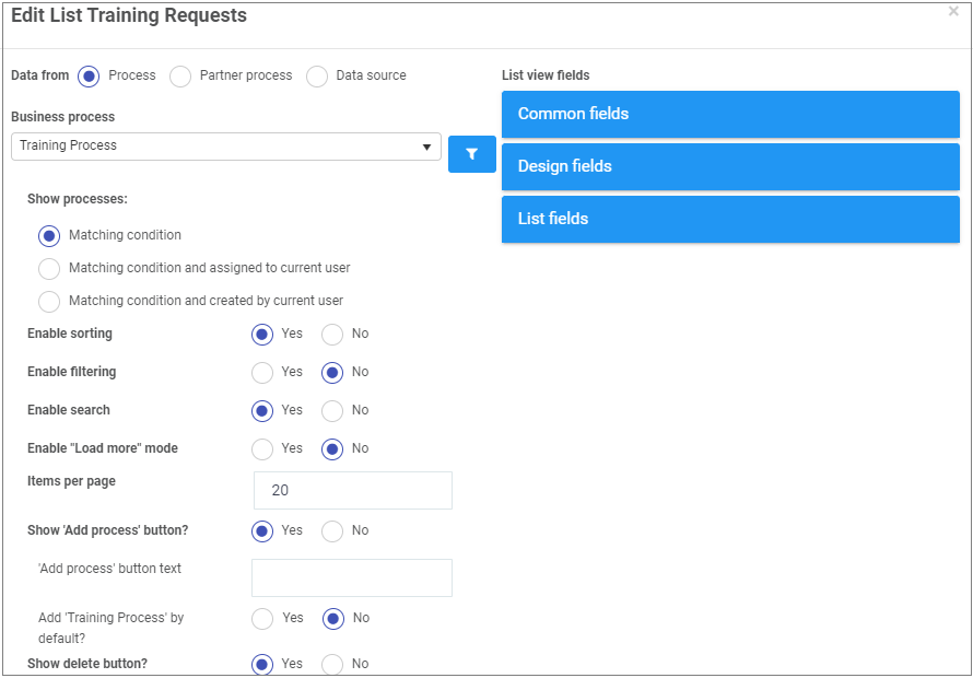
-
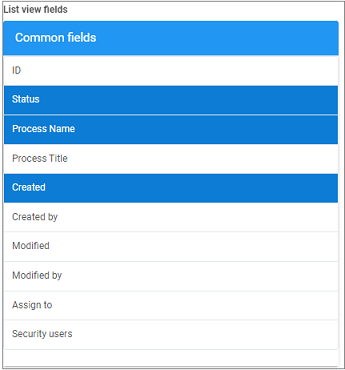
Click on Common fields to see a list of commonly used dashboard fields such as ‘Status’, ‘Created by’ and ‘Modified’. Click on as many fields as needed to add to the dashboard, for example 3 fields are selected below.
Click on Common fields again to close the options.
-
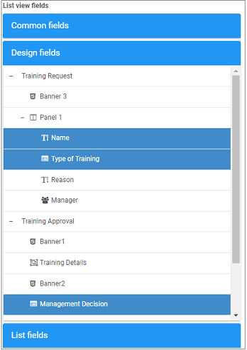
Click on Design fields to see a list of all the fields used in the design of the forms used in the chosen process. For example the Training Process shown below has 2 forms, ‘Training Request’ and ‘Training Approval’ and all control fields used in the form design are available to choose as filters for the dashboard. Click on the + symbol to drill down into the form, and click on the relevant fields to use them, for example Name, Type of Training and Management Decision have been chosen below.
Click on Design fields again to close the options.
-
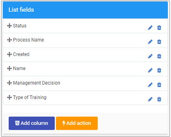
Clicking on List fields shows you a list of all the fields you have already chosen from Common fields and Design fields. There is also an option to Add column and Add action. You can change the order of the fields as they appear in the list from left to right by clicking on the Drag handle button
 .
.
-
Click on the OK button when you are finished editing to save your changes or click on Close to exit the dialog box without saving.
-
To change the list settings, that is the way the list looks, title and so on, click on the Settings button
and go to How to edit List widget settings to find out more about edit options. -
When you are finished making edits, click on the Save button
in the top menu to ensure your dashboard changes are saved and you see a pop-up message Page saved successfully. -
To make further changes later on, click on the Edit button
in the top menu and then click on the Pen button. -
When you have completed your changes, click on the Save button
 to save your changes or X to quit without saving.
Add column
If the numerous Common fields and Design fields are not enough, you can add your own columns using the Add column button in List view fields pane. To add a new column:
-
Click on the Add column button
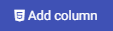 to display a HTML and CSS code editor that allows you to design the custom column.
 -
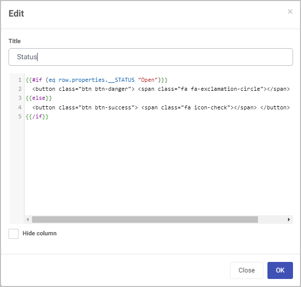
In the code editor, enter the Title of your new column add the code to achieve the desired look and effect for your new column. For example, a common practice would be to code a conditional function checking the internal status of each row’s record - if it’s equal to ‘Open’, create a red button to draw attention to records that are still open, and vice versa with the closed records. You can interact with and perform operations on the list’s fields by utilising the row.properties.enterFieldName method. The conditional statement uses Ember.js, learn more by clicking here.
-
When finished, click on OK to save your changes, or click on Close to cancel your changes.
Your new column will then appear to the right of your previously added column. To learn how to move these columns, see here.

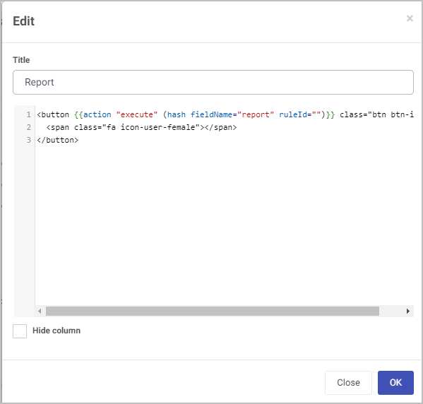
Add action
You can also add an action to your list widget, which will trigger a field or rule to be executed within the list’s associated process. To add an action:
-
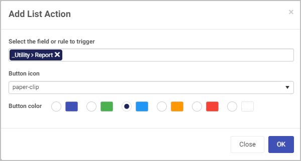
Click on the Add action button
 to display the Add List Action dialog box.
 -
Fill out the following fields:
- Select the field or rule to trigger - when the action button is clicked, which field or rule will be executed.
- Button icon - the visual icon associated with the button
- Button color
-
When finished, click on OK to save your changes, or click on Close to cancel your changes.
Your new action will now appear as a button to the right of previously added column. To learn how to move these columns/actions, see here.
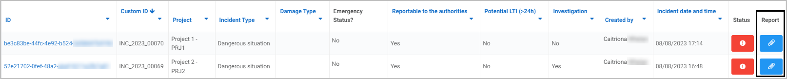
The code for the new action is automatically generated upon creating the action, as seen below with the created action generating a PDF report relating to the record in the same row. You can view the code and program extra features if desired by editing the action.
How to move List widgets
To move a List widget on a dashboard:
- On your dashboard, click on the Edit current page button
 in the top menu to go into Dashboard Edit mode.
 - Select the widget’s drag handle button
 .
. - Drag and drop the widget where you want it to go on your dashboard.
- Click on Save in the dashboard top menu to save the changes you’ve made.
How to delete List widgets
To delete a List widget from your dashboard:
-
On your dashboard, click on the Edit current page button
in the top menu to go into Dashboard Edit mode. -
Click on the widget’s Remove widget (Bin/Trash icon) button
 .
. -
A Delete widget dialog box will open. Click on OK to delete the widget (or click on Cancel if you wish to cancel the deletion).
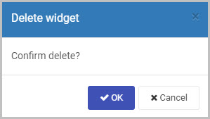
-
Click on Save
in the dashboard top menu to save the changes you’ve made.
How to edit List widget settings
To update or edit your List widget settings:
-
On your dashboard, click on the Edit current page button
in the top menu to go into Dashboard Edit mode. -
Click on the Update widget settings (Cog) button
 .
. -
The Edit widget dialog box will open, enabling you to make changes to any of the available options (the same options as were available in the Add widget dialog box discussed in Step 2 of How to get started).
For example, we could choose to reduce the width of the List widget to be 4 columns wide, by clicking to the left of the existing blue bar.
-
Click on OK to confirm the changes you’ve made to the widget settings (or click on Close if you don’t want to retain any changes).
-
The updated List widget will display on your dashboard. Click on Save
in the dashboard top menu to save the changes you’ve made.
Saving changes
Make sure to save any changes you make to your List widget by clicking on the Save button in the dashboard top menu. If you leave the dashboard without saving the changes you have made to a widget, the next time you visit the dashboard it won’t include any of the changes made to it since the dashboard page was last saved.
What’s next 
Now that you’ve learned about the Dashboard List widget, find out more about the other types of Dashboard widgets you can add to your Kianda dashboard:
- Chart widget
- Filter widget
- Rich Text widget
- Link widget
- Tile widget
- Walkthrough widget
- Custom dashboard widget
Feedback
Was this page helpful?
Glad to hear it! Please tell us how we can improve.
Sorry to hear that. Please tell us how we can improve.