Walk-through widget
A dashboard Walk-through widget can be used to walk a user through the features of a dashboard or steps in a process by displaying a series of prompts.
For example, if you have a Procurement dashboard page that displays key information relating to your procurement process (using Chart widgets, Tile widgets, a Link widget and a List widget), it could be useful to insert a Walk-through widget that can bring a new user through the various features of the page or through steps in the procurement process.
How to get started
To add a Walk-through widget to a dashboard:
-
Open the relevant dashboard page. To learn how to create your first dashboard page, go to How to create a dashboard page.
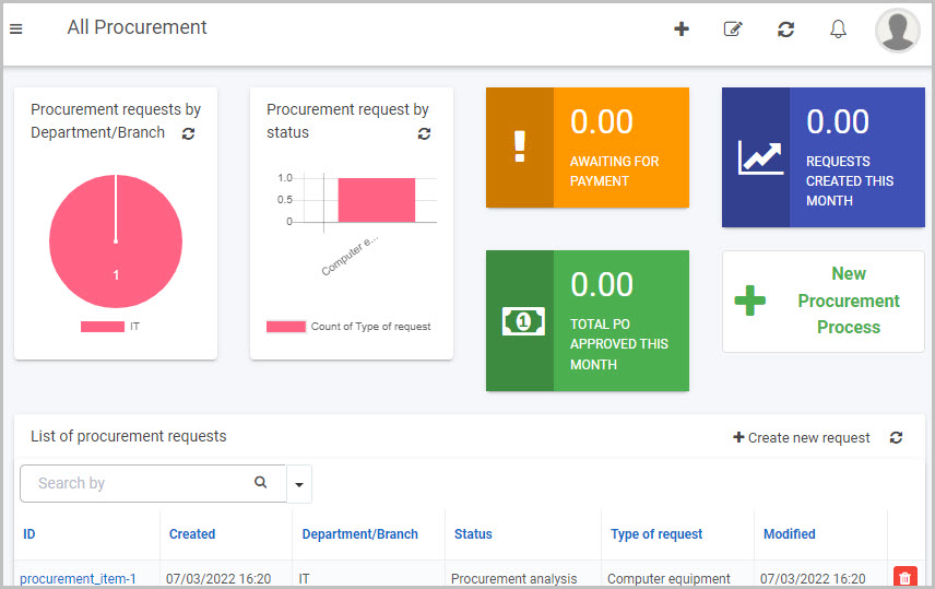
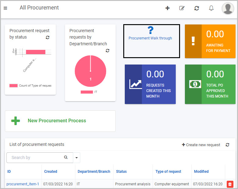
For this example, we’ll open a dashboard page called ‘All Procurement’ that has several widgets on it displaying various information relating to a procurement process.
-
Click on the Edit current page button from the top dashboard menu to go into Dashboard Edit mode (in which the Widget menu, Settings button
 , Bin/Trash button
  and Add layout container button
  are available):
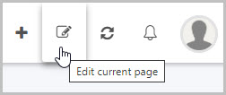
-
Click on the Walk-through widget button in the Dashboard Widget menu.

-
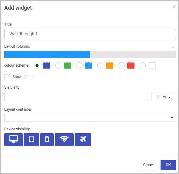
The Add widget dialog box opens with a range of options for your new Walk-through widget.
Choose the options you want:
-
Title - You can insert the title you want for your Walk-through widget (instead of the default title shown). In our example, we’ll call it ‘Procurement Walk through’.
-
Layout columns - You can choose how wide you want your Walk-through widget to be. You can choose from 1 to 12 columns in width by clicking on the blue bar. For example click half-way across the blue bar to create a widget that is 6 columns wide, or click to the very end of the bar to create a column that is 12 columns wide.
-
Colour scheme - You can choose from six colour options for the header of the widget (Navy, Green, Blue, Amber, Red or White), if you choose to display it.
-
Show header - You can choose whether or not you want the header of your Dashboard widget to be shown. This checkbox is not selected by default, so select it if you want the widget header to be displayed.
-
Visible to - You can choose who will be able to see the Walk-through widget. You can select single or multiple Users or Groups, or a combination of the two. Use the menu on the right to filter the drop-down list by Users or Groups. To find out more about pre-defined Groups on Kianda, go to Users & Groups.
-
Note - Dashboard page security: When a dashboard page is first created, the users(s)/group(s) who will be able to view the dashboard are selected in the ‘Visible to’ option in the Create dashboard page dialog box (see Step 3 in How to create a Dashboard page).
You can also edit or update this setting at any point to change who has permission to view a particular dashboard page. This higher dashboard-level security setting will take precedence over the security settings (‘Visible to’) that are applied to the individual widgets within the dashboard (such as the Walk-through widget, in this case).
See Dashboard security and Widget security for more information.
-
-
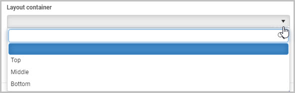
Layout container: This option will only display if you have already created layout containers for your Dashboard page. Here, you can select the layout container you want to place your new Walk-through widget in.
A layout container is a simple way to organise, arrange and move the widgets you add to your dashboard. To learn more about layout containers, go to How to add layout containers to a Dashboard page.
In this example, we can select to place our new Walk-through widget into one of three layout containers - Top, Middle or Bottom:
-
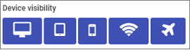
Device visibility - You can choose what devices and types of internet connections the dashboard Walk-through widget will be visible on - select all the options you want from Desktop, Tablet, Mobile, Wi-Fi and Flight mode as to when the device can view the dashboards. By default, all options are selected.
-
-
Click on OK when you’ve completed the Add widget dialog box.
-
A Walk-through steps dialog box automatically opens showing the options for the Walk-through widget:
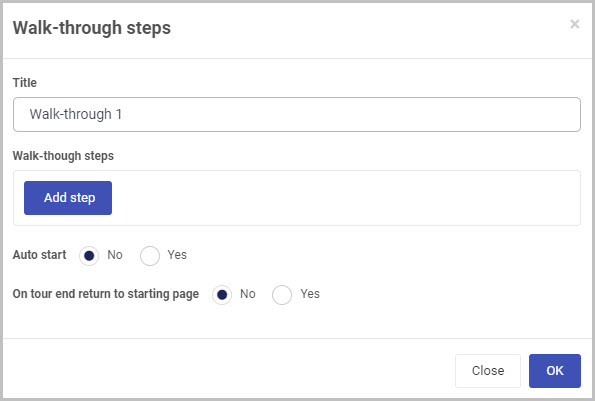
Select the options you want for your Walk-through widget:
-
Title - You can give your Walk-through a title. In our example, we’ll call it ‘Procurement Walk-through’.
-
Walk-through steps - This is where you can add all of the individual walk-through steps that you want to bring the user through.
To add your first walk-through step:
-
Click on the Add step
 button.
 -
The Edit step dialog box opens, allowing you to choose from a range of options for your walk-through step.
-
Once you’ve completed the options in the Edit step dialog box, click OK to add the step to the Walk-through steps dialog box.
Repeat these three steps to add as many steps as you want to your Walk-through widget.
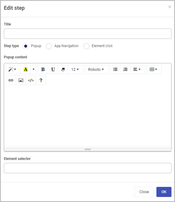
The options for the first step in your Walk-through widget in the Edit step dialog box include:
-
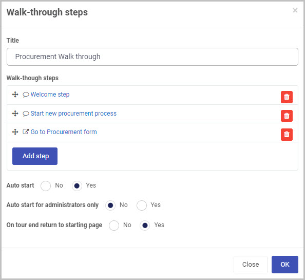
Title - Insert a title for this walk-through step. In our example, we’ll title our first step ‘Welcome step’.
-
Step type - You have a choice of three step types: Popup, App Navigation and Element click.
a. A Popup step is a pop-up dialog box containing whatever content you choose to display (including texts, links or pictures).
b. An App Navigation step brings the user to a new URL - for example, it could bring them into the first form of a process.
c. An Element click step shows the result of clicking on one of the elements in the dashboard.
Popup Steps
If you choose Popup as the step type, you can then complete the Popup content box to insert the content you want to appear in the pop-up walk-through step, including text, images or links.
You can choose from an wide array of styles and formats, including: Style, Colour, Bold, Underline, Remove font style, Font size, Font family, Unordered list, Ordered list, Paragraph, Table, Link, Picture, Code view (which allows you to switch to a code view of the step content) and Help (which displays a range of shortcut keys for different formatting options).
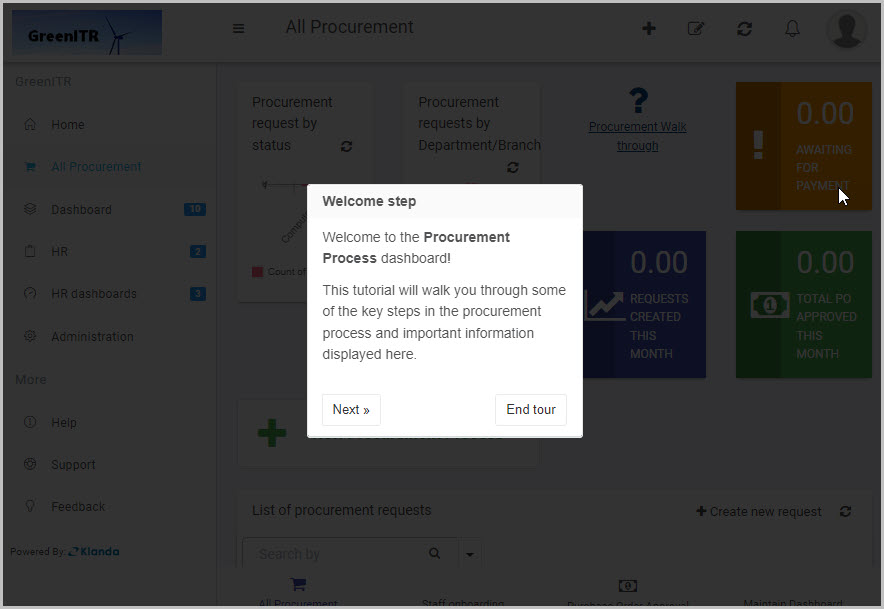
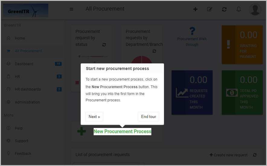
In our example, we will make the first step of our walk-through a Popup and will insert the content we want to appear:
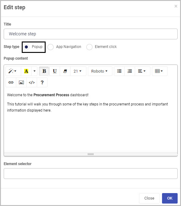
Example - Pop-up step
This first Popup walk-through step could look like this to the end user when they click on the Procurement Walk-through widget:
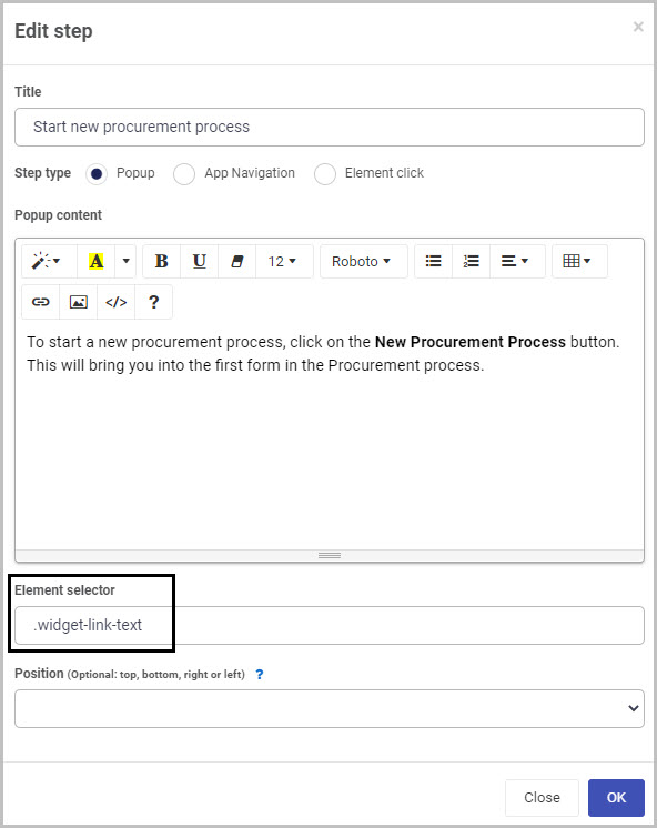
The Element selector field at the bottom of the Edit step dialog box can be used if you want an element on the page to be highlighted, to show the user where they need to click.
We could add a second step in our walk-through to be another pop-up that explains that the user should click the ‘New Procurement Process’ button to start a new procurement process. This time we can add an Element selector so that the button is highlighted during this step.
How to find the name of an element to insert
-
Right-click on the element on the page that you want to higlight.
In our case, we right-click on the New Procurement Process link button on the dashboard (as this is what we want to highlight during this step of the walk-through).
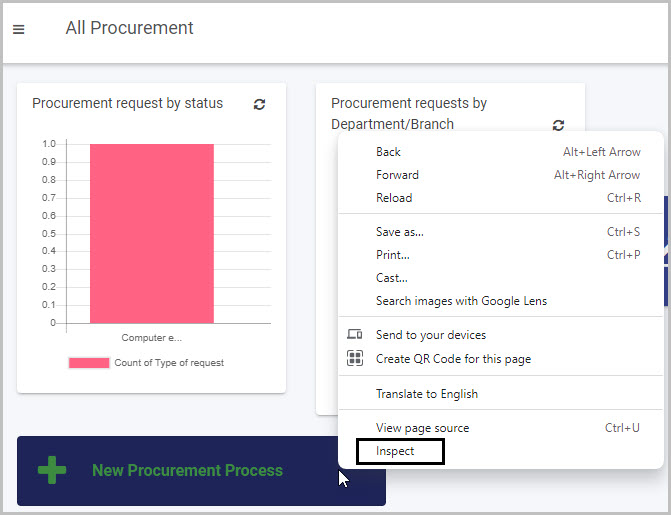
-
Click Inspect.
-
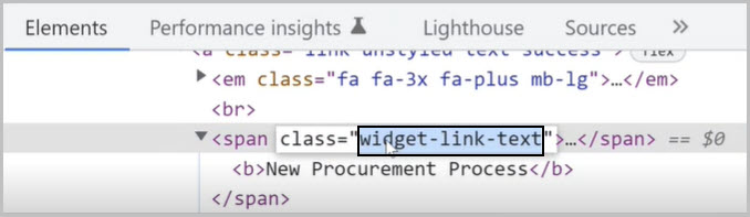
Copy the element you want to be highlighted in this walk-through step. In our case, we copy the element relating to the New Procurement Process link button:
-
Paste the name of the element into the Element selector box in the Edit step dialog box. You can choose the position of the pop-up text in relation to the element being highlighted from the Position drop-down menu.
Example - Element Selector
This Popup step that includes an Element selector could look like this to the end user as the second step in the walk-through:
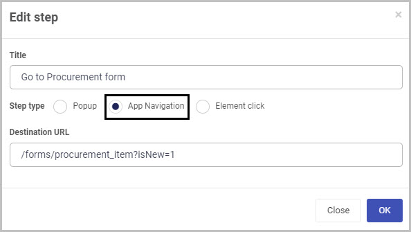
App Navigation steps
If you choose App Navigation as the step type, complete the Destination URL field that appears.
In our example, we will make the third step of our walk-through an App Navigation step type and will title it ‘Go to Procurement form’. The URL inserted as the Destination URL will bring the user into the first form of the Procurement process.
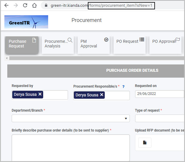
Example - App Navigation
This third App Navigation step in our walk-through example could look like this to the end user - the user is brought to the website we insered as the ‘Destination URL’:
Element click steps
If you choose Element click as the step type, complete the Element selector field that appears - see How to find the name of an element to insert to find out how to find the code to insert in order to show different clickable elements of the dashboard or process.
-
-
-
Auto-start - Select Yes if you want the Walk-through widget to automatically launch when a user opens the dashboard page.
-
On tour end return to starting page - Select Yes if you want the user to be returned to the dashboard page once the Walk-through steps have been completed.
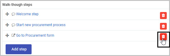
You can delete any of the walk-through steps you added to the Walkthrough steps dialog box by simply clicking on the Bin/Trash button to the right of the step.
-
-
Once you have completed the Walk-through steps dialog box - by choosing the options and adding the steps you want - click on OK (or click on Close to exit the dialog box without saving).
The completed Walk-through steps dialog box for our simplified example could look like this:
-
Click on the Save button
 in the top dashboard menu to save the insertion of the new Walk-through widget to the dashboard.
 -
Your new Walk-through widget will now be shown on your dashboard.
- Our ‘Procurement walk-through widget could look like this on our All Procurement dashboard:
How to edit Walk-through widgets
To edit a Walk-through widget on a dashboard:
-
In the dashboard, click on the Edit current page button
 in the top menu to view the page in Dashboard Edit mode (in which the Widget menu, Settings button , Bin/Trash button and Add layout container button are available).
 -
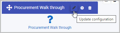
Click on the Walk-through widget’s Update configuration (Edit) button
 .
.
-
The Walk-through steps dialog box opens, enabling you to make whatever changes you want to the Walk-through widget using the same range of options as outlined in Step 6 of How to get started but also showing the walk-through steps you created.
-
Making the changes you want and then click OK.
-
The updated Walk-through widget will be shown on the Dashboard. Click on Save
in the dashboard top menu to save the changes you’ve made.
How to move Walk-through widgets
To move a Walk-through widget on a dashboard:
- On your dashboard, click on the Edit current page button in the top menu to go into Dashboard Edit mode.
- Select the widget’s drag handle button
 .
. - Drag and drop the widget where you want it to go on your dashboard.
- Click on Save in the dashboard top menu to save the changes you’ve made.
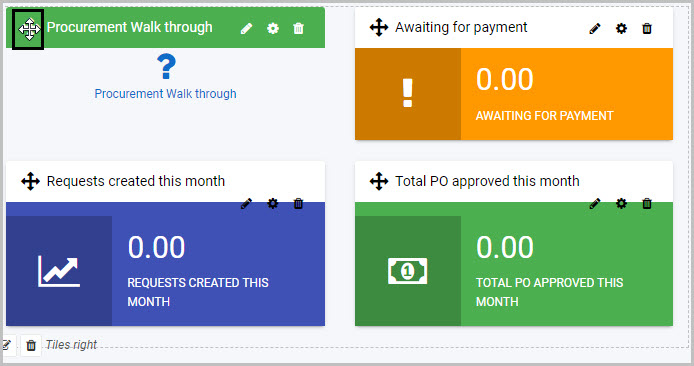
In our example, we could move the new ‘Procurement Walk-through widget to the top right section of the dashboard:
How to delete Walk-through widgets
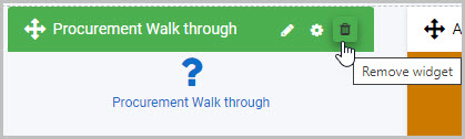
To delete a Walk-through widget from your dashboard:
-
On your dashboard, click on the Edit current page button
in the top menu to go into Dashboard Edit mode. -
Click on the widget’s Remove widget (Bin/Trash icon) button
 .
.
-
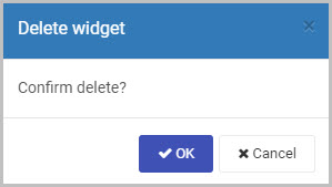
A Delete widget dialog box will open. Click on OK to delete the widget (or click on Cancel if you wish to cancel the deletion).
-
Click on Save
in the dashboard top menu to save the changes you’ve made.
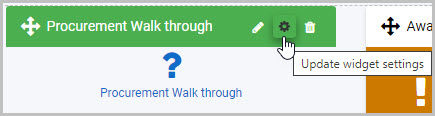
How to edit Walk-through widget settings
To update or edit your Walk-through widget settings:
-
On your dashboard, click on the Edit current page button
in the top menu to go into Dashboard Edit mode. -
Click on the Update widget settings (Cog) button
 .
.
-
The Edit widget dialog box will open, enabling you to make changes to any of the available options (the same options as were available in the Add widget dialog box discussed in Step 4 of How to get started).
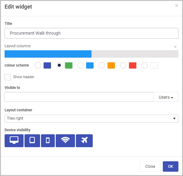
In our example, we could change the width of the Walk-through widget to be 6 columns wide (the same width as the tiles beside and below it on the dashboard), by clicking on the blue bar.
-
Click on OK to confirm the changes you’ve made to the widget settings (or click on Close if you don’t want to retain any changes).
-
The updated Walk-through widget will display on your dashboard. Click on Save
in the dashboard top menu to save the changes you’ve made.
Saving changes
Make sure to save any changes you make to your Walk-through widget by clicking on the Save button in the dashboard top menu. If you leave the dashboard without saving the changes you have made to a widget, the next time you visit the dashboard it won’t include any of the changes made to it since the dashboard page was last saved.
What’s next 
Now that you’ve learned about the Dashboard Walk-through widget, find out more about the other types of Dashboard widgets you can add to your Kianda dashboard:
Feedback
Was this page helpful?
Glad to hear it! Please tell us how we can improve.
Sorry to hear that. Please tell us how we can improve.