This is the multi-page printable view of this section.
Click here to print.
Return to the regular view of this page.
Building Apps with Kianda’s Low-Code Platform
Low-code development guides. Developers start here
Kianda is a low-code development platform designed for web developers who want to create robust business process applications without getting bogged down in complex coding tasks. Because Kianda is built on open web technologies—primarily CSS, JavaScript, and micro-services—you can put your existing skills to work right away. Instead of grappling with proprietary systems, you’ll find familiar tools and frameworks, making it straightforward to build and customize applications to meet your organization’s needs.
Key Technologies Under the Hood
Kianda’s front-end leverages established, open-source tools including Ember.js, Bootstrap, and features like web sockets and AJAX for real-time, responsive interfaces. This front-end stack lets you quickly create modern, dynamic user experiences using the same skills you apply every day in web development.
On the back-end, Kianda’s architecture is powered by scalable micro-services running on top of widely used technologies like .NET and Node.js, ensuring that your applications are both reliable and easy to maintain. By embracing these open standards, Kianda allows you to integrate seamlessly with other systems and tools in your ecosystem.
Ember.js and Handlebars
Kianda’s user interface is built using Ember.js, an open-source JavaScript framework well-known for its convention-over-configuration approach. This means you can write less boilerplate code while still delivering high-quality, maintainable applications. Ember.js works hand-in-hand with the Handlebars templating library. Handlebars makes it simple to bind data to templates, dynamically generate HTML, and reuse common UI patterns.
If you’re already comfortable with JavaScript and modern CSS frameworks, you’ll find working with Ember.js and Handlebars an easy step forward. For more on best practices, see our Ember Inspector guide and explore Ember.js documentation and Handlebars documentation.
Why Choose Low-Code with Kianda?
Low-code development reduces the time and effort needed to build enterprise applications. By using Kianda’s graphical interface and predefined building blocks, you can rapidly assemble process apps that integrate with your company’s workflows. At the same time, Kianda’s openness means you’re never locked in. If a standard component isn’t a perfect fit, you can dive into the code and craft a solution that suits your exact requirements.
Kianda provides a large selection of ready-to-use fields and rules, so non-developers can create forms and workflows without writing code. But when you need something more advanced, Kianda’s low-code approach lets you implement custom logic and UI widgets using the CSS and JavaScript skills you already have.
For example, you might create a new field type that displays images in a custom layout or build a bespoke rule widget for integrating with an external data source. You can also fine-tune list widgets for dashboards or write JavaScript expressions to automate tasks like generating unique IDs or formatting text.
What You Can Do as a Developer
With an administrator role, you have access to Administration functions that let you tailor the platform:
- Modify the Global JavaScript and Global CSS files to set application-wide styles or logic.
- Create custom Field, Rule, Dashboard, or data connector widgets to extend the platform’s capabilities.
- Integrate external data sources and use your own JavaScript expressions in fields, rules, or anywhere rich text is used, like in emails and dashboards.
- Customize list widgets to display data in dashboards in a way that makes sense for your organization’s metrics and KPIs.
- Incorporate HTML and custom styling in forms and emails to produce richer user experiences.
These options give you the flexibility to shape Kianda to fit your exact business processes, without leaving the familiar territory of open web development.
Kianda Developer is a user-friendly interface that lets you build and manage reusable widgets. Instead of starting from scratch, you can focus on your core logic or design. You can create:
- Field widgets: Custom UI elements that appear on-screen, such as specialized inputs or interactive controls.
- Rule widgets: Automated logic components that manipulate data, set statuses, or initiate actions.
- Dashboard widgets: Dynamic visualizations or layouts for presenting information on dashboard pages.
- Data connector widgets: Integrations for sending and receiving data from external sources.
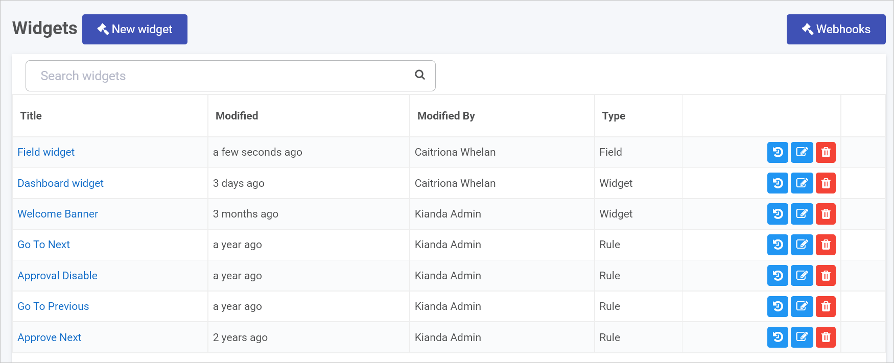
Getting Started with Kianda Developer
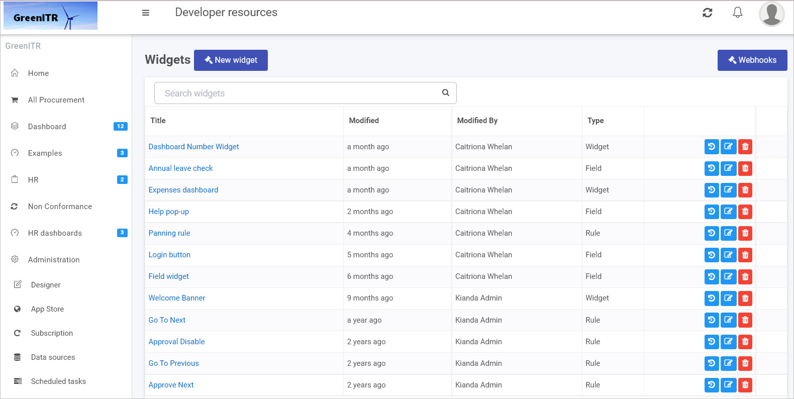
- Open Administration > Developer to see all custom widgets in your environment.
- Browse existing widgets, review version histories, edit or delete widgets, and easily restore previous versions.
- To create a new widget, click New widget, provide a title, pick an icon, and choose a widget type. Then add your HTML, Handlebars, and JavaScript logic.
- Once you’re done, you can export your custom widget as part of a Kianda file and import it into another environment. This portability ensures you can reuse and share your work seamlessly.
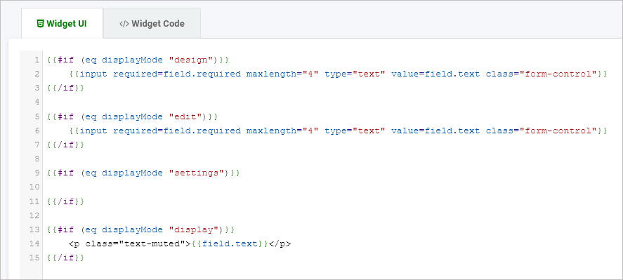
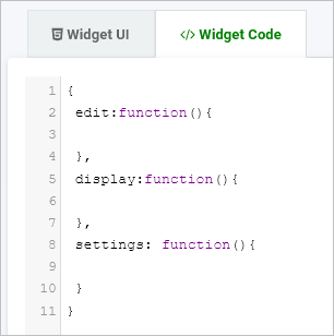
Below is an example of a simple field widget’s Handlebar and JavaScript code. The Handlebar template adapts based on the widget’s display mode (design, edit, settings, display), and the JavaScript object defines functions for each mode.
Handlebars UI:
{{#if (eq displayMode "design")}}
  {{input required=field.required maxlength="4" type="text" value=field.text class="form-control"}}
{{/if}}

{{#if (eq displayMode "edit")}}
  {{input required=field.required maxlength="4" type="text" value=field.text class="form-control"}}
{{/if}}

{{#if (eq displayMode "settings")}}
  <!-- Add UI for settings here if needed -->
{{/if}}

{{#if (eq displayMode "display")}}
  <p class="text-muted">{{field.text}}</p>
{{/if}}
JavaScript Logic:
{
  edit: function() {
    // Code for edit mode
  },
  display: function() {
    // Code for display mode
  },
  settings: function() {
    // Code for settings mode
  }
}
This structure allows you to cleanly separate your UI and logic, making development and maintenance straightforward.
JavaScript Expressions Everywhere
Kianda supports using JavaScript expressions throughout its platform—inside fields, rules, and email templates. For instance, you can combine multiple field values to generate new strings, format data dynamically, or even create direct links to specific process instances with functions like ProcessLink().
To learn more, visit our Expression builder guide and explore how to inject logic and dynamic content anywhere you need it.
By building on open technologies like CSS, JavaScript, Ember.js, and Handlebars, Kianda lets you apply the full range of your web development experience. Whether you’re creating simple apps or highly customized widgets, Kianda’s low-code approach helps you deliver results faster—without sacrificing flexibility or control.
1 - Field widget development
Build and customize Kianda field widgets with open web tech: CSS, JS, Handlebars
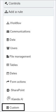
Kianda offers a range of predefined field (control) widgets to help you build forms and processes quickly. These include 16 built-in controls across three categories: Input, Layout, and Actions. Developers with the appropriate permissions—Administrator or Developer—can also create custom field widgets. These custom widgets appear in the Custom controls category within Kianda Designer, ready to be added to any form or process.
Because Kianda is built on open technologies like CSS, JavaScript, and Handlebars, creating custom fields feels familiar to experienced web developers. Rather than dealing with closed, proprietary components, you’ll use the same web standards you already know. The result is a flexible, low-code approach that lets you craft the exact user experiences your business workflows require.
How Custom Controls Work
Custom controls are created using Kianda’s Developer interface. Each widget you create has two main parts:
- Widget UI (Handlebars template): Defines the markup, event handlers, and expressions.
- Widget Code (JavaScript): Implements the widget’s logic and functions.
This approach lets you cleanly separate your presentation and logic layers, making it easy to iterate, maintain, and reuse code.
Handlebars Syntax
Kianda leverages Ember.js, an open-source JavaScript framework, which uses the Handlebars templating library for its UI. Handlebars is a simple way to create dynamic templates, using curly brace syntax (e.g., {{...}}) to bind data or call actions.
For example, consider the snippet below. It uses a {{field-picker}} component inside a {{#if (eq displayMode "settings")}} block. The field-picker lets users select which field in the form should be tied to a particular widget setting.
{{#if (eq displayMode "settings")}}
  <div class="form-group">
    <label class="control-label">Image to place pictures into</label>
    {{field-picker process=process required=true allowText=false includes='["fields/field-image"]' value=field.settings.imageDestination}}
    <label class="control-label">Field to display warning message in</label>
    {{field-picker process=process required=true allowText=false value=field.settings.warningMessage}}
  </div>
{{/if}}
Components like field-picker, field-date, field-group, and field-textbox help you rapidly build forms. You can inspect and understand these components using the Ember inspector add-in.
To create a custom field widget, you need to have the Administrator or Developer role. Check Users & Groups for details on permissions. Once you’re set:
-
Go to Administration > Developer in the main menu. The Developer resources page shows all existing widgets. You can filter by widget type “Field” to see existing field controls.
-
Click New widget to start creating a new custom field widget.
-
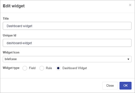
In the Edit widget dialog, enter:
- Title: A user-friendly name.
- Unique Id: Auto-populated from the title, but can be adjusted if needed.
- Widget Icon: Select from a wide range of icons.
- Widget type: Choose “Field” to create a field widget.
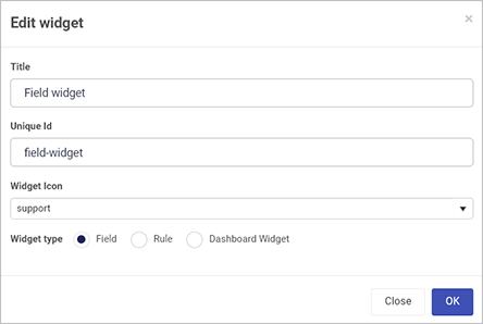
-
Click OK to confirm. The new widget appears in your widget list.
-
Open the widget to find two tabs:
- Widget UI: Add your Handlebars markup, bindings, and helper code.
- Widget Code: Add your JavaScript logic and event handlers.
-
From the Developer resources view, you can edit, delete, or restore previous versions of your widget using the available icons. This makes it easy to iterate on your design or roll back changes if needed.
-
Once saved, your custom field widget appears in Kianda Designer. Navigate to:
Administration > Designer > Open or create a process > Select a form, and you’ll see your new custom field under Controls > Custom.
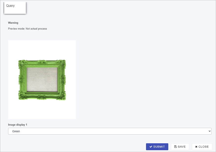
Below is an example of a custom field widget called “Image display.” It helps users select an image frame based on their choice in a dropdown list. This widget:
- Updates a “warning” text box field to inform the user when they are in preview mode.
- Lets the user choose a colored frame for an image displayed in another field.
This Handlebars template changes its behavior depending on the displayMode (design, edit, settings, or display). During edit mode, for example, it provides a dropdown that triggers an action to update an image field in the form.
{{#if (eq displayMode "design")}}
  <select class="form-control">
    <option value="">Please configure my settings before use</option>
  </select>
{{/if}}

{{#if (eq displayMode "edit")}}
  <select class="form-control" id="entityType" onchange={{action 'frameSelected' value="target.value"}}>
    <option value="">Select</option>
    <option value="https://.../green.jpg">Green</option>
    <option value="https://.../red.jpg">Red</option>
    <option value="https://.../yellow.jpg">Yellow</option>
    <option value="https://.../purple.jpg">Purple</option>
  </select>
{{/if}}

{{#if (eq displayMode "settings")}}
  <div class="form-group">
    <label class="control-label">Image to place pictures into</label>
    {{field-picker process=process required=true allowText=false includes='["fields/field-image"]' value=field.settings.imageDestination}}
    <label class="control-label">Field to display warning message in</label>
    {{field-picker process=process required=true allowText=false value=field.settings.warningMessage}}
  </div>
{{/if}}

{{#if (eq displayMode "display")}}
  <select class="form-control" onchange={{action 'frameSelected' value="target.value"}}>
    <option value="">Select</option>
    <option value="https://.../green.jpg">Green</option>
    <option value="https://.../red.jpg">Red</option>
  </select>
{{/if}}
This JavaScript defines what happens in each mode. For example, in edit mode it shows a warning message, and when the user selects a frame, it updates the target image field.
{
  edit: function() {
    var process = this.get('field.process');
    var warningMessage = process.findFieldByName(this.get("field.settings.warningMessage.name"));
    warningMessage.set("visible", true);
    warningMessage.set("enabled", false);
    warningMessage.set("text", "Preview mode: Not actual process");
  },
  display: function() {
    var process = this.get('field.process');
    var warningMessage = process.findFieldByName(this.get("field.settings.warningMessage.name"));
    warningMessage.set("visible", false);
  },
  actions: {
    frameSelected: function(image) {
      var process = this.get('field.process');
      var imageDestination = process.findFieldByName(this.get("field.settings.imageDestination.name"));
      imageDestination.set("text", image);
    }
  }
}
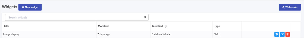
After saving, the new “Image display” widget appears in the Developer resources list:
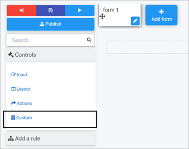
Once your custom field widget is created, you can use it in any process within Kianda Designer:
-
In Administration > Designer, open or create a process, then open the relevant form.
-
Under Controls > Custom, find and add your custom widget—like “Image display.”
-
Configure the widget by selecting which fields it should update. For example, map a “Warning” text box and an “Image” field that the widget will control.
-
Save and Preview the form to see your custom field in action. When you choose a frame color from the dropdown, the selected image field updates accordingly.
This approach combines the flexibility of standard web technologies with the convenience of a low-code environment. By building custom field widgets on open web technologies, Kianda empowers you to create tailored, dynamic business applications that evolve with your organization’s needs—no proprietary lock-in, and no steep learning curve.
If you have any questions or need further guidance, explore the related documentation on Ember.js, Handlebars, and the Ember inspector. You’ll find that with your existing CSS and JavaScript skills, you can seamlessly extend Kianda’s capabilities and deliver custom, interactive process apps quickly and efficiently.
2 - Rule widget development
Learn how to build and customize Kianda rule widgets with open web tech: CSS, JS, Handlebars
Kianda provides 60 predefined rules organized into various categories—including Workflow, Communications, and Data—so you can easily automate key tasks in your forms and processes. These out-of-the-box rules cover a wide range of scenarios, from sending notifications to manipulating data, managing files, interacting with SharePoint, and more. To learn about each category, simply follow the relevant links above.
When you need functionality beyond what these predefined rules offer, Kianda’s low-code platform lets you build your own custom rule widgets. Because Kianda is built on open web technologies (CSS, JavaScript, and templating with Handlebars), you can apply your existing web development knowledge to create powerful, tailor-made logic. This ensures that you’re never limited by predefined options—you can innovate and adapt to your organization’s evolving business needs, all while working in a familiar development environment.
While predefined rules handle many common use cases, your organization may have unique requirements that aren’t covered. For example, you may need a custom rule that:
- Integrates with a specialized external API,
- Applies advanced transformations to your form data before submission,
- Enforces specific business policies that evolve over time, or
- Dynamically updates fields based on complex conditions that fall outside existing patterns.
Custom rule widgets give you direct control over the logic that drives your automated processes. You’ll use standard web technologies—HTML, CSS, and JavaScript—within the Kianda platform, making it easy to write, maintain, and scale your custom logic as requirements change.
How to Get Started
To build custom rule widgets, you need an Administrator or Developer role. If you’re unsure about your role, check out Users & Groups for details.
Once you have the right permissions:
-
Access the Developer Resources: Go to Administration > Developer in the left-hand menu. This page lists all existing widgets, including field, rule, dashboard, and data connector widgets.
-
Create a New Rule Widget: Click New widget to open the widget creation dialog. Fill in the required details:
- Title: Give your widget a clear, descriptive name.
- Unique Id: Auto-generated from the title, but you can adjust if needed.
- Widget Icon: Select an icon that represents your widget’s purpose.
- Widget Type: Choose Rule for a custom rule widget.
Click OK to confirm. Your new widget will now appear in the Developer resources list.
-
Widget UI and Code: Open your new widget to see two tabs:
- Widget UI (Handlebars template): Defines the widget’s configuration UI within Kianda Designer. Here, you can add form fields, dropdowns, and other elements to help process designers configure the rule’s settings. Use Handlebars to dynamically bind data and handle user input.
- Widget Code (JavaScript): Implements the logic executed when the rule runs. Here, you’ll use JavaScript to manipulate process data, call APIs, set field values, or perform calculations.
By separating UI from logic, Kianda keeps your code organized and easy to maintain.
Example: Custom Warning Message Rule
Below is an example that demonstrates how to create a simple custom rule widget. This widget allows a designer to set a warning message and choose a target field where the message will appear when the rule executes.
Rule Widget UI (Handlebars)
<div class="form-group">
  <label class="control-label">Warning message to display</label>
  {{input type="text" required=true class="form-control" value=rule.settings.message}}
</div>
<div class="form-group">
  <label class="control-label">Field to display warning message in</label>
  {{field-picker process=process required=true allowText=false value=field.settings.field}}
</div>
In this template, {{input}} and {{field-picker}} components let the process designer specify a message and select the field in the form that will display the warning. This empowers business users (or other designers) to configure the rule without writing code.
Rule Widget Code (JavaScript)
{
  execute: function() {
    var rule = this.get('rule');
    var process = this.get('process');
    var field = process.findFieldByName(rule.get("settings.field.name"));
    var message = rule.get("settings.message");

    if(field) {
      process.setField(field, message);
    }
  }
}
Here, the execute function is the core logic that runs whenever the rule is triggered in a workflow. It retrieves the configured field and message, then updates that field’s value. This logic is concise, relying on standard JavaScript patterns and Kianda’s built-in APIs to interact with process data.
After creating and saving your custom rule widget:
-
Edit or Delete: From the Developer resources page, you can edit the widget’s UI or code at any time. If a widget is no longer needed, you can delete it.
-
Version History: Restore older versions of your widget if necessary, ensuring you can roll back changes without losing previous work.
-
Use in Designer: Once finalized, your custom rule widget appears under Rules > Custom when adding a rule in Kianda Designer. This makes your new logic available to any process designer in your organization.
Unlocking New Possibilities
By creating your own rule widgets, you tailor Kianda’s automation capabilities to match your exact needs. Combine your JavaScript skills, CSS styling, and open web development experience with Kianda’s low-code environment to build a powerful library of custom logic. Over time, you’ll develop a suite of custom rules that streamline workflows, enforce business policies, and integrate with other systems—all while leveraging familiar standards and straightforward developer tools.
Embrace Kianda’s open, flexible architecture to quickly deliver tailored business process automation. If you have any questions or need further guidance, explore the platform’s documentation or inspect existing widgets with the Ember inspector. With Kianda, experienced web developers can easily extend the platform’s rule system, enabling dynamic and evolving business processes with minimal friction.
3 - Page (Dashboard) Widget Development
Learn how to build and customize Kianda page widgets with open web tech: CSS, JS, Handlebars
Kianda provides several predefined dashboard widgets that make it easy to visualize process performance metrics at a glance. These widgets give you the building blocks you need to create informative, interactive dashboards that help end users understand the state of their processes in real-time. The existing 7 predefined widgets include:
While these widgets cover many common needs, there may be times when you want a custom dashboard element—something that fetches specific data, applies unique formatting, or interacts with the user in a specialized way. Kianda’s low-code platform lets you create custom page widgets using open web technologies you already know, like CSS, JavaScript, and Handlebars. By leveraging these familiar tools, you can display large datasets, integrate external APIs, or design dynamic user interactions with minimal friction.
Predefined dashboard widgets provide a quick, no-code way to visualize process data. However, your organization might have unique reporting requirements or require more complex interactions that are not fully addressed by the standard widgets. Custom dashboard widgets allow you to:
- Display large or complex datasets in a tailored format that meets your business needs.
- Integrate with external services or APIs, pulling in real-time data for end users.
- Enhance user interaction with custom buttons, filters, or drill-down features.
- Maintain a consistent brand experience, applying custom CSS or layouts to match your company’s style.
In short, custom dashboard widgets give you full control over the data presented to end users, enabling you to deliver clear insights and improve decision-making processes.
Getting Started with Custom Page Widgets
To develop custom dashboard widgets, you need the Administrator or Developer role. For details on roles and permissions, see Users & Groups.
Once you have the appropriate privileges:
-
Access the Developer Resources: In the Kianda main menu, go to Administration > Developer. This page shows all widgets—field, rule, dashboard, and data connectors—in one place.
-
Create a New Widget: Click New widget to open the widget creation dialog. Enter:
- Title: A clear name that describes what your widget does.
- Unique Id: Automatically generated from the title but can be adjusted.
- Widget Icon: Choose an icon that best represents your widget.
- Widget Type: Select Widget for a dashboard widget.
-
Define the Widget UI and Code: After saving, you’ll see two tabs for your widget:
- Widget UI (Handlebars template): This defines the widget’s appearance and how users interact with it. You can create settings views for configuration and runtime views for end-user interaction. For example, you might add text inputs, dropdowns, or buttons that trigger custom actions.
- Widget Code (JavaScript): This is where you implement your logic. You can fetch data from external sources, manipulate the DOM, handle user events, and create dynamic content that updates in real time.
Example Dashboard Widget UI:
{{#if (eq displayMode "settings")}}
  <!-- Configuration view: Let users set up the widget -->
  <div class="form-group">
    <label class="control-label">Your Message</label>
    {{input type="text" value=widget.settings.message class="form-control"}}
  </div>
{{else}}
  <!-- Runtime view: Display data to end users -->
  <div class="col-sm-12">
    <h2>Welcome {{widget.settings.message}}</h2>
    <button class="btn btn-sm btn-primary" {{action "customAction1"}}>Action 1</button>
    <button class="btn btn-sm btn-default" {{action "customAction2"}}>Action 2</button>
  </div>
{{/if}}
Example Dashboard Widget Code:
{
  actions: {
    customAction1: function() {
      // Implement logic for Action 1
    },
    customAction2: function() {
      // Implement logic for Action 2
    }
  }
}
In this example, the configuration view (displayMode “settings”) lets an administrator set a message. The runtime view uses that message and adds interactive buttons. In your own widget, you could replace these controls with a data visualization, a list of records, or any other output that suits your requirements.
-
Manage Your Widgets: Back in the Developer resources view, you can:
- Edit: Update the widget’s UI or code.
- Delete: Remove widgets you no longer need.
- Version Control: Restore previous versions if you make changes you want to roll back.
-
Use the Widget in Your Dashboard: Once saved, the custom widget appears in your dashboard pages. Administrators can:
- Go to Home and Create a new page or edit an existing dashboard page.
- Click Edit current page to reveal the widget menu.
- Select your custom widget from the dropdown menu.
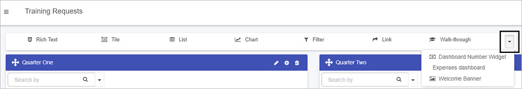
With the widget now placed on the page, adjust settings, connect it to data sources, and customize the display. Check Edit dashboard page settings for more details on configuring your page.
Unlock New Insights Through Custom Dashboards
By building custom dashboard widgets using familiar open web technologies, you can surface the exact data and interactions your users need. Whether you’re integrating an external reporting service, displaying aggregated metrics from multiple processes, or providing an interactive interface for exploring large datasets, custom widgets put you in the driver’s seat.
Kianda’s low-code approach blends the speed and ease of drag-and-drop configuration with the flexibility and power of full web development. As a result, you can quickly create dashboards that go beyond static charts and tables—delivering dynamic, user-friendly interfaces that help your team make better, data-driven decisions.
Embrace Kianda’s flexibility, leverage your CSS and JavaScript expertise, and start building custom dashboard widgets that enhance your organization’s insights and performance. If you need more guidance, explore the provided links, refer to the Ember inspector for debugging, and use your existing web development skills to make the most out of Kianda’s low-code platform.
4 - Global CSS file
Customize Kianda’s look site-wide by adding global CSS to style elements and define reusable classes
Kianda’s visual style is built on standard web technologies—primarily CSS and the Bootstrap framework. By default, Kianda applies a site-wide style that gives your workspace a consistent look and feel. However, as a workspace Administrator, you can override these defaults by using the Global CSS file. This lets you adjust aesthetics, tweak layouts, and even enhance functionality for your forms, processes, and dashboards.
Why Use the Global CSS File?
Global CSS lets you implement style changes that appear throughout your entire Kianda workspace. Rather than adjusting individual elements in each process or dashboard, you can create a unified look or add distinctive branding across all pages at once.
For example, you can:
- Apply consistent branding: Match your company’s color palette, typography, and visual identity.
- Improve usability: Make key buttons larger, adjust spacing for better readability, or change how messages are highlighted.
- Add functional styling: Hide certain elements until triggered by JavaScript, or highlight form fields based on conditions.
Before You Begin
Plan your design. Decide in advance what changes you want to make, and consider creating mock-ups to visualize the final look. Having a clear design direction helps ensure your CSS changes are cohesive and meaningful.
If you’re new to CSS or Bootstrap, you might review basic CSS and Bootstrap documentation first. Since Kianda is built on Bootstrap, you can use familiar classes, breakpoints, and responsive utilities to craft a user-friendly layout.
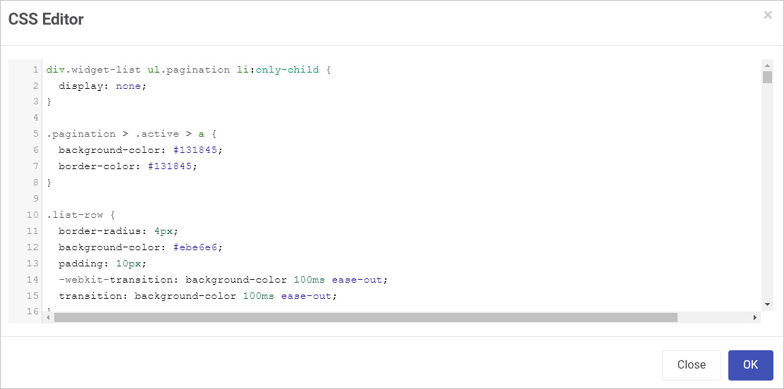
Where to Find and Edit the Global CSS File
-
As an Administrator, go to Administration > Developer.
-
Click on Edit Global CSS.
-
The global CSS file editor opens allowing a developer to edit the global CSS file.
-
When finished, click OK, then Save Changes in the Look and Feel section. Refresh Kianda to ensure the changes load.
Effective Use of CSS Classes
CSS classes let you define a style rule once and apply it to multiple elements. For instance, to create a “tile” style that you can reuse across many forms:
.tile {
  border-radius: 12px;
  border: 1px solid #e7eaee;
  background: white;
  margin-bottom: 15px;
  padding: 18px 15px 2px 15px;
}
Next, apply this class to any element in Kianda by typing “tile” into the Custom CSS class name field in the process designer.
Tip: Use clear, descriptive class names. They help you maintain consistency and make future adjustments easier.
Beyond Look and Feel: Using CSS for Functionality
While CSS is primarily for styling, you can also pair it with JavaScript to achieve functional effects. For example, you could:
- Hide elements: Use
display:none; in CSS to initially hide a button, then show it dynamically through JavaScript. - Highlight states: Combine CSS classes with conditions in Kianda’s logic to emphasize fields that need attention.
This blend of styling and scripting can improve your workflows without cluttering your markup.
Working with Bootstrap
Since Kianda uses Bootstrap, you can leverage Bootstrap’s utility classes to quickly style elements without custom CSS. For example, use .text-center to center text or .d-none to hide elements. If you do need custom rules, try extending or overriding Bootstrap styles sparingly. Keep these tips in mind:
- Avoid deep overrides: Stick to high-level classes or create new classes rather than overriding too many built-in Bootstrap rules. This reduces complexity.
- Responsive design: Use Bootstrap’s responsive classes and media queries to ensure your workspace looks good on all devices.
Using Font Awesome Icons
Icons can improve usability and help users instantly recognize actions:
a:before {
  font-family: "Font Awesome 5 Free";
  content: "\f007";
  display: inline-block;
  padding-right: 10px;
  vertical-align: middle;
  font-weight: 900;
}
This rule displays a user icon before any link (<a> element). Adjust icons by changing the Unicode value or adding conditions. For more details, see Font Awesome’s pseudo-elements guide and cheatsheet.
Local vs. Global CSS
While the Global CSS file affects your entire Kianda workspace, sometimes you want to make changes only in one process or dashboard. In that case, add <style> tags directly into a Rich Text field in that process or dashboard. This local approach ensures your changes are contained and won’t impact other parts of the system.
For example, to color all buttons magenta in a specific process:
- Add a Rich Text field to your process.
- Open Code View and wrap your CSS in
<style></style> tags. - Add your button styling inside the tags.
- Save and preview the process—the buttons will now have a magenta background, without altering buttons in other processes.
Naming Conventions and Maintenance
Over time, your Global CSS file can grow. Keep it maintainable by:
- Using meaningful names: Class names like
.primary-btn or .invoice-tile convey purpose. - Grouping related styles: Organize your file so that similar rules (e.g., buttons, panels, modals) are together.
- Commenting your code: Document why certain overrides exist. This helps future administrators or developers understand your intentions.
Testing and Iteration
After saving changes, always refresh Kianda and test your workspace on different devices or browsers. Check that your modifications didn’t unintentionally affect other elements. If you notice unwanted changes, refine your selectors or consider using local CSS for more targeted modifications.
In summary, the Global CSS file is a powerful tool that helps you shape your Kianda environment. By planning ahead, using descriptive classes, taking advantage of Bootstrap utilities, and keeping your code organized, you’ll create a more engaging, visually appealing, and functional workspace for your users.
5 - Global JavaScript file
Add global JavaScript for custom logic and reusable functions available across your entire Kianda workspace
The Global JavaScript file in Kianda gives you a central place to add custom JavaScript code that will be loaded and available across your entire workspace. Whether you want to create helper functions, bind custom actions to user interactions, or integrate with front-end frameworks at a deeper level, this file provides a convenient, site-wide JavaScript environment.
Because it’s globally accessible, you can think of this file as your own mini library of utilities and features that any process, form, or dashboard in Kianda can tap into. For example, you could define functions to:
- Manipulate DOM elements dynamically,
- Handle global events or user interactions,
- Integrate external APIs or services consistently,
- Hook into the Ember.js application lifecycle that Kianda’s front-end runs on.
Why Use a Global JavaScript File?
Reuse and maintainability: Instead of duplicating code across multiple processes or forms, write it once here. Any code in this file can be called from anywhere else, reducing repetition and simplifying long-term maintenance.
Centralized customization: Keep your custom logic organized in one place. If you need to adjust a commonly used function, updating it in the Global JavaScript file instantly applies the change throughout the workspace.
Deep integration: Kianda is built on Ember.js. By hooking into the Ember application through the global file, you can access app instances, sessions, and stores, letting you implement advanced custom behaviors that integrate with Kianda’s internal mechanisms.
Getting Started
-
Access the Developer Page:
As an Administrator, go to Administration > Developer in the Kianda menu.
-
Open Global JavaScript Editor:
Click Edit Global JavaScript to open the JavaScript editor. If you’ve already added code, it will appear here; if not, you can start from scratch.
-
Add or Modify Code:
Write or paste your JavaScript. You can define functions, create event listeners, or even hook into Ember’s initialization sequence. For example:
function testClick() {
  alert("Testing a button click");
}

// Ember app hooks for advanced integration
window.kiandaApp = {
  init: function (app) {
    app.boot().then(async () => {
      var appInstance = app.__container__.owner;
      var session = appInstance.lookup("service:session");
      var store = appInstance.lookup("service:store");
      // Add custom logic here if needed
    });
  },
  didInit: function(appInstance) {
    // Fires after the app has initialized
    // Ideal place for actions that require a fully loaded environment
  }
};
-
Save and Apply Changes:
Click OK, then Save Changes in the Subscription Details page. After saving, refresh your workspace to ensure the new code is loaded globally.
-
Use the Generated URL (If Needed):
A URL is generated for the Global JavaScript file. Typically, you don’t need to reference this URL directly within Kianda, but it’s available for troubleshooting or external references.
Best Practices
- Keep it organized: Group related functions together and comment your code, so it’s easier to maintain as your workspace grows.
- Use namespaces: To avoid naming conflicts, consider wrapping related functions in a single object or namespace. For example:
window.myCompanyUtils = {
  setHeader: function(elementId, text) {
    const headerElement = document.getElementById(elementId);
    if (headerElement) {
      headerElement.innerHTML = text;
    }
  }
};
- Embrace Ember hooks: The
window.kiandaApp object gives you direct access to Ember’s lifecycle. Use init or didInit to run code at startup, obtain services, or dynamically modify application behavior. - Leverage jQuery/Vanilla JS: Kianda includes jQuery, but you can also use modern JavaScript APIs (
document.querySelector, etc.). Prefer modern APIs when possible for cleaner, more performant code.
Example: Dynamic Interaction with a Dashboard
Here’s a more detailed example of a global function that updates a dashboard header based on a user’s selection in a dropdown:
function setHeader(elementId) {
  // Assuming the dropdown has a Kendo UI component or a similar API
  var dropdown = $('filter.dropdown [data-role=dropdownlist]').data("kendoDropDownList");

  dropdown.bind("cascade", function () {
    var selectedText = dropdown.text();
    var headerElement = document.getElementById(elementId);
    if (headerElement) {
      headerElement.innerHTML = selectedText;
    }
  });
}
How This Helps:
When a user selects a new filter in the dropdown, setHeader runs automatically (after binding), updating the displayed header dynamically. This logic can be easily reused in multiple dashboards or pages—just call setHeader with the correct element ID in each case.
Additional Ideas
- Data formatting functions: Create global helpers for formatting dates, numbers, or strings consistently across all processes.
- Event-based logic: Attach global event listeners to window or document, and run specific functions in response to custom events fired within Kianda.
- Complex integrations: Use
fetch or AJAX calls to integrate with external APIs, then store or display the returned data in various parts of your workspace.
In summary, the Global JavaScript file in Kianda is your toolbox. By placing commonly used functions, event handlers, and Ember lifecycle hooks here, you maintain a cleaner, more efficient codebase and give yourself the flexibility to implement custom logic throughout your workspace with minimal repetition.
6 - List widget template customisation
Learn how to customize Kianda list widget with Handlebars templates
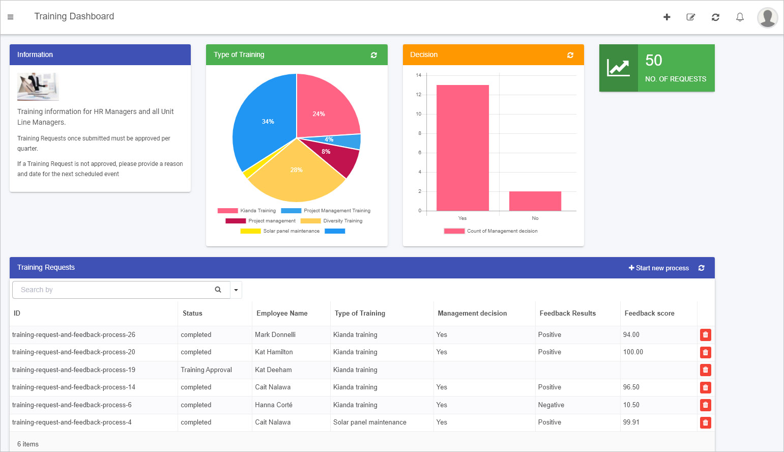
The List widget is a powerful dashboard component that displays process records or instances in an organized, visual format. For example, a “Training Requests” list can show each request’s ID, status, and the employee’s name who submitted it—all in one convenient place:
You can configure the List widget with no-code steps—such as filtering data, displaying specific fields, and enabling sorting or search features. For details, see Configure your widget.
However, to truly make the widget your own, you can customize it using HTML and Handlebars templates. This approach lets you change its look and feel, add icons, or even integrate dynamic behavior. In the following sections, we’ll walk you through how to get started with these customizations.
As with any of Kianda’s predefined dashboard widgets, you can add a List widget to your dashboard with just a few clicks. For details on adding widgets, see How to add widgets to a dashboard page.
The standard List widget already provides extensive configuration options—like conditions, sorting, and filtering—that leverage both design fields and Kianda’s built-in process fields. Yet, if you have an Administrator role, you can take this further by customizing how the List widget displays its data:
-
Go to an existing dashboard page or create a new one. Click Edit current page  to enter Edit mode.
-
Add a new List widget from the dashboard widget menu if none exists, or edit an existing one by clicking its Edit/pen icon.

-
In the Edit widget dialog, configure the widget by selecting which fields to display and how you’d like the data to appear. For guidance, see Configure your widget.
-
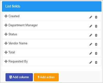
Once your fields are selected, click on List fields in the Edit widget dialog. Here, you’ll find two important buttons:
- Add column: Lets you add a new column with custom HTML or Handlebars code.
- Add action: Lets you attach a button to trigger rules or actions from the dashboard.
-
Add column  :
:
Clicking this opens a code editor where you can customize the presentation of your data. Insert HTML, Handlebars expressions, and even Font Awesome icons for visual cues. You can also hide a column if needed.
For example:
<div class="panel panel-primary">
  <button class="btn btn-warning">
    {{#if (eq row.properties.InternalStatus "completed")}}
      <span class="fa fa-check-circle"></span>
    {{else if (eq row.properties.InternalStatus "PO Request")}}
      <span class="fa fa-question-circle"></span>
    {{else if (eq row.properties.InternalStatus "Approval")}}
      <span class="fa fa-thumbs-up"></span>
    {{else if (eq row.properties.InternalStatus "Supplier Invoice")}}
      <span class="fa fa-newspaper-o"></span>
    {{else if (eq row.properties.InternalStatus "Payment")}}
      <span class="fa fa-money"></span>
    {{/if}}
  </button>
</div>
-
Add action  :
:
Use this feature to add a dashboard button that, when clicked, triggers specific rules or actions associated with a field in the underlying process. For example, you could re-run a “Submit” action even after a process instance is complete.
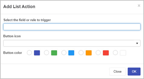
Choose a field or rule to trigger, assign an icon, and pick a button color. Your dashboard users will then be able to perform these actions directly from the list.
-
After making your changes, click OK to confirm. Then save your dashboard page changes by clicking the Save button  . You’ll see a “Page saved successfully” message.
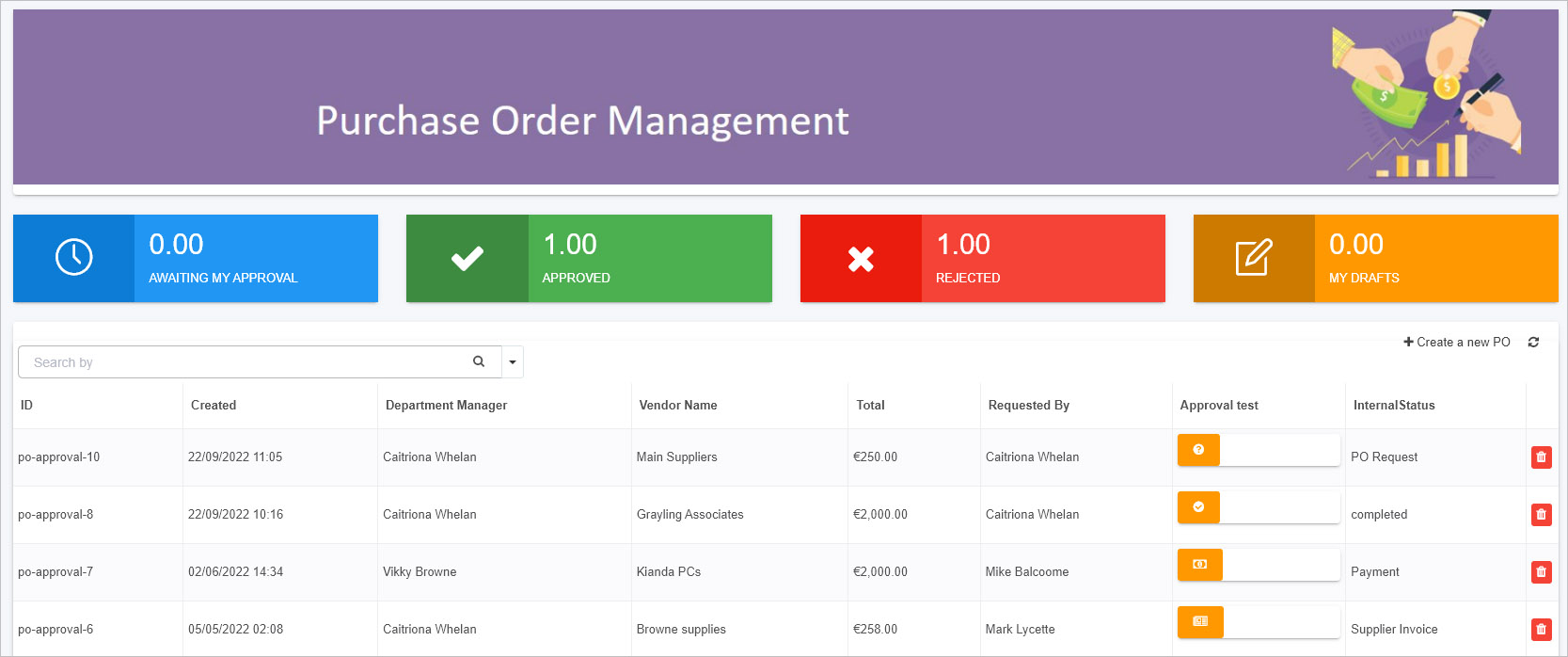
In the sample code above, we used Handlebars logic ({{#if}} conditions) to display different Font Awesome icons depending on the process instance’s status. For instance:
- PO Request: Shows a question-circle icon.
- Approval: Shows a thumbs-up icon.
- Supplier Invoice: Shows a newspaper icon.
- Payment: Shows a money icon.
- Completed: Shows a check-circle icon.
Since Kianda already loads Font Awesome, you can easily map different icons to different states, giving users a quick visual cue about each record’s progress.
When you follow the steps described and apply code via Add column, your dashboard might look like this:
You can also use JavaScript to enhance the widget’s functionality. For example, you could write custom actions in your Global JavaScript file (see Global JavaScript file) and then call them from within the Handlebars template. This flexibility means you’re not limited to static displays—you can introduce interactivity and dynamic content tailored to your specific requirements.
By blending Kianda’s built-in configuration options with custom HTML, Handlebars templating, and JavaScript actions, you can create a List widget that perfectly suits your reporting and visualization needs. This approach keeps development simple (just like regular front-end work) while unlocking a rich set of possibilities for your business dashboards.
7 - Kianda as a Progressive Web Application (PWA)
Learn about the benefits of PWA for enterprise mobile solutions deployment
What is a PWA?
A Progressive Web Application (PWA) is a web-based application that delivers a native app-like experience on any device—mobile, tablet, or desktop—without requiring an app store download. PWAs leverage modern web technologies to offer features such as offline availability, push notifications, and fast load times, all while maintaining the convenience and accessibility of a standard website.
By running Kianda as a PWA, you gain a flexible, secure, and user-friendly solution for enterprise mobility without the overhead of traditional mobile app distribution. Accessing Kianda through a PWA feels like using a native app, but with the continuous updates and centralized maintenance of a cloud-based web application.
Why Choose a PWA for Enterprise Applications?
-
No App Store Submission:
Distribute and update your enterprise application directly. Users can “install” Kianda from their browser without going through an app store.
-
Offline Capability:
Work seamlessly—even without network access. Tasks, forms, and process instances can be completed offline and automatically synced when connectivity returns.
-
Fast and Responsive:
Thanks to caching and efficient resource handling, PWAs load quickly. Users benefit from smoother interactions and better performance on all devices.
-
Engaging User Experience:
Receive timely push notifications and view content in a user-friendly interface that adapts to any screen size. Add your brand’s icon and color scheme for a polished, consistent experience.
-
Enhanced Security:
PWAs use secure HTTPS connections, leveraging browser-level security features like SSL encryption to protect data in transit.
Key Benefits of Using Kianda as a PWA
Offline Use
If users are in areas with limited or no connectivity—such as remote worksites or underground facilities—the PWA ensures they can still fill out forms, submit inspections, or log tasks. Changes made offline sync automatically when the device reconnects, eliminating data loss and downtime.
PWAs cache essential resources locally, reducing load times and improving reliability. Users enjoy instant access to Kianda processes and forms, contributing to better productivity and user satisfaction.
Easy Installation and Maintenance
Installing Kianda as a PWA is as simple as adding it to your home screen. Since updates happen behind the scenes over the web, there’s no need for users to download updates manually. Your IT team can roll out new features or fixes instantly, ensuring everyone is always on the latest version.
Brand Consistency and Engagement
Customize the PWA’s splash screen, icons, and theme colors to match your company’s identity. With push notifications enabled, you can engage your workforce, sending timely updates or alerts that improve communication and responsiveness.
Kianda’s interface adapts to various screen sizes and devices. Whether users access it from a smartphone, tablet, or desktop browser, they enjoy a consistent, intuitive experience. This adaptability also reduces development costs and complexity.
How to Install the Kianda PWA
General Requirements
- Ensure you have the latest version of your device’s operating system.
- Obtain your unique Kianda workspace URL, typically
https://<businessName>.kianda.com.
Android Installation
-
Navigate to the Kianda Workspace:
Open your preferred browser (e.g., Chrome) and go to https://<businessName>.kianda.com.
-
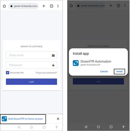
Prompt to Add to Home Screen:
On Android devices, you may be automatically prompted to add Kianda to your home screen. Tap Add [Business Name] to Home screen, then confirm by tapping Install.
-
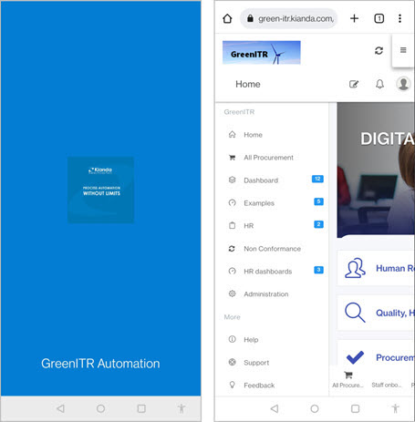
Confirmation and Access:
Once installed, a notification confirms the addition. An app-like icon with your brand’s image appears among your installed applications. Tapping the icon opens a loading screen with your chosen branding, then prompts for login credentials.

Manual Installation (Android)
If the automatic prompt doesn’t appear, follow these steps:
- Navigate to
https://<businessName>.kianda.com in your browser. - Tap the menu icon
 and select Add to Home screen.
 - Confirm by tapping Add.
iOS Installation
-
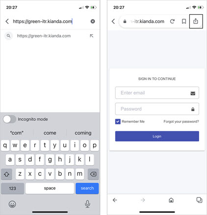
Open Kianda in Safari:
Navigate to https://<businessName>.kianda.com using Safari on your iPhone or iPad.
-
Add to Home Screen:
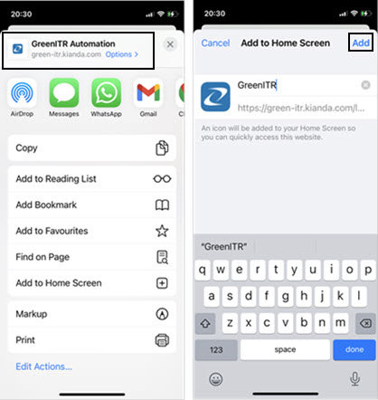
Tap the Share/Action button  , then select Add to Home Screen.
-
Confirm Installation:
Tap Add. The Kianda icon now appears on your home screen. Launching it opens your branded splash screen and then the login prompt. After logging in, you can access your processes as you would on any native app.
Tips and Best Practices
-
Encourage Users to Install the PWA:
Provide instructions or internal communications explaining how easy it is to install Kianda as a PWA, ensuring widespread adoption.
-
Manage Push Notifications:
If your organization uses push notifications, remind users that they can disable them if desired. For users who opt-in, timely and relevant notifications can improve engagement and responsiveness.
-
Regular Updates:
Keep refining and updating your Kianda processes. Since PWAs update automatically, users always have access to the latest forms and features without manual intervention.
-
Offline Testing:
Periodically test offline scenarios to ensure forms and tasks behave as expected without connectivity. This helps maintain user trust and productivity.
In Summary:
Turning Kianda into a Progressive Web Application provides a smooth, offline-capable, and engaging experience that feels just like a native mobile app—without the overhead of app store submissions or complex installations. By following the steps above and leveraging Kianda’s responsive, secure design, you can deliver a seamless, modern, and enterprise-ready application experience to your users.
8 - Webhooks
Learn how to configure webhooks to receive web callbacks from record creation
Webhooks in Kianda provide a straightforward way to notify external applications in real time when certain events occur within your workspace. Rather than constantly polling Kianda for updates, webhooks allow you to react immediately whenever process instances are created, updated, or deleted. This makes event handling efficient and responsive.
When a webhook event fires, Kianda sends an HTTP GET request to the configured URL(s), passing along essential details such as the process name, instance ID, and the type of event. Your external application can then use this information to update its own records, trigger workflows, or perform any other actions needed.
Note: The callback request has a timeout of 10 seconds. If your external service does not respond within this time, the request may fail.
Setting Up Webhooks in Kianda
To implement webhooks, you need an Administrator or Developer role. For more details on roles, see Users & Groups.
-
Open the Developer Resources:
- Go to Administration in the left-hand sidebar.
- Click on Developer to open the Developer resources page.
-
Access Webhooks:
- Click on Webhooks to configure callback URLs.
-
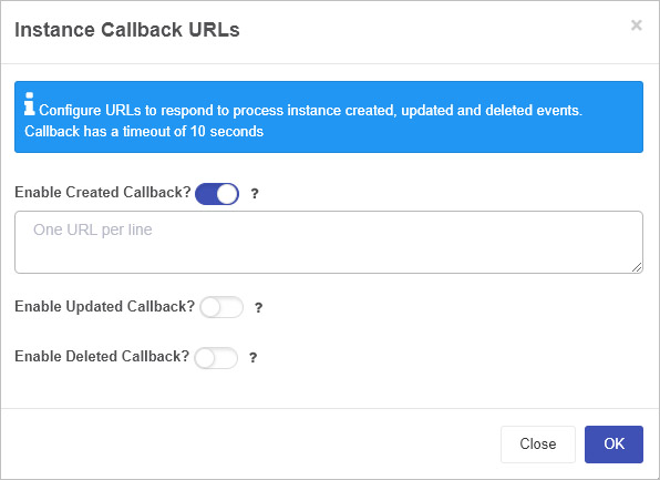
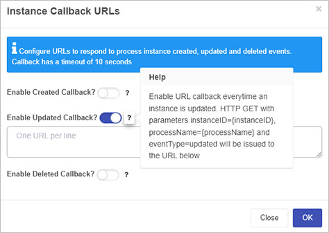
Configure Instance Callback URLs:
-
Enable and Specify Callbacks:
Turn on the relevant callback(s) using the sliders, then provide the URL(s) that Kianda should call when the selected event occurs.
-
Created Callback: Fires whenever a new process instance is created.
- Kianda sends a HTTP GET request with parameters:
instanceID={instanceID}&processName={processName}&eventType=created
-
Updated Callback: Fires whenever a process instance is updated.
- Kianda sends a HTTP GET request with parameters:
instanceID={instanceID}&processName={processName}&eventType=updated
-
Deleted Callback: Fires whenever a process instance is deleted.
- Kianda sends a HTTP GET request with parameters:
instanceID={instanceID}&processName={processName}&eventType=deleted
For each event type, you can enter one or more URLs (one URL per line) to notify multiple services simultaneously.
-
Help and Guidance:
If you need more details, click the Help button  to see additional instructions and examples.
-
Save Your Settings:
- Click OK to confirm your settings.
- Click Close if you want to exit without saving.
Once configured, Kianda will send HTTP GET requests to the specified URLs whenever the corresponding event occurs. You can then build logic in your external application(s) to handle these events—updating records, triggering other workflows, or integrating with third-party services.
In summary, Kianda’s webhook functionality allows your workspace to seamlessly connect with external applications in real time, reducing the need for constant polling and making it easier to maintain synchronized data and processes across systems.
9 - Introduction to Ember.js in Kianda
Learn about the emberjs in Kianda
Kianda’s front-end is built on Ember.js, a framework designed for creating rich, interactive web applications. Ember provides a powerful structure for building interfaces that dynamically respond to user input and data changes. To produce its UI, Ember uses Handlebars, a templating language that makes it easy to bind data models to your HTML.
If you’re familiar with modern web development, you’ll find Ember’s approach intuitive: templates, components, and data binding come together to create a smooth, dynamic user experience within Kianda’s low-code environment.
Handlebars: Templating Made Easy
Handlebars is a templating language that lets you write declarative HTML with embedded expressions. These expressions—enclosed in {{double curly braces}}—are automatically replaced by values from your data models.
For example:
<p>{{firstname}} {{surname}}</p>
If the data model provides:
{
  firstname: "Ryan",
  surname: "B'Oul"
}
The rendered HTML is:
This simple approach makes it easy to display dynamic data without writing complex logic. When data updates, the template refreshes automatically, ensuring users always see the latest state.
Using Properties and Dot Notation
Handlebars supports “dot notation” to access nested properties in objects:
<p>{{person.firstname}} {{person.surname}}</p>
If person is an object with firstname and surname properties, Handlebars will replace them in the template, keeping your markup clean and readable.
Built-in Helpers
Ember and Handlebars include helpers—functions used inside templates to handle common tasks. For example, each lets you iterate over arrays:
<ul>
  {{#each employee as |name|}}
    <li>{{name}}</li>
  {{/each}}
</ul>
Given:
{
  employee: ["Ryan B'Oul", "Mike Balcoome", "Maddie Lehane"]
}
The template renders:
<ul>
  <li>Ryan B'Oul</li>
  <li>Mike Balcoome</li>
  <li>Maddie Lehane</li>
</ul>
Similarly, if conditions let you show or hide content based on data:
{{#if manager}}
  <h1>{{firstname}} {{lastname}}</h1>
{{/if}}
If manager is true, the heading appears; if not, it’s hidden. Helpers let you add simple logic to templates without cluttering your code.
Creating Custom Helpers
You can extend Ember’s capabilities by writing your own helpers. For instance, you might create a helper to format dates or combine multiple properties. This keeps your templates clean and your logic reusable.
Inspecting the App with Ember Inspector
To better understand Kianda’s components and data, you can use the Ember Inspector—a browser add-on that helps you explore the internal structure of Ember apps. With it, you can:
- Inspect components and their properties.
- Understand the data models and routes.
- See which templates are used for specific UI elements.
How to Get Started with Ember Inspector:
- Install the Ember Inspector from the Chrome Web Store or your browser’s add-ons marketplace.
- Open your Kianda workspace and log in.
- Right-click on the page and select Inspect.
- Navigate to the Ember tab in the developer tools.
- Explore components, routes, and data to learn how Kianda’s UI is constructed.
Components and Properties
In Kianda, many UI elements—like fields, rules, and dashboard widgets—are implemented as Ember components. By inspecting them with the Ember Inspector, you can discover their properties and understand how they’re rendered. This knowledge can guide you when creating your own custom widgets or applying advanced customizations.
In Summary:
Ember.js and Handlebars provide a robust foundation for Kianda’s dynamic interfaces. Handlebars lets you write simple, declarative templates tied directly to your data, while Ember’s helpers and components help keep your application organized and responsive. Combined with tools like the Ember Inspector, these technologies give you the power to understand and customize Kianda’s front-end to suit your needs.
10 - Custom Connector Development
Learn about custom connectors, what they are and why they are used
What are Custom Connectors?
Kianda provides predefined datasource connectors such as the SQL server and SharePoint to allow you to connect your processes to particular data sources. A complete list of these predefined datasources is available at Data connectors. In addition to these predefined connectors, you can also create Custom connectors to enable you to configure your own connector to suit your needs.
Connectors in Kianda rely on a secure micro-service architecture that uses HMAC 256 to allow the configuration and connection to data sources.
Custom connectors work in the same way as other Kianda connectors, but with the added benefit of customisation.
The key components for a connector are:
- Backend micro-service to handle the actual connection to data sources
- Front-end data source configuration component (Handlebars + JavaScript)
- Security Keys (ClientID + Secret Key)
What are Custom Connectors used for?
Custom connectors provide the infrastructure to allow developers to create a custom datasource, it provides hooks for pre- and post-processing of the query and the ability to customise the datasource settings for the connector.
Custom Connector VS Datasource
As previously mentioned, the Kianda platform provides a list of predefined datasource connectors, such as SharePoint, SQL server and SAP. These however cannot be customized for an individual companies needs.
Custom Connectors provide end-to-end customisation for datasource connections. The Custom Connector provides the architecture to allow customisation of pre- and post-processing of database queries.
For example when using a SharePoint data source you can use parameters for example selection of the environment and user credentials, but if you needed extra parameter, you could use the custom connector to provide this ability.
How to get started
There are three key steps that need to be implemented in order to create and use a customised connector as follows:
-
Microservice - create a microservice that will implement metadata, query and test functions. <!– click on the Microservice link to get further details. –>
-
Use Kianda features to create and test your customised connector - use Developer to register a new connector<!– register a new connector –> and use Data sources to <!– create a datasource –> create a datasource for the newly customised connector. Both of these features are available under Administration
-
Process - use the custom connector to bring data into a process and use the query hook to filter the data. Use Kianda Designer to connect your data source to Kianda forms, for example a List control can connect to a datasource, see step 9 in List control.
What’s next 
To create a test service, follow the 3 steps above, or if you have already created a microservice go straight to steps to create a custom connector to learn how to create a custom connector.
10.1 - Microservice Creation
What is a Microservice
A microservice is a self contained independent service, usually hosted in the cloud, which can integrate with applications through REST APIs. Microservices allow developers to focus on developing a service without worrying about dependencies.
A microservice can be developed using almost any programming language.
Prerequisites
Before you get started, check that the following prerequisites are in place:
- Ability/permissions to create resources with a cloud platform, for example, Google Cloud, AWS or Azure
- Administration role or permissions within an Admin group within Kianda, see Users and Groups for more information
- Visual Studio installed or other text editor for your chosen programming language
Microservice Requirements
Your microservice should implement the following three functions:
- Test
- Metadata
- Query
It is required that the microservice uses security best practices, to encrypt sensitive data using AES encryption and verify that each request and response is secure using a HMAC signature.
Microservice Development
The following steps for development will use Microsoft Azure cloud as an example, however, other cloud computing platforms with similar features can be used resulting in different naming conventions. The key steps are:
-
Create a serverless Azure function app in Visual Studio by creating a new project, searching for Azure functions and using this as a template to get started. As well as the pre-defined libraries in the template, you must also add the following:
using System.Security.Cryptography;
using System.Text;
using Newtonsoft.Json.Linq;
using System.Collections.Generic;
using System.Linq;
-
Implement the functions for Test, Metadata and Query. Click on each of the links to read more. The steps highlighted in bold are unique to the specific function, while the other steps are repeated in all three functions.
-
Debug locally and test using a tool such as Postman or download Kianda Cloud Connect.
-
Deploy to Azure.
Test
The Test function ensures that the user is authorized to use the datasource. If they are not authorized then this function can be used to authorize the user and retrieve an access token for any further requests.
The steps involved in creating the test function are as follows:
-
Deserialize the data in the custom connector request - see schema for details and Test sample code.
-
Decrypt the encrypted settings property bag using the shared secret key and the Decrypt function, see Encryption/Decryption sample code for an example.
-
Authorize the user and retrieve bearer token for subsequent requests and save the token to the settings property bag.
-
Add the oauth token to the settings property bag and encrypt using your secret key.
-
Create custom connector response and include success message to indicate test succeeded/failed.
-
Sign the response using the EncryptdatawithHMACSHA256 method and include in the custom connector response, see Encryption/Decryption sample code for an example.
To help you get started, see sample code for the Test function by going to Test sample code.
The Metadata function provides the list of available endpoints in the microservice and is called when selecting the datasource in a Kianda process, for example use a particular datasource to populate a List field in a Kianda form.
The steps involved in creating the metadata function are as follows:
-
Deserialize the data in the custom connector request - see schema for details.
-
Decrypt the encrypted settings property bag using the shared secret key and the Decrypt function see Encryption/Decryption sample code for an example.
-
Create a JSON tree structure similar to the one found at Tree schema.
-
Create custom connector response and include success message to indicate success/failure.
-
Create a signature string using the EncryptdatawithHMACSHA256 method and include in the custom connector response, see Encryption/Decryption sample code for an example.
To help you get started, see sample code for the Metadata function by going to Metadata sample code.
Query
The Query function is where the execution of the datasource methods occurs, the metadata function provides the list of available methods.
The steps involved in creating the query function are as follows:
-
Deserialize the data in the custom connector request - see schema for details.
-
Decrypt the encrypted settings property bag using the shared secret key and the Decrypt function - see Encryption/Decryption sample code for an example.
-
Get the query object from the request - see schema for details, and call the function related to the query in the datasource .
-
Create custom connector response and include success message to indicate query succeeded/failed.
-
Create the query result object - see schema for details, and include in the custom connector response.
-
Sign the response using the EncryptdatawithHMACSHA256 method and include in the custom connector response, see Encryption/Decryption sample code for an example.
To help you get started, see sample code for the Query function by going to Query sample code.
Security
AES256
Advanced Encryption Standard (AES) is the technique used to encrypt sensitive data. This is a symmetric encryption technique, which means the same key is used to encrypt and decrypt the data, it is also a 2-way encryption algorithm.
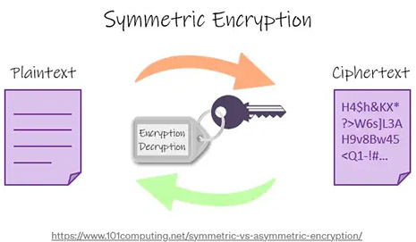
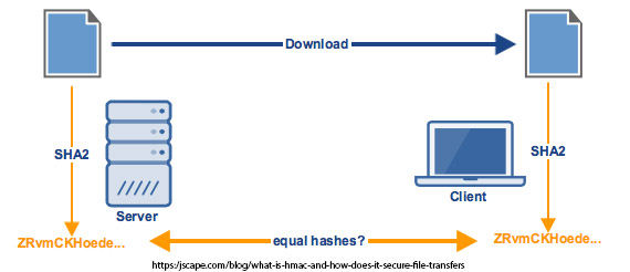
HMAC
Hash based Message Authentication Code (HMAC) is used to ensure query responses are coming from the correct end point. HMAC is also an encryption algorithm but unlike AES it’s one-way encryption, meaning it isn’t decrypted on the other side. It is used for verification, for example if we encrypt a secret key using HMAC with a request id and then do the same in the response, we can verify that we have got the response back from the correct endpoint and know that it has not been tampered with because both hashes will match. The hash used is SHA256.
With AES we are encrypting and decrypting data and this method is fast and secure for large data, while with HMAC we use it to simultaneously verify both the data integrity and authenticity of a message.
Schemas required for Custom Connectors
Custom Connector Request
	public class CustomConnectorRequest
        {
            public string subscriptionId { get; set; }
            public string userId { get; set; }
            public string requestId { get; set; }
            public string action { get; set; }
            public string encryptedSettingsPropertyBag { get; set; }
        	public byte[] iv { get; set; }
            public Query query { get; set; }
        }
Request Query Object
   public class Query {
        public string id { get; set; }
        public string action { get; set; }
        public JObject info { get; set; }
        public string orderBy { get; set; }
        public bool orderAscending { get; set; }
        public string paging { get; set; }
        public int rowLimit { get; set; }
        public List<string> fields { get; set; }
        public Dictionary<string, object> mappings { get; set; }
        public string filter { get; set; }
        public string filterBy { get; set; }
        public string filterMode { get; set; }
        public string signature { get; set; }

    }
Custom Connector Response
public class CustomConnectorResponse
    {
        public string requestId { get; set; }
        public string signature { get; set; }
        public string encryptedSettingsPropertyBag { get; set; }
    	public byte[] iv { get; set; }
        public QueryResult queryResult { get; set; }
    }
Response QueryResult
public class QueryResult
        {
            public bool success { get; set; }
            public string message { get; set; }
            public JObject data { set; get; }
            public List<JObject> items { get; set; }
            public string resultCount { get; set; }
            public string signature { get; set; }
        }
Retrieving URLs for Custom Connector settings
When you have created the Test, Metadata and Query functions and your microservice is running, you should receive an output similar to the following shown using Azure functions:
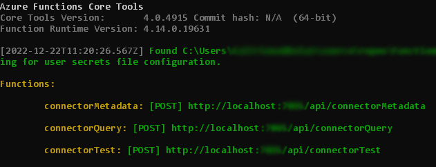
These URLs will be used in the Connector Settings tab when creating the Custom Connector.
What’s next
Once your Microservice is deployed, you are ready to start creating a custom connector go to steps to create a custom connector.
10.2 - Sample schemas
Introduction
This page features sample schemas for parameters used in the Query Code tab when creating a customised data connector.
Each section below features exemplar schemas and parameters to help you when creating code for your hooks in the Query Code tab.
The Metadata hook in the Query Code tab typically looks like the following, using two parameters: tree and datasource.
metaData(tree, datasource) {
    return tree;
  }
Sample schemas for tree and datasource are available by clicking on the links.
Tree schema
{
    "text": "Countries And Cities",
    "name": "countriesAndCities",
    "icon": "fa fa-database",
    "selectable": false,
    "nodes": [
        {
            "text": "Countries",
            "icon": "",
            "desc": "",
            "nodes": [
                {
                    "text": "Country Name",
                    "name": "countryName",
                    "type": "string",
                    "desc": "",

                },
                {
                    "text": "ISO Country Code",
                    "name": "ISOCode",
                    "type": "string",
                    "desc": ""
                }
            ]
        },
        {
            "text": "Cities",
            "name": "cities",
            "icon": "",
            "desc": "",
            "nodes": [
                {
                    "text": "City Name",
                    "name": "cityName",
                    "type": "string",
                    "desc": ""
                },
                {
                    "text": "ISO Country Code",
                    "name": "ISOCode",
                    "type": "string",
                    "desc": ""
                }
            ]
        }
    ]
}
To return to Microservice development, click on the Microservice link.
Datasource schema
Note: The same structure below can be used used in both Query hooks and Query success hooks, although data will vary slightly.
{
  "id": "2fe2d2c7-4feb-4c92-ac4c-fed4623d2d6e",
  "title": "Demo Connector",
  "type": "client",
  "typeIcon": "http://localhost:4171/public-file/322f14a6-63a0-4c68-b53e-4ca041c0e9ae/Geo-Connector-Icon.png",
  "typeTitle": "Demo Connector",
  "candelete": false,
  "readOnly": false,
  "status": "ready",
  "useConnector": false,
  "connectorId": "",
  "clientConnectorId": "19275478-68a9-43be-b8fb-54dc310cc0d6",
  "settings": {},
  "modified": "2022-11-11T15:12:44.173Z",
  "enableB2B": true,
  "enableFiltering": false,
  "b2bMappings": [],
  "modifiedBy": "5650d471-8c41-49b6-8f72-b77dddf3b956",
  "admins": [],
  "allowedUsers": [],
  "exclusionUsers": []
}
The Query hook in the Query Code tab typically looks like the following, using four parameters: datasource, query, rule and process.
 query(datasource, query, rule, process) {
     return query;
  }
Sample schemas each are available by clicking on the relevant links: datasource, query, rule, and process are available by clicking on the links.
Query schema
{
   "action": "select",
   "info": {
      "text": "Cities",
      "name": "Cities",
      "type": "item"
   },
   "rowLimit": 100,
   "conditions": [
      {
         "group": "and",
         "conditions": [
            {
               "id": "b3fe6a0b-c455-4560-abde-b5b7291d1ca8",
               "operator": "eq",
               "arg1": {
                  "name": "countryName",
                  "text": "Country Name",
                  "title": "Country Name",
                  "icon": "",
                  "type": "string",
                  "desc": ""
               },
               "arg2": {
                  "text": "Name",
                  "name": "name",
                  "type": "field",
                  "id": "07b1e8ab-9260-478c-a3e2-487aa0ee56f8",
                  "fieldType": "fields/field-textbox",
                  "date1": null,
                  "date2": null,
                  "value": "London"
               },
               "group": "and"
            }
         ],
         "id": "b6597e4d-60f1-44da-863a-e15287f72f1a"
      }
   ],
   "orderAscending": false
}
Rule schema
Note: This is similar to the rule used in the Query success hook.
The following sample rule schema is for a find-items rule which maps the response from the connector query to a table, notice the inputmapping and output mapping.
{
  "title": "Find items 3",
  "action": "rules/rule-finditems",
  "originalId": "5e6d1abc-1c5f-471c-b1f2-4bc038d7aefd",
  "enabled": true,
  "schedule": "default",
  "settings": {
    "inputMapping": [
      {
        "lefterror": "has-error",
        "righterror": "has-error"
      }
    ],
    "outputMapping": [
      {
        "left": {
          "text": "Country Name",
          "name": "country-name",
          "id": "6070ad52-7e4e-4a96-aa6b-320266644d93",
          "type": "field",
          "fieldType": "fields/field-textbox",
          "selectable": true,
          "icon": "fa fa-text-height"
        },
        "right": {
          "text": "Country Name",
          "name": "countryName",
          "type": "datafield"
        },
        "lefterror": "",
        "righterror": ""
      },
      {
        "left": {
          "text": "ISO Country Code",
          "name": "ISOCode",
          "id": "c2246c9a-af60-4fd0-9ac6-3195c456d3ff",
          "type": "field",
          "fieldType": "fields/field-textbox",
          "selectable": true,
          "icon": "fa fa-text-height"
        },
        "right": {
          "text": "ISO Country Code",
          "name": "ISOCode",
          "type": "datafield"
        },
        "lefterror": "",
        "righterror": ""
      }
    ],
    "errorMapping": [],
    "rowLimit": 100,
    "list": {
      "text": "Countries",
      "name": "Countries",
      "type": "item"
    },
    "mapToTable": "yes",
    "offlineCache": "no",
    "overrideTable": "yes",
    "serverPaging": "no",
    "table": {
      "text": "Table 1",
      "name": "form1-f4",
      "id": "7746f138-a913-4438-ba65-4905d8453d57",
      "type": "field",
      "fieldType": "fields/field-table",
      "selectable": true,
      "icon": "fa fa-table",
      "nodes": [],
      "visible": true,
      "rows": [
        {
          "text": "row1",
          "name": "form1-f4-row1",
          "id": "219e1d44-a997-4f76-b815-f409fdcb4774",
          "type": "field",
          "fieldType": "fields/table-row",
          "selectable": false,
          "nodes": [
            {
              "text": "Country Name",
              "name": "country-name",
              "id": "6070ad52-7e4e-4a96-aa6b-320266644d93",
              "type": "field",
              "fieldType": "fields/field-textbox",
              "selectable": true,
              "icon": "fa fa-text-height"
            },
            {
              "text": "ISO Country Code",
              "name": "ISOCode",
              "id": "c2246c9a-af60-4fd0-9ac6-3195c456d3ff",
              "type": "field",
              "fieldType": "fields/field-textbox",
              "selectable": true,
              "icon": "fa fa-text-height"
            }
          ],
          "visible": true,
          "state": {
            "expanded": true
          }
        }
      ]
    },
    "lastExecuted": "2022-12-14T17:29:42.425Z"
  },
  "elseSettings": {},
  "hasElse": false
}
Process schema
Note: This is similar to the process used in the Query success hook.
{
  "processVersion": "1.1",
  "processName": "connector-example",
  "isCreated": false,
  "isOfflineCreated": false,
  "isOfflineUpdated": false,
  "uniqueID": "45758d2b-f713-44c9-81dc-0e4cb7618902",
  "title": "connector example",
  "type": "Process",
  "name": "connector-example",
  "desc": "",
  "version": "1.0",
  "modified": "2022-11-14T09:33:46.254Z",
  "created": "2022-11-11T15:13:28.108Z",
  "status": "form 1",
  "securityMode": null,
  "enableSecurity": false,
  "deleted": false,
  "rejected": false,
  "completed": false,
  "settings": {
    "keepRuleExecutionOrder": "yes",
    "buttonDisplayFlag": true,
    "mobileNav": "yes",
    "comments": "",
    "offline-tag": "45758d2b-f713-44c9-81dc-0e4cb7618902"
  },
  "partnerId": null,
  "instanceIDFormat": null,
  "customInstanceIDFormat": null,
  "isPartner": false,
  "isDraft": true,
  "publish": false,
  "allowNew": false,
  "visMode": null,
  "group": null,
  "fieldsUpdated": null,
  "modifiedBy": null,
  "createdBy": null,
  "currentForm": "5af0c34e-28ea-4404-bba3-a8cf2df8eaff",
  "partner": null
}
The Query success hook in the Query Code tab typically looks like the following, using four parameters: datasource, result, rule and process.
 querySuccess(datasource,result,rule,process) {
    // this.get("dataservice").mapSuccess(result,rule,process); //uncomment to use default mapping behaviour
   return result;
  }
Sample schemas each are available by clicking on the relevant links: datasource, result, rule, and process are available by clicking on the links.
Result schema
{
    "success": true,
    "items": [
        {
            "countryName": "England",
            "ISOCode": 123
        },
        {
            "countryName": "Ireland",
            "ISOCode": 124
        }
    ]
}
What’s next
To discover how to use your customised data connector widget in Kianda process design, go to Kianda application designer.
To create other widgets go to Custom field widget, Custom dashboard widget and Custom rule widget pages to find out more.
To return to the previous pages click on the links below 
10.3 - Steps to create a custom connector
Introduction
This section will detail how to create a new Custom Connector which is a customised data connector for your organisation.
Note: You must be have an Administrator or Developer role to create a custom connector.
Before you begin
Please note before you begin that there are three key steps that need to be implemented in order to create and use a customised connector.
-
Microservice - create a microservice that will implement metadata, query and test functions, click on the Microservice link to get further details.
-
Use Kianda features to create and test your customised connector - use Developer to register a new connector and use Data sources to create a connector datasource for the newly customised connector.
-
Process - use the custom connector to bring data into a process and use the query hook to filter the data.
Register a new connector
To create a new customised connector, follow the steps below:
- From the left-hand side menu, go to Administration > Developer then within the Connectors panel click on New Connector.
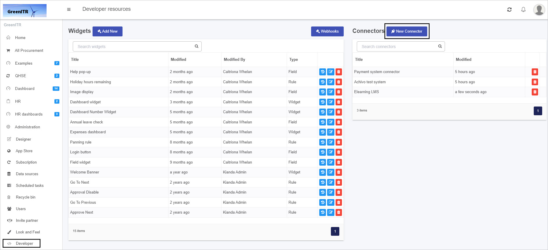
-
In the Create Connector dialog box, add a Title and browse for an Icon URL for your connector. The Connector Unique ID is automatically generated by the system.
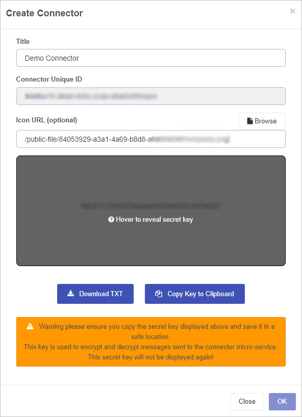
-
Make sure to copy the secret key to a safe location where you will find it as it will be needed later. You can do this by a) clicking on Download TXT which will result in the Secret Key being downloaded as a CSV file or b) clicking on Copy Key to Clipboard, then click on OK when done.
-
Ensure that this secret key is added to your Microservice code, see Encryption and Decryption sample code, where you need to replace the string in the GetSecretKey function as shown below:
 private static string GetSecretKey()
        {
            return "{secret key generated from Kianda}"; //REPLACE ME
        }
-
After populating the initial dialog box, the next screen will show you the title of the connector and contains four tabs: Connector Settings, Settings UI, Settings Code and Query Code.
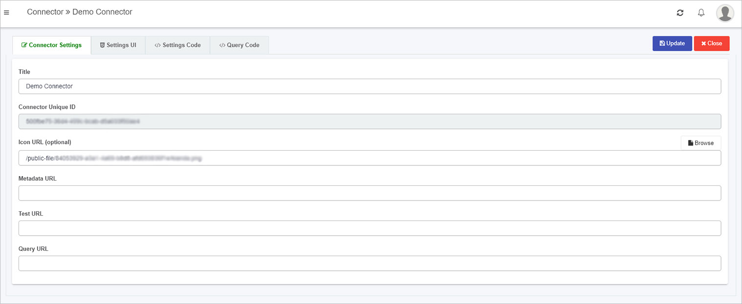
The details of these tabs are found in the following sections.
Connector Settings tab
This is where the Connector Title and Icon can be changed. These details will be seen in the Data connectors function, once the customised connector is created.
The URLs for metadata, test and query can be edited here too. The Metadata, Test and Query URL’s can be populated when the microservice is created, see Create a Microservice link for more details.
For example when your Microservice is running you should receive an output similar to the following shown using Azure functions and use these URLs in the Connector Settings tab.
To save details click on Update, then click on Close to return to the Developer resources page.
Settings UI tab
The Settings UI sets the user interface for a customised data connector within the Data sources function, found within Administration in the left-hand pane. By default there is sample code in this tab. This code will be rendered when the datasource for this connector is activated.
<div class="form-group">
   <label class="control-label">Client ID</label>
   {{input type="text" value=datasource.settings.clientID class="form-control"}}
</div>
<div class="form-group">
   <label class="control-label">Readwrite </label>
   {{radio-button default=true name='readwrite' label='No' value='no' group=datasource.settings.readwrite}}
   {{radio-button name='readwrite' label='Yes' value='yes' group=datasource.settings.readwrite}}
</div>
<div class="form-group">
   <button type="button" class="btn btn-primary" {{action 'authorize'}}>
   {{#if datasource.settings.authorized}}
   Re-Authorize
   {{else}}
   Authorize
   {{/if}}
   </button>
</div>
This code creates the content on the screen seen below, available in the Data sources function on the Datasource details page. Within the class form-group listed in the code above there is an Environment setting with labels ‘Demo’ and ‘Live’ which can be seen in the screen below. Also note an Authorize button added in the code above which has an action ‘authorize’ which is handled by the code in the Settings Code tab.
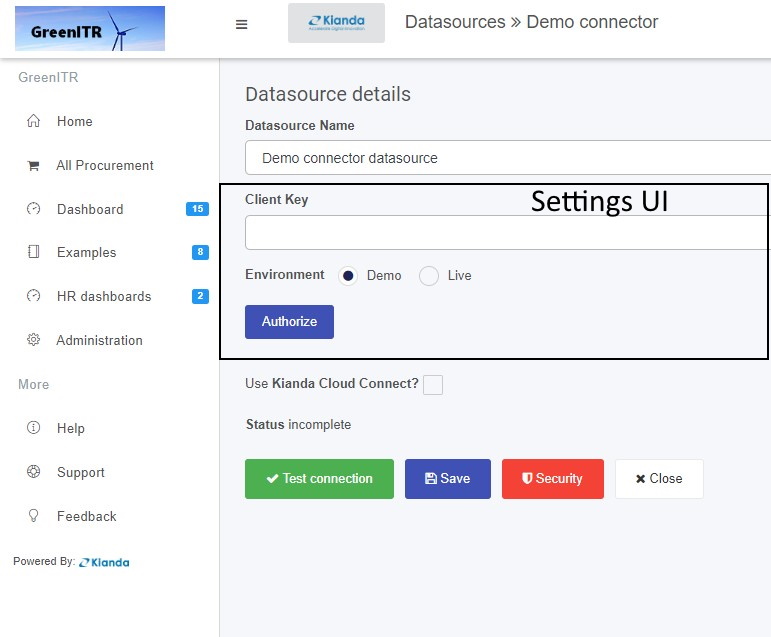
Other details on the screen above, like the name of the page Datasource details, Use Kianda Cloud Connect and buttons Test connection, Save, Security and Close are automatically part of the UI for customised data connectors. However, custom handlebars can be added for the settings of the connector datasource using code in the Settings UI tab, namely fields like Datasource Name and Client Key as shown in the image above. This principle works the same as Widget UI, which is seen when creating custom rule widgets or field widgets for example.
Settings Code
In a similar manner to creating custom rule widgets or field widgets where there are Widget code tabs, the connector widget has a tab called Settings Code which is used to create the JavaScript code for the settings UI.
By default there is code in this tab, for example the Authorize button shown in the Datasource details page above has an ‘authorize’ function which is the first segment of code below.
{
   actions: {
      authorize() {
         let clientId = this.get("datasource.settings.clientID");
         let redirectUri = 'https://app.kianda.com/index.html';
         let scope = 'openid User.Read.All Directory.Read.All ';
         var readWrite = this.get("datasource.settings.readwrite");
         if (readWrite === 'yes') {
            scope += 'Directory.ReadWrite.All Group.ReadWrite.All User.ReadWrite.All Directory.AccessAsUser.All';
         }
         this.set("scope", scope);
         let guid = uuidv4();
         let consentUrl = 'https://login.microsoftonline.com/common/oauth2/v2.0/authorize?' +
            'client_id=' + clientId +
            '&response_type=code' +
            '&redirect_uri=' + redirectUri +
            '&response_mode=query' +
            '&scope=' + scope +
            '&state=' + guid +
            '&prompt=login';
         var authWindow = window.open(consentUrl, '_blank', 'height=750,width=700,scrollbars=yes,location=yes');

         try {
            authWindow.focus();
         } catch (e) {
            $.notify('Error during authentication, please try again', {
               status: 'warning'
            });
         }
         var that = this;
         var handleCallback = function (evt) {
            if (that.isDestroyed !== true && evt.origin.indexOf('kianda.com') > -1 && evt.data) {

               let accessCode = evt.data;

               let scope = that.get("datasource.settings.scope");
               let openid = that.get("datasource.settings.openid");
               that.set('datasource.settings.accessCode', accessCode);
               that.set('datasource.settings.accessToken', null);
               that.set('datasource.settings.refreshToken', null);
               that.set('datasource.settings.authorized', false);
               that.set("datasource.settings.scope", scope);
               that.datasource.save().then(function () {
                  that.sendAction('test', that.datasource);
               });
            }


            window.removeEventListener('message', handleCallback);
         };
         window.addEventListener('message', handleCallback, false);
      }
   }


}
Other aspects to note in this sample code are the datasource settings, for example datasource.settings.accessToken and datasource.settings.environment denoting that you can add whatever settings you want to the UI within the Datasources details page using this type of code. These settings could be then used in a Microservice to create an action based on a chosen setting.
Query Code
When using a data source, all data sources will have built-in metadata, query and querySuccess functions to allow content searches, including metadata content or information about the content, such as title, author and creation date. The Query code tab contains the code needed for these three functions. Default code is provided to help you get started, see below.
{
  metaData(tree, datasource) {
    return tree;
  },
  query(datasource, query, rule, process) {
    return query;
  },
  querySuccess(datasource,rule,result,process) {
     //this.get("dataservice").mapSuccess(result,rule,process); //uncomment to use default mapping behaviour
    return result;
  }
}
The default code contains three hooks that allow you to tap in to a module to trigger certain behaviours or actions. These hooks are:
Click on each of the links above to see further details.
In Ember, bubbling will search for each of the actions in the code above, and if not found, then a default action is used, but if found the default is overwritten. This principle is useful when something is created multiple times which is the case when creating custom data connectors.
The Metadata hook is where the return of the tree or metadata call can be altered for a chosen datasource used in Kianda form design.
The treeparameter as part of this hook is seen in the sample code snippet below.
  metaData(tree, datasource) {
    return tree;
  }
An example of the tree structure is shown below.
The tree follows the structure that there is a root node, in this example Countries and Cities is the root. The tree can be customised by adding an icon and making nodes selectable.
{
  "text": "Countries And Cities",
  "name": "countriesAndCities",
  "icon": "fa fa-database",
  "selectable": false,
  "nodes": [
    {
      "text": "Countries",
      "icon": "",
      "desc": "",
      "nodes": [
        {
          "text": "Country Name",
          "title": "Country Name",
          "name": "countryName",
          "type": "string",
          "desc": ""
        },
        {
          "text": "ISO Country Code",
          "title": "ISO Country Code",
          "name": "ISOCode",
          "type": "string",
          "desc": ""
        }
      ],
      "fields": [
        {
          "text": "Country Name",
          "title": "Country Name",
          "name": "countryName",
          "type": "string",
          "desc": ""
        },
        {
          "text": "ISO Country Code",
          "title": "ISO Country Code",
          "name": "ISOCode",
          "type": "string",
          "desc": ""
        }
      ]

    },
    {
      "text": "Cities",
      "name": "cities",
      "icon": "",
      "desc": "",
      "nodes": [
        {
          "text": "City Name",
          "title": "ISO Country Code",
          "name": "cityName",
          "type": "string",
          "desc": ""
        },
        {
          "text": "ISO Country Code",
          "title": "ISO Country Code",
          "name": "ISOCode",
          "type": "string",
          "desc": ""
        }
      ],
      "fields": [
        {
          "text": "City Name",
          "title": "ISO Country Code",
          "name": "cityName",
          "type": "string",
          "desc": ""
        },
        {
          "text": "ISO Country Code",
          "title": "ISO Country Code",
          "name": "ISOCode",
          "type": "string",
          "desc": ""
        }
      ]
    }
  ]
}
This structure will result in the output as shown in the image below,
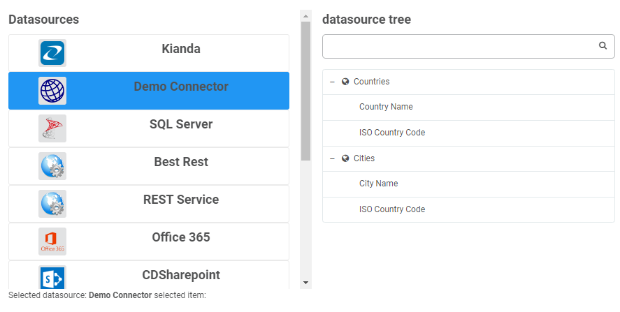
Query Hook
The Query hook allows a query to the datasource to be customised. Parameters are passed into this function to allow customisation to happen. These parameters are: datasource, query, rule and process; sample schemas are available for each at the Sample schema link.
In the sample code below, the filter is obtained by drilling into the query conditions object.
This is just one example of how the query can be customized before being processed, which is an advantage of using custom connectors. Take a look at the query schema for more information
 query(datasource, query, rule, process) {
    if(query.conditions)
    {
      query.filter = query.conditions[0].conditions[0].arg2.value;
    }
    return query;
  }
This ties in with the query success hook which handles the result which is returned from the datasource, which can also be customized.
QuerySuccess hook
The idea of the query success hook is to be able to customize the response of a datasource query for example drill into a complicated json response based on a condition.
querySuccess(datasource,result,rule,process) {
    // this.get("dataservice").mapSuccess(result,rule,process); //uncomment to use default mapping behaviour
   return result;
  }
Once the connector is created, the connector is available from the Data sources function under Administration, see Creating a datasource for details.
10.4 - Sample code for a microservice
Sample code
The following sections provide some sample code to help you get started in creating Test, Metadata and Query functions for your Microservice so that you can test and deploy a Custom Connector in Kianda, allowing you to connect forms and use data from any data source.
Encryption and Decryption sample code
        public static string HashWithHMACSHA256(string key, string value)
        {

            using (var hash = new HMACSHA256(Convert.FromBase64String(key)))
            {
                var hashedByte = hash.ComputeHash(Encoding.UTF8.GetBytes(value));
                var hashed = Convert.ToBase64String(hashedByte);
                return hashed;
            }
        }

        public static string AESEncrypt(string key, string plainData, out byte[] iv)
        {
            var _key = Convert.FromBase64String(key);
            using (Aes aes = Aes.Create())
            {
                aes.GenerateIV();
                aes.Mode = CipherMode.CBC;
                iv = aes.IV;
                aes.KeySize = 256;
                aes.Key = _key;
                using (var encryptor = aes.CreateEncryptor())
                {
                    using (MemoryStream ms = new MemoryStream())
                    {
                        using (CryptoStream cs = new CryptoStream(ms, encryptor, CryptoStreamMode.Write))
                        {

                            using (StreamWriter sw = new StreamWriter(cs))
                                sw.Write(plainData);
                        }
                        return Convert.ToBase64String(ms.ToArray());
                    }
                }

            }
        }


        public static string AESDecrypt(string key, string encryptedData, byte[] iv)
        {
            var buffer = Convert.FromBase64String(encryptedData);
            var _key = Convert.FromBase64String(key);
            using (Aes aes = Aes.Create())
            {
                aes.KeySize = 256;
                aes.Mode = CipherMode.CBC;
                aes.Key = _key;
                aes.IV = iv;
                using (var decryptor = aes.CreateDecryptor())
                {
                    using (MemoryStream ms = new MemoryStream(buffer))
                    using (CryptoStream cs = new CryptoStream(ms, decryptor, CryptoStreamMode.Read))
                    {
                        using (StreamReader sw = new StreamReader(cs))
                            return sw.ReadToEnd();
                    }
                }
            }

        }

        public static string GenerateAESKey()
        {
            using (Aes aes = Aes.Create())
            {
                aes.KeySize = 256;
                aes.GenerateKey();
                return Convert.ToBase64String(aes.Key);
            }
        }

        private static string GetSecretKey()
        {
            return "{secret key generated from Kianda}"; //REPLACE ME
        }
To return to Microservice development, click on the Microservice link.
Test sample code
        [FunctionName("connectorTest")]
        public static async Task<CustomConnectorResponse> connectorTest(
            [HttpTrigger(AuthorizationLevel.Function, "post", Route = null)][FromForm] HttpRequest req,
            ILogger log)
        {
            string SECRET_KEY = GetSecretKey();
            string signature = string.Empty;
            CustomConnectorResponse response = new CustomConnectorResponse();
            response.queryResult = new QueryResult();
            try
            {
                string testBody = await new StreamReader(req.Body).ReadToEndAsync();
                CustomConnectorRequest data = JsonConvert.DeserializeObject<CustomConnectorRequest>(testBody);
                var settings = JsonConvert.DeserializeObject<JObject>(AESDecrypt(SECRET_KEY, data.encryptedSettingsPropertyBag, data.iv));
                var accessCode = settings["accessCode"];
                var clientID = settings["client_key"];

                JObject tokenRequestObj = new JObject
                {
                    ["grant_type"] = "authorization_code",
                    ["client_id"] = clientID,
                    ["redirect_uri"] = "https://app.kianda.com/index.html",
                    ["code"] = accessCode
                };
                signature = HashWithHMACSHA256(SECRET_KEY, data.requestId);
                byte[] iv;
                var encryptedSettings = JsonConvert.SerializeObject(settings);
                var settingsobj = AESEncrypt(SECRET_KEY, encryptedSettings, out iv); //encrypt the settings
                response.encryptedSettingsPropertyBag = settingsobj;

                response.iv = iv;
                response.signature = signature;
                response.queryResult.success = true;
                response.queryResult.message = "Test completed successfully";
            }
            catch (Exception ex)
            {
                log.LogError(ex.Message);
                CustomConnectorResponse result1 = new CustomConnectorResponse();
                return result1;

            }

            return response;
        }
To return to Microservice development, click on the Microservice link.
         [FunctionName("connectorMetadata")]
        public static async Task<CustomConnectorResponse> connectorTree(//metadata
            [HttpTrigger(AuthorizationLevel.Function, "post", Route = null)] HttpRequest req,
            ILogger log)
        {
            string SECRET_KEY = GetSecretKey();
            string requestBody = await new StreamReader(req.Body).ReadToEndAsync();
            CustomConnectorRequest data = JsonConvert.DeserializeObject<CustomConnectorRequest>(requestBody);
            // Do Request for token and update settings object
            var settings = JsonConvert.DeserializeObject<JObject>(AESDecrypt(SECRET_KEY, data.encryptedSettingsPropertyBag, data.iv));

            JObject tokenRequestObj = new JObject
            {
                ["grant_type"] = "authorization_code",
                //["client_id"] = clientID,
                ["redirect_uri"] = "https://app.kianda.com/index.html"
                //["code"] = accessCode
            };
            //settings = GetToken(tokenRequestObj, settings);

            //create the Queryresult
            CustomConnectorResponse result = new CustomConnectorResponse();
            QueryResult resultQuery = new QueryResult();
            result.queryResult = resultQuery;


            //create the return Tree
            string signature = string.Empty;
            List<JObject> CityFields = new List<JObject> { };
            CityFields.Add(new JObject { ["name"] = "cityName", ["title"] = "City Name", ["text"] = "City Name", ["icon"] = "", ["type"] = "string", ["desc"] = "", });
            CityFields.Add(new JObject { ["name"] = "ISOCode", ["title"] = "ISO Country Code", ["text"] = "ISO Country Code", ["icon"] = "", ["type"] = "string", ["desc"] = "" });
            List<JObject> CountryFields = new List<JObject> { };
            CountryFields.Add(new JObject { ["name"] = "countryName", ["text"] = "Country Name", ["title"] = "Country Name", ["icon"] = "", ["type"] = "string", ["desc"] = "", });
            CountryFields.Add(new JObject { ["name"] = "ISOCode", ["text"] = "ISO Country Code", ["title"] = "ISO Country Code", ["icon"] = "", ["type"] = "string", ["desc"] = "" });

            List<JObject> nodes = new List<JObject> { };
            nodes.Add(new JObject { ["name"] = "Countries", ["text"] = "Countries", ["icon"] = "fa fa-globe", ["type"] = "STRUCTURE", ["nodes"] = new JArray { CountryFields }, ["fields"] = new JArray { CountryFields }, ["selectable"] = true });
            nodes.Add(new JObject { ["name"] = "Cities", ["text"] = "Cities", ["icon"] = "fa fa-globe", ["type"] = "STRUCTURE", ["nodes"] = new JArray { CityFields }, ["fields"] = new JArray { CityFields }, ["selectable"] = true });

            //create the tree root to be returned
            List<JObject> root = new List<JObject> { };
            root.Add(new JObject
            {
                ["text"] = "Countries and Cities",
                ["name"] = "CountriesAndCities",
                ["icon"] = "fa fa-database",
                ["selectable"] = false,
                ["nodes"] = new JArray { nodes }

            });

            try
            {
                result.queryResult.items = root;
                result.signature = HashWithHMACSHA256(SECRET_KEY, data.requestId);
                result.queryResult.success = true;
                result.queryResult.message = "Metadata Action Completed";
                byte[] iv;
                var encryptedSettings = JsonConvert.SerializeObject(settings);
                var settingsobj = AESEncrypt(SECRET_KEY, encryptedSettings, out iv); //encrypt the settings
                result.iv = iv;
                result.encryptedSettingsPropertyBag = settingsobj;
            }
            catch (Exception ex)
            {
                CustomConnectorResponse resultExc = new CustomConnectorResponse();
                QueryResult resultQueryExc = new QueryResult();
                result.queryResult = resultQuery;
                resultExc.queryResult.success = false;
                resultExc.queryResult.message = "Exception occured; " + ex.Message;
                resultExc.signature = signature;
                return resultExc;
            }

            return result;
        }
To return to Microservice development, click on the Microservice link.
Query sample code
    [FunctionName("connectorQuery")]
    public static async Task<CustomConnectorResponse> connectorQuery(
        [HttpTrigger(AuthorizationLevel.Function, "post", Route = null)] HttpRequest req,
        ILogger log)
    {
        string SECRET_KEY = GetSecretKey();
        CustomConnectorResponse result = new CustomConnectorResponse();
        QueryResult resultQuery = new QueryResult();
        result.queryResult = resultQuery;
        string signature = string.Empty;
        var myresponsestring = string.Empty;
        try
        {
            string testBody = await new StreamReader(req.Body).ReadToEndAsync();
            CustomConnectorRequest data = JsonConvert.DeserializeObject<CustomConnectorRequest>(testBody);
            Query query = data.query;
            var settings = JsonConvert.DeserializeObject<JObject>(AESDecrypt(SECRET_KEY, data.encryptedSettingsPropertyBag, data.iv));

            //demo object list creation

            result.queryResult.items = new List<JObject>();

            if (query.info.Value<string>("text") == "Countries")
            {
                List<JObject> CountriesList = new List<JObject>();
                var country1 = new JObject { ["countryName"] = "England", ["ISOCode"] = 123 };
                var country2 = new JObject { ["countryName"] = "Ireland", ["ISOCode"] = 124 };
                CountriesList.Add(country1);
                CountriesList.Add(country2);

                result.queryResult.items = CountriesList;
            }
            else
            {
                List<JObject> CitysList = new List<JObject>(); //create a list of jobjects
                var city1 = new JObject { ["countryName"] = "England", ["cityName"] = "London" };
                var city2 = new JObject { ["countryName"] = "England", ["cityName"] = "Liverpool" };
                var city3 = new JObject { ["countryName"] = "Ireland", ["cityName"] = "Dublin" };
                var city4 = new JObject { ["countryName"] = "Ireland", ["cityName"] = "Cork" };
                CitysList.Add(city1);
                CitysList.Add(city2);
                CitysList.Add(city3);
                CitysList.Add(city4);

                //check for conditions then return accordingly
                if (query != null && !string.IsNullOrEmpty(query.filter))
                {
                    //filtering the city list depending on the filter
                    var j = CitysList.Where(x => x.GetValue("countryName").Value<string>() == query.filter).ToList();
                    result.queryResult.items = j;
                }
                else
                {
                    // if no filter return the full list of citys
                    result.queryResult.items = CitysList;
                }
            }
            byte[] iv;
            var settingsobj = AESEncrypt(SECRET_KEY, JsonConvert.SerializeObject(settings), out iv); //encrypt the settings
            result.iv = iv;
            result.encryptedSettingsPropertyBag = settingsobj;
            result.signature = HashWithHMACSHA256(SECRET_KEY, data.requestId);
            result.queryResult.success = true;

        }
        catch (Exception ex)
        {
            CustomConnectorResponse resultExc = new CustomConnectorResponse();
            QueryResult resultQueryExc = new QueryResult();
            resultExc.queryResult.success = false;
            resultExc.queryResult.message = "Exception occured; " + ex.Message;
            resultExc.signature = signature;
            return resultExc;
        }

        return result;
    }
To return to Microservice development, click on the Microservice link.
What’s next
To learn how to create a custom connector view the steps to create a custom connector.