Kianda offers a range of predefined field (control) widgets to help you build forms and processes quickly. These include 16 built-in controls across three categories: Input, Layout, and Actions. Developers with the appropriate permissions—Administrator or Developer—can also create custom field widgets. These custom widgets appear in the Custom controls category within Kianda Designer, ready to be added to any form or process.
Because Kianda is built on open technologies like CSS, JavaScript, and Handlebars, creating custom fields feels familiar to experienced web developers. Rather than dealing with closed, proprietary components, you’ll use the same web standards you already know. The result is a flexible, low-code approach that lets you craft the exact user experiences your business workflows require.
How Custom Controls Work
Custom controls are created using Kianda’s Developer interface. Each widget you create has two main parts:
- Widget UI (Handlebars template): Defines the markup, event handlers, and expressions.
- Widget Code (JavaScript): Implements the widget’s logic and functions.
This approach lets you cleanly separate your presentation and logic layers, making it easy to iterate, maintain, and reuse code.
Handlebars Syntax
Kianda leverages Ember.js, an open-source JavaScript framework, which uses the Handlebars templating library for its UI. Handlebars is a simple way to create dynamic templates, using curly brace syntax (e.g., {{...}}) to bind data or call actions.
For example, consider the snippet below. It uses a {{field-picker}} component inside a {{#if (eq displayMode "settings")}} block. The field-picker lets users select which field in the form should be tied to a particular widget setting.
{{#if (eq displayMode "settings")}}
  <div class="form-group">
    <label class="control-label">Image to place pictures into</label>
    {{field-picker process=process required=true allowText=false includes='["fields/field-image"]' value=field.settings.imageDestination}}
    <label class="control-label">Field to display warning message in</label>
    {{field-picker process=process required=true allowText=false value=field.settings.warningMessage}}
  </div>
{{/if}}
Components like field-picker, field-date, field-group, and field-textbox help you rapidly build forms. You can inspect and understand these components using the Ember inspector add-in.
Getting Started with Custom Field Widgets
To create a custom field widget, you need to have the Administrator or Developer role. Check Users & Groups for details on permissions. Once you’re set:
-
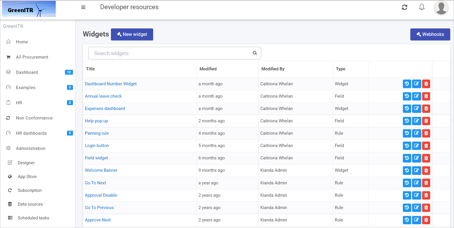
Go to Administration > Developer in the main menu. The Developer resources page shows all existing widgets. You can filter by widget type “Field” to see existing field controls.
-
Click New widget to start creating a new custom field widget.
-
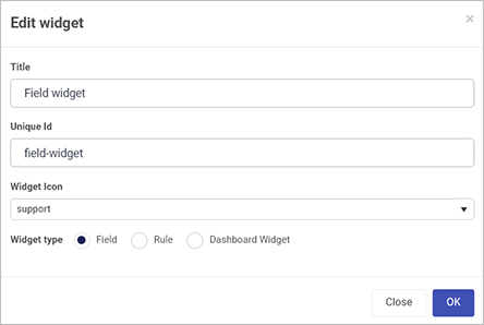
In the Edit widget dialog, enter:
- Title: A user-friendly name.
- Unique Id: Auto-populated from the title, but can be adjusted if needed.
- Widget Icon: Select from a wide range of icons.
- Widget type: Choose “Field” to create a field widget.
-
Click OK to confirm. The new widget appears in your widget list.
-
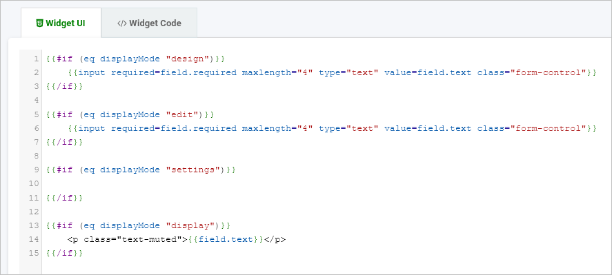
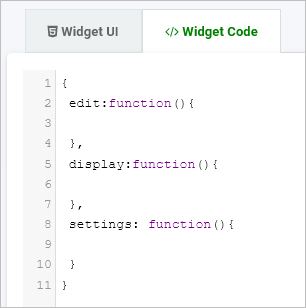
Open the widget to find two tabs:
- Widget UI: Add your Handlebars markup, bindings, and helper code.
- Widget Code: Add your JavaScript logic and event handlers.
-
From the Developer resources view, you can edit, delete, or restore previous versions of your widget using the available icons. This makes it easy to iterate on your design or roll back changes if needed.
-
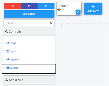
Once saved, your custom field widget appears in Kianda Designer. Navigate to: Administration > Designer > Open or create a process > Select a form, and you’ll see your new custom field under Controls > Custom.
Example: Creating a Custom Field Widget
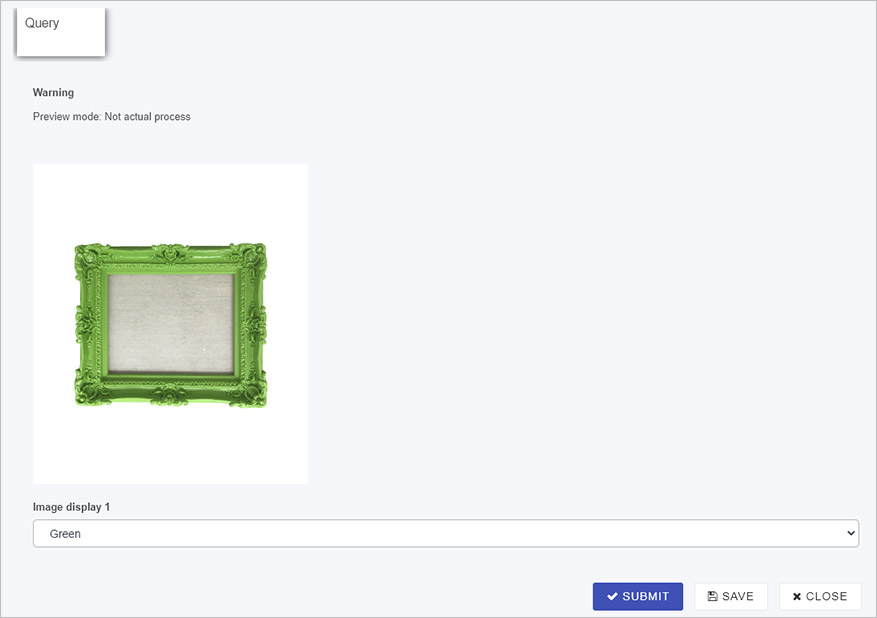
Below is an example of a custom field widget called “Image display.” It helps users select an image frame based on their choice in a dropdown list. This widget:
- Updates a “warning” text box field to inform the user when they are in preview mode.
- Lets the user choose a colored frame for an image displayed in another field.
Sample Widget UI Code
This Handlebars template changes its behavior depending on the displayMode (design, edit, settings, or display). During edit mode, for example, it provides a dropdown that triggers an action to update an image field in the form.
{{#if (eq displayMode "design")}}
  <select class="form-control">
    <option value="">Please configure my settings before use</option>
  </select>
{{/if}}

{{#if (eq displayMode "edit")}}
  <select class="form-control" id="entityType" onchange={{action 'frameSelected' value="target.value"}}>
    <option value="">Select</option>
    <option value="https://.../green.jpg">Green</option>
    <option value="https://.../red.jpg">Red</option>
    <option value="https://.../yellow.jpg">Yellow</option>
    <option value="https://.../purple.jpg">Purple</option>
  </select>
{{/if}}

{{#if (eq displayMode "settings")}}
  <div class="form-group">
    <label class="control-label">Image to place pictures into</label>
    {{field-picker process=process required=true allowText=false includes='["fields/field-image"]' value=field.settings.imageDestination}}
    <label class="control-label">Field to display warning message in</label>
    {{field-picker process=process required=true allowText=false value=field.settings.warningMessage}}
  </div>
{{/if}}

{{#if (eq displayMode "display")}}
  <select class="form-control" onchange={{action 'frameSelected' value="target.value"}}>
    <option value="">Select</option>
    <option value="https://.../green.jpg">Green</option>
    <option value="https://.../red.jpg">Red</option>
  </select>
{{/if}}
Sample Widget Code
This JavaScript defines what happens in each mode. For example, in edit mode it shows a warning message, and when the user selects a frame, it updates the target image field.
{
  edit: function() {
    var process = this.get('field.process');
    var warningMessage = process.findFieldByName(this.get("field.settings.warningMessage.name"));
    warningMessage.set("visible", true);
    warningMessage.set("enabled", false);
    warningMessage.set("text", "Preview mode: Not actual process");
  },
  display: function() {
    var process = this.get('field.process');
    var warningMessage = process.findFieldByName(this.get("field.settings.warningMessage.name"));
    warningMessage.set("visible", false);
  },
  actions: {
    frameSelected: function(image) {
      var process = this.get('field.process');
      var imageDestination = process.findFieldByName(this.get("field.settings.imageDestination.name"));
      imageDestination.set("text", image);
    }
  }
}
After saving, the new “Image display” widget appears in the Developer resources list:

Using Your Custom Field in a Form
Once your custom field widget is created, you can use it in any process within Kianda Designer:
-
In Administration > Designer, open or create a process, then open the relevant form.
-
Under Controls > Custom, find and add your custom widget—like “Image display.”
-
Configure the widget by selecting which fields it should update. For example, map a “Warning” text box and an “Image” field that the widget will control.
-
Save and Preview the form to see your custom field in action. When you choose a frame color from the dropdown, the selected image field updates accordingly.
This approach combines the flexibility of standard web technologies with the convenience of a low-code environment. By building custom field widgets on open web technologies, Kianda empowers you to create tailored, dynamic business applications that evolve with your organization’s needs—no proprietary lock-in, and no steep learning curve.
If you have any questions or need further guidance, explore the related documentation on Ember.js, Handlebars, and the Ember inspector. You’ll find that with your existing CSS and JavaScript skills, you can seamlessly extend Kianda’s capabilities and deliver custom, interactive process apps quickly and efficiently.