List widget template customisation
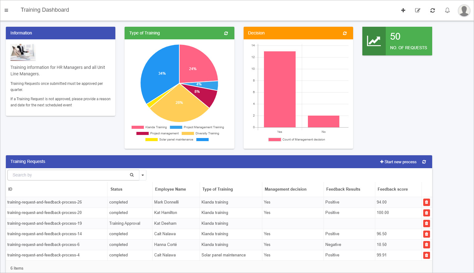
The List widget is a powerful dashboard component that displays process records or instances in an organized, visual format. For example, a “Training Requests” list can show each request’s ID, status, and the employee’s name who submitted it—all in one convenient place:

You can configure the List widget with no-code steps—such as filtering data, displaying specific fields, and enabling sorting or search features. For details, see Configure your widget.
However, to truly make the widget your own, you can customize it using HTML and Handlebars templates. This approach lets you change its look and feel, add icons, or even integrate dynamic behavior. In the following sections, we’ll walk you through how to get started with these customizations.
How to Get Started with List Widget Customization
As with any of Kianda’s predefined dashboard widgets, you can add a List widget to your dashboard with just a few clicks. For details on adding widgets, see How to add widgets to a dashboard page.
The standard List widget already provides extensive configuration options—like conditions, sorting, and filtering—that leverage both design fields and Kianda’s built-in process fields. Yet, if you have an Administrator role, you can take this further by customizing how the List widget displays its data:
-
Go to an existing dashboard page or create a new one. Click Edit current page
 to enter Edit mode.
 -
Add a new List widget from the dashboard widget menu if none exists, or edit an existing one by clicking its Edit/pen icon.

-
In the Edit widget dialog, configure the widget by selecting which fields to display and how you’d like the data to appear. For guidance, see Configure your widget.
-
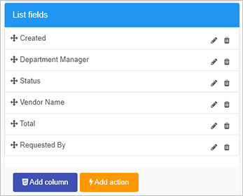
Once your fields are selected, click on List fields in the Edit widget dialog. Here, you’ll find two important buttons:
- Add column: Lets you add a new column with custom HTML or Handlebars code.
- Add action: Lets you attach a button to trigger rules or actions from the dashboard.

-
Add column
 :
:
Clicking this opens a code editor where you can customize the presentation of your data. Insert HTML, Handlebars expressions, and even Font Awesome icons for visual cues. You can also hide a column if needed.For example:
<div class="panel panel-primary"> <button class="btn btn-warning"> {{#if (eq row.properties.InternalStatus "completed")}} <span class="fa fa-check-circle"></span> {{else if (eq row.properties.InternalStatus "PO Request")}} <span class="fa fa-question-circle"></span> {{else if (eq row.properties.InternalStatus "Approval")}} <span class="fa fa-thumbs-up"></span> {{else if (eq row.properties.InternalStatus "Supplier Invoice")}} <span class="fa fa-newspaper-o"></span> {{else if (eq row.properties.InternalStatus "Payment")}} <span class="fa fa-money"></span> {{/if}} </button> </div> -
Add action
 :
:
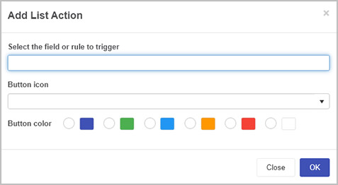
Use this feature to add a dashboard button that, when clicked, triggers specific rules or actions associated with a field in the underlying process. For example, you could re-run a “Submit” action even after a process instance is complete.
Choose a field or rule to trigger, assign an icon, and pick a button color. Your dashboard users will then be able to perform these actions directly from the list.
-
After making your changes, click OK to confirm. Then save your dashboard page changes by clicking the Save button
 . You’ll see a “Page saved successfully” message.
Example of List Widget Customization
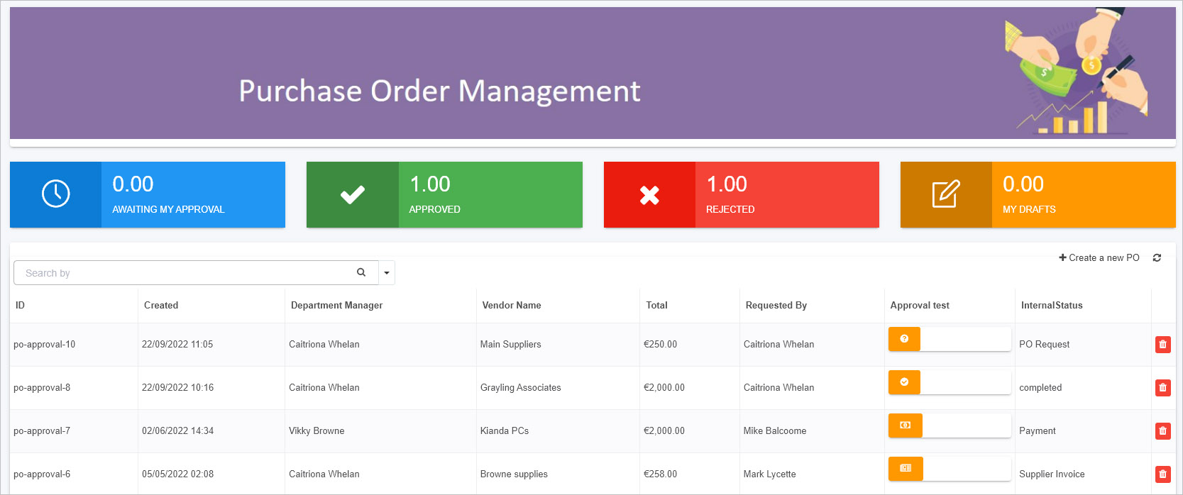
In the sample code above, we used Handlebars logic ({{#if}} conditions) to display different Font Awesome icons depending on the process instance’s status. For instance:
- PO Request: Shows a question-circle icon.
- Approval: Shows a thumbs-up icon.
- Supplier Invoice: Shows a newspaper icon.
- Payment: Shows a money icon.
- Completed: Shows a check-circle icon.
Since Kianda already loads Font Awesome, you can easily map different icons to different states, giving users a quick visual cue about each record’s progress.
When you follow the steps described and apply code via Add column, your dashboard might look like this:

You can also use JavaScript to enhance the widget’s functionality. For example, you could write custom actions in your Global JavaScript file (see Global JavaScript file) and then call them from within the Handlebars template. This flexibility means you’re not limited to static displays—you can introduce interactivity and dynamic content tailored to your specific requirements.
By blending Kianda’s built-in configuration options with custom HTML, Handlebars templating, and JavaScript actions, you can create a List widget that perfectly suits your reporting and visualization needs. This approach keeps development simple (just like regular front-end work) while unlocking a rich set of possibilities for your business dashboards.