Process Designer
The process designer provides an intuitive interface where you can quickly start building a process app together with forms, fields and rules for any business use case. Forms are an important component of any process. They might be used as a stage of a process and can be made active individually or at the same time (parallel forms).
A process design is a JSON document that encapsulate the visual layout and logic that renders into a fully functional process app and allows users to perform all sort of tasks. The process designer allows process designers to easily compose the process JSON schema without ever requiring the user to write a single line of code.
Designer introduction
This video introduces the process designer and demonstrates how to start creating a form and add fields to a process.
Preview a process
As an Administrator or someone with the role Design business process, you can preview your process designs at any time using the Run and preview process button  . This is a useful feature that allows you to preview your process, and visualise the logical flow of your design without publishing it yet for your users to view/use. Within the preview window, you can also troubleshoot your fields, rules and conditions by utilising the rule debugger feature.
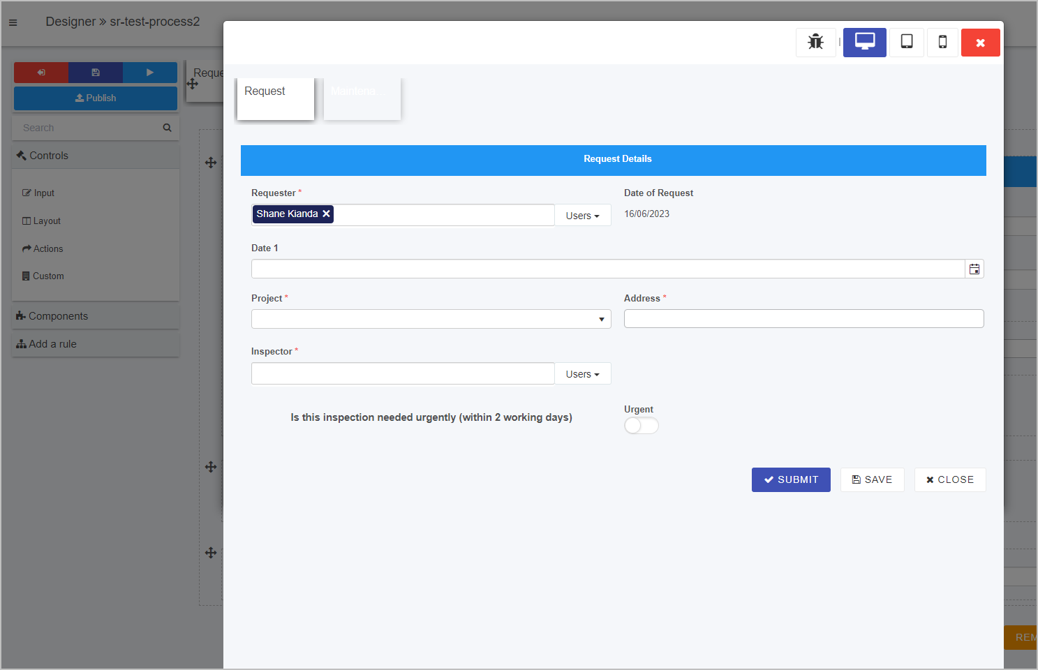
How to launch the process preview
-
Navigate to the left-hand pane of the designer screen and click on the Run and preview process button
 . From here, your process will display in a preview window only to you or to other Process/workspace security users that have access to the design.
 -
Within the process preview window, you can interact with controls and enter information as expected and the rules will execute on fields/buttons - the window displaying as a process instance, similar to when it will when published.
-
You can utilise the Rule debugger feature for troubleshooting purposes by clicking on the Enable / Disable Rule debugging button
 in the top right corner of the window.
 -
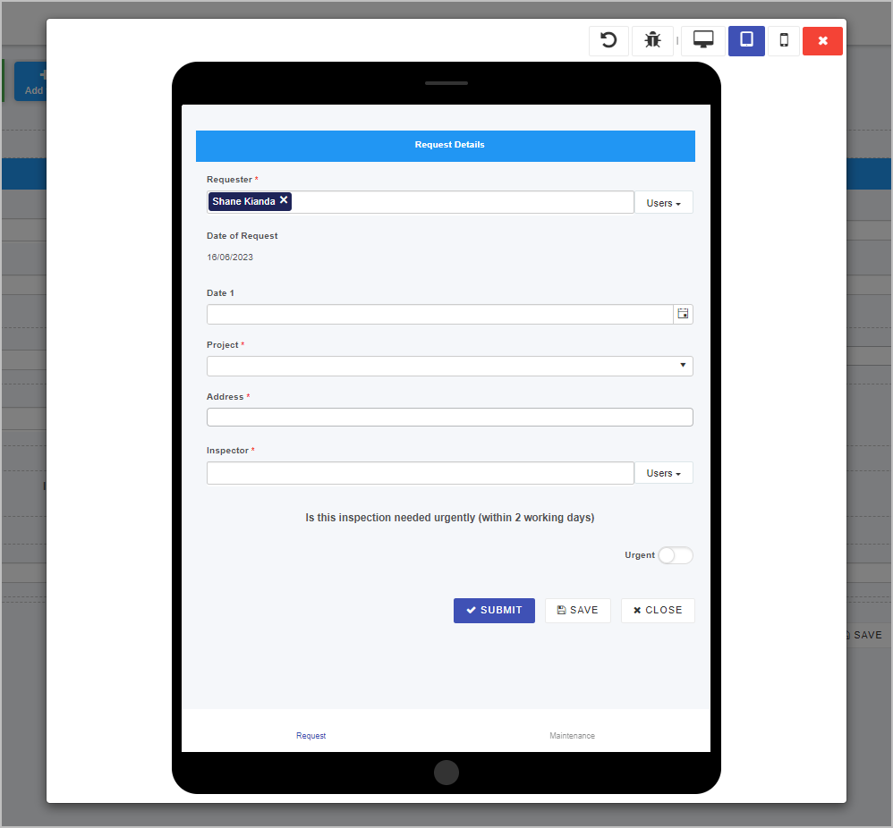
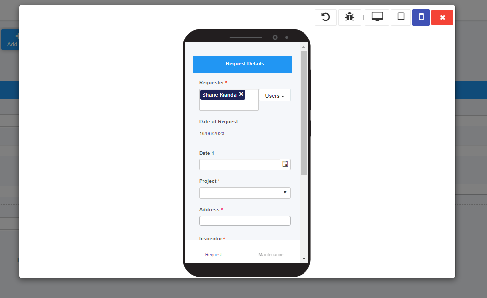
You can preview the process design from the perspective of different devices by clicking on the Device preview buttons to the right of the Rule debugger button. This feature will visualise how your process design is dynamic and responsive on a myriad of devices. The options for device emulation are as follows:
-
Desktop preview
 - displays the process instance as it would look on a desktop device.
 -
Tablet preview
 - displays the process instance as it would look on a tablet device.
-
Mobile preview
 - displays the process instance as it would look on a mobile device.
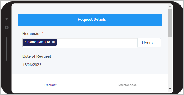
Note: If you select Tablet preview or Mobile preview, a Rotate device button
 will appear in the top right-hand corner. Clicking on this button will rotate the device screen from portrait to landscape and vice versa in the preview window.
-
-
When you are finished previewing your process design, click on the Exit preview mode button
 in the top right-hand corner of the previewer window.
Add new forms
Add new forms by clicking the add form button on the top of the designer screen. Options will be displayed to allow you to configure how the form should work.
Editing forms
Click on the form tab on top of the designer to reveal the form edit button (pencil) clicking this button will open the form editor and reveal its properties.
Import forms
Within the process designer you can import forms and other fields from other process designs within your workspace. Click the import button to the top right of the process designer to import parts of other process designs into your process.
Properties pane
In addition to adding fields/controls and rules, there are a number of ways to create the form and process design you want. You can set properties at property, form and field level. Properties represent how an element presents itself, for example the title and layout of the element.

Properties at all levels are visible in the right-hand pane of Kianda designer, along with the:
-
Import button
 to allow you to import forms and form elements like fields
 -
Version history button
 to allow you to manage version of the process design
 -
Settings button
 to allow you to apply process security settings amongst other options
Process level properties
When you click on a process from the main process view, straight away you will see the Process properties in the right-hand pane as shown in the image above. To find out more about process go to the Process properties page.
When you click on a form within a process, then the properties view changes to show Form properties, as shown in the image in Form level properties.
If you want to return to Process properties, click on the process name beside the Designer and chevron symbol, that is:
Form level properties
When you click on a form in Kianda Designer, the properties for that form appear.

To find out more about form properties go to the Form properties page.
Note that at form level, additional buttons appear above Form properties namely:
-
Edit/Pen button
 where clicking on this button opens the Edit dialog box for the chosen item, for example a form.
 -
Clone button
 that allows you to make a duplicate form. Click on OK to make a copy or Close to close the dialog box and cancel the copy.
 -
Bin/trash button
 where clicking on this button opens a popup asking you to confirm that you want to delete the selected form. Click on OK to make a copy or Close to close the dialog box and cancel the deletion.
Field level properties
When you add controls to forms Kianda Designer, and select a field/control, the properties for that field appear in the right-hand pane.

The type of field/control is listed in the properties pane, for example ‘Text box’ as shown in the image above. How the field appears is easy to control simply by checking/unchecking a number of boxes. To find out more about field/control properties go to the Control properties page.
Version History
The process design in Kianda maintains a compreensive version history of any changes made to the platform. The Version number of a process will be updated every time a process design is saved by clicking on Save button.
The designer maintans two types of versions: Draft and published. Draft versions are only visible to administrators and designers while the last published version is visible to end users.
A design without a published version cannot be used by an end-user to create a new record.
The current or active version of a process is always visible in the right-hand pane, for example V0.34.
The first version of a process is 0.1 and will increment to 0.2 and so on, each time a process is saved. Once the process is published the version changes to 1.0 and increments with each publication.
If the process is subsequently saved, then the next version will be V1.1 and the next published version will be V2.0.
Using versioning makes it is easy to keep track of changes and to restore the design to an older version if needed.
Process Settings
You can use Settings to control process wide settings for the current process design and control things like behavious of form tabs, process security and anonymous access of the process.
General settings
Process ID Settings: Use this to control how the process record ID generation. The default record ID is a combination of the process ID and the record ID,example: process-1.
With this setting designers can use any combination of fields or expression to generate the record unique ID.
Onload rules execution mode: Controls when onload rules execute. The options are: Always, when in edit mode and When its a new record
Enable form assignment notification: Enables automatic push notifications to be send to assigee user when a record is assigned to them.
Prevent closing an instance with unsaved data: This allows the system to prompt to save unsaved changes to a form record if the user attempts to navigate away without saving first.
Enable process chat: Enables process level chat features for a given process record.
Security
Use the security tab to configure security settings for the process.
Enable process security: Enables or disables process level security. Users without access to the record receive access denied error.
The following are the available security modes:
- Restricted creator: With this security mode only indicated users can create a new record of the process, users assigned to the record can update it and everyone else can only view it.
- Restricted assign to: With this security mode only indicated users can create a new record, assign to users can view or modify it, everyone else cannot view the record.
- Restricted: This is the most restricted security mode. Only directly indicated users can create, view or update records.
Tabs
Use the tabs to configure how the process tabs will behave including its look & feel. Control here setttings such hidding the form tabs altogether, hidding the workspace left nav and enabling the mobile footer navbar.
You can also configure here the colours for the selected tab and trhe completed (submited) tab.
Anonymous form
Use the anonymous form tab to enable at process level anonymous form submission.
When enabled the user has the option to create the new record anonymous link. This is a unique link that allows users to submit new records without authentication.
Process instances
When your process is created in Designer, you can save the process, and then submit data to that process. When you save or submit data, then an instance of the process is created. Another name for a process instance is a record. This instance is tied to user data or calculated values, or to whatever the process is designed to do.
The instance has a unique ID which can be seen in a list widget in a dashboard. For example, this List widget displays the individual records of various training requests submitted by employees. The unique ID for each record is shown in the first column. Form owners or those with security access can click on ID ‘training-request-and-feedback-process-26’ to view the training request form completed and submitted by employee Mark Donnelli.
List widget in a dashboard showing process instances
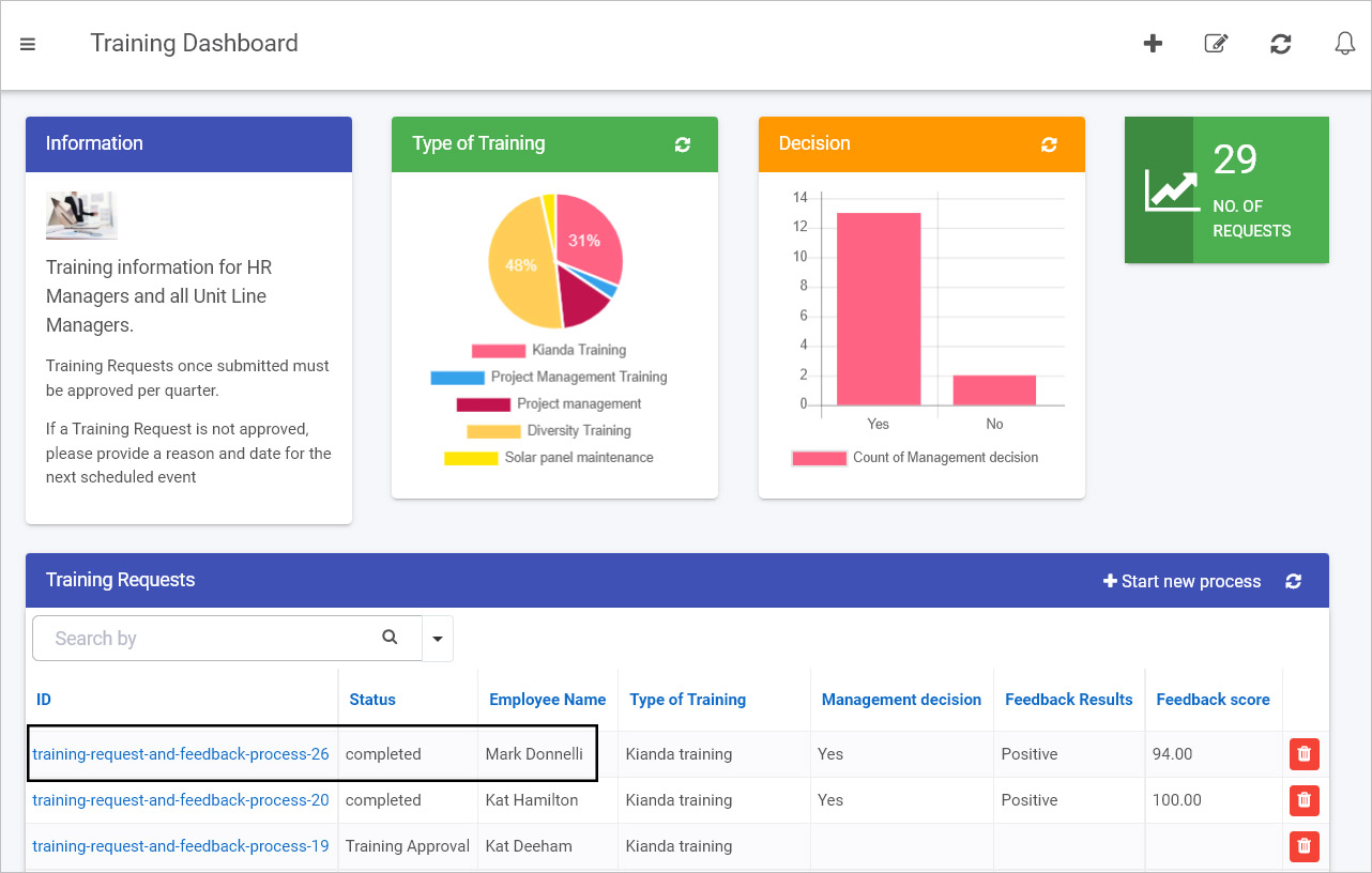
This means that each new record generated by a process will have its own unique URL that can be shared with those who have the required security access and need to be involved in that particular process instance. For example, in this case, the training request submitted by Mark (an employee) may be viewed and approved by his line manager:
You can create a link on your dashboard – in the example shown above, the Start new process button at the top right of the Training Requests list widget – that enables you to create a new record by bringing you into the relevant form. For information on creating list widgets go to List widget.
If you commit to the process by submitting or saving information, then the result is a new process instance – that is, a new unique record – which will be seen in a list widget in the dashboard, as seen in the image above.
Keeping in mind that Designer is used to create processes, and that each ‘run’ of the process design results in a unique process instance or record, will help you later on when designing forms and dashboards.
Instance Common fields
The non-design fields associated with all Kianda processes are listed below. It is useful to keep these fields in mind when designing forms, as they can be used to retrieve, store or display values from process instances for example Status which is the status of a process instance. Using these ‘internal values’ could be useful where the status of one process could be used as a condition to trigger the start of another process, for example using the Start a process rule.
The common fields associated with process instances are:
| Field name | Explanation |
|---|---|
| ID | This is the process instance ID, labelled as ‘process-name-number’, for example ‘safety-inspection-8’. This ID is part of the URL that brings you to the process instance/record held on the system when information is either submitted or saved. For example clicking on the process instance ID ‘safety-inspection-8’ in a dashboard brings you to the form. |
| Unique ID | This is a system generated ID for each process instance, a 32 letter and number generated value. |
| Status | This is the status for the process instance, that is either a ‘form name’ or ‘Completed’. Completed indicates that all forms in a process have been submitted, while ‘form name’ indicates what the active form is in the process, that is, where the process is ‘at’. For example in a process of two forms, a Request form and an Approval form. Once the Request form has been submitted then the status for a process is ‘Approval form’ indicating that this form needs to be completed. |
| Version | This is the process instance version number that starts as 1.0. If a process instance is updated, for example if a process design is updated and published and process instances are updated with the change, then the next version of the instance will be 2.0. |
| Process Version | This is the process design version, that is the version of the process design that has been used as a template for the process instance. |
| Process Name | This is the Unique ID name that comes from the process design that is the template for the process instance. The ID is created when the process is created. The ID field autofills from the title of the process as shown in Create your first process. |
| Process Title | This is the Process title that comes from the process design title, created when the process is created or updated, for example see Create your first process. |
| Created | This is a date and time stamp when the process instance is created. |
| Created by | This is the user name of the user who created the process instance. |
| Modified | This is the date and time stamp when the process instance is modified, for example after a process design is published and existing process instances are updated. |
| Modified by | This is the user name of the user who modified the process instance. |
| Assign to | This is the user name of the user who a process is assigned to. Process designs may have a static option for reassignment in their design so that process instances can be reassigned using Quick actions. Alternatively the Assign form rule can be used to dynamically assign form ownership to another user. That user is named in the Assign to field. |
| Security users | These are the named security users, defined using Process settings by selecting Enable process security and naming Process security users which can be Users, Groups and/or Partners. |