This guide aims to provide you with a clear understanding of how to use Kianda’s forms and controls features to build the process layout for user input capture and to automate tasks.
1. Introduction
Using Kianda’s form builder, you can quickly design dynamic forms and controls to streamline various business processes.
In this section, we will cover the basics of Kianda forms and controls. You will learn how to navigate the platform, access the form builder, and create new process designs.
We will also discuss the different types of controls available, such as input controls, layout controls, actions, and custom controls, and how they can be used to build interactive and responsive forms. By the end of this section, you will be ready to start creating forms that meet your specific business requirements.
Before we begin, ensure you have the necessary admin rights within your Kianda workspace and a basic understanding of HTML, CSS, and JavaScript, especially for creating custom controls. This guide will provide step-by-step instructions and visual aids to help you get started quickly. Whether you are building a simple form or a multi-step process application, Kianda’s form builder and versatile controls will help you achieve your goals with minimal coding effort.
Tip
If you did not do so already, you can sign-up for for a free developer workspace here.2. Accessing the Form Builder
To access the form builder in Kianda, ensure you have admin rights within your workspace. Once logged in, navigate to the top right corner of the screen and click the cog icon to open the admin menu.
From there, select the “Designer” menu to open the designer page where all process designs are listed. You can either click on an existing design or create a new one by filling out the necessary details in the dialog box.
Watch the video below for a visual guide on accessing the designer and selecting a process form design to start building your forms.
3. Understanding Controls
In Kianda, controls are the building blocks of your forms. They allow you to capture user inputs, organize the layout, perform actions, and even create custom functionality.
Controls are grouped into four main categories: Input, Layout, Actions, and Custom. Each category serves a distinct purpose, helping you create interactive and responsive forms tailored to your business needs. The table below lists the controls available under each category.
| Input Controls | Layout Controls | Action Controls | Custom Controls |
|---|---|---|---|
| Text Box | Panel | Button | Custom controls created using HTML, Handlebars, and JavaScript |
| List (Dropdown, Radio Button, Multi-select, Checkbox) | Dialog Box | Link | |
| Number | Rich Text | ||
| Date | Field Group | ||
| File | |||
| Table | |||
| User Picker | |||
| Toggle | |||
| Signature Pad |
4. Adding Controls to a Form
Adding controls to a form in Kianda is a straightforward process. Once you have accessed the form builder, you can drag and drop the desired controls from the control panel onto your form canvas.
Each control can be customized through its properties, which are displayed on the right side of the screen. You can configure settings such as visibility, required fields, responsiveness, and more. This intuitive interface allows you to quickly build and modify forms to suit your specific needs, ensuring an efficient and user-friendly experience for end-users.
5. Making Forms Mobile Responsive
Ensuring that your forms are mobile responsive is essential for providing a seamless user experience across different devices. Kianda’s form builder allows you to design forms that automatically adjust to various screen sizes, from desktops to tablets and smartphones. Using the responsive layout options available in the form builder, you can define how each control should behave on different devices. This ensures that your forms remain accessible and user-friendly, regardless of the screen size.
To make a form mobile responsive, start by configuring the layout settings of each control. In the properties panel, you can specify the number of columns a control should span on different screen sizes, following the Bootstrap grid system.
For example, you might set a text box to take up half the width of the screen on a desktop (6 columns) but adjust it to full width (12 columns) on a mobile device. This flexibility allows you to optimize the layout for better readability and ease of use on smaller screens.
Additionally, you can group controls using layout elements like panels and field groups to maintain a clean and organized structure. These grouping elements can also be configured for responsiveness, ensuring that related controls stay together and display cohesively on all devices. By leveraging Kianda’s responsive design features, you can create forms that provide a consistent and efficient user experience, enhancing usability and satisfaction for both desktop and mobile users.
6. Advanced Control Configuration
Advanced Control Configuration in the form builder allows you to tailor each control to meet specific requirements. Each control type has a unique set of advanced options that can be configured to optimize functionality and user experience. Here are the detailed configurations for some of the common control types:
Textbox Control
- Mode: Single line of text, Multiple lines of text, Rich text - Sets the type of text input allowed.
- Text style: Normal, Capitalize, Uppercase, Lowercase - Adjusts the text appearance.
- Control type: Text, Password - Determines the kind of data the control will handle.
- Auto fill: Default, Off - Enables or disables automatic suggestions.
- Placeholder: Text displayed inside the textbox as a hint.
- Expression: An expression in JavaScript that can add references to other fields - Allows dynamic value calculation.
Number Control
- Display format: Default, Integer, Currency, Percentage - Specifies how the number is formatted.
- Show number up-down arrow: Yes / No - Displays arrows for incrementing/decrementing the number.
- Enable native number input on mobile: Yes / No - Allows native mobile number input.
- Decimal places: Sets the number of decimal places allowed.
- Placeholder: Text displayed as a hint inside the number input.
- Expression: Same as the textbox - Allows dynamic value calculation.
List Control
The list control is a versatile control that can bind directly to data sources such as databases or other process data.
- List source: Entered manually, Form data, Data source - Determines where the list data comes from.
- Display format: Dropdown list, Radio list, Multi select, Checkbox list - Sets how the list items are displayed.
- Filter mode: Starts with, Contains - Controls the filtering behavior of the list.
- Enable native selector on mobile: Yes / No - Allows native mobile list selection.
Date Control
- Display format: Date, Date and time - Sets the type of date input allowed.
- Allow manual entry of date format?: Yes / No - Allows manual date input in a specified format.
- Adjust to user timezone?: Checkbox - Adjusts the date/time according to the user’s timezone.
- Set default date onload?: Yes / No - Sets a default date when the form loads.
- Enable native picker on mobile: Yes / No - Allows native mobile date selection.
File Control
- Save location: Selector of the data source where files are uploaded to - Specifies where the files are stored.
- Open file behavior: Download, Open in browser - Determines how the file is accessed after upload.
- Folder structure: None, Process(ID), Process/Form, Custom - Organizes files within specific folders.
- Allow file override: Yes / No - Permits or restricts file overwriting.
- Allow remove file: Yes / No - Allows files to be deleted.
- Allow uploading multiple files: Yes / No - Permits multiple file uploads.
- File name options: Original file name, Auto generated, From form field - Sets the naming convention for uploaded files.
- File extension: Specifies allowed file types.
- Enable media capture: Yes / No - Enables capturing media directly through the form.
- Button text: Customizes the upload button text.
- Button icon: Sets an icon for the upload button.
- Enable background upload: Allows files to be uploaded in the background.
- Enable chunked upload: Allows large files to be uploaded in chunks.
User picker Control
- Selection mode: Single, multiple - Specifies if multiple users can be selected.
- Member of group: Limits the selection of users from single group.
- Selection options: Users, Groups, Partners (External users) - Defines what type of principals can be selected.
- Default to current user: Yes / No - Auto select the current user in the picker control.
Toggle Control
Toggle control allows the capture of Boolean type of content using (Yes / No by default)
- Value when enabled: Specifies specifies the value when the toggle or checkbox is selected.
- Value when disabled: Specifies specifies the value when the toggle or checkbox is un-selected.
- Display mode: Toggle, Checkbox - Defines what type of control will be used (Checkbox or a toggle control).
Table Control
Allows the capture of tabular or repeating data. Table control can include panel as the single column that in itself can contain other controls. This makes the table controls a flexible control for both tabular format data as well as for repeating data structures.
- Add row text: The button text for the add new row button of the table - Customizes the text for the add row button.
- Page size: Table paging size - Sets the number of rows per page.
- Enable adding rows: Yes / No - Allows users to add rows.
- Enable removing rows: Yes / No - Allows users to remove rows.
- Show row count: Yes / No - Displays the number of rows.
- Enable sorting: Allows table columns to be sorted.
- Enable search: Enables search functionality within the table.
- Add first row on load: Automatically adds the first row when the form loads.
- Enable export to CSV: Allows exporting table data to a CSV file.
Panel Control
- Enable panel security: Enables settings to apply dynamic security to a panel - Secures panel content based on conditions.
- Color scheme: Options to choose color for the panel - Customizes the panel color.
Dialog Control
- Dialog size: Default, Large - Defines the size of the modal dialog.
- Hide Ok, Hide Close: Options to choose hide the default modal dialog buttons.
Button Control
- Enable button security: Same as panel security - Secures button actions based on conditions.
- Button size: XL, L, M, S, XS, Default - Sets the size of the button.
- Block button: Yes / No - Makes the button span the full width of its container.
- Align button: Left, Center, Right, Default - Aligns the button within its container.
- Color scheme: Various color options - Customizes the button color.
- Icon: Sets an icon for the button.
- Show in form body: Yes / No - Controls whether the button is displayed within the form.
These configurations ensure that each form control can be finely tuned to provide the best user experience and functionality, making your forms not only more powerful but also more adaptable to specific needs.
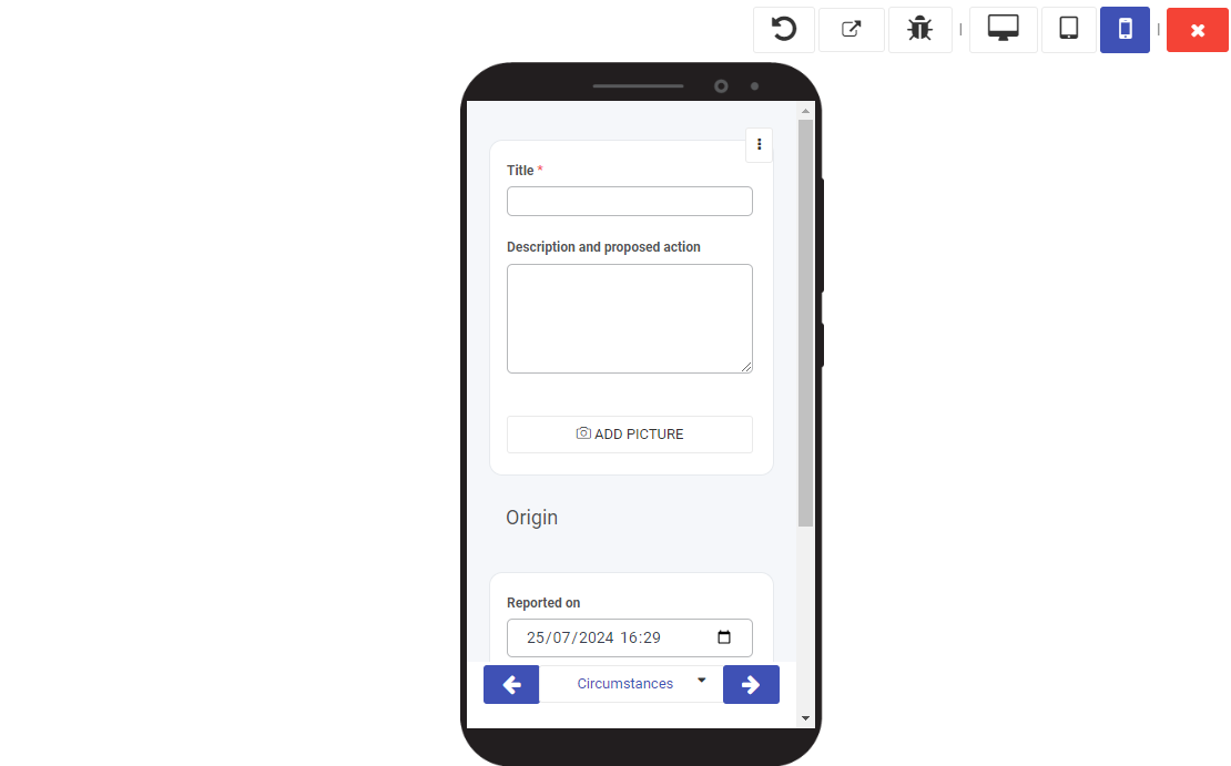
7. Testing Your Form
The Previewer allows true iterative development, by providing a testing mechanism to give insights that lead to further developments. Each process version can be saved as a draft, with options to restore to earlier versions if needed.
-
Testing Form Functionality
While in preview mode the user can test in detail and using multiple screen sizes the form they are working on. Rules and other form level configuration will behave just like it would for end users.
-
Debugging Common Issues
To debug and step through the form the user might click the debug button